

The popular advice is simple: black and white makes architecture look timeless. That's only half true. A monochrome conversion won't rescue weak geometry, poor exposure, or a brief that depends on material color. In professional work, black and white photography architecture is better understood as a client-delivery decision. It can clarify form, control visual noise, and suit editorial presentation, but it can also remove information a developer, brand team, or tenant needs.
The medium has always been closely tied to buildings. Nicéphore Niépce's View from the Window at Le Gras, made in 1826 or 1827, is widely described as the first architectural photograph because it depicted buildings and rooftops. Its exposure reportedly lasted about 8 hours, a reminder that static built forms were among the earliest practical subjects for photography, as documented by this history of monochrome architectural photography. The question today isn't whether monochrome has authority. It's whether that authority serves the assignment.
Why Black and White Is a Strategic Choice for Architecture
Black and white isn't automatically moody, nostalgic, or artistic. Used well, it's a form of visual editing. Removing hue can make the viewer read mass, proportion, texture, rhythm, and light before getting distracted by color relationships that may have little to do with the architect's intent.
A mixed-material facade is a good example. Stone, metal, glass, painted panels, and exposed concrete can produce a busy color field, especially under flat overcast light. Grayscale can reduce that competition and make the hierarchy of planes easier to understand. In a congested urban setting, the same treatment can push signage, parked vehicles, and clothing into a supporting role while the building's structure takes priority.
That doesn't mean color is a problem. It means color is information, and information needs to earn its place.
Where monochrome improves the message
Interior work often benefits from the same discipline. Daylight entering through one elevation, warm decorative fixtures, cool LEDs, and reflected color from furniture can create a confusing visual temperature. A monochrome image removes those clashes and lets the viewer judge the volume of the room through luminance, shadow, and edge definition.
This is particularly useful for editorial features, architectural awards, and design portfolios where the image has to communicate an idea quickly. Buildings became an established photographic subject by the 1860s, and the French heliographic mission of 1851 was described as the first French architectural photography project created to inventory national historic monuments. Black and white remained dominant for much of the twentieth century because it was archival, less expensive, easier to develop, and useful for managing architecture's wide brightness range, according to this overview of architectural photography.
A commercial client needs a different test. Ask whether color communicates something essential:
- Brand identity: Does the facade depend on a distinctive corporate color?
- Material specification: Does the client need to show timber tone, brick variation, stone warmth, or a finish schedule?
- Wayfinding: Will tenants or visitors use color cues to recognize the property?
- Occupancy and lifestyle: Does the image need to show people, planting, food, or furniture as part of the proposition?
If the answer is yes, color may be the more accurate deliverable. If the answer is no, monochrome can produce a cleaner and more controlled presentation.
The brief decides the finish
Monochrome also expands scheduling flexibility. You're less dependent on a narrow golden-hour window when the final image is judged primarily by tonal separation rather than warm color. Overcast weather can become useful instead of disastrous, provided the building has strong relief, repeated openings, or a convincing relationship between light and shadow.
Before you shoot, answer three questions: Who is the end user? Where will the image appear? Does the geometry improve when hue is removed? The visual history of the medium, outlined in the evolution of architectural photography, supports the medium's credibility. It doesn't replace your responsibility to choose the right deliverable.
Pre-Shoot Planning and Scouting for Monochrome Builds
A monochrome assignment starts before the camera comes out of the bag. Scouting should tell you whether the building has tonal structure, not merely whether it has an attractive viewpoint.
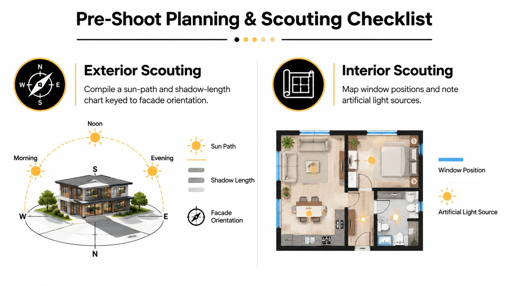
Exterior scouting
Start with orientation. Mark each important facade on a plan, then record how the sun moves across it and how shadows lengthen through the day. You're looking for raking light that reveals joints, reveals, and surface texture without pushing pale masonry or reflective glazing into a featureless white mass.
A practical exterior checklist includes:
- Viewpoints: Test the primary entrance, the architect's intended sightline, and at least one less obvious oblique position.
- Lens tests: Scout with a 35mm lens for a natural working view, then use a tilt-shift lens to evaluate vertical control and framing flexibility.
- Reflections: Note neighboring towers, traffic, sky brightness, and any distracting reflected signage in glass.
- Movement: Log vehicle and pedestrian patterns. Sometimes a quiet capture window is more valuable than a retouch-heavy frame.
- Foreground: Identify trees, walls, bollards, doorways, or environmental elements that can provide a dark tonal anchor.
Raking light is not always the answer. A brutalist facade may need hard sun for graphic shadows, while a glass building may work better when the sky and structure balance softly.
Interior scouting
For interiors, walk the floor plan rather than relying on a quick visual impression. Mark window positions, direct daylight paths, reflective surfaces, artificial fixtures, and areas where warm and cool sources overlap. Those color clashes may disappear in black and white, but glare and luminance imbalance won't.
Check whether fixtures need flagging, dimming, or relighting. Identify where a scrim can soften daylight, where a black flag can protect a wall from spill, and where a small LED panel can lift a dark stair or reception desk without flattening the room.
Brief and equipment check
Before the shoot, confirm the client's brand requirements, deadline, approval process, and delivery formats. A developer may need color for sales material and monochrome for an award submission. Treat those as separate outputs from the beginning.
Your kit checklist should include:
- Lens lineup: A 24mm, 45mm, and 90mm tilt-shift set, with a 17mm or 19mm option if the site demands an unusually broad view.
- Support: A solid tripod, tethering cable, spare batteries, and a tested capture workstation.
- Exposure tools: Histogram display, highlight warnings, gray card, and a method for checking reflections.
- Access: Permits, security contacts, elevator access, furniture movement approval, and a plan for clearing occupants.
A tested tethered workflow catches framing, flare, and focus problems before the building's best light is gone.
Composition and Geometry That Make B&W Architecture Work
Monochrome exposes whether the composition carries its own weight. Without color to distract the eye, viewers read the architecture through its lines, intervals, and tonal blocks. That makes geometry a delivery decision, not a finishing preference. For a developer brief, disciplined structure can clarify the building. For editorial work, a controlled break in that structure can create tension and emphasis.
Start with the strongest directional lines. Roads, paving joints, stair edges, railings, window mullions, and ceiling seams can pull attention toward an entrance or vanishing point. Keep each line purposeful. A bright, irrelevant patch at the end of a leading line weakens the frame, while a line that exits too quickly can leave the image without enough visual pressure.
Geometry before contrast
Symmetry works well when a building has a clear central axis, such as a classical entrance, monumental staircase, or repetitive curtain-wall elevation. Perfect symmetry can also feel static. Shift slightly off axis when the frame needs tension, while retaining enough order for the building to remain legible.
Brutalist structures often suit broad, quiet shapes and firm shadow boundaries. Classical buildings depend more on proportion, repetition, and the measured relationship between columns, openings, and voids. Glass-heavy facades require close attention to reflections. A reflected sky can become the dominant tonal shape, changing the apparent hierarchy of the facade.
Foreground anchors give the frame scale and weight. A doorway, column, tree canopy, or dark horizontal strip can prevent the lower edge from dissolving into pale pavement. Planting, walls, or hardscape elements can provide a dark tonal anchor without becoming the subject. Choose an anchor that supports the building rather than competes with it.
Negative space is equally useful. A broad sky, blank wall, or empty floor can isolate a structural gesture and make repetition feel deliberate. Removing visual noise gives the eye room to read form, which often helps monochrome outperform color in concise editorial layouts and restrained commercial presentations.
Control verticals, then decide when to break them
Use a tilt-shift lens or deliberate camera height to keep verticals credible. Correct convergence when the image must document the building, support sales clarity, or represent the architect's work faithfully. For an editorial frame, intentional keystoning can add urgency or stress height, but the distortion must appear chosen.
Practical rule: Decide whether the image is documentary or expressive before correcting every line.
Post-processing should follow that viewfinder decision. Contrast cannot create structure missing from the composition. The principles in the science of architectural composition apply before grayscale conversion, because geometry determines how the viewer moves through the frame.
Camera Settings, Lenses, and Exposure for High-Contrast Scenes
Architectural cameras are usually stationary, but the exposure problem is not simple. A bright sky, white facade, dark window recess, and polished floor can occupy the same frame. If you protect only the shadows, highlights clip. If you save only the sky, the building becomes a black block.
Use a tilt-shift lens when converging verticals or precise framing matter on an exterior. A 24mm prime is useful for confined interiors and broad spatial relationships, while a 45mm prime often gives a more restrained structural view. Longer primes help isolate facade studies and compress repeated openings without making the entire building feel like a diagram.
A reliable capture baseline
For static frames, work at base ISO when practical. A low ISO setting, commonly within the 100–200 range, can support clean files and broad dynamic range, but the exact setting depends on the camera and the amount of movement in the room. A tripod, mirror lock-up, or electronic first curtain can reduce vibration when the subject isn't moving.
Shoot RAW. Use a neutral or flat picture profile so the histogram gives you a more honest warning about highlight placement. The LCD preview can look dramatic and still hide clipped masonry, signage, or window detail.
Meter the brightest important material, then expose as far to the right on the histogram as possible without clipping. This preserves more sensor data for later tonal shaping and can reduce shadow noise in the conversion, as explained in this expert guidance on black-and-white building photography.

Bracket when the scene demands it
Bracket when deep structural shadow and bright sky compete, or when artificial interior lighting creates a wide luminance range. Three exposures at one-stop intervals provide a practical starting point for selecting or merging frames, provided the client and post-production schedule allow that treatment.
Published imaging references note that an XDR CMOS sensor may provide roughly 60 dB in linear mode, up to 154 dB maximum intrascene dynamic range, and around 130 dB in common configurations. Architectural imaging research also documents scenes spanning about 8.5 EV, which helps explain why a single frame can struggle with white walls, bright sky, and deep shadows together, as described in this reference on high-dynamic-range imaging sensors.
The histogram is the benchmark, not the drama of the preview. Preserve texture in the brightest important materials before conversion.
Shutter speed is also creative. A long exposure can turn passing occupants into soft indications of scale, while a faster shutter preserves a clean lobby or workplace. Decide whether people should describe the room or interrupt it.
Lighting, Timing, and On-Set Direction
A mixed-use developer wants two different pictures from the same property. The dawn exterior needs to establish the building in its setting. The mid-morning amenity interior needs to show volume, finish, and a believable sense of use. A single lighting plan won't serve both.
For the exterior, blue hour can work well with a glass facade because the sky retains structure while interior illumination begins to register. Textured stone usually benefits from a lower, more directional source that reveals relief. Hard midday sun has a narrower role, but it can produce strong graphic shadow studies when the brief values pattern over hospitality.
A representative call sheet
The schedule should follow the building's surfaces, not the convenience of the crew.
- Dawn exterior: Photograph the main elevation while the sky and interior lights remain legible together. Keep an eye on bright glazing and reflected highlights.
- Stone detail window: Return when the sun strikes the facade at an angle that reveals texture instead of flattening it.
- Amenity interior: Clear unnecessary foot traffic, stage furniture, and decide whether practical fixtures should remain visible.
- Graphic study: Reserve hard directional light for stairs, fins, repetitive windows, or deep structural shadows.
Inside, scrims, reflectors, black flags, and compact LED panels often solve more problems than adding large strobes. A scrim can reduce a hot window, a black flag can stop spill from contaminating a pale wall, and a small LED can lift a stair edge without erasing the room's natural falloff.
Direct people as part of the composition
Stand where the architect intended the room to be understood. A few inches of camera movement can change the relationship between a column, a doorway, and the far wall. If occupants are needed, cue them to move through the space rather than pose in every frame. Controlled motion can communicate scale, while random movement turns the image into a cleanup project.
Read the room's luminance range before committing to the first exposure. Look at the brightest window, the deepest corner, reflective flooring, and dark furniture. If the range is beyond what one frame can hold, bracket early rather than discovering the problem after the room has been reset.
Overcast weather can produce even, calm exteriors, but it won't reveal every textured surface. Weather flexibility is useful only when the brief values softness. If the client needs deep relief and graphic shadow, a bright but controlled day may serve the image better.
RAW Conversion and Post-Processing Workflow
The conversion should begin with the RAW file, not with a saturation slider. A proper monochrome tool or channel mixer lets you decide how recorded colors become luminance. That matters because red brick, orange wood, blue glass, green planting, and skin can collapse into similar gray values if you remove color without controlling the channels.
Choose a profile deliberately. A linear profile offers broad contrast control. A camera-standard profile may give you more familiar shadow behavior when recovery is important. Convert early, then judge the frame as a grayscale image rather than repeatedly comparing it with the color original.
Build the tonal structure
Start with global exposure and white balance. White balance still matters in a monochrome file because it changes the relative brightness of color channels before they become gray. A warmer or cooler tonal interpretation can be appropriate, but it should support the building rather than become a visible effect.
Set the black and white points carefully. The black point defines the darkest endpoint, the white point defines the brightest, and shadow and highlight controls let you recover specific ranges without shifting every pixel together. The goal is a broad histogram with usable detail at both ends, not maximum contrast for its own sake.
A useful starting matrix can look like this:
| Material | Red % | Green % | Blue % | Tonal Goal |
|---|---|---|---|---|
| Brick and terracotta | 55 | 30 | 15 | Separate warm masonry from dark openings |
| Concrete | 35 | 40 | 25 | Preserve neutral surface texture |
| Wood | 45 | 35 | 20 | Maintain grain without muddy shadows |
| Blue glass | 25 | 35 | 40 | Hold reflected sky and facade structure |
| Planting | 25 | 55 | 20 | Keep foliage distinct from adjacent surfaces |
These are starting points, not fixed recipes. Material, light, and camera response should determine the final balance.
Use local control with restraint
Apply a graduated filter to a bright sky, a radial mask to an atrium or stair, and brush adjustments to distracting signage or reflections. Dodge and burn works best with a soft, low-flow brush. Keep the transition subtle enough that the viewer notices the architecture, not the retouch.
The same principle applies to cleanup. Remove temporary distractions that interfere with the building's reading, but don't erase evidence that the client needs, such as signage, access points, safety markings, or material transitions. This guide to using post-production to fix structural photos is relevant to correction, but software shouldn't replace a sound camera position.
Finish with restrained grain if the image needs a tactile print character. Tri-X 400 and HP5 simulations can work at low strength, though a clean digital finish may be more appropriate for a developer's website. Sharpen edges rather than blank walls, then check the file on a calibrated display and review a small proof before exporting.
Presentation, Portfolio, and Client Delivery
A successful monochrome image can still fail commercially if the delivery is careless. The client may see the photograph in a magazine, on a property website, in a presentation deck, on social media, or as a large print. Each context changes how much detail, sharpening, compression, and tonal subtlety the file can carry.
Agree on output requirements before the shoot. Print and editorial work need sufficient resolution and an appropriate color-management workflow, even when the visible image is grayscale. Web files need predictable dimensions, restrained sharpening, and compression that doesn't turn fine facade texture into noise.
Package files for the approval process
Use a naming system that survives revisions. A structure such as Project_View_Sequence_Version keeps alternatives together without burying the useful information in a vague filename. Don't overwrite the original RAW or the master edited file when the client requests a crop, alternate contrast treatment, or color version.
A professional delivery can include:
- Review gallery: Watermarked proofs with clear file names and a simple approval method.
- Contact sheet: A concise overview that helps the client compare views and tonal treatments.
- Master files: Layered TIFFs when further editorial or design work is expected.
- Usage files: Flattened JPEGs exported for the agreed web, presentation, or editorial use.
- Alternate finish: Color and monochrome versions only when both serve a documented purpose.
Present monochrome as an intentional option during review, not as a surprise after delivery. Reference prints or side-by-side proofs help the architect understand what grayscale gains and what it removes. For a developer, explain that black and white can emphasize structure while color may communicate materials, branding, and leasing information more completely.
Make approval specific
A reshoot clause should address more than dissatisfaction. Define whether approval covers framing, vertical correction, lighting balance, contrast, visible occupants, and the selected finish. If a frame misses the required geometry or loses detail in a key material, that's a production issue. If the client changes the brief after approval, that's a different conversation.
Portfolio sequencing also matters. A lone monochrome image among saturated color work can look accidental. Group related frames by building, visual language, or assignment purpose. Repetition, negative space, and tonal consistency make a series feel designed rather than filtered.
Before delivery, check:
- Metadata: Retain useful copyright and project information, while removing private location or device data when appropriate.
- Profiles: Confirm the intended profile and grayscale handling for the destination.
- Versions: Separate proofs, approved masters, and exported usage files.
- Archive: Keep the RAW files, edited masters, and final exports in more than one secure location.
The current discussion around monochrome architecture still focuses heavily on technique, while practical guidance on archival consistency, cross-platform delivery, and client decision-making remains less developed. Recent competition activity, including the Architectural Rhythms competition category, shows that monochrome remains an active form rather than a nostalgia exercise. Its commercial value still depends on matching the finish to the audience, medium, and information the image must carry.
Jimmy Clemmons Photographer offers architectural imagery with location scouting, lighting design, on-set direction, and professional editing for built-environment and commercial brand assignments. If you need black and white photography architecture that preserves geometry while fitting a developer, editorial, or design brief, visit Jimmy Clemmons Photographer to discuss the project and delivery requirements.