

At its core, architectural composition is the art of telling a building's story through my camera lens. It’s less about following rigid rules and much more about intentionally arranging lines, light, and space to guide the viewer’s eye and make them feel something—much like a film director staging a critical scene.
What Is The Science of Architectural Composition
Think of an architectural photographer not just as someone who documents a building, but as an interpreter. My camera isn't just capturing a structure; it's translating the architect's vision into a visual story. The "science" of composition is really just the language I use for that interpretation.
Every choice I make—from the camera angle to the time of day—is a deliberate act. It's all meant to communicate something specific about the building’s purpose, its connection to the environment, and the experience it's designed to create.
This approach goes far beyond just taking a picture of a building. It's about understanding how visual elements shape what people feel. A soaring skyscraper might need to be framed from a low angle to convey power and ambition, while a cozy interior should be shot to feel like a tranquil, welcoming retreat. The composition builds that emotional response.
My Storytelling Toolkit
As a photographer, my toolkit for composition has a few core elements that I constantly balance to shape the final image and its underlying message. These are the fundamental building blocks I use to construct a visual story.
Lines and Form: These define the structure's shape and, more importantly, guide the viewer's eye through the frame. Strong vertical lines can suggest stability and grandeur, while soft, curved lines create a more organic, flowing feel.
Light and Shadow: Light is what sculpts the building. It reveals texture, defines form, and creates mood. Hard, direct light produces sharp, dramatic shadows that emphasize geometry, whereas soft, diffused light can make a space feel calm and inviting.
Space and Scale: This is all about how the building sits in the frame and its relationship to everything around it. Using negative space can isolate a detail to give it importance, while including human figures can instantly provide a sense of scale and life.
This diagram helps break down how these core components interact.
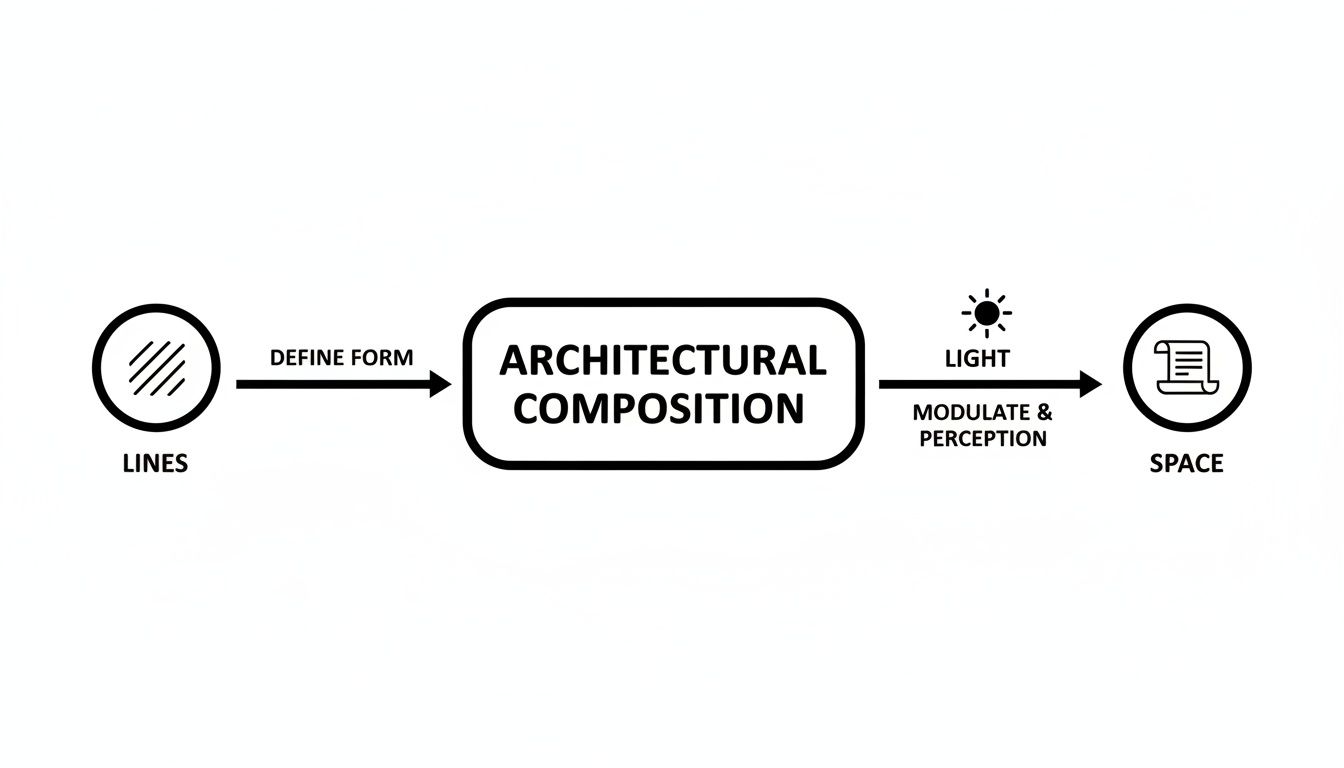
As you can see, lines create the initial structure, but it’s light that truly defines that structure and gives it emotional depth. Getting a handle on these principles is the first step toward understanding the artistry behind truly impactful architectural images.
To put it more directly, these principles are the pillars that hold up every successful photograph. I've broken them down in this table to show what they mean in practice and how they influence the final shot.
The Pillars of Architectural Composition
| Principle | What It Means | Its Impact on the Viewer |
|---|---|---|
| Balance | Distributing visual weight (light, dark, large, small elements) to create a sense of equilibrium. | Creates a feeling of stability, calm, and intention. An unbalanced image can feel chaotic or unsettling. |
| Rhythm & Repetition | Using repeating elements like columns, windows, or patterns to create a visual beat that leads the eye. | Generates a sense of order, harmony, and movement. It can make a large structure feel cohesive. |
| Emphasis & Hierarchy | Making one element stand out as the focal point, with other elements supporting it. | Guides the viewer's attention directly to the most important feature of the design. |
| Proportion & Scale | The relationship between the sizes of different elements within the image and to the whole. | Establishes a sense of realism and helps the viewer understand the true size and grandeur of the space. |
| Unity & Harmony | Ensuring all the individual parts of the composition work together to form a cohesive, unified whole. | Makes the image feel complete and satisfying, like every element belongs exactly where it is. |
Mastering these pillars is what separates a simple snapshot from a photograph that truly communicates the soul of a building. It’s the difference between documenting a space and telling its story.
The Power of Geometry in Visual Storytelling
Long before you notice the color of the paint or the texture of the stone, your brain has already processed a building's geometry. We're wired to find meaning in shapes, lines, and patterns. As a photographer, this is where I get to move beyond the simple "rule of thirds" and dig into the why—the deep-seated reasons a certain composition just feels right.
For me, geometry is the fundamental grammar of an architectural photograph. It’s how I translate a designer’s vision into an image that speaks, telling a clear story about the space without a single word. A strong composition isn't just about looking good; it's about making you feel something.
From Lines to Emotion
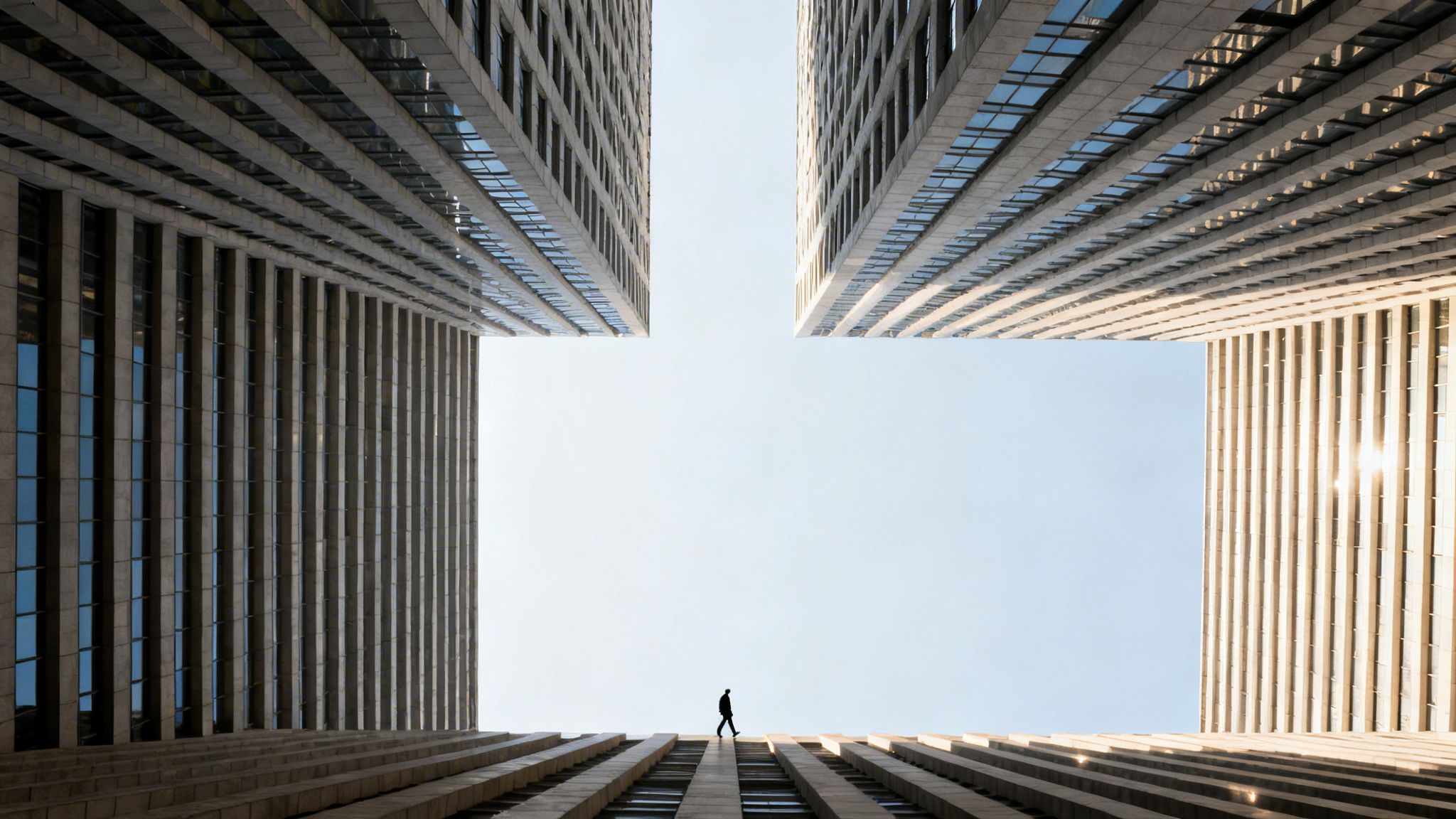
Think about the basic shapes that build our world. Strong, vertical lines always feel powerful, stable, and full of ambition. When I photograph a skyscraper from a low angle, I'm deliberately using those converging lines to communicate authority and scale, to make you feel the structure reaching for the sky.
On the other hand, soft, sweeping curves tell a different story—one of organic flow, comfort, and grace. Capturing a gracefully curved staircase or a rounded interior wall is all about emphasizing that feeling of welcome. My job is to frame these lines in a way that guides your eye and reinforces the emotion the architect intended.
This link between geometry and perception is nothing new. It’s a foundational principle that architects themselves have relied on for centuries to create powerful experiences.
A fascinating study of over 5,000 notable architects from 1400 to 2020 found that 62% hailed from urban hubs where patronage drove innovation. Renaissance masters like Brunelleschi used mathematical precision to pioneer linear perspective in the Florence Cathedral dome, establishing vanishing points that would influence 90% of Western architecture. It's a powerful reminder that the principles we use today are part of a long, deliberate tradition.
This history isn't just academic; it informs how I approach every shot, knowing these geometric tools have been tested for generations.
Translating Theory into Visual Language
With a solid grasp of these principles, I can start making very specific choices to evoke an emotional response. By controlling how the lines and shapes relate within the frame, I can build a sense of balance, create dynamic tension, or foster a quiet harmony. It’s all about making every element serve the story.
Here’s how I put that into practice on a shoot:
Symmetry and Balance: A perfectly centered, symmetrical composition brings an immediate sense of order, formality, and calm. I use this for grand entrances or monumental facades to convey a feeling of stability and timelessness.
Asymmetry and Tension: Sometimes, perfect balance isn’t the goal. By intentionally placing a key feature off-center, I can create a more dynamic, modern feeling. It adds visual interest and pulls the eye through the frame in a more active way.
Leading Lines: This is a classic for a reason. I'm always looking for strong lines—a hallway, the edge of a roof, a road—to create a visual pathway that leads the viewer’s eye directly to the heart of the image. It’s like creating a journey within the photo.
Framing: Using elements like a doorway, a window, or an archway to frame the main subject is one of my favorite techniques. It adds layers and depth, making the shot feel more intentional and giving the viewer the sense of discovering a hidden view.
Weaving these techniques together allows me to build a visual narrative that’s not just pleasing to the eye but also emotionally resonant. This is the most important part of photographing architecture and interiors effectively. It’s what turns a simple record of a building into a compelling statement about its design.
Using Light and Shadow to Shape Perceptions
If geometry gives a building its bones, light and shadow give it a soul. For me, light isn't just a utility for seeing a structure; it's an active character in the story I'm telling. My job is to direct that character, using it to sculpt a building’s personality and guide how an audience feels about it.
I see light as a carving tool. The building is there, but it takes a deliberate hand to use light to chisel away the unimportant and reveal the true form. This is how you find the emotional core of a design.
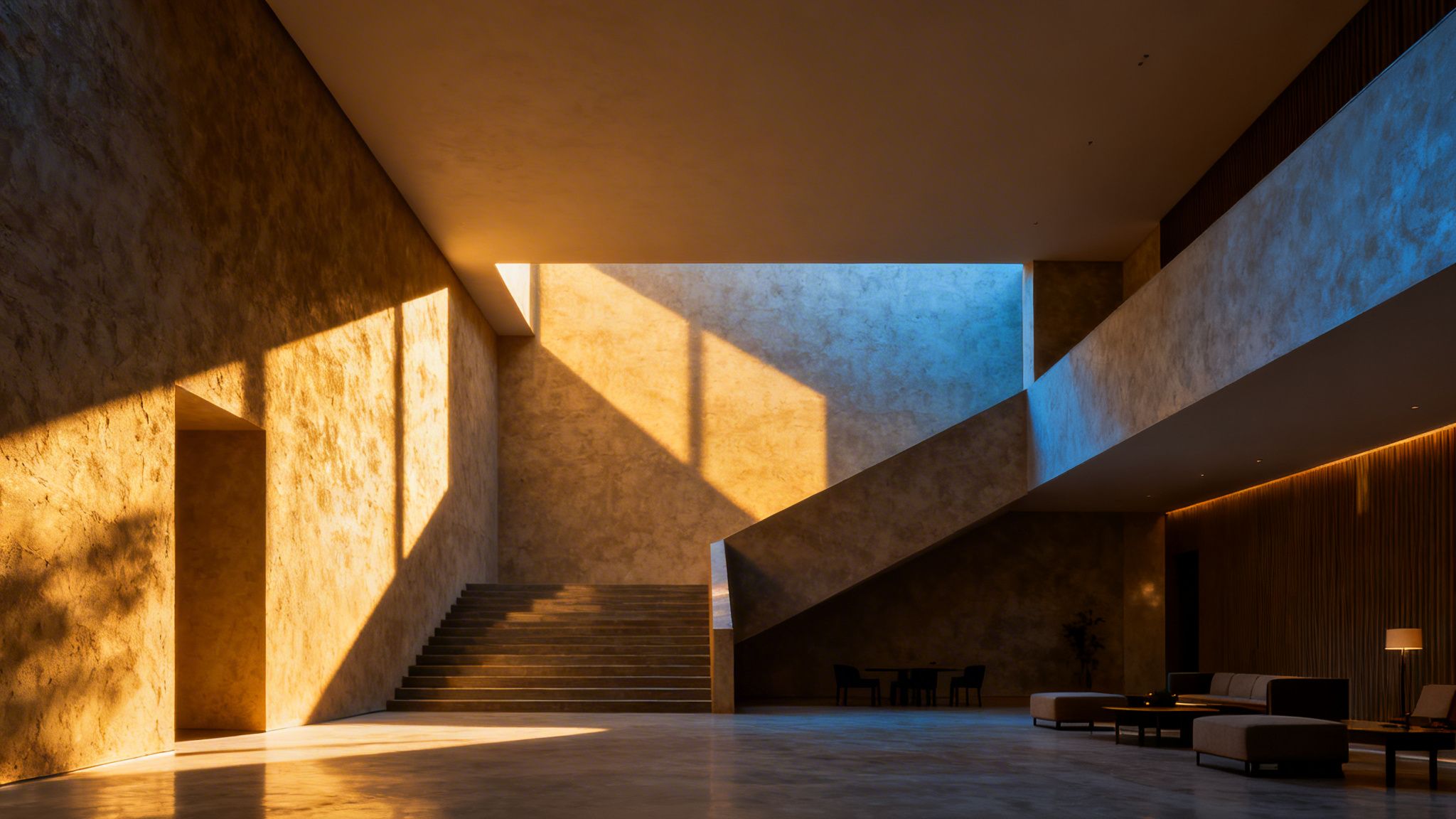
That's why photographers are obsessed with the "golden hour"—those short windows right after sunrise and before sunset. The light is soft, angled, and warm, casting long shadows that bring out texture and create a stunning sense of depth. It can make a building feel both majestic and serene, instantly elevating its entire presence.
The Emotional Spectrum of Light
The quality of light translates directly into an emotional response. Different lighting tells completely different stories about the exact same space, which is a huge part of the science of architectural composition. Understanding this is essential for creating images that honor the architect's vision.
Every lighting choice I make is intentional, aimed at evoking a specific feeling. The right light can make a building feel welcoming instead of imposing, or serene instead of sterile.
Here's how I think about different types of light and the moods they create:
Hard Light: This gives you sharp, defined shadows and high contrast. It’s fantastic for emphasizing powerful geometric forms, showing off rough textures like concrete or brick, and creating a sense of drama. It's a bold choice that demands attention.
Soft Light: Think of the gentle, diffused light on an overcast day. It creates smooth transitions and a feeling of calm. It's my go-to for interiors where the goal is to create a sense of peace and comfort without distracting, harsh shadows.
Dappled Light: When light filters through trees or an architectural screen, it creates complex, moving patterns. This adds a beautiful layer of visual interest and makes a space feel more organic and connected to its environment.
Light does more than just illuminate; it models form, defines space, and creates atmosphere. A photographer’s control over light is their primary means of interpreting a structure’s design. The same facade can appear flat and lifeless in midday sun but come alive with texture and depth when lit from a sharp angle at dawn.
Choosing the right light isn’t luck; it’s all about careful planning. It means scouting the location, tracking the sun’s path, and sometimes bringing in my own lighting to get the exact look I need. For a deeper look into that process, our guide on choosing the best light for a site shoot breaks it all down.
Using Shadow to Define Form
We talk a lot about light, but shadow is its equal partner. Shadows aren't just empty space—they are powerful tools that create contrast, build depth, and direct the eye. Without shadow, even the most dynamic building can look flat.
By controlling the shadows, I can hide distractions, pull focus to a key feature, or carve a visual path through the photograph. Deep, dramatic shadows can convey strength and mystery, while soft, subtle ones suggest elegance. It’s a delicate dance, but in the end, light reveals while shadow defines.
Creating a Narrative with Rhythm and Repetition
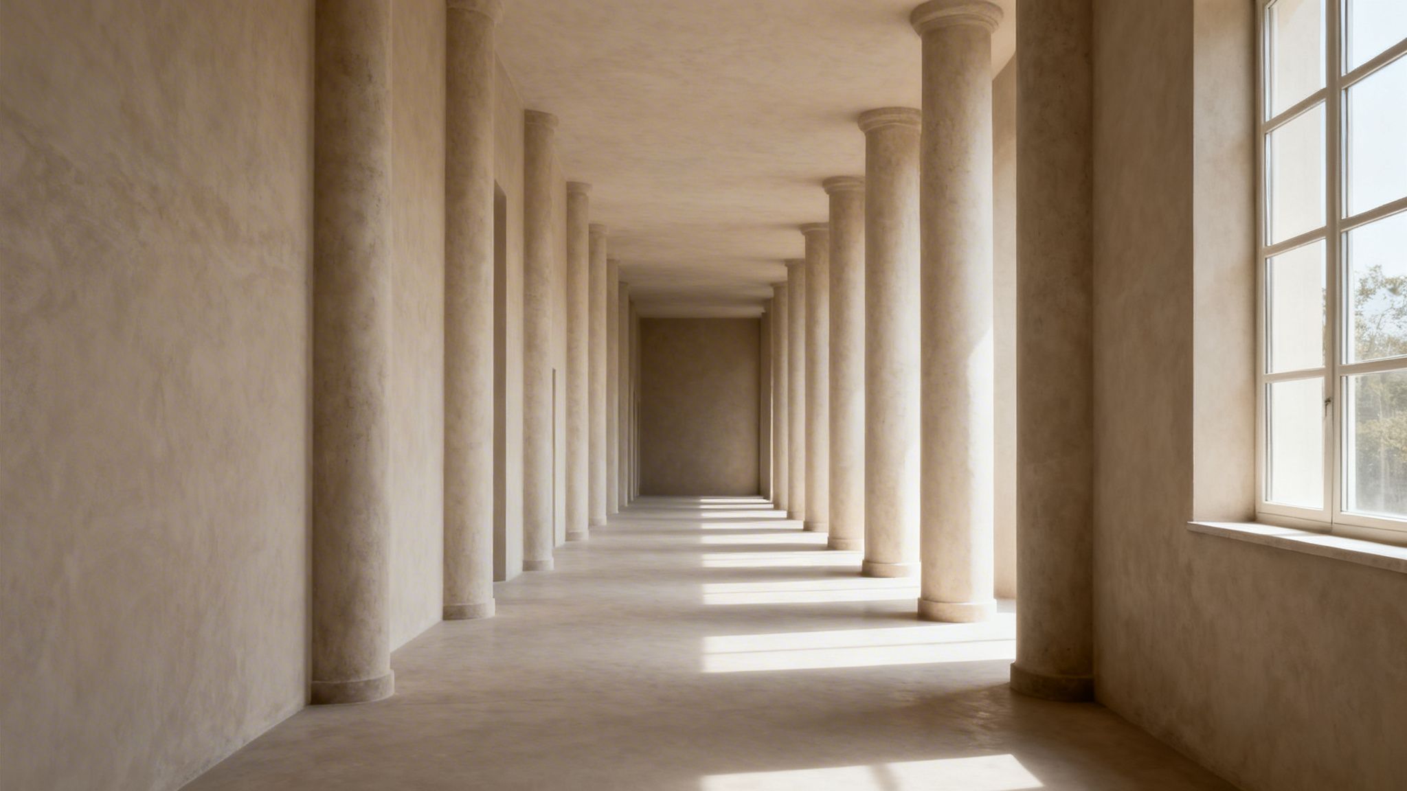
If geometry is the skeleton of a building and light is its soul, then rhythm is its heartbeat. It’s the visual pulse that guides your eye through a space, turning a static structure into a journey. Think of a series of columns marching down a corridor or the consistent pattern of windows on a facade—that’s rhythm in action.
My job as a photographer is to find that pulse and capture it. I’m always looking for the repetition of elements that creates a sense of flow. These patterns act as visual signposts, leading the viewer from one part of the image to the next. It’s how I transform a simple photograph into a dynamic story.
A fast rhythm, like tightly spaced beams on a ceiling, can inject a shot with energy. A slower, more deliberate rhythm—think widely spaced arches—gives a space a feeling of grandeur and calm. It’s all about finding the cadence the architect intended and making it sing in the final image.
Finding the Visual Beat
This isn’t a new concept. The most powerful architecture in history has always used rhythm to organize space and guide human experience. It's a fundamental principle.
Take the Roman Colosseum, completed back in 80 CE. Its facade is a masterclass in repetition, with 80 arches stacked on each level. This wasn't just for structural support; it created a powerful, undeniable visual cadence that still feels impressive thousands of years later. In fact, this idea of balancing symmetry with rhythm influenced an estimated 70% of Western architectural design for centuries, as you can see in these enduring architectural timelines.
I keep that history in mind on every shoot. Whether I’m framing a modern glass curtain wall or the exposed rafters of a rustic home, the goal is the same: find the pattern, establish the rhythm, and give the viewer's eye a clear path to follow.
Rhythm guides the eye and organizes complexity. When viewers can anticipate a pattern, they feel a sense of stability and understanding, even in a vast or intricate space. It’s the visual equivalent of a steady hand, leading you through the design one beat at a time.
This is what gives a photograph a sense of completeness. The eye knows exactly where to go, making the visual experience feel satisfying and intentional.
From Single Shots to a Cohesive Story
Rhythm is also the key to weaving individual photographs into a compelling narrative for a client. When I deliver a full gallery, I’m not just handing over a folder of pretty pictures. I’m presenting a curated visual tour that tells the story of the project.
A typical sequence flows like this:
- The Establishing Shot: We start wide, showing the building in its environment to set the stage.
- The Entry Sequence: Next, I’ll focus on the rhythm of the entrance—maybe a patterned walkway or a series of exterior lights that lead you to the door.
- The Core Space: This is the hero shot, revealing the heart of the building, like a soaring lobby or the main living area.
- The Detail Shot: Finally, we move in close to highlight craftsmanship. This could be the texture of a stone wall, the joinery on a custom staircase, or a unique fixture.
Each image builds on the one before it, creating a flow that moves from the big picture to the intimate details. This is how we go beyond just documenting a building. We create an experience, an emotional connection that makes the architect's vision truly resonate.
Putting Composition to Work for Your Brand
Knowing the theory behind geometry, light, and rhythm is one thing. The real work starts when we use the science of architectural composition to get real results for a client. This is where my process moves beyond documentation and becomes a tool for marketing and branding.
My goal is always to create images that do more than just show a space—they need to communicate an idea and connect with the viewer. By deliberately composing every shot, I can translate a brand’s message into a visual story that persuades and inspires.
Let's look at how this plays out on a real project. Here are a couple of examples where intentional composition directly supported a client’s business goals.
The Tech Headquarters
I was brought in to photograph a new headquarters for a fast-growing tech firm. They needed a full suite of images for their website, press launch, and, most importantly, their recruitment campaigns.
The challenge was to project two seemingly opposite ideas at once: stability and forward-thinking innovation. The building itself was sleek and minimalist, so I knew the composition had to carry the narrative.
My Strategy: I leaned into strong, symmetrical compositions, especially for the main lobby and large workspaces. Centering the camera created a powerful sense of order and balance, which visually communicates reliability. It’s a subtle cue, but it works.
The Light: To bring in the feeling of innovation, I focused on clean, cool lighting. We shot during the day, using bright, indirect natural light to create a feeling of transparency and clarity—perfect for a tech company. It highlighted the crisp whites and metallic finishes without any heavy, dramatic shadows.
The Geometry: My focus was on the building’s powerful vertical and horizontal lines. This reinforced a sense of structure and logic, mirroring the engineering mindset of the company itself.
The final images gave them a visual language that felt authentic to their brand. The symmetry projects confidence, while the cool, bright light feels modern and energetic. Their launch had a polished visual foundation, and the images helped them attract the top-tier talent they were after.
The most effective architectural photography doesn't just show what a building looks like; it shows what a company stands for. By aligning visual composition with brand values, the images become powerful strategic assets.
It’s a great example of how a disciplined compositional approach can solve a complex branding problem.
The Luxury Hotel
A new boutique hotel needed to launch with imagery that could immediately justify a premium price point. The goal wasn’t just to show rooms, but to evoke a feeling of exclusive escape and intimate luxury.
The interior designer had done a masterful job with rich textures and warm, ambient lighting. My job was to translate that tactile, serene experience into a two-dimensional photograph.
My Strategy: Instead of sterile, wide shots, I focused on creating a visual rhythm. I used repeating patterns to guide the eye and create a soothing cadence—the tufts of a velvet headboard, the grain in a sequence of wood panels, the soft glow from sconces down a hallway.
The Light: This project was all about warmth. I scheduled the entire shoot around the golden hour to capture that soft, inviting light pouring through the windows. Inside, I subtly supplemented the existing ambient glow to create deep, rich tones and a cozy, enveloping atmosphere.
The Details: I used a shallow depth of field to pull focus to the specific details that screamed luxury. The intricate weave of a throw blanket, the polished edge of a marble counter, a custom brass fixture. This creates a sense of intimacy and highlights the craftsmanship that sets the hotel apart.
The final gallery told a story of quiet elegance. The warm, rhythmic compositions made the spaces feel both opulent and welcoming. The hotel used these images to build a brand that felt aspirational and serene, leading to a launch that blew past their initial booking projections. The photography didn’t just show the rooms; it sold the experience.
Your Guide to a Successful Photography Collaboration
Now that we’ve walked through the principles of composition, let's talk about how we put them to work together. The most compelling architectural photographs I create are born from a true partnership—when your deep knowledge of the design meets my eye for visual storytelling.
My role is to be more than just a photographer; I’m your creative partner. My job isn’t to simply document a building, but to interpret your vision and use the camera to translate that vision into a story that resonates. This process starts long before I even pull the camera out of the bag.
Our shared goal is simple: to agree on the story we want to tell before a single photo is taken. This ensures every frame is deliberate and perfectly aligned with your business and marketing goals.
Start with a Clear Creative Brief
The creative brief is easily the most important document we'll create together. Think of it less like a checklist and more like our shared roadmap for the entire project. It’s what guarantees we’re telling the same story from the first shot to the last.
This brief needs to nail down the "why" behind the shoot. Are we creating images for an award submission? Your new website portfolio? A social media campaign? The final destination for these photos completely changes my approach to lighting, framing, and composition.
A great creative brief is the foundation of a successful photoshoot. It closes the gap between your design intent and my photographic execution, ensuring the final images don't just show a space—they achieve a specific business goal.
With this brief in hand, every creative decision we make on-site becomes intentional and focused.
Define the Story Your Images Will Tell
Once we know why we're shooting, we can define the narrative. What are the key features that truly capture your design philosophy? What's the one feeling you want people to have when they see these images?
Your brief should absolutely include a shot list, but let’s push beyond just naming rooms. Give me context for each shot:
- The Hero Shot: Pinpoint the single most important image that needs to capture the soul of the entire project. This is our North Star.
- Narrative Flow: Think about the experience of moving through the space. Should we capture the journey from a powerful exterior to an intimate interior detail?
- Key Details: Show me the specific materials, the perfect joinery, or the custom-built features that speak to your firm’s commitment to craftsmanship.
This kind of narrative focus transforms a simple list into a powerful storytelling tool.
The Non-Negotiable Pre-Shoot Walkthrough
I can't stress this enough: a pre-shoot walkthrough of the finished project is essential. This is where the creative brief truly comes to life. Walking the site together lets us lock in the best angles, talk through the natural light, and spot any potential challenges ahead of time. It’s also the perfect time to review our guide on how to prepare your project site for a professional photoshoot to make sure every detail is dialed in.
This walkthrough is our final alignment before shoot day. It’s what gives us both the confidence that the final images will be a true, powerful reflection of all your hard work.
A Few Common Questions About Architectural Photography
When you start digging into the "why" behind great architectural images, a few practical questions always come up. Here are some honest answers based on my experience in the field, designed to demystify the process and show you how intentional photography creates real value.
A common one I get is whether the principles I use for a soaring skyscraper are the same for a cozy living room. The answer is absolutely yes. The core tools—line, light, rhythm, and balance—are universal. How I apply them is what changes.
For an exterior, I might focus on how the structure commands its environment or catches the morning sun. Inside, the goal shifts to capturing the texture of a hand-scraped floor or the intimate feel of a reading nook. The principles are the same; the story is different.
How Long Does a Professional Shoot Take?
This is the classic "it depends" question, but for good reason. The timeline is shaped entirely by the story we need to tell. A single, perfect hero shot of a facade might take a few hours as we wait for the light to be just right. Documenting an entire commercial building, inside and out, could easily be a multi-day project.
There are a few key variables I always plan for:
- How many final images you need to tell your story.
- The lighting complexity—are we working with beautiful natural light or sculpting the space with supplemental lighting?
- The scale and accessibility of the project.
- The specific time of day needed to get the shot, like the coveted golden hour.
That's why a pre-shoot walkthrough is non-negotiable. It lets us build a realistic schedule together and ensures our time on-site is as productive as possible.
What Makes Professional Photography Worth the Investment?
This is my favorite question because it gets to the heart of what I do. Professional architectural photography isn’t just about getting "nice pictures." It's an investment in translating your design intent into an image that makes people feel something.
It's the difference between a simple snapshot and a compelling story.
Good composition does more than just document a space—it persuades. It turns a building from a collection of materials into a narrative. It communicates the quality, vision, and emotion you poured into the project. That's what captures attention and builds a brand's reputation.
Ready to tell your building's story with compelling, intentional photography? Jimmy Clemmons Photographer combines an editorial eye with an architectural discipline to create images that elevate your brand and communicate your vision with clarity. See how we can collaborate and learn more at jimmyclemmons.com.