

A lot of structural photos die in the gap between what the eye saw on site and what the file delivers back in the studio. The composition felt right. The light was close. The building had presence. Then the image opens on a calibrated monitor and the problems pile up fast. Verticals lean. A wall picks up a color cast from a nearby window. A bright fixture stretches oddly after perspective correction. A stack of boxes sits exactly where the clean line of the room needed to breathe.
That is normal client work.
Using Post-Production to Fix Structural Photos is not about rescuing careless shooting. It is about finishing the photograph to the standard the subject deserves. Architecture, interiors, hospitality spaces, and commercial properties ask for a level of precision that casual editing cannot deliver. The camera records raw material. The final image gets built later, through controlled decisions about geometry, tone, cleanup, and output.
Beyond the Shutter: The Core Work of Architectural Imagery
A strong architectural frame is often only half-finished when the shutter closes.
The location may have been prepped. The light may have landed perfectly on the facade. You may have waited for the right balance between sky detail and reflected light in the windows. Even so, the file often comes back with small structural failures that matter a great deal. A slight inward lean makes a building feel unstable. A deep shadow closes up material detail. One stray sign, cone, or outlet pulls the eye away from the design.
Why clients care about the finish
Architects, developers, hotels, and design teams are not buying a record of a space. They are buying a polished visual asset that carries intent. The image has to communicate order, material quality, scale, and trust. If it fails in any of those areas, the photograph stops helping the project.
That business impact is not abstract. An Airbnb data analysis found that high-quality, well-composed photos increase bookings by an average of 11.0%, and a professionally edited bedroom cover image can lift annual revenue by $500-$1,100 per listing. That study is about listings, but the lesson applies far beyond short-term rentals. Better photographs change decisions.
For built environment work, post is where the image becomes credible.
Post-production is part of authorship
There is still a stubborn idea that “getting it right in camera” means editing should be minimal. In architectural photography, that view is too narrow. You still need discipline on location. You still need to choose the right lens height, manage reflections, and watch your corners. But the digital darkroom is where you complete the photograph.
A good edit does not fake the space. It restores it.
That can mean correcting the optical lean caused by lens position. It can mean opening shadow detail so concrete, stone, or millwork reads the way it did in person. It can mean removing a temporary distraction that nobody wanted in the frame to begin with. The work is technical, but the goal is visual honesty.
Key takeaway: Post-production is not an apology for bad shooting. In architectural work, it is the controlled final stage of making the image accurate, persuasive, and publishable.
The best site work still matters enormously. So does timing. Light gives you the raw material that editing can shape well, rather than fight against. That is why decisions made before capture still carry through the whole process, especially around choosing the best light for a site shoot.
Foundation First Preparing Your Files for Flawless Correction
The cleanest structural corrections start long before Perspective Warp or Clone Stamp.
Most failed edits begin with poor file discipline. The wrong frame gets chosen. The RAW file is underused. Corrections stack on top of an unstable baseline. Then the editor spends too much time solving problems that should have been prevented in the first ten minutes.
Start with culling, not fixing
The first pass is selection. Not editing. Not experimenting. Selection.
A professional architecture workflow often narrows a shoot to the top 10-20% of keepers before structural work begins. That multi-pass cull matters because structural editing is time-heavy. If the image has weak composition, bad timing, or an awkward crop, no amount of refinement later will make it efficient to finish.
A practical culling sequence looks like this:
Reject technical misses
Remove frames with missed focus, obvious motion blur, or exposure problems that leave too little room to work.Group near-duplicates
Compare small shifts in tripod position, human presence, and reflected highlights. Tiny differences matter in architecture.Choose for correction potential
Pick the frame that offers the cleanest path through post. Sometimes that is not the most dramatic frame. It is the one with better edge spacing, fewer merges, and less painful cleanup.Tag hero images early
Mark the likely finals before deep editing starts. It prevents the common mistake of spending an hour refining a frame that was never the strongest option.
Build a neutral baseline in RAW
Once the keepers are chosen, the next step is not style. It is control.
The RAW file should be normalized before any structural surgery begins. In Lightroom or Capture One, that means setting exposure, white balance, and lens corrections so the file behaves predictably when pushed later. A sloppy starting point creates artifacts, especially after perspective moves or local contrast work.
Use this stage to handle:
- Lens profile correction for known optical distortion and vignetting.
- Basic exposure balancing so you can judge shadow and highlight structure accurately.
- Neutral white balance that removes obvious color contamination before local adjustments.
- Initial crop awareness so you know how much room perspective correction will consume.
If the file was captured in high-bit-depth RAW, you have more room to shape luminance and color without the image breaking apart. That latitude matters most in interiors, where windows, practical fixtures, and dark materials all compete.
What stays simple at this stage
Do not overwork the file early.
Keep the foundation pass restrained. If you push clarity, saturation, or aggressive sharpening before geometry is fixed, you make later artifacts harder to spot and harder to remove. The goal is a clean, technically stable starting point.
A useful rule is simple. If an adjustment changes mood, save it for later. If it improves accuracy, do it now.
Practical tip: Early editing should make the image easier to diagnose. If your baseline pass makes the file look “finished,” you probably moved too far too soon.
A quick pre-correction checklist
| Check area | What to confirm before geometry work |
|---|---|
| File selection | Best composition, best reflections, strongest timing |
| RAW integrity | Enough highlight and shadow detail to support later moves |
| Lens correction | Profile applied and distortion reviewed |
| White balance | Neutral enough to judge surfaces accurately |
| Exposure | Balanced, but not stylized |
| Crop margin | Enough extra frame to survive transforms |
This stage is quiet, but it decides everything that follows. Good post-production feels faster not because the tools are magical, but because the file prep was disciplined.
Mastering Geometry Straightening Lines and Warping Perspectives
Geometry is where architectural editing stops looking casual and starts looking professional.
A strong building can look clumsy in a file for reasons that have nothing to do with the building itself. Camera height, lens choice, shooting angle, and room constraints all bend perception. Some of that distortion is expected. None of it should remain unexamined in the final image.
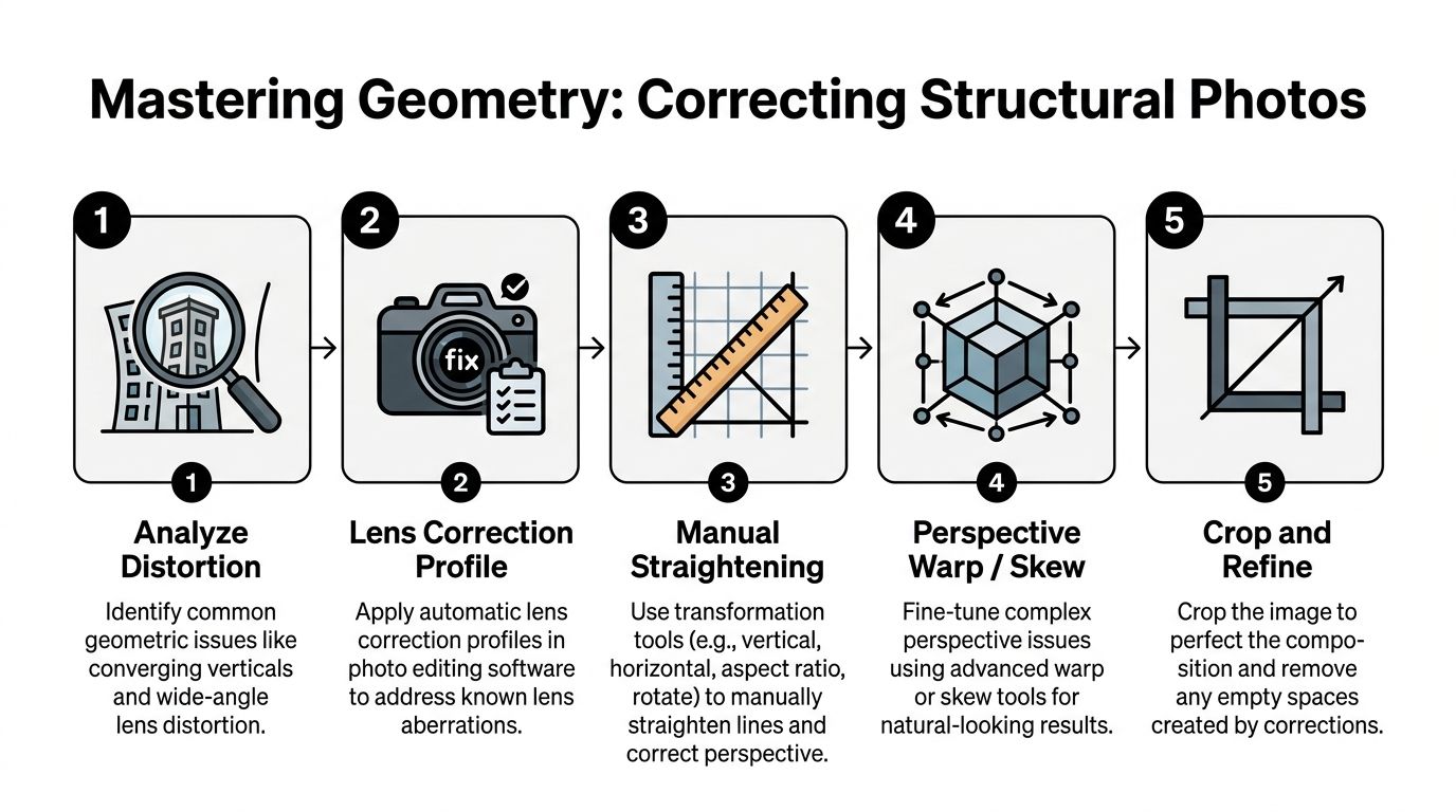
Start with diagnosis, not correction
Before touching sliders, identify the type of distortion you are seeing.
Not every crooked line needs the same fix. Some frames suffer from simple converging verticals. Others have barrel or pincushion distortion from the lens. Interiors often add a trickier problem. You straighten the walls, then discover the chandelier, sconce, or curved furniture still looks bent in a way the room never did.
That last category is where many tutorials stop being useful.
A good diagnostic pass asks four questions:
- Are the verticals wrong, or just the feeling of the frame?
- Is the problem caused by lens distortion or camera position?
- Will a global transform solve it, or will it damage other elements?
- After correction, which non-planar objects will still look unnatural?
That sequence keeps you from overcorrecting.
What to use and when
Lightroom and Photoshop overlap, but they do not serve the same role equally well.
Here is the practical breakdown:
| Problem | Best first tool | When to escalate |
|---|---|
| Mild converging verticals | Lightroom Upright | If auto correction looks stiff or misreads the frame |
| Precise line control | Lightroom Guided Upright | If separate surfaces need different corrections |
| Wide-angle interior distortion | Adaptive Wide Angle or manual transform in Photoshop | If curved lines and bowing remain after basic correction |
| Mixed-plane perspective issues | Photoshop Perspective Warp | If one room face needs independent control |
| Distorted fixtures and decor | Puppet Warp or Liquify | If the room is straight but objects still look warped |
For many exteriors, Lightroom gets you most of the way. For serious interior work, Photoshop usually finishes the job.
A useful compositional reference helps here, because structural correction should support the design logic of the frame, not fight. The strongest editors keep geometry tied to visual rhythm, spacing, and edge discipline, which is why it helps to understand the science of architectural composition.
Lightroom for the first pass
Lightroom works best when the geometry problem is broad and predictable.
Use Upright when the building needs quick normalization. It is efficient, and for some facades it is enough. Use Guided Upright when you need to draw the correction with intent. Interior corners, door frames, shelving, and window mullions make good guide lines because they give the software clear references.
The common mistake is chasing mathematical perfection.
Perfectly vertical lines can still produce an image that feels wrong if the room gets compressed or stretched unnaturally. Architecture photography is not surveying. The goal is a believable photograph that honors the design.
Photoshop for complex spaces
Once a correction starts affecting different planes unevenly, Lightroom becomes blunt.
Perspective Warp is often the better move when one wall, ceiling plane, or hallway needs independent shaping. It lets you define sections of the image and adjust them with more localized control. That matters in lobbies, restaurants, and hotel interiors where several directional surfaces coexist in one frame.
Adaptive Wide Angle can also help when a lens has exaggerated the shape of the room. It is particularly useful when straight lines have bowed in a way that a basic transform cannot cleanly solve.
Use these tools carefully. Big transformations create stretched pixels, odd proportions, and dead-looking corners. A smaller correction that preserves natural scale usually beats a technically perfect but visually brittle file.
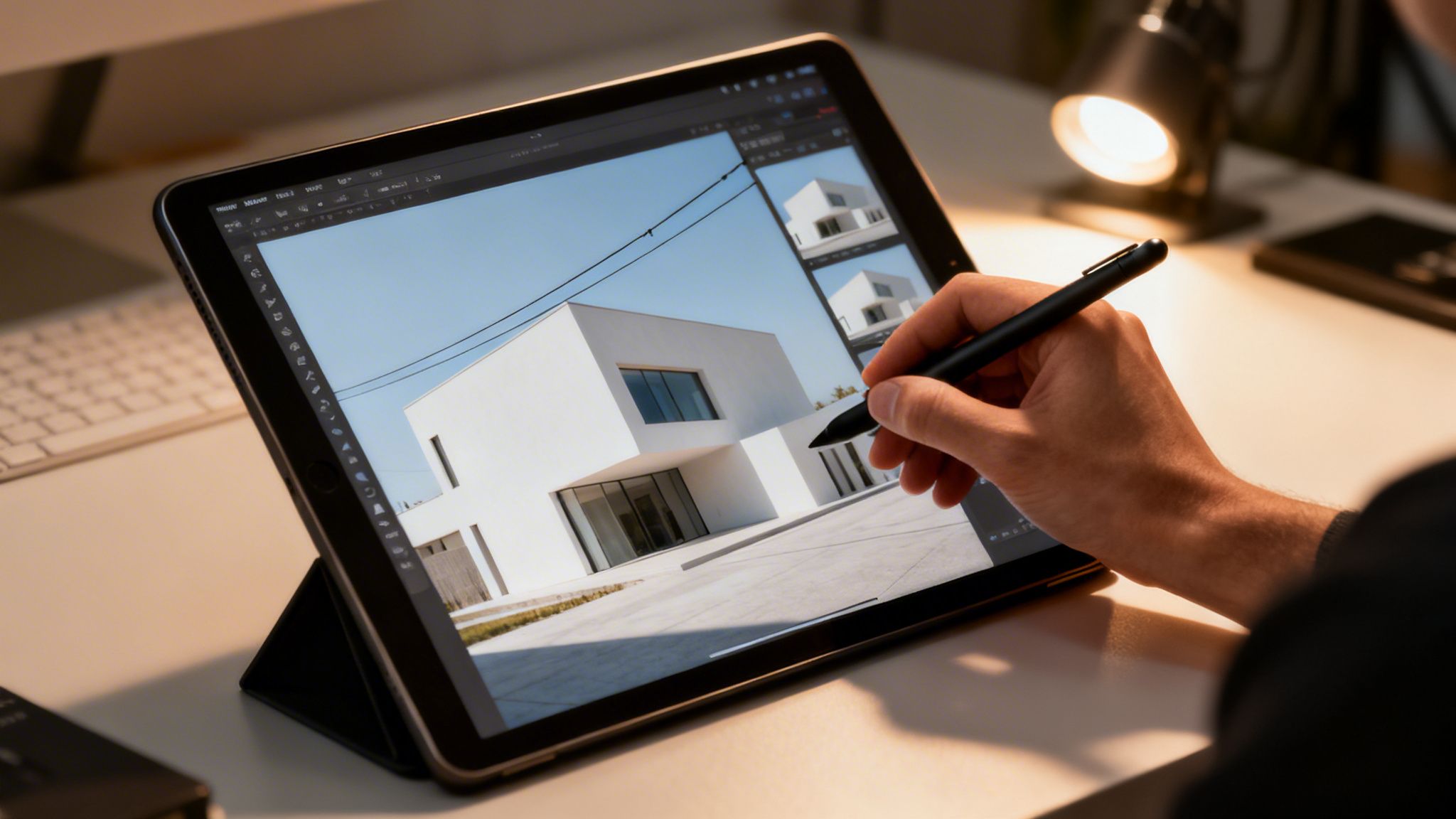
Here is a helpful visual walkthrough before getting into the harder fixture problem.
The overlooked problem of interior fixtures
This is the issue many editors underestimate.
A room can be corrected beautifully, yet a hanging pendant still reads as warped. A chandelier may look stretched sideways. A rounded lamp shade may keep a fish-eyed bend that gives away the correction immediately. That problem matters because interior designers notice it fast, and once they see it, the image stops feeling trustworthy.
A common but important warning from existing perspective-correction discussions is that tutorials cover verticals well, but they rarely deal with how wide-angle correction leaves chandeliers or curved furniture looking unnaturally fish-eyed. This creates a real problem for interior-focused work.
How to fix fixtures without breaking the room
Local warping proves its value here.
After the global room correction is complete, duplicate the corrected layer and isolate the distorted fixture or curved object. Then work locally.
A practical approach:
Mask the object first
Separate the chandelier, pendant, or curved furniture edge onto its own working layer if possible.Use Puppet Warp for structure
Place pins at anchor points that should remain stable. Move the distorted parts gradually. This works well when the object has recognizable joints, arms, or a clear frame.Use Liquify for contour cleanup
Push small shape irregularities back into believable form. Use a light hand. Liquify is for finesse, not rebuilding design.Check against nearby geometry
Fixtures should look natural relative to ceiling lines, tables, and wall spacing. A corrected pendant that no longer aligns with the room will still look wrong.Zoom out often
The error is usually obvious at full-frame view, not at close zoom.
Practical tip: If a fixture still feels wrong after several local corrections, roll the global perspective fix back slightly. The room and the object must agree with each other. A less aggressive room correction often solves both problems at once.
Tone correction supports geometry
Geometry is not only about shape. It is also about edge readability.
A 2021 study published in PMC found that post-production methods such as Histogram Equalization reduced structural reconstruction errors in photo-based 3D models by up to 23.84%. The important takeaway for photographers is not just about modeling. It shows that luminance and contrast correction improve how structure reads in the image.
That tracks with real editing practice. If edges are buried in muddy shadow or flattened by uneven exposure, perspective correction becomes less reliable and the architecture itself reads less clearly. Good tonal preparation helps geometry land convincingly.
When to stop
Editors often ruin structural files by trying to remove every sign of lens perspective.
That is not always the right finish. A slightly natural sense of depth usually serves a space better than a flattened, over-managed frame. Hotel rooms should still feel inhabitable. A lobby should still have scale. A tower should still feel tall.
The cleanest architectural edits do not announce the software. They let the viewer feel that the space photographed well.
The Art of Subtraction Advanced Cleanup and Compositing
Once the structure is correct, distractions become louder.
A vent, exit sign, outlet, sensor spot, reflection glitch, or cart in the background can undo an otherwise careful image. Cleanup work is less glamorous than geometry, but it is often what separates a polished editorial frame from a file that still feels like a location scout.
Clean small problems first
Start with the easy clutter.
Remove dust spots, wall blemishes, minor floor debris, and isolated distractions before attempting major object removal. This helps in two ways. First, it clarifies the visual field so you can see what still bothers the frame. Second, it avoids rebuilding large areas only to discover smaller defects later.
Typical first-pass cleanup includes:
- Sensor dust in bright walls or sky areas
- Outlets and vents that interrupt a clean plane
- Minor signage that was unavoidable on site
- Reflection specks on glass, metal, or polished stone
- Uneven wall marks that pull attention in minimal interiors
Use Healing Brush for fast texture repair when the surrounding area is consistent. Move to Clone Stamp when you need strict source control.
Exposure blending without the HDR look
Many structural photos fail not because they are crooked, but because the light is unresolved. A window goes nuclear. A shadow corner dies. A practical fixture glows without detail. The room no longer feels coherent.
Manual blending usually looks better than an aggressive automated HDR treatment.
The clean approach is to stack bracketed exposures in Photoshop and reveal only the areas each frame handles best. The bright frame can support shadow detail in cabinetry or seating. The darker frame can preserve the exterior view and keep practicals from blooming uncontrollably.
Use masks, not opacity shortcuts. Work at a size where transitions can be judged accurately. Keep the blend invisible.
The point is not to show every value equally. The point is to let the space feel lit the way a person experiences it.
Removing a major obstruction
Removing a major obstruction transforms cleanup into a structural process.
Sometimes the frame is right, but a large object blocks the photograph. Pallets, stacked boxes, temporary staging gear, or maintenance items can sit exactly where the architecture needs to read cleanly. If the area behind the obstruction is simple, the file may still be salvageable.
A proven method for removing major obstructions against a uniform wall uses the Clone Stamp at full opacity with soft brushes, then rebuilds shadows on a separate 50% gray layer set to Overlay. On uniform surfaces, experienced editors report success rates of 85-95% with this kind of fix.
A workable removal sequence
This process is methodical. It is not fast.
Judge the background accurately
Blank walls are favorable. Repetitive texture, detailed tile, or visible grain patterns raise the difficulty quickly.Duplicate the background layer
Keep a clean source structure so you can compare and roll back sections if needed.Clone with broad tone in mind
Sample from nearby clean wall areas. Use soft-edged brushes so the patch does not announce itself with a hard seam.Rebuild gradients and shadows separately
The clone handles texture and base tone. The lighting realism comes later. Add a 50% gray layer in Overlay mode and use controlled dodge and burn to restore the natural falloff.Inspect at multiple zoom levels
Close zoom catches texture repetition. Full-frame view catches false gradients and fake-looking light.
What usually goes wrong
Object removal rarely fails because the clone tool was unavailable. It fails because the lighting was misunderstood.
The main danger signs are easy to recognize:
| Failure point | What it looks like |
|---|---|
| Repetitive sampling | Wallpaper effect or looping wall texture |
| Dead shadow recreation | The wall goes flat where it should breathe |
| Edge mismatch | Corners, baseboards, or trim lose continuity |
| Perspective neglect | Lines drift after cleanup and stop agreeing with the room |
The shadow issue is especially important. A clean wall with the wrong falloff looks fake faster than a wall with a tiny imperfection left behind.
Key takeaway: When removing a large object, the clone is only half the job. The final finish comes from rebuilding the light so the wall still belongs to the room.
Content-Aware Fill is a start, not a finish
Content-Aware Fill can save time, especially on broad wall areas or simple flooring, but it should be treated as an assistant. Not an author.
Use it to establish a first pass. Then refine manually. Architectural files are unforgiving because repeated patterns, bent trim, or broken tonal transitions are easier to see than in many other genres.
The more graphic the room, the less forgiving the cleanup.
Compositing with restraint
Some spaces need more than removal. They need selective assembly.
That can mean blending a cleaner exterior view into windows, combining multiple moments of practical lighting, or borrowing a better reflection from a nearby frame. Good compositing in architecture is conservative. It serves continuity. It should never look clever.
If the image starts feeling assembled, the edit has gone too far.
Final Polish Color Grading Contrast and Delivery
The structure can be fixed. The cleanup can be invisible. The file can still feel dead.
Final polish is where the image gains presence. Not by becoming louder, but by becoming more coherent. Color, local contrast, and output treatment should support the architect’s material palette and the intended mood of the space.
Grade for material truth, not fashion
Architectural color work should not chase trends.
Wood needs to stay believable. Concrete needs separation without turning cyan. Brass should feel intentional, not radioactive. White walls must still hold subtle tone differences. Good grading supports the design language already present in the space.
That usually means working with restraint in curves, HSL controls, and local masks. Warmth can help hospitality interiors. Cooler neutrality can suit commercial or institutional spaces. The decision should come from the project, not from a preset.
A useful question is simple. Does this grading make the materials read better, or does it just make the edit more obvious?
Shape depth with local contrast
Global contrast rarely finishes an architectural image well on its own.
Dodging and burning remain some of the most effective tools in structural photo finishing. A separate gray layer set to Overlay is a practical way to guide the eye, restore subtle falloff, and keep surfaces dimensional. This is especially useful in interiors where broad ceiling light can flatten everything at once.
Use local contrast to support hierarchy:
- brighten a circulation path slightly
- deepen a shadow pocket under a counter
- hold detail around windows without flattening the room
- separate foreground furniture from the wall behind it
The best local work is almost invisible. The viewer notices clarity, not the technique.
Recheck the fixture problem before export
One of the most common interior mistakes reappears at this point.
A frequent problem in structural editing is ignoring what happens to interior fixtures after perspective correction. Tutorials often cover verticals, but they rarely solve the way wide-angle correction can leave chandeliers or curved furniture looking unnaturally fish-eyed, which is exactly the kind of issue interior designers notice first.
That means the fixture check belongs in the final polish stage too, not just during geometry work. Before delivery, scan pendant lights, chandeliers, rounded chair backs, curved millwork, and reflective decor. These details often look acceptable during technical correction but feel wrong once the whole image is viewed as a finished piece.
Practical tip: On the final pass, flip the image horizontally for a minute. Distorted fixtures and uneven local corrections often reveal themselves immediately when the frame looks unfamiliar.
Sharpen for the destination
Output sharpening is not one universal move.
A file headed for print wants a different finish than one headed for a responsive website, a digital brochure, or a listing platform. Sharpen late, and only after resize. Edge-aware sharpening usually serves architecture better than a broad, crunchy pass that hardens noise and surface artifacts.
Think in terms of destination:
| Destination | Sharpening approach |
|---|---|
| Large print | Preserve texture and edge clarity without brittle halos |
| Website gallery | Slightly crisper perceived detail at the final web size |
| Editorial layout | Watch fine lines, mullions, and facade patterns for moiré or oversharpening |
| Client review PDF | Keep sharpening moderate so comments focus on the image, not artifacts |
Do not use sharpening to compensate for poor file prep or weak geometry. It only amplifies mistakes.
Final QA Checklist Before Delivery
A disciplined quality check catches the issues clients would otherwise find first.
| Check area | What to Look For | Status |
|---|---|
| Vertical lines | Buildings, walls, and door frames look intentional and believable | |
| Interior fixtures | Chandeliers, pendants, and curved furniture no longer look warped | |
| Edge integrity | No stretched corners, broken trim, or bent baseboards after transforms | |
| Cleanup work | Cloning patterns, wall repeats, and artifact seams are invisible | |
| Shadow realism | Removed objects leave natural falloff and room depth intact | |
| Color balance | Whites are neutral enough, and materials read as designed | |
| Window treatment | Exterior views and interior brightness feel consistent | |
| Local adjustments | Dodge and burn guide the eye without obvious hotspots | |
| Crop and composition | Important lines breathe properly at the frame edge | |
| Output sharpening | Matches print or web destination without halos | |
| Export review | File naming, dimensions, and format match the client brief | |
Final polish is where technical work becomes presentation. It is also where restraint matters most. If the viewer sees the editing before they see the architecture, the finish is not done.
From Flawed Capture to Flawless Client Asset
A structural photo rarely arrives fully formed straight out of camera. It arrives with potential.
The professional difference lies in how that potential is handled. Careful culling keeps weak frames from stealing time. A neutral RAW foundation preserves flexibility. Geometry correction restores order. Cleanup removes friction. Final grading and delivery decisions turn a technically repaired file into a publishable image with purpose.
That process is not separate from photography. It is photography.
Clients in architecture, hospitality, real estate, construction, and editorial work judge images by how clearly they communicate design intent. A leaning wall, a warped chandelier, or a badly rebuilt shadow tells them the file was not finished with enough care. A refined image does the opposite. It signals competence, attention, and respect for the subject.
Using Post-Production to Fix Structural Photos is ultimately about control. Not control for its own sake, but control in service of clarity. The final image should feel calm, precise, and trustworthy. It should carry the same discipline as the building, interior, or brand it represents.
That level of finish also has practical implications beyond aesthetics, especially when usage rights, client deliverables, and downstream applications come into play in architectural image rights and licensing.
If you need architectural photography that is finished with that level of care, Jimmy Clemmons Photographer creates polished imagery for architects, developers, designers, hospitality groups, and commercial brands. From capture planning through final post-production, the work is built to present spaces with clarity, structure, and editorial-grade precision.