
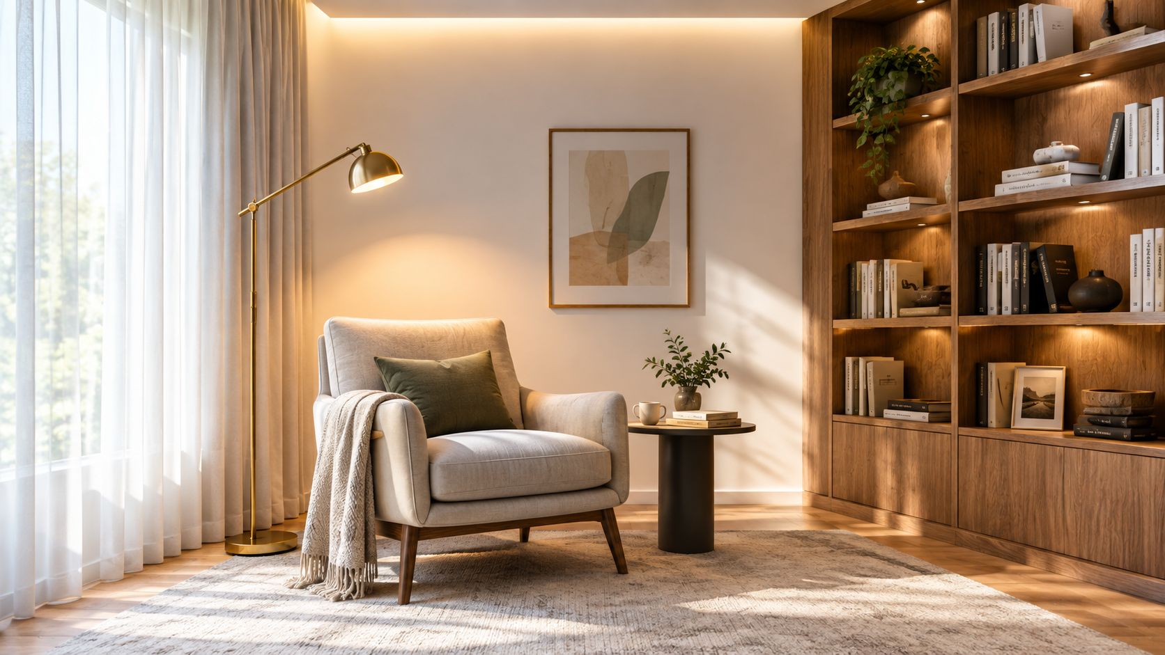
You walk into a room and notice the lighting before you notice the furniture. In one space, a single bright ceiling fixture flattens every surface, throws shadows under faces, and makes carefully chosen materials look ordinary. In another, light arrives at different heights, grazes a textured wall, catches the edge of a table, and leaves enough shadow for the room to feel dimensional. That difference is the practical heart of lighting design for interior spaces.
Good lighting isn't a matter of just adding fixtures or increasing output. It shapes movement, attention, comfort, material perception, and the way an interior will later appear through a camera lens. The strongest schemes work for people first, then give photographers enough tonal structure to tell the story of the architecture.
The Invisible Architecture of Interior Light
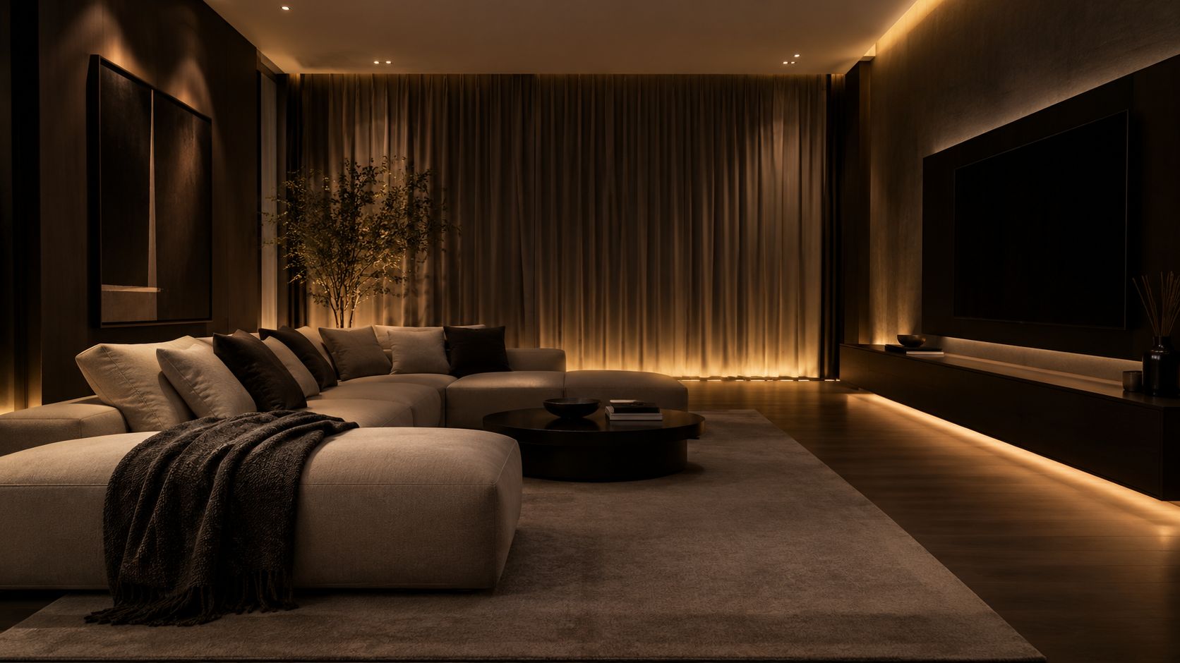
Walk into a poorly lit living room at night and the visual problem is usually obvious. A bright ceiling source dominates the field of view, the corners disappear, and faces sit in shadow. The room may contain beautiful joinery and expensive finishes, but the light has reduced everything to a flat collection of objects.
A well-resolved room behaves differently. A concealed source might lift the ceiling, a wall fixture might reveal texture, and a carefully aimed accent might establish the focal point. No single luminaire needs to perform every job. The room feels coherent because each source contributes to a visual rhythm.
Light organizes experience
Lighting establishes hierarchy. It tells people where to sit, which corridor leads somewhere important, where a reception desk begins, and whether a surface deserves attention. It also controls the apparent scale of a space. Vertical illumination can make a narrow room feel more open, while a bright, exposed source can make even a generous interior feel visually compressed.
The camera responds to the same relationships, but more severely. A person may tolerate a bright window and a dark wall for a moment. A photograph records that contrast as lost detail, clipped highlights, or a composition that feels disconnected from the actual experience.
For most of architectural history, daylight was the primary source of interior illumination. A 1986 historical review of architectural lighting notes that before the 1800s, architects had to use the building envelope as the main mediator between exterior and interior environmental conditions. By the late 19th century, electric light began replacing daylight, and by the mid-20th century electric lighting had largely supplanted it in many buildings.
Read the room before choosing the fixture
Start with the architecture rather than a catalog. Observe where daylight enters, which surfaces are matte or reflective, and how people occupy the room at different times. A desk, a sofa, a vanity, and a circulation route each need a different relationship with brightness.
Photographer's observation: A room becomes legible when light gives the eye a reason to move. Uniform brightness often removes that reason.
The practical aim isn't to imitate daylight everywhere. It's to preserve its useful qualities, direction, variation, and connection to surfaces, while using electric light to support the way the room operates. That requires a plan for layers, glare, color, and the final visual record.
Building Depth with Layered Lighting Strategies
A single overhead source provides coverage, but coverage isn't the same as quality. It often lights the working plane while leaving walls, furniture faces, and ceiling planes visually inactive. Layered lighting gives each part of the room a role.
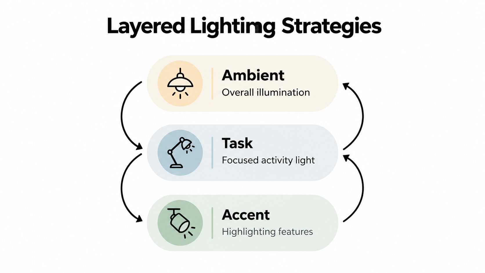
Think of the three primary layers as a stage set:
- Ambient light establishes the general visibility of the room.
- Task light supports an activity that needs visual precision.
- Accent light directs attention toward architecture, artwork, furniture, or texture.
Start with ambient coverage
Ambient lighting is the room's visual floor. It might come from a luminous ceiling, indirect cove lighting, diffuse pendants, or daylight supported by electric sources. The mistake is treating ambient light as the entire design. If every surface receives the same emphasis, the room loses depth.
Map the main zones first. In a corporate lobby, ambient illumination may support reception and circulation, while wall lighting gives the perimeter presence. In a residential kitchen, general ceiling light can cover movement, but the worktop needs a separate task layer and the island may need a more deliberate visual anchor.
Place task light where bodies work
Task lighting should follow posture and activity rather than fixture symmetry. Under-cabinet sources need to land on the counter without reflecting directly into the eyes. A reading light should arrive from a useful angle without creating a shadow across the page. Mirror lighting should reveal the face rather than spotlight the top of the head.
Visual comfort guidance gives a useful proportional reference. When immediate surroundings are lit at 500 lux, the background area should be about one-third of that value, and task lighting should remain outside the forbidden angle in the field of vision to reduce direct glare, according to the Guidelines for Visual Comfort.
Use accent light to create hierarchy
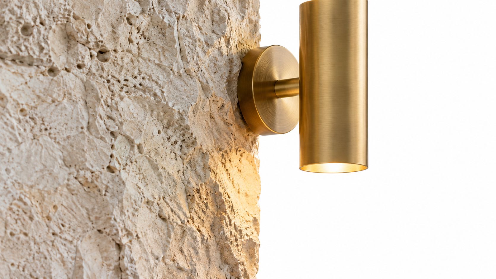
Accent lighting is where the design becomes expressive. A narrow beam can bring out stone relief, a wall washer can make a display wall feel expansive, and a low-level source can draw the eye through a corridor. The source doesn't need to be bright if its position and contrast are intentional.
Dimmers make these layers useful across the day. Keep ambient light available for cleaning and circulation, then reduce it while allowing task or accent sources to carry the evening composition. For window coverings and daylight control, Henson's Designs layering tips offer a useful parallel: overlapping layers can control intensity, privacy, and atmosphere without asking one element to solve every condition.
Review the room from seated and standing positions. A plan that looks balanced from above may expose a bright lamp to someone sitting on a sofa. The best layered schemes support the activity, create visual depth, and remain comfortable when the occupants stop looking at the fixtures.
Translating Technical Metrics into Visual Comfort
Technical metrics matter because the eye doesn't experience a room as a lumen count. It experiences brightness relationships, contrast, color, direction, and glare. A design can meet a task illuminance target and still feel tiring if the visible luminaires are too bright or the surrounding surfaces are too dark.
Lux tells you where light lands
Illuminance, measured in lux, describes how much light reaches a surface. CIBSE guidance gives typical levels of 100 lux for movement and casual seeing, 300 lux for moderately easy visual tasks, 500 lux for moderately difficult tasks where color judgment may be required, and 1,000 lux for very difficult tasks involving small details, as summarized in daylighting quality guidance.
Use those values as task references, not as a complete design. A horizontal work surface may be adequately lit while the wall behind it remains dull, making the room feel visually heavy. Check the surfaces people look at, including faces, vertical storage, wall finishes, and circulation edges.
| Activity Type | Target Lux | Visual Demand |
|---|---|---|
| Movement and casual seeing | 100 lux | Basic orientation and circulation |
| Moderately easy visual tasks | 300 lux | Routine activities |
| Moderately difficult tasks | 500 lux | Tasks where color judgment may be required |
| Very difficult tasks | 1,000 lux | Small-detail work |
UGR predicts discomfort
The Unified Glare Rating, or UGR, evaluates discomfort glare in indoor electric-light installations. Practical values typically span about 10 to 30, with lower values indicating less perceived discomfort. Many guidance documents treat UGR 19 as the comfort/discomfort threshold for offices and similar task spaces, according to the ZVEI method for UGR calculation.
UGR depends on luminaire luminance, background luminance, source size, and viewing position. That's why two rooms with the same horizontal lux can feel entirely different. One may use shielded optics and bright surrounding surfaces, while the other exposes intense LED points against a dark ceiling.
Color needs its own decision
CRI and CCT describe different qualities. CRI addresses color fidelity, while CCT describes the apparent warmth or coolness of the light. Select them independently because a lamp can have high or low CRI at any CCT. A warm source with poor color fidelity may make wood and textiles look muddy, while a cooler source with strong fidelity may reveal finishes clearly but feel too clinical for a hospitality setting.
Calculate glare during layout development, not after installation. Test sightlines from the normal positions, specify shielding where sources enter the field of view, and review the result through a camera as well as in person. Comfort and image quality often improve together because both depend on controlled contrast.
Integrating Light with Architecture and Materials
Light reveals material through direction, scale, and contrast. A painted wall can take broad, even illumination, while rough stone needs a controlled angle to show relief. Grazing light placed close to the surface can create strong depth, yet a small shift in fixture position may exaggerate defects or produce distracting hot spots. Those artifacts affect both the occupant's view and the camera's exposure.
Give vertical surfaces a voice
Walls and ceilings establish perceived volume. A high-performance lighting strategy guide separates quantity from quality. Illuminance describes how much light reaches a surface, while CRI and CCT describe color fidelity and apparent warmth. Select these properties independently. A lamp can have high or low CRI at any CCT.
Balanced interiors need useful horizontal task light as well as meaningful illumination on walls and ceilings. The cited guidance recommends wall illuminance of at least 50% of working-plane illuminance and ceiling illuminance of at least 30%. Office environments may target walls at 75 lux or more and ceilings above 30 lux, according to that lighting strategy reference. Treat these values as design checks, not a substitute for reviewing reflectance, color, texture, and viewing distance.
A wall washer aimed at a pale finish can make a room feel larger and keep faces readable in photographs. The same output may vanish into a dark, absorbent surface, encouraging higher intensity and creating glare elsewhere. Include the finish schedule in the lighting calculation.
Control reflections before they control the image
Glossy stone, lacquer, glass, and polished metal can reflect a luminaire or window directly toward the viewer. Move the source, alter its beam direction, or use a broader diffuse source before increasing output. Veiling reflections can hide a countertop, display, or screen even when its measured brightness appears adequate.
Openings require the same scrutiny. If you are comparing architectural arch door styles for homes, assess how glazing, frame depth, and curved geometry will catch daylight and reflected electric light. A rounded opening can anchor a composition, while a poorly positioned source can turn its glass into a bright interruption.
For practical architectural lighting design guidance, review fixture placement, material response, and visual hierarchy together. Stand where occupants and cameras will stand. The useful test is whether the light reveals the finish, preserves comfort, and supports the intended image rather than announcing the fixture.
Selecting Fixtures and Managing Energy Efficiency
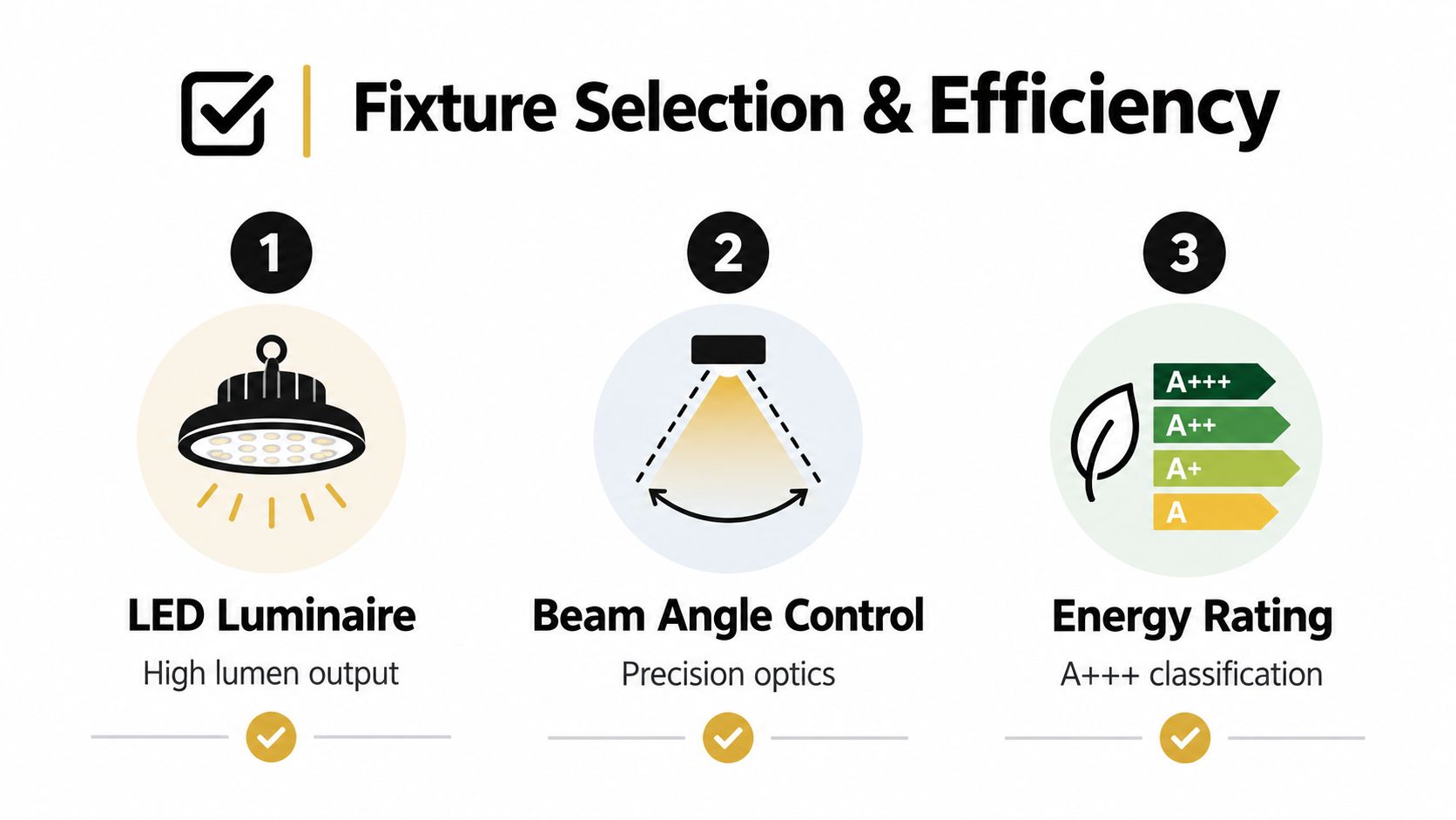
A fixture earns its place through optical performance before appearance. Recessed downlights, linear profiles, wall washers, pendants, and portable lamps produce different source brightness, shadow patterns, beam spreads, and sightline risks. Those differences affect how comfortable the room feels and how cleanly its architecture records in a photograph.
A deep-aperture recessed fixture can control glare along a circulation route. Wide distribution supports ambient coverage, while a narrow optic isolates artwork or texture. A pendant gives a table a clear spatial marker, but its luminous surfaces must remain comfortable from nearby seated positions. Check the view from the intended camera position as well as from everyday eye level.
Compare the hardware to the job
Match the fixture to the visual task:
- Deep-aperture downlights: Keep ceilings visually quiet where glare control matters.
- Linear luminaires: Provide continuous light for work surfaces, coves, and long architectural edges.
- Wall washers: Reveal vertical finishes when they have sufficient setback and accurate aiming to avoid scalloping.
- Decorative pendants: Establish identity and focus over a table, provided their brightness remains comfortable from normal viewpoints.
- Portable lamps and sconces: Add low and mid-level layers that give an evening interior a more human scale.
Lighting remains a significant energy use in modern interiors. The U.S. Energy Information Administration reports that lighting accounted for about 6% of household electricity use in 2020, 17% of electricity use in commercial buildings in 2018, and 6% of electricity use in manufacturing facilities in 2018.
Reduce waste without flattening the room
LED adoption has raised the efficiency baseline. 90% of U.S. households reported using LED bulbs for indoor lighting in 2024, and the share using mostly LEDs rose from 4% in 2015 to 63% in 2024. Efficient sources reduce demand, but distribution and control determine whether that efficiency becomes useful light. A poorly aimed LED can still create glare, spill light into unused areas, and produce uneven illuminance that weakens both comfort and photography.
Divide the system into practical control zones. Let circulation, work surfaces, decorative features, and perimeter lighting respond independently where the project permits. In wet areas and renovation work, review bathroom lighting circuits and codes before fixing fixture locations or control layouts. A lower-energy installation should still preserve the intended hierarchy, surface detail, and camera-ready balance.
Staging and Capturing Interiors for Architectural Photography
A room can feel balanced in person and still photograph poorly. Cameras compress the experience into a frame, so the photographer must preserve the hierarchy that the lighting designer created while controlling windows, reflections, furniture, and exposure.
Start before the camera arrives. Remove objects that interrupt the main sightline, straighten furniture, and place chairs or tables to create a route through the frame. Leading lines may come from a countertop, a floor joint, a ceiling edge, or a wall of luminaires. Staging should clarify use, not make the space look unoccupied or artificial.
Build the frame around the light
Walk the room at the intended camera height and identify the sources that will dominate the image. A bright window behind a dark seating area may need exposure bracketing, a curtain adjustment, supplemental light, or a change in camera position. Keep the window's role clear. It can act as a luminous background, a source of direction, or a compositional opening, but it shouldn't compete accidentally with the interior.
Turn off fixtures that don't support the image. A mismatched color source can make one wall green, another orange, and a third neutral. If several sources must remain visible, balance their color appearance deliberately and use a neutral reference during capture.
Shape, don't overpower
Supplemental strobes, flashes, reflectors, and gelled light can restore detail in shadowed areas without replacing the architectural scheme. The goal is usually to lift a face of cabinetry, separate a dark corridor, or balance a window, not to make the room look flash-lit.
Use a tripod when the design calls for controlled exposure and exact verticals. Check the edges of the frame for bright fixtures, clipped windows, and reflections that weren't visible from the center of the room. Then review the image in black and white as a diagnostic. If the composition collapses without color, the brightness hierarchy may need adjustment.
For a focused reference on balancing ambient sources and supplemental light, see this guide to lighting for interior photography. Jimmy Clemmons Photographer also offers architectural photography workflows that incorporate location scouting, lighting strategy, and on-set direction for interiors.
Preserve the human reading of the space
Post-production should refine contrast, perspective, and color rather than invent a different room. Keep texture in bright surfaces, retain shadow where it gives the architecture depth, and avoid lifting every dark area until the image becomes visually weightless. The strongest photograph usually resembles the best moment in the room, not an evenly exposed inventory record.
Executing a Cohesive Lighting and Visual Strategy
A successful lighting plan begins with human use and ends with visual communication. The designer must know where people sit, work, walk, pause, and look. The photographer must know which of those relationships need to survive in a single frame.
Before installation, review fixture positions from real eye levels. Check exposed sources, reflected glare, shadow behavior, wall brightness, ceiling presence, and the relationship between task and background zones. After installation, walk the room at several times of day and test the controls in the order occupants will use them.
Use a final practical review
- Check comfort: Look from normal seated and standing positions, not only from the reflected ceiling plan.
- Check surfaces: Confirm that stone, wood, fabric, glazing, and metal show their intended character.
- Check hierarchy: Make sure focal features receive attention without turning into isolated bright spots.
- Check the camera view: Photograph representative angles and review windows, reflections, verticals, and shadow detail.
- Check operation: Confirm that dimming and scene controls support real activities rather than creating unnecessary complexity.
The best interior lighting is noticeable in its effects, not in its hardware.
Use lighting design services when the project needs a coordinated review of architectural intent, fixture placement, and image-making requirements. A cohesive strategy doesn't chase maximum brightness. It creates a readable sequence of light, shadow, texture, and focus that feels comfortable in person and remains convincing on camera.
Jimmy Clemmons Photographer documents interiors through careful composition, controlled exposure, location scouting, and lighting strategy that respects the design intent. If you're preparing a finished space for publication, marketing, or project records, visit Jimmy Clemmons Photographer to discuss an architectural photography plan built around the way your space is meant to be experienced.