

You arrive at a finished residence before dusk, camera case in one hand and a light meter in the other. The architect is still walking the rooms with the lighting designer, checking a ceiling cove, a recessed slot, and one carefully aimed sconce that grazes a textured wall. Before the first exposure, those fixtures have already decided where the eye will travel, which surfaces will hold detail, and whether the room will feel calm or visually noisy.
That's the part of architectural lighting design photographers understand immediately. Lighting decisions happen months before a shoot, but their consequences appear in every frame. A warm source can make oak feel rich or muddy, a bright window can turn a polished interior into a silhouette, and an exposed downlight can place an unflattering pool across a face. Good lighting has to work for the person standing in the room and for the sensor recording it.
Stepping Into a Space Before the Lights Go On
On that residence shoot, the room didn't need to be bright to feel ready. The cove fixture established a quiet ceiling plane, while the grazing sconce gave the stone wall a direction. Furniture sat in a restrained pool of ambient light, and the darker edges of the room created enough contrast for the architecture to retain depth.
That first walk-through is where a photographer can tell whether the lighting plan understood the camera. A room may feel comfortable in person because the eye adapts quickly, yet still photograph with hot windows, dead corners, or reflections across a dining table. Conversely, a dramatic interior can look beautiful on a monitor while occupants struggle to read, circulate, or work.
Light is part of the composition
The camera doesn't interpret a room as a neutral container. It records relationships between bright and dark surfaces, the color of adjacent sources, the direction of shadows, and the reflectance of materials. Cove lighting can separate a ceiling from a wall, but excessive output can flatten the entire room. A wall washer can reveal joinery, but poor aiming can create scallops that distract from the craftsmanship.
The best projects give the photographer choices. There's enough ambient fill to protect shadow detail, enough directional light to establish hierarchy, and enough control to tune the room for different views. The result isn't a single “correct” setting. It's a lighting system that can support daily use, editorial images, brand campaigns, and the changing daylight that enters through the façade.
Design intent should survive the shoot
Architects, lighting designers, and photographers often describe the same room in different terms. The architect may talk about volume and material continuity. The lighting designer may discuss beam control, glare, and dimming. The photographer sees luminance relationships and exposure latitude.
Those descriptions belong in the same conversation from the beginning. The following decisions connect them: the role of form, function, and hierarchy; the metrics that reveal how LEDs treat materials; fixture placement; daylight and controls; and the practical brief that keeps the final images faithful to the built work.
The Three Principles That Shape Every Lighting Plan
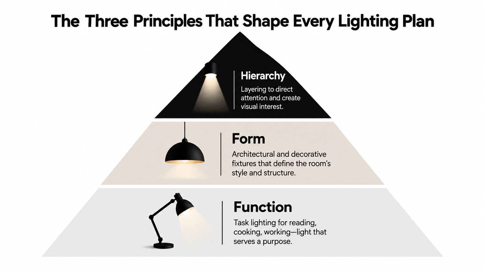
A useful lighting plan starts with three filters: function, form, and hierarchy. They overlap, but they answer different questions. Function asks what people need to see. Form asks how light should reveal the architecture and fixtures. Hierarchy asks where attention should land first, second, and third.
Function gives light a job
A kitchen counter needs usable light across the workplane, not merely a decorative pendant above the island. A desk needs controlled illumination that doesn't reflect into a screen. A stair needs enough visual definition for safe movement, while a corridor may benefit from a continuous vertical rhythm rather than a row of bright spots.
Function is the easiest principle to defend in a client meeting because the task is visible. Start by identifying what people do in each zone, then select the source, distribution, and control method that support that activity without spilling light into every adjacent surface.
Form reveals volume and material
Form-driven lighting makes architecture legible. A concealed linear fixture can extend a ceiling plane, a pendant can announce the scale of a lobby, and a carefully placed grazer can show the irregularity of stone. Decorative fixtures contribute their own shape, while integrated fixtures often disappear so the architecture carries the visual weight.
A reading nook demonstrates the difference. The fixture doesn't need to compete with the chair or the view. An asymmetric wall washer aimed across the nearby surface may provide a stronger architectural gesture than a bright overhead fitting.
Hierarchy directs attention
Hierarchy is where atmosphere becomes intentional. In a hotel entrance, a sculptural pendant may establish arrival, a reception desk may receive the next visual emphasis, and a textured wall may sit lower in the sequence. In a retail interior, the lighting should distinguish merchandise, circulation, and brand elements rather than give every display equal priority.
Client-meeting test: If every surface is presented as a feature, the plan has no hierarchy.
Use hierarchy to set the order of attention, then adjust intensity, beam spread, surface brightness, and control scenes to support it. For broader residential cost context, a resource on holiday lighting installation costs can help separate temporary decorative work from the permanent architectural systems being specified here. For a clearer overview of professional scope, see this guide to lighting design services.
Reading the Numbers That Actually Matter
Photographers often receive a fixture schedule filled with technical terms that sound precise but don't answer the practical question: what will this room look like? Lumens describe luminous flux emitted by a source or fitting. Lux describes illuminance arriving at a surface. Luminance describes how bright a surface appears in a particular direction, which is much closer to what the camera records.
Delivered lumens can differ from source lumens because optics, housings, lenses, and other fixture components affect the light that leaves the fitting. A room can therefore contain impressive source figures and still produce weak wall brightness, uncontrolled glare, or uneven exposure.
Color metrics change the photograph
Correlated color temperature, or CCT, describes whether a source appears warmer or cooler relative to the Planckian locus. A 2700K interior generally reads warmer and more intimate than a 4000K interior, but CCT alone doesn't predict whether oak, stone, textiles, or skin will look natural.
CRI offers a familiar reference for color rendering, yet the U.S. Department of Energy explains that CCT alone cannot describe spectral quality, while ANSI/IES TM-30 adds fidelity and gamut metrics for a more complete assessment of LED color behavior (DOE TM-30 tutorial). TM-30 specifications may include IES Rf ≥ 70, IES Rg ≥ 89, and a first-hue-bin color-shift limit of -12% to +23%, values documented in the same DOE reference.
Two walls finished in the same oak veneer can diverge under different LED spectra. One source may preserve the warm variation between grain and stain, while another can make the surface appear dull or oddly saturated. A red textile may also lose richness even when a conventional CRI number looks acceptable. Ask for TM-30 data when the project depends on material truth, particularly in hospitality, retail, galleries, and premium residential interiors.
| Metric | What It Measures | What It Predicts for Photography |
|---|---|---|
| Lumens | Total luminous flux from a source or fitting | The potential light output, not how evenly the room or subject will be lit |
| Lux | Illuminance arriving at a surface | Whether a task plane, wall, or floor receives useful light |
| Luminance | Apparent brightness of a surface in a viewing direction | Exposure relationships, highlight risk, and visible surface separation |
| CCT | Warm or cool appearance of a light source | Overall mood and the color relationship between fixtures and daylight |
| CRI | A conventional indication of color rendering | A general warning about color quality, but not a complete spectral picture |
| TM-30 | Fidelity, gamut, and hue-specific color behavior | Whether materials and saturated colors retain believable appearance |
For readers comparing illuminance with the older footcandle convention, this footcandle and lighting guide offers useful terminology. The numbers aren't compliance decorations. They're a shared language for the architect, lighting designer, color consultant, and photographer.
Choosing Fixtures and Placing Them With Intention
Fixture families solve different spatial problems. A recessed downlight can provide discreet pools for tasks, but a dense grid often makes a ceiling look busy and places hard shadows below faces. Track fixtures offer adjustability for galleries and retail, while linear and cove systems create continuity across ceilings, millwork, and wall edges.
Wall washers need enough setback for their distribution to open across the surface. A common starting point is a setback of roughly one-third of the ceiling height, then field-adjusting for the fixture, wall texture, and desired uniformity. A narrow 10° beam belongs on a specific artwork, product, or architectural detail, not across a broad wall where it will exaggerate unevenness.
Match distribution to geometry
Asymmetric optics are useful along corridors, stair walls, and tall vertical surfaces because they throw light where the architecture needs it rather than wasting output into the ceiling or circulation zone. Pendants work best when their scale, suspension, and luminous surfaces support the room's volume. Slot fixtures can remain visually quiet, but their trim and glare control still matter from the camera position.
| Fixture Type | Typical Beam Spread | Mounting Height Range | Best Use |
|---|---|---|---|
| Recessed downlight | Narrow to wide, depending on optic | Ceiling-mounted at the room's finished ceiling | General, task, or controlled accent lighting |
| Track fixture | Adjustable narrow to medium | Ceiling or suspended track | Retail displays, galleries, and changeable focal points |
| Linear fixture | Continuous or elongated distribution | Ceiling, cove, millwork, or suspended | Even planes, work areas, and architectural lines |
| Cove light | Indirect, broad reflection | Concealed at ceiling or wall edge | Soft ambient light and ceiling definition |
| Wall washer | Broad asymmetric or controlled wide beam | Ceiling-mounted with deliberate wall setback | Vertical surfaces, artwork, and joinery |
| Pendant | Downward, upward, or diffuse | Suspended above furniture or circulation | Form, scale, and localized task or ambient light |
| Slot fixture | Narrow, concealed distribution | Recessed into ceiling or architectural detail | Minimal visual presence and clean ceiling planes |
Placement should follow the hierarchy established earlier. Put task pools near workplanes, accents on focal points, and ambient light into the residual field. Check the fixture from the intended camera position because a fitting that looks invisible from the sofa may flare directly into a wide-angle lens.
Beam angle, glare rating, shielding, and adjustability determine whether the photographer can isolate a subject without catching a bright aperture in the frame. The guide to choosing the best light for a site shoot is useful when the lighting plan and the photographic plan need to share the same location logic.
Bringing Daylight and Controls Into the Conversation
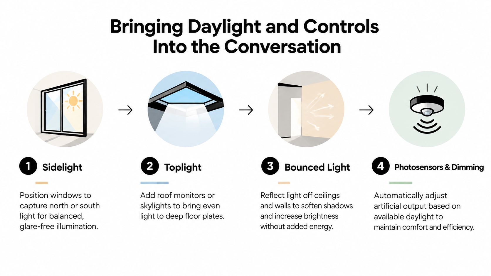
Daylight should be treated as a primary source, not a bonus that gets corrected after the electric scheme is complete. Sidelight from a façade can create directional modeling near the window, toplight can reach deeper floor plates, and bounced light from ceilings or pale walls can soften the transition between bright and shaded zones.
The strategy depends on orientation, glazing, room depth, surface reflectance, and the work taking place near the façade. A photographer sees the same variables as changing exposure and contrast. The Whole Building Design Guide stresses that successful daylighting requires shading to reduce glare and excess contrast, avoid direct beams across critical visual tasks, and eliminate veiling reflections that reduce contrast on reflective surfaces (Whole Building Design Guide daylighting guidance).
Controls should supplement the sky quietly
Photosensors can reduce electric output when daylight is strong, while occupancy controls can prevent empty spaces from remaining fully lit. Tunable-white drivers can shift the apparent warmth of the electric light, but they also add commissioning, programming, maintenance, and user-interface decisions.
DALI and 0–10V systems can support coordinated control strategies, provided the fixture drivers, sensors, scene programming, and shading equipment are specified as one system rather than assembled late. Continuous dimming or stepped dimming paired with photocells helps electric output follow changing sky conditions, instead of leaving the room overlit when daylight peaks.
Dimming behavior affects the image
A dimming curve changes how a fade feels. A linear relationship can appear abrupt to the eye at lower levels, while logarithmic or square-law behavior can make transitions feel more even. During a photo shoot, a jump in output can look like a visual cut, especially when a room moves from daylight-led to electric-led illumination.
Motorized blinds should respond to sun angle and glare conditions, not merely a fixed clock schedule. Shading reduces the contrast that overwhelms a camera's dynamic range and creates hot windows in marketing imagery. For a practical reference on using window light as a photographic material, see this window-light photography guide.
How Real Projects Translate Light Into Image
A flagship retail interior used warm wall washers to bring out timber joinery without turning every surface into a spotlight. The fittings sat close enough to give the millwork presence, but their output was restrained so the grain remained visible rather than becoming a band of glare. The trade-off was deliberate. Fewer, better-aimed sources preserved richer shadows, while the warmer color made the store feel inviting but required careful color checking beside daylight.
A museum gallery demanded a different discipline. The lighting team specified high color rendering and reviewed TM-30 data because textile dyes needed to remain credible both in person and on camera. The camera crew arrived with a meter and a color chart, not because the lighting plan had failed, but because verification protects the relationship between the designed environment and the final file.
Contrast has a limit on the sensor
A residential atrium used one oculus and a tunable cove instead of a full track layout. The opening supplied a strong natural center, while the cove lifted the surrounding ceiling and kept the architectural volume readable after the sun shifted. The result had fewer sources and more shadow structure, but it also required careful timing and control during photography.
The best lighting plan doesn't remove every shadow. It decides which shadows carry the architecture.
Photographers often spend less time rescuing color when the lighting team has already controlled source consistency, reflections, and scene balance. Guidance on architectural imagery and visualization can help teams coordinate composition, material presentation, and lighting intent through resources such as this architectural visualization guide.
The meter and chart still matter. They confirm what the eye suspects, reveal mixed-source conflicts, and give the post-production team a dependable reference. Lighting has done its job when editing refines the image instead of repairing the room's color logic.
Why Better Controlled Light Beats Brighter Light
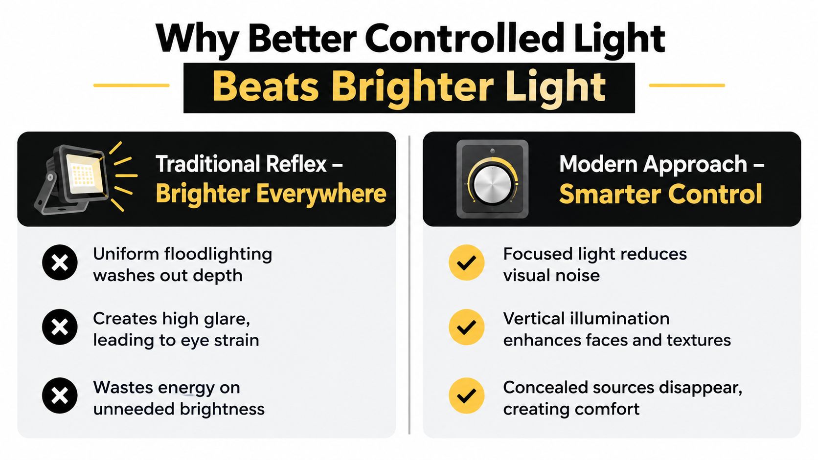
A lobby can be flooded with output and still feel dim. If the walls remain dark, faces receive little vertical illumination, and glare dominates the ceiling, occupants experience visual strain rather than clarity. The eye responds to luminance relationships, so adding more light to every horizontal surface rarely solves the underlying problem.
Two lobbies, two experiences
The first scheme uses high-output fixtures to flood the lobby uniformly. It makes the floor bright, pushes light toward the ceiling, and leaves little separation between the reception desk, circulation path, and feature wall. On camera, faces can pick up unhelpful overhead brightness while polished surfaces return broad reflections.
The second scheme layers restrained ambient light with vertical illumination, controlled accents, and concealed sources. The reception desk becomes legible, the wall material holds texture, and the ceiling recedes rather than competing with the people below it. It may use less visible brightness while producing a stronger sense of orientation.
Industry coverage describes this shift toward visual comfort, glare control, vertical illumination, integrated fixtures, and warmer hospitality-style atmospheres, including applications that reach 1800K in some linear-tape work (Architectural Lighting trends coverage). Lower CCT can support atmosphere, but it doesn't excuse weak task visibility or inconsistent material rendering.
Watch for common failure modes. Ceiling brightness can flatten faces in photographs, accents can disappear if their contrast is too weak, and extra fixtures can multiply glare when better aiming or a more appropriate dimming curve is the actual correction. Circadian strategies also require practical decisions about programming, maintenance, user control, and project type. The concept matters, but implementation determines whether occupants experience useful variation or merely another complex control layer.
A Practical Lighting Brief for Architects and Brands
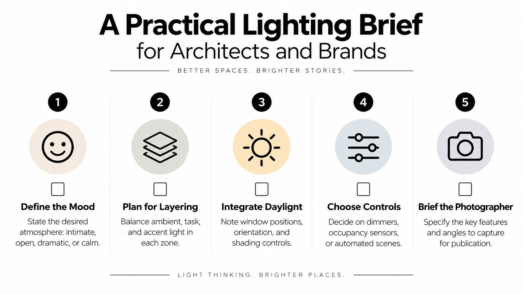
A strong brief gives the lighting designer and photographer the same definition of success. Start with the experience, then document the technical boundaries that protect it.
Before design begins
- Define the mood: State whether the space should feel intimate, open, dramatic, calm, energetic, or luxurious.
- Mark the visual priorities: Identify the walls, materials, products, people, and circulation routes that must hold attention.
- Set color expectations: Document target CCT ranges and request CRI and TM-30 information rather than relying on CCT alone.
- Share reference imagery: Include images that show desired shadow depth, surface brightness, fixture visibility, and daylight behavior.
During design development
- Coordinate the fixture schedule: Record fixture family, finish, optic, beam spread, shielding, driver type, and color consistency across the project.
- Define control behavior: Specify dimming protocol, scene logic, photosensor zones, occupancy response, and tunable-white requirements where relevant.
- Review from the camera position: Test likely viewpoints for flare, reflections, hot windows, ceiling brightness, and material separation.
- Protect the hierarchy: Confirm that task, ambient, and accent layers still direct attention rather than competing for it.
Before the shoot
Bring a light meter, color chart, lens-cleaning supplies, gels for controlled supplemental sources, and a shot list tied to the architect's priorities. Check the lighting scenes at the time of day planned for the shoot, because daylight can change the balance between a window wall and the interior.
Ask the vendor to confirm driver behavior, dimming compatibility, beam data, and color consistency across fixtures. Arrange power and access for long exposures, and agree on whether supplemental strobes, softboxes, or hidden sources are acceptable. The final deliverables should connect the lighting intent to the shot list, so the same details that serve occupants also support the images used by the brand, developer, architect, or publication.
Jimmy Clemmons Photographer brings architectural photography, lighting design, location scouting, and on-set direction together for built-environment imagery. If your project needs photographs that preserve the intended CCT, material color, contrast, and spatial hierarchy, visit Jimmy Clemmons Photographer to discuss the assignment and visual brief.