

If you ask any working architectural photographer what separates their work from the pack, the answer is almost always the same: light. It’s not about having the newest camera or shooting the most expensive properties. It’s about the deliberate, skillful control of light to tell a story.
Mastering light is what allows you to guide the viewer’s eye, reveal the texture of a hand-scraped floor, and ultimately, make someone feel something about a space. It’s the single most crucial skill in our line of work.
Why Light Is Your Most Important Tool
True control over the final image is the hallmark of a professional. It’s your ability to walk into a room, assess the existing light, and then bend it to your will to create something balanced, intentional, and emotionally resonant.
I’ve come to think of light as a narrative tool. A soft, directional wash from a window can make a room feel serene and inviting. A hard, focused pop of a strobe on a key design element declares it the hero of the shot. Even removing light to create rich, moody shadows tells a powerful story about form and depth.
Moving Beyond Basic Tips
This guide is designed to move past the generic advice and give you a look at a real-world professional workflow—the kind that turns a flat, uninspired space into a captivating photograph. You'll learn to think like a commercial photographer, where every choice you make with your lights serves the goals of the architect, designer, or brand you’re shooting for.
We're going to get into the nitty-gritty of what it takes to deliver professional results:
- The Right Gear: What strobes, LEDs, and modifiers I actually bring on a job and why.
- Controlling the Scene: How to manage tricky mixed color temperatures and tame harsh, unavoidable ambient light.
- Proven Setups: My go-to lighting plans for different spaces, from cozy residential homes to large-scale commercial interiors.
- The Digital Darkroom: My process for blending exposures and retouching for a final image that looks flawless but feels completely natural.
The goal is never just to make a room bright. It’s to make it interesting. Our job is to translate a three-dimensional space into a two-dimensional image that feels just as immersive and dynamic as standing there in person.
Of course, the best lighting plan in the world won't save a messy or unprepared site. To get the absolute most out of your shoot day, I highly recommend checking out my guide on how to prepare your project site for a professional photoshoot.
With the right preparation and the techniques in this guide, you’ll have the confidence to tackle any lighting challenge and create images that truly stand out.
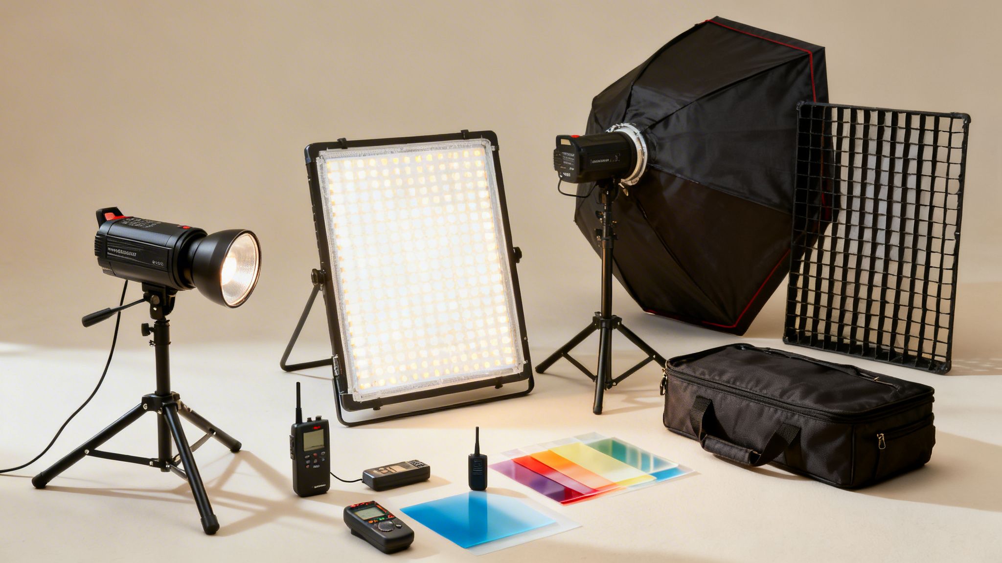
Building Your Professional Lighting Toolkit
The gear you bring to a shoot is your first creative decision, long before you even frame up a shot. Your ability to walk into any space—regardless of the challenges—and control the light is what separates the pros. It’s not about owning every new toy; it's about building a reliable, efficient kit that lets you execute your vision.
When I moved from film sets into architectural photography, I learned this fast. The market for lighting equipment is booming—it was a USD 20,323.5 million industry back in 2021 and is expected to clear USD 32,471.1 million by 2033. North America, with its 32.75% market share, is a huge driver, largely thanks to the demand for high-end commercial content. What that means for us on the ground is better, more efficient tools. The right softboxes and LEDs, which now make up 70% of many kits, can cut setup time by 30%. On a tight schedule, that’s everything. You can see the full breakdown of the photography lighting market's growth for yourself.
Strobes vs. Continuous LEDs
The first big question for any kit is always strobes or LEDs. Honestly, the answer is both. They each solve different problems, and you need to be ready for anything.
Strobes are the absolute workhorses for architectural work. Their incredible power in a short burst is what allows you to tame a scene. When you have bright sunlight pouring through a window, a strobe is the only thing that can overpower it and give you a balanced exposure. That power also means you can stop down to f/8 or f/11 for that tack-sharp, deep depth of field we need, keeping everything from the foreground details to the background view in focus.
- Power to Overpower Daylight: This is non-negotiable for balancing bright windows.
- Deep Depth of Field: Lets you work at the ideal apertures for sharpness.
- Motion Freezing: The flash duration is so fast it guarantees crisp details, no matter what.
- Low Heat Output: They run cool, which is a massive relief on long, multi-room shoots.
Continuous LEDs have really come into their own, and their main advantage is simple: you see exactly what you’re getting. There’s no guesswork. You can watch the light and shadows move in real-time as you adjust placement, which can be a huge time-saver. Modern high-CRI LEDs are also fantastic at rendering accurate color. If you're weighing the options, our guide on choosing the best light for a site shoot breaks it down further.
My own kit is a hybrid. I use powerful, battery-powered strobes for the main lighting—the heavy lifting. But I always have a couple of small, versatile LED panels to tuck into tight corners, light up a dark bookshelf, or add just a subtle kick of light where a full strobe head would be overkill.
Shaping the Light with Modifiers
A bare flash is a harsh, ugly light. The real artistry comes from shaping it. Modifiers are what turn that raw power into something beautiful and dimensional.
Your first and most important modifier should be a large softbox—think 3x4 feet or even bigger. It creates a soft, wrapping light that mimics a large window, giving a natural and inviting feel to a room. It’s a simple rule: the larger the light source is relative to your subject, the softer the light will be.
For more surgical control, nothing beats a strip box with a grid. The long, narrow shape is perfect for creating an edge light on a piece of furniture or casting a subtle highlight down a hallway. When you add a fabric grid to the front, it tightens the beam and stops light from spilling everywhere. This gives you pinpoint accuracy to highlight one specific feature without contaminating the rest of your scene.
The Unsung Heroes of Your Kit
Finally, there are the support pieces. They aren't as glamorous as the lights, but your shoot will fall apart without them.
- Sturdy C-Stands: Don’t even think about using flimsy light stands. C-stands (or Century stands) with boom arms are your best friend. They’re heavy, stable, and let you place a light almost anywhere—over a kitchen island, high above furniture, or even cantilevered outside a window—without worrying about it crashing down.
- Reliable Wireless Triggers: Your triggers are the lifeline to your lights. A cheap, unreliable set will cause misfires and drive you insane. Invest in a rock-solid system with excellent range. It pays for itself in avoided frustration.
- Light Meter: Yes, even in 2026. Your camera's meter is great, but a dedicated handheld light meter is faster and more precise for multi-light setups. It lets you measure each light's output independently, dial in your lighting ratios perfectly, and get a consistent exposure from the very first frame.
Taming Light and Color Temperature
The hardest part of interior photography often isn't about adding your own light—it's about wrangling the light that's already in the room. I can’t tell you how many times I’ve walked into a space and found a chaotic mix of light sources. You might have cool, blue daylight pouring through a window, a warm table lamp glowing orange in the corner, and maybe even the green tint of overhead office lights.
My first move is always to just stand there and take it all in. Before I even think about unpacking a strobe, I do a mental inventory of every single light source, natural and artificial. That initial walk-through sets the entire strategy for the shoot and is the key to creating a clean, polished image instead of a messy, amateur-looking snapshot.
Dealing with Mixed Lighting
One of the most common headaches is what we call a "mixed lighting" situation. Picture a beautiful living room with a huge window on one wall and a few cozy, warm-toned practical lamps scattered around. Your camera can only be set to a single white balance, which means one of those light sources is going to look wrong. You’ll either get a distracting blue cast from the window or an overpowering orange glow from the lamps.
The professional approach isn't to fight it, but to pick a side and force everything else to match. You have to translate the light, not battle it.
Here’s my process:
- Kill the Practicals: My first instinct is usually to turn off every artificial light in the room. This gives me a clean canvas of just natural light, which I can then build upon with my own strobes.
- Gel and Embrace: Sometimes, those lamps are part of the room's character and need to be on. In that case, I don't fight their warmth—I join it. I'll pop a CTO (Color Temperature Orange) gel onto my strobe. This makes my flash's light mimic the warm, orangey color of the tungsten bulbs.
- Set the White Balance: Now that my flash is putting out warm light, I can set my camera's white balance to tungsten (usually around 3200K). The result is fantastic: the light from the lamps and my flash renders as a pure, clean white. Meanwhile, the daylight from the window turns into a beautiful, stylistic cool blue.
This isn't just a technical fix; it's a creative choice. You get to use that color contrast to add depth and mood, turning a problem into an intentional part of the final image.
My rule of thumb is simple: either overpower the ambient light completely or embrace it entirely. Anything in between usually ends up looking like a color-polluted mess. The goal is always clean, intentional color.
Balancing Common Interior Light Sources
Understanding the different "colors" of light you'll encounter is crucial. Most of the time, you're not dealing with just one. This table breaks down the common culprits and how I approach them.
| Light Source | Typical Color Temp (Kelvin) | Photographic Challenge | Recommended Solution |
|---|---|---|---|
| Natural Daylight | 5500K - 6500K (can vary) | Very cool (blue); changes throughout the day. | Use as the primary key light or gel strobes blue (CTB) to match it. Can also be rendered as a cool blue accent. |
| Tungsten / Incandescent | 2700K - 3300K | Very warm (orange/yellow). | Turn them off, or gel strobes orange (CTO) to match. Set camera WB to Tungsten (~3200K). |
| Fluorescent | 4000K - 5000K | Often casts a green or magenta spike. | Turn them off if possible. If not, use a "plus green" or "minus green" gel on strobes to balance the cast. |
| Modern LEDs | 2700K - 6500K (often tunable) | Can be unpredictable; cheap LEDs have poor color rendering. | Easiest to work with. If tunable, set them to match your desired WB (daylight or tungsten). |
Ultimately, the key is to decide which light source will be your "hero" and then adjust everything else—your strobes, your camera settings—to fall in line with it.
The Advantage of Controllable LEDs
Thankfully, managing color has gotten much easier with the rise of modern LED lighting. For photographers, this means more and more spaces we shoot are already lit with high-quality, often color-tunable sources that are a breeze to work with. The growth of the indoor LED market, which hit over USD 55 billion in 2023, shows just how prevalent this tech has become. If you want to dive deeper, you can find more on the global indoor LED market's expansion and its impact on design.
Precision Control with Light Painting
Sometimes you face a room that’s just too big, too complex, or filled with too many reflective surfaces for a standard lighting setup. I’m talking about grand hotel lobbies, intricate staircases, or rooms with dozens of little nooks and crannies. In these situations, I rely on a technique called light painting.
Instead of trying to light the whole scene in one shot, light painting is about building the final image from many different exposures. I lock my camera down on a sturdy tripod and then, frame by frame, I light just one small piece of the scene at a time with a single, mobile strobe.
For example, when lighting a complex staircase, my workflow might look like this:
- Ambient Base: I start by capturing a clean base exposure for the ambient light to get the natural feel of the space.
- Stair Treads: Then, I'll walk up the stairs, firing a gridded strobe at each individual step from a low angle to create sharp texture and definition.
- Handrail Highlight: Next, I'll take another exposure where all I'm doing is creating a long, clean highlight along the handrail.
- Feature Wall: Finally, I might add a soft wash of light onto a distant wall to give it some separation from the foreground.
Later, in Photoshop, I layer all these individual shots and mask them together. It’s a core technique in high-end lighting for interior photography. It's absolutely more time-consuming, both on set and in post-production, but for those architecturally complex spaces, the surgical control and flawless result are simply unmatched.
Proven Lighting Setups for Common Interior Scenes
Knowing the theory is one thing, but being on location with a client looking over your shoulder is another. That’s when having a few trusted lighting recipes in your back pocket becomes your greatest asset. This isn’t about copying diagrams; it’s about knowing why a light goes in a certain spot so you can think on your feet and adapt to any room.
Let's walk through three distinct scenarios I encounter all the time: a bright residential kitchen, a moody hotel bar, and a sprawling open-plan office. Each space has its own story, and my job is to use light to tell it effectively. Getting this right is more important than ever. The interior lighting market was valued at USD 85.45 billion in 2026 and is expected to climb to USD 104.26 billion by 2030. That growth is driven by the demand for incredible interiors, which directly fuels the need for photographers who can capture them perfectly.
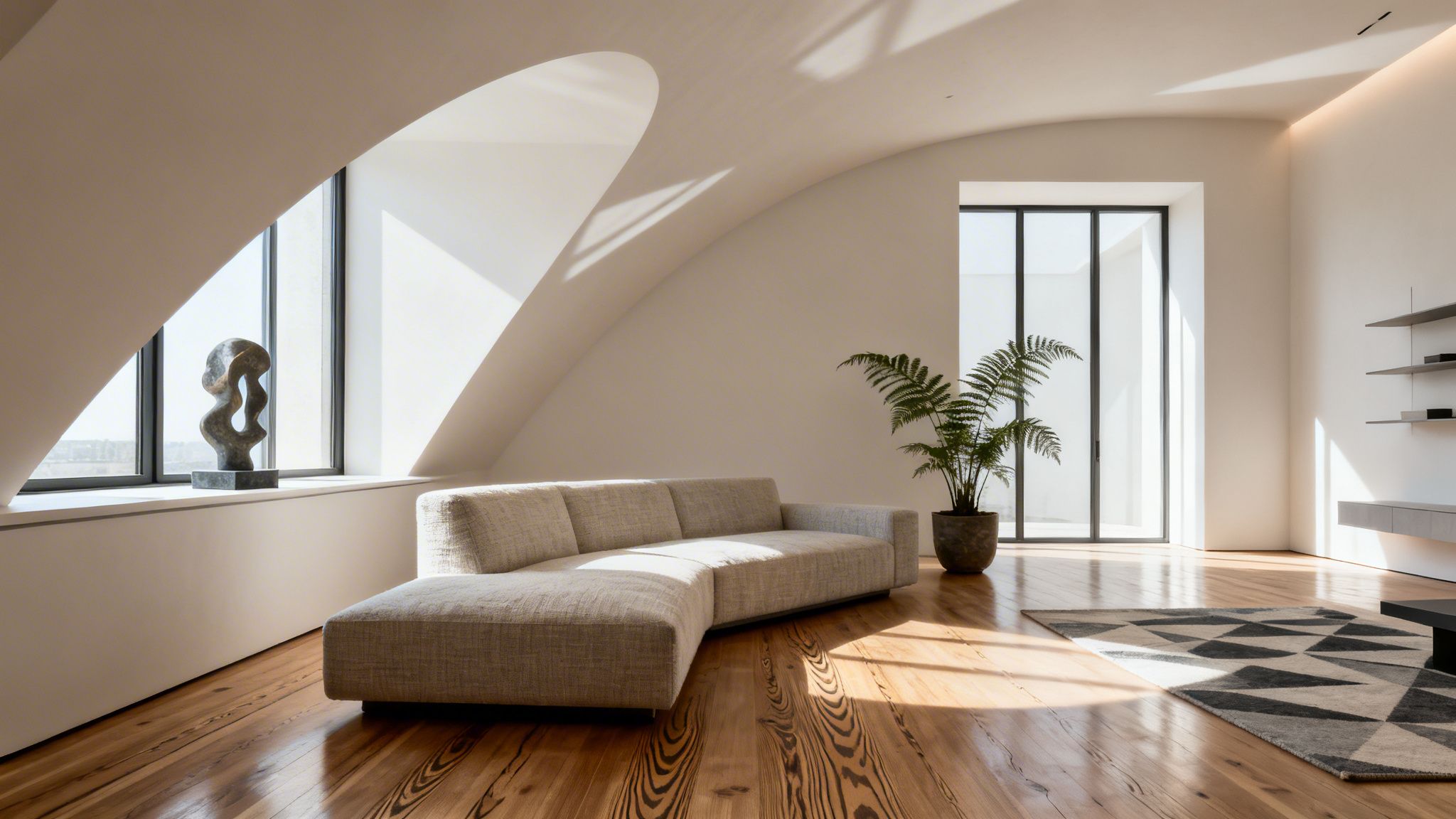
The Bright and Airy Residential Kitchen
When I’m shooting for a design magazine or an architect’s portfolio, the kitchen needs to feel clean, inviting, and full of life. My goal is to create an idealized version of the space—bright, but with enough shadow to feel real and three-dimensional.
My starting point is almost always one large light source that acts like a huge, soft window. I’ll place a strobe with a 4x6 foot softbox or a large scrim just out of the frame, feathering the light across the scene from a high angle. This gives me those soft, directional shadows that beautifully define the shape of cabinetry and countertops.
Then, I'll bring in a second light. A gridded strip box placed on the opposite side or slightly behind a feature like the kitchen island works wonders. It creates a subtle "kicker" that separates the island from the background, adding that extra bit of polish and highlighting the texture of the materials.
Finally, it’s the small details that make a shot breathe. I often hide a tiny LED panel behind a bowl of fruit or under a cabinet to add a little pop of light. It’s a subtle touch, but it makes the whole scene feel more layered and dynamic.
Pro Tip: If the room allows, bouncing your main strobe off a large white ceiling or wall is my favorite trick. It creates an enormous, soft source that wraps around everything beautifully and looks incredibly natural. Just make sure the surface is neutral white to avoid any unwanted color cast.
This three-light approach—a big key light, a focused kicker, and a detail light—is a fantastic foundation for almost any residential space you walk into.
The Moody and Intimate Hotel Bar
Shooting a dark, intimate space like a hotel bar or a high-end restaurant is a completely different challenge. Here, the goal isn't to blast away the darkness but to embrace it. My job is to preserve the moody ambiance while selectively sculpting the light to highlight key features. Over-lighting a dark space is the quickest way to ruin its character.
I always start by taking an ambient-only shot to capture the existing atmosphere. This frame is my canvas. From there, I use small, tightly controlled lights to add shape and draw the viewer's eye.
A gridded strobe is perfect for "raking" light across a textured brick wall or a row of liquor bottles, making them pop without spilling light everywhere. I often "paint" with light in these situations, using multiple exposures. I might fire a small, snooted flash to create a tight circle of light on a specific seating area in one frame, then pop another flash on a signature cocktail in the next. These separate exposures are later blended in post-production to create one perfect, polished image.
Managing the mix of my lights with the bar's decorative fixtures is crucial.
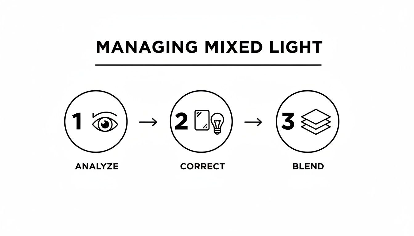
This process of analyzing the existing light, correcting or adding my own, and blending it all together is the core of how I tackle these complex scenes. It allows you to combine the authentic mood of the space with the precision of strobe lighting.
If you want to explore this more, our comprehensive guide on photographing architecture and interiors goes much deeper into composition and visual storytelling.
The Consistent and Even Open-Plan Office
Commercial spaces demand an entirely different mindset. When I'm shooting a large office, the objective is consistency. The client needs to see the entire space clearly, with even, natural-looking illumination. There's no room for distracting hot spots or deep, moody shadows.
My first move is almost always to kill the overhead fluorescent or LED lights. They rarely have good color quality and create unflattering "top-down" light. I need to build the light myself.
I create my own "ambient" layer using several strobes. I’ll place four or more lights around the perimeter of the room, either bouncing them off the ceiling or pushing them through large diffusion panels. The goal is to raise the overall light level in a way that feels completely sourceless. A handheld light meter is my best friend here, helping me walk the room and ensure every zone is lit to the exact same level.
Once that clean, even base is established, the image can look a bit flat. So, I’ll add a single, directional key light—much like in the kitchen setup—to bring back some shape. A large softbox casting gentle shadows is usually all it takes to give the workstations and furniture a sense of form and depth.
By building light in layers—a consistent base followed by a shaping key—you can tackle even the largest commercial interiors and deliver images that are both informative and beautiful.
Where the Final Image Comes Together
Getting the shots on location is just the first part of the job. The real craft—transforming a collection of carefully lit frames into one seamless, stunning photograph—happens back at the studio. This is where technical precision meets artistry, turning solid captures into the kind of work that defines a portfolio.
Honestly, my post-production workflow really starts on set. I never shoot without tethering my camera to a laptop. It’s a non-negotiable part of my process.
Having that large, high-res screen gives both me and the client an immediate look at the composition, focus, and lighting. We can spot a distracting reflection or a shadow that’s just not sitting right and fix it then and there. Nailing it in-camera is the single best way to avoid hours of frustrating guesswork in Photoshop.
The "Flambient" Method
One of the cornerstone techniques for achieving clean, vibrant, and natural-looking interiors is what we call the "flambient" method. It's a simple portmanteau of "flash" and "ambient," and that’s exactly what it is: blending a flash exposure with an ambient light exposure.
My approach usually relies on three key frames that I’ll later stack and blend in Photoshop:
- The Ambient Plate: This is my foundation. It’s a shot using only the natural light available in the space. The goal here is to capture the true mood, the soft quality of the window light, and the authentic color palette of the room.
- The Flash Plate: Next, I bring in my strobes. This frame is all about control. The flash cuts through muddy color casts, fills in deep shadows, and brings out all the rich texture and detail in the furniture and finishes. This is where the crispness comes from.
- The Window Pull: Finally, I expose just for the view outside. The exterior is almost always brighter than the interior, so a separate, darker exposure is needed to capture the landscape or cityscape without it being blown out to pure white.
Back in Photoshop, these frames become my palette. I'm not just merging files; I'm painting with light. I’ll use layer masks to borrow the clean color from the flash layer, the soft shadows from the ambient layer, and that perfect view from the window pull.
Blending and Retouching with a Purpose
Once I have my exposures layered in Photoshop, the real artistry begins. Using layer masks, I selectively paint in the best elements from each shot. Maybe I’ll use the flash exposure on a sofa to get the fabric color just right, but then mask in the softer, more natural shadow it casts from the ambient frame.
The whole process is a delicate balance. The goal is an image that feels totally believable—no one should ever suspect it was built from three or more different photographs.
Beyond the blend, a few final retouching steps are essential to delivering a polished, professional image:
- Cleaning Up Distractions: I'll meticulously clone out things like scuff marks on a wall, stray electrical outlets, or the reflection of my own softbox in a glossy floor.
- Neutralizing Color Casts: Even with strobes, you might get a slight green tint from a window or an orange hue from a nearby lamp. I use selective color adjustments to neutralize these for a clean, true-to-life look.
- Correcting Verticals: Wide-angle lenses are a must for interiors, but they can make walls look like they’re leaning. I always use lens correction tools to ensure all my vertical lines are perfectly straight. It’s a small detail that screams professionalism.
- Final Sharpening: The very last step is a subtle sharpening pass. The key is to be gentle—you just want to make textures like wood grain and fabric pop without creating an over-sharpened, digital look. I often apply it selectively to the most important details in the frame.
This meticulous work in post is what takes a photograph from good to great. It's how we honor all the careful planning on-site and deliver a final image that truly captures the integrity of the design.
Common Questions from the Field: My Answers to Your Toughest Lighting Challenges
Even the best-laid plans run into snags on location. Every space has its own personality and its own set of problems to solve. Over the years, I've seen the same questions pop up time and time again. Here’s my no-nonsense advice, straight from my experience in the field.
How Do You Handle Flash Reflections in Windows and Glass?
Ah, the eternal struggle. The reflection of your own light staring back at you is the classic interior photographer's headache. The solution is almost always about the angle. Start by moving your light, not your camera. Your goal is to position the flash so its reflection bounces harmlessly outside your frame. Think of it like a bank shot in pool—the angle in equals the angle out.
If you’re stuck in a tight space and can’t move the light, the next best thing is to make it bigger. A massive diffusion source, like a 6-foot scrim or a giant softbox, turns a glaring hot spot into a soft, hazy glow that often looks like natural light spilling in.
When a reflection just won't go away, a circular polarizing filter (CPL) becomes your most valuable tool. A simple twist of the filter on your lens can make reflections on glass, polished floors, and even some countertops practically vanish.
As a last resort, I'll fix it in post. After I've got my main, lit shot, I'll move or turn off the problem light and take a second "reflection plate." It's then a simple masking job in Photoshop to paint the clean area over the reflection. It's the cleanest way to solve an impossible reflection.
Are Strobes or LEDs Better for Interiors?
This isn't an either/or question; it’s about using the right tool for the right job. I use both on nearly every shoot.
Strobes are my workhorses for a single, powerful reason: they deliver an incredible amount of clean, consistent light. That power lets you overpower the sun on a bright day, shoot at a deep aperture like f/11 for wall-to-wall sharpness, and freeze a scene with a perfect, crisp flash. For high-end architectural work, they're non-negotiable.
Continuous LEDs have a massive advantage in their "what you see is what you get" nature. This makes them wonderfully intuitive. You can see exactly how the light is shaping a room in real-time, which can be a huge time-saver. I find modern LEDs with a high CRI are perfect for adding tiny, precise highlights or for video work.
My setup is a hybrid. I rely on strobes for the heavy lifting and keep a few small LED panels in my bag for lighting up dark nooks, under-cabinet spaces, or adding a little kick to a specific piece of furniture.
How Many Lights Do You Actually Need for a Shoot?
It's a surprising answer, but you can create absolutely beautiful images with just one powerful off-camera flash. By using a technique called "light painting," you can walk through a space and illuminate it one section at a time, compositing the shots together later.
For the sake of efficiency on a commercial shoot, however, my typical setup involves 2 to 4 lights. A standard arrangement looks something like this:
- One "key" light that sets the mood and primary lighting direction.
- One or two "fill" lights to open up shadows or light an adjacent room seen through a doorway.
- A small, gridded "accent" light to add a pop of dimension to an architectural detail or a key piece of decor.
The goal is never just to make a room bright. The goal is to use light to sculpt the space, guide the eye, and tell a story.
How Do You Get Rid of Those Awful Orange or Green Color Tints in a Room?
You're seeing a color temperature battle. Your camera is likely balanced for the clean, daylight-colored light from your flash (around 5500K), but it's also picking up the warm, orange glow from household lamps or the sickly green cast of older fluorescent fixtures.
Your first and best option is to simply turn off all the ambient lights you can. Control the scene. If the lights are a feature and must be on, then you have to make your flash match their color. A CTO (Color Temperature Orange) gel on your flash will warm it up to match incandescent bulbs. Once you've done that, you can set your camera's white balance to "Tungsten," and everything will look clean again.
For those old, green-tinted fluorescents, you might need a "Plus Green" gel on your flash. If gelling just isn't practical, shooting a grey card in the mixed light gives you a reference point to try and correct the color later, but it’s a much messier fix than getting it right in-camera.
At Jimmy Clemmons Photographer, we bring an editor’s eye for narrative and technical precision to every project. If you're looking for imagery that elevates your design or brand, explore our work and services at https://jimmyclemmons.com.