

The first time I walked up to the Children's Museum of Atlanta, I noticed the pacing before I noticed the exhibits. Families compressed at the entrance, the bright exterior acting like a visual cue that this wasn't a hush-and-don't-touch museum, but a building designed to be read in motion.
A New Lens on Childhood Wonder
Most visitor guides treat the Children's Museum of Atlanta as a checklist stop near downtown attractions. That misses the point. This building works best when you read it as a sequence of thresholds: street to lobby, lobby to exhibit floor, exhibit floor to moments of concentrated play. From a photographer's perspective, that sequence matters because it tells you where anticipation builds, where clutter tends to gather, and where the cleanest frames usually happen.
The museum sits in a part of Atlanta where bold civic architecture, tourist movement, and family programming all overlap. That means your visit benefits from two kinds of planning. One is practical: arrival time, parking, tickets, and how to manage a child-focused venue without turning the day into logistics. The other is visual: where the light falls, how the interior circulation pulls people forward, and which views communicate the museum's character rather than just recording that you were there.
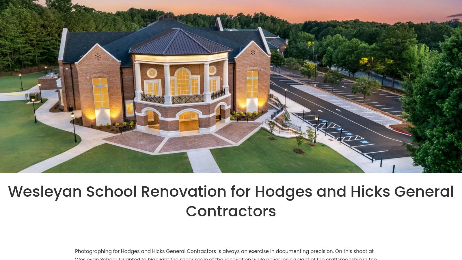
For architects, photographers, and parents who pay attention to space, this place rewards a slower eye. The strongest images usually aren't the obvious ones. They come from watching how children occupy scale, color, and texture inside a building made for their height and rhythm.
If you're already interested in how Atlanta's built environment photographs across different contexts, this broader look at top architectural landscapes in Atlanta gives useful context for how the museum fits into the city's larger visual language.
The Children's Museum of Atlanta is small enough to feel manageable and busy enough to punish improvisation. Good visits, like good shoots, start with a plan.
A Legacy of Play and Purpose
The museum's history explains its temperament. It began in 1988 as a traveling “Museum Without Walls” effort and later moved into a permanent downtown home, a shift summarized in Wikipedia's entry for the Children's Museum of Atlanta. You can still feel that origin in the building. The place behaves like an outreach institution that settled into a fixed address, not like a formal civic room that expects quiet admiration.
That matters once you step inside with a camera, or with children. The spatial priorities are clear. Activity comes first. Sightlines stay open. Surfaces are built to take wear. Adults can monitor movement without hovering over every interaction, and children get enough freedom to test, stack, crawl, role-play, and reset their attention quickly.
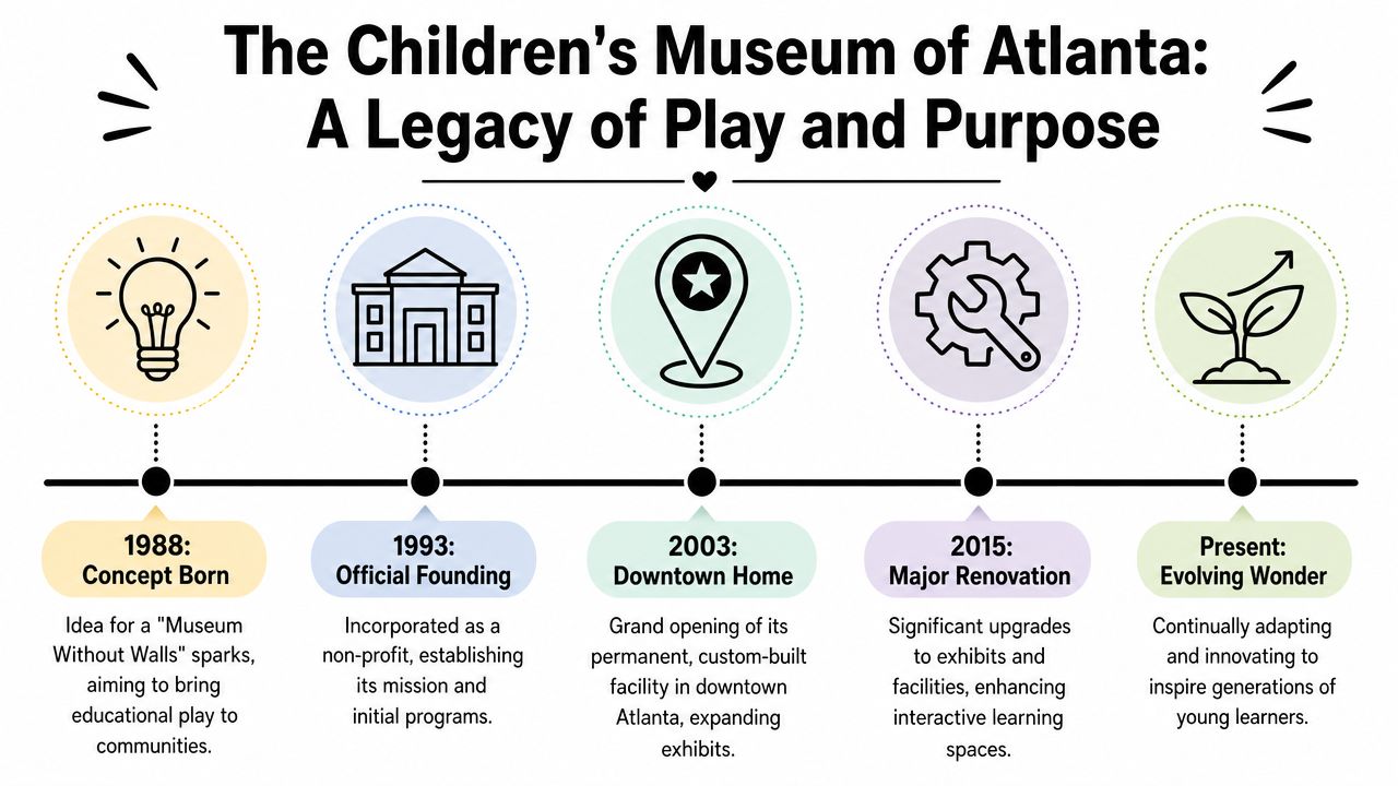
Why the history still shows in the space
From a design perspective, the museum is strongest when you read it as a working tool for early childhood learning. Its nonprofit, play-based mission is not just branding. It shapes the room sizes, the circulation, the visibility across activity zones, and the balance between stimulation and control.
That trade-off is worth noticing.
A children's museum can chase spectacle and photograph well for five minutes, or it can support real use for hours. This one leans toward use. For visitors, that usually means a better day. For photographers, it means the best frames come from watching how kids occupy the space rather than hunting for one heroic wide shot.
What works, and what to plan around
The alignment between mission and building is the strongest part of the experience. Nothing feels overly precious. The museum is tuned for younger children, and the environment reflects that with scaled interactions, direct wayfinding, and a pace that favors repetition over novelty.
The trade-off is just as clear. Families with older children may read the same focus as either helpful or limiting, depending on the group. If your party spans a wide age range, set expectations early. The building tells you who it was designed for, and the visit goes better when you follow that cue.
Practical rule: Plan around the museum's intended age range and use pattern. The space works best when your expectations match its design.
Planning Your Visit Logistics and Hours
Arrival sets the tone here more than the facade does. In downtown Atlanta, a ten-minute delay at the wrong garage can cost you the calm start that younger children need, and it can also cost you the softer, cleaner opening moments a photographer usually wants. The museum sits at 275 Centennial Olympic Park Drive NW, Atlanta, GA 30313, and the first practical decision is parking, because there is no on-site lot.
The museum recommends parking at 236 Williams Street, with 104 John Portman Blvd NW as the GPS address for that lot. It also posts current admission rules, operating hours, holiday exceptions, and adult entry policies on its official FAQ and visit planning page. Check that page before you leave. Hours and special closures matter more here than at larger museums with longer daily windows.
Quick facts at a glance
| Attribute | Details |
|---|---|
| Name | Children's Museum of Atlanta |
| Address | 275 Centennial Olympic Park Drive NW, Atlanta, GA 30313 |
| Parking | No on-site parking |
| Recommended lot | 236 Williams Street |
| GPS for recommended lot | 104 John Portman Blvd NW |
| General admission | $12.57 |
| Free admission | Babies 11 months and younger, and museum members |
| Weekday hours | 10:00 AM to 3:30 PM on Monday, Tuesday, Thursday, and Friday |
| Saturday hours | 9:30 AM to 4:30 PM |
| Closed | Sundays and Wednesdays |
| Holiday closures | Thanksgiving and Christmas Day |
| Christmas Eve hours | Closes at 1:00 PM |
| Adult policy | At least one adult age 18 or older for every five children |
| Entry restriction | Adults can't enter alone without a child |
| Paying age range | Visitors between ages 1 and 100 pay admission |
A short operating window changes how I'd structure the day. This is not the kind of museum visit that rewards a loose downtown schedule with a late arrival, a long coffee stop, and vague lunch plans. Families usually do better by treating it as a focused block of time. Arrive ready, enter promptly, and give the children enough uninterrupted time to settle into the exhibits before energy drops.
That matters for photography too.
If the goal is clean documentation of the space and the experience, the first hour is usually the most usable. Children are still reading the room, adults are less burdened with bags and snacks, and backgrounds tend to feel more orderly before the day compresses. Saturday gives you the broadest public access window, but it also tends to produce denser circulation and busier frames.
Practical arrival strategy
A few choices make the visit easier:
- Choose parking before you leave home. Downtown indecision adds walking, waiting, and avoidable stress.
- Watch the adult-to-child ratio. The museum requires one adult age 18 or older for every five children.
- Do not plan on adult-only entry. Adults without a child are not admitted.
- Build in transition time. Strollers, elevators, and street crossings can turn a short approach into a longer one.
I'd also keep food and break planning conservative. The museum experience is strongest when the group is still fresh enough to use the exhibits with some patience, rather than trying to stretch the visit past the point where noise and fatigue flatten everything into visual clutter.
For a smoother visit and better photographs, solve parking, tickets, and timing before you arrive.
Navigating the Zones A Tour of the Exhibits
The easiest way to understand the Children's Museum of Atlanta is to think in zones rather than rooms. The museum is built for circulation. Children move from one sensory prompt to another, and adults follow with a mix of delight and low-level vigilance. That flow is a strength. It keeps energy up and makes the building feel larger than a straightforward square-footage number might suggest.
The museum is designed for young children, and that changes what “successful exhibit design” means. You're not looking for hushed contemplation. You're looking for spaces that can absorb motion, let adults keep sightlines, and offer immediate invitation without long explanation.
How to read the layout
The most useful mental map is simple: anchor points for themed play, connectors that keep families moving, and open views that reduce the sense of confinement. That's why the museum often feels less fragmented than some children's venues. Even when the content shifts, the circulation remains legible.
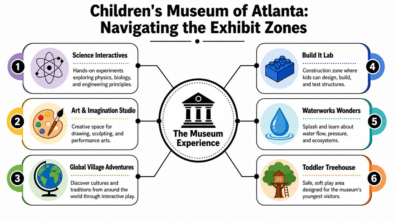
The infographic above frames six recurring experience types that match how many families use the museum:
- Science interactives tend to generate the most concentrated engagement because cause and effect read quickly for younger children.
- Art and imagination spaces usually produce the best candid moments. Hands are busy, faces are expressive, and adults often step back enough for cleaner frames.
- Global or community-themed role-play areas work well when you want context in the image, not just a portrait.
- Build-focused zones create strong detail shots. Blocks, structures, and partial constructions tell a story of process.
- Water-based play adds motion and reflection, but it also adds visual chaos. Shoot tighter if you're after keepers.
- Toddler-oriented areas often have softer forms, lower contrast, and more controlled pacing.
What a walkthrough feels like
In practice, families rarely move through these spaces in a perfect sequence. A child gets captured by one tactile prompt, then pivots hard toward something louder, brighter, or more kinetic. That's normal. The museum is built for repetition and return, not linear progress.
For photography, that means the first pass is usually reconnaissance. Watch where children hesitate, where they commit, and where they repeat an action. Those repeat actions are where timing gets easier.
A few patterns help on the floor:
- Start with broad frames early. Before children fully disperse, you can still capture the relationship between architecture and activity.
- Shift to medium shots once play stabilizes. That's where gestures become readable.
- Finish with details. Hands on surfaces, shoes under tables, and built objects often say more than another smiling face toward camera.
Trade-offs inside an active museum
What works is the museum's pace. It rarely asks children to wait long for meaning. The space gives them enough sensory variety to keep discovery alive.
What doesn't work for some visitors is trying to “do everything.” The better approach is selective attention. Let one or two zones become the heart of the visit. That usually creates a calmer child and a stronger set of images.
Good museum coverage isn't about photographing every exhibit. It's about finding the places where design, behavior, and emotion line up in the same frame.
An Architectural and Design Perspective
From the outside, the Children's Museum of Atlanta presents itself with enough color and clarity to signal its audience immediately. That's smart urban communication. In a district where many buildings compete for attention, the museum doesn't try to look severe or institutional. It announces approachability.
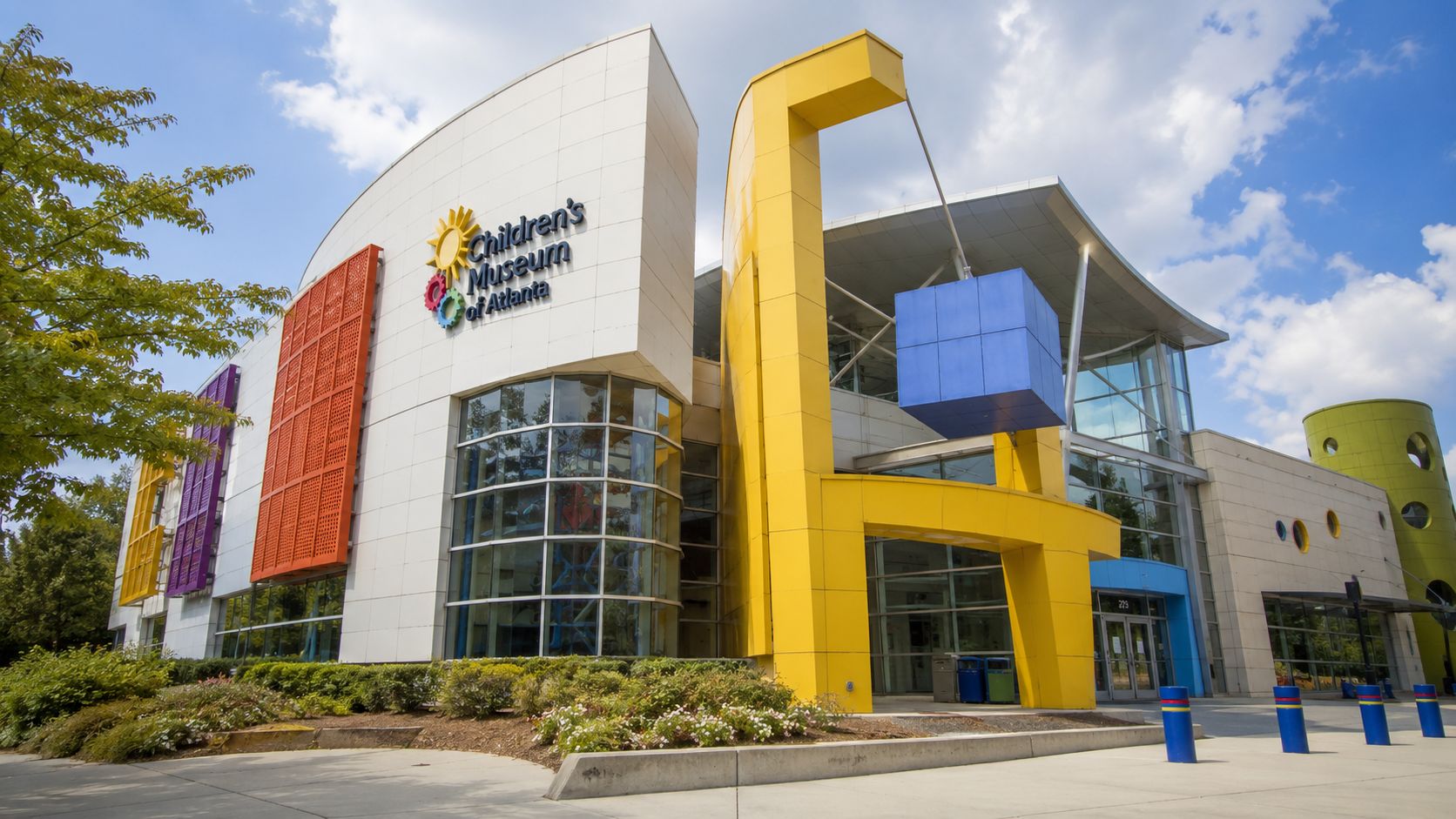
What interests me most is how the building manages a difficult brief. A children's museum has to be expressive without becoming visually exhausting. It has to support supervision while still letting children feel like the space belongs to them. It also has to survive relentless daily contact. Those are architectural constraints, not decorative ones.
Reading the building like a photographer
The exterior works best in oblique views rather than flat, centered documentation. Slight angle gives the mass more depth and helps the color read as part of a civic setting instead of a standalone object. In bright weather, the cleanest photographs usually come when the sky provides enough separation to simplify the roofline and edge conditions.
Inside, the design challenge shifts from object-making to flow-making. Sightlines matter more than sculptural flourish. Adults need to scan quickly. Children need to recognize invitation instantly. That usually produces a spatial language built on openness, visual cues, and durable surfaces rather than intricate formal gestures.
For anyone interested in how major design practices shape Atlanta's built environment, this look at Perkins and Will in Atlanta offers a useful parallel lens on architecture that balances public use, identity, and performance.
Program matters more than style
A lot of casual commentary on children's spaces stops at “colorful” or “fun.” That's too thin. In a building like this, the more revealing question is whether form supports program. Here, the answer is largely yes. The museum's mission depends on repeat use, quick comprehension, and physical participation, so the architecture succeeds when it clears the way for those behaviors.
That means some of the most important design choices may look ordinary in photographs. Wide passages. Rounded or forgiving transitions. Finishes that don't demand protection. Open supervision angles. None of that sounds glamorous, but it's what allows the building to function as intended.
A short visual reference helps if you want a feel for the place in motion:
Where the building earns respect
The Children's Museum of Atlanta earns respect not because it strives for formal drama, but because it appears to understand its users. In architecture, that's harder than it sounds. A building for young children can become patronizing or chaotic very quickly. This one works best when it stays legible.
That legibility is also why it photographs well. The story isn't hidden. The building tells you who it is, who it serves, and how you're meant to move through it.
A Guide to Photography at the Museum
Photographing the Children's Museum of Atlanta requires different expectations depending on who you are. Parents want sharp, memorable frames without fuss. Professionals want visual clarity, clean geometry, and a truthful record of how the building performs under real use. The techniques overlap, but the priorities don't.
For parents who want better pictures fast
Start by lowering your ambition and raising your timing. You don't need a perfect portrait in every zone. You need a few frames where expression, gesture, and context all make sense.
Try these practical choices:
- Use your phone's standard lens first: Ultra-wide lenses can distort children's faces and make interiors feel messier than they are.
- Get down to child height: That single change usually improves images more than any app or filter.
- Shoot during repeated play: The second or third time a child pours, stacks, presses, or climbs, you can anticipate the motion.
- Avoid backlit entrances for portraits: Transition spaces often look dramatic to the eye but produce difficult exposure on a phone.
- Clean the frame edges: Move one step left or right before you shoot. Background clutter is often an inch away from disappearing.
Don't chase smiles on command. Photograph concentration. In children's museums, focused play usually tells the richer story.
For editorial and architectural photographers
Treat the museum as an active interior, not a static design object. That changes lens choice and timing. A wide lens is useful, but if you go too wide too quickly, the frame starts reporting chaos instead of structure. I prefer beginning with compositions that establish circulation and then tightening to show how children activate the design.
A few methods work well:
- Scout before shooting seriously. Watch where staff queues visitors, where families pause, and which areas empty briefly.
- Look for layered compositions. Foreground activity, midground structure, and a readable background often communicate the building best.
- Expose for color consistency. Child-focused interiors can include mixed lighting and saturated surfaces that shift fast if you're careless.
- Prioritize honest use patterns. A children's museum shouldn't be photographed as if nobody ever touches anything.
If you work in this genre often, this practical guide to photographing architecture and interiors aligns well with the kind of disciplined framing this museum rewards.
What usually fails
Overstaging fails. So does shooting too much from adult standing height. Another common mistake is trying to isolate the architecture completely from the users. In a museum like this, people aren't visual interference. They are evidence that the design is working.
The best images usually do one of three things well: they show scale, they show interaction, or they show order inside activity. If a frame does none of those, it's probably just coverage.
Essential Visitor Services and Accessibility
A family visit works when the museum feels manageable. In practical terms, that comes down to circulation, basic comfort, and trust that the environment is being maintained well enough for heavy daily use. The Children's Museum of Atlanta benefits from a compact, supervised feel, which helps caregivers keep a visit on track without constant regrouping.
One operational detail stands out. The museum closes every Wednesday from August through May for deep cleaning and exhibit repair, a practice described in the Tripadvisor overview of the Children's Museum of Atlanta. The same source states that this routine supports a 95%+ exhibit uptime rate. For parents, school coordinators, and anyone photographing an active public interior, that matters because maintenance is what separates an engaging venue from a tired one.
Why maintenance changes the visitor experience
Young children interact physically with everything. They push, lean, spill, climb, tap, and repeat. A museum that serves that audience has to be maintained as a live system, not as a static display environment.
That Wednesday closure suggests a practical philosophy:
- Repair before failure compounds: Broken interactive elements change how children move through the room.
- Disinfect on a real schedule: Families with very young children notice whether hygiene looks performative or operational.
- Protect consistency for field trips: Group visits depend on the exhibits working as expected.
- Support safety through upkeep: Cleanliness and functionality are part of accessibility, not extras.
What to expect, and what to verify
The museum's posted rules already tell you it's structured around families with children, not casual adult tourism. That tends to make the environment more coherent once you're inside. The trade-off is that some visitors may want more explicit public detail about specific amenities or accommodations before arrival.
If you're planning around nap schedules, sensory needs, stroller use, or feeding routines, it's smart to confirm current conditions directly with the museum before the trip. Policies and on-site arrangements can change, and practical comfort often depends on details that a general visitor guide can't reliably assume.
A well-run children's museum doesn't just entertain. It reduces friction for caregivers. Maintenance, cleanliness, and functional exhibits are part of that service, even when visitors barely notice them.
Frequently Asked Questions
Are masks currently required?
Mask guidance has not been stated clearly in the public materials reviewed for this guide. Before you set out, confirm the current policy with the museum directly.
That call matters more here than it would at a conventional gallery. Families often plan around short attention windows, and entry surprises can throw off the whole visit.
Does the museum offer sensory-friendly hours or quiet zones?
Public information reviewed for this article does not clearly identify sensory-friendly hours, designated quiet zones, or detailed accommodation guidance. The planning gap is also discussed by the Arthur M. Blank Family Foundation in its page about the museum and public access information.
For caregivers who need a predictable setting, that missing detail matters. Ask specific questions before arrival, including where a child can decompress, whether headphones are allowed, and which time of day tends to be calmer.
Is the museum a good fit for neurodivergent children?
It can be a strong fit for some children because the museum is built around tactile play, movement, and choice. It can also feel loud, visually dense, and fast-paced during busy periods.
From a photographer's perspective, that same energy is what gives the museum its character. From a caregiver's perspective, it may require tighter timing and a clear exit plan. Both things can be true at once.
What's the best way to plan if you need certainty?
Call or email before your visit and keep the questions concrete. Ask about current entry procedures, lower-traffic hours, stroller parking, food policies, and whether staff can point you to a quieter corner if a child needs a reset.
Early arrival is usually the safer bet for families who want more control over sound, crowding, and photo opportunities.
Is this a good museum for photography?
Yes, with the right expectations. The museum works best for candid family frames, details of hands-on exhibits, and images that show how children move through the space. It is less suited to clean architectural coverage during open hours because the rooms are designed to stay active.
If you bring a camera, travel light, work fast, and stay respectful of other families' privacy. A small body, one versatile lens, and available light are usually the right kit.
If you need polished visual coverage of cultural spaces, educational environments, or design-forward interiors, Jimmy Clemmons Photographer brings an editorial eye to architecture, brand storytelling, and the lived experience of a space.