

Atlanta’s skyline changes fast when the light turns. I’ve watched glass towers flatten into gray at noon, then pick up color and depth in the last minutes before dusk. That’s why Top Architectural Sites in Atlanta aren’t just places to visit. They’re places to read, plan, and shoot with intent.
Atlanta’s design story is unusually visible. The city lost much of its earlier built fabric after the 1864 destruction, and that rupture still shapes how its architecture is understood today. Along Peachtree Street and beyond, old and new sit in active conversation, from postmodern towers to cultural institutions to Olympic-era public space. For a photographer, that means the job isn’t only to make a building look polished. It’s to show how Atlanta keeps rebuilding its identity through form, material, and environment.
My approach is simple. Start with the design brief, then scout for what the architect or developer is really trying to communicate. Sometimes that’s scale. Sometimes it’s pedestrian experience, daylight, or how a plaza slows people down before they enter a building. The camera angle comes later. If you reverse that order, you get pretty images that don’t help a client.
This guide is built from that working method. It’s not a tourist roundup. It’s a professional shooting playbook for ten Atlanta sites that consistently deliver strong architectural narratives, whether the assignment is editorial, hospitality, real estate, institutional marketing, or a design portfolio. At each location, the useful questions stay the same. What’s the defining gesture? Where does the site sit in the city? What light makes the materials readable? Which frames belong in a commercial set, and which ones belong in an editorial sequence?
1. The Georgia Aquarium
The first time I scout the Georgia Aquarium, I do not start with the hero frame. I start with the approach. This building earns its keep photographically through sequence: the pull from the street, the curve of the envelope, the compression at the entry, and the shift inside from civic exterior to controlled light and spectacle. The Georgia Aquarium visitor information identifies it as the largest aquarium in the Western Hemisphere, which matters less as a headline than as a clue to how the project was designed to handle volume, visibility, and public movement.
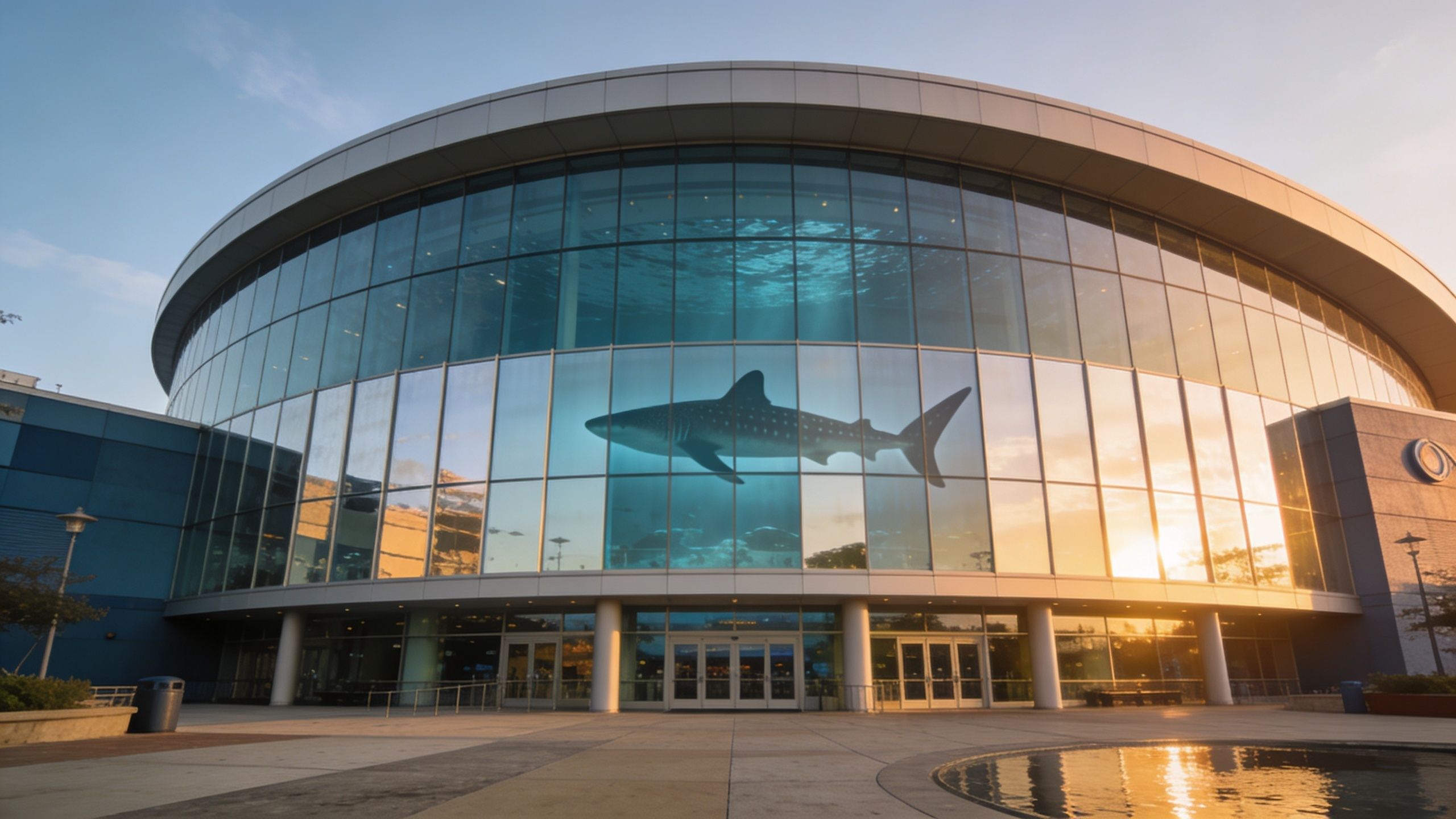
The main exterior challenge is simple. Curved glass reflects everything. Pavement glare, nearby buildings, tour buses, bright sky holes, and pedestrian clutter all show up faster here than many photographers expect. For that reason, I plan this assignment as two separate problems: a controlled exterior set for form and context, and an interior set for mood, circulation, and exhibit lighting.
For clients commissioning commercial building exterior photography, the usable shot list usually falls into three groups:
- Hero exterior: A wide frame that gives the facade enough breathing room to show its arc and mass.
- Arrival and threshold views: Entry doors, canopy geometry, paving patterns, queue organization, and how visitors read the building before they enter.
- Interior architectural frames: Circulation paths, railing lines, tank glow, ceiling treatment, and moments where exhibit design supports the architecture instead of overpowering it.
That set works for hospitality marketing, institutional promotion, editorial features, and tourism campaigns because it gives a client both identity images and practical coverage.
The trade-off is timing. Early weekday mornings are usually better for the exterior because the forecourt stays cleaner and the facade reads with fewer distractions. Midday can still work if the sky is thin and bright rather than hard blue, since flat light often produces cleaner glass than dramatic sun. Dramatic weather is useful only if reflections stay controlled.
A polarizer helps, but curved glazing never responds evenly across the full frame, so it should be treated as a refinement tool, not a fix. If the sky is running hot while the facade falls off, graduated ND filtration can hold the top of frame together. Interior work requires the opposite mindset. Protect the color in the tanks, keep verticals disciplined, and expose for the architectural envelope so the space does not collapse into a black shell around the exhibits.
The weak version of this shoot is a single postcard exterior. The strong version is a sequence that shows how the building handles scale, public entry, and immersion. That is the difference between an attractive image and a set a client can use.
2. The Bank of America Plaza
If you need one building to summarize Atlanta’s vertical ambition, this is it. The Architecture of Atlanta overview identifies Bank of America Plaza as completed in 1992 and standing at 1,023 feet (312 meters), making it the tallest building in Atlanta. It anchors Peachtree Street, and visually it behaves like a marker you can use to organize the rest of downtown.
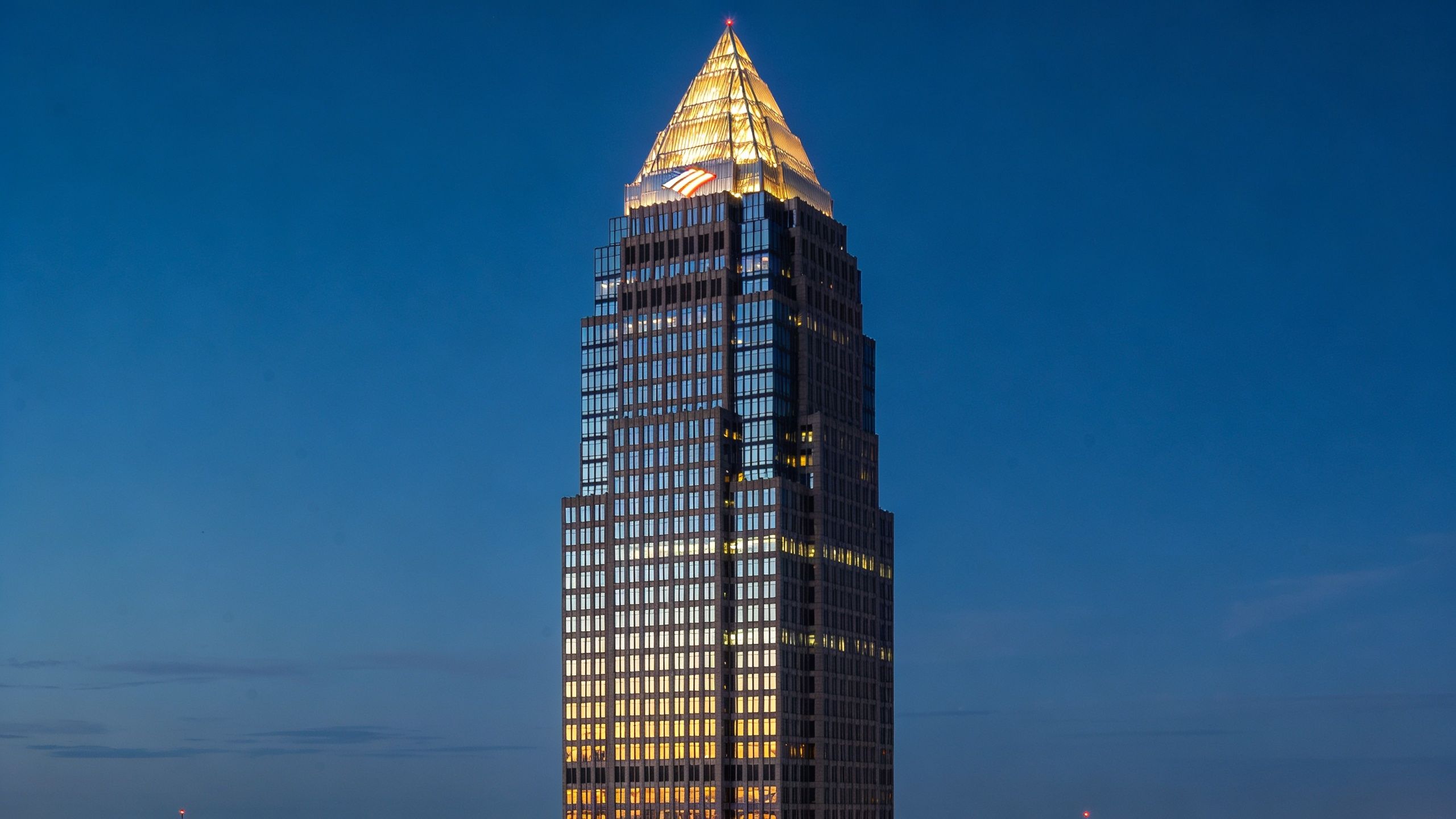
This is a tower that rewards patience more than aggression. Many photographers go straight for the obvious skyline angle and stop there. That gets you a recognizable image, but it won’t give a developer, publication, or corporate client enough material. Strong coverage starts at street level, where the tower’s height becomes believable because people, traffic, setbacks, and neighboring structures establish proportion.
Best angles for a usable set
A complete shoot usually needs more than one vantage family:
- Street-level verticals: These sell height and let the crown pull the eye upward.
- Mid-distance skyline views: These place the tower in Atlanta’s larger urban pattern.
- Blue-hour frames: The crown becomes the subject, not just the top of the building.
For exterior specialists, this kind of assignment is exactly where disciplined planning matters. My process for commercial building exteriors starts with identifying the money shot, then backing into access, sun position, and traffic flow so the final set feels intentional rather than opportunistic.
The real trade-off
Reflective glass can either make the tower sing or flatten it. Midday often gives you hard contrast without much nuance, while dusk tends to produce a better balance between facade detail and sky color. If you’re after the crown, wait. If you’re after the body of the tower, look for light that rakes across the planes rather than blasting them head-on.
Practical rule: Don’t let the spire do all the work. The strongest Bank of America Plaza images also explain its relationship to the street.
For editorial use, I’d also include one frame that shows Peachtree’s layering of old and new. That context helps the building read as part of Atlanta’s rebuilding story instead of a freestanding icon.
3. The Piedmont Park Historic Structures and Landscape Design
Piedmont Park asks for restraint. The temptation is to treat it as scenery, but the more useful approach is to photograph it as designed space. The park’s value isn’t just greenery. It’s the choreography between paths, structures, open lawns, planted edges, and skyline views.
This is one of the best places in Atlanta to show how site design directs movement without feeling rigid. A client in hospitality, wellness, residential development, or civic planning usually wants to see how people enter a place, where views open up, and how built elements support the overall rhythm of the site. Piedmont Park offers all of that if you don’t reduce it to generic park coverage.
A better shooting sequence
Start broad, then tighten. I’d usually open with an establishing frame that shows the park’s relationship to Midtown. After that, move into pathway alignments, pavilion or conservatory details, water-adjacent moments, and any sightline that reveals how the design handles transition from dense city fabric to open space.
The most persuasive images tend to include:
- Circulation logic: Paths, crossings, and directional lines that explain movement.
- Layered depth: Foreground planting, midground structure, background skyline.
- Seasonal specificity: Trees, groundcover, and lawn condition that represent the park at that moment.
What clients often miss
Site photography lives or dies on timing. A site can be well designed and still photograph poorly if the horticultural cycle is off, maintenance is behind, or the sun is too high to separate textures. I’d rather reschedule than force a flat, brittle set.
What works here is golden-hour sidelight and a clear shot list. What doesn’t is overusing ultra-wide lenses that make every element feel farther apart than it is. That can weaken the design intent by turning a coherent park into disconnected fragments.
A good Piedmont Park frame should tell you where to walk next. If it can’t do that, it probably isn’t saying enough about the design.
4. The High Museum of Art
The first time I photographed the High, the assignment looked simple on paper. White walls, clean geometry, a famous museum. Then the light shifted across the facade, the atrium started throwing bright highlights into deep shadow, and it became clear that this building only rewards precision.
That challenge is what makes the High one of Atlanta’s strongest architectural subjects. Richard Meier’s original building and Renzo Piano’s later expansion give the site a real architectural dialogue. One speaks in disciplined, luminous surfaces. The other extends the campus with a different rhythm and a lighter institutional touch. For a photographer, that creates a useful brief. Show where the language changes, and show where it stays coherent.
White architecture leaves very little room for error. Exposure has to stay controlled, but the bigger issue is separation. If the light goes flat, the museum loses the edge definition that gives its forms authority. If the contrast spikes too hard, the white surfaces clip and the interior transitions fall apart.
My approach starts with sequence. I build a set that explains the campus before I chase isolated hero frames. Exterior work should cover the relationship between the two design phases, entry conditions, facade curvature, and the way the building meets the plaza. Interior work should focus on atrium volume, stair geometry, gallery thresholds, and how daylight travels across walls, floors, and railings. Strong architectural composition principles matter here because a small change in camera height or angle can either clarify the geometry or clutter it.
A useful shot list for the High usually includes:
- Wide campus views: Show how the Meier and Piano elements sit together.
- Three-quarter exterior angles: Reveal curvature, panel rhythm, and shadow depth.
- Atrium frames: Capture vertical volume and controlled daylight.
- Circulation details: Stairs, ramps, rails, and thresholds that explain movement.
- Material close-ups: Joints, corners, transitions, and reflected light on white surfaces.
Timing decides the quality of the set. Early hours are often better outside because the building reads cleanly before foot traffic and parked service activity start competing with the architecture. Inside, skylit spaces need careful exposure control, especially when bright ceiling light drops into darker circulation zones. I often bracket selectively, but I still compose for a single readable frame instead of relying on correction later.
For editorial use, the High works best as a story about authorship, expansion, and light. For institutional marketing, I’d add a few frames with visitors in scale, but only where the human presence helps explain the building rather than distracts from it.
The High does not forgive lazy framing. It rewards patience, measured exposure, and a shot list built around relationships, not just objects.
5. The Mercedes-Benz Stadium
The first time I photographed Mercedes-Benz Stadium, the problem was obvious before I raised the camera. The building is so recognizable that many frames stop at recognition. A strong stadium set has to do more. It has to explain scale, structure, circulation, and the way the building sits against downtown.
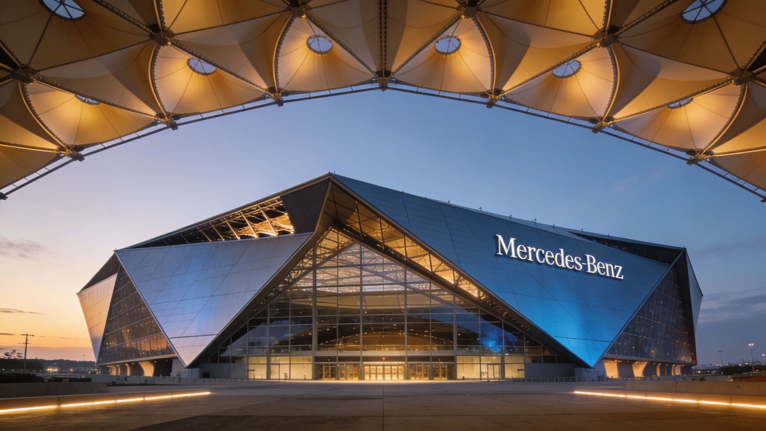
The retractable roof gets the attention, and for good reason. The petal geometry gives the stadium its identity. But the better assignment usually comes from showing how that geometry connects to the faceted facade, the entry sequence, the plaza edges, and the interior concourses. For architecture, the story is not only the object. It is the experience of approaching, entering, and moving through it.
A productive shot list here needs discipline:
- Long-lens exterior views: Compress the roof and facade so the form reads clearly without edge distortion.
- Three-quarter approach angles: Show the relationship between the skin, entries, and pedestrian flow.
- Plaza and threshold frames: Document how the building meets the ground and handles crowd movement.
- Interior concourse views: Capture structure, signage, light, and circulation in one readable composition.
- Seating bowl perspectives: Show volume and sightline logic without turning the frame into a sports cliché.
- Dusk hero shots: Use the building lighting to separate the form from the surrounding infrastructure.
The trade-off is coverage versus clarity. If you stay too wide and too close, the stadium starts to feel swollen at the edges and the roof loses coherence. If you back off too far, the form flattens into a generic event venue. I handle that by building the set in layers, starting with distant establishing views, then medium-distance facade studies, then selected interior frames that explain how the venue works. The same architectural composition principles for large civic structures apply here. Every frame needs a clear subject and a controlled hierarchy.
Here’s a useful look at the venue in motion:
Light changes the assignment. Early daylight is often better for exterior coverage because the skin reads cleaner before the site gets crowded with delivery activity, security barriers, and heavy pedestrian traffic. Dusk is better for signature views and sponsored content because the illumination gives the building stronger separation. Interior work needs restraint. The goal is to show premium areas, circulation, and structure without letting screens and branded graphics dominate the architecture.
For client use, the stadium supports several distinct deliverables:
- Commercial development and venue marketing: Access, frontage, public realm, and recognizable exterior identity.
- Hospitality and premium experience campaigns: Suites, clubs, concourses, and arrival sequence.
- Editorial architecture features: Roof mechanics, facade patterning, structural expression, and urban context.
The building rewards planning more than improvisation. A rushed pass can get a recognizable frame. A professional set requires timing, distance control, and a shot list built around how the stadium performs at every scale.
6. The College Football Hall of Fame
The College Football Hall of Fame is a good reminder that smaller civic buildings often need more careful framing than giant ones. Its form is distinctive, but it sits in a busy district where visual clutter can creep into almost every angle. That means the job isn’t only to capture the building. It’s to edit the surroundings through position, lens choice, and timing.
Architecturally, the fan-shaped exterior gives you a clear thematic anchor. That’s useful for institutional clients because the design language connects directly to the subject matter without becoming novelty architecture. If I’m shooting it for a museum or sports client, I want to preserve that sense of energy while still making the building feel credible as architecture.
The most productive shot list
At this site, I’d focus on a compact but strategic sequence:
- Ground-level fan-form views: Enough perspective to read the gesture without distortion.
- Pemberton Place context: A frame that lets the building breathe within its public setting.
- Atrium depth: Interior views from more than one level so the volume feels intentional.
Evening can work especially well because the lighting helps separate the building from surrounding distractions. During the day, foreground elements can become noisy if you aren’t strict about frame edges.
Best use-cases for clients
This site is especially strong for sports tourism, institutional marketing, and editorial storytelling. It gives you exterior identity and interior experience in a relatively compact footprint. That’s a practical advantage because you can produce a balanced set without the logistical burden of a much larger venue.
Shoot one sequence for architecture and a separate one for brand storytelling. Combining them too early usually weakens both.
What doesn’t work is approaching it like a monument. The better images tend to show movement, access, and layered interior views that explain how the design welcomes visitors.
7. Atlanta BeltLine Urban Park and Adaptive Reuse Landscape
I’ve seen more weak edits from the BeltLine than almost anywhere else in Atlanta. The usual problem is coverage that treats it like one place instead of a connected system of trails, reused rail infrastructure, planted corridors, murals, bridges, and development edges. A single wide shot may be attractive, but it rarely explains why this project matters to planners, developers, or design editors.
The value of the BeltLine is its layered urban experience at eye level. You can show circulation, reuse, planting design, retail frontage, and public behavior in the same assignment, but only if you scout the segment first. The Eastside Trail communicates something very different from a quieter stretch with less retail pressure and more room to study grading, materials, and adjacency.
What to photograph
This assignment benefits from a tighter shot list than photographers often expect. Coverage gets stronger when each frame has a job.
A practical set should include:
- Linear corridor views: Frames that show depth, rhythm, and how the trail pulls people through the corridor.
- Adaptive reuse details: Bridge structures, preserved industrial elements, and building edges that make the redevelopment story legible.
- Street-to-trail transitions: Entrances, crossings, stairs, ramps, and retail thresholds that show how the project connects to surrounding neighborhoods.
- Human-scale use: Seating, shade, cyclists, runners, and small groups that clarify scale without turning the image into crowd documentation.
The broader Atlanta design market helps explain why this subject keeps showing up in client briefs. The Atlanta 500 real estate and design profile points to a city shaped by active residential and infill commercial development, which makes the BeltLine especially relevant for firms documenting growth, public realm work, and redevelopment strategy.
Trade-offs that matter on site
People are part of the assignment here. Remove them completely and the work can feel sterile, almost like an unbuilt rendering. Include too many and the set starts reading like event coverage instead of architecture and urban design photography.
Light matters just as much as access. Early morning usually gives cleaner frames, better separation, and fewer distractions at trail level. Late afternoon can be useful if the brief needs social energy, but it also brings harder crowd control, inconsistent patches of sun, and more visual noise from signage, scooters, and service activity.
For editorial use, I’d build a sequence that moves from corridor overview to material detail to neighborhood connection. For commercial clients, the stronger set usually balances public amenity with adjacent development value. Trying to summarize the entire BeltLine from one segment almost always weakens the story. Better coverage comes from choosing a specific stretch and photographing it with enough discipline that the design decisions read clearly.
8. The Westin Peachtree Plaza and John Portman Legacy
The Westin Peachtree Plaza still changes the way downtown Atlanta feels. Its cylindrical form cuts cleanly against the city’s more angular skyline, and that contrast is exactly why it remains such a powerful subject. If you’re shooting Atlanta’s architectural identity rather than just individual buildings, this tower deserves a place on the list.
John Portman’s influence also makes the interior just as important as the exterior. The atrium isn’t background. It’s part of the argument. Hospitality clients, design publications, and historians all care about how the building stages arrival, vertical movement, and spectacle.
How to photograph Portman well
Portman spaces ask for structure. If you get seduced by the scale and start shooting everything wide, the drama becomes mush. The better approach is to alternate between spatial overviews and tighter frames that isolate elevators, balcony lines, and repeating curves.
I’d divide the job this way:
- Skyline context: Show the tower’s cylindrical profile in relation to downtown.
- Ground-level presence: Let the base and entry sequence explain how the building meets the street.
- Interior drama: Use multiple levels to reveal atrium depth and vertical circulation.
What still makes it relevant
This building is historically important, but that isn’t enough on its own. A photograph has to show why the design still matters now. In practice, that means emphasizing the tower’s sculptural clarity and the experiential quality of the interior spaces rather than relying on nostalgia.
For hospitality marketing, top-level views and lifestyle-oriented compositions have value, but I’d keep the architecture primary. The strongest set usually balances urban icon, interior spectacle, and design lineage without letting any one of those swallow the others.
9. Trust Company Tower and Promenade Park Plaza
This is the kind of building photographers can skip too quickly. It doesn’t have the instant name recognition of Atlanta’s biggest icons, but it rewards serious commercial coverage because it solves a more subtle problem well. The tower and its plaza relationship create a stronger pedestrian story than many more famous properties.
That matters for developers and property managers. A glass or stone facade alone doesn’t sell a commercial site. The leasing story often lives at grade, where plaza design, setbacks, planting, and circulation shape first impressions. Trust Company Tower serves as a useful case study for photographing urban office architecture with context.
What to prioritize
I’d shoot this one from the street out, not the skyline in. The reason is simple. The plaza is part of the building’s identity, and if you ignore it, the tower becomes just another vertical object in a crowded downtown field.
Useful frames include:
- Approach views: Pedestrian entry, base detailing, and setback relationships.
- Material studies: Facade depth, shadow lines, and crafted transitions.
- Context shots: Adjacent structures that explain where the building sits in the downtown grid.
Why this site matters commercially
For real estate marketing, this kind of property often needs images that feel polished but not generic. A tenant, investor, or broker wants to understand quality, access, and urban presence. That means your framing should make the plaza legible and show how the building handles public space.
What works is golden-hour sidelight because it reveals facade texture and gives the plaza some dimensionality. What doesn’t is flat overhead light combined with a distant telephoto skyline crop. That strips away the exact qualities that make the building useful to photograph.
10. State Farm Arena and Contemporary Sports Architecture
State Farm Arena represents a different kind of sports venue story than Mercedes-Benz Stadium. It’s less about singular roof form and more about urban integration, fan experience, and how a large entertainment building behaves within a dense event district. That distinction should shape the shoot.
The exterior lighting is one of the obvious visual hooks, especially at dusk and night, but the more convincing commercial set will also explain arrival, adjacency, and interior hospitality. Clients in sports, live events, real estate, and sponsorship need all of those layers.
What to capture first
This is a venue where sequencing matters. Start outside before the building lights dominate the assignment. That gives you clean documentation of form, access, and relationship to nearby development. Later, let the LED-driven identity come forward once the architectural basics are covered.
A solid deliverable set would include:
- Exterior daytime coverage: Form, entries, transit adjacency, surrounding district.
- Blue-hour and night coverage: LED expression and event-ready atmosphere.
- Interior premium spaces: Clubs, suites, concourses, and hospitality zones.
The practical challenge
Arenas can become visually chaotic fast. Signage, screens, barricades, and operational clutter all compete with the architecture. That means pre-production is part of the photography. You need to know what can be cleared, what can be turned off, and which angles avoid temporary distractions.
Some sports venues photograph better when they’re quiet. Others need a little energy. State Farm Arena usually wants a controlled amount of both.
For neighborhood-focused development work, I’d also include a few frames that show how the arena sits within the wider district rather than isolating it as a standalone object. That gives the images more commercial value and a stronger urban narrative.
Top 10 Atlanta Architectural Landscapes Comparison
A comparison table like this is only useful if it helps plan the shoot. For architectural work in Atlanta, the key question is not which site is "best." It is which site fits the assignment, the access level, the light you have, and the story the client needs to tell.
The chart below reflects that working reality. I’ve framed each location by production difficulty, gear and coordination needs, likely deliverables, and the kinds of commercial or editorial assignments where the images carry the most value.
| Item | Implementation complexity 🔄 | Resource requirements ⚡ | Expected outcomes 📊⭐ | Ideal use cases 💡 | Key advantages ⭐ |
|---|---|---|---|---|---|
| The Georgia Aquarium | Medium 🔄, crowd management and glass reflection control | Moderate ⚡, polarizers, ND filters, access coordination | Strong commercial and editorial images built around water, glass, and visitor experience | Architectural portfolios, tourism marketing | Curved glass façade, whale shark tank, varied interior and exterior coverage |
| Bank of America Plaza | High 🔄, tall-building perspective control and skyline separation | Moderate ⚡, wide-angle lenses, high-angle or aerial options | Iconic skyline and corporate imagery, including day and night crown views | Skyline compositions, corporate real estate, branding | Distinctive illuminated crown, strong vertical silhouette |
| Piedmont Park Historic Structures | Low to Medium 🔄, seasonality and public activity | Low to Moderate ⚡, repeat scouting across seasons, golden-hour timing | Versatile park and community imagery for sustainability and civic storytelling | Public-space documentation, park design portfolios, editorial | Wide range of zones, seasonal interest, easy scouting access |
| The High Museum of Art | Medium 🔄, exposure control for white façades and skylights | Moderate ⚡, ND filters, facility coordination for interiors | Refined cultural and institutional images with strong geometric contrast | Museum marketing, design publications, institutional branding | White façade, dramatic atrium, Meier and Piano architectural dialogue |
| Mercedes-Benz Stadium | High 🔄, roof timing and large-scale production coordination | High ⚡, aerial coverage, broad shot list, venue permissions | High-impact sports architecture imagery and engineering-focused deliverables | Stadium marketing, sports and brand partnerships, architectural case studies | Retractable iris roof, LED systems, dramatic structural expression |
| College Football Hall of Fame | Medium 🔄, visitor flow and LED-heavy interiors | Moderate ⚡, evening exterior coverage, interior access coordination | Memorable branded imagery with a dramatic atrium and strong façade presence | Sports museum marketing, event space documentation | Fan-shaped form, dramatic atrium, integrated LED façades |
| Atlanta BeltLine Urban Park | High 🔄, corridor scale and multi-segment coordination | High ⚡, extended production time, research, aerials, varied gear | Story-driven urban transformation imagery with strong redevelopment value | Urban planning, redevelopment case studies, editorial features | Adaptive reuse story, diverse segments, broad community context |
| Westin Peachtree Plaza (Portman) | Medium 🔄, cylindrical form and atrium shooting logistics | Moderate ⚡, wide lenses, interior access, timing for atrium light | Iconic hospitality imagery and strong architectural history coverage | Hospitality marketing, architectural history, portfolio work | Cylindrical tower, tall atrium, rotating restaurant and Portman legacy |
| Trust Company Tower & Promenade Plaza | Medium 🔄, plaza activity and urban shadow control | Moderate ⚡, golden-hour scouting, higher vantage points | Detail-rich postmodern imagery with useful public-realm context | Commercial real estate, urban design, architectural portfolios | Postmodern detailing, integrated pedestrian plaza, refined materials |
| State Farm Arena | High 🔄, event schedules and LED exposure control | Moderate to High ⚡, coordination, evening coverage, interior access | Contemporary arena imagery suited to district branding and redevelopment stories | Sports marketing, mixed-use development promotion, urban renewal | Distinctive LED skin, modern hospitality spaces, strong neighborhood relationship |
Some of these sites reward precision more than spectacle. The High Museum and Bank of America Plaza fall into that category. Others, like Mercedes-Benz Stadium and the BeltLine, ask for a broader shot list because the assignment usually extends beyond the building itself into circulation, context, and public use.
That trade-off matters. A compact cultural site can produce a polished deliverable set in a shorter window. A city-scale corridor or major venue usually needs more scouting, more approvals, and a clearer edit strategy to keep the final image set focused.
From Scout to Shot Capturing Atlanta’s Architecture
The assignment usually starts before the camera comes out. In Atlanta, a tower can read as a skyline icon from one block, then flatten into visual clutter from the next. A museum can look controlled at noon and unusable an hour later once glare starts bouncing through the facade. Good architectural photography here comes from scouting, a tight brief, and a shot list that respects what each site is trying to communicate.
These ten locations show why Atlanta's top architectural sites cannot be reduced to a simple list of landmarks. Each one asks for a different working method. The Georgia Aquarium rewards careful control of reflections and a sequence that connects civic presence to interior experience. Bank of America Plaza is about scale, vantage point, and timing. Piedmont Park asks for frames that show designed public space through use and circulation. The High Museum rewards precision with light, white surfaces, and geometry. The major sports venues demand coverage at scale without letting the edit drift into visual noise.
That difference separates casual coverage from commissioned work with a purpose. The job is to translate intent into images a client can use. Architects need to see that form, material, and circulation read clearly. Developers need images that support leasing and positioning. Editors need frames that place a building inside a broader story about the city.
Atlanta is strong territory for that kind of work. Its skyline carries the legacy of a city that repeatedly remade itself. Its cultural buildings project civic ambition. Its parks and adaptive reuse corridors show how growth, infrastructure, and public life meet in the same frame. You can photograph postmodern towers in the morning, a museum interior in controlled light later in the day, and finish with transit-adjacent public space at dusk without solving the same visual problem twice.
The practical side decides the outcome just as much as taste does. Scouting saves time on shoot day. Access determines whether the final set feels generic or specific. Timing often matters more than adding another lens to the bag. Some sites need blue hour to separate form from background clutter. Others need soft early light to hold material detail. Some benefit from people in frame because activity explains the design. Others read best with clean, quiet compositions.
I treat the brief as part of the composition process. Before shooting, decide what the pictures need to do. A leasing package needs clear exterior identity, arrival sequences, amenities, and context. Editorial coverage usually needs a stronger point of view and a better sense of how the project sits within Atlanta. Award submissions often need disciplined geometry, restrained editing, and details that show design resolution. Portfolio work has more room for interpretation, but it still needs structure.
Shot lists should reflect that reality. A strong set usually includes one or two hero views, several medium frames that explain circulation and massing, and detail images that prove the materials and joints were worth specifying in the first place. For a place like the BeltLine or Piedmont Park, I would also plan for transitional views that show how people move through the site. For the High Museum or Bank of America Plaza, I would keep the edit tighter and make every angle earn its place.
Context carries unusual weight in Atlanta. A tower is part of a larger story about redevelopment, finance, and skyline identity. A park is public space, but it is also civic branding and urban relief. An adaptive reuse corridor shows recreation, yes, but also planning priorities, adjacent development, and the city’s preferred image of growth. The photographer’s job is to make those layers visible without turning the work into a thesis project.
If you are building a portfolio, use these sites to prove range, not just taste. Deliver establishing views, human-scale frames, and details with intent. Sequence the work so the viewer understands the place rather than just admiring isolated images.
If you are commissioning a shoot, ask for photographs that do more than look polished. Ask for a set that explains design logic, public use, and market position with clarity. If you need architectural photography that treats design, light, and brand narrative with equal care, connect with Jimmy Clemmons Photographer. The right images do more than record architecture. They amplify its purpose.