

A luxury pool is usually photographed too late in the process and too casually in execution. The design team has already solved the hard problems. Vessel geometry is dialed in, material transitions are clean, lighting is tuned, and the setting has finally stopped looking newly installed. Then someone reaches for a camera and produces a set of images that flatten the entire experience into generic real estate coverage.
That disconnect costs you. Not just aesthetically, but strategically. A weak image set makes a carefully resolved project feel ordinary, and ordinary work doesn't justify premium design fees, editorial attention, or award submissions. Luxury clients don't just buy square footage, tile, or hydraulics. They buy a point of view. Your photography has to prove that point of view with the same discipline you used to design the space.
The strongest pool photography works like a magazine feature, not a jobsite record. It establishes context, reveals intent, controls hierarchy, and gives the viewer a reason to linger. The frame should explain why the vanishing edge matters, why the lap pool sits where it does, why the paving module aligns with the architecture, and why the lighting was worth the investment. If the images don't communicate that story, the work gets undervalued.
That’s why Photography Tips for Luxury Pool Designers should start with editorial thinking before camera settings. Good technique matters, but technique only serves the narrative. The question isn't how to photograph water. It's how to photograph design value.
Use the ideas below to build images that feel commissioned, not casual. Some of these techniques are simple scheduling decisions. Others are small pieces of technical discipline that separate portfolio work from phone snapshots. Together, they help your finished project read the way it deserves to read: intentional, refined, and expensive.
1. Golden Hour and Blue Hour Timing for Water Feature Photography
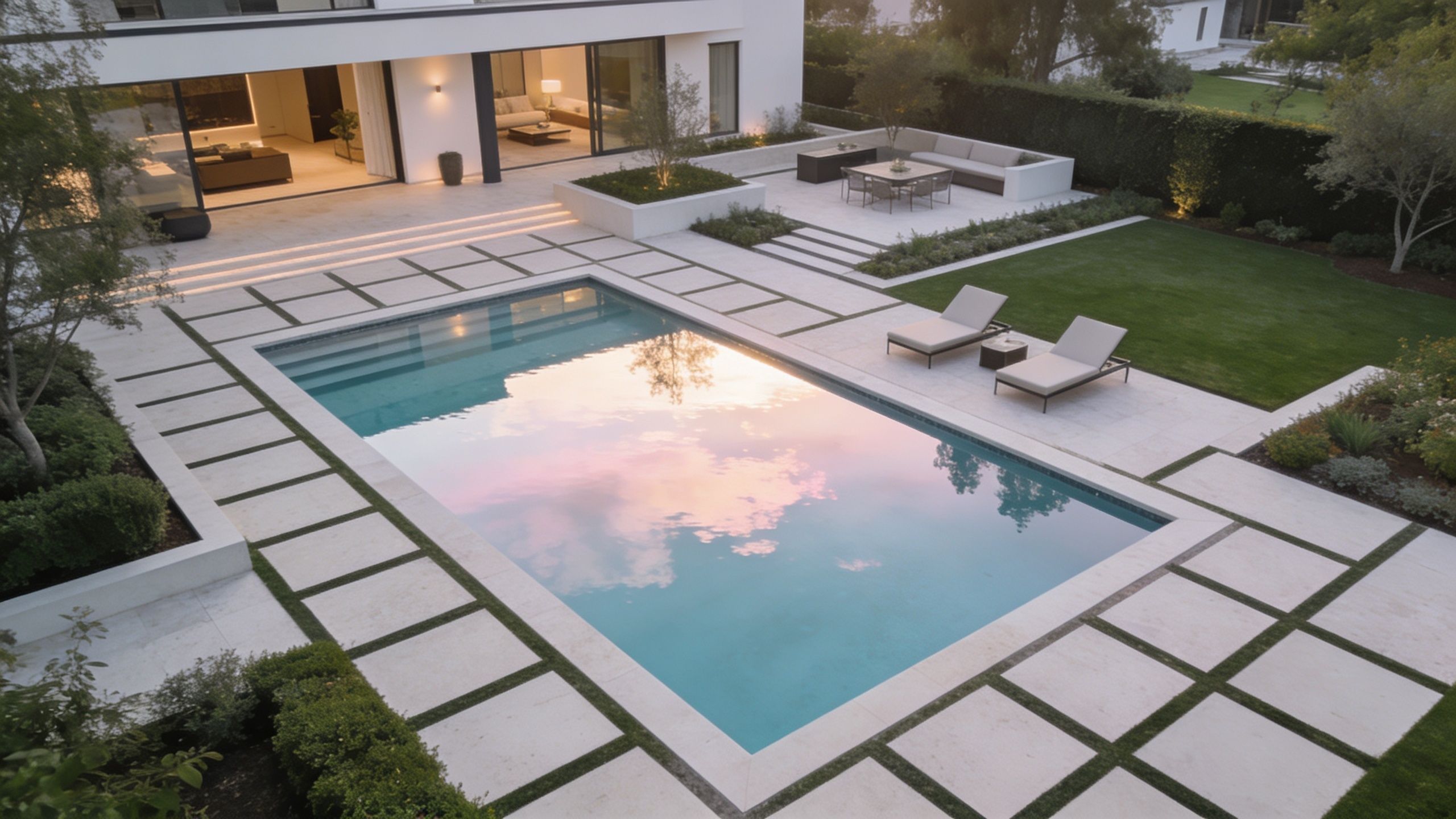
A designer signs off on the last finish, the water is clean, the lighting is programmed, and the shoot gets booked for 1:00 p.m. because that’s when everyone is free. The result is predictable. Hard overhead sun strips depth out of the water, blows out pale stone, and makes a carefully resolved pool read like a flat construction record.
Schedule controls quality here more than gear does.
For luxury pool work, timing is an editorial decision. The frame has to explain why the vessel sits where it does, how the water relates to the architecture, and what mood the project was built to deliver. Early and late light do that job far better than midday because they separate planes, shape reflections, and let the water behave like part of the design instead of a bright distraction.
Al Bello notes in Adorama’s swimming photography guide that the sun’s position changes how water texture, shadows, and edge definition read in outdoor scenes. The same principle applies to residential and hospitality pool photography, where small shifts in sun angle can decide whether the image feels premium or merely descriptive.
Use each window for a different story
Golden hour is for form, materials, and proportion. Low warm light skims across coping, exposes subtle texture in decking, and gives geometric edges enough contrast to hold their shape. On vanishing edges, perimeter-overflow details, and long rectilinear pools, that side light often reveals the designer’s discipline better than any noon hero shot.
Blue hour serves a different purpose. Pool lighting, spa spillways, fire features, step lights, and interior glow begin to balance against the sky. If the lighting plan was part of the sell, dusk photography is required because daylight alone cannot show what the client paid for.
Jimmy Clemmons explains the value of blue hour for luxury projects in terms that match how premium spaces are marketed. The same editorial logic applies when you are building a portfolio set that needs to justify design fees, not just document completion.
Aerial timing matters too. If the project includes axial planning, shoreline geometry, or strong relationships to grade and architecture, the same light window should guide any drone photography for site surveying and visual planning so the full set reads as one story.
Practical rule: Be in position before the light turns. Composition, lens choice, and reflection control should be solved before the sky gets interesting.
What works on site
These habits make short light windows productive instead of frantic:
- Scout reflections at the same hour you plan to shoot: One side of the pool may mirror the architecture beautifully, while the opposite side picks up fencing, neighboring roofs, or empty sky.
- Bracket the hero frames: Water, white coping, dark glazing, and surrounding shadows can exceed what one exposure holds cleanly. A short bracket gives you options without forcing the water to look artificial in post.
- Stage the water early: Skimmer drift, leaves, hose marks, and random turbulence become obvious when the image is quiet. Still water reads as intentional. Messy water reads as rushed.
- Coordinate lighting cues before dusk: If bubblers, fire bowls, or color-changing fixtures need adjustment, solve it before the best 15 minutes of the evening.
The trade-off is simple. Golden hour usually gives stronger material definition. Blue hour gives stronger atmosphere and a better read on the lighting design. Strong portfolio coverage often means shooting both, because editors, award juries, and high-end clients want proof of craft and proof of mood.
Done well, timing turns a finished pool into a visual argument for design value. That is the difference between a photo set that records a project and one that earns attention.
2. Drone Photography and Aerial Perspectives for Pool and Site Context
A designer walks me to the terrace and starts pointing out alignments: the vanishing edge aimed at the ridgeline, the spa tied to the main axis of the house, the way the paving pulls guests from arrival court to water. At ground level, that story breaks into fragments. From above, it reads in one frame.
Aerial work earns its place when the pool is doing more than looking beautiful. It needs to explain planning. The strongest drone image shows how the vessel relates to the architecture, circulation, grade, planting masses, view corridors, and outdoor rooms around it. That is the frame an editor wants because it proves the project was composed, not merely decorated.
Here’s the overhead view worth studying first.
Why the aerial frame justifies design value
Luxury clients respond to order fast. They may never say "axial alignment" or "site hierarchy," but they notice when the pool locks the property together. Aerial photography makes that visible. It shows whether the water feature anchors the plan, whether the terraces have a clear logic, and whether the house and exterior spaces speak the same design language.
That broader read is why overhead images appear so often in resort marketing, residential features, and awards submissions. A patio-level hero shot can sell mood. A well-chosen aerial can defend the design fee.
The mistake is treating every drone frame as a straight-down diagram. Top-down views are useful for geometry, especially on rectilinear projects, but they can flatten the experience and hide grade transitions. Good coverage usually comes from shooting a sequence of heights and camera angles, then selecting the frame that tells the clearest story.
I usually want three categories of aerials:
- Low oblique views: These keep the house, pool, and terrace connected while preserving depth and scale.
- Mid-altitude frames: These often give the best balance of geometry, circulation, and site relationships.
- High establishing shots: These work when the setting adds value, such as waterfront lots, hillside properties, or large estates with strong planning logic.
Each altitude answers a different editorial question. Low asks how it feels to inhabit. Mid asks how it is organized. High asks why the setting matters.
There are trade-offs. Fly too low and the image starts to behave like a ground shot with a gimmick. Fly too high and expensive material decisions disappear. The right height depends on what the project is trying to prove. If the achievement is precise spatial choreography, stay high enough to show the full composition. If the achievement is the transition from house to water, come down and keep the horizon under control.
For firms interested in using aerial imagery during planning as well as marketing, this guide to drone photography for site surveying shows how overhead capture can support more than portfolio work.
Aerial photography works best as a design explanation tool. Use it to show intent, hierarchy, and control. That is what turns a pool shoot from documentation into a feature-worthy visual narrative.
3. Strategic Use of Polarizing Filters to Enhance Water and Reflections
Water lies to the camera. It can look white when it’s blue, opaque when it’s clear, and chaotic when the pool is beautifully resolved. The culprit is usually uncontrolled reflection. If you don't manage glare, the image won’t show the waterline tile, the finish tone, or the depth transitions that matter to a design buyer.
A circular polarizer is one of the few accessories that changes a pool photograph in-camera in a way post-production can't fully fake. It lets you decide how much surface reflection to keep and how much to suppress.
Control, don’t erase
The mistake is assuming a polarizer should remove all reflection. It shouldn’t. Luxury pool photography usually needs both. You want enough control to reveal the water’s true color and enough reflection to keep the surface elegant and alive. Kill all the sheen and the pool can start to look dead. Leave all the glare and it becomes unreadable.
The sweet spot usually appears when you rotate the filter slowly and stop before maximum effect. At that point, the water still holds some sky and architecture, but tile lines, step geometry, and finish quality begin to emerge.
A polarizer should edit reflection, not eliminate it.
This matters on hospitality-style pools, perimeter-overflow edges, dark interior finishes, and any project where subtle material choices are part of the sales argument. A good filter also helps separate premium water color from the chalky, overexposed look that cheapens otherwise excellent work.
How to use it without creating problems
Polarizers come with trade-offs. They reduce incoming light, and uneven skies can become obvious if you're shooting too wide. You need to work deliberately.
- Rotate while watching the waterline: Don’t judge the effect by the sky alone. The pool edge tells you when the filter is helping.
- Favor oblique shooting angles: The filter tends to be most useful when you’re not shooting straight down or straight across.
- Stay alert to over-polarization: If one end of the water looks natural and the other looks unnaturally dark, back off.
If I’m photographing a luxury residential pool with glossy tile, I’ll often make one frame with moderate polarization, one with less, and one without. Designers usually prefer the nuanced version, not the aggressively corrected one. It feels more believable.
This is one of the most practical Photography Tips for Luxury Pool Designers because it directly affects how expensive the water looks. Water color, clarity, and reflection quality aren't decorative details. In the final image, they are part of the brand signal.
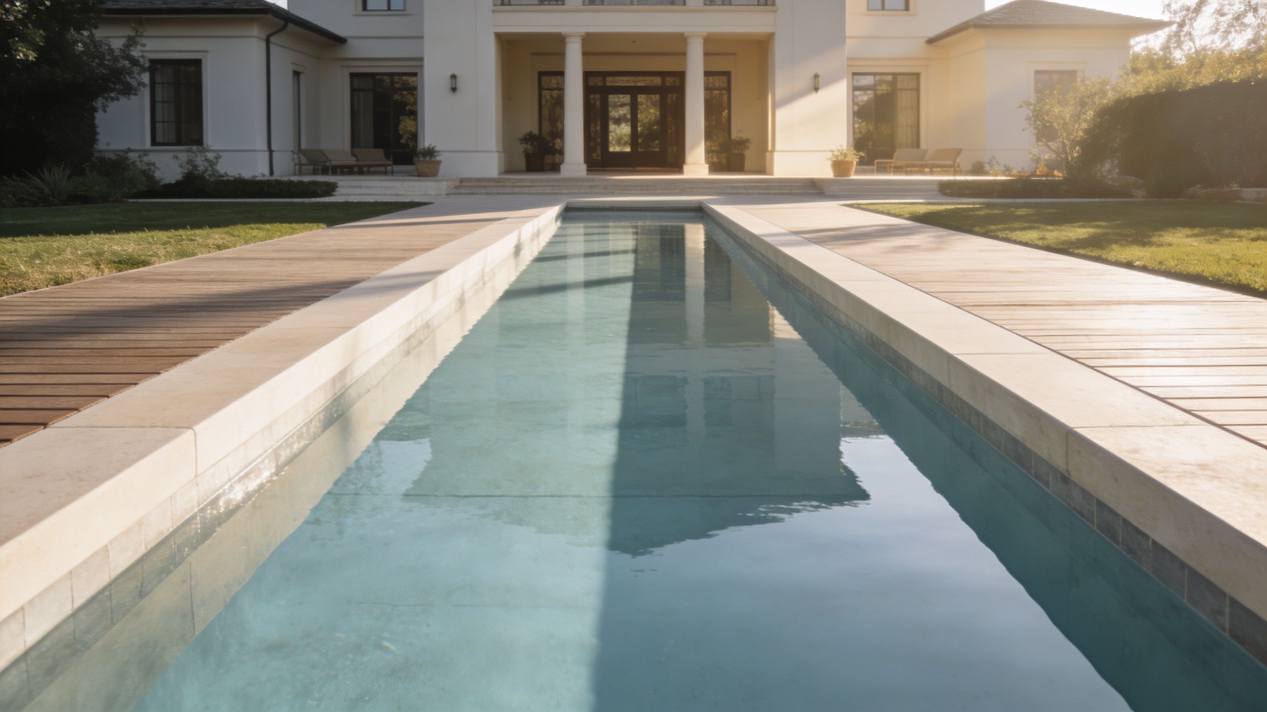
4. Compositional Framing for Leading Lines and Geometric Proportion in Pool Design
Composition is where documentation becomes authorship. A pool can be exquisitely designed and still photograph poorly if the frame ignores the geometry that gives the project its authority. Strong composition doesn’t decorate the design. It reveals the logic already built into it.
That’s why magazine-quality pool imagery nearly always feels calm. The photographer has chosen a clear idea for the frame. Symmetry, tension, progression, compression, release. Something is organizing the viewer’s attention.
This kind of discipline matters even more with modern pools, where small alignment errors become obvious fast. Houzz featured 34,489 modern pool photos as of April 2026, a useful reminder of how crowded the visual field is and how much clean, design-forward composition matters if you want work to stand out on Houzz’s modern pool gallery.
Read the design before you raise the camera
A formal lap pool wants different treatment than a freeform resort-style layout. One benefits from axial composition and disciplined edges. The other may need a frame that guides the eye through curves, planting mass, and layered amenities. If you shoot both with the same wide-angle habit, you flatten their differences.
Before photographing, identify what the designer was trying to make dominant. Is it the horizon line? The long vanishing edge? The relationship between pool and pavilion? Once that’s clear, let the composition reinforce it.
Jimmy Clemmons speaks directly to this editorial kind of framing in his advice on photography tips for architecture awards, and the same standards apply here.
Build hierarchy into the frame
Compositional strength often comes from simple decisions:
- Use edges as visual rails: Coping lines, lane-like proportions, and decking joints can pull the viewer toward the key feature.
- Place the horizon intentionally: A centered horizon often weakens tension unless the design is overtly symmetrical.
- Layer depth on purpose: Foreground furniture, midground water, and background architecture can create narrative progression when they’re kept clean.
The frame should answer one question immediately: what is the designer asking me to notice first?
Award submissions, editorial features, and premium portfolios all depend on this clarity. A stronger composition doesn’t just make a prettier photo. It makes the project easier to value.
5. Controlled Lighting Design with Supplemental Flash and Reflector Techniques
A designer walks me to the far end of the pool and points to the detail that sold the project. A floating stair, a stone reveal under the coping, a lounge court tucked beneath a deep overhang. Then the ambient exposure wipes it out. The water reads beautifully, but the feature that carries the design fee disappears into shadow.
That is the moment supplemental light earns its place.
Editorial-quality pool photography is not about flooding the scene with gear. It is about protecting hierarchy. If the viewer cannot read the shaded conversation pit, the step geometry, or the texture under a cantilever, the frame stops short of telling the full story. Documentation records the pool. A stronger portfolio image explains why the design is expensive.
Pool settings create hard lighting problems because the contrast is structural, not incidental. Sunlit water and pale paving can sit beside dark facades, recessed kitchens, or dense planting pockets. Left alone, the camera usually sacrifices one side of that equation. Supplemental flash and reflectors let you hold detail where the design needs attention.
Use fill to defend the design intent
The best fill light is almost invisible. It restores information without changing the character of the ambient scene.
Start with the area the designer would care about losing. That might be a submerged step edge, the finish on a ceiling above an outdoor room, or the face of a raised wall that shapes the pool composition. Expose the frame for the overall mood, then bring that one weak area up carefully. The goal is not even brightness. The goal is legibility.
Reflectors are usually the first tool I reach for in daylight. A white reflector gives a soft lift under overhangs and seating niches without announcing itself. Silver works when the fill source needs more reach, but it can turn specular surfaces harsh very quickly, especially around polished stone and moving water. Flash makes more sense when the target area is too far from the reflector, blocked by structure, or falling away as dusk deepens.
Small corrections read expensive
Restraint matters more here than output.
A pool image starts to feel cheap when the fill is obvious. You see it in brightened shadows that no longer match the direction of the sun, in overlit foreground furniture, or in steps that glow harder than the water beside them. The fix is simple. Lower the power, narrow the purpose, and compare frames.
A reliable working sequence looks like this:
- Identify the one dark zone that cannot be sacrificed: choose the feature that carries design value.
- Set ambient exposure first: keep the sky, water, and architectural lighting believable.
- Add the smallest amount of fill that solves the problem: one controlled correction is better than broad fill across the whole scene.
- Check edges and reflections: flash spilling onto water or glossy tile gives the trick away immediately.
I often place the light farther back than beginners expect and feather it across the subject rather than aiming it straight in. That preserves texture and avoids the flat, real-estate look that works against luxury presentation.
The magazine-editor mindset helps here. A publishable frame does more than show that a project exists. It directs the eye to the decision the designer wants respected. Supplemental light, used with discipline, keeps that decision visible.
6. Color Theory and White Balance Management for Water Features
A designer signs off on a refined palette. Pale limestone, warm teak, deep waterline tile, controlled amber lighting. Then the photographs come back and the stone looks peach, the water turns electric cyan, and the whole project feels cheaper than it is.
That failure usually starts with white balance.
Water is difficult because it records color from several places at once. Sky color, pool finish, depth, surrounding planting, adjacent hardscape, and artificial light all shift what the camera sees. A preset rarely survives that mix. The job is to decide which color relationship carries the design intent, then protect it from capture through final edit.
Treat water as both surface and light source
Still water behaves like a mirror until wind, circulation, or fountain action breaks the reflection. That changes color fast. A calm vanishing-edge basin may read cool and architectural. The same basin, photographed ten minutes later with underwater LEDs active and the sky falling darker, can pick up green, magenta, or amber contamination depending on the fixtures and nearby materials.
That is why I avoid chasing a generic “perfect blue.” Luxury work is judged by palette control, not by how saturated the water looks.
At blue hour, warm sconces and fire features should stay warm. At sunset, amber reflections across the water may be part of the design story, especially with travertine, limestone, or sand-toned finishes. Correcting all of that to neutral often strips out the atmosphere the designer paid for.
Set a color anchor before you start refining
Good files make editing faster and safer. I want one dependable neutral reference under the actual site lighting, then I build from there.
Use a disciplined workflow:
- Shoot RAW: compressed files collapse too quickly once you start correcting mixed light and reflective surfaces.
- Capture a neutral reference frame: a gray card or neutral target near the pool deck gives you a starting point tied to the scene, not to guesswork.
- Choose the priority tone: decide whether the hero color is the water, the stone, the façade lighting, or the sky.
- Correct in local zones when needed: underwater LEDs and outdoor lighting often need selective adjustment instead of one global white balance setting.
- Check skin, stone, and water together: if people are in frame, believable skin tone helps confirm whether the overall color treatment still feels credible.
This is where the magazine-editor mindset matters. A publishable image set does not let every frame drift into its own color logic. The sequence needs to feel intentional, as if one visual hand shaped the whole story.
Consistency signals value
A single strong frame can survive a small color bias. A full gallery cannot. If the water reads steel blue in one image, turquoise in the next, and gray-green in the third, the viewer stops reading design and starts noticing inconsistency.
The fix is restraint. Build one master interpretation of the project’s palette, then match the set to it. Keep whites clean without bleaching texture out of plaster and stone. Let warm architectural lighting stay warm without pushing the entire file orange. Preserve the coolness of evening water without making the house feel lifeless.
Good color grading in pool photography does one thing above all. It makes expensive materials look true to themselves.
7. Sequential and Series Photography for Before After and Design Process Documentation
A single hero shot is useful. A complete series is persuasive. Designers often invest all their energy in one cover-worthy image and then wonder why the project still feels underrepresented online, in submissions, or in proposal decks. The answer is usually that one frame can’t carry the full burden of the story.
Luxury buyers want confirmation. They want to see the broad gesture, then the transitions, then the craftsmanship, then the way the pool lives within the property. Editors think this way too. They build features as image sequences, not isolated trophies.
Think like a photo editor
Jeff Cable described a ruthless but efficient culling workflow after a swim meet, narrowing 3000 photos to 1200 favorites and then to 400 for sharing, along with quick Lightroom work for exposure and cropping in his swim meet camera strategy article. Different subject, same lesson. Coverage matters, and disciplined editing matters just as much.
For a luxury pool project, the useful sequence often includes:
- Establishing views: Show the pool in relation to house, surroundings, and approach.
- Medium frames: Explain terraces, lounging zones, outdoor kitchens, cabanas, and waterline relationships.
- Tight details: Prove finish quality and design precision.
Then add time-of-day variation if the project supports it. Daytime for geometry. Dusk for mood. Night for lighting intent. If the firm wants to market process, include progress photography or a before-and-after pair with matching vantage points.
Don’t confuse volume with coverage
More images aren’t better if they repeat the same information. Each frame should add a new layer to the argument for quality. That’s the editorial standard.
A resort marketing team might need a broad set that includes lifestyle use, service areas, and circulation. A design award submission might need restrained, highly controlled frames that emphasize formal language and craft. A developer might need the pool’s relationship to surrounding amenities. The sequence changes with the audience, but the principle holds. Build a visual narrative, not a folder of near-duplicates.
This is one of the most overlooked Photography Tips for Luxury Pool Designers because it requires planning before the shoot. But once you start thinking in series, your project pages become much more convincing.
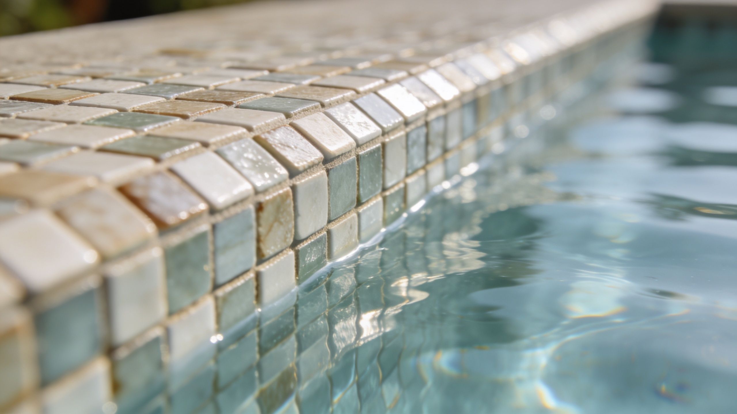
8. Detail and Texture Photography for Materials Finishes and Craftsmanship
A project gets shortlisted on atmosphere, then judged on evidence. For luxury pools, close detail is that evidence. It shows whether the material palette was merely expensive or resolved with discipline.
That means photographing craft with the same intent used for the hero shot. A tight frame of a flush drain, a perfectly handled radius in the coping, or a waterline tile transition with no visual noise can say more about design quality than another wide twilight view.
Show what the client paid for
Magazine editors look for proof. They want to see how one material dies into another, how the mason handled alignment at a corner, and whether the finish holds up under close inspection. Designers should want the same thing in a portfolio image set. A broad composition sells the setting. A detail frame supports the fee.
Light does most of the work here. Raking light from roughly 30 to 45 degrees reveals stone relief, aggregate, brushed metal, and slip-resistant textures without forcing contrast in post-production. Front light tends to flatten. Hard overhead sun can bleach pale materials and bury fine surface character in glare. If I need to show craft, I would rather wait for the right angle of light than fix a dead surface later on a monitor.
Focus and aperture need restraint. Stop down enough to hold the important plane sharp, but not so far that the frame starts to feel forensic. Luxury material photography should still feel editorial. Clinical sharpness can make a handcrafted surface look cold.
What deserves a close frame
Good detail coverage usually includes both finish selection and construction judgment:
- Material transitions: Coping to deck, tile to plaster, stone to metal trim, and any edge condition that shows precision.
- Waterline workmanship: Tile alignment, grout consistency, overflow edges, slot details, and how reflections interact with the finish.
- Integrated hardware: Drains, return fittings, grates, lights, and jets photographed as part of the design language, not hidden as liabilities.
- Surface character: Honed, flamed, brushed, acid-washed, exposed aggregate, or hand-finished textures shown under light that explains the difference.
One caution. Detail shots fail when scale disappears completely. Include just enough surrounding context to explain what the viewer is looking at. A beautiful abstract texture has limited value if a prospective client cannot tell whether it is coping, cladding, or interior finish.
Authentic surfaces matter here. Real photography records mineral variation, tiny alignment decisions, moisture, and wear patterns that renderings tend to smooth out. That honesty gives the image authority, especially for award entries, high-end proposals, and published project features.
Premium specifications do not explain themselves. The photograph has to make the workmanship legible.
8-Point Comparison: Luxury Pool Photography Tips
| Technique | Implementation Complexity 🔄 | Resource Requirements ⚡ | Expected Outcomes ⭐📊 | Ideal Use Cases 💡 | Key Advantages ⭐ |
|---|---|---|---|---|---|
| Golden Hour and Blue Hour Timing for Water Feature Photography | Medium, time‑sensitive scouting and timing | Low, tripod, planning; minimal gear | High, cinematic natural light, accurate ambiance | Showcase reflections, evening entertaining scenes, editorial imagery | Natural mood, minimal supplemental lighting, magazine‑ready |
| Drone Photography and Aerial Perspectives for Pool Landscape Context | High, certification, flight planning, regulatory coordination | High, professional drone, licensing, insurance, post‑processing | High, unique aerial context, scale, strong marketing impact | Site planning, estate listings, master‑planned communities | Reveals layout & scale; differentiates portfolio |
| Strategic Use of Polarizing Filters to Enhance Water and Reflections | Low, simple rotation and angle testing | Low, inexpensive filters, minimal setup | High, reduced glare, deeper water color, clearer detail | Daytime water reflections, tile visibility, reduction of specular highlights | Cost‑effective, immediate visual improvement |
| Compositional Framing: Leading Lines and Geometric Proportion in Pool Design | Medium‑High, advanced artistic judgment and vantage selection | Low, lens choice, time to explore angles | High, editorial‑quality, directional storytelling | Portfolios, editorial spreads, award submissions | Elevates perceived value; guides viewer attention |
| Controlled Lighting Design: Supplemental Flash and Reflector Techniques | High, technical flash control; needs assistants/crew | High, flash units, modifiers, stands, grip gear | High, consistent exposures, revealed architectural detail | Overcast or high‑contrast scenes, night balances, interiors | Predictable results; reveals materials; extends shooting windows |
| Color Theory and White Balance Management for Water Features | Medium, mixed‑light balancing and calibration | Low‑Medium, gray card, RAW workflow, color tools | High, accurate color, cohesive series, fewer corrections | Brand‑accurate representation, mixed light (natural + landscape) | Ensures color fidelity; reduces post‑processing risk |
| Sequential and Series Photography for Before/After and Design Process Documentation | High, coordination of multiple visits, times, and angles | Medium‑High, extended shoot time, storage, post work | High, comprehensive narrative, strong before/after impact | Process documentation, case studies, multifaceted marketing assets | Tells full project story; multiplies usable content |
| Detail and Texture Photography: Showcasing Materials, Finishes, and Craftsmanship | Medium, precise focus, careful lighting, composition | Medium, macro/close‑focus lenses, dedicated lighting | High, evidence of craftsmanship, persuasive close‑ups | Material showcases, manufacturer features, award entries | Justifies pricing; highlights build quality and finishes |
Develop Your Photographer's Eye
Mastering the photography of your work is part of the design process, not a marketing task tacked on at the end. Once the pool is complete, the photographs become the lasting version of the project that most future clients, editors, and award juries will experience. For many people, the images are the project.
That’s why strong luxury pool photography needs more than attractive light and a capable camera. It needs judgment. You have to know when a reflection helps and when it hides the tile line. You have to know when symmetry strengthens the frame and when it makes the image static. You have to know whether the story is really about the vessel itself, or about the way the pool completes a larger architectural composition. Those choices are what separate persuasive portfolio work from routine documentation.
The magazine-editor mindset is useful because it forces clarity. Every frame should earn its place. One image establishes the setting. Another proves the geometry. Another explains the circulation. Another justifies the material budget. Another shows what happens when the lighting design comes alive. When a full set works this way, the project stops feeling like a collection of nice photos and starts reading like a coherent feature.
That coherence matters commercially. Luxury buyers are looking for confidence. They want to see that the designer controls proportion, material, atmosphere, and finish at every scale. Your photography should communicate the same thing. It should say that this project was considered from the aerial view down to the waterline detail, from bright daylight to dusk, from broad composition to tactile surface. A strong image sequence tells clients that the design practice behind it is equally disciplined.
It also helps to accept a simple truth. Not every project needs every technique. Some pools are best at dawn because the architecture faces east and the water takes front light beautifully. Some need blue hour because the underwater lighting and surrounding grounds illumination are central to the concept. Some demand drone coverage because the core story is site planning. Others rise or fall on texture, craftsmanship, and precise color. The skill is in matching the approach to the project rather than forcing the same shot list onto every commission.
If you're photographing your own projects, start with one area of control and build from there. Get serious about timing before you buy more gear. Learn to read reflections before you reach for stronger editing. Practice making a three-image sequence that tells a complete story before trying to produce twenty images at once. Small improvements compound when they’re applied consistently across every finished project.
If you're hiring a photographer, brief them like a design partner, not a vendor asked to make things look nice. Explain what makes the project special. Point out the alignments, the view corridors, the material transitions, the lighting decisions, and the details the client almost missed during the install. The photographer who understands the design intent can translate it. The one who doesn’t will only record surfaces.
Strong photography protects the value of your work. It gives your portfolio authority, supports better presentations, strengthens editorial submissions, and helps future clients understand why your projects command attention. Start applying these Photography Tips for Luxury Pool Designers on the next completed pool, even if you only implement one or two. Your portfolio will become sharper, more consistent, and much harder to ignore.
When your pool designs need photography that reads with editorial discipline instead of generic property coverage, Jimmy Clemmons Photographer brings the right mix of architectural precision, lighting control, and narrative instinct. For architecture and design firms, developers, hospitality groups, and builders who want images that communicate design intent and enhance perceived value, Jimmy delivers crafted visual stories that feel as intentional as the spaces themselves.