

The deadline for the annual architecture awards is approaching. Your team has poured years into a landmark project, and now it comes down to the images you submit. In most firms, that’s the moment when everyone realizes the building isn’t being judged in person. It’s being judged through a few frames, on a screen, often in quick succession.
That changes the job of the photographer.
An award submission isn’t a project archive, and it isn’t a marketing gallery. Architects’ portfolios often run to 50-100 images, while awards entries may allow only 3-5 images. That gap is where strong projects either gain authority or disappear. If you can only show a handful of photographs, each one has to work harder. It has to carry design intent, atmosphere, technical clarity, and enough narrative force to make a jury stop.
That’s why the best Photography Tips for Architecture Awards have less to do with collecting pretty views and more to do with editing, sequencing, and intent. You need the hero shot, yes, but you also need proof. Proof of function. Proof of craft. Proof that light, material, orientation, and human use weren’t accidents.
Magazine work teaches the same discipline. A feature doesn’t survive on one good cover image. It needs an opening frame, supporting frames, quiet details, and a closing image that leaves a strong aftertaste. Award photography works the same way. The strongest entries feel authored.
What follows is practical, field-tested guidance for making images that do more than describe a building. They argue for it. They show jurors what matters, in the right order, with no wasted frames.
1. Master Golden Hour and Blue Hour Lighting
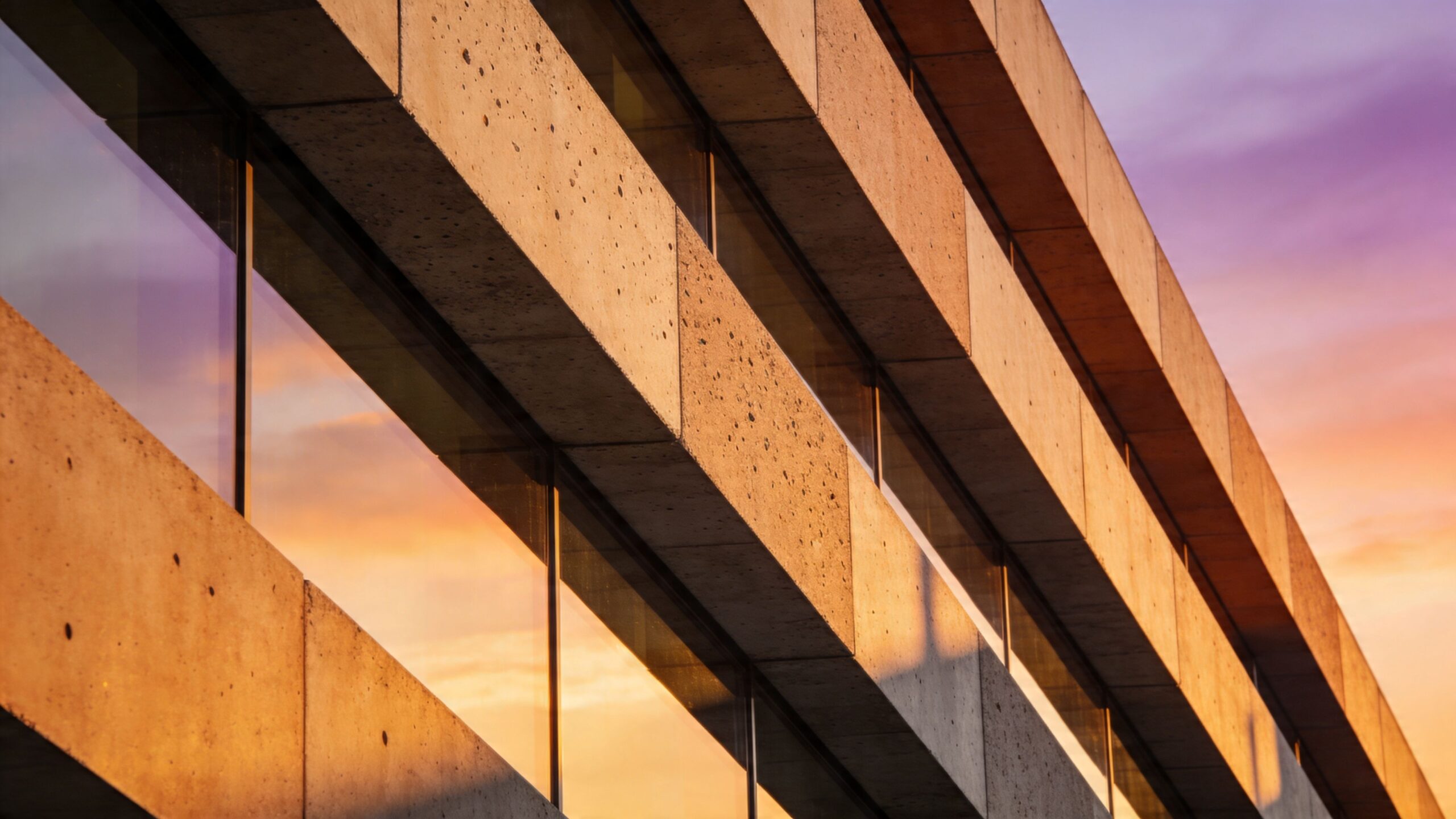
Light is the first editor of architecture. Before composition, before retouching, before sequencing, light decides whether a building reads as flat documentation or as lived form with depth and presence.
Golden hour gives you direction. Blue hour gives you balance. Both are useful, but they solve different problems. Golden hour is often the better choice when you need to reveal massing, texture, and shadow lines across concrete, brick, timber, or metal. Blue hour is where glazed buildings, hospitality projects, and residences with strong interior lighting often come alive because interior and exterior values sit closer together.
Match the light to the story
A museum with deep overhangs may need early or late directional light to separate planes. A corporate lobby with a luminous interior ceiling may need twilight, when the exterior sky still holds color and the glass doesn’t blow out into white. A campus building can require both, especially if the submission needs one image that explains context and another that shows occupancy and transparency.
Architecture Photography Awards notes that wide-angle views, human elements for scale, and careful use of time of day help communicate architecture in a way judges value. In practice, that means you don’t ask, “When is the light pretty?” You ask, “When does the design read most clearly?”
Practical rule: Don’t book a single arrival time and hope for the best. Book the story first, then assign the light.
What works and what doesn’t
What works is arriving early, scouting in daylight, and knowing exactly where the sun will strike the façade, plaza, or main interior view. What doesn’t work is treating golden hour as a magic filter. If the key elevation faces the wrong way, warm light won’t save it. It may flatten the building or leave the most important façade dead.
A few field habits matter every time:
- Scout your angles first: Use tools like Google Earth or Instagram during prep to identify likely camera positions before shoot day.
- Shoot RAW for flexibility: Backlit edges, reflective glazing, and bright sky transitions are easier to manage when the file holds highlight and shadow detail.
- Coordinate building lighting: For blue hour, ask the client to turn on interior, grounds, and signage lighting before the window closes.
Plan for more than one weather condition
Golden hour is valuable, but awards juries also respond to buildings shown under changing environmental conditions. Julia Anna Gospodarou’s discussion of award-winning work stresses that photographers should document buildings across different weather and times of day, not only in the most flattering sunset light. That discipline matters because it shows performance, mood, and adaptability, not just appearance.
If I’m covering a project that depends on daylighting, transparency, or thermal control, I want more than one lighting condition in the edit. One atmospheric frame is memorable. A small set that proves the building’s behavior is stronger.
2. Compose Using Leading Lines and Geometric Framework
Most weak award submissions fail long before post-production. They fail in camera because the photographer saw objects instead of structure. Architecture doesn’t reward casual framing. It rewards decisions.
The strongest compositions use the building’s own geometry as a visual argument. Corridors pull the eye forward. Stair rails create momentum. Window grids establish rhythm. Structural bays can either calm an image or energize it, depending on where you place the frame.
Build the frame from the building
Good architectural composition starts by reducing the scene to volumes, lines, and voids. Julia Anna Gospodarou emphasizes diagonals, leading lines, shadows, and the relationship between positive and negative space as the foundation of strong work. That’s exactly right. A building has to be translated from three-dimensional space into a two-dimensional image without losing depth.
If the lines aren’t doing work, the image is probably decorative rather than persuasive.
For a deeper look at how structure drives visual order, Jimmy Clemmons’ guide on architectural composition is useful because it treats composition as a design discipline, not a bag of tricks.
A strong frame gives the viewer somewhere to enter, somewhere to travel, and somewhere to stop.
Symmetry is useful, but not always correct
Symmetry is powerful when the architecture itself is formal, axial, or ceremonial. Atriums, galleries, civic entries, and colonnades often benefit from a centered composition because it reinforces order. But symmetry becomes a crutch when photographers apply it to every subject. Some spaces need tension. A diagonal stair, a layered threshold, or a compressed-to-open circulation sequence often reads better with an off-center frame.
What usually works:
- Leading lines with a destination: Hallways, canopies, paths, and facade joints should pull the eye toward the key design move.
- Foreground structure: A wall edge, opening, or railing can create depth without clutter.
- Negative space with purpose: Sky, blank wall, or shadow should clarify the form, not just fill the frame.
What usually fails:
- Overwide views with no hierarchy: You can see everything, but nothing matters.
- Uncorrected verticals: If the building looks like it’s falling backward, the jury notices.
- Busy frames with competing axes: Too many signals and the image loses authority.
Test more than one geometry
At a good location, I’ll often shoot the same scene in at least three compositional modes. One symmetrical. One diagonal. One layered with a strong foreground anchor. The comparison is revealing. The building usually tells you which one is honest.
That’s the difference between recording architecture and composing it for awards. You’re not hunting a pretty angle. You’re building a readable frame that carries intent.
3. Control and Use Artificial Lighting Strategically
Natural light is often beautiful, but it isn’t always sufficient. Interiors, deep overhangs, shaded entries, and mixed-light environments regularly need intervention if you want a frame that feels controlled rather than compromised.
A key distinction among submissions emerges here. One set of images respects the architecture’s lighting design and spatial hierarchy. The other set settles for whatever ambient light happened to be there.
For interiors especially, supplemental lighting isn’t about making the image brighter. It’s about directing attention, controlling contrast, and preserving the architect’s intent when the camera sees the room differently than the eye does.
Add light without advertising it
In award photography, artificial light should support the architecture, not perform for itself. I want a fixture, flash, or continuous source to reveal ceiling volume, wall texture, or a circulation path. I don’t want the viewer to think about where I put the light stand.
That usually means working indirectly. Bouncing into ceilings. Feathering light across a wall instead of blasting it straight on. Letting practical fixtures stay believable while adding just enough shape to keep the room from collapsing into murk.
A helpful companion read is Jimmy Clemmons’ piece on lighting for interior photography, which gets into the balancing act between ambient atmosphere and image clarity.
Here’s a useful demonstration of how architectural shooters think through interior light shaping and balance:
When to intervene and when to leave it alone
If an interior has excellent daylight, clean glazing, and a strong lighting scheme already in place, I’ll disturb as little as possible. Minimal intervention often preserves the character of the design. But if the room includes dark ceiling pockets, hot windows, or dead corners that are important to the spatial reading, that’s where controlled supplemental light earns its place.
The classic mistake is overlighting. Too much fill kills the mood, flattens material variation, and makes the space look more like a catalog set than a designed environment.
A better approach is selective:
- Lift critical shadows: Bring back detail where the design would otherwise disappear.
- Support texture: Light across a surface, not directly into it, when material quality matters.
- Preserve practical sources: Let sconces, pendants, and cove lighting still feel like they belong to the architecture.
On-set reminder: If the room no longer feels like the room, the lighting setup has gone too far.
Mixed color temperature needs discipline
Many award entries lose sophistication because the color is incoherent. Daylight from one side, warm practicals from another, and green spill from a nearby source can make excellent architecture feel unresolved. Sometimes that mix is part of the authentic experience and worth preserving. More often, it needs to be tamed.
Good architectural lighting control means deciding what the dominant color story should be and shaping the file toward it. If the architect designed a warm hospitality interior against a cool twilight exterior, keep that conversation. If the image just feels muddy, clean it up before the jury ever sees it.
4. Implement Advanced Post-Processing and Exposure Blending
Editing is where architectural photography either keeps its credibility or loses it. Awards juries don’t need sterile files, but they also don’t reward heavy-handed processing that turns a building into illustration.
The best post-production is disciplined and almost invisible. It removes distractions, restores balance, and protects the design logic that was already present on site. It doesn’t invent drama that wasn’t there.
Blend for clarity, not spectacle
Backlighting is one of the hardest conditions to handle cleanly. Julia Anna Gospodarou points to exposure bracketing and blending as a practical solution when the sun sits behind the subject and the building and sky need different treatment. That’s a real-world technique, not a stylistic gimmick. You expose for structure, expose for sky, then blend with restraint so tonal balance feels coherent.
The keyword is restraint.
What works is making the image feel like the building on its best day. What doesn’t work is crunchy HDR halos, radioactive grass, glowing window edges, or shadow recovery so aggressive that the file stops feeling photographic.
The edit has to hold together as a series
One polished image isn’t enough. Award submissions live or die as a group. If one frame is cool and neutral, the next is warm and saturated, and the third has aggressive perspective correction, the set feels assembled rather than authored.
A solid workflow usually follows this order:
- Correct perspective first: Vertical and horizontal discipline affects how every later adjustment reads.
- Set color temperature consistently: Especially across interior and exterior frames in the same submission.
- Blend only where needed: Keep local corrections targeted instead of global and heavy.
- Retouch distractions carefully: Exit signs, cords, stains, and temporary clutter matter, but over-cleaning can make a building feel unreal.
Don’t let software overwrite judgment
Lightroom, Capture One, and Photoshop are powerful, but presets can make photographers lazy. Architectural work demands case-by-case judgment because every room, facade, and glazing condition behaves differently. A twilight exterior, a daylight office, and a museum gallery don’t want the same curve or saturation treatment.
The strongest retouching leaves the architecture intact and the photographer invisible.
One practical habit helps more than any software trick. Step away from the image, come back later, and ask a blunt question: does this still feel like a building, or does it feel like an effect? If the answer is “effect,” pull it back.
Award photography doesn’t need flashy editing. It needs editing that supports evidence. Jurors should remember the architecture, not your sliders.
5. Showcase Material Detail and Surface Texture Through Lighting and Focus
Awards don’t only recognize form. They recognize decisions. Material selection, detailing, and craft often carry as much design intelligence as the massing or plan, and your photographs need to prove that.
That means detail images can’t be filler. They have to connect material to concept.
A timber handrail, a stone reveal, a perforated metal screen, a glazing junction, or the way sunlight drags across a board-formed wall can say more about the project’s seriousness than another generic wide shot ever will. The key is to show detail without severing it from the larger narrative.
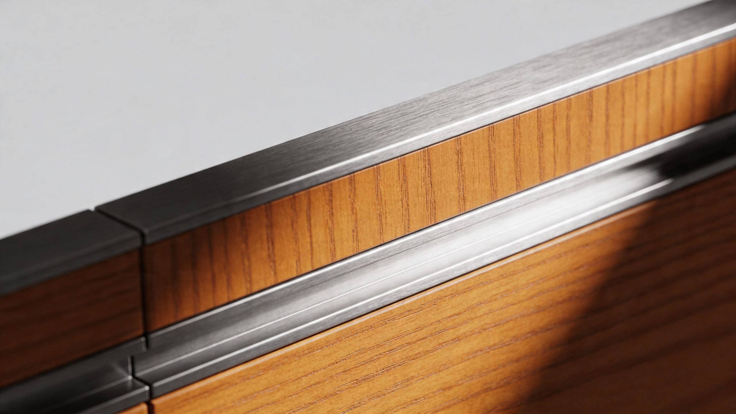
Light across the surface, not straight at it
Texture shows itself when light rakes across it. Straight, flat illumination often hides the very craftsmanship you’re trying to reveal. Wood grain loses depth. Stone looks dull. Metal reads as a vague gray plane instead of a finish with character.
For detail work, small shifts in camera position and light direction matter more than photographers expect. Move a few feet. Wait for the sun to travel. Turn on or off a nearby practical. The difference between “nice detail” and “jury remembers this” is often that small.
Useful patterns in the field:
- Show material in context first: Let the jury understand where the finish belongs.
- Then isolate the detail: Tighten the frame to reveal joinery, surface, or edge condition.
- Keep the plane sharp where it matters: Don’t hide weak focus behind shallow depth of field unless that softness serves a clear purpose.
Detail images still need design discipline
A close-up isn’t exempt from composition. Lines still matter. Background still matters. Reflections still matter. If you’re photographing a custom millwork corner or a steel connection, watch for tangents, hot spots, and distracting overlaps that cheapen the frame.
I like detail images that do one of two things. They either explain a construction idea clearly, or they create a tactile pause inside the larger series. The best ones do both.
Material photographs should answer an unspoken question from the jury: was this building merely designed well, or was it also made well?
Don’t confuse detail with decoration
Some photographers treat detail shots as visual garnish. They grab a faucet, a chair edge, a bit of tile, and move on. That can work for lifestyle coverage, but awards juries need details that support the architectural thesis. Photograph what is specific to the project, not what could belong anywhere.
If the project uses locally expressive materials, unusual fabrication, careful solar control devices, or refined transitions between systems, those deserve attention. A strong detail image says, “Look at the level of thought embedded in this building.” That’s a persuasive sentence, even when it’s spoken only through a frame.
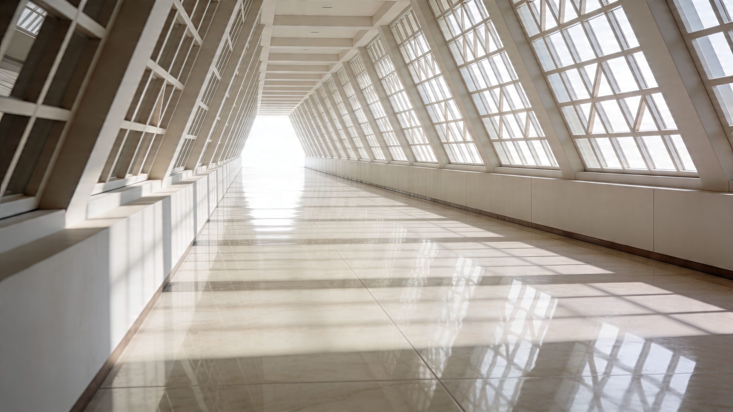
6. Capture Spatial Relationships and Architectural Flow
The jury opens the submission and sees six polished frames. Each one works on its own. Together, they still fail to explain the building. That gap is usually not about exposure or composition. It is about sequence.
Architecture awards are rarely won by isolated hero shots alone. A strong entry shows how the project is experienced over time. It lets the jury understand approach, entry, compression, release, orientation, and connection. If those relationships stay unclear, the work reads as a set of attractive fragments rather than a resolved piece of architecture.
Photograph movement through the building
Circulation often carries the clearest evidence of design intelligence. The way a stair turns toward light, the way a corridor widens before a shared space, the way a threshold resets scale. Those are the moments that explain planning.
This usually means spending time on images that are less obviously spectacular. A landing between floors may tell the story better than the double-height room it leads to. A view through two or three aligned openings can reveal hierarchy, privacy, and orientation in one frame.
Wide lenses help, but discipline matters more than focal length. Go wide enough to show spatial relationships. Stop before verticals start to feel unstable or room proportions become inflated. If a 16mm frame makes the building look more dramatic than it feels in person, that image may weaken the submission instead of helping it.
A few approaches consistently work:
- Frame through thresholds: Doors, screens, and portals help show depth and progression.
- Hold multiple planes in the image: Foreground, middle ground, and background make adjacency legible.
- Show where the eye travels next: A good circulation image creates anticipation.
- Keep the geometry honest: Correct perspective enough to preserve intent, not so much that the space feels flattened.
Use people with restraint and purpose
Human presence often clarifies a circulation photograph. One figure crossing a bridge, pausing at a railing, or entering a pool of light can establish scale and explain how the space is used.
The choice is tactical. Too many people and the frame becomes an occupancy study. Too little life and the building can feel abstracted from its purpose. For awards, I usually want people to support the reading of the architecture, not compete with it.
Timing matters as much as placement. A single person at the point where the plan changes direction can do more than a crowded room ever will.
Build a sequence, not a stack of unrelated views
Editorial discipline helps here. Instead of asking whether each image is strong alone, ask whether each image earns its place in the set. A convincing series often starts outside, crosses the threshold, establishes the primary volume, then explains how secondary spaces branch, connect, or unfold. That structure gives the jury a mental map.
I often review contact sheets with one question in mind: can someone who has never visited this project understand how it works after ten images? If the answer is no, the shoot still has a gap.
The best spatial photographs do more than describe rooms. They reveal intent. They show how the architect organized experience, controlled pace, and directed attention from one moment to the next. That is the level awards juries look for.
7. Collaborate Strategically with Architects and Design Teams
Award-winning photography starts well before the camera comes out. If the first serious conversation about the shoot happens on site, you’re already behind.
Strong architectural images come from alignment. The photographer needs to understand what the architect believes is important, what the client wants the jury to notice, and which design moves distinguish the project from other entries. Without that, even technically polished images can miss the point.
Get the design intent in plain language
Before a shoot, I want someone on the design team to explain the project without jargon. What was the central problem? What was the key move? What should a jury understand after seeing the images? If the answer is vague, the photography will usually be vague too.
That conversation also clarifies practical priorities. Some projects need sustainability elements shown clearly. Others need context, craft, circulation, or public use. For awards such as the Holcim Awards or the RIBA Sustainability Award, the submitted images may need to communicate factors like glazing orientation, energy production, thermal performance, or material sourcing, not just visual appeal. Those requirements were noted in the earlier guidance on award submissions, and they change the shot list materially.
A useful pre-shoot collaboration process
The best teams don’t improvise the whole day. They prepare enough to be precise, but not so much that they become rigid.
A productive workflow usually includes:
- Review drawings and site plans: They help identify axes, approach sequences, and view corridors.
- Walk the project with the architect: That reveals which moments carry the design argument.
- Agree on must-have frames: Hero images matter, but so do proof images that support the written submission.
- Clarify logistics: Lighting controls, access, furniture styling, grounds readiness, and occupancy all affect the result.
Push back when needed
Collaboration doesn’t mean saying yes to every requested angle. Architects sometimes ask for views that matter emotionally to them but don’t translate into clear photographs. Photographers need to explain that trade-off clearly.
If a requested image confuses scale, muddies circulation, or undermines the series, I’ll usually make the frame for record purposes, then propose a stronger alternative beside it. That conversation is part of the job. A photographer serves the project best by protecting how it reads.
The architect brings design intent. The photographer brings visual judgment. Award images need both.
The strongest working relationships feel editorial. Everyone understands the story, the audience, and the standard. Once that happens, the shoot stops being a coverage exercise and becomes a focused act of translation.
8. Build Comprehensive Series and Develop Signature Aesthetic
A single hero shot can get attention. It rarely carries an awards submission by itself. Jurors are usually evaluating whether a project holds together as a body of evidence, and your image set has to prove that the architecture is coherent from the street to the smallest crafted moment.
That’s why series building matters as much as any individual frame. You’re not submitting highlights. You’re submitting an argument.
Think like a picture editor
Editorial work teaches a simple lesson. A memorable feature has rhythm. It opens decisively, expands intelligently, pauses on detail, and finishes with intention. Architecture awards reward the same discipline.
A strong series usually includes an establishing exterior, one or more context frames, key interiors, transitional views that explain movement, and selected details that prove craft and specificity. It doesn’t feel repetitive, and it doesn’t leave obvious gaps.
For photographers who want to see how renovation and design stories can be shaped with editorial logic, Jimmy Clemmons’ article on turning renovations into magazine features is a helpful reference point.
Curation beats coverage
One of the most important realities of award submission photography is that more images don’t make a stronger case. Better sequencing does. If the same idea appears three times, cut two of them. If a frame is beautiful but doesn’t add new information, it’s slowing the series down.
The images that survive curation usually fall into distinct roles:
- Opening image: Announces the project with authority.
- Context image: Places the building in site, street, or natural setting.
- Primary spatial images: Show the core design moves.
- Detail images: Demonstrate material intelligence and craft.
- Human or use image: Confirms lived scale and occupancy.
- Closing image: Leaves the jury with mood, memory, or resolution.
Style matters, but it can’t become a filter
A signature aesthetic is useful because it makes the submission feel authored. Consistent color handling, tonal restraint, framing discipline, and a clear sense of visual taste all help. But style should never overpower the project. The strongest photographers adapt their voice to the building rather than forcing every commission into the same visual mold.
That’s the trade-off. Too little aesthetic consistency and the set feels generic. Too much and the architecture starts serving the photographer’s brand instead of the award entry.
When a series really works, the jury feels guided. They understand the building quickly, then more thoroughly. The submission feels calm, deliberate, and complete. That’s the effect you want. Not a folder of strong pictures, but a cohesive visual narrative with a point of view.
Architecture Award Photography: 8-Point Comparison
A jury rarely sees the weather delay, the access fight, or the hour spent shifting furniture back into alignment. They only see the final edit. This comparison matters because each of these eight practices asks for a different kind of effort, and each pays off in a different way across a submission series.
The key trade-off is simple. Some techniques improve a single frame fast. Others strengthen the whole narrative of the project, which is usually what separates a polished entry from a memorable one.
| Title | Implementation Complexity 🔄 | Resource Requirements ⚡ | Expected Outcomes ⭐📊 | Ideal Use Cases | Key Advantages 💡 |
|---|---|---|---|---|---|
| Master Golden Hour and Blue Hour Lighting | Medium. Requires timing, scouting, and weather discipline | Low. Tripod, filters, scouting time, minimal crew | High ⭐📊. Rich color separation, natural depth, stronger exterior atmosphere | Exterior facades, twilight cityscapes, marketing and awards | Scout in advance, shoot RAW, use graduated ND filters with restraint |
| Compose Using Leading Lines and Geometric Framework | Medium. Depends on vantage control and repetition in the field | Low. Standard lenses, tripod, occasional elevated access | High ⭐📊. Fast visual clarity and stronger reading of form | Interiors, staircases, corridors, editorial covers | Use viewfinder grids, test both symmetric and off-axis framings |
| Control and Use Artificial Lighting Strategically | High. Demands technical setup and fast problem-solving on site | High. HMI/LEDs/flash, crew, power access, permits | High ⭐📊. Cleaner mixed light, repeatable results, stronger editorial polish | Mixed-light interiors, night exteriors, hospitality, museums | Test early, meter carefully, diffuse to support the architecture rather than overpower it |
| Implement Advanced Post-Processing and Exposure Blending | High. Requires editing judgment as much as software skill | Medium to High. Capture One or Photoshop, storage, experienced retouching workflow | Very High ⭐📊. Balanced exposures, corrected perspective, polished final files | Award submissions, publication features, complex lighting scenes | Shoot brackets, use luminosity masks, keep tonal corrections believable |
| Showcase Material Detail and Surface Texture Through Lighting and Focus | Medium. Calls for precise metering and close control of focus | Low to Medium. Prime or macro lenses, small lights, extra time onsite | Medium to High ⭐📊. Detail frames that prove craft and material intent | AIA entries, design editorials, high-end real estate | Identify key materials during the scout and pair detail shots with wider views |
| Capture Spatial Relationships and Architectural Flow | High. Requires sophisticated framing and strategic access | Medium. Wide-angle lenses, access to mezzanines or roofs, possible assistant | High ⭐📊. Clear communication of circulation, hierarchy, and design logic | Workplaces, museums, education, hospitality, masterplans | Walk circulation routes during the scout and build depth through layered framing |
| Collaborate Strategically with Architects and Design Teams | Medium. Requires coordination before and after the shoot | Low to Medium. Meeting time, plan access, shared references | High ⭐📊. Better alignment on story, smoother approvals, stronger submissions | Award submissions, editorial features, branded projects | Hold a focused pre-shoot brief, review priorities, confirm what the jury needs to understand |
| Build Cohesive Series and Develop Signature Aesthetic | High. Requires planning, selective shooting, and disciplined editing | High. Multiple shoot days, heavy edit time, consistent workflow | Very High ⭐📊. Cohesive portfolio, recognizable visual voice, stronger award submissions | Awards, magazine features, studio branding and marketing | Prepare a clear shot list, shoot with options, then edit down to the frames that carry the narrative |
Use the table as a planning tool, not a checklist. A small residential project may benefit more from disciplined sequencing and material detail than from a large lighting package. A museum or hotel often needs the opposite. The strongest award entries match production effort to the story the building can support.
Your Blueprint for an Award-Winning Submission
The deadline is close. The entry form allows only a handful of images. The project itself is rich, layered, and difficult to summarize in a few frames. This defines the assignment in award photography. The job is not merely to record a building well. The job is to edit a visual argument that a jury can understand quickly and remember later.
Architects design in space, sequence, material, and light. Photographers have to convert those qualities into still images without flattening the project into a set of attractive fragments. In practice, that means working under imperfect weather, restricted access, active sites, budget limits, and submission rules that leave no room for wasted frames.
Discipline decides the outcome.
The strongest award images come from clear priorities. Choose light that explains form. Frame the building with intent instead of forcing style onto it. Use supplemental lighting only when it clarifies the architecture. Retouch enough to remove distractions, not enough to erase the truth of the place. Include detail where craftsmanship matters. Include wider views where circulation, context, or spatial hierarchy matter more. Then cut hard and build the final set as a sequence, because awards are usually won by a body of work that holds together, not by one hero shot carrying the whole submission.
That editorial standard is what separates routine project coverage from award work. In magazine assignments, every frame has a role. One image opens the story with authority. Another gives context. Another slows the viewer down and reveals material intelligence. Award submissions benefit from the same discipline. Jurors rarely know the project as intimately as the design team does, so the photographs need to explain the design clearly, in the right order, and without visual clutter.
I have seen strong buildings underperform because the image set was too broad, too repetitive, or too polite. A general marketing shoot often aims to cover everything for future use. An awards submission needs a sharper point of view. Sometimes that means skipping a perfectly good image because it repeats information. Sometimes it means prioritizing a circulation sequence, a sectionally revealing interior, or a twilight exterior that connects the project’s public presence to its interior atmosphere. The building stays the same. The argument changes.
Good collaboration improves that argument early. When the architect, photographer, and communications team agree on what the jury needs to understand, the shoot gets more focused. Access requests become smarter. Styling choices get easier. Time goes toward the images that can carry the submission instead of broad coverage that will never survive the final edit.
The finished set should feel calm, precise, and inevitable.
It never happens by accident. It comes from scouting, scheduling, technical control, patient editing, and a willingness to leave out images that are good on their own but weak in sequence. That is one of the hardest trade-offs in this field, especially when a team is attached to certain views. Awards juries respond to coherence.
If an awards deadline is approaching, treat photography as part of the submission strategy from the start of planning. A photographer with an editorial background brings more than exposure control and perspective correction. The value is judgment. Which image should lead. Which one earns its place. Which one explains the project best under tight viewing conditions. For firms looking in Atlanta or beyond, Jimmy Clemmons Photographer is one relevant option for that type of assignment, with a practice centered on architectural imagery and an editorial approach to visual storytelling.
Strong architecture needs clear visual advocacy. During awards season, the image set often makes the case before a single project statement is read.