

A building can be beautifully designed and still photograph badly.
You have probably seen the result. The lobby looks bigger than it feels in person, but not in a flattering way. The tower seems to taper unnaturally. Window lines drift. Corners darken. A carefully proportioned facade starts to look like a graphic effect instead of architecture. For architects, designers, developers, and brand teams, that is not a small issue. It changes how the work is understood.
Wide-angle lenses are often the right tool for architectural photography because they let a camera hold space, context, and sequence in one frame. They can show how a building sits on its site. They can make a compact interior readable. They can preserve the relationship between foreground materials and the larger volume beyond. But the same lens that solves the access problem can create a proportion problem.
That tension has been with photography from the beginning. The Harrison & Schnitzer Globe lens, introduced in 1862, marked the first successful wide-angle lens for photography, with a 92° maximum field of view according to the history of photographic lens design. From that early milestone forward, lens design kept pushing toward broader views with better control. The goal was to do more than fit more into the frame. It was to do so without destroying the geometry that gives architecture its meaning.
Clients usually describe the problem in plain language. “It feels stretched.” “The room looks false.” “The building looks like it’s falling back.” Those reactions are useful. They point to the same professional standard: a wide image should feel expansive without becoming deceptive.
That is where good architectural photography separates itself from casual real estate coverage. The job is not to make a room seem as large as possible or a facade as dramatic as possible. The job is to make the image serve the design intent. Sometimes that means using a wider lens. Sometimes it means stepping back and using a longer one. Sometimes it means leaving space around the frame because correction later will matter.
Capturing Grandeur Without Distortion
A wide-angle image usually gets commissioned for a simple reason. The client wants scale, context, and atmosphere in a single photograph.
An architect may need an exterior hero image that shows massing, street presence, and material transitions. An interior designer may need a hospitality room to feel open while still reading accurately. A marketing team may want a headquarters lobby to communicate brand confidence. In each case, the lens decision affects more than composition. It affects trust.
When a big view becomes a false view
The common mistake is not using a wide-angle lens. The common mistake is using one without respecting what it does to space.
Stand too close and the foreground swells while the background recedes too aggressively. Tilt the camera up and vertical lines begin to converge. Push correction too hard later and the building regains straight edges but loses believable proportions. The image may still look polished, but anyone who knows the project can feel that something is off.
That matters because architecture is judged through ratios. Door height against ceiling height. Mullion spacing against facade rhythm. Seating scale against room volume. Once those relationships drift too far, the image stops documenting and starts distorting.
Grandeur depends on control
Wide-angle photography is not about making everything look larger. It is about deciding what should feel present in the frame and what should stay proportionally restrained.
A strong architectural image can feel expansive without shouting “wide lens.” That is usually the sweet spot. The viewer notices the design first, not the optics.
A wide-angle lens succeeds when it gives the viewer spatial clarity. If the lens draws attention to itself, the image usually needs another pass.
This is the standard behind Wide-Angle Lenses and Building Proportions. The lens is there to reveal architecture, not reinterpret it.
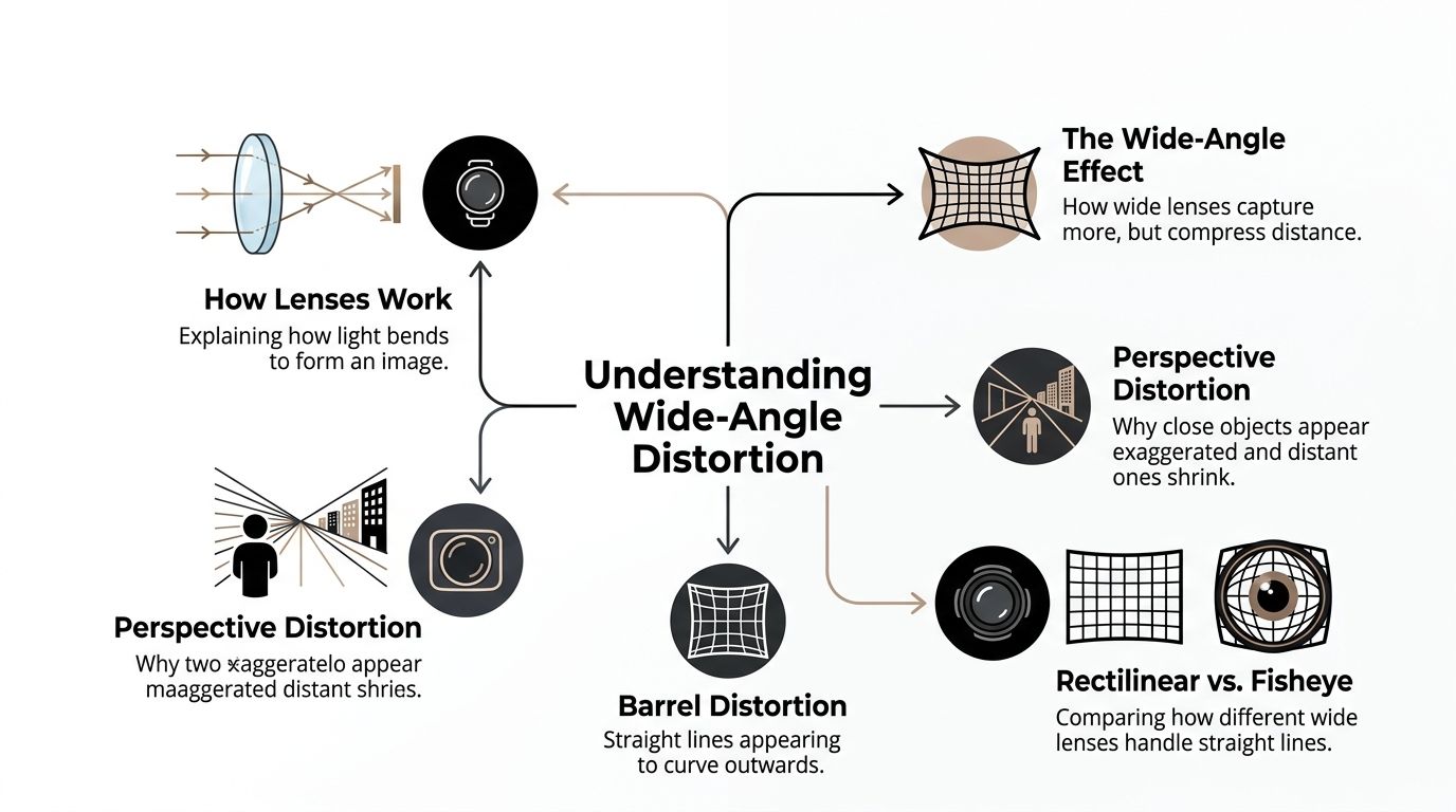
The Physics of Perception Why Wide Lenses Warp Space
The easiest way to understand wide-angle distortion is to think about flattening a curved world onto a flat surface. A lens gathers a broad scene, then projects it onto a rectangular sensor. The wider the scene, the harder that translation becomes near the frame edges.
That does not automatically mean the lens is bad. It means geometry has consequences.
What counts as wide-angle
On 35mm format, any focal length of 35mm or less is considered wide-angle, and common options include 35mm, 28mm, 24mm, 21mm, 20mm, 18mm, and 14mm, while the frame diagonal measures 43.3mm and a 50mm lens is considered normal by convention, as outlined in this overview of the wide-angle lens standard.
Those numbers matter because focal length changes how spatial relationships read. A 35mm view can feel open but still restrained. A 24mm view can hold a room or a facade more easily. Move into the ultra-wide range and the frame becomes harder to manage at the edges.
Perspective distortion and lens distortion are not the same
Clients often group every problem under “distortion,” but there are two different causes.
Perspective distortion comes from camera position. If the camera is too close, objects nearest the lens become dominant. If the camera is tilted upward, verticals converge. The building appears to lean because the camera was angled, not because the lens is defective.
Lens distortion comes from optics. Barrel distortion causes straight lines to bow outward. Rectilinear wide-angle lenses are designed to keep straight lines straight, but even they stretch objects near the frame edge as they map a wide scene onto a flat image.
The difference matters because the remedies differ. You fix perspective by changing position and camera alignment. You fix lens distortion with lens choice and correction profiles.
Why the edges feel strange
A useful benchmark comes from rectilinear design itself. A 14mm rectilinear lens can make foreground elements appear up to 1.5 to 2x larger relative to the center, which is why chairs, counters, paving, or entry canopies can suddenly feel oversized in the corners, according to this explanation of wide-angle lens projections.
That edge stretch is why a small object near the camera can dominate a frame that was supposed to be about the room or building beyond it. It is also why a wide view can feel less accurate even when all the lines remain technically straight.
For teams that care about composition as much as geometry, the visual logic behind this is worth understanding. This breakdown of architectural composition principles is useful because lens behavior and composition choices are inseparable in practice.
What clients usually notice first
Most non-photographers do not walk through an image identifying projection formulas. They react to symptoms.
- Leaning verticals signal that the camera was tilted.
- Bulging edges make walls, casework, or facade lines feel unstable.
- Oversized foreground objects make interiors feel misleading.
- Compressed distance can make circulation areas feel shorter than they are.
If a viewer comments that the image “doesn’t feel like the space,” they are often responding to perspective first and optics second.
That is why good wide-angle architectural photography starts with a discipline of position, height, and alignment. The physics are built into the lens. The craft lies in deciding how much of that behavior the final image should reveal.
Controlling Proportions In-Camera Before the First Click
The best correction happens before the shutter fires.
Software can rescue a frame, but every strong architectural workflow starts with the same assumption: if the camera position is wrong, post-production becomes damage control. If the camera position is right, post becomes refinement.
A short video can help clarify how quickly perspective shifts when camera position changes.
Start with camera height
Camera height changes proportion more than most clients expect.
Set the camera too low and countertops, seating, and floor planes dominate. Set it too high and tables, fixtures, and lower architectural details flatten out. For facades, camera height often determines whether the building feels balanced or top-heavy.
A practical rule on site is simple. Place the camera where the image gives equal dignity to upper and lower elements. That may be near the visual midpoint of the subject, or it may be adjusted slightly to protect an important design feature. The point is not formula. The point is balance.
Keep the sensor plane parallel when accuracy matters
If the sensor plane is not parallel to the subject, lines begin to converge. That can be expressive in some editorial work, but for architecture it usually reads as loss of control.
For exteriors, this means resisting the urge to tilt up just to include the top of the building. For interiors, it means checking wall edges, millwork lines, and door frames before committing to the frame. Sometimes the right choice is to move back. Sometimes it is to raise the camera and keep it level. Sometimes it is to change lenses entirely.
A quick on-site checklist
- Check verticals first: Before adjusting styling details, inspect the outer frame lines.
- Watch the corners: Edge problems often reveal themselves there before they are obvious elsewhere.
- Leave correction room: Compose with a little extra margin if perspective correction is likely later.
- Test more than one height: A small elevation change can settle a room or facade immediately.
Most proportion problems become visible on a tripod screen before they become visible on a client’s monitor. That is the moment to fix them.
Choose focal length based on the subject, not the obstacle
The wrong workflow starts with panic. “The room is small, so use the widest lens.” That often produces the most distorted version of the space.
The better workflow starts with the representation goal. What must remain trustworthy in the frame? If the answer is furniture scale, cabinetry rhythm, or facade order, the lens should support those relationships. In many cases, a less dramatic wide-angle choice gives the better photograph.
A useful mental model looks like this:
| Situation | Better approach |
|---|---|
| Tight interior with strong foreground furniture | Back up where possible and avoid the widest option |
| Tall facade on a constrained street | Keep the camera level and solve framing with position, not tilt |
| Lobby with strong symmetry | Prioritize parallel alignment over maximum width |
| Exterior with site context | Use width only if the surroundings support the story |
Why lens and sensor pairing matters
There is also a technical layer clients rarely see, but they can see its effects. Chief Ray Angle mismatch between a wide-angle lens and a sensor can reduce edge sharpness and cause illuminance to fall off by 20 to 40%, making building corners darker and softer and falsely compressing perceived scale, as described in this technical note on wide-angle lens and sensor CRA alignment.
In practice, this is one reason premium architectural files look calmer at the edges. The photographer is not only choosing a focal length. They are choosing a lens-camera combination that holds detail and illumination more evenly across the frame.
What works and what does not
What works is restraint.
Move the camera before switching to an extreme focal length. Level the camera before promising to “fix it later.” Build correction space into the frame. Watch for edge dominance. If a foreground object feels exaggerated on the back screen, it will feel even more exaggerated in final delivery.
What does not work is relying on width alone to solve storytelling. The widest lens often gets more into the frame, but it rarely gives the most truthful version of the architecture.
Real-World Scenarios From Sweeping Exteriors to Tight Interiors
Most proportion problems become obvious when you compare the common mistake with the deliberate solution. The technical rules matter, but clients usually understand them fastest when they are attached to a real shooting condition.
Glass-faced high-rise exterior
The “before” version is easy to picture. The photographer stands too close at street level, tilts the camera up to catch the top, and uses a very wide lens to force the whole building into one frame. The result shows the tower, but the base swells, the crown narrows, and the facade rhythm loses credibility.
The “after” version begins with patience. The photographer changes position first, sometimes by crossing the street, sometimes by finding a higher vantage, sometimes by accepting that the full height is less important than the way the facade reads. The camera stays level as long as possible. Reflections are treated as part of the composition, not an inconvenience.
A stronger high-rise image usually sacrifices a little width to preserve order. That trade often gives the architect what matters most: believable verticals and facade cadence.
Boutique hotel lobby interior
Hotel interiors tempt people into going too wide because every function needs to fit. Seating, reception, feature lighting, circulation, material transitions. The mistake is to stand in the doorway with the widest lens available and let the nearest chair or table explode in scale.
The better frame often comes from a modest repositioning. Shift the camera deeper into the room. Raise or lower it slightly until furniture mass feels stable. Keep the lens wide enough to communicate volume, but not so wide that the foreground becomes a caricature.
This is especially important in hospitality work because the room has to feel inviting, not inflated. Guests and designers both recognize when a space has been made to look larger than it really is.
For a broader look at how photographers approach those architectural and interior conditions, this overview on photographing architecture and interiors is a useful companion.
Corporate headquarters lobby
Corporate architecture carries a brand burden. The image has to communicate quality, confidence, and clarity. A lobby shot with unstable verticals or stretched edges does the opposite.
The weak version usually overstates the floor plane and understates the upper volume. Desks and seating near the camera become dominant. The room starts feeling like an empty shell around enlarged objects.
The professional solution is often less dramatic than clients expect. Use a moderate wide-angle view. Center the major axes. Let the branding elements, materials, and circulation lines hold the frame. If there is a signature stair, art wall, or reception feature, place it where edge stretch will not deform it.
Amenity deck or exterior courtyard
Outdoor common spaces create another trap. A very wide lens can include the skyline, landscaping, seating, and pool edge all at once, but the nearest paving or furniture can become so large that the rest of the environment feels distant and secondary.
A better image usually defines a primary subject first. Is the point the amenity itself, the urban setting, or the relationship between them? Once that is clear, the lens choice becomes easier. Sometimes the answer is still a wide-angle lens. Sometimes it is a sequence of frames made with more restraint.
The right wide-angle image does more than show more. It tells the viewer what matters most while keeping the space believable.
Across all these scenarios, the pattern is consistent. The strongest image rarely comes from the widest possible focal length. It comes from the best relationship between position, alignment, and intent.
Rescuing Proportions with Digital Correction Techniques
Digital correction is the finishing room, not the design room.
That distinction matters because software can straighten lines, reduce lens defects, and recover a frame that was shot under pressure. It cannot fully restore a perspective that was exaggerated at capture. If the foreground was made dominant by camera position, no slider can make that choice disappear without introducing other compromises.
What automated tools do well
Current tools are good at the first layer of cleanup. Lens profiles can remove predictable barrel distortion. Perspective tools can pull verticals and horizontals back into alignment. AI-driven systems can identify structures quickly and speed up the early pass.
Adobe Lightroom's AI Perspective Match and DxO ViewPoint 5.1 have been cited as automating many wide-angle fixes and potentially reducing post-processing time by 40%, but photographers also report that over-reliance can reduce accuracy on complex facades, which is why a hybrid workflow still matters, according to this discussion of wide-angle workflow and AI correction.
That matches practical experience. On straightforward interiors or simple elevations, automation often gets close fast. On glass towers, curved buildings, layered facades, or interiors with mixed geometry, it can over-correct one area while subtly breaking another.
A practical correction sequence
The cleanest workflow usually follows this order:
Apply lens profile correction
Remove the known optical behavior of the lens first.Correct major vertical and horizontal drift
Fix the global geometry before touching local appearance.Evaluate edge stretch
Straight lines are not enough. Check whether people, furniture, or facade modules still look credible.Crop with intent
Remove the outermost areas if they carry the worst stretching.Finish manually
Fine-tune problem zones rather than forcing one automatic solution across the whole frame.
Where automation fails
Automation struggles most when the image contains competing signals.
A curtain wall with reflections can confuse edge detection. A sculptural stair can be interpreted as structural geometry. A curved facade can be “corrected” toward flatness. In those cases, software may produce a technically straighter file that is less faithful to the building.
That is why manual judgment still matters. A photographer has to decide which lines are architecturally essential, which departures are acceptable, and how much crop the frame can tolerate before the composition loses force.
For readers looking at the post side of structural imagery in more detail, this piece on using post-production to fix structural photos adds useful workflow context.
Straight is not the same as accurate. A corrected image can still feel wrong if the spatial relationships were already overstated in camera.
The crop is part of the correction
One of the least glamorous truths in architectural photography is that many corrected files get tighter.
That is not failure. It is discipline. If the outer frame carries the most severe stretching, cropping can protect the credibility of the final image. The best photographers often shoot with that reality in mind, leaving room around the subject so the corrected frame still feels intentional.
What works is a hybrid method. Let software handle the predictable math. Let human judgment protect the architecture.
Defining Professional Standards When Is Distortion Unacceptable
Clients often ask the right question in the wrong language. They ask whether a photo can be “fixed,” when the more useful question is whether the image still represents the project faithfully enough for its purpose.
This is the standard.
There is still a lack of hard universal rules, but professional consensus offers useful thresholds. For high-end architectural deliverables, barrel distortion should be under 1 to 2%, many photographers crop 10 to 15% of the frame after shooting to remove the worst perspective stretch, and architects increasingly want key ratios preserved within a 5% tolerance, as discussed in this article on fixing wide-angle distortion in architectural photography.
Different deliverables require different tolerance
A dramatic marketing image has more room for interpretation than a portfolio image for an architect, developer, or publication.
If the photograph is meant to create mood, some perspective emphasis may be acceptable. If it is meant to document facade design, interior millwork, or planning clarity, tolerance tightens quickly. The key is that distortion should look chosen when it appears, not accidental.
A practical judgment framework
| Deliverable type | Distortion tolerance |
|---|---|
| Brand-forward marketing image | Slight perspective drama may be acceptable if core geometry still feels credible |
| Architect portfolio image | Ratios and line behavior should be tightly controlled |
| Developer leasing or investor material | Space should feel attractive but not inflated |
| Editorial feature image | Creative framing can work, but obvious warping undermines authority |
Signs the image has crossed the line
You do not always need measurements to know an image has failed. Experienced clients usually spot it quickly.
- Doors and windows feel disproportionate
- Facade rhythm changes from center to edge
- Furniture scale distracts from the room
- Verticals look corrected, but the room still feels unnatural
- Cropping becomes so aggressive that composition falls apart
Distortion becomes unacceptable when it changes how the design is understood, not just how the photograph feels.
That is why proportion control is not a technical vanity. It is part of professional representation. The image may be persuasive, but it still has to be trusted. In architecture, trust is visual.
Frequently Asked Questions
| Question | Answer |
|---|---|
| Do wide-angle lenses always distort buildings? | They always influence spatial perception. Whether that becomes a problem depends on focal length, camera position, alignment, and how much edge stretch remains in the final frame. |
| Is a wider lens always better for interiors? | No. In many interiors, the widest option makes foreground furniture and floor planes feel exaggerated. A slightly longer lens from a better position often gives the more accurate result. |
| Can software fully fix a bad architectural photo? | It can improve many files, especially by correcting lens behavior and perspective drift. It cannot fully undo a camera position that exaggerated proportions at capture. |
| Should vertical lines always be perfectly straight? | Usually, yes, for architectural deliverables where accuracy matters. There are creative exceptions, but for most architect, developer, and design uses, stable verticals read as professional control. |
| How much distortion is too much? | For high-end work, the general professional expectation is tight control of barrel distortion and preserved key ratios. If doors, windows, furniture, or facade modules start reading incorrectly, the image has gone too far. |
| Why do corrected images often look more cropped? | Perspective and lens corrections usually trim the outer frame because the edges carry the strongest stretching. Good photographers compose with that expected crop in mind. |
| Are phone cameras enough for architectural work? | They can work for scouting, reference, and casual content. For premium architectural deliverables, dedicated camera and lens choices provide more control over geometry, edge performance, and final file quality. |
| When should a photographer use AI corrections? | AI tools are useful for speed on straightforward frames. For complex facades, high-value interiors, and architect-facing work, manual review and refinement remain necessary. |
If you need architectural images that respect proportion as carefully as they respect atmosphere, Jimmy Clemmons Photographer brings editorial discipline, precise composition, and design-aware post-production to every assignment. For architects, designers, developers, and brand teams, that means photographs that feel expansive without losing credibility.