
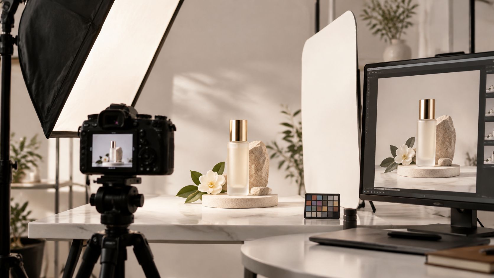
Your product launch deadline is approaching, the catalog of fixtures needs approval, and the images don't quite belong together. A brushed finish looks warm in one frame and cool in another. Camera heights shift, shadows change direction, and the marketing team can't crop the campaign banner without cutting into the product.
Most of those problems start before the shutter opens. A camera records the setup you've built, including inconsistent light, an unstable viewpoint, and reflections nobody noticed on the small preview screen. Editing can tidy the result, but it can't reliably reconstruct missing texture or make incompatible perspectives match.
Strong product shots are crafted, not caught. For architecture, interiors, and corporate campaigns, that means treating the shoot as a repeatable production process rather than a collection of attractive individual photographs.
The most useful product photography tips connect technique to a commercial requirement: comparable catalog views, believable materials, and files that work across layouts. Start with an approved reference image, then keep checking every product against it. Lighting, camera position, color, composition, and delivery should all follow decisions your team can document and repeat.
1. Control Light with Diffusion and Modifiers
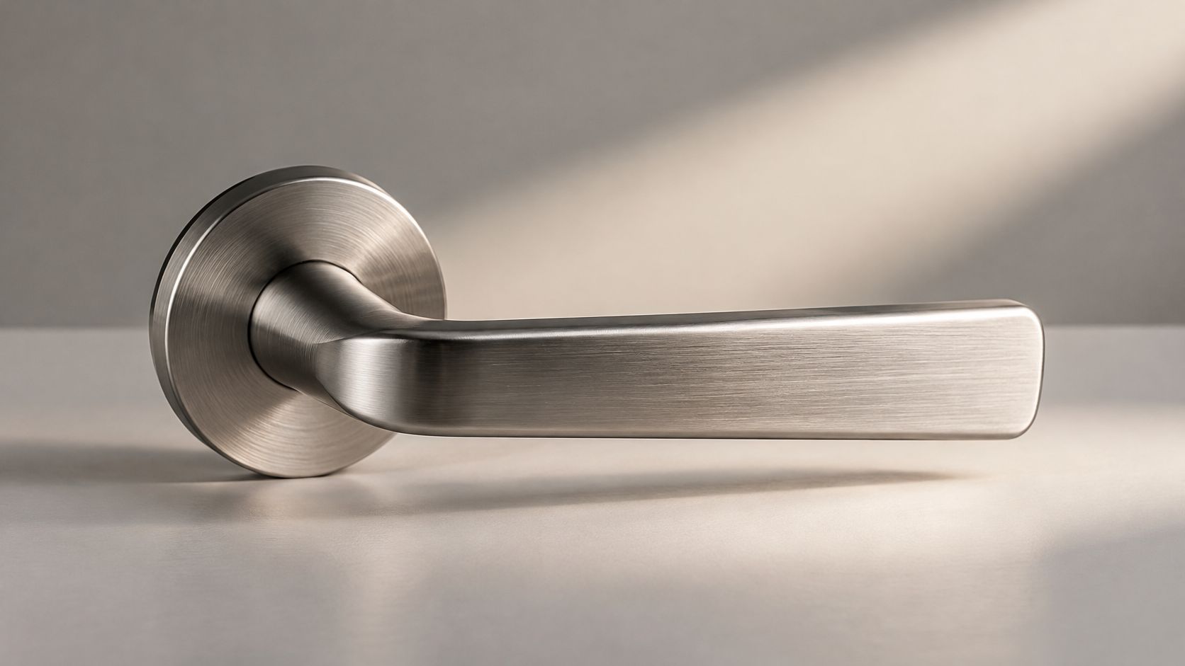
Light the material, not just the object. A brushed metal door handle needs directional illumination that reveals its grain. A translucent fixture needs enough separation to show its silhouette without losing the texture of its diffuser.
Start with a large diffused source beside and above the product, then place a white reflector opposite it. This controlled product-lighting setup separates the main light, shadow fill, and background illumination so each can be adjusted independently.
Build shape before adding lights
Move the source around the product while watching the highlight, not just overall brightness. For a handle, a broad panel at a grazing angle can reveal brushing; for a pendant, an overhead softbox and narrow strip light can establish volume and edge separation.
- Set softness: A source that appears larger from the product generally produces softer shadows. Moving it closer increases its apparent size but can create greater brightness falloff across a deep object.
- Set contrast: Bring the white reflector closer to open shadows. Replace it with a black card when the product looks flat.
- Check detail: Inspect the histogram, highlight warnings, and enlarged image before approving glossy surfaces.
Practical rule: Add another light only when you can name the problem it solves.
A documented commercial photography lighting setup makes repeat sessions easier. Pair that setup record with photography guidance for ecommerce catalog teams, keeping material accuracy ahead of decorative lighting effects.
2. Lock the Camera Position and Shoot Tethered
A faucet collection can look inconsistent even when every exposure is correct. Change camera height between products and the spouts appear to bend differently; change distance and their proportions no longer compare cleanly.
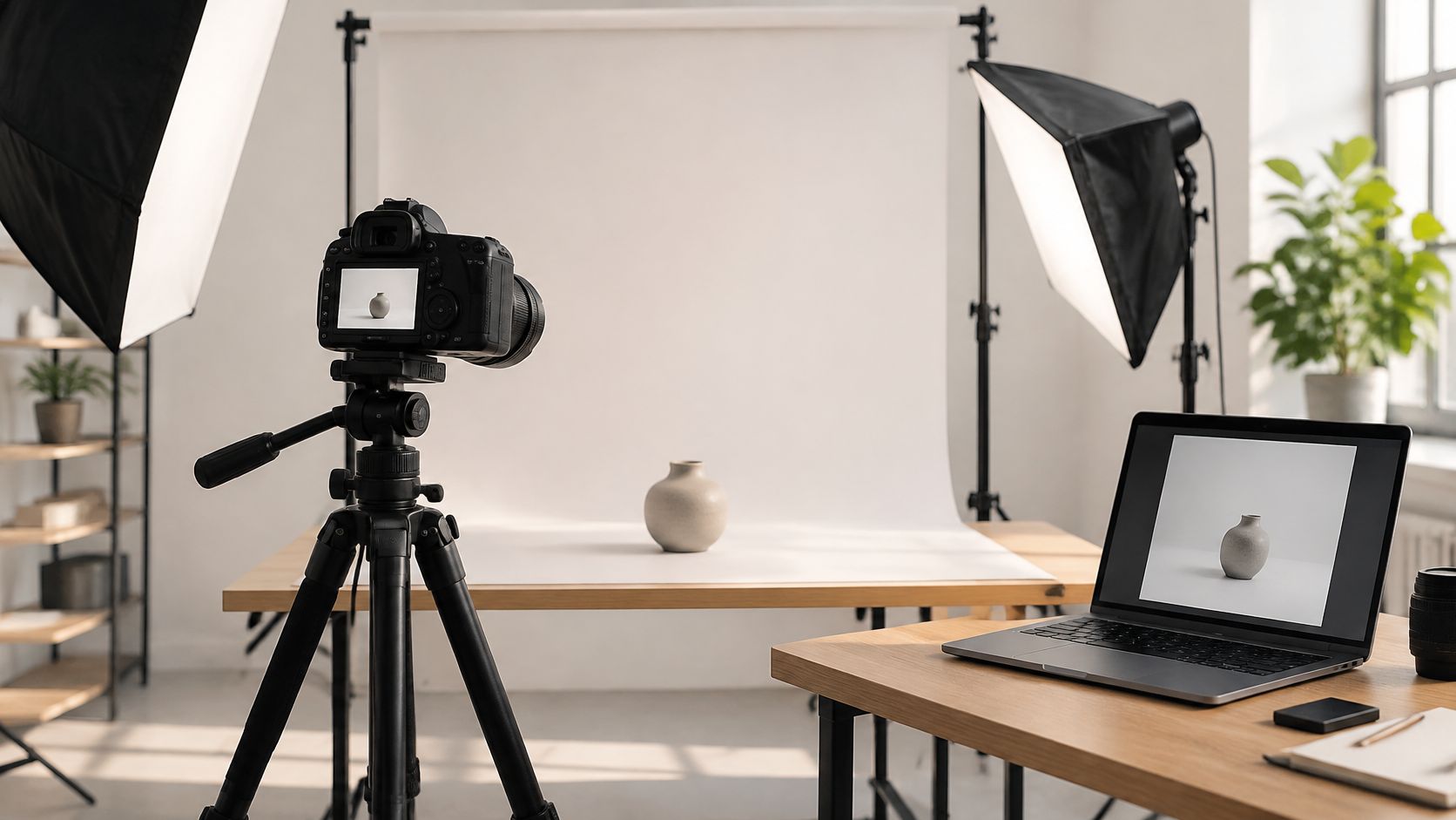
Mount the camera on a sturdy tripod, mark its floor position, and record the lens, camera height, and distance to the product datum. Tether to a computer so the photographer, stylist, and approver can inspect the same frame instead of judging separate camera-screen previews.
Approve the view before the batch
A U.S. consumer survey summary reports that 50.5% of respondents wanted at least three to five product photographs before considering a purchase. Build a repeatable sequence of primary, side, rear, and detail views rather than improvising angles for each SKU.
- Check geometry: Compare the live view with an approved overlay. Align the mounting surface or product base, not an arbitrary outer edge.
- Check focus: Magnify lettering, front edges, and the surfaces buyers need to inspect.
- Check continuity: Lock exposure and white balance, then save a reference frame before changing products.
Tethering adds cables, power requirements, and a potential trip hazard. Secure the cable and keep the workstation outside the styling area.
Don't force differently sized products into identical framing without deciding how scale should read. Consistent viewpoint and consistent image size aren't always the same requirement.
3. Use Seamless Backdrops and Controlled Backgrounds
A white background doesn't have to mean a featureless product. The background should isolate the subject while the lighting preserves its edges, contact shadow, and material character.
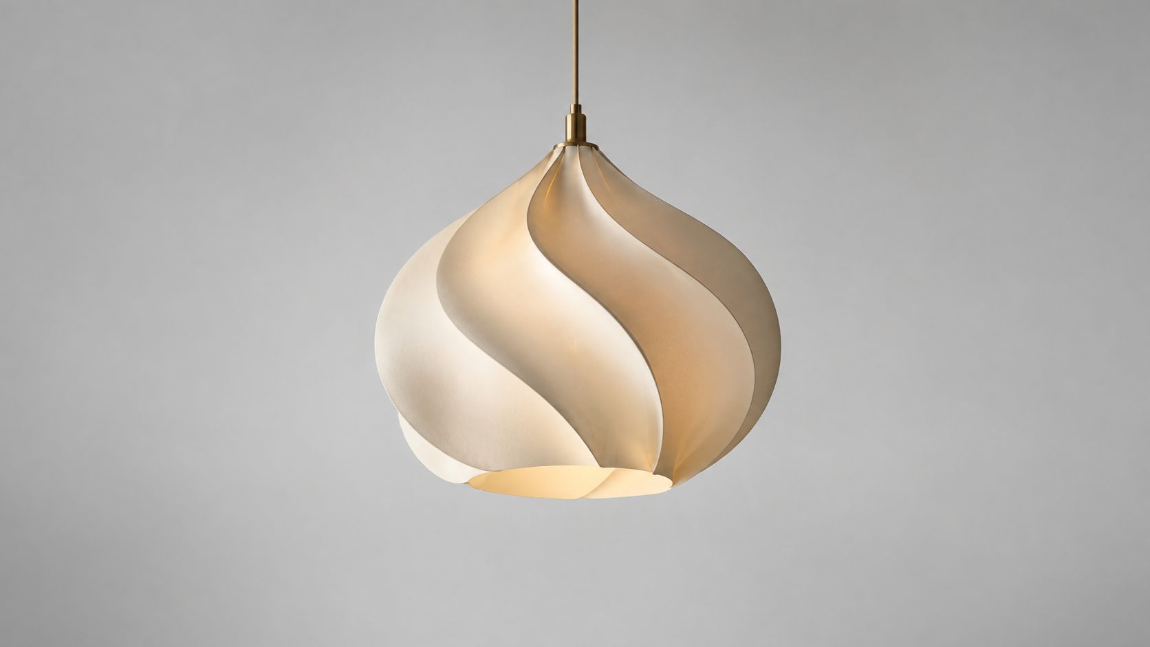
For a sculptural pendant, a light gray sweep can retain the pale shade's outline more naturally than an aggressively bright white background. A tile sample photographed on concrete serves a different purpose: it suggests an installation setting rather than a neutral catalog comparison.
Separate catalog and campaign decisions
Curve the sweep gently from vertical to horizontal so there's no visible horizon. Place the product forward of the backdrop and illuminate the background separately, using flags to prevent that light from washing over the subject.
- Prepare the surface: Clean the sweep and product before positioning. Keep replacement paper or a spare panel nearby.
- Set the background: Measure an unobstructed area and retain that reference across the series.
- Inspect the boundary: Check pale edges, glass, cables, and perforations before increasing background brightness.
- Compare the set: Review neighboring catalog images together, not only as individual files.
A clean background should remove distractions, not erase the evidence that the product occupies real space.
Textured surfaces add atmosphere but can contaminate color through reflected light. Capture the neutral catalog version first, then introduce the campaign surface as a deliberate variation. Keep the original camera and lighting reference so the team can return to the approved setup without rebuilding it from memory.
4. Stack Focus for Maximum Sharpness
A layered material sample may have a sharp front edge and a soft rear surface even when the camera is perfectly stable. Closing the aperture further can increase depth of field, but diffraction can soften the fine detail you're trying to preserve.
Focus stacking offers another route. Capture overlapping focus planes with the camera and product stationary, then blend their sharp regions into a composite.
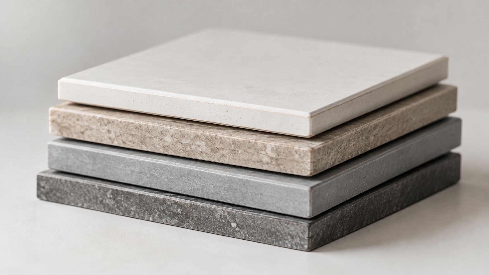
Test a normal exposure first
Compose and light the countertop samples before starting the sequence. Use a rigid tripod, remote release, manual exposure, and stable illumination; begin at the nearest required detail and move focus progressively toward the rear.
- Check overlap: Use sufficiently small focus changes that adjacent sharp areas overlap.
- Check movement: Watch suspended parts, loose cables, and flexible packaging that could shift between exposures.
- Check the blend: Inspect seams, holes, reflective edges, and overlapping components at full magnification.
A product-gallery usability benchmark found that 25% of ecommerce sites supplied insufficient-resolution imagery or inadequate zoom. Stacking helps capture usable detail, but it won't compensate for undersized exports or aggressive compression.
The trade-off is extra capture and retouching time, especially around reflective assemblies. Use stacking where inspection requires depth, not automatically for every image.
Sharpness also doesn't explain dimensions. For small hardware or accessories, the principle behind showing ring size and fit in photos applies: pair the detailed image with a separate, believable scale reference.
5. Ensure Accurate Color with Calibration Tools
Neutral white balance is a starting point, not a complete color-management system. A gray card helps remove a color cast, but it doesn't guarantee that a difficult paint pigment, textile, or coated metal will reproduce accurately.
The international color-management FAQ explains that camera profiles depend on the lighting conditions under which they were created. Changing illumination can therefore require a new reference rather than reusing a profile from an unrelated setup.
Keep the reference in the product's light
For a paint-sample series, photograph a gray card and color target at the product position without glare. Remove them for the final exposures, but retain the reference files alongside the corresponding image set.
- Control illumination: Block changing daylight and avoid mixing sources with visibly different color characteristics.
- Set a baseline: Apply the reference white balance and appropriate camera profile before individual corrections.
- Review consistently: Use a calibrated monitor under controlled viewing conditions.
- Deliver predictably: Embed the intended color profile and send a color-managed proof for approval.
A practical color-correction workflow should distinguish neutral correction from a campaign's creative grade. Keep an accurate master before adding warmth, contrast, or atmosphere.
For illuminated fixtures, don't assume a photograph can prove the manufacturer's stated color temperature. Exposure, surrounding light, display settings, and processing all affect appearance.
The same limitation applies to reflective finishes. Show directional variation clearly, and compare the physical sample under a defined viewing light rather than promising an exact match on every viewer's screen.
6. Control Reflections and Glare
A chrome faucet reflects the studio as much as it reflects the lights. If the surface looks chaotic, adding brightness usually makes the clutter more obvious.
Build the reflected environment deliberately. Surround the faucet with broad white diffusion, then introduce black cards to create controlled dark lines that describe its curves.
Reflection test: View every adjustment from the lens position. A card that looks correctly placed from beside the table may create the wrong reflection in the photograph.
Shape the reflection before filtering it
A light tent can simplify a small polished product, but uniform white surroundings may flatten its shape. Leave controlled tonal variation so the viewer can distinguish a cylinder from a flat plate.
- Inspect first: Look for the camera, ceiling fixtures, windows, and clothing reflected in the product.
- Place cards: Move black and white cards while watching the tethered image.
- Test polarization: Rotate a polarizer to assess glare on glass or coated surfaces. Don't expect it to remove every reflection, particularly from bare metal.
- Recheck exposure: Filters and added diffusion can reduce the light reaching the camera.
For glass fixtures, a dark reflected line can define an otherwise invisible edge. A cloth or card around the camera can reduce its reflection, but inspect whether it creates a conspicuous dark patch instead.
This demonstration provides a visual reference for evaluating reflective surfaces.
Keep approved card positions marked. Small movements can change a polished surface dramatically, making reflection control particularly important across a catalog of related finishes.
7. Compose with Negative Space and Context
Open the intended layout before placing a single prop. A website banner, a printed specification sheet, and a portrait-oriented campaign crop each demand different amounts of surrounding space, and a frame that works for one often fails the other two.
For a pendant above a dining table, show enough of the room to explain proportion without letting the styling overpower the fixture. For door hardware, a restrained timber surface can communicate material relationships while leaving room for a headline.
Make context answer a question
A large-scale product-page usability study found that 42% of users attempted to determine a product's physical size from images. Frame the scene so it answers that question directly: familiar references, believable installation heights, and undistorted perspective do the work a dimensions paragraph cannot.
- Set the crop: Preview the required layouts while tethered and protect space for text.
- Choose useful props: Include objects that explain scale, installation, or use. Remove decorative pieces that compete with the product.
- Check perspective: Avoid an exaggerated wide-angle view that makes the fixture appear larger relative to its surroundings.
- Capture alternatives: Photograph both the contextual scene and a clean version without supporting props.
Context also needs to survive publishing. Alt text should describe what an image visibly communicates rather than repeating the product title.
Write alt text such as "Brushed metal lever installed on a timber door, showing the rectangular backplate." Leave out claims about durability or performance the image cannot support.
Negative space is useful only when it serves a layout. Too much empty area in a product thumbnail can make the object difficult to inspect on mobile. When a campaign spans an architecture, interiors, or product series, record the approved crop and prop positions in the setup reference so the next item in the line matches the first.
8. Build a Consistent Retouching and Delivery Workflow
Editing a catalog image in isolation makes inconsistency easy to miss. Review the series together so differences in background tone, product brightness, crop, and shadow density become visible before delivery.
Confirm the intended outputs before the shoot, then capture the product identifier and setup reference alongside each batch. A shared preset can establish a baseline, but pale stone, dark metal, and translucent plastic still require individual judgment.
Preserve the product while removing distractions
Use a documented photo-editing workflow that separates color correction, cleanup, creative grading, and export. Keep the original RAW files and an untouched photographic reference.
- Correct first: Establish exposure, profile, and white balance before local retouching.
- Clean selectively: Remove dust and temporary supports without erasing grain, machining marks, or real construction details.
- Compare the series: Match related products against the approved reference rather than repeatedly adjusting by eye.
- Verify delivery: Check SKU names, crops, embedded profiles, file formats, and enlargement quality.
Synthetic edits require another approval step. A consumer survey on generated imagery found that 84% of consumers said disclosure was important.
Routine masking or dust removal is different from generating a room that implies an installation exists. Document substantive changes and clearly disclose generated scenes or materially altered details.
For architectural products, don't invent joints, change surface texture, or suggest performance through fabricated lighting effects. Retouching should improve the presentation of the evidence, not replace it. Review exported files as well as masters, because compression and sharpening can undermine otherwise careful work.
How the eight product photography techniques compare by best use, setup effort, and key equipment
Each row solves a different problem; match them to the gap in your current shot list.
| Item | Best For | Setup Effort | Key Equipment |
|---|---|---|---|
| Control Light with Diffusion and Modifiers | Revealing texture, shape, and finish | Moderate; needs space and light placement | Softboxes, umbrellas, diffusion panels, grids, flags |
| Lock the Camera Position and Shoot Tethered | Consistent series and on-set review | Moderate; fixed setup and tethered workstation | Tripod or copy stand, camera, tether cable, computer |
| Use Seamless Backdrops and Controlled Backgrounds | Clean catalog images or styled product scenes | Moderate; large sweeps need space and lighting | Paper, fabric, or vinyl backdrop; textured panels; background lights |
| Stack Focus for Maximum Sharpness | Detailed products with depth needing front-to-back sharpness | High; multiple frames and post-processing | Macro or close-focus lens, tripod or focusing rail, stacking software |
| Ensure Accurate Color with Calibration Tools | Color-critical products, finishes, brand materials | Moderate; calibration and color-management steps | Gray card, color checker, calibrated monitor |
| Control Reflections and Glare | Glossy, metallic, and glass products | High; reflections take time to manage | Reflectors, black flags, polarizer, light tent or cube |
| Compose with Negative Space and Context | Layout flexibility, scale, or lifestyle context | Moderate; prop and composition planning | Product, selected props or surfaces, suitable background |
| Build a Consistent Retouching and Delivery Workflow | Cohesive campaigns and organized multi-format delivery | Moderate; repeatable editing and file management | Editing software, presets, organized storage, export settings |
For catalog consistency, the first three rows carry the most weight; locked framing and a controlled background outpace any lighting purchase. Stacking and reflection control earn their higher effort on deep or glossy products.
Turn These Techniques into a Repeatable Product Shoot
Start with the problem that currently causes the most rework. If finished metal looks inconsistent, stabilize the reflected environment before buying another light. If products won't align in a catalog, lock the camera geometry before building more editing presets.
Choose a representative product that exposes the difficult parts of the assignment. A pale fixture with a reflective mount and textured diffuser is a more useful test than an uncomplicated matte object. Approve its lighting, framing, color, and cleanup standard before photographing the rest of the collection.
Give the team a usable reference
Save the approved image alongside a setup photograph, lighting diagram, camera settings, and color-target exposure. Record the product's position as carefully as the tripod's position, especially when mounting plates or installation surfaces determine alignment.
- Before capture: Confirm required views, layouts, product identifiers, and output specifications.
- During capture: Check focus, clipped highlights, reflections, color references, and agreement with the approved frame.
- Before delivery: Compare the full series, verify filenames, and inspect the published-size exports.
Automation becomes useful after those decisions are stable. The practical question behind this guide to product photography automation is which repetitive tasks can follow a defined standard without changing the product's appearance.
Batch naming, baseline adjustments, and derivative exports are sensible candidates. Finish accuracy, installation context, and the removal of real material characteristics still need careful human review.
Repeat the decisions that protect accuracy. Reassess the decisions that depend on the material.
A reliable process doesn't mean every object receives identical lighting. It means every adjustment has a reason, every exception is recorded, and every final image serves the same commercial standard.
Use these product photography tips to build a small approved series before committing to a full catalog. Compare the images in the actual campaign layout, not just on the editing monitor. That's where you'll see whether the products look coherent, the materials remain believable, and the audience has enough information to understand what's being offered.
Our Atlanta-based practice offers commercial photography, lighting design, on-set direction, and professional editing for product-centered brand content. Visit Jimmy Clemmons Photographer to discuss your product range, required views, and campaign layouts so the shoot can be planned around consistent, accurate imagery.