

You know the situation. A designer signs off on a project with carefully specified finishes, the space is photographed beautifully, and then the final gallery lands in their inbox with the oak millwork drifting orange in one frame, neutral in the next, and slightly green in the corridor shots. Nothing about the architecture changed. The color pipeline did.
That's why color correction photography matters so much in architectural and commercial work. You're not just making files look polished. You're translating materials, light, and brand intent into images that need to hold up across a full set, across devices, and often across print and digital deliverables.
In this kind of work, color errors don't read as “creative.” They read as carelessness. If a hospitality group spent months dialing in the tone of painted walls, brass fixtures, textiles, and wood finishes, your job is to protect those decisions. The same goes for brand teams that need a headquarters interior, executive portraits, and marketing collateral to feel like they belong to one visual system.
Why Precise Color Correction Matters in Photography
Architects and designers don't hire a photographer just to show a space. They hire someone who can describe the space accurately with light, perspective, and color. If the limestone reads too warm, the steel goes cyan, or the same white paint shifts from room to room, the images stop functioning as documentation and start undermining the project.
That matters long before anyone zooms into a histogram. A developer may use the photos in leasing materials. An interior designer may send them to publications. A lighting manufacturer may compare fixture output and finish appearance across installations. In each case, the viewer assumes the camera is telling the truth.
Accuracy builds trust
Commercial clients notice consistency before they notice style. They may not say “the tint is off,” but they will absolutely react when upholstery, paint, or flooring looks unstable from frame to frame.
Practical rule: If a client can't trust the color in one image, they start questioning all the other technical decisions too.
That's the hidden cost of weak color correction. It doesn't only affect one file. It affects confidence in the whole project.
Color work also has a technical lineage behind it. Modern digital workflows rest on the additive color model established by James Clerk Maxwell's 1861 experiment, which proved that all colors can be created by mixing red, green, and blue light, forming the scientific basis for digital color workflows, as documented by the Science and Media Museum's history of colour photography.
Color correction is not the same as color styling
A lot of confusion comes from mixing correction with grading. Correction is about getting the file neutral, believable, and stable. Grading is where mood and interpretation can come in later.
For architectural assignments, I treat correction as a technical discipline first. That means:
- Neutral whites stay neutral: White walls shouldn't bounce between pink, green, and blue depending on the room.
- Materials keep their identity: Walnut should still read as walnut, not a generic warm brown pushed by saturation.
- Lighting feels intentional: A warm restaurant interior can remain warm without turning muddy or contaminated by green casts.
- The series matches: Hero shots, detail frames, and supporting wide angles need to live in the same color world.
Advice for color correction photography often provides portrait or other scene tips that stop at “adjust white balance” and “add contrast.” That's not enough for a commercial set. In a built environment, every surface reflects onto another surface. Glass, stone, painted walls, daylight, practical fixtures, LEDs, and exterior spill all interact. Precision isn't a luxury step. It's the job.
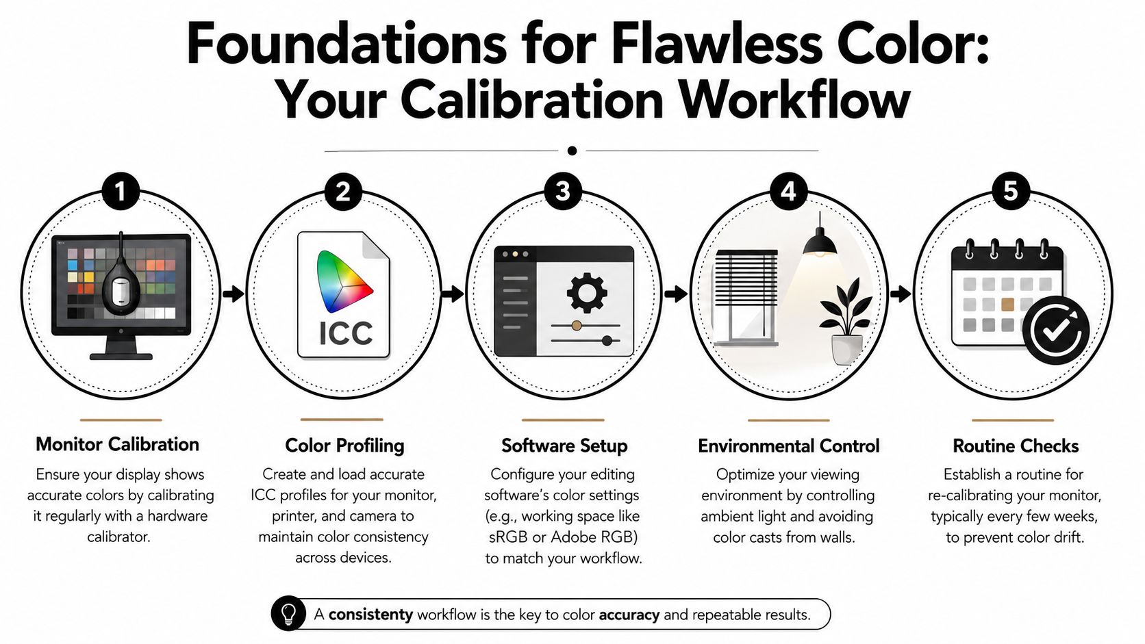
Foundations for Flawless Color Your Calibration Workflow
Before editing a single RAW file, build a controlled environment. If your display is off, every correction you make is a guess dressed up as confidence. That's why monitor calibration isn't optional in professional color correction photography.
Start with a calibrated monitor
For high-end architectural and commercial workflows, the standard monitor target is D65 (6500K) for white point, gamma 2.2, and 80–120 cd/m² luminance, with recalibration every 2–4 weeks to prevent drift, according to this guide on color management for photographers.
Those settings aren't arbitrary. They give you a repeatable baseline that makes neutral grays, whites, and skin tones far more dependable during editing. If your monitor runs too bright, you'll tend to deliver files that print dark. If the display has a cool cast, you'll warm images unnecessarily and create inconsistency across the set.
Build the workflow in order
A dependable setup usually looks like this:
Calibrate the display with hardware
Use a colorimeter, not your eyes. Visual calibration feels fast, but it changes with fatigue, room light, and whatever image you looked at five minutes earlier.Load the correct display profile
The profile tells your operating system and editing software how your monitor behaves. Without that step, calibration is incomplete.Set your working space deliberately
Lightroom uses a wide-gamut environment, while Photoshop is often set around Adobe RGB or ProPhoto RGB depending on the workflow. Wide-gamut editing preserves flexibility, but it only helps if the screen is profiled and you export intentionally.Control your room light
Edit in a stable environment. Bright daylight from a window on one side and a warm lamp on the other will push your eyes around even if the monitor is perfectly calibrated.Recheck on schedule
Displays drift. Good workflows assume drift will happen and correct for it before it shows up in client work.
Calibrate first. Edit second. If you reverse that order, you'll spend your time correcting your monitor's errors instead of the photograph's.
ICC profiles and environmental discipline
ICC profiles sound more intimidating than they are. In practice, they're the translation layer that helps your camera, monitor, software, and output device stay in agreement. They don't guarantee perfection, but they reduce surprises.
For photographers handling spaces with competing light sources, the environment around the monitor matters almost as much as the screen itself. Keep the editing room visually quiet. Neutral surroundings help you judge neutral color. If you regularly photograph complicated interiors, this guide to mixed lighting photography is worth studying alongside your calibration habits because capture and editing discipline need to support each other.
A calibrated system won't make a bad file good. It does something more useful. It makes your decisions reliable.
The Digital Darkroom Global Adjustments in RAW
Once the monitor is trustworthy, the main work starts in the RAW processor. Here, you establish the baseline for the entire image. Good global correction should make the file feel clean, balanced, and structurally sound before you touch any local masks or material-specific refinements.
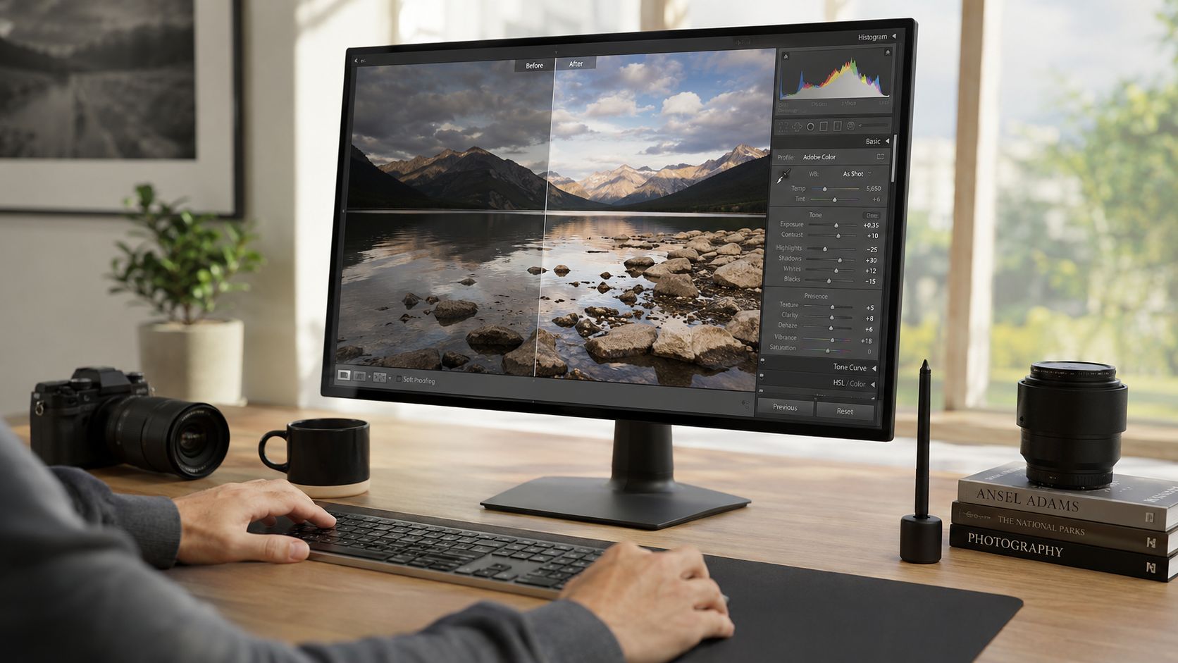
Begin with white balance from a reference
If I've shot a gray card or color checker in the same light as the subject, that frame becomes the anchor. It gives me a neutral reference before taste and screen fatigue start influencing choices.
If there's no reference card in the frame, I look for believable neutrals in the scene. That can be painted trim, a neutral countertop, a ceiling plane, or another surface that should not carry obvious color. Rushed editing often goes sideways here. People sample something that only appears gray but is picking up reflected color from a nearby wall or fixture.
A solid RAW baseline usually follows this order:
- Set white balance first: Correct temperature for warm or cool bias, then use tint to remove green or magenta contamination.
- Establish exposure: Get the overall brightness into a believable range before touching contrast.
- Check highlight and shadow retention: Protect glass, white walls, window surrounds, and dark corners.
- Refine tonal separation: Use curves or levels so the image has shape without forcing black and white points too aggressively.
Watch the histogram and avoid clipping
One of the most common failures in commercial drafts is clipping. According to Adorama's explanation of the basics of color correction, losing detail in pure blacks or whites occurs in approximately 30% of uncorrected commercial drafts when editors rely on brightness sliders instead of input levels that preserve dynamic range.
That tracks with what many photographers see in practice. Brightness is blunt. Input levels and curves give you control.
What works better is separating your tonal moves:
- Gamma or shadow control for darker regions
- Midtone shaping for the body of the room
- Gain or highlight control for windows, reflections, and bright finishes
That matters in architecture because clipped highlights on glass feel cheap fast, and crushed interior shadows can erase the design of a space.
If a corner goes black or a window frame goes paper white, the image may feel punchier on first glance, but it's less useful to the client.
For a broader post-production system around these early decisions, this breakdown of a photo editing workflow connects the RAW stage to the rest of the finishing process.
Work clean before you work stylish
A lot of editors jump into saturation, vibrance, or creative grading too early. That usually creates bigger cleanup later. In architectural files, global color should be technically credible before it becomes expressive.
A practical checkpoint is simple: ask whether the room's surfaces now look plausible under the photographed light. If the answer is yes, move on. If not, don't hide the problem under contrast or preset-driven mood.
Here's a useful demonstration format before moving into finer work:
The RAW stage doesn't finish the image. It creates a technically honest digital negative that can survive more precise corrections later.
Refining the Details Local Color and Material Accuracy
Global correction gets the room into the right neighborhood. Local correction is where the image starts telling the truth about surfaces, finish quality, and light behavior. This is especially important in architecture because materials don't all respond the same way. Stone, paint, brushed metal, stained wood, and fabric each need a different hand.
Correct what changed, not what didn't
The most common local mistake is overreaching. A green cast on one wall doesn't mean the whole room needs magenta. Warm practical lamps in a lobby don't mean every part of the frame should be cooled to neutral. Local work is about isolating the problem and protecting everything else.
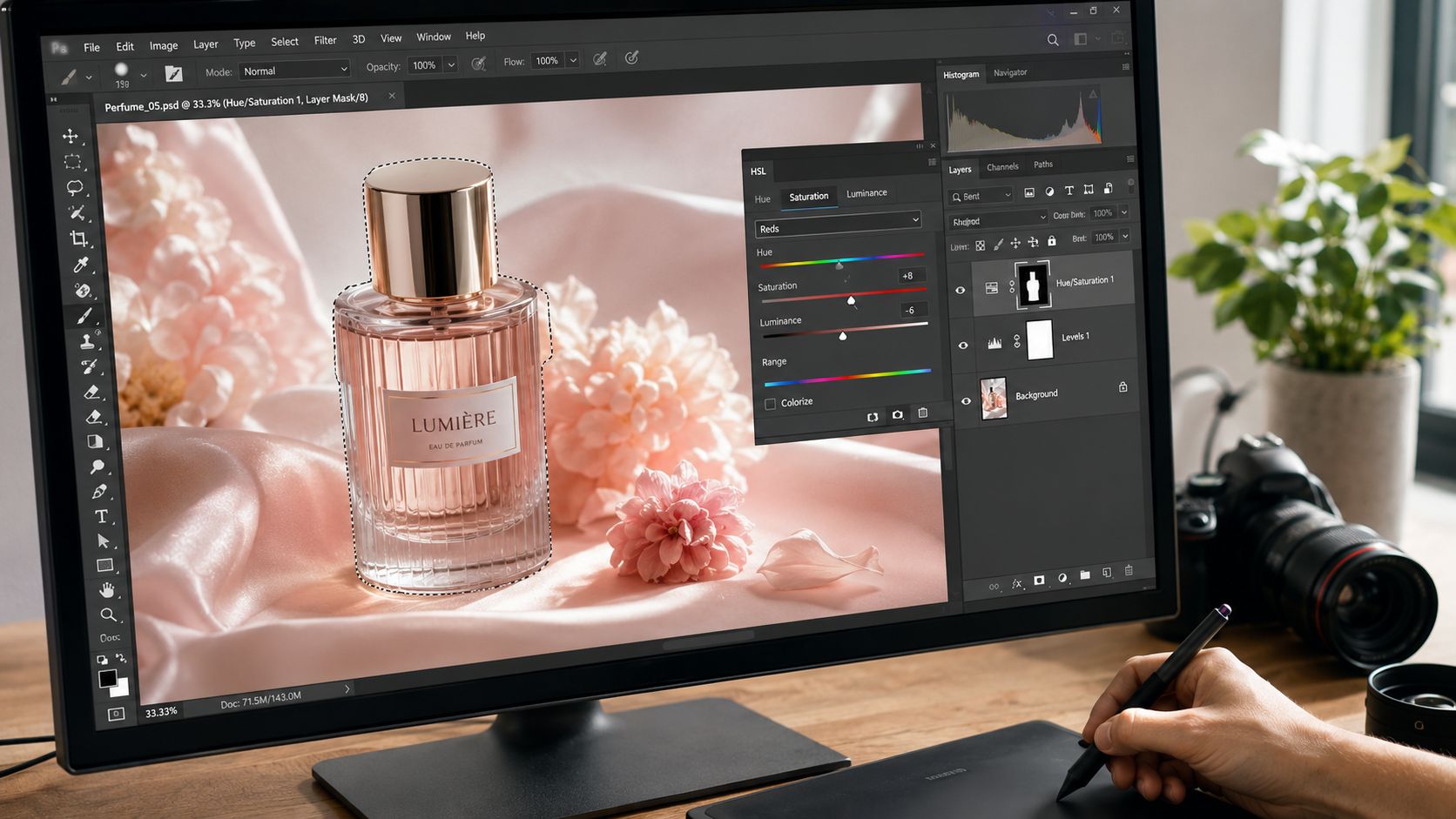
A typical interior problem looks like this: window light and foliage outside push a subtle green cast onto a white wall near the glazing, while the rest of the room is lit by warmer interior fixtures. The fix isn't global white balance. The fix is a targeted mask on the affected wall, then a restrained tint and hue correction that removes the contamination without sterilizing the space.
Use HSL and masks with material logic
HSL tools are useful, but only when you're thinking in terms of actual materials rather than slider categories.
- Wood finishes: Use luminance and saturation carefully. Richer doesn't always mean better. Overdoing either one can make wood look synthetic.
- Painted surfaces: Watch hue shifts around neutrals. Slight changes in tint can make a premium paint finish look dirty.
- Metal and stone: These usually need subtlety. The goal is accurate separation of undertone, not dramatic color.
- Textiles and upholstery: Keep an eye on how neighboring colors reflect into them, especially near windows and accent walls.
Photoshop masks and adjustment layers help because they let you refine the correction edge by edge. In Lightroom or Adobe Camera Raw, local brushes and masks can do much of the same work if the file isn't too complex.
Mixed LED spaces need a different mindset
A major challenge in current architectural work is mixed LED lighting. One source notes that 68% of commercial interiors use variable-color fixtures, while most color correction advice still assumes static tungsten or fluorescent conditions, creating a serious gap for photographers working to maintain consistency in these spaces, as discussed in this article on accurate colors in product and commercial photography.
That problem is real on location. In one room, a ceiling cove may read warm, task lighting may read cooler, daylight may shift through glazing, and decorative fixtures may add another spectral character entirely. There often isn't one “correct” white balance for the full frame.
What works is prioritization:
Choose the dominant visual truth
Decide what the client most needs represented accurately. It may be the millwork, the walls, the furnishings, or the fixture output.Neutralize obvious contamination
Remove the casts that make materials look wrong, even if some intentional warmth or coolness remains.Preserve lighting character
Don't flatten the room trying to make every source the same color. Good correction should unify, not sterilize.
The best architectural color correction often leaves some difference between light sources. It just makes those differences look intentional instead of chaotic.
That balance is where professional local work separates itself from generic editing.
Ensuring Consistency Across an Entire Project
A single frame can be corrected beautifully and still fail the assignment if the rest of the gallery drifts. Commercial clients almost never judge one image in isolation. They review a set. They compare room to room, detail to wide, daylight shot to twilight shot. Consistency is what makes the work feel expensive and dependable.
Build the set around a hero image
I like to choose one hero frame early. Not the most dramatic image necessarily, but the one that best represents the project's true color relationships. That frame becomes the visual reference for the rest of the edit.
From there, compare surrounding files against it. Are whites landing the same way? Is the walnut tone stable across rooms? Do concrete, brass, and painted surfaces feel like they belong to the same building? Presets can help, but they should follow the hero image, not replace judgment.
Measure, then adjust
Professionals often use Photoshop's Color Sampler Tool for exactly this kind of cross-image consistency work, and Photoshop CC allows up to 8 samplers for comparing different image elements, as described in Gerald Bakker's guide to color correction and the 4 C's.
That matters because consistency isn't only visual. It's measurable. Sample a neutral wall, a wood surface, a patch of sky if visible, or a reference material that repeats across the project. If those relationships drift too far between frames, the set starts to feel unstable.
A practical review pass often includes:
- Neutral checkpoints: Revisit walls, ceilings, and trim across multiple images.
- Material checkpoints: Compare recurring finishes such as flooring, wood veneer, brick, or metal.
- Skin tones if people are present: Corporate and hospitality projects often include staff or occupants. Their color shouldn't shift wildly between scenes.
- Sequence review: Look at the whole gallery in grid view, not just one image at 100%.
Presets are starting points, not decisions
A custom preset can save time after you've solved the first few key images. It's useful for carrying baseline contrast, profile choices, and broad color direction through the set. But no preset understands that one conference room had blue daylight spill and the next one sat under warmer fixtures. You still need to tune per frame.
I've found the strongest sets are edited in layers of attention. First pass for baseline correction. Second pass for image-specific fixes. Final pass for sequence consistency. That last pass is where small discrepancies become obvious, and where a polished gallery takes shape.
The discipline here isn't glamorous, but clients feel it immediately. The entire project reads as one coherent visual statement.
Proof and Deliver with Professional Polish
The final stage is where good editing either holds together or falls apart. A file that looks perfect in your editing environment can still disappoint if it isn't proofed and exported for its destination. This is the last mile of color correction photography, and it's where a lot of otherwise strong work loses precision.
Soft proof before export
Soft proofing lets you preview how an image will behave in a specific output condition. That matters because a website, a printed brochure, a magazine layout, and a presentation deck don't all interpret color the same way.
For web delivery, the priority is usually predictable display across common devices and browsers. For print, the goal is controlling surprises before ink and paper reshape the image. Soft proofing won't solve everything, but it reveals where saturated colors, delicate neutrals, or shadow detail may shift enough to require a final adjustment.
A proofed file is a safer file. You're checking how the image will live, not just how it looked while you edited it.
Match export settings to the job
Different deliverables need different output choices. This table keeps the decision practical.
| Deliverable | File Format | Color Space | Resolution | Use Case |
|---|---|---|---|---|
| Website gallery | JPEG | sRGB | Optimized for screen use | Architect or designer portfolio, online marketing |
| Print submission | TIFF | Adobe RGB or client-specified profile | High resolution | Magazine layouts, brochures, large-format reproduction |
| Presentation deck | JPEG or PNG | sRGB | Screen-ready | Internal reviews, pitch decks, proposals |
| Retouching handoff | TIFF | Wide-gamut workflow profile | Full resolution | Further editing in Photoshop or collaborative post-production |
| Transparent graphic placement | PNG | sRGB | Screen-ready | Web overlays, composite-ready assets |
A few delivery habits make life easier for everyone:
- Embed the profile: Don't assume the client's system will guess correctly.
- Name files clearly: Include project, location, and intended use when appropriate.
- Export variants on purpose: One master file and one web-ready version usually prevent confusion.
- Review outside the editing software: Open exported files in a standard viewer to catch obvious surprises.
If you want to separate technical correction from creative finishing more clearly, this article on color grading photography is a useful companion because grading decisions should sit on top of a file that's already accurate.
A polished delivery isn't about overcomplication. It's about making sure the file the client receives still says what the photographed space said.
When architectural imagery, commercial interiors, or brand portraits need exacting color and polished delivery, Jimmy Clemmons Photographer brings an editorial eye and a disciplined workflow to every assignment. From accurate material rendering to consistent project-wide finishing, the studio creates photographs that help designers, developers, and marketing teams present their work with clarity and confidence.