
A developer once showed me a beautifully designed building brochure and asked why the project still felt flat online. The answer was in the photography. The images described the structure, but they didn't reveal what it felt like to approach it, move through it, or trust the people behind it.
Beyond the Snapshot Why Your Story Matters
A lot of firms confuse documentation with persuasion.
An architectural project can be expensive, refined, and considered, yet still underperform when the photography only says, “Here is the building.” That kind of coverage records surfaces. It rarely communicates intent. A prospect sees clean lines, correct exposure, and maybe a nice lobby. They still don't understand why the project matters, who it serves, or what kind of thinking shaped it.
Story-driven photography does a different job. It frames a project as evidence of judgment. It shows how a visitor arrives, where the eye lands, how materials carry light, and what the space asks people to do. For brands, the same principle applies. A generic office photo says you occupy space. A narrative image says your team solves problems in a certain way.
What descriptive images miss
I've seen this problem most often when a team invests heavily in design and treats the shoot as the final administrative task. They ask for exteriors, interiors, conference room, lobby, done. The result is usually competent and forgettable.
What's missing is sequence. A client doesn't experience a building as a spreadsheet of rooms. They experience approach, entry, transition, pause, detail, and atmosphere. A hiring manager doesn't evaluate a company through a row of headshots alone. They read posture, interaction, environment, and visual consistency.
Practical rule: If the images can be rearranged in any order without changing meaning, there probably isn't a story yet.
That matters commercially because buyers aren't only judging taste. They're judging trust. They want signs that a firm understands users, not just finishes.
A thoughtful image set can also support the business case for commissioning stronger work. The discussion around the ROI of professional photography gets at a point many teams learn late: visuals don't sit on the sidelines. They shape perception in proposals, press features, award entries, investor decks, and websites.
Why story changes the outcome
The strongest project photography gives viewers a reason to keep looking. It creates an argument without sounding like one. In architecture, that might mean showing how a façade compresses into a quieter interior, or how a corridor pulls a visitor toward daylight. In brand work, it might mean replacing stiff conference-table poses with a sequence that shows leadership, process, and actual collaboration.
Photography has worked this way for a long time. In July 1888, Eastman Kodak introduced the first mass-market camera with the slogan “You press the button, we do the rest,” and the Kodak Brownie followed in 1901, helping make visual storytelling accessible far beyond specialists, as outlined in the history of photography. That shift mattered because it moved photography closer to lived experience and farther from pure technical gatekeeping.
The practical lesson hasn't changed. Technical skill is required, but it isn't the point. The point is to make people feel they've seen something true.
Understanding Photographic Storytelling
A photograph rarely tells the whole story by itself. It points.
That's the most useful way to think about photography storytelling, especially for architects, designers, and brand teams who've been taught to chase a single hero image. The hero shot matters, but it's only one sentence in a larger visual language.
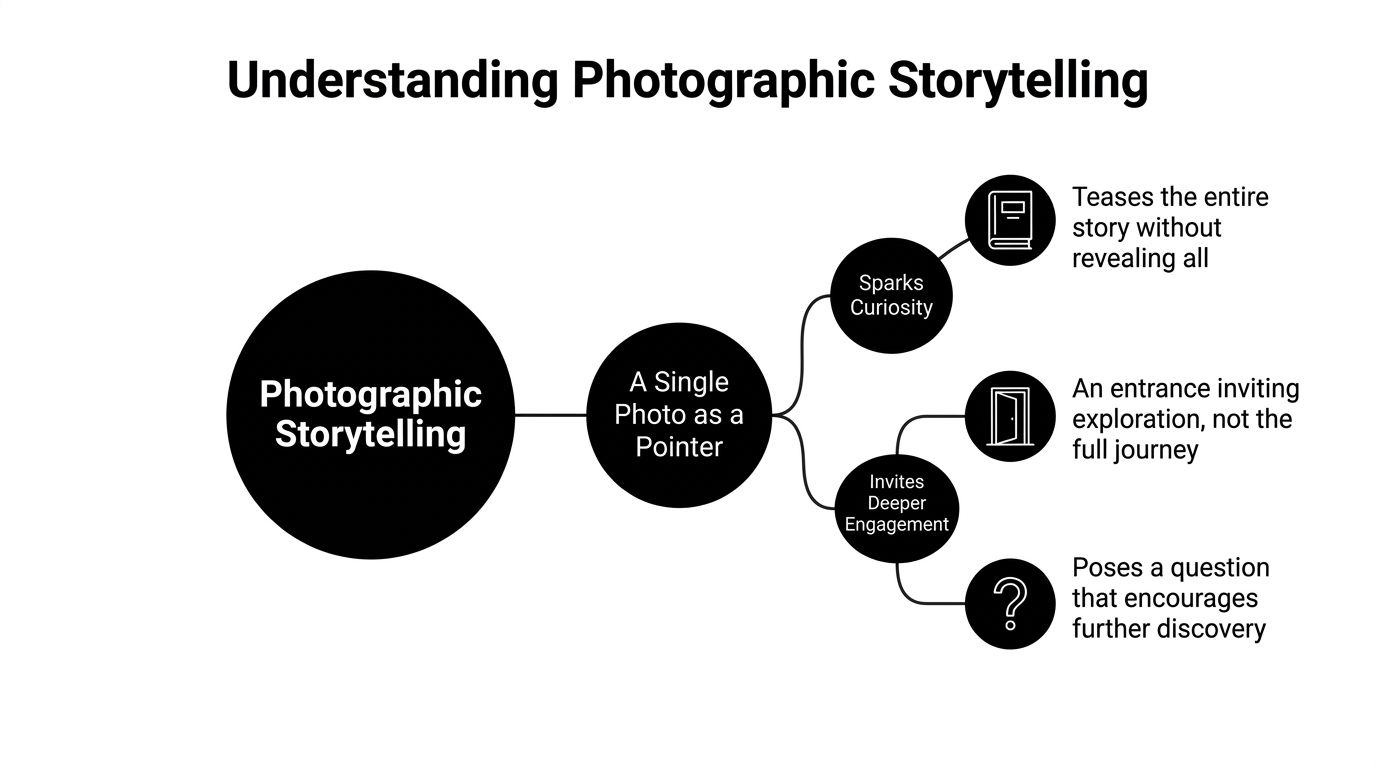
A single image asks. A series answers
One frame can be powerful because it withholds as much as it reveals. A moody exterior at dusk can make a viewer wonder who uses the building, what happens inside, and why the architect chose that relationship between mass and light. A portrait in a workshop can suggest craft, patience, and authority without spelling any of it out.
That idea aligns with the discussion of narrative photography at Artsper. It notes that while it's unusual for a single image to tell a complete story with a start, middle, and end, images often suggest a larger narrative, and a series is usually what provides beginning, middle, and end in full in Artsper's essay on narrative photography.
Think of it this way:
- Single frame: A statement or question.
- Short series: A paragraph.
- Full campaign or editorial package: A complete argument.
That distinction matters because many shoots fail in planning, not execution. The client asks for “some wide shots and details,” but nobody decides what the sequence is supposed to say.
Use the visual sentence test
A practical test is to ask whether each image plays a different role.
One photograph might establish place. Another introduces the user or occupant. A third isolates a design decision such as joinery, texture, or circulation. A fourth shows use, movement, or human scale. When those frames work together, viewers don't just see coverage. They infer intent.
A strong storytelling image raises questions before it gives answers.
That's why captions can help, but they shouldn't have to rescue weak images. The frame itself should generate curiosity through composition, timing, and context.
Why this matters for spaces and brands
Architectural clients often assume storytelling belongs to photojournalism or lifestyle campaigns. It doesn't. Built environments tell stories through entry sequence, compression and release, reflections, threshold moments, and repeated materials. Corporate identity does the same through gesture, work environment, dress, tools, and proximity between people.
When photography storytelling works, the viewer starts constructing a mental backstory. They don't just see a lobby. They imagine arrival. They don't just see a leadership team. They infer culture.
That's the goal. Not to explain everything, but to control what kind of questions the image invites.
Mastering the Grammar of Visual Narrative
Narrative photography isn't mysterious. It runs on choices. The most important are light, composition, and moment.
Get those three working together and the frame starts carrying meaning instead of just information.

Light shapes the emotional reading
Most photographers learn exposure early. Fewer learn to ask what the light is saying.
In storytelling work, light isn't decoration. It defines emotional cause and effect. Soft light creates intimacy and warmth. Harsh shadows create tension and drama. Backlighting can introduce mystery through silhouette, while side lighting builds depth by emphasizing texture. Color temperature also matters, with warm tones often supporting passion and cool tones leaning toward melancholy, as discussed in Alan Ranger's piece on the art of storytelling photography through lighting.
For architectural photography, that means you don't light every room for maximum visibility. Sometimes even, open illumination is right. Sometimes it kills the mood. A chapel, hospitality lounge, or residential interior often needs restraint. Let the shadows hold some shape. Let the windows feel directional. Let polished stone or wood grain respond to side light instead of flattening it.
For brand portraits, the trade-off is similar. Soft frontal light is flattering, but it can also erase character. A founder with a strong point of view may read better with more contour. A collaborative team may benefit from broader, gentler light that keeps the frame open and approachable.
Composition directs attention
Composition is where intent becomes legible.
Lines, edges, and planes tell the viewer where to look first and what matters next. In architecture, composition often means controlling verticals, balancing foreground against depth, and deciding whether symmetry supports the concept or sterilizes it. In brand work, it means placing people in a relationship to tools, products, or workspace that feels purposeful rather than staged.
A useful reference point for this craft is the science of architectural composition. The underlying principle is simple: the frame should guide the eye in the same order you want the story understood.
Use composition deliberately:
- Leading lines: Pull the viewer through a corridor, across a façade, or toward a subject's gesture.
- Framing elements: Doorways, glass partitions, foliage, and structural openings can create context instead of empty filler.
- Negative space: Gives a premium, editorial feel when the subject needs room to breathe.
- Perspective control: Keeps the image from feeling sloppy when precision is part of the brand.
A short demonstration helps more than abstract theory, so this video is worth a look:
Moment is the part clients usually forget
A perfectly lit, carefully composed frame can still feel dead.
What revives it is moment. In portrait and brand work, that might be the split second when someone leans in, listens, or adjusts a prototype. In architecture, moment is subtler. It can be a door opening, a reflection shifting across glass, a person crossing a stair at exactly the right pace, or waiting until sunlight reveals the intended rhythm of a façade.
Working method: Don't ask only, “Is this beautiful?” Ask, “Did anything happen in this frame?”
The answer doesn't need to be theatrical. It needs to be specific. The best storytelling images often record a small event that makes the picture feel inhabited and true.
Crafting the Architectural Narrative
Buildings don't speak, so the photographer has to translate.
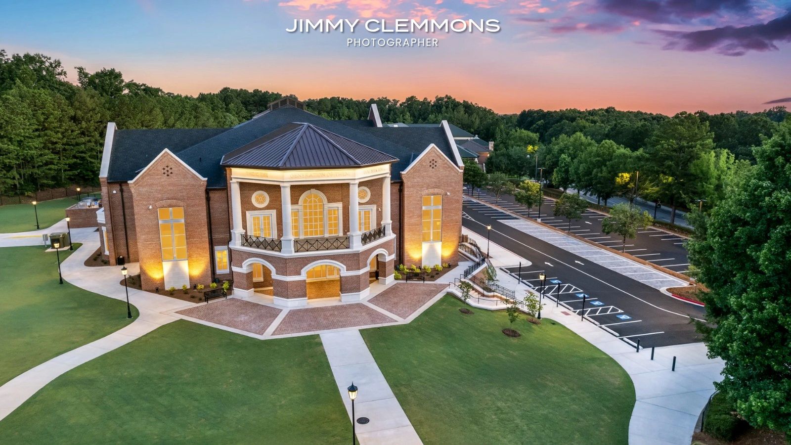
That's what makes architectural storytelling different from portraits. The subject is static, but the experience of it isn't. People approach a building from a distance, register its scale, notice how it meets the site, pass through a threshold, and discover how light, material, and circulation shape behavior. The job is to photograph that experience in a way that feels intentional.
Start with the design argument
Before the camera comes out, define what the project is trying to say.
Is the story about calm? Then the sequence should favor balance, quiet transitions, and measured light. Is it about public energy or student movement? Then the imagery needs more flow, more layered sightlines, and more evidence of circulation. Is it about precision craftsmanship? Then details can't be filler. They carry the thesis.
A common mistake is treating architecture as a set of isolated objects. Exterior. Lobby. Stair. Conference room. Done. That approach may satisfy a checklist, but it often destroys narrative continuity. A better sequence moves from context to entry to interior logic to tactile detail.
Angle is not a gimmick
Most guides still treat architecture too conservatively. That's a problem because built space changes dramatically with viewpoint. According to a summary built from commercial photography coverage, 73% of guides overlook how unique angles reveal narrative depth in built environments, and a 2026 Autodesk report says 58% of architecture clients now demand “angle-driven narrative photography” to show flow and scale, with Tamron America emphasizing techniques such as “crouching down, lying on the ground, climbing to higher vantage points” in its discussion of capturing unique perspectives.
That tracks with practical experience. Eye level is often the least interesting place to stand.
Try these decisions instead:
- Go low: A ground-level angle can strengthen structure, exaggerate vertical intent, and make approach feel more dramatic.
- Go high: High-up vantage points clarify circulation, adjacencies, and how the project sits in context.
- Get close: Tight studies of material transitions often explain the architect's discipline better than another wide room shot.
- Shift off-axis: A slight change in alignment can reveal tension, asymmetry, or spatial layering that a straight-on frame hides.
Buildings aren't flat subjects. If the angle doesn't change the meaning, it probably isn't the right angle yet.
Think in sequences, not trophies
A school campus is a good example. One wide exterior can establish the institution and site presence. A second image may show how students move from outdoor areas to entry. Inside, a medium frame can reveal the relationship between corridor, daylight, and gathering space. Then a close detail of brick, handrail, or fixture finish grounds the larger design language in something tactile.
That sequence gives the viewer scale, use, and authorship.
Architects often want the signature shot first. Fair enough. But the signature frame lands harder when the rest of the edit supports it. A dramatic exterior without supporting interior rhythm feels like advertising. A complete sequence feels like understanding.
Building the Brand and Portrait Narrative
People read brand photography faster than marketing teams think.
They notice whether a workspace feels active or staged. They notice whether leadership looks comfortable together. They notice whether tools, materials, and background details support the company's claims or undermine them. That's why photography storytelling matters just as much for firms with people in the frame as it does for firms showcasing buildings.
Stop asking for “natural” if you mean “unguided”
Clients often say they want candid images. Usually they mean they don't want awkward posing.
That's a reasonable goal, but candid-looking photographs still need direction. Left alone, most subjects stiffen, overperform, or freeze. Good direction doesn't manufacture personality. It creates conditions where real behavior can happen on camera.
For a leadership team, decide what the audience should infer. Are these people rigorous? Inventive? Approachable? Decisive? Each one changes how the session should be built. A group meant to feel collaborative should be photographed in relationship to each other and to the environment, not lined up like a directory page. A founder meant to project authority may need a more controlled frame, stronger posture, and a setting that signals judgment rather than friendliness.
Build scenes around actual behavior
The fastest way to make brand images feel false is to invent actions nobody really does.
If the team never gathers around a laptop in a sunlit hallway, don't stage that scene. Work from real habits. Photograph review sessions, material handling, whiteboard discussions, prototypes on tables, site walks, or client-facing interactions that already belong to the company's rhythm.
Useful prompts include:
- Decision-making moments: Reviewing plans, samples, or timelines.
- Craft moments: Hands on materials, tools, mockups, or production details.
- Relationship moments: A quick exchange, eye contact, or shared focus on the same object.
- Environmental portraits: A subject in the space that explains their role without needing a caption.
The right references can help teams visualize this difference. Reviewing a set of brand photography examples often clarifies how much stronger a brand story becomes when portraits, workspace, and process images speak the same language.
What works and what doesn't
Here's the trade-off in plain terms.
What works is specificity. Real rooms, real tools, real posture, real interactions, and wardrobe that belongs to the company. What doesn't work is generic corporate theater. Folded arms in a lobby. Forced laughter at a conference table. Random pointing. Coffee cup acting.
A brand narrative also needs tonal consistency. If the architecture is sleek and minimal but the portraits are overlit and busy, the company starts speaking in two voices. If the website copy emphasizes craftsmanship but the images never show hands, materials, or process, trust drops.
The portrait should feel like it belongs to the same world as the brand's spaces, products, and decisions.
That's when viewers stop seeing a photo shoot and start seeing a company.
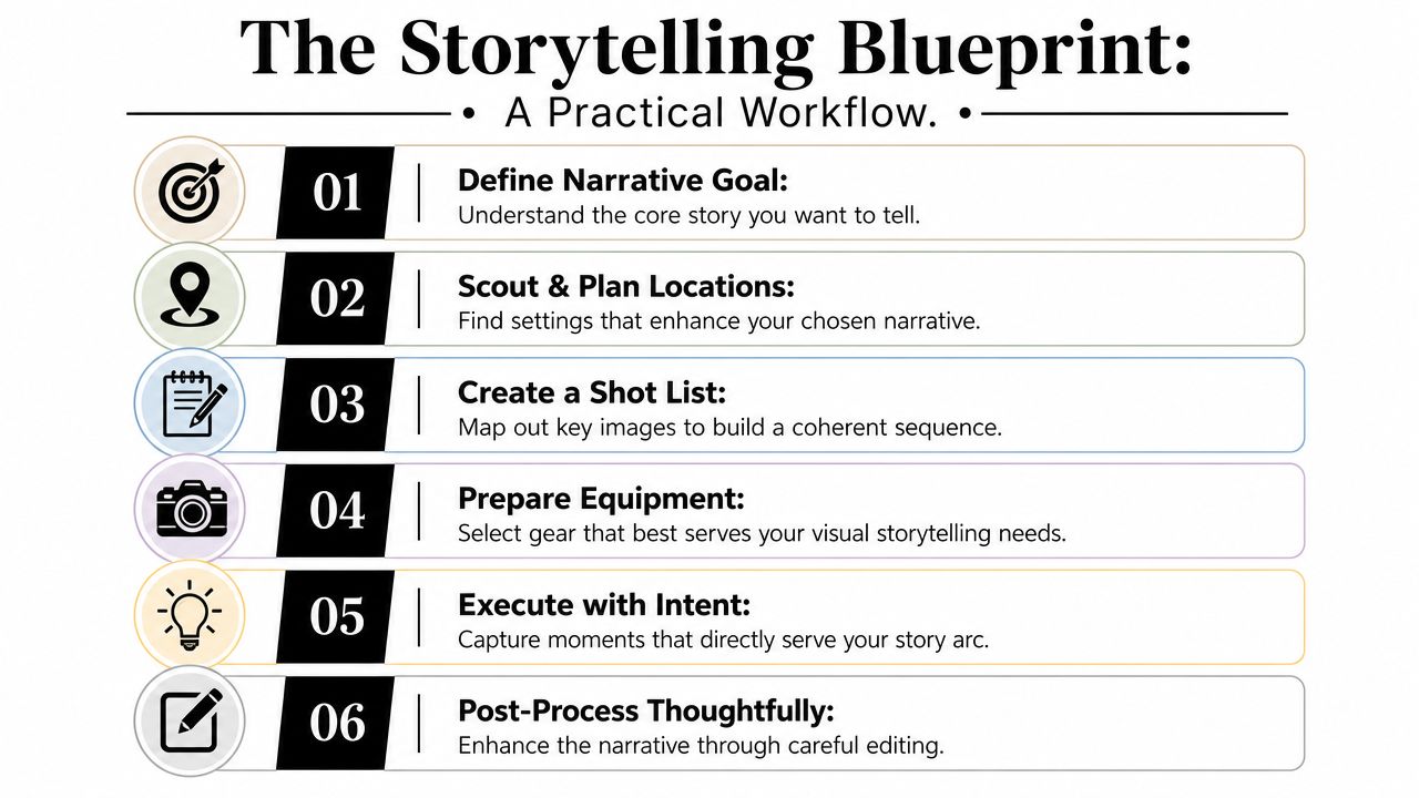
The Storytelling Blueprint A Practical Workflow
Most storytelling problems start before the shoot day.
They start when nobody defines the message, nobody decides what the image sequence must do, and nobody briefs the photographer with enough clarity to make good decisions under time pressure. A practical workflow fixes that.
Step one through three
Start with the narrative core. Reduce the assignment to one sentence. Not ten. One. “This school is designed to support focused learning and community.” “This office reflects disciplined, modern legal counsel.” “This hospitality project feels intimate rather than grand.” If the sentence is fuzzy, the images will be too.
Then build the shot list by role, not by room count. You need an establishing image, transition images, detail images, and frames that reveal use or human scale when appropriate. That's how a sequence starts reading like a story instead of a survey.
Third, brief the photographer with emotional and practical criteria. Don't just provide an address and a schedule. Share the intended audience, must-show features, visual references, access constraints, styling concerns, and what should be avoided.
What to decide before the camera arrives
A simple checklist keeps everyone honest:
| Phase | Key Question | Example (Architectural Shoot) |
|---|---|---|
| Narrative goal | What must the viewer understand after seeing the images? | The building feels welcoming, ordered, and full of daylight |
| Audience | Who will use the images? | Prospective clients, awards juries, editorial features |
| Sequence | What frames create beginning, middle, and end? | Exterior approach, threshold, main circulation, material detail |
| Visual tone | What should the light and mood feel like? | Calm, warm, precise, not overly dramatic |
| Priority subjects | Which spaces or moments matter most? | Entry façade, lobby stair, classroom connection, brick detailing |
| Constraints | What can disrupt the story if ignored? | Parked cars, signage clutter, poor timing, unstyled surfaces |
| Human element | Do people help explain scale or use? | One or two figures moving through corridor at the right moment |
| Delivery use | Where will the final images live? | Website headers, proposal deck, print brochure, social crops |
Final review criteria
When the edit comes back, don't ask only whether the images are pretty. Ask whether they're doing the assigned job.
Review the set against these standards:
- Clarity: Can an outsider understand the project or brand quickly?
- Sequence: Does each image add new information?
- Consistency: Do light, color, and framing feel coherent?
- Specificity: Are there real details that make the story credible?
- Usefulness: Do the files support the places they'll appear?
One more consideration belongs in every serious workflow: ethics. The discussion of ethical storytelling in photography points out that 89% of creators skip pre-trip research, even as practitioners stress working with people on the ground and doing open-minded research first. It also cites a 2025 Public Media Association survey reporting that 67% of photojournalists require subject consent documentation before shooting, while 12% of photography courses include ethics modules, as described in this piece on telling story ethically through the lens of a camera. For brands and architects, the lesson is simple: accuracy, consent, and context are part of the craft, not administrative extras.
A good photograph can attract attention. A good narrative can hold it. A disciplined workflow is what gets you from one to the other.
If you need photography that does more than document a project, Jimmy Clemmons Photographer creates architectural, brand, and portrait imagery with editorial discipline, precise lighting, and a clear narrative point of view. For firms that want images that communicate design intent, company culture, and commercial value, it's a strong place to start.