
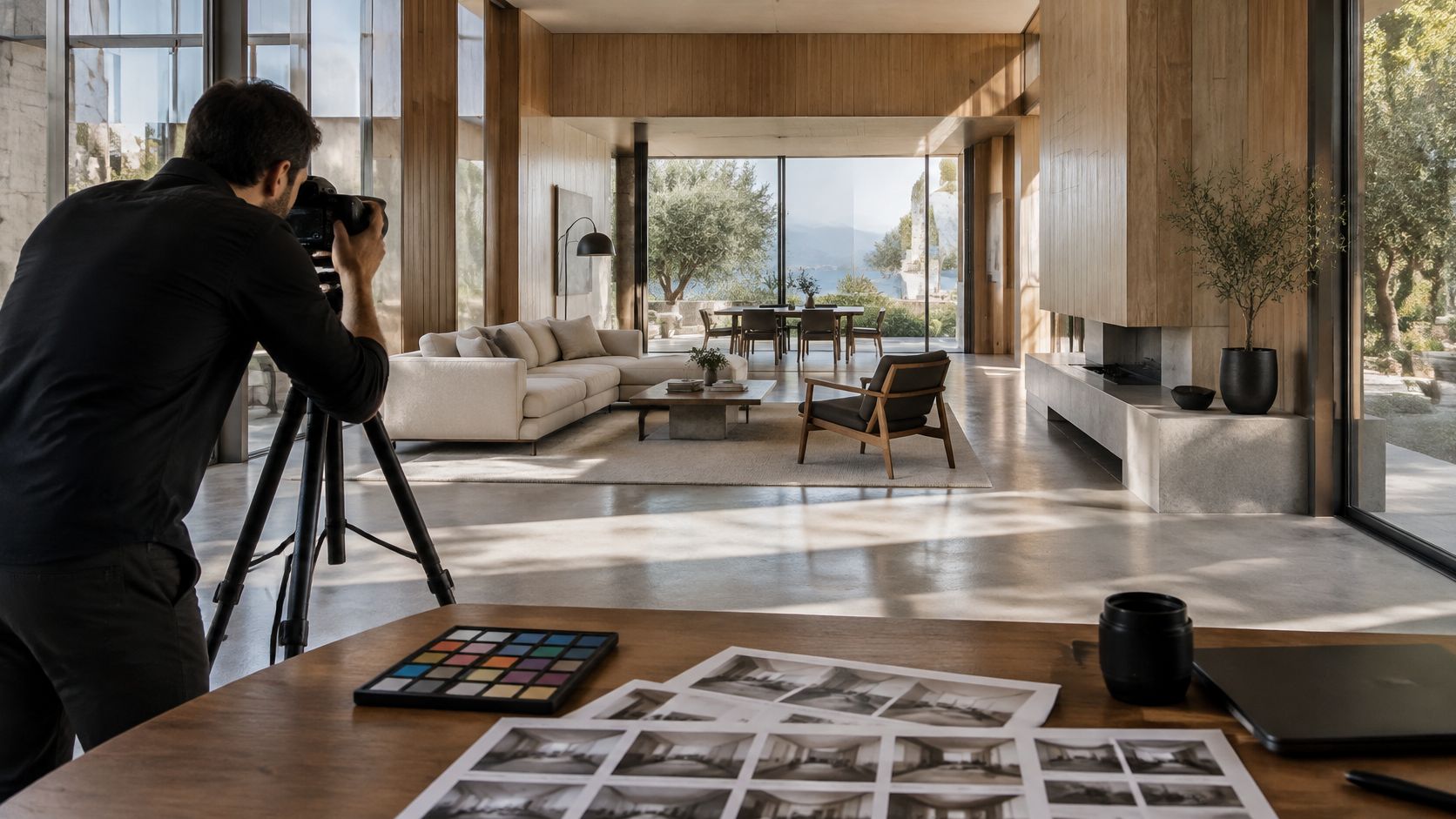
The gallery link arrives two days before the proposal is due. Inside are forty-two files named with camera sequence numbers, half of them in a wide-gamut space with no embedded profile, and none of them showing the rear elevation the planning consultant asked about. The pictures are beautiful. They're also close to unusable for the job the project needs done.
That gap between attractive and functional is where most design photo briefs fail. Fixing it is mostly paperwork done before the shoot: what each frame has to carry, which file goes where, and what a reader who can't see the image needs to be told.
What Photography for Design Covers
A design photograph sits closer to a section drawing than to a holiday snapshot. A section drawing exists to carry specific information to a specific reader: wall buildup, floor-to-floor height, how a stair lands at a landing. A design photograph carries the same information optically, form, scale, light, material and context, and it only works when you know who is reading it.
Photography for design means images built to explain design intent to someone who has to make a decision. That reader might be a design review panel, a client signing off a proposal, a tenant comparing two floors, or an editor deciding whether a project runs at all. The brief starts from the design decisions, not from whatever happened to look pleasant on the day.
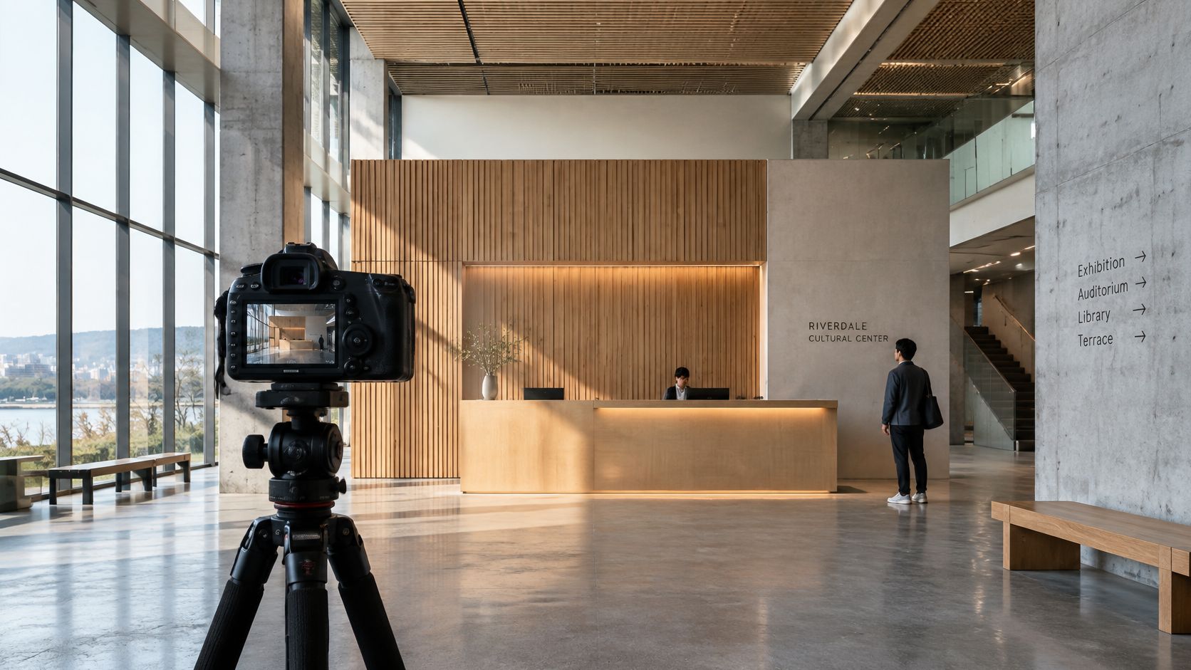
Lifestyle and gallery work run the other way round. A lifestyle shoot starts with a mood and hunts for a frame that supports it. Design work starts with a wall section, a lighting strategy, a material palette and a delivery date, then asks what the picture has to prove. The discipline has been informational since its beginnings: Nicéphore Niépce's View from the Window at Le Gras, made around 1826 to 1827, put rooftops and buildings into one of the first permanent photographs, and by 1851 a French state commission had sent five photographers to record historic monuments, producing 258 photographs so officials could judge which buildings deserved preservation, as the record of architectural photography's history sets out.
Three jobs every design photograph does
- Document the finished space. Someone who wasn't on site has to understand what was built, including the parts nobody photographs for Instagram.
- Let a reader judge form and material. Proportion, joinery, finish and lighting intent get assessed from the frame, often by people approving a budget.
- Travel without you. The same file lands in a proposal, a listing, a print feature, a planning record and a website, months or years after the shoot, with no one present to explain it.
Four common briefs pull in different directions. A leasing listing needs an entrance sequence and a typical floor. A competition entry needs site context and one clean principal elevation. A brand case study needs people using the space. A construction capability page needs junctions and finishes tight enough to prove workmanship. One shoot can serve all four when the shot list is written first.
The test is simple. If the images have to answer a question about the building or the brand rather than decorate a page, the project needs design photography, and the brief gets written before the shoot rather than after delivery. When a new set has to sit beside older frames from a previous camera, AI photo editing and enhancement can normalize exposure and clear a distracting background as a first pass before the final manual grade.
Deliverable Specifications for Each Output
Six outputs come off most design shoots, and each wants a different file. Hand over one folder of full-size JPEGs and somebody downstream loses a day rebuilding what should have been decided at a desk.
Deliverable specifications by output
| Output | Format | Colour space | Notes |
|---|---|---|---|
| Master archive | RAW (camera native) | Camera native, profile embedded | Never edited; source for every export |
| Print working file | TIFF | Adobe RGB (1998) | Soft-proof with the printer profile |
| Website hero | JPEG or WebP | sRGB IEC 61966-2.1 | Tagged sRGB, compressed for load speed; 2400 px on the long edge |
| Social post | JPEG | sRGB IEC 61966-2.1 | Crop for each platform's ratio at 1080 px wide |
| Client proposal PDF | JPEG inside PDF | sRGB IEC 61966-2.1 | 150 ppi at display size, captions kept with each image |
| Editorial or print submission | TIFF or JPEG | As the publication specifies | 300 ppi at print size; follow the publication's spec sheet |
The rows only hold together if the colour pipeline underneath them does. The International Color Consortium's guidance on colour management explains that cameras and other imaging devices reproduce colour differently, so an ICC-based workflow uses profiles to describe each device and convert colour between capture, editing, monitor and output. Files headed for web and general digital use should be converted to sRGB IEC 61966-2.1 before export, where the file describes how the image should appear on an sRGB display rather than acting as a neutral record of scene colour.
The colour workflow behind those rows
Adobe RGB (1998) gives a larger gamut and earns its place as an editing or print working space, particularly where saturated greens and cyans in planting, hospitality interiors, branded environments or pigmented materials have to survive reproduction. The failure mode is specific and common: keep a wide-gamut file without embedding its profile and an unmanaged application reads the raw RGB numbers wrongly, so the image shows up muted or shifted.
Working sequence: capture in RAW, edit on a calibrated monitor, embed the working profile, soft-proof the intended output, then export a separate tagged sRGB derivative for anything digital.
That sequence protects the widest flexibility while making sure a client's site, proposal or social channel doesn't display a different brand colour from the one the design team signed off.
Naming carries the rest of the system. Build it from project code, view, orientation and colour space, so a file like riverfront_rear-elevation_wide_srgb.jpg explains itself in a folder of two hundred. One master, one derivative per channel, and every derivative named for the output it serves.
Coverage Shot List for Every Project
A set assembled from whatever looked best on the day collapses the first time a consultant asks for the rear elevation. Coverage is a plan, not a mood.
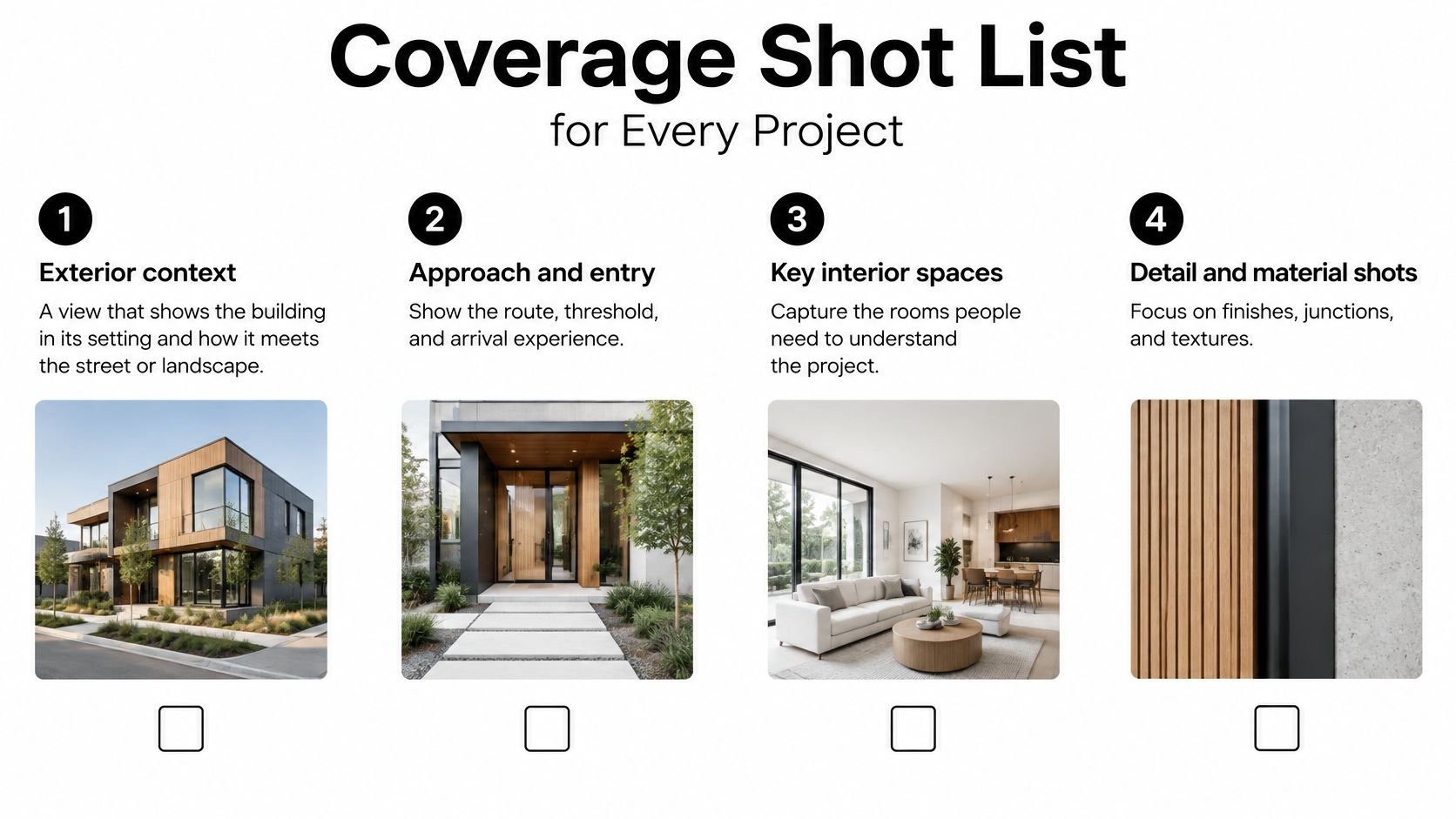
Build the list in four layers and give each frame a job.
- Exterior context. One view showing how the building meets the street, the site or its neighbours.
- Every principal elevation. Front, rear and both opposing sides, so no face of the building is missing from the record.
- Interior circulation and rooms. Entry, the route through the plan, the stairs, the transitions, and the service areas that make the place work.
- Characteristic detail. Joints, fixtures, material junctions, the construction decisions worth proving.
The U.S. National Park Service standards for heritage documentation set a concrete floor under that structure. They require photographs to be fully captioned and perspective-corrected, and higher documentation levels must include at least one image showing scale, ordinarily at the principal facade. The same guidance calls for views covering front and rear facades, opposing sides, interiors and significant details, so that another person can interpret the image without depending on the photographer's memory.
Make every frame findable on its own
The NPS preservation brief on architectural investigation with 35 mm photography offers a method that adapts cleanly to digital work: photograph every interior and exterior wall elevation plus general views and typical or unusual details, then number rooms, windows and doors on a floor plan so images can be organized and labeled consistently. Translate that into a location code, sequential frame numbers and a keyed plan, and a client can request "the second-floor corridor looking north" without a phone call. A working example of that structure sits in our guide to building a shot list that survives review.
Scale deserves its own note. Put a person, a chair or another object of known size in at least one frame at the principal facade, and record orientation and crop flexibility at capture rather than guessing later in the edit.
The most dramatic frame is rarely the most useful one. A quieter view of circulation, human scale or a material junction often carries a proposal further than the hero shot, because it answers the reader's question.
Keeping Lines Straight and Light Consistent
Point a camera up at a tall facade and the verticals converge. The sensor plane is no longer parallel to the building plane, and the effect gets worse the closer you stand and the wider the lens. That's geometry, not sloppiness, and it decides whether a photograph is accurate enough for design review or editorial use.
A tilt-shift lens solves it optically. Keep the camera level and shift the lens vertically to include the top of the structure while the verticals stay parallel. The analysis of straight-line technique in architectural photography makes the case plainly: this beats relying on software alone, because post-processing has to warp and crop recorded pixels, and heavy correction eats usable framing while leaving uneven sharpness. The setup that works is unglamorous. Level camera on a tripod, a focal length that leaves margin around the subject, and only as much shift as the structure demands.
Perspective control options compared
| Approach | Works best when | Trade-off | Typical use |
|---|---|---|---|
| Tilt-shift lens, camera kept level | Tall facades and interior verticals | Lens cost and slower setup | Design review and architectural records |
| Level camera with extra edge area | No tilt-shift lens on hand | Less room to crop after correction | Interiors and moderate elevations |
| Software correction after capture | Minor keystone only | Warps and crops recorded data | Light touch on finished images |
| Longer lens from farther back | Rooms too tight to step back | Needs space and a longer lens | Interiors with limited depth |
Light consistency across the set
Perspective is half the discipline; the other half is making twelve frames look like one building on one day. Choose a time of day that suits each facade rather than shooting everything at noon and hoping. Lock white balance across the set instead of letting auto white balance drift between rooms. Bracket interior exposures so window detail and room surfaces both hold information, then blend with restraint.
Straight lines and steady colour are the two things a client notices without knowing why. Get either wrong and the space looks badly built.
That's the practical stake. Doorways, cabinetry, columns and ceiling lines are how clients judge construction quality and spatial rhythm, so their proportions have to survive the edit intact. The wider standards we apply to colour, naming and consistency sit in our brand photography guidelines.
Writing Alt Text and Captions Into the Brief
Alt text describes an image's purpose, not its inventory. "Lobby photo" tells a screen reader user nothing. A description that names the subject, the spatial relationship and the reason the image exists does the job, which is why the Web Content Accessibility Guidelines require text alternatives for non-text content and allow that information to be rendered as large print, braille, speech, symbols or simpler language.
The gap is measurable. Data from the 2025 WebAIM Million, reported through Scholarly Kitchen, found that 18.5% of home-page images lacked alt text, while a broader scan of two million page reviews found 60% of images with no alternative text at all. Generic machine-written descriptions won't close that gap for design work, because the value of a frame often sits in spatial hierarchy, circulation, material contrast or the relationship between people and the built environment.
The three-part pattern I write into every brief
Subject, spatial relation, purpose, in that order. Here's the difference on a hypothetical lobby frame.
Before: Lobby.
After: Double-height lobby with a limestone reception desk at left, a brass directory panel at right, and clerestory daylight falling across a terrazzo floor. Shows how visitors are oriented on arrival.
Keep alt text concise for a purely illustrative photograph and move complexity elsewhere: a complex hero image can carry a longer description on the page covering layout, materials, lighting and the design feature being demonstrated. Reserve empty alt text for decorative frames.
Colour needs the same treatment. The guidelines bar colour as the only means of conveying information, which matters the moment a gallery filter, a project map or a status indicator is coded by hue. Add a label, a pattern or a position cue so a visitor with low vision or colour-vision deficiency doesn't lose information that sighted users get instantly.
Run the workflow deliberately: the photographer records each frame's intent on set, the architect or brand team approves the wording, and any AI-drafted caption is checked by someone who knows the project. Then put the deliverable in the brief as a line item. An image inventory with alt text, captions and long descriptions, delivered beside the edited files.
Sector Examples and Image Priorities
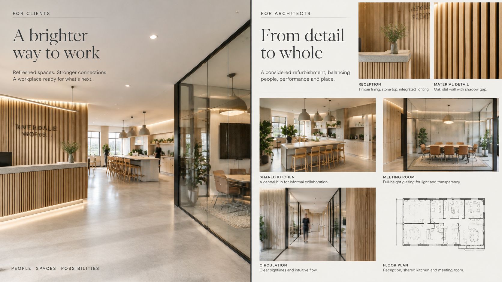
Take one mid-sized office refurbishment: a timber-lined reception, a shared kitchen, a rooftop terrace. The building doesn't change, but three teams want three different sets of pictures out of it. The architecture team needs an exterior context view, scale frames and a keyed plan. The leasing team needs an entrance sequence and a typical floor. The brand team wants people at work and colour-accurate social files.
Commercial property relies on pictures more than most sectors, and the numbers show why. In 2024, 83% of real-estate buyers said listing pictures were key to their decision-making, according to figures published by Matterport. That's a buyer statistic, not an architecture one, and it still shapes the brief: it's the reason the entrance sequence and typical floor outrank the rooftop hero for a leasing set.
Where each sector's brief usually breaks
| Sector | Priority images | Deliverable that matters most | Common gap |
|---|---|---|---|
| Architecture firm | Exterior context, principal elevation, scale view | Keyed plan with numbered photos | Missing service areas and secondary elevations |
| Interior design and hospitality | Circulation, material details, dusk lighting | Tagged sRGB web set | Hero shots without the rooms that support them |
| Commercial real estate | Exterior, entrance, typical floor, amenities | Listing set with consistent orientation | Inconsistent crops across listings |
| Corporate brand team | Workplace in use, leadership portraits, space details | Brand-colour-accurate social and web files | Colour shifts between platforms |
| Construction or education contractor | Progress views, finished spaces, unusual details | Captioned archive for proposals | No dated record of the site |
The pattern repeats: the deliverable that matters is never just a photograph, it's a photograph plus the structure around it.
Hospitality and interior work rewards patience over heroics. Dusk lighting carries mood, and circulation frames explain how a guest moves from door to bar to table. A single striking image of a bar won't do the work that a sequence does, which is why these briefs are worth mapping against the wider set of types of commercial photography before the day is booked.
Confirm the Brief Before You Book
A shoot gets expensive in the gaps. Every question you resolve beforehand is a question that doesn't resurface as a reshoot.
Image sets also outlive the campaign that paid for them. Recent research describes AI systems that classify images, cluster them by similarity, and generate context-sensitive captions for discovery and organization, as this Springer chapter on AI-assisted image workflows sets out. In practice, the context you record at capture, the view name, the orientation, the design feature in frame, becomes part of the asset's value rather than a note nobody reads.
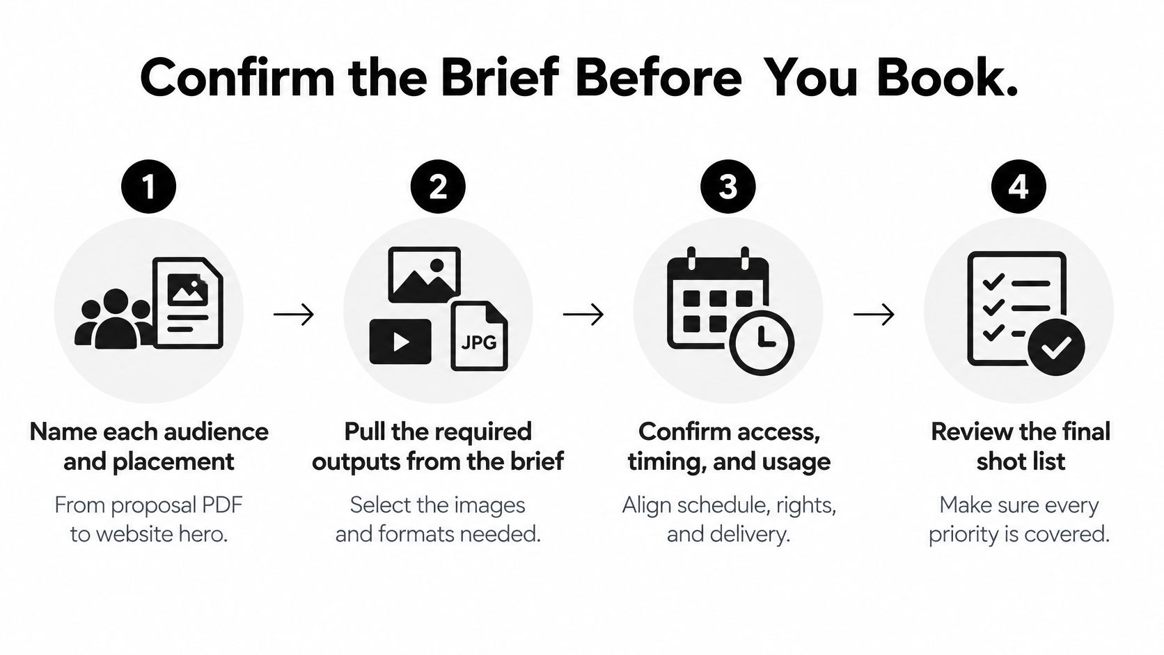
- Name each audience and placement, from proposal PDF to website hero, and count how many distinct sets that makes.
- Pull the required outputs from the specification table and confirm the colour space for each one.
- Attach the shot list, including scale frames, the keyed plan and the details that prove workmanship.
- Decide who writes alt text and captions, and when they get reviewed by someone who knows the building.
- Agree the count, meaning how many final images, how many revision rounds, and how files are delivered.
- Confirm usage rights for each placement, because a web licence rarely covers a print feature.
Then ask any provider three blunt questions. Does their coverage extend to sweeping exteriors and refined interiors, or are they mostly an interiors outfit? Do they handle location scouting, lighting design and on-set direction, or just show up with a camera? Is professional editing and a specified file delivery included in the quote, or billed after?
Those are the answers that separate a photographer who can carry a design brief from one who produces a nice gallery. Our own practice is built around architectural photography and corporate brand content, with scouting, lighting, direction and editing treated as part of the same job.
Send the brief, the shot list and the output table together, in one document, this week. Quotes get sharper, the day runs faster, and nothing arrives on deadline in the wrong colour space.
Jimmy Clemmons Photographer brings editorial discipline to built environments, shooting the exterior context, the principal elevations, the rooms that support daily use and the details that prove the construction. If you're planning a project page, a leasing set or an award submission, we can help you write the shot list, agree the file specs and deliver images that hold up in every placement. Visit Jimmy Clemmons Photographer to start the conversation before your next shoot is booked.