

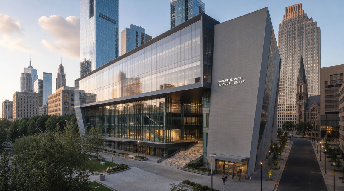
The first time I walked up on the Parker H. Petit Science Center, what struck me wasn't the scale alone. It was the way the building had to look composed from the street while housing some of the most demanding scientific spaces a university can put into one structure.
An Atlanta Landmark for Science and Design
In downtown Atlanta, the Parker H. Petit Science Center reads as more than a campus building. It behaves like a city building. It meets the street with the confidence of a civic project, not an academic afterthought, and that matters in a district where architecture has to hold its own against traffic, signage, neighboring towers, and the visual noise that comes with a dense urban core.
For designers and photographers, that urban condition is part of the story. The building isn't isolated on a pastoral campus lawn where every exterior angle is easy. It sits in a real city environment, and that pressure tends to sharpen architecture. Facades have to work harder. Entrances have to communicate clearly. The massing has to register quickly from oblique views and from across the street.
That's one reason the science center has such a strong presence in conversations about Atlanta architectural landscapes. It carries institutional weight, but it also contributes to the larger visual identity of downtown. Seen from the sidewalk, from a passing car, or through a camera frame, it projects research, instruction, and public purpose at the same time.
Buildings like this succeed when they communicate their mission before you ever read the directory.
The Parker H. Petit Science Center works on that level. It signals seriousness. It also signals access, collaboration, and modernity, which is a harder combination to get right than most project descriptions admit.
The Vision Behind a Downtown Science Hub
The Parker H. Petit Science Center opened in March 2010 as a 10-story, 350,000-square-foot facility, and the project carried a reported cost of $149.6 million according to the project history published on Pete Petit's site. Those facts tell you this wasn't a routine classroom addition. Georgia State University treated it as a major institutional move, aimed at integrating high-tech research space, teaching areas, and even retail within a dense downtown campus.
That combination is what makes the project important. Many universities expand science programs by distributing departments across multiple buildings over time. That approach can work, but it often creates friction. Faculty travel between buildings. Students move between disconnected lab cultures. Expensive equipment gets duplicated or placed in spaces that are harder to share.
Why consolidation mattered
Putting so much science activity under one roof changes how a campus works. It doesn't eliminate complexity. In fact, it concentrates it. But concentration can be productive when the building is planned for overlap, circulation, scheduling, and shared support spaces.
A downtown university has even more incentive to think this way. Land is constrained. Expansion opportunities are limited. Every large capital project has to do several jobs at once. The Parker H. Petit Science Center appears to have been conceived with that reality in mind. It wasn't just built to house labs. It was built to tighten the relationship between research and teaching in the middle of the city.
Here's the practical value of that strategy:
- Academic proximity: Biology, nursing, and related programs benefit when students and faculty can move through the same building rather than across a scattered campus.
- Shared infrastructure: Advanced lab environments require serious mechanical and safety systems. Concentrating those needs can be more coherent than trying to retrofit them piecemeal.
- Urban efficiency: A dense site rewards vertical, mixed-use thinking more than low-rise sprawl does.
The opening marked more than a ribbon cutting
Georgia State University held a ribbon cutting on March 29, 2010, marking the opening of the science center as a facility intended to advance scientific understanding, health innovation, and health education, as documented by the Georgia State Financing and Investment Commission announcement. That same documentation also notes the presence of BSL-2 and BSL-3 labs and a BSL-4 suite, which places the building in a very different category from a standard undergraduate science hall.
Practical rule: When a university project combines public-facing teaching space with high-containment research, the building has to resolve conflicting demands instead of simply stacking programs floor by floor.
That's the ambition behind the Parker H. Petit Science Center. The project had to support instruction, research, public identity, and technical containment at the same address. From a design and documentation standpoint, that's what makes it memorable.
Architectural Expression and Urban Presence
The strongest science buildings don't advertise complexity through clutter. They edit. They organize. They let the exterior suggest rigor without making the envelope feel defensive. The Parker H. Petit Science Center does that balancing act well because its urban presence isn't just about monumentality. It's about discipline.
Seen through a photographer's lens, the building rewards angles that show both its public face and its controlled repetition. You want the frame to catch the rhythm of the facade, the depth of the glazing, and the way the mass settles into the block. Broad daylight gives you clarity. Late afternoon gives you shape.
Form follows the program, but not literally
A key design challenge was accommodating a diverse program that included wet labs, teaching labs, a nursing unit that mimics a hospital, and high-containment facilities such as a BSL-4 lab, all within a single urban structure, as noted in ENR's project coverage. That kind of mix demands advanced architectural and MEP systems because ventilation, access control, and operational intensity vary sharply from one zone to another.
That's where many large academic buildings struggle visually. The mechanical logic can overwhelm the architectural logic. You see it in awkward rooftop expression, mismatched floor plates, or facades that stop making sense once the program gets difficult. Here, the better reading is that the design had to absorb those differences and present them as a unified institutional object.
For architects studying this building, that's the useful lesson. The exterior doesn't need to diagram every interior condition. It needs to establish order, legibility, and a credible public identity.
A few things typically work well in buildings like this:
| Design concern | What tends to work | What usually fails |
|---|---|---|
| Facade expression | Repetition with enough variation to show hierarchy | Too many visual moves competing at once |
| Urban massing | Clear vertical stacking and a strong street edge | A bulky envelope with no relief or rhythm |
| Science identity | Transparency where appropriate, solidity where needed | Overexposed interiors or blank walls everywhere |
What the street teaches you
In downtown Atlanta, pedestrian viewpoints are short and often interrupted. You rarely get the ideal full-front elevation. You get partial views, compressed corners, reflections, street furniture, and traffic. Good architecture survives those fragments.
That's one reason this building is worth studying alongside other work associated with Perkins&Will in Atlanta. The city asks a lot of institutional buildings. They have to resolve technical complexity while still reading cleanly in imperfect real-world conditions.
A building like this should look intentional from fifty feet away and intelligible from five hundred.
The Parker H. Petit Science Center benefits from that kind of discipline. For photographers, that means the best compositions often come from restraint. Don't chase novelty first. Start by showing how the facade holds together under ordinary urban pressure. That's the truest measure of architectural presence.
Inside the Innovation Hub Key Facilities
Once you move from the exterior story to the interior program, the Parker H. Petit Science Center starts to read as a layered system rather than a single destination. That's how complex science buildings should work. Public and instructional zones need to feel accessible. Specialized research areas need tighter control. The success of the whole building depends on how clearly those gradients are organized.
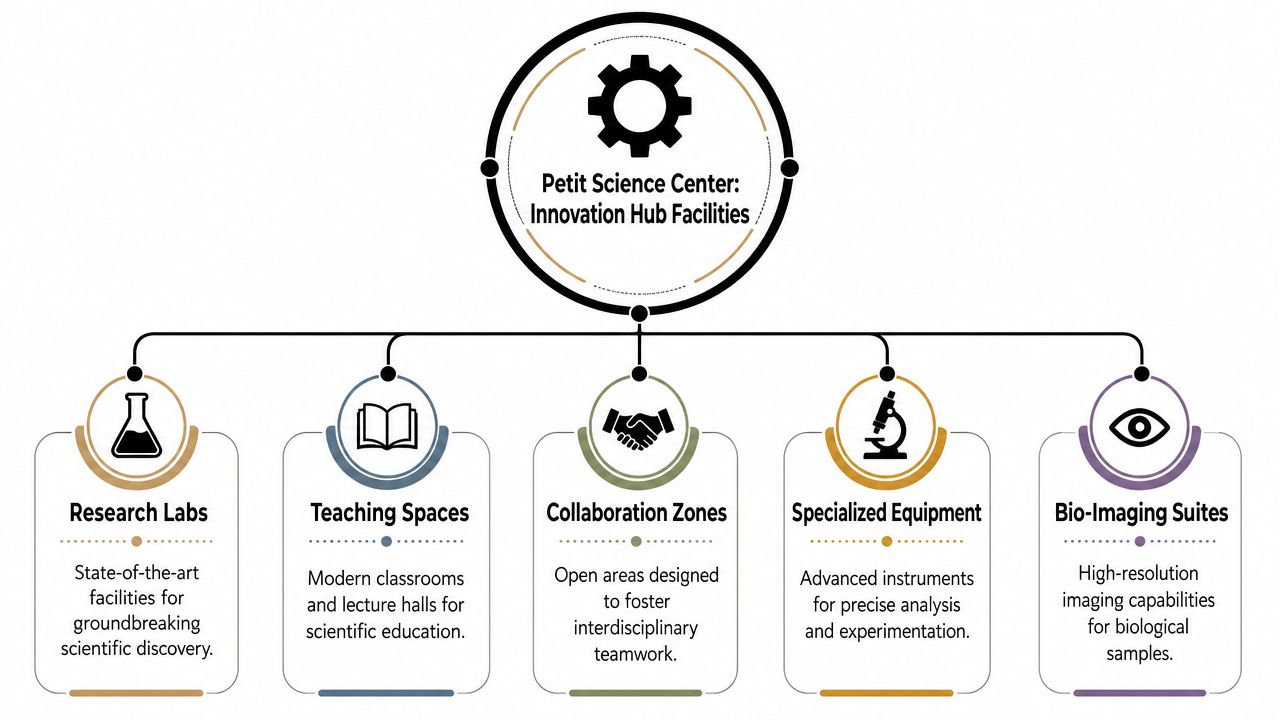
The center's lab program includes wet labs and teaching labs, but its most specialized assets are the high-containment biosafety spaces, which include BSL-2, BSL-3, and a BSL-4 lab suite according to Atlanta Downtown's project description. That immediately tells you the building has to manage very different risk profiles inside one envelope.
How to read the building as a visitor
If you're trying to understand the interior without getting lost in technical jargon, it helps to think in layers.
Teaching spaces first
These are the rooms most students encounter regularly. In a well-planned science building, teaching labs need to be durable, easy to supervise, and flexible enough to support changing curricula without constant renovation.General research zones next
Wet labs support day-to-day experimental work. These spaces usually demand more substantial utilities, more specialized storage, and tighter coordination between bench layouts and building systems.Specialized and restricted environments
High-containment areas sit at the far end of the control spectrum. These aren't spaces you “feature” casually in architecture photography. They are operational environments, and their design priorities center on containment, pressure relationships, access protocols, and mechanical reliability.
What works in buildings with mixed lab types
When a project includes teaching, clinical simulation, and containment-driven research, a few design choices make a major difference:
- Clear circulation hierarchy: Public users shouldn't drift into research back-of-house zones by accident.
- Mechanical zoning that matches use: High-intensity spaces need support systems that don't compromise lower-intensity areas.
- Room for adaptation: Science changes faster than architecture. Buildings that allow bench reconfiguration and infrastructure access age better.
- Visual orientation: Even highly technical facilities need intuitive wayfinding, daylight where appropriate, and enough openness to reduce the institutional maze effect.
What usually doesn't work
The failure mode in academic science buildings is rarely dramatic. It's usually operational. Rooms become too rigid. Service access is inconvenient. Teaching labs feel detached from research culture. Researchers inherit layouts that made sense on paper but not in active use.
Field note: In science facilities, photogenic space isn't enough. A corridor may look crisp in pictures and still be frustrating if equipment movement, supervision lines, or security transitions weren't thought through.
The Parker H. Petit Science Center is important because its program asks the building to perform at several levels at once. It has to support instruction. It has to support advanced research. It has to maintain trust with users who need both openness and control. That's a demanding brief, and it's one of the reasons the building remains so relevant as a case study.
A Catalyst for Research and Community Health
The strongest argument for the Parker H. Petit Science Center isn't that it's large. It's that its scale was used strategically. According to McCarthy's project page, the building is a 10-story, 350,000-square-foot research and teaching laboratory facility, and that scale allows multiple disciplines, including biology, chemistry, nursing, and public health, to be consolidated under one roof. The same project description notes that this arrangement reduces interdepartmental travel time and improves access to shared instrumentation.
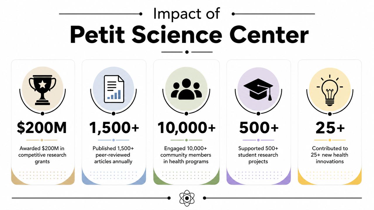
That matters more than it sounds. In university science, distance creates drag. It slows informal collaboration. It makes shared equipment harder to schedule and maintain. It separates undergraduate learning from visible research activity. Bringing those functions together doesn't guarantee collaboration, but it removes one of the most common architectural barriers to it.
Why this building matters beyond campus
For Atlanta, the center represents a certain kind of institutional confidence. It places serious scientific work in the urban core rather than pushing it to a distant research park. That has symbolic value, but it also has practical value. Students, faculty, staff, and visitors encounter science as part of downtown life, not as an isolated enterprise.
From a planning standpoint, that's persuasive for three reasons:
- Interdisciplinary contact improves when proximity is real. Shared hallways and adjacent departments create opportunities that separated buildings often don't.
- Public health education gains credibility when training environments feel current and integrated. A nursing program housed alongside active research functions signals that education and discovery belong together.
- Expensive tools are easier to justify when more users can access them. Consolidation supports a stronger case for shared resources.
The community effect is architectural too
A building can support community health indirectly through research, teaching, and training. It can also do it through visibility. When a science center looks open, serious, and well integrated into the city, it tells students and the public that scientific work isn't hidden away.
Co-location doesn't create collaboration by itself. But without co-location, collaboration has to fight the building before it can fight the problem.
That's why the Parker H. Petit Science Center deserves attention from architects, developers, and higher-ed leaders. It shows how a single facility can act as infrastructure for research and as a public statement about what a downtown university values.
A Photographer's Perspective on the Science Center
If you're photographing the Parker H. Petit Science Center, your job isn't just to make it look impressive. The job is to make the building legible. Science buildings can become visually anonymous if you lean too hard on generic wide shots, and they can become misleading if you isolate only the sleekest corners.
I'd start with the urban approach. Walk the perimeter before setting a tripod. Watch where the facade compresses, where the street opens up, and where reflections help rather than distract. In a downtown setting, the best hero image usually comes after you've rejected the obvious corner view.
Exterior strategy that tells the truth
For exteriors, I'd break the shot list into three passes.
- Context frames: These establish how the building sits in downtown Atlanta. Use neighboring structures, street trees, and traffic cues carefully. They should support scale, not clutter it.
- Primary elevations: Shoot for order. Keep verticals controlled. Let the facade rhythm carry the image rather than forcing drama with an extreme lens.
- Detail studies: Materials, joints, entry conditions, and the transition from public sidewalk to institutional threshold often tell more about design quality than a giant overview does.
Golden hour is useful here because it gives the envelope depth and separates planes cleanly. Twilight can work too, but only if the interior lighting pattern is disciplined. Random occupancy lighting weakens a facade shot fast.
Camera rule: If the building's lines are doing the work, don't let lens distortion become the subject.
For teams that need polished documentation for architecture, development, or higher-ed marketing, architectural and interior photography services can help structure that shot list around design intent rather than around a generic campus brochure approach.
Interior views require restraint
The challenge inside a building like this is access. You may not be able to photograph the most sensitive spaces directly, and that's appropriate. So the assignment becomes interpretive. Show circulation. Show transparency where it exists. Show the relationship between teaching, movement, and institutional identity.
A useful interior sequence usually includes:
Arrival and lobby conditions
In this area, the building explains itself to first-time users.Vertical circulation moments
Elevators and stairs aren't glamorous, but they reveal how the building organizes complexity.Lab-adjacent views
Doorways, glazing, and threshold conditions often communicate the research environment without compromising restricted areas.
Here's a helpful visual reference point for pacing and atmosphere later in the sequence:
Composition choices that separate strong work from routine coverage
Architectural photographers sometimes overcorrect with science buildings. They either make them too cold and clinical, or too lifestyle-driven. Neither approach holds up well.
What works better is a balanced set:
| Shot type | Purpose | Common mistake |
|---|---|---|
| Wide exterior | Establish identity and massing | Too much sky, not enough street relationship |
| Medium facade crop | Show material rhythm and proportion | Flattening the image with harsh midday light |
| Interior overview | Explain circulation and hierarchy | Overstaging with people who don't belong |
| Detail vignette | Reveal craft and use | Chasing texture without context |
The Parker H. Petit Science Center rewards photographers who can read both architecture and program. If you understand what the building is trying to do, the images get sharper. Not just technically. Conceptually.
Planning Your Visit and Final Thoughts
If you want to see the Parker H. Petit Science Center in person, treat it first as an active academic and research building. That means public access may be limited to common areas or exterior viewpoints, while many lab and support spaces remain restricted. That's normal for a facility with teaching functions alongside sensitive research environments.
For most visitors, the best approach is practical:
- Start outside: Walk the block and study the building from multiple corners before you look for a single perfect angle.
- Visit during changing light: Morning and late afternoon usually reveal facade depth better than flat midday sun.
- Respect operational boundaries: If a space looks controlled, assume it is. Don't force access for the sake of curiosity or photography.
- Look for the threshold moments: Entry, glazing, sidewalk relationship, and how the mass meets the street often say more than a distant skyline shot.
The building's significance isn't only in its technical program. It's in how convincingly it joins academic ambition, urban presence, and architectural discipline. Plenty of science buildings are efficient. Fewer communicate their purpose clearly to the city around them.
The Parker H. Petit Science Center stands out because it had to solve hard problems without looking confused. It had to house teaching, research, simulation, and containment. It had to behave as part of downtown Atlanta. And it had to keep doing those jobs after the ribbon cutting was over.
That's why it remains worth visiting, studying, and photographing. It's a serious building with a public face, and those are always the most rewarding kind to document.
If you need photography for a university facility, research building, corporate interior, or architectural project in Atlanta, Jimmy Clemmons Photographer provides architectural imagery, interior coverage, and visual documentation built around design clarity and real-world use.