

A lot of firms arrive at the same frustrating moment. The new site looks refined, the photography is excellent, the projects feel premium, and then the site loads like it’s dragging stone uphill. On a studio monitor in the office it may seem acceptable, but on a phone, on hotel Wi-Fi, or from a client across the country, the experience starts to feel slow and heavy.
That tension is real for architecture studios, developers, interior designers, hospitality groups, and photographers. A portfolio site isn’t a catalog page. It has to communicate judgment, materiality, light, finish, and scale. Generic image advice often treats every website like a news feed or e-commerce store. High-end firms need a more careful standard for Optimizing Firm Websites for Image Speed without flattening the very quality that makes the work persuasive.
The High-End Firm's Dilemma Speed Versus Splendor
A design-focused website lives or dies by its imagery. If the photos feel muddy, the firm looks less precise. If the files are huge, the site feels careless. Those aren’t separate brand problems. They’re the same problem showing up in different ways.
The hardest part is that creative firms can’t follow blunt advice like “compress everything harder.” That works for commodity content. It fails on a portfolio where a prospect is judging glazing detail, shadow transition, stone texture, ceiling lines, or the way daylight moves through a room. A page can be technically fast and still feel cheap if the imagery has visible artifacts.
That gap is well documented. Research on portfolio image optimization notes that existing guidance usually centers on generic e-commerce or news sites, while creative portfolio sites face a specific conflict between high-resolution presentation and page speed. The same source also notes that this tension is especially relevant as of 2026, with page experience carrying more weight and portfolio sites often suffering when image quality visibly degrades.
Why portfolio sites are different
A high-end firm website has a different job than a product grid. It has to do at least three things at once:
- Show detail: Clients need to inspect finishes, composition, and spatial clarity.
- Load smoothly: Friction at the first visit undermines trust before anyone reads a word.
- Stay search-competitive: Slow, image-heavy pages make it harder to meet modern performance expectations.
That’s why the best approach isn’t maximum compression. It’s controlled optimization. You protect the important parts of the frame and remove waste everywhere else.
Practical rule: If visitors notice the optimization before they notice the work, the optimization was too aggressive.
What actually works
The firms that get this right treat web performance as part of presentation, not a technical chore delegated after launch. They resize before upload. They create multiple image versions for different screens. They preload only the few images that shape first impression. They lazy load the rest. They use a CDN so a viewer doesn’t wait on a distant server just to see one hero shot.
Just as important, they decide where fidelity matters most. A homepage hero needs to feel crisp immediately. A thumbnail in a scrolling grid doesn’t need the same byte budget. A close-up detail image may deserve a more careful export than a supporting shot.
That same judgment applies outside the website too. Firms already make these decisions in client-facing presentation work, whether they realize it or not. The thinking is similar to managing client visual expectations in professional imagery. You’re aligning the medium with the moment of review.
Mastering Modern Image Formats and Compression
A beautiful portfolio can lose its effect long before a prospect studies the work. The page opens, the hero image hesitates, and the first impression shifts from craft to friction. In high-end architecture, interiors, and outdoor design portfolios, that problem usually starts in the asset prep, not in the front-end code.
For firms that depend on photography, renderings, and detail shots to convey quality, image files are often the heaviest part of the page. Common Ninja’s review of image optimization and website speed notes that images often make up the majority of a page’s weight, so format and compression decisions have an outsized effect on load time and Core Web Vitals.
Start with format choice, not plugin choice
A CMS plugin can automate delivery, but it cannot fix poor source decisions. Teams still need to decide which format fits the image itself.
Use a practical hierarchy:
- JPEG remains useful for source exports, editorial handoffs, and cases where you want a predictable photographic workflow.
- WebP is the best default for many firm websites because it usually cuts file size while preserving visual quality well enough for portfolio presentation.
- AVIF can push file sizes lower still, but it deserves image-by-image review. On some architectural images, especially those with delicate gradients or subtle material shifts, the savings are not the only consideration.
Google’s WebP documentation explains why WebP has become a common baseline for modern delivery. It can reduce file size relative to older formats while supporting both lossy and lossless compression. That flexibility matters on sites where one gallery may contain atmospheric dusk photography, crisp facade elevations, and minimal interior shots with large quiet surfaces.
Image Format Comparison for Professional Portfolios
| Format | Typical Size Reduction (vs JPEG) | Best For | Key Consideration |
|---|---|---|---|
| JPEG | Baseline | Source exports, legacy workflows, photographic compatibility | Familiar, but often heavier than modern alternatives |
| WebP | Smaller than JPEG in many web workflows | Most portfolio photography on the web | Strong balance of compression and quality |
| AVIF | Often smaller than WebP | Highly optimized modern delivery pipelines | Requires close visual review for tonal subtlety and browser strategy |
Compression should be perceptual, not blind
Compression settings should follow the image’s job on the page.
Architectural imagery is less forgiving than generic marketing photography. Hard edges, repeated structural lines, glazing, stone texture, and long shadow gradients reveal compression mistakes quickly. A setting that looks acceptable on a lifestyle photo can break down on curtain walls, soffits, or smooth plaster surfaces.
A reliable workflow looks like this:
- Resize to the actual display need first. Start with the intended use, not the original master export.
- Remove nonessential metadata. Camera and editing data add weight without improving the on-page experience.
- Export and review visually. Check the full frame, then inspect sensitive areas such as lines, textures, and gradients.
- Convert to a modern format where it holds up. WebP is often the safest default. AVIF is worth testing selectively.
- Set different quality thresholds by image role. The homepage hero, a detail gallery image, and a small project thumbnail should not share one compression rule.
One sentence sums it up. The right compression setting disappears into the presentation.
What to protect in architectural imagery
High-end portfolios ask more of image optimization because viewers are evaluating design judgment, materials, and execution. They are not just skimming for a general impression.
Protect these areas during export review:
- Edge integrity: mullions, reveals, stair lines, furniture profiles, trim details
- Gradient smoothness: skies, plaster walls, reflected light, dusk scenes, polished finishes
- Texture realism: stone, wood grain, concrete, metal mesh, textiles
- Color subtlety: mixed color temperatures, warm interior spill, exterior twilight, reflective surfaces
This is the trade-off generic image guides often miss. A portfolio site does not need museum-grade files everywhere, but it cannot treat all images as interchangeable content blocks either. The goal is selective fidelity. Save bytes where scrutiny is low. Protect detail where the image is carrying the firm’s credibility.
A better decision framework
Use compression according to evaluative importance:
- Hero image: modern format, conservative compression, close review on desktop and mobile
- Project gallery image: moderate compression, with extra attention to lines and material detail
- Thumbnail grid: stronger compression is usually acceptable because the image is read quickly and at small size
- Decorative background or transitional image: optimize more firmly because it supports the page rather than carrying the main judgment
Teams that handle this well treat export settings as part of art direction. Fast pages matter, but so does the feeling of precision. On a firm website, image optimization is not just technical cleanup. It is presentation control.
Implementing Smart Responsive Image Sizing
The most common portfolio mistake is simple. One very large image gets sent to every visitor, regardless of screen size. That means a phone may receive a file prepared for a wide desktop monitor. The browser may shrink it visually, but the visitor still downloads the oversized asset.
That’s waste, not quality.
The challenge is sharper for architecture and photography portfolios because mobile-first shortcuts can hurt desktop presentation. This analysis of image optimization practices for visual brands notes that the architectural photography sector lacks good guidance on balancing mobile speed with the high-resolution viewing decision-makers expect on larger screens.
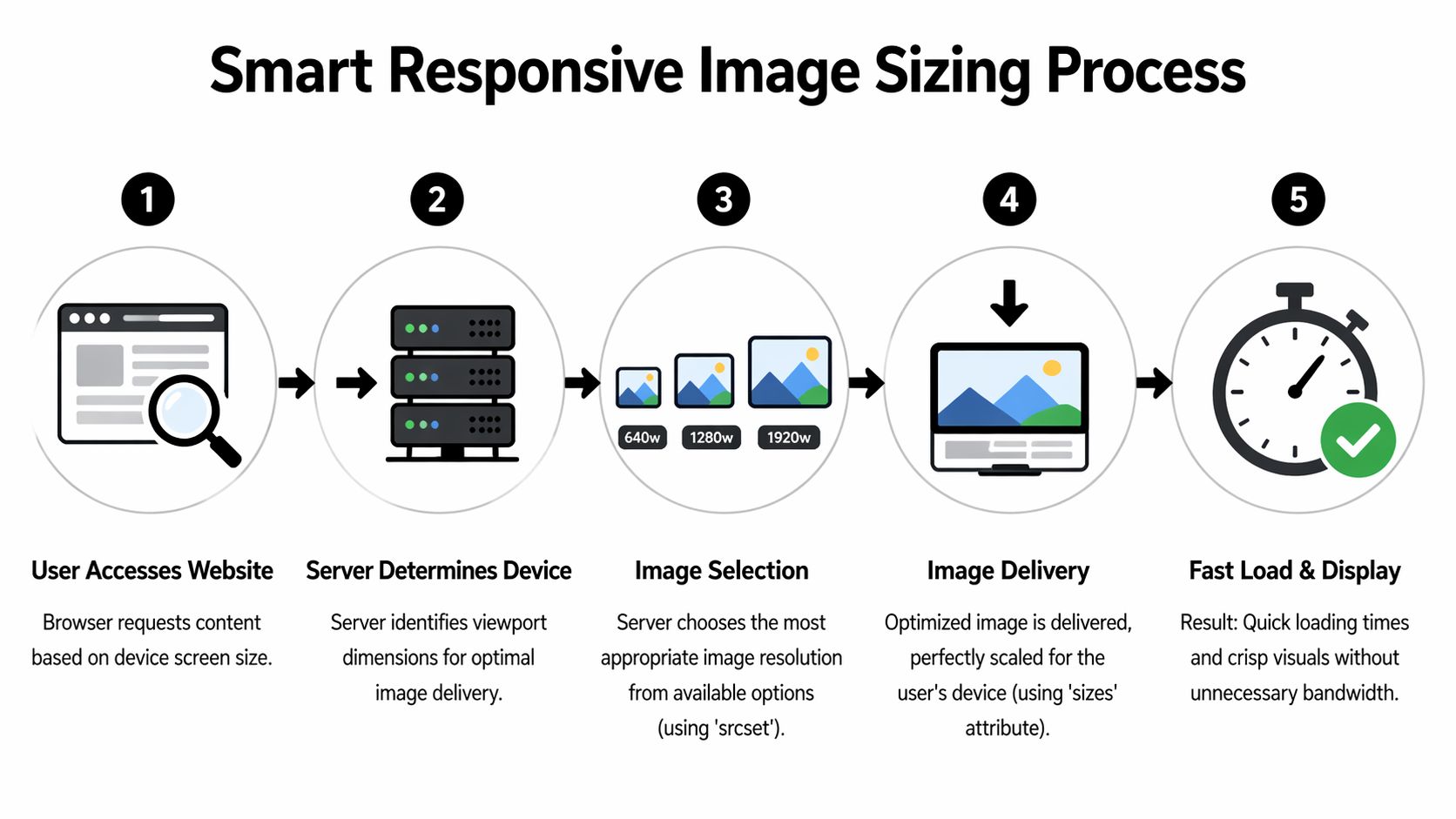
What srcset actually does
srcset gives the browser a menu of image widths. sizes tells the browser how much space the image is likely to occupy in the layout. Together, they let the browser choose an appropriately sized file.
A practical example for a project hero image:
<img
  src="/images/project-1600.webp"
  srcset="
    /images/project-768.webp 768w,
    /images/project-1200.webp 1200w,
    /images/project-1600.webp 1600w,
    /images/project-2000.webp 2000w"
  sizes="(max-width: 768px) 100vw, (max-width: 1400px) 90vw, 1600px"
  width="1600"
  height="1067"
  alt="Contemporary office atrium with glass partitions and natural light">
That markup does three important things:
- It avoids sending desktop-scale images to smaller screens
- It preserves crispness on larger screens
- It sets width and height to stabilize layout before the image loads
Use picture when you need format fallbacks
If you want modern formats with fallback support, use the <picture> element:
<picture>
  <source
    type="image/avif"
    srcset="
      /images/project-768.avif 768w,
      /images/project-1200.avif 1200w,
      /images/project-1600.avif 1600w"
    sizes="(max-width: 768px) 100vw, 1200px">
  <source
    type="image/webp"
    srcset="
      /images/project-768.webp 768w,
      /images/project-1200.webp 1200w,
      /images/project-1600.webp 1600w"
    sizes="(max-width: 768px) 100vw, 1200px">
  <img
    src="/images/project-1200.jpg"
    alt="Boutique hotel lobby with layered lighting and stone finishes"
    width="1200"
    height="800">
</picture>
This setup lets modern browsers take the lighter format while older ones still get a reliable image.
Build image widths around layouts, not guesses
Don’t generate random widths because a plugin suggests them. Generate sizes that match the actual templates on the site.
For most firm websites, these are the image categories that matter:
- Full-width hero images
- Two-column editorial or case-study images
- Project gallery images
- Thumbnail grids
- Open-lightbox or detail-view images
A homepage hero may justify larger variants. A three-column project grid almost never does. If the rendered slot is small, sending a large file is just unnecessary transfer.
Field note: Responsive images aren’t about making everything smaller. They’re about matching each file to the exact viewing context.
A practical responsive sizing workflow
Here’s a reliable production process:
- Export one clean master for web use, not the untouched original.
- Generate multiple widths for each layout class.
- Convert those widths into modern formats.
- Add
srcsetandsizesthrough your CMS or build system. - Test on phone, laptop, and large desktop screens.
If your CMS supports responsive image generation, use it. If it doesn’t, you may need a service like Cloudinary or Imgix, or a build process that creates variants automatically.
Where firms often get this wrong
The mistakes are usually operational, not conceptual:
- One upload, one output: the CMS stores only one oversized version.
- No width descriptors: the browser can’t make a smart choice.
- Missing dimensions: the layout shifts while images load.
- Desktop-only review: the team approves the site on a large display and misses mobile bloat.
- Mobile-only overcorrection: files are too aggressively optimized, and desktop viewers lose detail.
The right setup gives different visitors different files while preserving one consistent visual standard. That’s the point. A mobile visitor should get speed. A desktop prospect reviewing a project should still get clarity.
Accelerating Delivery with Lazy Loading and CDNs
Even perfectly compressed images can feel slow if delivery is sloppy. File optimization is only half the job. The rest is timing and location. When the browser requests an image, how soon it requests it and where it receives it from shapes the user’s experience.

Lazy loading fixes the first impression
A portfolio homepage may contain a hero image, featured projects, team imagery, and supporting detail shots. If the browser tries to fetch everything at once, the first screen competes with images the visitor hasn’t even reached yet.
Lazy loading fixes that. The browser defers offscreen images until the user scrolls near them.
The implementation is simple:
<img
  src="/images/project-grid-800.webp"
  loading="lazy"
  width="800"
  height="600"
  alt="Restaurant interior with layered lighting and custom millwork">
Use lazy loading for below-the-fold imagery, project grids, supporting gallery images, and secondary content blocks. Don’t use it on the primary hero image that defines the first screen. That asset usually needs the opposite treatment, such as preload or higher fetch priority.
A CDN changes distance, not just speed
A Content Delivery Network caches assets on servers closer to the visitor. Instead of every image request traveling back to your origin server, the request is served from an edge location that’s geographically nearer.
For firms with a broad regional or global audience, that matters. This explanation of CDN-based image performance notes that an automated image optimization pipeline with a CDN can reduce Time to First Byte by 40% globally, helping sites move toward the sub-2.5s Largest Contentful Paint threshold required by Core Web Vitals.
Think of it this way. If your image library lives in one city, every distant visitor is effectively asking that city for every visual asset. A CDN puts copies closer to where people are located.
What a strong delivery setup looks like
The best setups combine several delivery rules at once:
- Prioritize the hero image: preload it or give it high fetch priority
- Lazy load supporting images: keep the initial request budget focused
- Cache aggressively: static images should be easy for browsers to reuse
- Use a CDN with image transformation support: one source image can become many delivery variants automatically
A lot of modern platforms can do this. Cloudinary, Imgix, and some managed hosting stacks combine resizing, format conversion, and edge delivery in one pipeline.
A short explainer helps if you want a visual overview of the moving parts:
What not to do
Delivery problems usually come from one of these habits:
- Lazy loading everything: if the hero waits too, the page feels hesitant
- Using a CDN without image variants: files arrive from nearby, but they’re still too large
- Ignoring cache headers: repeat visits stay heavier than they should be
- Uploading giant originals into a visual builder: the builder displays them smaller, but still serves bloated files
Fast delivery doesn’t excuse oversized assets. A CDN makes a smart workflow better. It doesn’t rescue a careless one.
For high-end firms, this part often gets overlooked because it’s less visible than retouching or layout design. But visitors feel it immediately. The site either appears to respond with confidence, or it doesn’t.
Automating Your Image Workflow in Your CMS
Manual optimization works for a handful of pages. It breaks down once the site grows, the team changes, or new projects get added under deadline. If performance depends on someone remembering fifteen export rules every time they upload a gallery, performance won’t hold.
Automation is what turns a good launch into a durable system.
What the CMS should handle for you
A capable image workflow inside WordPress, Webflow, Squarespace, or another CMS should do most of the following without constant intervention:
- Generate multiple image sizes for common layout slots
- Convert assets into modern formats such as WebP, and in some pipelines AVIF
- Attach responsive markup so browsers can select the right variant
- Preserve original uploads for archival or alternate use
- Apply lazy loading rules where appropriate
- Maintain width and height attributes to protect layout stability
If your stack can’t do those things natively, add tooling that can. On WordPress, that may mean an optimization plugin and image CDN integration. On Webflow or a headless stack, it may mean build-time processing or a media service. The exact vendor matters less than the workflow.
Build a publishing system, not a cleanup habit
A clean setup usually follows this order:
- A team member uploads one prepared source image.
- The CMS or media service creates derivative sizes automatically.
- The system serves modern formats where supported.
- Templates output responsive image markup.
- Delivery rules decide which images load immediately and which wait.
That structure keeps standards consistent even when different people publish content.
Features worth looking for
When evaluating plugins, media services, or CMS capabilities, prioritize tools that can do these jobs well:
- Responsive variant generation: the platform should create practical widths from one upload
- Format negotiation: it should serve lighter formats where the browser accepts them
- Compression controls: not just on or off, but adjustable enough for image-led work
- CDN integration: media should be distributed efficiently
- Bulk regeneration: older libraries often need to be rebuilt under new rules
- Visual override options: some hero images need more careful handling than default settings allow
That last point matters for premium portfolio sites. Full automation is useful, but fully blind automation isn’t.
A good system automates the routine and leaves room for judgment on the images that carry the brand.
Keep contributors from breaking the system
Even a well-configured CMS can be undermined by upload habits. Editorial teams, marketers, and designers need a short operating standard.
That standard can be simple:
- Upload web-prepared images, not untouched masters
- Use the correct image field for each layout
- Avoid replacing responsive modules with raw image embeds
- Review key pages after publishing
It also helps to centralize visual guidance. A resource library, style guide, or internal reference point reduces inconsistency across teams. Firms that maintain shared standards for creative production usually have an easier time with website performance too. The same discipline that supports professional photo resources for Atlanta creative and business teams also supports cleaner digital publishing workflows.
The best CMS setup feels invisible. People upload work, the site stays fast, and nobody has to remember a long checklist every week.
Testing Performance and Protecting Visual Intent
A common failure on high-end firm websites happens after the technical work is "done." The page scores well, the files are smaller, and the portfolio suddenly feels flatter, harsher, or less expensive than the built work deserves.
Testing has to protect both outcomes. The page needs to load quickly, and the images need to preserve the decisions that made them strong in the first place.
PageSpeed Insights is a practical starting point because it surfaces the issues that usually affect image-heavy portfolio pages: oversized payloads, delayed Largest Contentful Paint, layout shift, and render path problems. GTmetrix and browser dev tools help confirm what is being requested, which image candidate is being served, and whether the browser is pulling assets in the order you intended.
Measure the page, then inspect the image
Performance reports are useful, but they do not judge photographs. They do not tell you whether a curtain wall lost edge definition, whether a plaster surface started to band, or whether a carefully graded interior now looks muddy on a phone.
That review still belongs to people.
On architectural and luxury portfolio sites, I check the page first, then the image at the size a client sees it. Hero images deserve the closest review because they carry both the heaviest visual load and the strongest performance risk. Detail shots matter too, especially when the project story depends on materiality, craftsmanship, or subtle lighting.
Look closely at areas compression tends to damage first:
- Window mullions, trim, and other precise lines
- Stone, fabric, wood grain, and other fine textures
- Soft tonal transitions in walls, ceilings, or sky
- Mixed interior lighting where color can shift
- Shadows and dark gradients where artifacts hide until they become distracting
What to look for in a visual QA pass
Run that review on real devices. A calibrated desktop display is useful, but it is not enough for pages that will be opened on phones, laptops, and large external monitors.
A short QA pass usually catches the issues that synthetic testing misses:
- Phone review: Does the page appear quickly, stay stable, and keep the main image readable?
- Laptop review: Do project images still look refined during normal scrolling and clicking?
- Large display review: Do hero images hold texture and tonal control at wider viewing sizes?
- Cross-browser review: Are the intended formats and fallbacks displaying correctly?
If an image looks brittle, banded, or overly sharpened, reduce compression. If it looks clean but still arrives too heavy for the layout, cut dimensions before you cut quality again. On premium portfolio sites, the better fix is often resizing strategy, not more aggressive compression.
Performance metrics matter, but judgment finishes the job
Largest Contentful Paint matters because it reflects how quickly the main visual arrives. Cumulative Layout Shift matters because design firms should not present work on pages that jump while loading. Those metrics map directly to how polished the site feels.
They still leave out visual intent.
A speed score will not tell you that a concrete wall now looks blotchy or that a shadowed stair detail lost separation. It will not flag a hero crop that technically loads fast but no longer carries the sense of scale the original frame had. Those are brand problems, not just image problems.
The final review on key pages can stay simple:
Ask two questions: Did the page load without friction? Did the image still feel intentional?
Teams that answer both questions well usually treat optimization as selective craft, not bulk reduction. The same judgment used in post-production techniques that correct structural photos without making them feel manipulated applies here. The best technical work protects the photograph rather than leaving obvious fingerprints on it.
Fast and beautiful support each other on a strong firm website. Speed gets the work in front of people quickly. Visual quality gives them a reason to keep looking.
If your firm needs imagery that holds up both visually and digitally, Jimmy Clemmons Photographer creates architectural, commercial, and brand photography designed to present high-end work with clarity, control, and lasting impact.