

You've probably had this moment. The shoot is complete, the files are sharp, the space looks good, and yet the final selects still don't feel like your brand. They document the room, but they don't deliver the atmosphere, hierarchy, and polish that make a design project memorable.
That gap is where a skilled interior design photo editor earns their place. For architecture and design firms, editing isn't cleanup after the primary work is done. It's part of how the project is interpreted for a portfolio, an award submission, a publication pitch, or a leasing campaign. The right editor helps protect accuracy while shaping the visual story you want clients to see.
From Great Photos to Unforgettable Imagery
A finished interior can be expensive, layered, and carefully considered, yet still look flat in a raw capture. Stone loses depth. White walls shift warm or green. Window views blow out. A carefully composed room starts to feel smaller than it did in person. None of that means the photography failed. It means the image hasn't been completed yet.
High-end interiors rarely become persuasive through capture alone. They need refinement that respects the architecture, restores the intended light, and gives materials the presence they had on site. That's why the editor isn't a last-minute technician. They're the final visual interpreter.
The urgency is real. The AI Interior Design market was valued at USD 1.47 billion in 2024 and is projected to reach USD 6.96 billion by 2032, according to SNS Insider's AI interior design market report. That projection reflects how quickly visual expectations are changing. Clients, publications, and developers now see polished spatial renderings and enhanced imagery every day. Your photography has to hold its own in that environment.
Why good files still feel unfinished
A room can be technically well photographed and still miss the emotional read. Common reasons include:
- Muted material contrast. Velvet, limewash, brushed brass, and natural stone often need careful tonal separation to read properly on screen.
- Competing light sources. Daylight, sconces, recessed lighting, and exterior spill can push color in different directions.
- Weak visual hierarchy. Without guided contrast and local adjustment, the eye lands on bright distractions instead of the design decisions that matter.
Great editing doesn't make a space look fake. It helps the photograph behave more like the experience of standing in the room.
What clients are really buying
You're not hiring an editor just to remove outlets or tidy reflections. You're hiring someone to turn a competent file into an image that can carry your reputation. For a residential designer, that may mean restraint and warmth. For a hospitality group, it may mean atmosphere and finish. For a developer, it may mean clarity, consistency, and trust.
That's the difference between a gallery people scroll past and a set of images they remember.
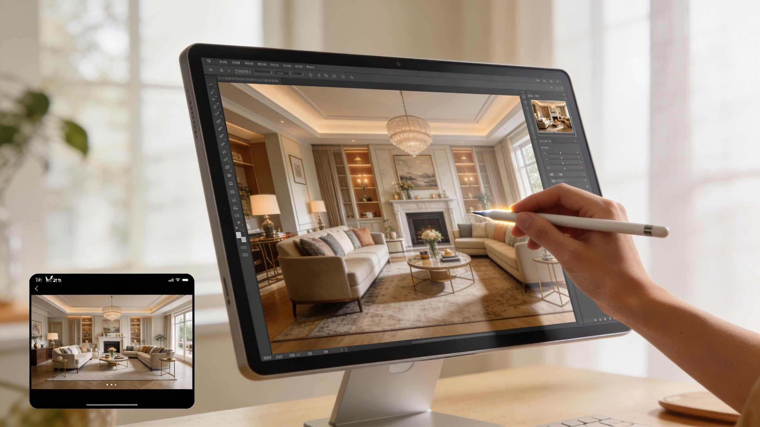
The Editor's True Role Beyond Simple Retouching
People often use “retouching” as if it covers the entire post-production process. It doesn't. In interior work, the essential distinction is between technical correction and creative enhancement. They overlap, but they solve different problems.
Technical correction protects credibility. Creative enhancement shapes perception. A serious editor has to know where one ends and the other begins.
Correction first or design first
Many teams get tripped up at this stage. As noted by Musely's discussion of room perspective correction workflows, professionals must manage the difference between correction-first workflows that maintain authenticity for architectural records and design-first workflows that explore style with AI. An expert editor knows when to apply each method.
If you're documenting a completed project for architects, builders, editors, or discerning design clients, correction usually comes first. Vertical lines need to be straight. Lens distortion has to be controlled. Proportions must reflect the built space. Without that foundation, every later adjustment sits on an unstable image.
If you're developing concept visuals, mood explorations, or alternate styling directions, design-first tools may have value. But they shouldn't be confused with documentary photography. A corrected photograph says, “This is the space.” A redesigned image says, “This is one possible interpretation.”
What professional editing actually includes
A strong interior design photo editor works in layers of intent:
- Geometric discipline so cabinetry, door frames, and wall planes feel architecturally honest.
- Light management so windows, shadows, and practical fixtures coexist without chaos.
- Material fidelity so woods, textiles, metals, and painted surfaces feel believable.
- Selective cleanup so distractions disappear without sterilizing the room.
That last point matters. Over-editing is easy to spot in luxury interiors. If every reflection is erased, every texture is smoothed, and every surface becomes clinically perfect, the image stops feeling lived in and starts feeling synthetic.
The editor as translator
An interior designer may want a room to read as calm, elevated, and tactile. A commercial client may want the same room to read as premium, bright, and efficient. The camera records the space. The editor interprets which visual cues will support the intended message.
Practical rule: Ask whether the image needs to prove the space or persuade the viewer. That answer determines the editing strategy.
That's why simple retouching language undersells the job. A specialized editor isn't just fixing pixels. They're aligning the photograph with the purpose it needs to serve.
How to Brief Your Editor for Perfect Results
Most disappointing edits start with a weak brief. Sending RAW files with “please polish” doesn't give an editor enough to work with. If you want images that feel specific to your firm, your project, and your audience, you need to brief the editor like a creative partner.
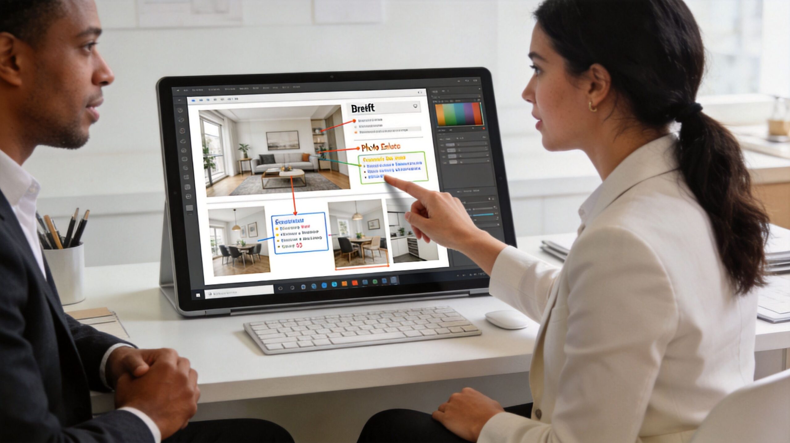
A useful brief doesn't have to be long. It does need to be specific.
Start with the story of the project
Before talking about window pulls or object removal, define what the project is supposed to communicate. A brief should answer a few simple questions:
- Who is the audience. Editorial team, future residential clients, hotel guests, leasing prospects, or investors.
- What should the space feel like. Give three words, such as quiet, polished, and warm.
- What matters most visually. Materials, light quality, layout, custom millwork, or a particular spatial sequence.
This is also where prep work before the shoot matters. If you're still refining that side of the process, it helps to review high-end interior shoot staging considerations before files ever reach the editing desk.
Identify the hero frames
Not every image needs the same level of labor. Mark the hero shots. These are the images that will carry the project on your homepage, in media outreach, in print submissions, or across campaign assets.
A practical brief might separate files into three groups:
| Image type | Purpose | Editing priority |
|---|---|---|
| Hero images | Portfolio, press, awards | Highest |
| Supporting images | Project gallery, proposals | Medium |
| Utility images | Social, internal use, documentation | Streamlined |
That one distinction changes how an editor allocates time and attention.
Say this, not that
Vague requests force editors to guess. Better language leads to better results.
Instead of “Make it brighter”
Say “Keep the room luminous, but preserve detail in the window view and don't wash out the oak tones.”Instead of “Fix the color”
Say “The plaster should feel neutral and soft, not yellow. Keep the brass warm but controlled.”Instead of “Clean it up”
Say “Remove the outlet, cable shadow, and distracting reflection in the mirror. Leave the natural texture in the stone and sofa.”
Give references with context
Reference images help, but only if you explain what you like about them. Don't just send a folder of screenshots. Tell the editor what each one demonstrates:
- Use this for mood. Soft contrast, restrained highlights, gentle shadows.
- Use this for color handling. Whites stay neutral, woods stay rich.
- Use this for pacing. Editorial, uncluttered, not overly glossy.
A reference without commentary often creates more confusion than clarity.
Define revision expectations early
Before work begins, align on the basics:
- Which files need full retouching
- Whether AI-assisted cleanup is acceptable
- How many revision rounds are included
- What delivery formats you need
- Where the images will appear first
Clear direction at the start saves time later. Beyond that, it gives the interior design photo editor enough context to make judgment calls that serve your brand, not just the software.
The Professional Editing Workflow Unpacked
Once the brief is solid, the workflow should move in a deliberate order. Good editing is cumulative. Each decision supports the next one. If the foundation is wrong, no amount of retouching will save the image.
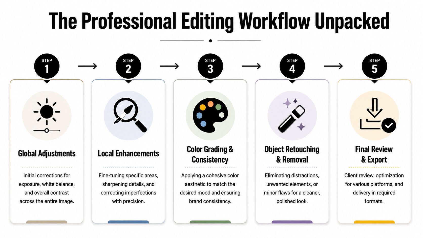
Foundation before finesse
The first pass is global correction. This usually happens in Adobe Lightroom, Adobe Camera Raw, or Photoshop, depending on how the files were captured and how complex the scene is.
That stage addresses the broad structure of the image:
- Perspective correction for verticals and architectural alignment
- Lens correction to reduce distortion
- Baseline white balance so neutrals behave properly
- Global exposure and contrast to set the tonal range
At this point, the image should look stable, not finished. If someone jumps into object removal or dramatic color work too early, they often create inconsistencies that are harder to fix later.
Exposure blending and window control
Interiors almost always contain a dynamic range problem. The view outside the window is bright. The corner under the console table is dark. The camera can't hold both gracefully in a single exposure as often as the eye can.
That's why bracketed capture matters. A key professional technique involves blending bracketed exposures (-2, 0, +2 EV) into a natural high-dynamic-range image. According to Imagtor's benchmark on editing mistakes in real estate photography, when this is done with histogram guidance, 92% of edited images pass client approval, compared with 65% for edits eyeballed for brightness.
That gap tells you something important. Good editing isn't just taste. It's method.
A disciplined workflow often includes:
- Importing the bracketed set and aligning frames
- Blending for natural highlight and shadow retention
- Checking the histogram rather than relying on screen brightness alone
- Pulling windows down selectively so they read as believable, not pasted in
- Holding texture in bright upholstery, stone, and painted trim
For structural imagery, these choices matter even more. Teams that handle architecture seriously often rely on post-production methods for structural photographs to preserve form while refining the final image.
If the viewer notices the edit before they notice the room, the blend has gone too far.
Color grading and local retouching
After exposure is balanced, the editor turns to color and local control. At this point, the image starts to align with your brief.
Three areas usually need close attention:
Material accuracy
Wood should look like the wood you specified. Marble should keep depth. White paint should remain distinct from cream upholstery. A strong editor protects those separations rather than flattening everything into one neutral wash.
Lighting logic
A room lit by daylight and practical fixtures needs internal coherence. Shadow direction, fixture warmth, and window brightness all need to feel like they belong to the same moment.
Distraction removal
This is the surgical phase. Cords, exit signs, specks on walls, sensor dust, outlet covers, and awkward reflections are all candidates for cleanup. The best editors remove what pulls attention without erasing the personality of the room.
Here's a simple breakdown of what tends to happen where:
| Workflow stage | Primary tools | Main risk if done poorly |
|---|---|---|
| Global correction | Lightroom, Camera Raw, Photoshop | Distorted space and unstable tones |
| Exposure blending | Photoshop layers, HDR tools | Fake windows, halos, flat surfaces |
| Local retouching | Healing, cloning, masking | Repetition artifacts and plastic textures |
| Color grading | Curves, HSL, selective masks | Brand inconsistency and inaccurate materials |
A professional workflow doesn't chase perfection for its own sake. It shapes a finished image that feels credible, intentional, and consistent with how you want the project remembered.
Finding and Vetting Your Photo Editor
Hiring an editor is a creative decision, not just an operational one. The portfolio matters, but so does taste, restraint, communication, and the ability to work within your standards. A flashy before-and-after gallery can hide a lot of bad judgment.
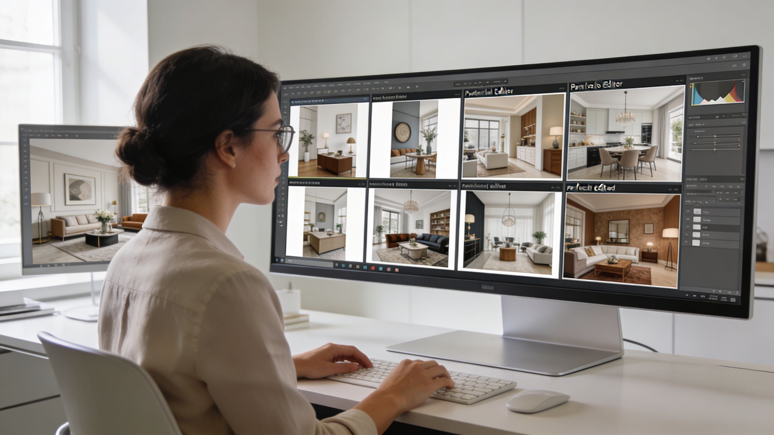
What to look for in a portfolio
Don't judge an editor by one dramatic transformation. Look for consistency across many projects.
Review their work for:
- Straight lines that stay straight. Verticals should feel disciplined without making the room look stretched.
- Controlled color. Whites, woods, stone, and metals should remain distinct and believable.
- Natural lighting. Window views should integrate cleanly. Shadows should hold information without turning muddy.
- Tasteful restraint. Luxury work should feel polished, not digitally overcooked.
If every image has the same heavy contrast, the same cyan windows, or the same hyper-clean look, you're seeing a preset mentality, not editorial judgment.
Test before you commit
The fastest way to vet an interior design photo editor is with a paid test. Send one challenging frame and one straightforward frame. Include a concise brief. Then evaluate both the output and the process.
Here's what the test should reveal:
- Can they follow direction without becoming literal to a fault?
- Do they protect architectural realism?
- Are they asking smart questions?
- Do revisions improve the image or just change it?
A good editor doesn't solely obey notes. They interpret them well.
Ask about modern tools without chasing gimmicks
AI is now part of the conversation whether firms like it or not. According to Woodworking Network's reporting on designer AI adoption, 85.4% of interior designers are using AI tools in their work. That makes it reasonable to ask whether your editor can integrate AI for speed and creative visualization while still maintaining control in Photoshop and other traditional software.
That doesn't mean you want a button-pusher. It means you want someone who knows where automation helps and where it damages the image.
The best editors use AI like an assistant, not like a substitute for judgment.
Business fit matters too
Even talented editors can become difficult partners if the process is sloppy. Before hiring, clarify:
| Vetting point | What to ask |
|---|---|
| Pricing model | Per image, per project, or retainer |
| Turnaround | Standard delivery time and rush options |
| Revisions | How many rounds are included |
| File handling | Preferred RAW delivery and export specs |
| Style alignment | Whether they can adapt to your brand, not just their own default look |
A dependable editor should make your workflow calmer, not noisier.
The Final Quality Check Your Pre-Publication Checklist
Once the edited files arrive, don't review them casually on a phone and call it done. Open them on a proper display. Compare them against your brief. Check them as both a technician and a brand steward.
The point of this review isn't to hunt for minor flaws only. It's to confirm that the images present your work the way you want to be known.
Review in two passes
First, inspect the technical integrity. Zoom in. Check the corners. Watch windows, mirrors, edges of furniture, and transitions between light sources. These are the places where rushed edits usually reveal themselves.
Then step back and assess the image as a whole. Does the eye land where it should? Does the room feel believable? Does the mood align with the project?
If texture is central to your work, it's smart to compare the delivery against practical standards for capturing texture in interior design photos. Fine materials often suffer when editors push brightness too far or smooth away local contrast.
Image Quality-Check Checklist
| Check Area | What to Look For | Status (Pass/Fail) |
|---|---|---|
| Perspective | Vertical lines are straight and proportions feel natural | Pass/Fail |
| Exposure | Bright areas hold detail and shadows feel open, not muddy | Pass/Fail |
| Window treatment | Exterior view looks believable and blends naturally with the room | Pass/Fail |
| Color accuracy | Paint, wood, stone, metal, and fabric read true to life | Pass/Fail |
| Halos and masking | No glowing edges around furniture, walls, or windows | Pass/Fail |
| Retouching quality | Removed objects leave no repeating patterns or obvious cloning | Pass/Fail |
| Texture | Materials retain depth and tactile quality | Pass/Fail |
| Brand fit | The image feels consistent with your portfolio and market position | Pass/Fail |
Questions worth asking before approval
- Would this image stand up in print, on a large screen, and in a portfolio review?
- Does it reflect the built project accurately?
- Is anything in the edit drawing attention away from the design?
A final review should protect the standard you want associated with your name. Once the files go live, they're no longer just photographs. They become evidence of how your firm sees design, quality, and detail.
If you want imagery that treats architecture and interiors with editorial discipline, Jimmy Clemmons Photographer creates polished visual work for design firms, commercial brands, and built environments that need more than basic documentation.