
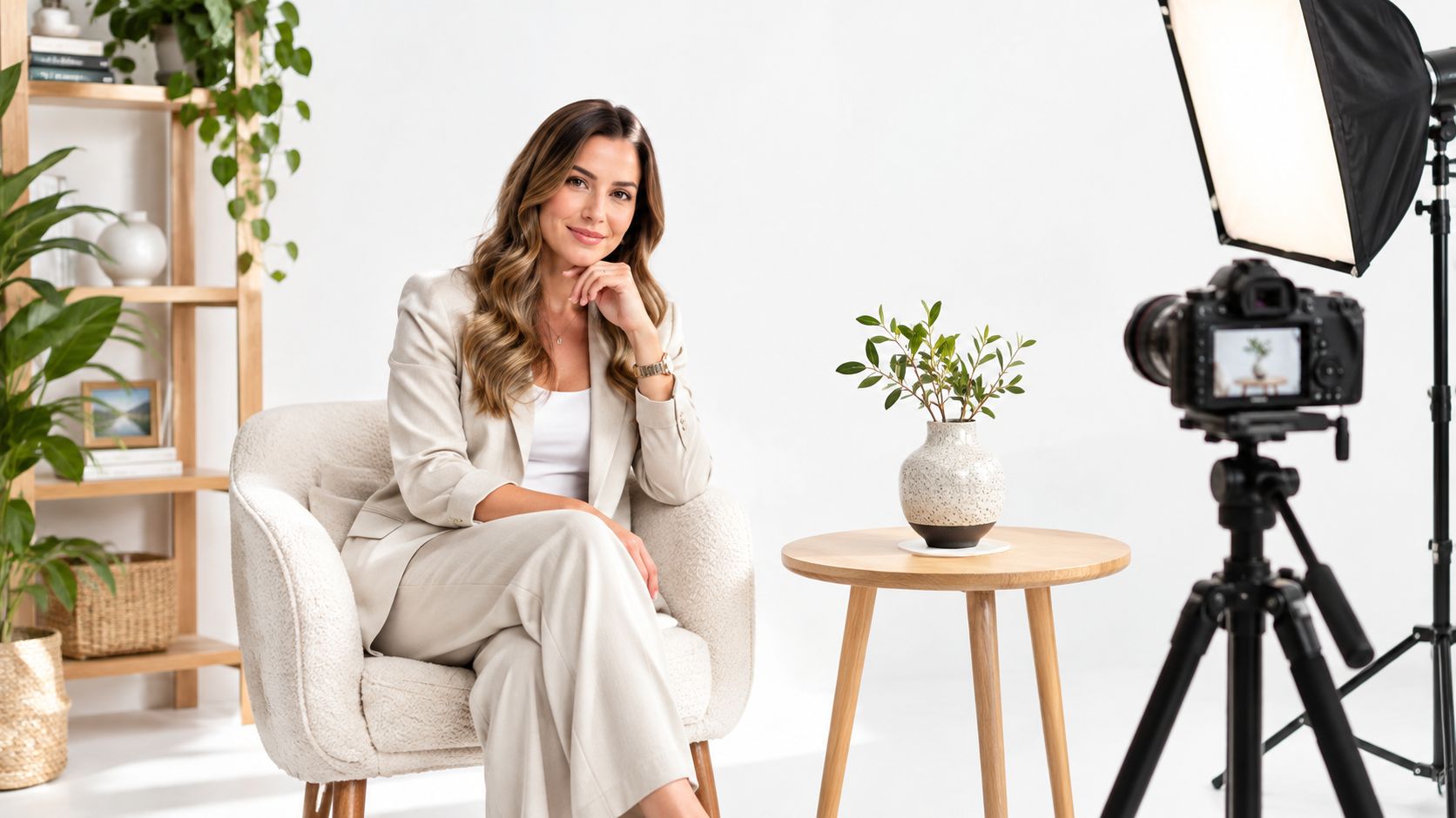
Indoor shoots often start with a practical problem: the weather has changed, the room is mixed with competing light, or a client needs images that show more than a flattering backdrop. The space itself can carry the story, whether the brief calls for a calm home interior, a confident portrait, or a clear view of how a workplace functions.
The best indoor photoshoot ideas aren't attractive rooms alone. They're ways to communicate atmosphere, material quality, personality, or product value. Interiors have been photographic subjects since the medium's early history: Nicéphore Niépce's View from the Window at Le Gras, generally dated to 1826 or 1827, depicts rooftops and buildings, while William Henry Fox Talbot photographed a latticed window at Lacock Abbey in 1835. The first image required an exposure lasting several hours, making stationary architecture a practical subject. That history still resonates in window-framed compositions, long room views, and carefully arranged still lifes. (Architectural photography)
The nine setups below adapt to residential and architectural work, leadership portraits, team culture, hospitality scenes, and product staging. Each pairs a visual mood with a lighting approach, camera position, shot sequence, and practical on-set decisions. If you're collecting references for another kind of milestone shoot, these golf course milestone pictures may offer a different direction.
1. Natural Window-Light Interior Setup
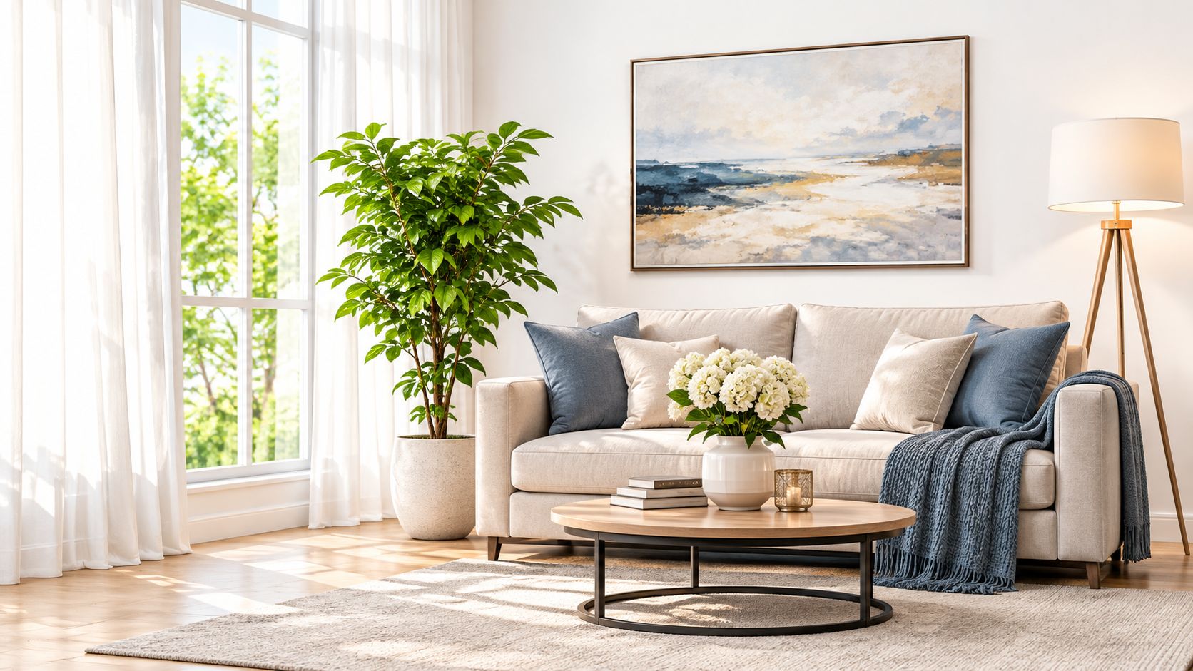
A large, unobstructed window can do the work of a broad softbox, giving furniture and finishes gentle direction without making the room look artificially lit. This setup suits a residential living room photographed in the morning, with sheer curtains softening daylight across a sofa and reading nook. It also works for an office reception area where late-afternoon light picks out the desk and plants.
Start by watching where direct sun falls on the relevant façade. Schedule the main frames when the window light is indirect, then switch off overhead fixtures to avoid competing color casts. A wide-angle lens can establish the room, but keep the camera level and avoid pushing so wide that furniture stretches at the frame edges. A tripod helps maintain consistent framing while you make exposure variations for bright windows and darker interior detail.
On-set rule: Photograph the clean, daylight-led version first. Add practical lamps for a warmer variation only after you've secured a frame with reliable color.
A gray card placed in the same light gives you a reference for setting white balance; a tripod also makes it easier to bracket exposures and blend them cautiously if the window and room exceed the camera's exposure range. For a repeatable portfolio, keeping the time of day similar across projects can help maintain a consistent daylight character. For more on shaping window illumination, see window-light photography.
Shot sequence: Capture a wide room view, a mid-distance seating or work area, then close details of fabric, wood, and other finishes. Keep one version free of extra props so the space remains easy to evaluate.
2. One-Point Perspective Corridor and Hallway Composition
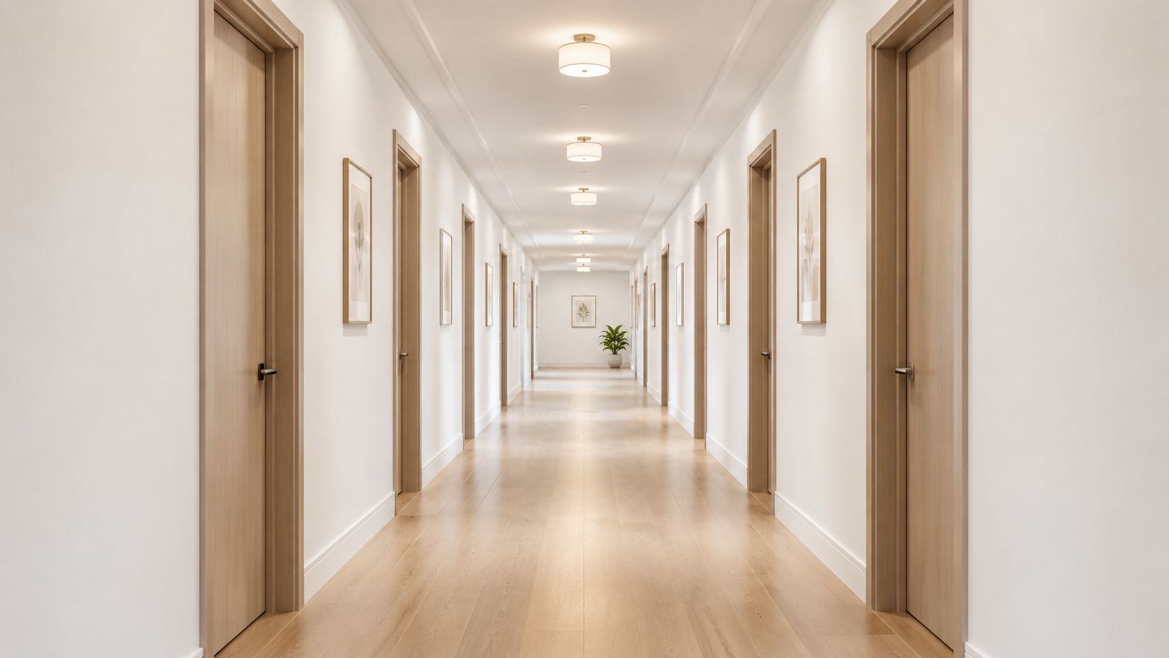
A corridor can make architecture feel orderly and legible when its lines meet at a single vanishing point. Center the camera on the hallway axis and let doors, ceiling fixtures, or lockers repeat into the distance. A library corridor photographed at dusk, with ceiling lights leading toward a glass study room, can feel quiet and purposeful. A school hallway with a centered skylight can instead emphasize circulation and daylight.
Choose a shift lens or correct perspective carefully in editing to keep verticals parallel. A moderate wide-angle lens gives the frame depth without making the nearest door or wall feel disproportionately large. Level the camera, check that the vanishing point is centered, and clear the axis before shooting. If people need to pass through, make a clean frame first and keep a backup composition ready.
- Show scale deliberately: Place a person or a single object at a considered distance. Too many figures break the visual rhythm.
- Hold foreground and distance detail: Bracket exposures if the far end is brighter than the near hallway, then blend only as much as needed.
- Make a second composition: A slightly off-center view can reveal a doorway or side connection that the symmetrical frame hides.
The trade-off is clear: symmetry gives the corridor impact, but it can flatten the space if every door and wall looks identical. Add a functional detail or human figure only when it helps explain how the building is used. For more ways to organize a frame with architectural lines, see leading lines in photography.
3. Chiaroscuro Studio Portrait With Rembrandt Lighting
For a leadership portrait that needs gravity rather than casual warmth, use one controlled key light and let the shadow do some of the storytelling. Place the light slightly above eye level and to one side, then turn the subject gently toward it until a small triangle of light remains on the shadow-side cheek. A dark gray background and a gridded softbox or snoot keep light from washing across the whole scene.
A portrait lens gives a natural facial perspective, while a camera position close to eye level keeps the image direct. Make a test frame before the subject settles into a long sequence. Check that the highlight triangle reads clearly, the catchlight is visible, and the shadow doesn't swallow the far eye. The setup can work for a consistent leadership series, or for an editorial profile where a more dramatic contrast suits the subject.
The limitation is that high contrast can make an approachable portrait feel severe. If the brief calls for warmth, add a restrained fill or bring the subject slightly closer to the key. Keep the background dark, but don't let it merge with dark clothing.
Practical judgment: Match the contrast to the person and purpose, not just the visual drama of the lighting diagram.
For a walkthrough of the lighting arrangement, watch the demonstration below.
Photograph a tight head-and-shoulders frame, a looser portrait with negative space, and a neutral expression alongside a more animated take. The same attention to direction and control applies when learning lighting for portraits. For broader production context, this overview of how to light a film set provides another perspective on shaping a scene.
4. Hospitality Lobby Lifestyle Vignette
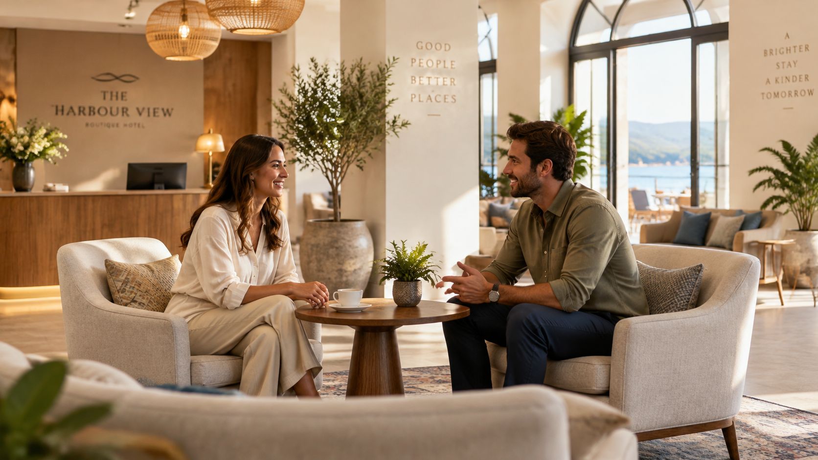
A hospitality image should show how a room feels to occupy, not just how it looks when empty. Set a lounge table with one clear focal prop, such as a drink or a notebook, and give people a natural action: a conversation, a pause between meetings, or a glance toward the room. A hotel lobby scene can combine window light with warm pendants, while a shared work lounge might use a laptop and coffee to suggest everyday use.
Use a wide lens from a position that keeps the architecture readable, then step in for hands, table details, and expressions. Mixed daylight and warm artificial sources can add atmosphere, but they can also contaminate skin tones and neutral surfaces. Decide which source should lead. If color accuracy matters, adjust or switch off competing fixtures instead of trusting post-processing to make every light agree.
Capture a clean plate before adding people or props. That gives you a useful view of the space on its own and protects the client's options if the staged details distract. Then photograph the scene in motion rather than directing stiff poses. Watch the background for reflections, stray bags, and objects that compete with the intended activity.
Shot sequence: Start with a wide architectural frame, make a mid-distance interaction image, then collect detail frames of the table setting, seating, and lighting.
The balance matters. Too few props can make the scene feel unoccupied; too many turn the room into a styled still life. Keep the set believable and let the architecture remain visible.
5. Corporate Team Portrait in an Office Environment
A team portrait can reveal workplace culture while showing the place where people work. A group gathered around a drafting table, for example, connects the people to their shared activity. A meeting-room portrait with natural light from one side can feel more composed while still retaining the glass walls and desks that identify the setting.
Scout backgrounds before asking the group to assemble. Remove clutter that doesn't belong, then choose a camera position that includes a few purposeful workplace details without letting them take over. A moderate wide lens can fit a group into the room, but don't stand too close to the edge of the lineup, where faces may stretch. Stagger people across two depth planes to add shape and help separate them from the background.
Office lighting often mixes window daylight with overhead fixtures. Turn off conflicting lights when possible, or balance the flash and camera white balance toward a consistent reference. Color temperature describes the chromaticity of a light source, while white balance adjusts camera-channel gains to make neutral surfaces appear neutral. A gray card or color target gives you a practical starting point for repeatable color. (Architectural photography lighting glossary)
- Make a formal frame first: Give the group clear direction, with hands and posture arranged intentionally.
- Keep the room in context: Photograph the team around a work surface or in front of a meaningful feature, not a random wall.
- Stay ready between poses: Capture relaxed exchanges when the group resets, but don't assume candid frames replace a dependable formal portrait.
A strong delivery includes the composed team image, a smaller-group variation, and individual environmental portraits. This range gives a communications team different ways to represent the same workplace.
6. Product Tabletop Setup on a Seamless Gradient Sweep
A continuous sweep gives a product one unbroken background and surface, so the eye stays on shape, finish, and detail. Use a curved paper or studio backdrop for a decorative fixture, a material sample, or a small interior object. A strip light can create a clean edge highlight on a reflective product, while a broad overhead source can show the grain and veining of stone.
Keep the camera close to the product's eye level when form and silhouette matter; raise it for a more informative view of a flat sample. Use a normal or short-telephoto lens to avoid perspective exaggeration. Light the sweep separately from the object so you can control the background tone without changing the product exposure. Black flags near reflective surfaces help shape highlights and prevent broad, unwanted reflections.
Tethering to a large screen makes it easier to inspect edges, color, and fine detail while the object is still on set. Keep microfiber cloths and compressed air nearby, especially when dust or fingerprints become obvious against a clean background. Photograph the hero view, a detail of the finish, and a secondary angle that clarifies how the product is made.
A seamless backdrop removes distractions, but it won't fix a poorly controlled reflection. Check what the product is reflecting before adding more light.
The setup is also useful for product-centered campaigns involving fixtures and material samples. For another take on planning product visuals inside chat, use the same discipline of defining the object's essential visual features before styling the frame.
7. High-Key Minimalist White Studio Setup
A bright, near-white studio can make a product, model, or architectural form feel open and uncluttered. Place a minimalist chair on a white sweep, or photograph an architectural model against a continuous pale background. A large overhead diffuser softens shadows; a restrained fill keeps the object from disappearing into the field.
Use a normal or short-telephoto lens to keep the subject's proportions honest. Position the camera at the height that best explains the form, then check the brightest areas rather than relying on the camera's preview alone. Set a custom white balance, monitor the histogram, and keep enough shadow detail to show depth. A subtle gray shadow, shaped with a small black flag or gray card, can separate an object from its background without undermining the clean look.
The risk is overexposure. If highlights clip, white surfaces lose texture and edges become hard to read. Make small exposure adjustments and inspect bright regions as you work. Retouching dust and edge imperfections is part of the process, but careful cleaning on set saves time and keeps outlines natural.
Shot sequence: Photograph a wide, airy composition with space around the subject, a closer frame that explains construction or material, and a version with slightly more shadow for clients who need a less clinical option.
This style works best when simplicity is intentional. An all-white room with a product that has no tonal separation can look flat, so preserve a little contrast where the object meets the background.
8. Industrial Loft Texture and Material Study
Low-angle light brings out the texture of brick, concrete, steel, and timber. In a converted warehouse, a raking source across the brick wall can reveal surface variation while a steel stair adds a strong line through the frame. A restaurant renovation might pair a concrete counter detail with reclaimed shelving and exposed ductwork.
Start with one light placed low and to the side of the material, then add soft fill if the shadows hide important finish details. A normal lens helps describe a surface without exaggerating it; step back for an overall view that shows where the material sits in the room. Get close for grain, joints, and workmanship, but include a frame that provides scale and context.
Clean surfaces and remove temporary construction materials before making the finished-work images. When a renovation story needs to show progress, photograph both the in-progress condition and the completed surface, keeping camera position and framing as consistent as practical. Sample pieces photographed beside full-scale applications can help viewers connect a material's detail with its effect across the space.
A strong material study isn't just a collection of close-ups. It shows how finishes meet, how light moves across them, and how the craft contributes to the experience of the room. Use a soft fill when the raking light becomes too theatrical; the objective is to reveal texture, not turn every surface into a dramatic effect.
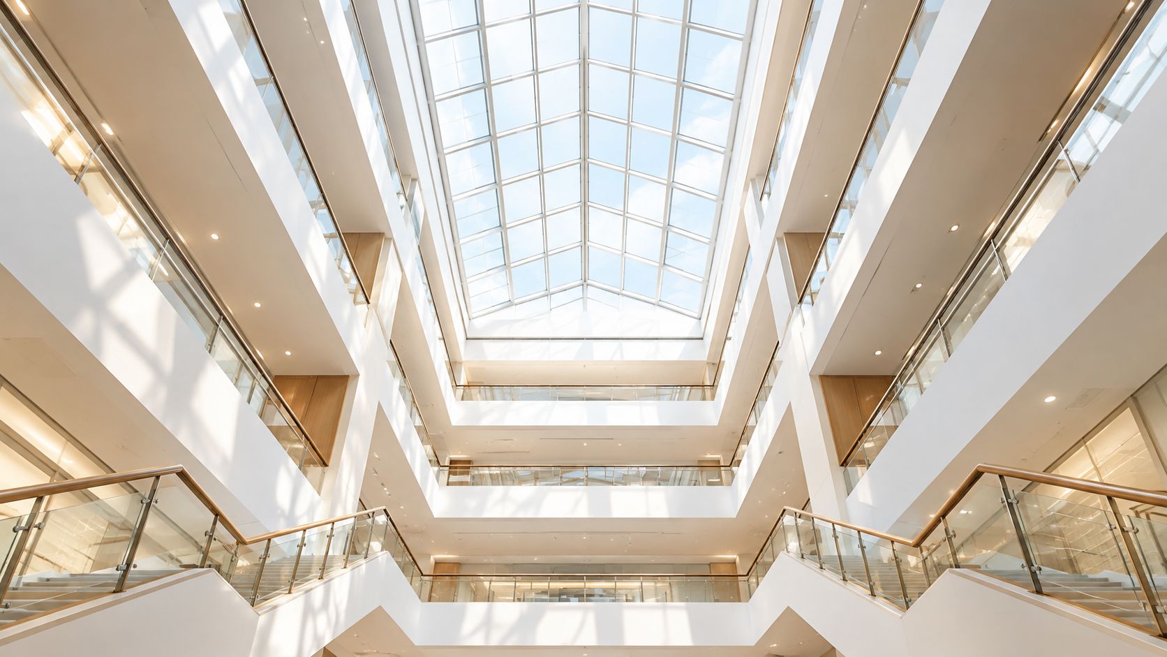
9. Atrium and Stairwell Vertical Composition
Look upward through an atrium or downward across an open stairwell to show how floors, railings, and skylights relate. A vertical frame can emphasize height and layered geometry, while a person on a landing gives viewers a sense of scale. Keep that person out of the main architectural lines so the structure remains the first read.
A wide-angle lens helps fit the full volume into the frame, but stand far enough back to limit distortion. Use a tripod and level the camera carefully, then correct remaining convergence with restraint. If the skylight is bright and the lower floors are dark, make bracketed exposures and blend only where needed to retain detail without creating an artificial-looking result.
Composition choice: A centered, symmetrical frame can make an atrium feel formal. Shift the camera when an offset stair, railing, or light well tells the story more clearly.
Shoot when the skylight's light direction gives the interior useful shape, rather than assuming the brightest moment is automatically best. Make an establishing frame, a tighter view of the railings and floor layers, and a detail that captures a material or junction. If people move through the space, photograph a clean architectural version first, then add a figure as a separate visual layer.
The final image should communicate volume, not just height. Include enough of the lower floor or stair connection to help a viewer understand how the levels meet.
Comparison of 9 Indoor Photoshoot Ideas
| Photography Setup | 🔄 Complexity & Resources | 📊 Expected Outcome | ⭐ Ideal Use Cases | 💡 Key Advantage |
|---|---|---|---|---|
| Natural Window-Light Interior | Low; window light, reflector, tripod; timing and exposure control required | Soft, authentic images with natural texture and depth | Residential, hospitality, and office interiors | ⚡ Minimal equipment and setup |
| One-Point Perspective Corridor | Moderate; centered camera, wide lens, careful leveling and distortion correction | Symmetrical image emphasizing depth, rhythm, and scale | Institutional, educational, and hospitality spaces | Strong, reusable graphic composition |
| Rembrandt-Lighting Studio Portrait | Moderate; one key light, optional negative fill, controlled background | Dramatic portrait with sculpted shadows and a light triangle | Executive, speaker, and editorial portraits | ⭐ Distinctive, authoritative look with a small lighting kit |
| Hospitality Lobby Lifestyle Vignette | High; models, props, styling, and coordination with property staff | Warm, lived-in images showing how people use the space | Hotels, restaurants, co-working spaces, and residential amenities | 📊 Helps audiences imagine using the space |
| Corporate Team Portrait in Office | Moderate; office location, group scheduling, and supplemental lighting | Environmental portraits that convey workplace culture | Recruitment, investor, and corporate communications | Uses existing workplace features as a set |
| Product Tabletop on Gradient Sweep | Moderate to high; seamless backdrop, shaped lighting, and careful cleaning | Clean, consistent product images with controlled highlights | Products, fixtures, materials, and design objects | ⚡ Precise control over light, color, and background |
| High-Key Minimalist White Studio | Moderate; large diffused lights and careful highlight monitoring | Bright, uncluttered images that emphasize form and detail | Catalogs, websites, minimalist products, and architectural models | ⭐ Adaptable, distraction-free visual style |
| Industrial Loft Texture and Material Study | Moderate; directional light, cleaning, and varied close-up and wide framing | Detailed images highlighting surface, craftsmanship, and scale | Renovations, adaptive reuse, and construction portfolios | Reveals material character and build quality |
| Atrium and Stairwell Vertical Composition | Moderate to high; wide lens, tripod, exposure bracketing, and access coordination | Dramatic images conveying height, volume, and structural rhythm | Civic, educational, and commercial buildings | 📊 Creates a strong architectural hero image |
Build a Shoot Around One Clear Visual Idea
Before arriving on set, decide which image must carry the story. That frame might be a quiet room shaped by window light, a portrait that feels composed and authoritative, or a workplace scene that shows people using the space naturally. Once the priority is clear, the rest of the shoot can build context around it rather than competing for attention.
Scout the location and identify the strongest light, the cleanest camera position, and any practical constraints. Check access routes, reflective surfaces, overhead-light color, and background clutter before people or products arrive. If the venue requires permission or imposes restrictions, confirm those details ahead of time so you don't lose the best light while resolving logistics.
Prepare a short shot list that moves from the overall view to functional scenes and finish details. Capture clean architectural plates before adding people, props, or movement. Then direct the subject or set dressing with enough structure to make the image purposeful, while leaving room for natural gestures and useful variations.
Good indoor photography depends on choices that support the brief. A wide lens can show the whole room, but a tighter view may explain how a seating area works. Dramatic contrast can add mood, but softer light may describe materials more accurately. A centered composition can reinforce order, while an off-center frame may reveal circulation or leave room for copy. Treat each technique as a decision, not a rule.
For property marketing, photographs are a key part of how buyers assess a listing online. A survey reported that 81% of buyers who searched online considered listing photos very useful, more useful than floor plans, virtual tours, or other listed website features. That supports planning for a sequence of images, including context, room connections, and material detail, rather than relying on a single hero frame. (Real estate photography statistics)
The most effective indoor photoshoot ideas are flexible frameworks. Adjust the camera position, lighting, lens, and props until the images communicate the intended mood and function clearly. Review color and geometry before delivery, and make sure the final sequence works as a coherent visual story.
Jimmy Clemmons Photographer offers architectural and interior photography, commercial brand content, professional portraits, and location-specific lighting and on-set direction. If you're planning an indoor shoot that needs to show both the space and its story, visit Jimmy Clemmons Photographer to discuss your project.