
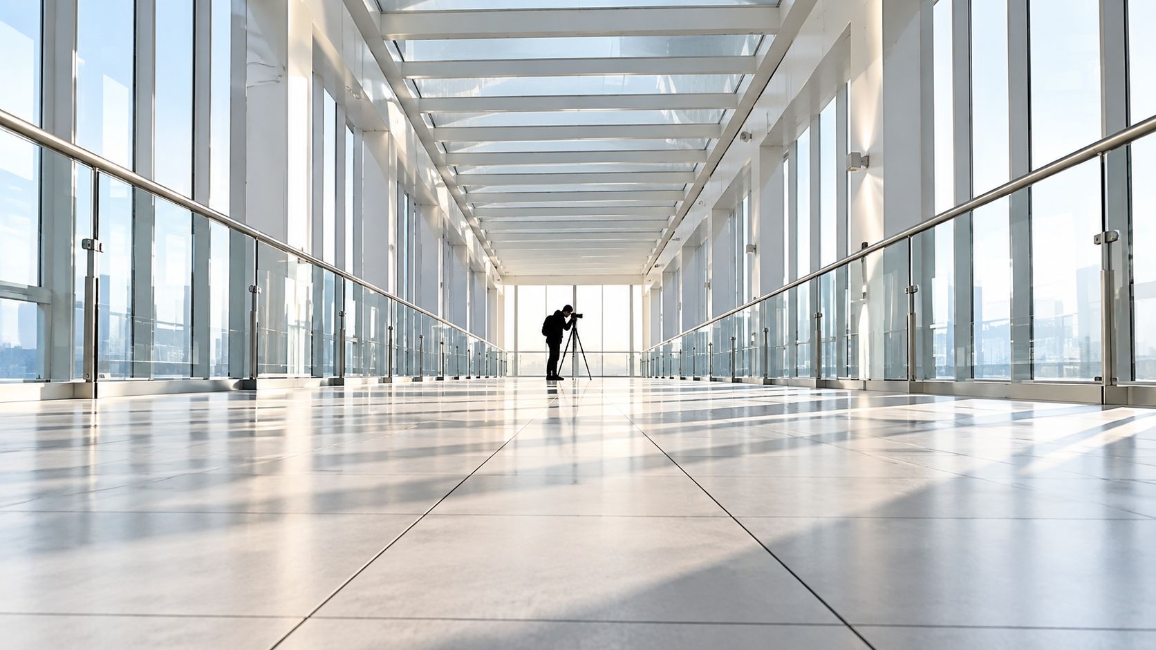
You arrive at an architectural shoot before the building wakes up. The lobby is quiet, the surfaces are clean, and the brief sounds simple: show the space, place a person or product within it, and make the result feel intentional. Yet the strongest composition usually isn't waiting in the camera bag. It's already under your feet, along the ceiling, beside the stairs, and deep inside the corridor.
Leading lines in photography are real or implied edges that guide a viewer's eye through the frame toward a subject or focal area. In commercial work, they do more than decorate a composition. They direct attention before the viewer has fully identified the merchandise, face, sign, or architectural feature. The line starts the conversation.
The idea has deep roots. Linear perspective developed in Renaissance art during the 15th century, and artists including Leonardo da Vinci and Raphael used converging lines toward a single vanishing point. Photography carried that visual logic into the 19th century, as the medium emerged around 1826–1839, with early milestones including Joseph Nicéphore Niépce's permanent image from 1826 or 1827 and Louis Daguerre's 1839 Paris street scene (historical overview of leading lines).
Arriving on Set and Seeing the Lines Already There
At first light, I walk into a mixed-use building with the art director before unpacking the camera. The lobby gives us several options immediately. Terrazzo floor seams run toward reception, escalator handrails angle into the upper level, and a long elevator corridor narrows into a clean terminus. None of these elements was installed for the photograph, but each can become an on-set direction tool.
That distinction matters. Symmetry holds the eye in place. Leading lines release it toward a target. A perfectly centered lobby may communicate order, but a floor seam that carries the viewer toward a person at reception communicates where the space wants attention to go.
Practical rule: Don't ask only whether a line looks attractive. Ask what it makes the viewer notice next.
A leading line can be obvious, such as a road, rail, wall, or stair edge. It can also be quiet, such as a change in floor tone, a shadow boundary, a row of lights, or the direction of a person's gaze. Adobe describes the technique as using human-made or natural lines, either subtle or pronounced, to direct focus, create balance, and tell a story (Adobe's definition of leading lines).
On a commercial set, the subject is the destination rather than an interruption. A retail display can sit at the end of a perspective corridor. A portrait can occupy the point where a handrail seems to arrive. A sign can be placed where a ceiling pattern naturally resolves. The line does the selling before the subject has to work hard.
The visual principle also connects to the history of photography. Niépce's 1826 image, View from the Window at Le Gras, uses building edges and rooflines to create depth. Ansel Adams's 1927 Monolith, the Face of Half Dome uses a winding trail and terrain contours, while Henri Cartier-Bresson's 1932 Behind the Gare Saint-Lazare uses railway geometry to reinforce movement and structure (historical examples of leading lines).
Scouting the Scene for Usable Lines
Set aside a dedicated scouting block before raising the camera. Walk the location for roughly 10 minutes, starting from the entrance and checking each possible shooting position. The first attractive angle often hides a stronger route through the space.
Scan from ground level to ceiling. Floor seams, tile grout, timber joints, and changes in terrazzo aggregate can provide foreground paths. At eye level, inspect skirting boards, window mullions, balustrade rails, stair edges, door frames, and wall junctions. Then look up for ceiling coffers, beams, suspended lights, duct runs, and repeating fixtures. Architectural and commercial briefs often depend on these details remaining legible, so note which lines stay clean when viewed from a practical camera height.
Include implied lines in the survey. Repeating lamps, planted trees, bollards, parked cars, or people wearing similar colors can create a directional rhythm without forming one continuous edge. Mark whether the sequence remains readable from the intended shooting position or breaks against clutter.
Use this six-step checklist:
- Choose a primary path. Identify the clearest route from the frame edge or foreground into the useful area of the composition.
- Add a supporting path. Select a secondary line that strengthens the main route without creating a competing direction.
- Find the terminus. Note where the line resolves, such as an architectural detail, sign, product zone, or controlled area of negative space.
- Test the direction. Walk laterally and change height. If the line exits the frame or ends in clutter, adjust position before setting the camera.
- Record the evidence. Use your phone to photograph the floor, ceiling, and key geometry. Capture one wide test frame and one tighter frame.
- Lock the choice. Save the selected viewpoint, camera height, and orientation so the crew can reproduce the setup after lighting or styling changes.
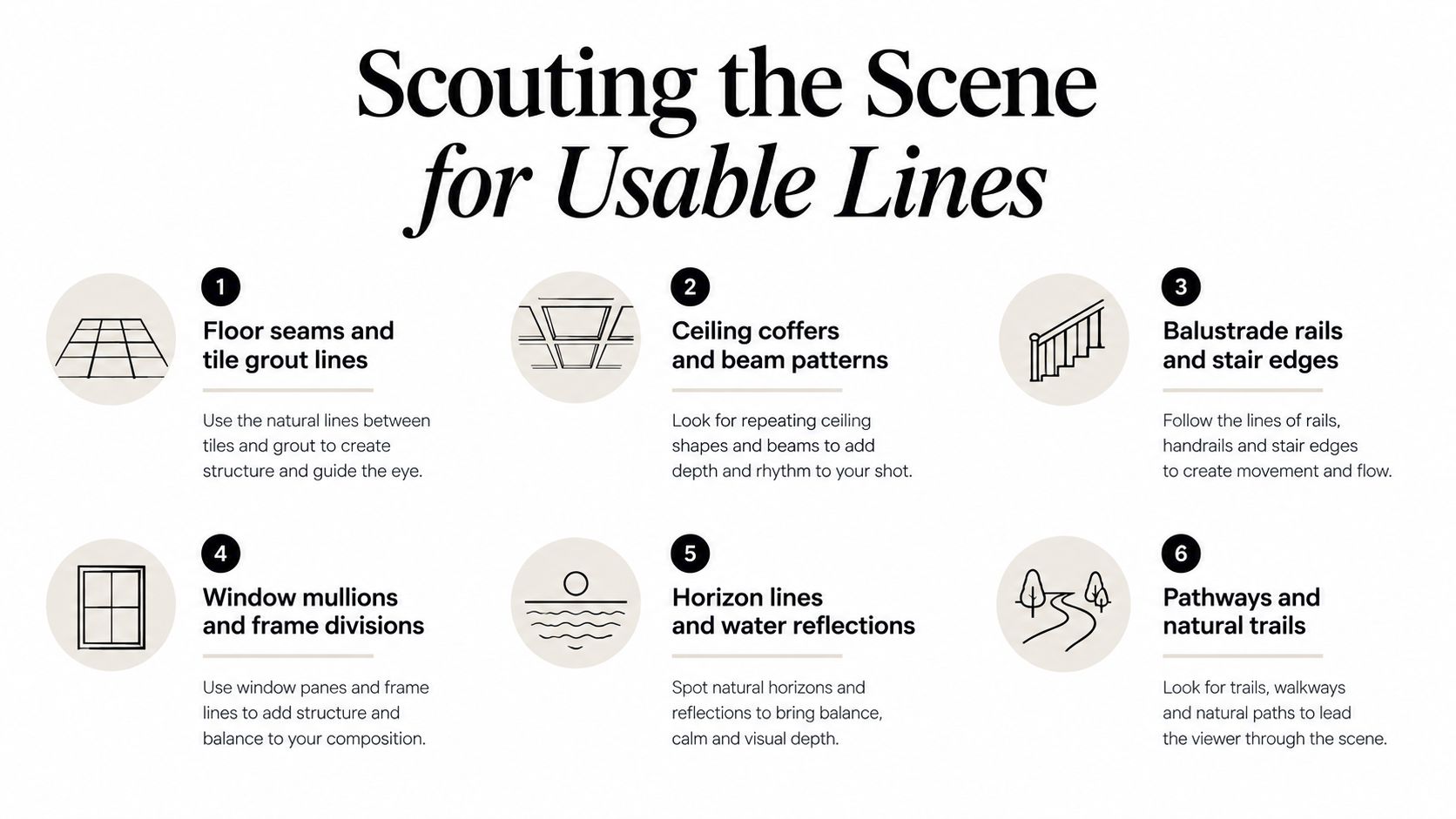
Small changes in height and angle can turn a floor seam from a distracting border into a clear directional arrow. A practical location-scouting workflow for photographers helps document that process across several rooms and keeps the visual logic consistent for the client.
Lens Choice and Perspective for Stronger Lines
Lens choice is the strongest dial for shaping convergence. Focal length doesn't merely determine how much of a room fits into the frame. It changes the relationship between foreground and background, the apparent distance between repeating elements, and the force with which edges travel toward a vanishing point.
A 24–35mm lens works well for environmental frames where you want the building itself to become the line. Stand close to a stair, wall, or floor junction and the perspective expands aggressively. This can give a lobby energy and scale, but it can also make near objects dominate and cause verticals to lean if the camera isn't controlled.
A 50mm lens offers a more restrained middle ground. The space feels less exaggerated, verticals remain mostly true when the camera is carefully placed, and a corridor still reads as a corridor rather than a visual funnel. This range is often useful when the brief needs architectural clarity alongside a human presence.
An 85–135mm lens compresses space. Repeating doorways, columns, lamps, or rails stack into bands, and a hallway can become a graphic layer instead of a tunnel. The line is less about dramatic depth and more about rhythm, repetition, and controlled separation.
| Focal Range | Line Strength | Convergence | Best Use |
|---|---|---|---|
| 24–35mm | Strong and expansive | Pronounced | Environmental architecture, dramatic interiors, foreground-to-background paths |
| 50mm | Balanced and natural | Moderate | Human-scale commercial frames, rooms with controlled perspective |
| 85–135mm | Compressed and graphic | Subtle in depth, strong in repetition | Editorial details, stacked architectural elements, tighter subject placement |
A tilt-shift lens can correct converging verticals when the building must look precise. That correction is valuable for facades, interiors, and any brief where straight structure is part of the promise. But distortion isn't automatically a mistake. An intentionally low, wide view can make an entrance feel monumental or turn a corridor into a runway, provided the effect supports the message.
Camera height changes the line as much as the lens. Eye level gives the viewer a human-scale route. Waist level grounds the foreground and lets floor lanes dominate. A low, centered camera creates a heroic runway, which can suit an entrance, staircase, or product reveal.
The working rule is simple: the closer the subject and the wider the lens, the stronger the lines become. For a deeper treatment of perspective and rectilinear control, use this guide to wide-angle architecture photography, then test the result on location rather than trusting the focal length label alone.
Placing the Subject and Directing the Eye
Use direct cues to make the subject cooperate with the geometry already in frame:
- “Take one step toward the rail.”
- “Turn your shoulders with the corridor.”
- “Keep your gaze where the floor seam resolves.”
- “Move the hand closer to the edge, but leave the product silhouette clear.”
- “Let the background prop support the path, not block it.”
These instructions turn leading lines into on-set direction rather than a framing exercise. Ask the assistant or art director to move the subject a small amount along the rail, seam, or shadow, then check what receives emphasis. A slight shift can bring the face, hands, or product edge into the line without making the pose look staged.
Pose direction determines whether the body extends or interrupts the route. When a model's torso follows a balustrade, corridor, or countertop, the figure becomes part of the structure. A limb pointing across the strongest line can pull attention away, which may be useful for tension but weakens a clean commercial message. For a product, continue the route through its silhouette, label direction, or a nearby prop.
In lifestyle architectural work, hands and gaze give the eye a second instruction. Hands can echo a railing or worktop. A gaze can carry a broken line toward a doorway or exterior view. Place secondary props in the next layer of the route, leaving enough separation for the primary subject to remain clear.
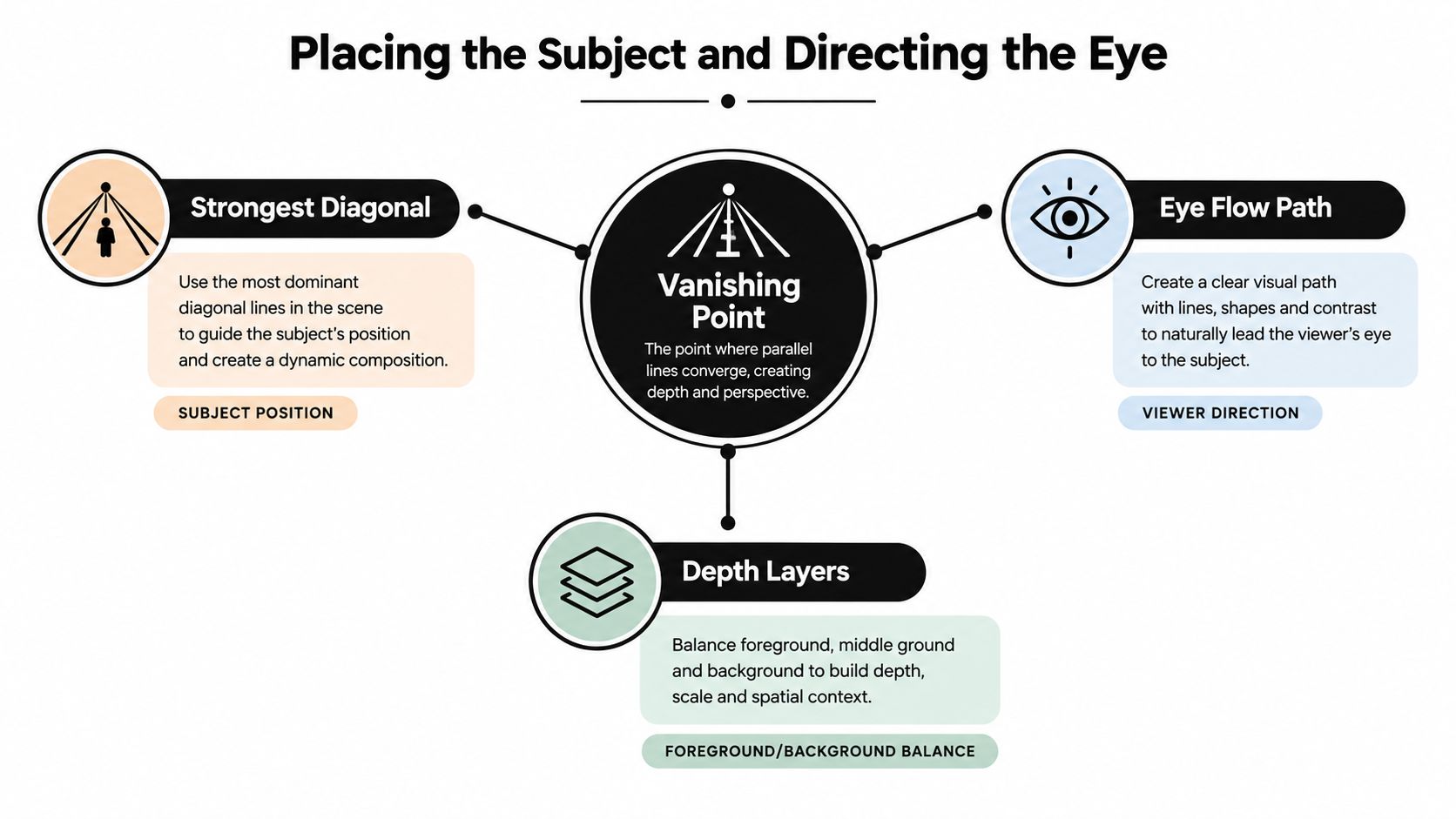
Centering can work when symmetry is part of the brief, especially for a facade, entrance, or product reveal. Off-center placement usually gives the viewer a route into the subject instead of stopping the line at the middle of the face. The choice should serve the subject and protect the image's message, rather than follow a fixed rule. Practical composition guidance on lines and horizon placement supports using lines to strengthen visual flow.
For people-focused assignments, movement adds another constraint. Leave room for the subject to enter the line, turn through it, or look toward its endpoint while preserving authentic behavior. These tips from EventUploader's blog can help when action changes quickly and deliberate eye direction still matters.
A final check is simple: follow the line through the frame and identify where attention stops. If it stops on a prop, bright edge, or empty patch before reaching the subject, move that element, adjust the pose, or change the crop.
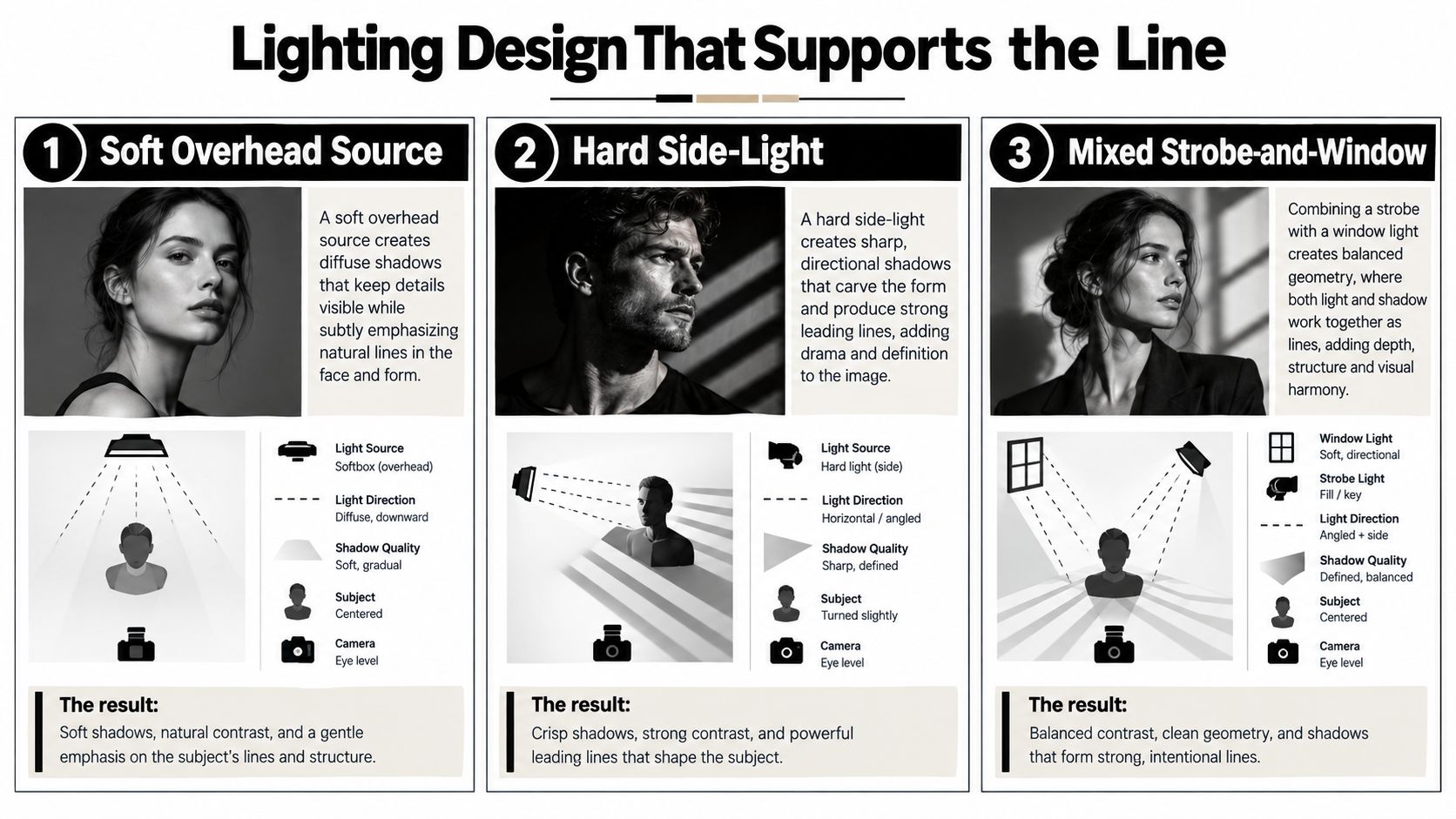
Lighting Design That Supports the Line
Lighting should follow the geometry you choose, not erase it. Once the line is identified, decide whether the light should reveal its surface, carve a shadow beside it, or let it recede so the subject remains dominant.
A soft overhead source produces gentle tonal changes. It can reveal floor seams and ceiling patterns without making the space feel theatrical, which suits a calm interior brief. Its weakness is direction. If every surface receives similar bounce, the line loses contrast and becomes a boundary rather than a path.
Hard side-light behaves differently. It creates sharp shadows from rails, mullions, furniture, and architectural edges. Those shadows can become leading lines of their own, especially when they travel toward a person or product. The trade-off is visible imperfection. Dust, uneven walls, and harsh transitions become part of the image, so the effect needs to match the intended tone.
A mixed strobe-and-window setup offers more control. Window light can preserve the building's natural atmosphere while a strobe lifts a subject or reinforces a selected surface. Flagging one wall can create a clean edge line. A snoot can project a narrow streak down a corridor. Ambient bounce may also fill the very shadow you wanted, so watch the frame after every adjustment.
Flat light doesn't make a strong line neutral. It makes the line harder to read.
The same principle applies to moving-image production, where continuity and exposure need to support directional design across a sequence. A practical lighting guide for video recording offers useful context for balancing sources, shadows, and subject separation.
On site, I check the tethered preview at the intended reproduction size. A line that looks elegant on the camera screen may disappear in a bright client layout. Conversely, a shadow that feels too strong at full size may provide exactly the structure needed once the image is reduced.
For broader preparation, review this guide to choosing the best light for a site shoot. The key decision remains local and immediate: identify the path first, then light only what helps the path survive the final select.
Broken and Implied Lines as an Editorial Choice
A leading line doesn't always need to reach the subject. In editorial and commercial photography, stopping the line can create a more useful kind of tension. A rail may disappear behind a textured wall, a floor seam may end in negative space, or a row of lights may lead toward a model who is already leaving the frame.
The interruption makes the viewer complete the route mentally. That can be valuable when the brief needs room for copy, a product silhouette, or an open-ended narrative. A complete line says, “look here.” A broken line can say, “continue the story.”
The mistake is not using an incomplete line. The mistake is allowing it to break accidentally. Before shooting, previsualize the implied continuation. Place a prop where the line would have gone, cast a person whose gaze carries it forward, or use a shadow to bridge the gap without making the connection literal.
Where the break earns its place
A textured wall can stop a hard architectural edge and create a quiet destination for typography. A graphic panel can interrupt a corridor line while holding the viewer near a campaign message. A model's exit can extend the route beyond the frame, which gives a space a sense of use rather than presenting it as a static diagram.
The subject's trajectory should reinforce the unfinished path. If the line stops to the left, a face turned right may pull attention away. If a figure is walking into negative space, the body angle and gaze should support that empty area as the intended destination.
How to defend the decision
Clients may accept a break when the purpose is visible in the layout. They may push back when the line appears to miss the subject or when the frame is judged only as a standalone thumbnail. Explain the choice in art-direction language rather than theory:
- The interruption creates space for copy.
- The subject continues the route through gesture and gaze.
- The incomplete line keeps the frame open for editorial sequencing.
- The wall texture becomes the destination, not a dead end.
A quick contact sheet helps. Show the complete version beside the interrupted frame and identify what each one asks the viewer to do. The stronger option isn't always the one with the cleanest convergence. It is the one that gives the image a job.
Common Pitfalls and Quick Troubleshooting
Leading lines fail in predictable ways. A wide lens can create so much convergence that the building becomes unstable. A horizon can bisect the frame, foreground clutter can interrupt the route, and a centered subject can turn an active diagonal into a static target.
Start with the tethered preview, not the camera screen alone. Check the histogram for clipped highlights or crushed shadows, then reduce the image to something close to its final reproduction size. The line needs to read in a contact sheet, presentation deck, or mobile layout, not only when inspected pixel by pixel.
Use this troubleshooting sequence when the frame feels flat:
- Reposition the camera. Move left, right, higher, or lower until the primary line travels toward something meaningful.
- Reduce convergence. Step back or use a longer focal length if the foreground is overpowering the subject.
- Control the horizon. Raise or lower the camera, or reframe so the horizon doesn't cut through the subject's face or the most important architectural feature.
- Clear the foreground. Remove bags, signage, furniture, or loose objects that stop the eye before it reaches the destination.
- Move the subject off-axis. Place the person or product along the strongest diagonal rather than dead center.
- Adjust the light. Add a controlled shadow or highlight if the selected line has lost contrast.
- Crop with purpose. Use the final aspect ratio to remove competing paths, but don't rely on cropping to rescue an unresolved perspective.
The recurring errors
Converging lines should create depth, not visual panic. Competing lines need hierarchy, and a flat lighting setup may need a flag or directional source to restore the route. A crooked horizon can make an intentional diagonal look like a mistake, while a missing vanishing point leaves the viewer without a clear destination.
Before pressing the shutter, ask: If I follow the strongest line, where do I arrive, and is that where the brief wants me to look?
That question catches most failures quickly. It also keeps the technique subordinate to the image's purpose, which is where leading lines belong.
Jimmy Clemmons Photographer offers architectural imagery, commercial brand content, portraits, location scouting, lighting design, and on-set direction for built-environment briefs. If you need a composition that uses perspective, controlled light, and purposeful eye flow, visit Jimmy Clemmons Photographer to discuss your next assignment.