
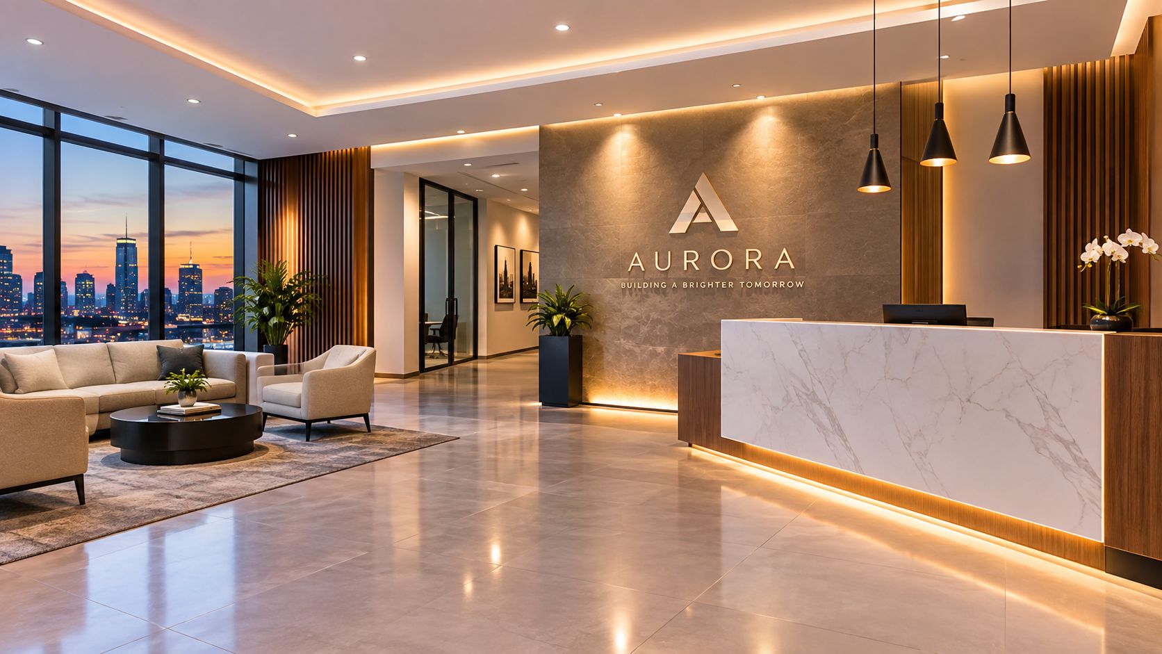
You enter a newly finished office lobby with a camera in one hand and a visitor badge in the other. The marble reception desk is beautifully made, but the ceiling grid throws a flat wash across every surface. Faces disappear into shadow, polished stone reflects bright points into the lens, and the brand colors on the wall look different from one side of the room to the other. The space is bright, yet it doesn't feel welcoming or easy to move through.
That disconnect is the central problem in commercial lighting design. Light has to work for people moving through the building, for the architecture that gives the space its character, and for the images that will introduce the brand to people who haven't visited. It affects comfort, safety, material perception, wayfinding, energy use, maintenance, and the photographer's ability to record the interior truthfully.
A useful design doesn't begin with a fixture catalog. It begins with questions. Where should people look first? Which surfaces need texture? What tasks happen at each plane? How will daylight change the room? Which scenes must staff control, and what should happen automatically? The answers create a lighting system that performs after opening day, not just during the handover.
This guide moves from visual principles to measurable targets, controls, collaboration, and photography. It is intended for architects, interior designers, developers, facilities teams, marketing leaders, and anyone commissioning images of a commercial space. For a broader introduction to lighting considerations across workplace and hospitality settings, this office and restaurant lighting guide provides useful context.
Introduction Why Commercial Lighting Design Makes or Breaks a Space
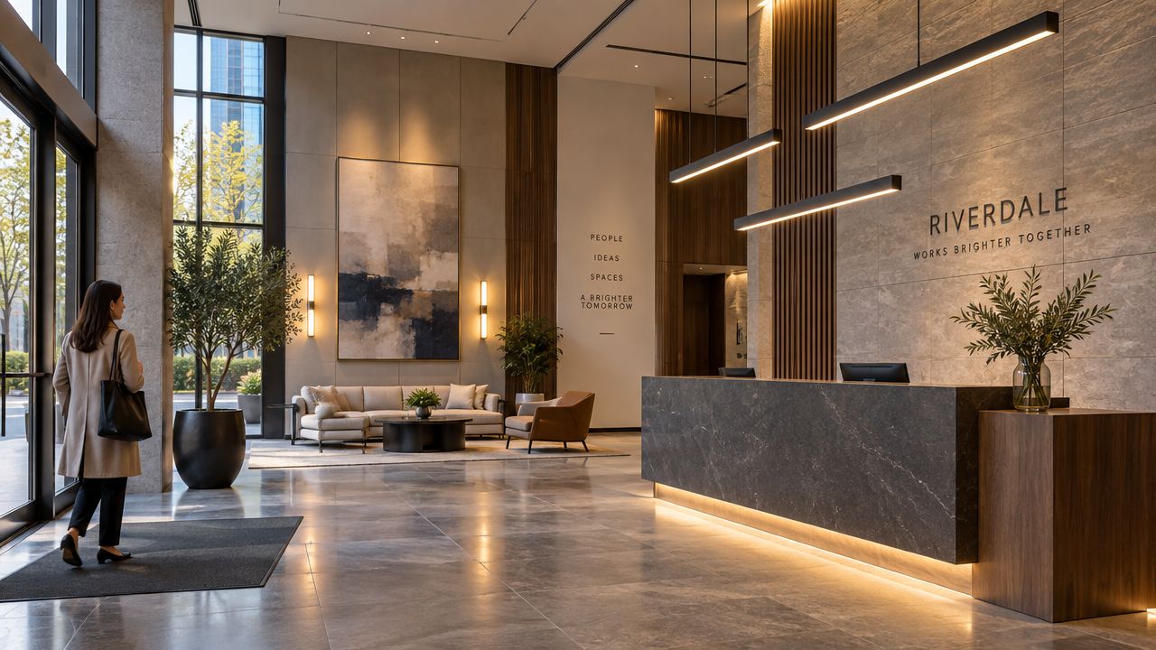
A successful lobby doesn't announce its lighting system. It lets visitors understand the room quickly, see the receptionist clearly, read the material palette, and feel an appropriate level of energy. The light may be warm around a seating area, more neutral at a work surface, and carefully directed toward a sign or art wall. Those differences create hierarchy without requiring a sign at every turn.
An unsuccessful lobby often has the opposite problem. Every zone receives the same intensity, the same beam spread, and the same visual priority. Bright downlights compete with daylight, glossy finishes produce glare, and a photographer has to suppress reflections instead of showing the design. Occupants experience this as visual fatigue or discomfort. A brand team experiences it as inconsistent imagery.
The strongest projects treat lighting as performance infrastructure. A floor needs enough illumination for movement, but walls and faces need attention too. A conference room needs clear facial visibility and controlled reflections, while a retail display needs color accuracy and deliberate emphasis. A corridor can be quieter, but it shouldn't feel like a leftover zone.
The practical test: If the room looks impressive only from one camera position, the lighting is probably serving a photograph rather than the people who occupy the space.
Designers and clients can use the rest of this guide as a decision tool. Start with the layers of light, then check task performance, glare, color quality, controls, and energy limits. After that, coordinate the lighting intent with the architectural photographer before the final shot. The result should be a space that reads with clarity in person and retains that clarity in images.
Understanding Layered Light and How Commercial Spaces Come Alive
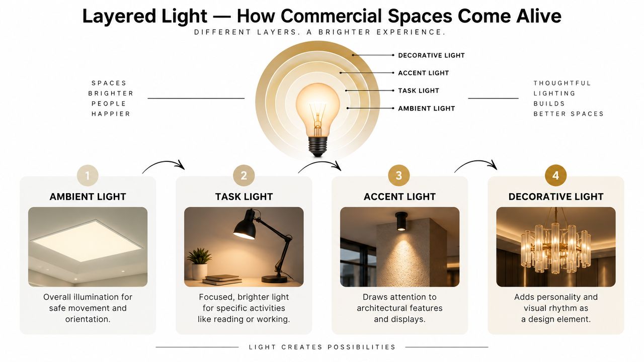
Light becomes easier to design when each source has a job. Instead of asking whether a room needs more fixtures, ask which visual layer is missing. Ambient light establishes the general field. Task light supports an activity. Accent light creates hierarchy. Decorative light contributes character and rhythm.
Four jobs, four ways to shape experience
Ambient light is the quiet foundation. It supports safe movement and orientation, often through a broad ceiling system, indirect cove, or carefully distributed downlights. It shouldn't carry every visual responsibility in the room.
Task light concentrates useful illumination where people read, write, type, prepare food, inspect merchandise, or perform technical work. A desk, counter, meeting table, or checkout surface may need a different solution from the surrounding circulation area.
Accent light directs attention. A narrow beam can reveal a textured column, display, artwork, stair, or branded surface. Its value comes from contrast and placement, not from being brighter.
Decorative light acts as an architectural element. A pendant, chandelier, or luminous feature can mark a reception zone or create a visual pause. It still needs to coexist with the functional layers, otherwise the decorative object becomes a source of glare.
Fixture families matter because they shape the beam, the shadow, and the visible hardware. A recessed adjustable spotlight can aim at a wall, while a linear system may create continuity along a circulation route. Optics determine whether a surface receives a soft gradient or a hard-edged pool. Color temperature influences atmosphere, but it shouldn't be chosen without considering daylight, materials, skin tones, and the brand's visual language.
Look beyond the floor
People read rooms vertically. Walls, faces, signs, and displays often communicate more than the floor plane.
A uniformly bright floor can still leave a workplace visually dull if the walls are dark and faces sit below the light. Vertical illumination helps visitors recognize destinations, helps teams see one another in meetings, and gives photographs depth. In retail, it also lets merchandise read as an intentional composition rather than a row of evenly lit objects.
Layering supports wayfinding because it gives the eye a sequence. A brighter reception wall can establish arrival. A quieter corridor can guide movement toward a more luminous destination. A display or stair can become a landmark. The same logic works in offices, restaurants, public interiors, and hospitality spaces.
For a complementary view of how architecture and illumination interact, this architectural lighting design resource offers another useful reference point. The key is to use layers as a visual language, not as a checklist of fixture types.
Performance Targets Glare Control and Color Quality That People Feel
A room can look balanced on paper and still feel wrong in person. The floor may read bright enough, while faces, wall signage, and product displays stay flat or unclear. Illuminance sets the amount of light reaching a surface, usually in lux or foot-candles, but it does not describe the whole visual experience.
Match illumination to the task
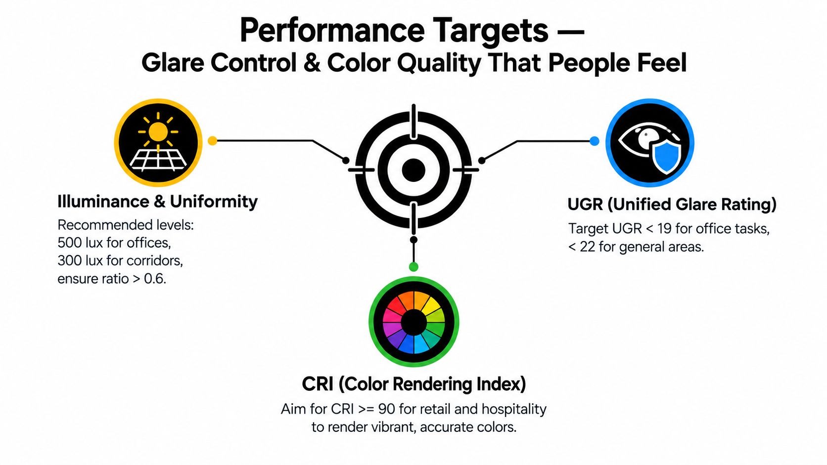
Open offices often use about 500 lux, conference rooms 30 to 50 foot-candles, corridors 5 to 10 foot-candles, and retail sales areas 30 to 150 foot-candles, depending on the merchandise. These benchmarks are summarized in commercial architectural lighting guidance. They show why a single brightness setting across a floor plan rarely serves every use well.
Task-based standards also separate office activities. Typical maintained illuminance targets include 500 lux for writing, typing, reading, and data processing, 300 lux for filing and copying, 200 lux for office circulation, and 750 lux for detailed technical drawing, as outlined in this task-based lighting standards reference.
Uniformity shapes how those levels feel. A task surface surrounded by a much darker field can seem harsh, while an overbright background can flatten hierarchy. Guidance summarizing EN 12464-1 states that the immediate surround should receive at least 0.5 times the task illuminance, with a minimum of 100 lux and uniformity of at least 0.40. The background should receive at least one-third of the task illuminance, with a minimum of 50 lux and uniformity of at least 0.10, according to this lighting standards guide.
Control glare before adding output
Glare comes from the relationship between a bright source, its position, the observer's angle, and reflective surfaces. In commercial indoor workplaces, EN 12464-1 applications commonly use the Unified Glare Rating, or UGR. Typical office work is specified at UGR ≤19, while technical drawing and detail work use the tighter threshold of UGR ≤16; the scale includes 13, 16, 19, 22, 25, and 28, as described in this UGR design fundamentals reference.
The practical fix is usually a mix of shielding, beam control, surface placement, and furniture orientation. A luminaire that feels comfortable over a matte desk can still throw a hard reflection on polished stone or glass. On camera, that same issue appears as a flare, a blown highlight, or a face that loses shape.
Choose color quality for the visual job
CRI 80 is often treated as a minimum acceptable level, while CRI 90+ is preferred for color-critical applications such as retail, healthcare, and food service. High color quality helps materials, products, food, and skin tones read more accurately, but only if the sources stay consistent and exposure is handled carefully. For teams balancing practical fixtures with daylight and artificial light, this mixed lighting photography reference is useful for seeing how different sources behave in the frame.
Quality beats quantity when the eye has a clear subject. Too much output can flatten texture, raise glare, and make a space harder to photograph.
A photographer reads the floor, vertical surfaces, faces, reflections, and visual balance together. If a room feels dim, the missing layer is often a wall wash, a face-level component, or a poorly lit sign, not a lack of total output. In commercial lighting design, that distinction matters because people, brand cues, and the camera all respond to the same spatial conditions.
Code Compliance Energy Limits and Controls That Actually Work
A lighting concept becomes useful only when it survives code review, installation, occupancy, and maintenance. Energy allowances limit how much lighting power a project can assign to an area, while controls determine whether the installed system behaves intelligently after people arrive.
ASHRAE/IES 90.1 tightened commercial lighting power allowances over time. A 2016 lighting standard summary states that area, linear, and application limits were reduced by an average of 30% compared with prior efficient-LED-era assumptions, as documented in this ASHRAE/IES 90.1 lighting summary. A related training table gives building-area-method values including 0.61 W/ft² for open-plan offices, 0.41 W/ft² for guest rooms, 0.51 W/ft² for hotel lobbies, and 1.05 W/ft² for retail sales areas, from the same reference.
These limits make zoning and control logic part of the design, not an afterthought. A daylight-responsive perimeter zone shouldn't behave like an interior core. A presentation scene shouldn't use the same output as a cleaning scene. A vacancy sensor shouldn't switch off a room while occupants remain still and working.
Control strategy comparison for commercial interiors
| Control Strategy | Best Use Case | Energy and Comfort Benefit | Watch Out For |
|---|---|---|---|
| Daylight-responsive dimming | Perimeter zones beside windows or skylights | Reduces electric output as available daylight reaches a setpoint | Needs commissioning, sensor placement, and coordinated shading |
| Occupancy sensing | Meeting rooms, enclosed offices, support spaces | Turns or dims lighting based on room use | Poor detection can cause premature shutoff |
| Vacancy sensing | Spaces where occupants prefer manual control | Avoids unnecessary automatic activation while retaining user choice | Staff may leave lights on if the control culture is unclear |
| Scene control | Reception, conference, hospitality, and presentation areas | Makes different activities easy to support without ad hoc adjustments | Too many scenes confuse users |
| Zoning | Mixed-use floors and retrofit-heavy projects | Keeps output aligned with task, daylight, and occupancy conditions | Incorrect zones create uneven brightness and complaints |
Daylight harvesting works best when paired with shading and layer-based strategies. In commercial buildings, guidance from the U.S. government and utilities cites annual lighting energy savings commonly around 40% to 50%, with measured day-by-day savings ranging from 40% to 80% depending on season and orientation. The GSA integrated daylighting findings identifies the strongest results on west-facing perimeter zones with unobstructed façades, where reduced electric lighting can also cut associated HVAC loads by reducing internal heat gains.
Controls must remain maintainable. AI-enabled features and invisible integration can improve adaptation, but facilities teams still need clear override behavior, accessible components, documented scenes, and a way to diagnose complaints. Post-occupancy measurements and staff feedback matter more than the fixture count on the reflected ceiling plan.
How Lighting Supports Architecture Branding and Photography
A brand appears through repetition. The same material, color, logo, and spatial gesture may be encountered by a visitor, seen in a photograph, and remembered from a presentation. Lighting determines whether those elements look calm, energetic, tactile, precise, or generic.
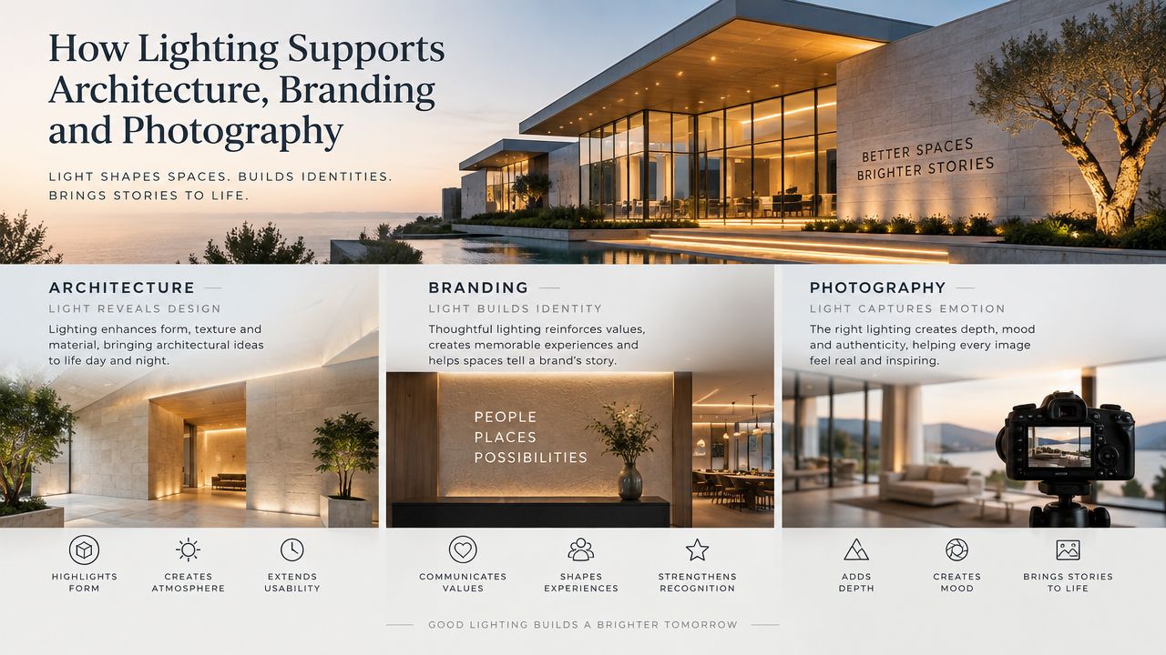
A hypothetical workplace can illustrate the difference. The first version uses a uniform ceiling wash, leaving a timber wall flat and faces dark at the reception point. The revised approach adds controlled vertical light to the wall, softens the reception zone, and reserves a discreet accent for the brand mark. Employees see one another more comfortably, visitors understand the arrival sequence, and the camera records depth instead of a bright ceiling with a dim foreground.
A retail environment presents a related challenge. Merchandise needs accurate color, but every product shouldn't receive the same emphasis. A photographer may use supplemental sources, reflectors, or corrective color gels to balance mixed light, yet the built-in system should already provide a coherent base. Good architectural images don't hide the lighting strategy. They reveal how the strategy organizes attention.
Warmth, rhythm, and human presence
Recent commercial guidance has emphasized a move toward hospitality-style, lower-temperature lighting and circadian considerations. These choices can make offices and public interiors feel less clinical, but warmth can't compensate for poor task visibility or uncontrolled contrast. The right decision depends on use, daylight, materials, operating hours, and the emotional register of the brand.
Vertical illumination is especially important for portraits and workplace storytelling. A person seated beneath a bright overhead source may show deep eye sockets and a shiny forehead, while a softly lit wall and balanced facial light give the image a more natural sense of presence. The same adjustment benefits everyday conversation.
The camera also exposes mixed color. Daylight through glass, warm decorative sources, and neutral work lighting can create competing color casts. The solution may involve zoning, dimming, lamp selection, or carefully planned supplemental lighting on shoot day.
A photographer needs to know which scenes represent normal operation and which are presentation states. This video offers a visual reference for how designed light can shape commercial interiors:
Before a shoot, walk the space at camera height. Check reflections in glazing, stone, screens, and polished furniture. Then view the same scene from a visitor's path. If the composition works only from the tripod, the lighting needs another round of design attention.
Working With Design Teams and Photographers From Brief to Final Shot
The cleanest projects use handoffs rather than surprises. The client defines the experience, the design team translates it into spatial decisions, the electrical and controls teams make it buildable, and the photographer tests whether the visual story survives through the lens.
Start with a brief that names the experience
Include the space types, activities, materials, daylight conditions, visual priorities, operating scenes, maintenance constraints, and photography goals. State whether the project needs a calm workplace, a vivid retail setting, a welcoming lobby, or a flexible environment that changes through the day.
A practical brief should identify:
- Primary tasks: Describe what people do at desks, tables, counters, corridors, displays, and reception points.
- Visual hierarchy: Mark the walls, faces, products, architectural details, and signs that must draw attention.
- Performance targets: Record illuminance, UGR, CRI, uniformity, and any applicable energy limits.
- Control intent: Define daylight, occupancy, vacancy, scene, and manual override behavior.
- Image requirements: List hero views, detail views, portraits, brand moments, and expected operating scenes.
Site analysis follows. Walk the building at different daylight conditions, note reflective finishes, photograph the existing ceiling, and identify the positions from which visitors and cameras will see the space. A mockup on one representative zone is more informative than a persuasive rendering because it reveals glare, shadow, color interaction, and control behavior.
Coordinate installation and aiming
After specification, the team should document aiming angles, circuit logic, sensor locations, scenes, and maintenance access. On site, verify that the installed system matches the intended beam direction. Furniture, signage, partitions, and planting often change after the lighting plan is drawn.
Aiming is a visual craft. Adjust the source while looking at the surface it serves, not only at the fixture. Confirm the effect from seated and standing eye levels. Then test the room from the planned photography positions.
For a photography workflow that includes lighting decisions, location preparation, direction, and editing, lighting design services from Jimmy Clemmons Photographer can sit alongside the architectural and electrical teams as one available option.
Prepare the final shot
Before photography, clean lenses and reflectors, confirm scene settings, remove temporary obstructions, and check that screens or illuminated signs don't overpower faces. Balance daylight with the selected interior scene rather than allowing every source to run at full output.
During the shoot, the photographer should communicate when a reflection, bright window, or color shift changes the story. Small adjustments to dimming, curtains, aiming, or furniture position can protect the architecture without making the image feel staged.
Putting It All Together Templates Checklists and Next Steps
A dependable commercial lighting design brief can fit on a page if it asks the right questions. Start with the experience, then define the measurable conditions that support it.
A reusable project template
Project purpose: Describe the brand character, user groups, operating scenes, and architectural features that should lead the eye.
Space and tasks: List each zone, its activities, relevant surfaces, and task-specific illuminance target. Use the appropriate benchmark rather than assigning one value everywhere.
Visual comfort: Record UGR requirements, reflective materials, screen positions, viewing directions, and uniformity expectations for task, surround, and background.
Color quality: Set the CRI requirement by application. Identify merchandise, food, healthcare materials, artwork, skin tones, and branded colors that need accurate rendering.
Controls and energy: Define zones, daylight response, occupancy or vacancy behavior, scene controls, manual override, commissioning, and maintenance access. Check applicable lighting power limits early.
Photography: Note hero views, vertical surfaces, portrait locations, camera positions, daylight conditions, and whether images should show everyday operation or a presentation scene.
The final punch list
- Walk the floor: Check task surfaces, circulation, stairs, and transitions.
- Look up and around: Inspect walls, faces, signs, displays, and reflective finishes.
- Test every scene: Confirm that dimming and sensors support actual work rather than only the design intent.
- Check the camera view: Look for glare in glass, polished stone, screens, and furniture.
- Document the system: Record settings, aiming, overrides, replacement access, and control logic.
- Return after occupancy: Gather feedback and tune the system where behavior differs from the plan.
The central measure isn't fixture quantity. It's whether people can see comfortably, understand the space, recognize its character, and use it without fighting the controls. Lifecycle value comes from making those conditions stable, serviceable, and adaptable as daylight, furniture, tenants, and brand needs change.
Jimmy Clemmons Photographer brings architectural imagery, commercial brand content, location scouting, lighting design, on-set direction, and professional editing to built-environment projects. Visit Jimmy Clemmons Photographer to discuss how your lighting decisions can translate into clear, purposeful images that show the space and the people using it.