

You've probably opened a promising RAW file from a finished project, nudged the Temp slider a little warmer, added contrast, pushed saturation, and realized the image started drifting away from the space you photographed. The oak veneer turned orange. The concrete lost its density. The daylight that felt clean on site now looks theatrical.
That's the challenge in color grading photography for architecture and commercial brands. The work isn't just about style. It's about preserving design intent, keeping materials believable, and shaping a mood that supports a client's brand instead of overpowering it.
In portraits, viewers will forgive a stylized grade if the emotion lands. In architecture, they won't. Architects, developers, hospitality groups, and corporate marketing teams need images that feel refined but still accurate. A successful grade has to hold both at once. It has to feel considered on a website, in a pitch deck, across a brochure spread, and in a magazine layout without making the steel too cyan or the walnut too red.
The Foundation Before You Grade
The best color work starts before Lightroom opens. If the file is weak on set, grading becomes repair work. Repair work is slower, less precise, and far more likely to break the image.
Architectural photography gives you very little room for sloppiness. Exposure errors hide texture. Poor white balance shifts surfaces in ways clients catch immediately. A careless profile choice bakes in contrast or color that limits how far you can push the file cleanly.
Exposure has to protect material detail
Get exposure right for the surfaces that matter most. In a hospitality lobby, that may be the stone floor and wood paneling. In a corporate interior, it may be the balance between window light, walls, and fixtures. I'm less interested in making the back-of-camera preview look dramatic than in protecting detail across the tonal range.
A useful discipline on site:
- Judge the image by materials, not mood. Ask whether concrete still reads like concrete and whether white walls still hold tonal separation.
- Watch bright edges and specular areas. Glass, polished metal, and lacquered finishes clip fast.
- Leave yourself room. If you know the final grade will add shape and contrast, don't force that contrast in camera.
Practical rule: If a texture disappears before grading starts, color work won't bring it back naturally.
That same discipline applies to exterior work. Midday sun, shade, mixed sky conditions, and reflective facades all create color problems that are easier to prevent than fix. Good architectural grading begins with a technically calm file.
For planning around direction and quality of light on location, it helps to think through choosing the best light for a site shoot before the camera comes out.
Auto white balance is useful, but not enough
Auto white balance is convenient, and it performs well often enough that many photographers stop there. But Photzy notes that auto white balance is accurate approximately 90% of the time. For professional architectural work, that remaining margin matters.
A file can be technically close and still be wrong for the project. “Close” doesn't help when a design firm chose a specific warm plaster, a hospitality brand needs a consistent amber glow, or a developer wants daylight to feel neutral rather than blue.
Use manual white balance intentionally when:
- Materials carry the story. Stone, timber, steel, brass, and fabrics all shift differently under mixed light.
- The brand has a known palette. Restaurants, offices, and retail environments often depend on a controlled color language.
- Mixed lighting complicates the file. Window daylight, practical fixtures, LEDs, and accent lighting rarely agree.
Camera profiles shape the edit before the edit
Profile choice is easy to overlook because it doesn't feel as dramatic as curves or HSL. It matters anyway. A more neutral profile often gives a cleaner starting point for architectural work than a punchier profile designed to impress quickly on screen.
Here's the practical difference:
| Profile approach | What it tends to do | Where it helps |
|---|---|---|
| Neutral starting profile | Preserves flexibility and keeps colors restrained | Architecture, interiors, commercial sets |
| Punchier profile | Adds immediate contrast and color character | Fast previews, some editorial looks |
| Project-specific test profile | Matches your intended delivery style more closely | Repeat clients and campaign work |
A good digital negative should feel open, not pre-decided. If the profile already exaggerates blues in shadows or pushes warmth into wood, every later move becomes a correction.
Color Theory for Built Environments and Brands
A hotel brand signs off on a warm, welcoming lobby. Then the delivered images make the oak paneling drift orange, the limestone floor go yellow, and the brass fixtures lose their finish. The problem is not taste. It is color judgment without enough respect for materials, lighting, and brand standards.
Color theory matters in architecture because built spaces are read differently than portraits, products, or travel scenes. Viewers judge surface finish, depth, cleanliness, and spatial hierarchy in a split second. Clients judge something else too. They look for material accuracy and whether the grade supports the identity they use across brochures, websites, signage, and investor decks.
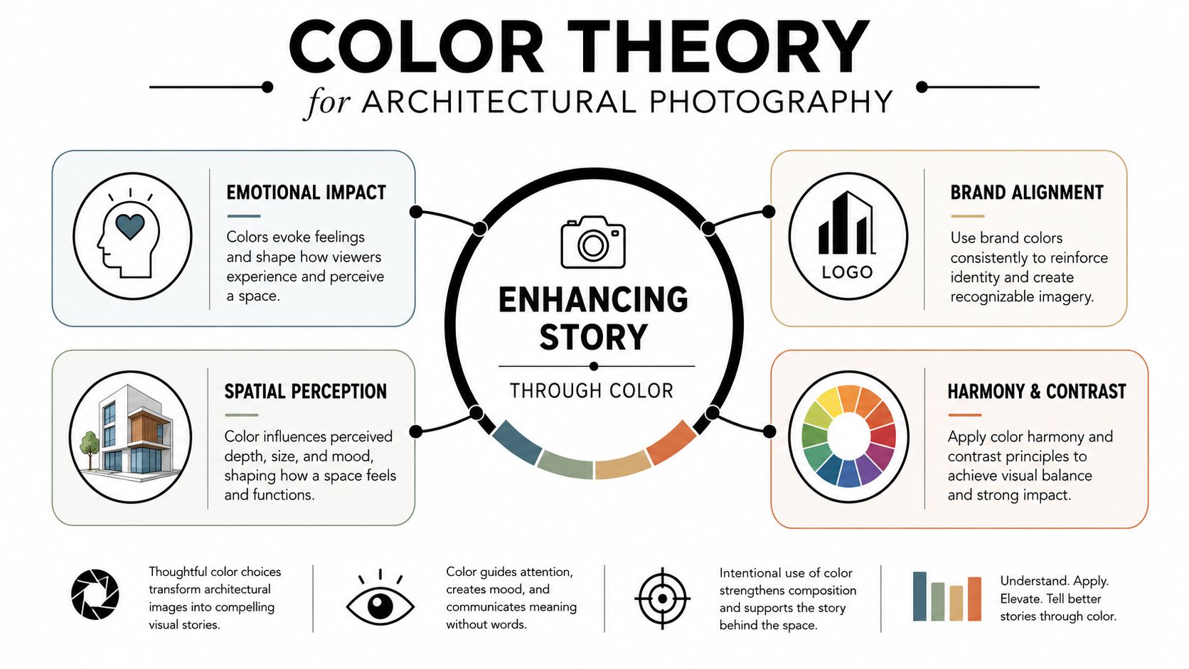
The grade has to support the architecture
Architectural color grading has less tolerance for broad stylistic moves. A look that feels polished in editorial work can make a commercial interior harder to trust. That shows up fast in concrete, wood, glass, painted walls, and fabrics with a specified finish.
I see the same failure points repeatedly on commercial jobs:
- Concrete gets dirty fast when blue is pushed into the shadows and global saturation stays too high.
- Wood loses species accuracy when warmth is added globally instead of targeting the areas that need it.
- Glass stops feeling architectural when cyan grading takes over reflections, edge contrast, and daylight detail.
- White interiors fall apart when highlight tinting introduces a visible cast into ceilings, trim, and millwork.
If the design team selected the material palette carefully, the grade needs to describe that palette with discipline.
That does not mean every frame should stay clinically neutral. It means each color choice needs a job. Warmth can make a restaurant feel hospitable. Cooler neutrals can sharpen a workplace campaign. The trade-off is always the same. As mood increases, the risk of misreading finishes increases too. For teams refining that balance in post, a strong real estate photography editing workflow helps keep correction decisions separate from styling decisions.
Brand color is not the same as color cast
Commercial clients often ask for a grade that feels aligned with the brand. That request gets misunderstood all the time. Brand alignment rarely means washing the frame with the company's dominant color.
A hospitality brand may want amber warmth, but that warmth usually belongs in lamp glow, upholstery, selective highlights, and a controlled shift in overall tonality. A law office may need restraint, where polished stone, white walls, and dark wood still read clean and expensive. A technology client may prefer cooler rendering, but the file still has to protect neutral paint, accurate screen light, and believable daylight from the windows.
I judge brand-driven grading with four practical questions:
- What should the viewer feel first?
- Which surfaces must stay neutral to preserve credibility?
- Where should color carry the eye?
- At what point does atmosphere start to distort function?
Those questions keep the conversation tied to business goals instead of vague language about vibe.
Spatial perception changes with color decisions
Color grading also changes how architecture reads in two dimensions. Cooler shadows can increase a sense of depth. Controlled warmth in lit areas can bring reception desks, seating groups, or feature walls forward. Lower saturation often makes premium interiors feel quieter and more considered. Heavy warm-cool contrast can do the opposite and break the room into competing zones.
This matters in marketing images because the photograph is often standing in for a physical visit. The viewer needs to understand circulation, focal points, and the relationship between surfaces. Good grading helps the eye move through the frame in the same order the designer intended.
A useful framework for client conversations looks like this:
| Client goal | Color approach | Common mistake |
|---|---|---|
| Warm hospitality | Warm highlights, restrained neutrals, gentle shadow separation | Making all wood and walls too orange |
| Clean corporate | Neutral base, cool bias in select areas, controlled saturation | Turning the whole image blue |
| Luxury residential | Soft warmth, rich but believable material depth | Over-polishing surfaces until they feel artificial |
| Editorial design feature | More sculpted tonal relationships, selective color emphasis | Prioritizing style over material truth |
The Professional Grading Workflow in Lightroom and Camera Raw
A hotel brand signs off on walnut millwork, brass fixtures, and a restrained warm-neutral palette. Then the delivered photos make the wood go orange, the brass turns green, and the lobby no longer matches the brand standards. That failure usually happens in the raw workflow, not on set.
Professional grading in Lightroom and Adobe Camera Raw starts with separation of tasks. Correction gets the file stable and believable. Grading shapes the image so it supports the client's positioning without breaking material accuracy.
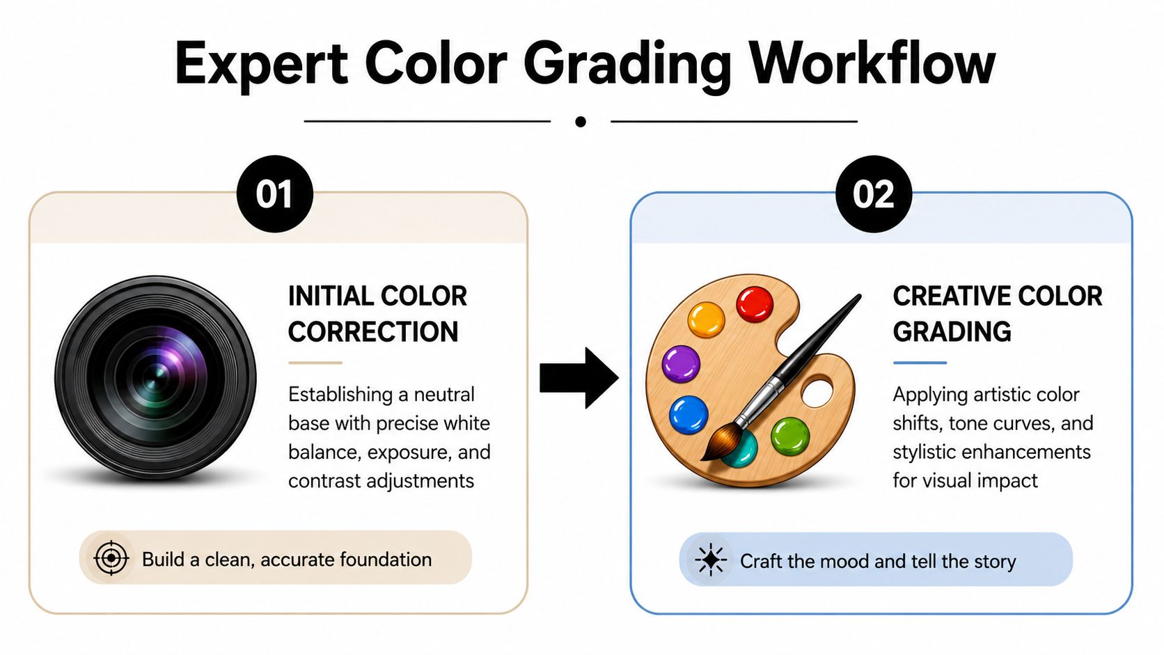
Stage one is correction
Correction sets the baseline the rest of the campaign will depend on. If the neutral point is wrong here, every later move gets harder, especially across a mixed set of interiors, exteriors, and detail frames.
My order is simple:
- Set exposure first. Tonal placement affects how every color decision reads.
- Dial white balance manually. Use walls, ceilings, stone, concrete, and other known neutrals instead of trusting auto settings.
- Reduce obvious color pressure early. If paint, timber, or signage already feels too loud, pull it back before adding any style.
- Apply profile and lens corrections. Geometry and baseline rendering should be settled before creative work starts.
Adobe's Camera Raw guidance supports this separation between correction controls and creative color adjustments, and Adobe also notes that the Tone Curve can be applied per channel for more targeted color control: https://helpx.adobe.com/camera-raw/using/color-grading-local-adjustments.html
For teams building a delivery workflow for property, hospitality, and commercial listings, real estate photography editing follows many of the same standards for neutral balance, clean tonality, and client-ready output.
Stage two is the creative look
Once the file is technically sound, the grade can do its job. In architecture, that job is narrower than it is in portrait or editorial work. The image still has to describe finishes accurately, preserve the designer's intent, and sit comfortably beside the rest of the campaign.
I use three tool groups most often.
Tone Curve
The Tone Curve controls contrast with better precision than the basic panel. For interiors, restraint matters. Aggressive bends can posterize gradients on painted walls, cheapen polished stone, and make daylight transitions look brittle.
A clean curve usually uses only a few points:
- Shadow anchor to hold black detail in corners, glazing frames, and dark furniture
- Midtone anchor to keep wall color and key materials from drifting
- Highlight anchor to protect window edges, white ceilings, and reflective surfaces
If the curve starts looking busy, the file is usually being forced.
Color Mixer and HSL
Such methods frequently rescue architecture files. HSL lets you correct one material family without pushing the whole frame off balance.
Common uses:
- Pull orange saturation down when timber starts reading as varnished plastic
- Nudge yellow hue when warm fixtures push white paint toward nicotine
- Lower blue luminance in glass or sky to add structure without making the building feel cold
- Refine green saturation so planted areas support the architecture instead of competing with it
The trade-off is speed versus precision. Broad HSL moves are fast, but they can affect adjacent materials. Stone, beige upholstery, oak, and warm concrete often share overlapping color ranges, so every adjustment needs a quick material check at 100%.
Color Grading wheels
The grading wheels work well for subtle tonal relationships. Used lightly, they help establish hierarchy in the frame and keep the atmosphere aligned with the client brief.
A practical starting pattern looks like this:
| Tonal zone | Useful direction | Why it works |
|---|---|---|
| Shadows | Slight cool bias | Gives structure to recesses, glazing, and deep interior areas |
| Midtones | Mostly neutral | Protects walls, flooring, and finish accuracy |
| Highlights | Gentle warmth | Keeps daylight and practical lighting inviting without yellowing whites |
The key is coherence. Shadows, midtones, and highlights should support one reading of the space, not three different moods.
Keep the file clean
Quiet files travel better across print, web, and multiple stakeholders reviewing on different displays.
A few habits help:
- Use 32-bit processing when available if the file needs heavier tonal recovery
- Avoid global saturation for mood because it usually punishes neutrals first
- Adjust one color family at a time so you can see what changed and what drifted
- Check lifted shadows for noise and color blotching in deep interiors and twilight work
I also compare the graded image against the ungraded raw at several points during the edit. If the brand palette feels stronger but the stone, wood, metal, and paint still look plausible, the workflow is doing its job.
Advanced Masking and Local Adjustments in Photoshop
A hotel lobby can look perfectly balanced to the eye and still fall apart in post. Window light runs cool, downlights push amber into the ceiling, decorative fixtures warm the seating area, and branded signage has to stay on-color for the client. A global grade cannot solve all of that at once. Photoshop is where I separate those problems and correct them without damaging the materials that sell the space.
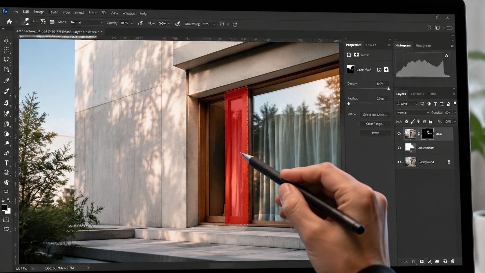
One interior, three color problems
Architecture files usually fail in zones, not across the whole frame. An office reception image might contain a blue exterior view, a neutral stone floor, and warm timber slats under accent lighting. Each area needs its own correction target. If all three get pushed with the same sliders, the stone picks up contamination, the wood loses character, or the view through the glass turns artificial.
I usually divide a frame into practical regions before I start adjusting color:
- Window zone for exterior view, mullions, and spill around the glass
- Primary interior surfaces such as walls, ceilings, floors, and large neutral planes
- Feature materials like wood veneer, stone, upholstery, metal, or branded signage
That structure keeps the edit tied to the way the client reads the image. Developers care about finish accuracy. Designers care about light quality and material separation. Brand teams care whether the signage, packaging, or hero color still matches the approved palette.
Local edits protect material accuracy
Different parts of the same image often need different color logic. That is the main reason to use masks.
A concrete floor may need green removed from reflected glazing. A walnut panel may need a small density change without cooling the whole room. A backlit logo may need hue protection so it stays consistent with the brand guide while the surrounding wall is corrected separately.
In practice, local adjustments preserve relationships between surfaces. They let the brass stay warm, the walls stay neutral, and the daylight stay believable in the same frame.
Local adjustments keep one correction from creating a second problem somewhere else.
A Photoshop sequence that holds up under client review
I do not use an identical layer stack on every file, but the sequence stays disciplined because the order affects the result.
- Set the base composite first. Blend exposures or window pulls before any color work, so tonal structure is stable.
- Build broad masks by region. Start with luminosity selections, color range, or channel-based masks, then refine by hand.
- Correct casts with adjustment layers. Curves, Selective Color, Hue/Saturation, and Color Balance cover most architectural color issues.
- Protect brand-critical elements. Signage, packaging, tenant identity colors, and wayfinding often need their own masked corrections.
- Refine texture and depth selectively. Add micro-contrast to stone, brick, or wood only where it supports the material.
- Check edges at high magnification. Glass lines, ceiling transitions, and polished reflections expose weak masking fast.
The trade-off is time. Precise local grading takes longer than a global pass, but it saves rounds of revision later. Commercial clients notice when a white wall goes pink near a fixture or when a premium material no longer looks like the installed finish.
This kind of workflow is easier to understand when you see it in motion. The following walkthrough is useful for that kind of selective edit work.
What usually fails
The common mistakes are predictable. Masks are too hard at the edges. Corrections are too strong. Reflections get missed, so glass and polished stone reveal a different color treatment than the surfaces around them.
I also see editors neutralize a scene so aggressively that the space loses its lighting hierarchy. An upscale restaurant should not read like a medical office. A corporate lobby still needs warmth, but it has to be controlled warmth, placed where the architect and brand team intended it.
The safest test is simple. Toggle the correction off and on, then ask whether the image reads more clearly as a built space and more accurately as a branded environment. If the answer is no, reduce the adjustment and rebuild the mask.
Maintaining Color Consistency Across a Campaign
A developer signs off on a hero lobby image, then opens the rest of the campaign and sees three different buildings. The brass reads amber in one frame, green in the next, and neutral gray in the brochure cover. That kind of drift weakens trust fast, especially when the work is meant to support leasing, hospitality, or investor marketing.
Consistency across a campaign is not about making every frame look identical. It is about keeping the project, the materials, and the brand voice stable from image to image. Architecture clients care about finish accuracy. Brand teams care about recognition. A grade has to hold both.
Presets help with speed. Standards protect the campaign.
Presets are useful for getting a set into the same tonal range, but they do not solve the hard part. The hard part is keeping limestone, white oak, painted drywall, and branded accent colors believable under different weather, different glazing conditions, and different capture times.
I treat presets as a production tool, not a visual identity. For campaign work, the stronger approach is to lock a few repeatable decisions early:
- A reference hero frame with approved color and contrast
- Material priorities such as wood tone, metal finish, concrete color, and wall neutrality
- Brand-sensitive hues that cannot drift between assets
- Exposure and white balance boundaries for interiors, exteriors, twilight, and detail shots
That framework keeps the edit consistent without forcing every file into the same look.
Architecture grading needs tighter tolerance than general editorial work
A lifestyle campaign can absorb wider color variation and still feel intentional. Built environment photography usually cannot. If walnut millwork shifts red, or a tenant brand color shifts toward orange, the image stops serving the project accurately.
I see this problem often in mixed-light campaigns. One interior gets graded for warmth, another for neutrality, and a third picks up a cool glass cast. Each file may look good on its own. Together, they suggest careless production.
The fix is simple in principle and demanding in practice. Compare images side by side, not one at a time. Review by sequence, by room type, and by intended use. A website header set needs one level of cohesion. A print brochure spread usually needs even more.
If the campaign will live online, I also check how the files hold up after export and compression because color consistency can fall apart once assets are resized for firm websites optimized for image speed.
Build a campaign look around the project, not around style trends
Heavy cinematic grading creates the fastest consistency because the look is doing most of the work. It also creates the fastest client pushback when details disappear or materials stop matching reality. Commercial architecture work benefits from restraint.
A stronger campaign grade usually has these traits:
| Weak campaign consistency | Strong campaign consistency |
|---|---|
| Each image follows a preset blindly | Each image is matched to an approved reference |
| Color shifts with weather and mixed light | Materials stay stable across conditions |
| Mood changes from frame to frame | Tone supports one clear brand position |
| Style is obvious | Control is obvious |
The goal is not a signature effect. The goal is a reliable visual system.
My review pass is about drift
Before delivery, I review the full set looking for small deviations that become obvious in sequence. Warmth creeping into white walls. Glass turning cyan in only a few frames. Stone and concrete separating into different color families. Saturation increasing on detail shots because they were edited later and in isolation.
Those are the errors clients notice, even if they cannot name them technically.
A consistent campaign grade makes the architecture feel real, the materials feel installed, and the brand feel managed. That is what commercial clients are paying for.
Final Quality Checks for Flawless Print and Web Delivery
A file can look excellent in the edit and still fail at delivery. That's where a lot of otherwise polished work loses authority. The photographer stops when the image looks good on one screen, in one room, at one zoom level.
That standard is too low for commercial work. Delivery has its own craft, and clients notice when it's missing.
Good enough on screen is not good enough in use
Print and web don't interpret files the same way. A grade that feels balanced on a bright monitor can print muddy. A rich export can fall apart under web compression. Fine textures that feel crisp in Photoshop can shimmer or artifact after resizing.
That's why final review has to happen in context:
- For web, check scaling, perceived sharpness, and how color holds after export.
- For print, soft-proof the file and evaluate whether key tones compress or shift.
- For multi-use campaigns, confirm that the same master edit can survive more than one output path.
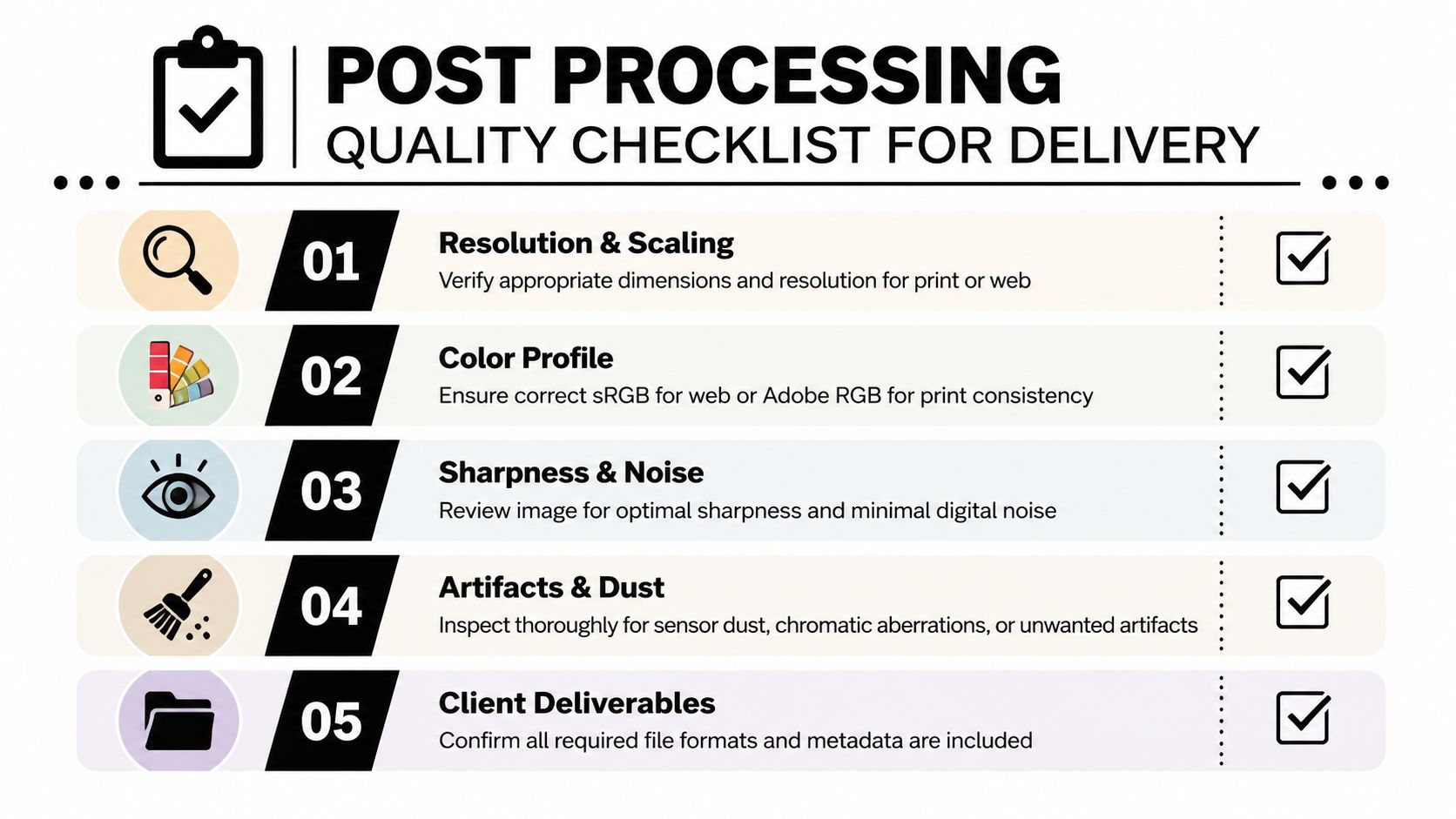
The checks I never skip
A final pass should be systematic. Not because clients demand perfection in theory, but because small flaws become obvious once images go public.
Here's the checklist I use most often:
Resolution and scaling
Export for the actual use case. Don't hand over oversized files for everything and assume the platform will do the right thing.Color profile
Use the profile that fits delivery. Web files generally need sRGB. Print workflows may call for Adobe RGB or a specific print profile depending on the vendor.Sharpness and noise
Recheck at output size. Architectural files often need a different sharpening balance than portraits because of edges, lines, and fine detail.Artifacts and dust
Inspect skies, white walls, glass, and shadow transitions. Those areas reveal cleanup failures quickly.Naming and deliverables
Package files so the client can use them. Campaign folders, logical naming, and version clarity save everyone time.
For teams publishing large image sets online, optimizing firm websites for image speed becomes part of the delivery conversation too. A beautiful file that loads poorly still creates a bad experience.
Print and web need different discipline
Photographers often assume color management is a technical afterthought. It isn't. It's the final stage of visual control.
A compact comparison helps:
| Output | Priority | What to watch |
|---|---|---|
| Website | Speed, clarity, dependable color | Compression artifacts, oversharpening, profile mismatch |
| Brochure or magazine | Tonal separation and print stability | Muddy shadows, clipped highlights, paper response |
| Presentation deck | Cross-screen consistency | Excess contrast, color drift between displays |
The delivered image is the real image. The edit on your monitor is only a draft until then.
The final review should challenge your own taste
The hardest quality-control step is questioning edits you personally like. Maybe the shadows feel dramatic. Maybe the warmth feels luxurious. Maybe the cool bias gives the project a sleek mood.
Ask whether those choices still serve the client's use. Can someone read the finishes accurately? Does the room still feel the size it is? Does the image hold up beside the rest of the campaign? Does it survive export?
If the answer is uncertain, the grade isn't done. It's just attractive.
If you need architectural or commercial imagery graded with that level of control, Jimmy Clemmons Photographer brings an editorial eye, precise exposure discipline, and a design-aware post-production approach to every assignment. The studio works with architects, developers, corporate teams, and publications that need images to feel polished, accurate, and consistent across print and digital use.