

You're probably looking at Cobb Galleria because a project landed on your desk fast. A conference needs launch images. A design team needs polished interiors. A marketing group wants the venue to feel bigger, cleaner, and more current than the usual event snapshots allow. That's where most venue guides stop being useful.
For creative and event professionals, cobb galleria in atlanta ga isn't just a booking line item. It's a layered visual environment with competing priorities: crowd flow, branding, ceiling height, mixed lighting, dock access, reflective surfaces, and timing around live event activity. If you treat it like a generic convention box, the work looks generic.
The better approach is to read the property the way an architectural photographer does. Look at how people move through it. Look at where the eye lands first. Look at how glass, carpet, truss, signage, and ballroom lighting either support the story or fight it. A clean frame at this venue usually comes from preparation, not improvisation.
A planner might need sponsor-friendly wide shots that still feel premium. An architect might need documentation of scale, finish, and circulation. An editorial team might need the venue to read as part of the larger Cumberland district rather than as an isolated building. Those are different assignments, and the Cobb Galleria supports all of them, but not from the same angle or at the same time of day.
Understanding the Cobb Galleria Beyond the Brochure
A creative brief for this venue often sounds simple at first. “Get us the ballroom, the exhibit hall, a few networking moments, and some clean exterior coverage.” Then the true assignment appears. The exhibit hall is active. The pre-function areas are visually busier than expected. The lighting package shifts from one room to the next. The client wants the space to feel modern, but the visual story also needs to acknowledge that the property is in transition.
That's why the usual venue summary doesn't help much. Brochure language tells you what rooms exist. It rarely tells you how the venue behaves on camera.
What the venue actually asks of a team
The Cobb Galleria works best when you split the job into three layers:
- Architectural layer. You're documenting form, scale, circulation, finishes, and the relationship between interior and exterior zones.
- Operational layer. You're working around load-in, attendee traffic, staff movement, vendor staging, and event schedules.
- Brand layer. You're deciding whether the building should read as neutral infrastructure or as an active part of the client story.
If those layers get mixed together carelessly, images turn muddy fast. A wide shot may show the room, but not the experience. A branded event image may carry energy, but hide the architecture. A polished interior may feel sterile if the assignment needed lived-in momentum.
Practical rule: At Cobb Galleria, the strongest images usually come from deciding early whether the frame is about space, event, or identity. Trying to make one shot do all three usually weakens it.
The venue rewards teams that scout with intent. You need to know which views hold up under pressure, which corners collapse visually once pipe-and-drape goes in, and which circulation zones can support portraits, editorial coverage, or sponsor content without turning into a cluttered background.
Deconstructing the Galleria Complex
A team arrives expecting one clean venue story. Within minutes, the assignment splits into several. The convention center, the surrounding commercial edges, the arrival points, and the nearby performance venue all read differently on camera, and each one asks for a different shooting plan.
“Cobb Galleria” works as shorthand, but it hides the actual structure of the property. For creative teams, that shortcut creates problems. A shot list built around one building usually misses how the site functions as a connected campus, with distinct visual zones that support different kinds of coverage.
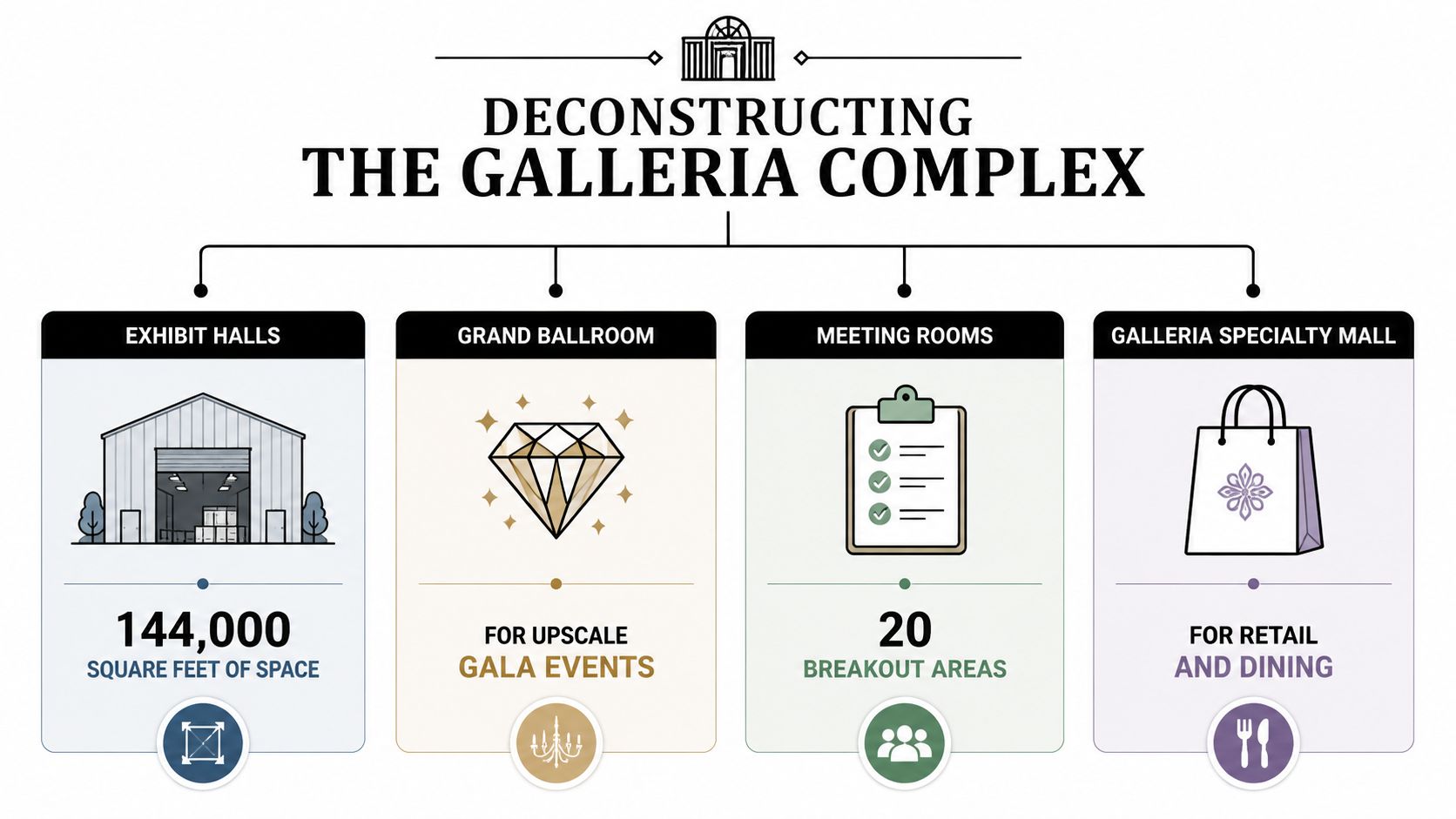
The convention core
The convention center is still the main working subject for most assignments. It carries the broadest range of deliverables, from clean architectural documentation to sponsor coverage, ballroom marketing images, trade show recaps, and venue sales collateral.
The important distinction is not size alone. It is how the spaces transition. Exhibit halls read as volume and infrastructure. Ballrooms depend on finish quality, ceiling treatment, and lighting control. Meeting rooms and boardrooms often matter more to corporate clients than photographers expect because they show the venue at the scale where decisions get made. Pre-function areas do a different job entirely. They show circulation, density, and whether an event feels active or staged.
Those zones should not be photographed the same way. Wide lenses help in the halls, but they can flatten premium finishes in the ballroom if the camera position gets careless. Tighter compositions often work better in meeting spaces because they show proportion and material without exaggerating empty corners.
The adjacent performance venue
The Cobb Energy Performing Arts Centre changes the visual identity of the district, even when it is not the primary subject. Its presence gives the area more range than a stand-alone convention property would have on its own.
That matters for editorial teams, tourism marketers, and planners building destination-level content. If the brief needs more than room coverage, the pairing of convention and performance functions helps frame the area as a broader cultural and business hub. For photographers who regularly document Atlanta architectural sites worth studying for composition and context, that mix is one reason this district has more visual flexibility than many event campuses.
The surrounding district
The Cumberland setting adds useful support material, but it can also dilute the assignment if the team does not define the story early. Nearby hotels, retail, road access, and commercial activity are helpful only if the final image set needs destination context.
I usually sort the campus into rings before a shoot:
| Zone | Best use for creative teams |
|---|---|
| Primary venue interiors | Hero images, event coverage, architecture documentation |
| Entrances and exterior edges | Arrival sequences, sponsor visibility, establishing frames |
| Adjacent district context | Editorial support, destination storytelling, B-roll |
| Nearby hospitality touchpoints | Executive portraits, ancillary event moments, client lifestyle imagery |
That framework saves time on site. It also prevents a common mistake. Teams often gather district material because it feels useful, then discover later that the client only needed the convention center to read clearly and convincingly.
At Cobb Galleria, a room story, a venue story, and a district story are three separate assignments. The strongest coverage starts by choosing one, then building the shot plan around that decision.
The Architectural Story of an Atlanta Landmark
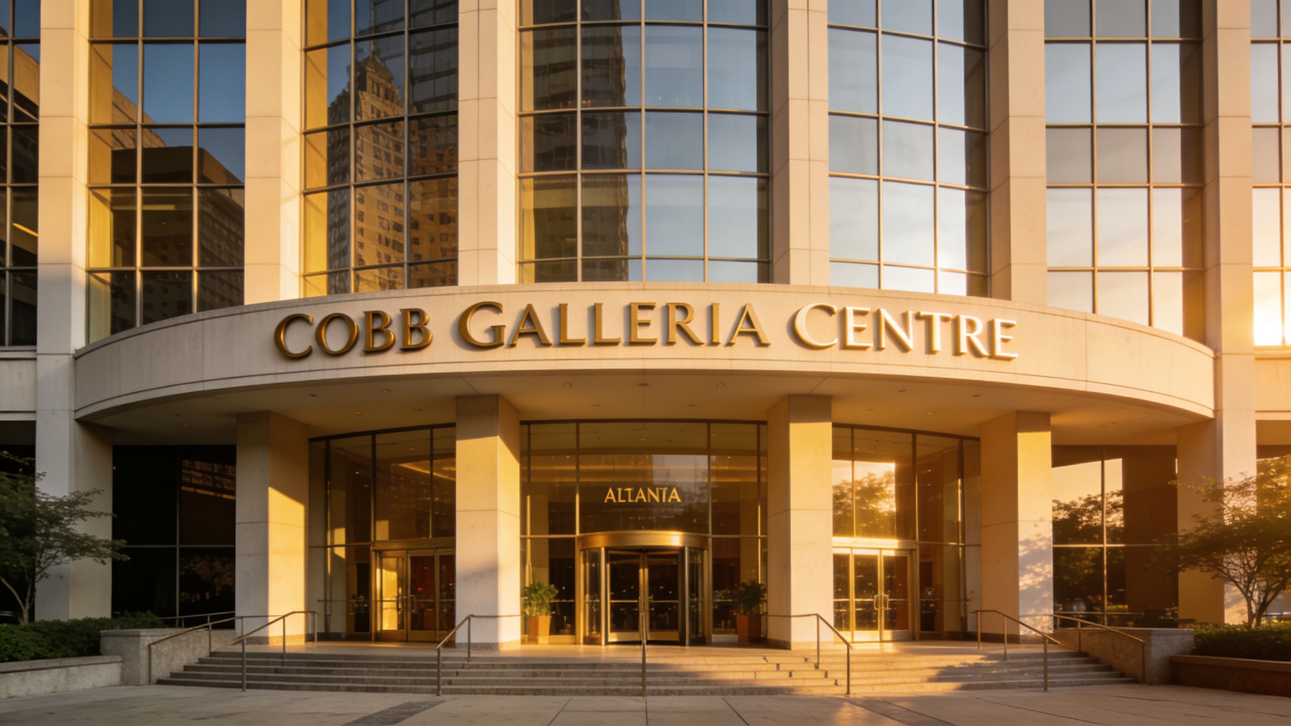
Arrive before setup starts and the building reads one way. Return during load-in, or after a rebrand rollout, and it reads another. Cobb Galleria is most legible during those in-between moments, when circulation, service access, finish choices, and sightlines are exposed instead of covered by event dressing.
The center began in the mid-1990s to serve conventions, meetings, and social events in northwest Atlanta, as noted earlier. That origin still shows in the planning. The architecture is organized around throughput, flexibility, and readable movement from one zone to the next.
That matters on camera.
Buildings designed for constant turnover can photograph better than more self-conscious venues because the logic is clear. Corridors point somewhere. Entries have a job to do. Large-volume rooms connect back to prefunction space in a way that makes visual sense, which gives photographers a stronger base for establishing shots, arrival sequences, and editorial coverage.
A building shaped by utility
The design language comes from event operations. You see it in the broad spans, the generous circulation zones, and the way the venue sits inside a larger hospitality and commercial setting. For creative teams, that means the strongest frames usually come from showing how people move through the building, not from trying to force it into the visual grammar of a museum or boutique hotel.
There is a trade-off. Flexible venues change character fast. A room can feel polished, civic, corporate, or purely transactional depending on drape lines, stage build, sponsor graphics, and furniture density. Good coverage has to separate permanent architecture from temporary dressing. I usually do that by prioritizing structural edges, ceiling rhythm, glazing, and transition points between public and event space.
Renovation and visual transition
The more compelling architectural story is the venue's current period of change. A major renovation is underway, and public documentation still leaves real gaps in before-and-after coverage, according to the Inside the District renovation update. For architects, developers, venue marketers, and editorial teams, that missing record is where the assignment gets interesting.
The property has also gone through a name change, as noted earlier. Rebranding and renovation rarely happen in neat phases from a photographic standpoint. Old signage, updated finishes, temporary barriers, and revised wayfinding often coexist for months. That creates friction for clean marketing imagery, but it also produces a more honest visual record of how the building is evolving.
Buildings reveal priorities during construction and transition. Finished promotional images usually hide those decisions.
For teams documenting Atlanta's built environment, Cobb Galleria belongs in the same conversation as other Atlanta architectural sites worth studying. Its value is not only in the final polished frame. It is in showing how a working civic-commercial venue updates its identity while preserving the operational clarity that made it useful in the first place.
Inside the Primary Event and Commercial Spaces
The interior story at Cobb Galleria is about controlled scale. Some venues give you one heroic room and a lot of forgettable support space. This one is more varied. Different rooms solve different visual problems, which is useful if your assignment includes architecture, live event coverage, sponsor content, portraits, and editorial detail all in one day.
The exhibit halls are the clearest example. The facility's four exhibit halls provide 144,000 square feet of contiguous space with 41-foot ceiling heights, support 812 booths or theater-style seating for 12,000, and are part of an expansion project expected to complete in early 2027, according to the AMI Magazine venue profile. That tells you the rooms are large. It doesn't tell you how to make them photograph well.
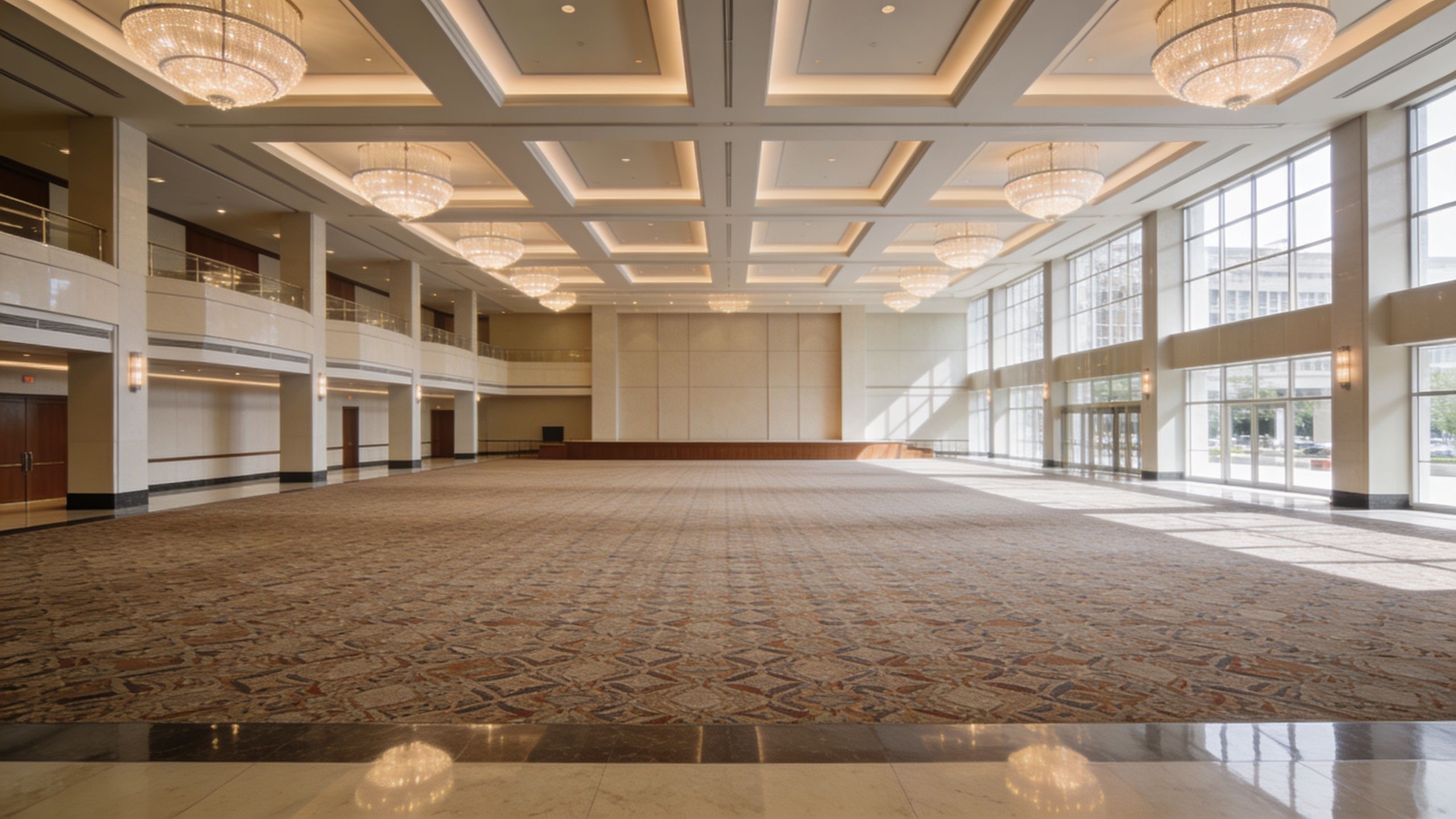
Exhibit halls
Big halls punish weak composition. If you stand too high without foreground structure, the room flattens. If you shoot too low without anchoring lines, the floor dominates and the room feels empty even when it isn't.
What works better:
- Use booth geometry as a compositional grid. Repeating aisle lines and overhead elements help explain scale.
- Shoot before full attendee density peaks if the client needs clean architecture with event life, not visual congestion.
- Keep branding selective. One or two readable brand moments are stronger than a frame overloaded with signage.
What doesn't work:
- Centering everything from the back wall.
- Letting mixed temporary lighting define the whole frame.
- Treating the hall as a single image problem instead of a sequence of vantage points.
Ballroom conditions
The ballroom has a different temperament. It's less about industrial scale and more about finish, atmosphere, and controlled symmetry. Chandeliers, patterned flooring, linens, staging, and perimeter glazing can all be assets, but only if the room is simplified before you shoot.
A ballroom frame usually needs hierarchy. The eye should land on one dominant feature first, then read the room. If every table treatment, chair cover, and uplight color competes equally, the image feels busy instead of elegant.
Field note: In ballrooms, wide lenses solve less than people think. A slightly tighter frame with better alignment often feels more expensive than an ultra-wide view that exaggerates carpet and dead space.
Meeting rooms and breakout zones
These spaces are easy to ignore and often more commercially useful than the grander rooms. For corporate clients, they show functionality, intimacy, and flexibility. For designers, they can reveal finish choices, lighting quality, and furniture layout without the visual noise of a major event.
A useful way to evaluate them is by assignment type:
| Space type | Best photographic use |
|---|---|
| Meeting rooms | Panel sessions, training, executive gatherings |
| Boardrooms | Leadership portraits, editorial business coverage |
| Pre-function foyers | Registration scenes, networking candids, sponsor displays |
| Breakout circulation | Transitional storytelling, guest movement, wayfinding visuals |
Transitional areas matter more than most clients expect
Pre-function areas and connecting spaces often do the hardest storytelling work. They show how guests arrive, gather, pause, and move onward. That's the difference between documenting a room and documenting an event experience.
The mistake is to treat these areas as filler. In practice, they're where natural interactions occur and where the building often reads most clearly as a hospitality environment rather than a sealed event container.
Navigating Access and Logistics for Professional Teams
Most venue pages cover guest access. They don't cover the questions a production crew asks first. Where do carts move cleanly? Which entrance reduces wasted time? How do you avoid loading into the wrong side of an active event? At this campus, those details matter because public guidance for professional crews remains limited. Basic accessibility information exists, but practical guidance for commercial shoots, including equipment transport across the 2800/2 Galleria Parkway campus, integrated parking access, and ideal shooting windows during convention activity, is still largely unaddressed in the public accessibility information for the adjacent venue.
Build your plan around friction points
Don't assume a guest-friendly route is a crew-friendly route. A polished arrival path can be the slowest option once you add rolling cases, stands, tripods, tether stations, or wardrobe.
Use a planning checklist before shoot day:
- Confirm your active entrance with venue staff, not just your client contact.
- Ask where temporary event installations will sit on the day of access.
- Map the cart path from vehicle to room, including elevators, turns, thresholds, and staging hold points.
- Identify a secondary holding zone in case the room isn't ready when your team arrives.
- Schedule around event turnover, because a room may be technically available while the corridor serving it is still chaotic.
Parking and timing are creative decisions too
Parking isn't just an operations issue. It affects your photography schedule. Long hauls from deck to room eat setup time, shorten scouting time, and push teams into less favorable light.
If you're producing architectural or marketing images rather than pure live-event coverage, ask for access windows that avoid peak public movement. A room may look the same on a floorplan, but the usable frame changes once registration lines, sponsor deliveries, banquet resets, or housekeeping circulation start.
For production teams, preparing a site for a photoshoot becomes especially important here because the venue's scale can hide small inefficiencies until they snowball. One misplaced staging area or delayed access point can affect every shot that follows.
What crews should settle before call time
- Permissions. Get clear approval for tripods, stands, added lighting, and any access beyond public circulation.
- Room state. Confirm whether the room should be photographed empty, partially dressed, or fully live.
- Power and tethering. Decide whether you're shooting self-contained or building a reviewed workflow on site.
- Staff escort needs. Some assignments move faster with one venue point person who can open doors, redirect traffic, and answer room-specific questions.
A clean production day at Cobb Galleria comes from pre-negotiation. The building can support complex work. It just doesn't reward assumptions.
The Professional Photography and Scouting Guide
The strongest way to photograph cobb galleria in atlanta ga is to stop thinking in terms of “venue coverage” and start thinking in terms of visual hierarchy. This property gives you several kinds of images, but they don't all want the same light, lens, or camera height. If you use one formula across the whole campus, the edit looks repetitive and the building feels less refined than it is.
Start with the assignment, not the room
An architect, a convention organizer, and a magazine editor may all ask for “the venue,” but they mean different things.
For architecture and design coverage, prioritize:
- Alignment and vertical control
- Readable circulation
- Material transitions
- Exterior-to-interior relationships
For event marketing:
- Crowd density that feels active, not chaotic
- Clean sponsor visibility
- Stage sightlines
- Moments that show participation
For editorial features:
- The venue in context
- Transitional spaces
- Evidence of renovation or identity shift
- Frames that suggest story beyond the room itself
That distinction matters because it changes where you stand and when you shoot.
Interior light and mixed color
Convention venues rarely give you one clean color temperature. You're often balancing daylight from glass, warm ambient house fixtures, LED screens, stage wash, and practicals from exhibit booths. At Cobb Galleria, that mix is manageable if you decide early what the dominant light source should be in each frame.
If the assignment is architectural, neutralize the room and keep color accents controlled. If the assignment is event-driven, let some of the ambient character stay. Over-correcting every source can flatten the atmosphere.
The adjacent theatre raises the stakes even more. The Cobb Energy Centre's theatre includes an 82-foot grid height and multiple galleries, a configuration that creates complex lighting conditions that architectural photographers need to manage carefully in low-light interiors, according to the Cobb Energy Centre technical package. That kind of environment rewards deliberate exposure strategy and punishes rushed mixed-light work.
If you can't identify the dominant light in a room within a minute, don't start shooting wide hero frames yet. Solve the light first.
Best angle logic for this campus
A few angle principles hold up consistently here:
- Exteriors work best when the façade reads as part of arrival, not as a flat front elevation. Include approach lines, glazing, and pedestrian cues.
- Exhibit halls usually need one high-context wide frame, one mid-level frame with readable human scale, and one detail sequence that isolates branding or architectural rhythm.
- Ballrooms benefit from corner-based symmetry more often than dead-center symmetry because corner views reveal depth and table layout.
- Pre-function spaces often photograph best while lightly occupied. Empty can feel sterile. Full can feel blocked.
Scout for reflections and interruptions
Glass, polished surfaces, digital signage, and temporary branding can create visual noise quickly. During scouting, don't just look for beautiful angles. Look for what will ruin them.
Create a short pre-shoot audit:
- reflective glazing
- exit signs in dominant sightlines
- clutter pockets near walls
- uneven drape lines
- cable runs
- sponsor materials with conflicting color palettes
This is also where a more disciplined approach to photographing architecture and interiors pays off. The venue doesn't need heroic treatment. It needs precise editing of what enters the frame.
Permissions and pacing
Professional results here come from permission and timing as much as camera craft. Ask about:
- approved load-in path
- tripod and stand use in public areas
- access before attendee arrival
- whether temporary event crews can pause in visible zones
- who can authorize minor resets of furniture or signage
Then build pacing into the shoot. Don't rush from exterior to ballroom to exhibit hall in a straight line if the light and room readiness don't support that order. The best sequencing often follows room condition first, light second, and client priority third.
Maximizing Your Project at the Cobb Galleria
The Cobb Galleria succeeds when you stop treating it like a neutral container. It isn't one. It's a working venue with a distinct visual logic, a broad campus identity, and a current moment of architectural transition that changes how it should be documented.
For event professionals, that means planning imagery alongside operations. The room layout, guest movement, signage placement, and access routes all affect what the final work can look like. For architects and developers, it means understanding that the property tells two stories at once: the long-established convention infrastructure and the newer identity taking shape through renovation and rebranding. For marketers, it means knowing when to feature the building itself and when to let it support the brand more subtly.
The trade-offs worth making
Some choices consistently improve outcomes:
| Better choice | Why it works |
|---|---|
| Scout before finalizing shot list | The venue changes with setup and traffic |
| Prioritize a few hero views | Strong edits beat exhaustive but repetitive coverage |
| Photograph transitions, not just destinations | Arrival, gathering, and circulation make the venue believable |
| Coordinate with operations early | Access decisions affect composition and timing |
The opposite choices usually create trouble. Overshooting every room without a hierarchy leads to a bloated edit. Waiting to solve logistics on site wastes the best light and the cleanest access. Treating all event spaces the same flattens the story.
A venue like this doesn't need more coverage. It needs more discernment.
That is the advantage in approaching cobb galleria in atlanta ga as a creative and logistical blueprint. Once you understand where the space opens up, where it tightens, how it carries light, and how people move through it, the venue becomes more than a backdrop. It becomes part of the message.
If you need polished architectural imagery, event documentation, or a scouting-led visual plan for a project at the Cobb Galleria, Jimmy Clemmons Photographer brings an Atlanta-based, design-focused approach built for commercial spaces, brand storytelling, and editorial-grade results.