
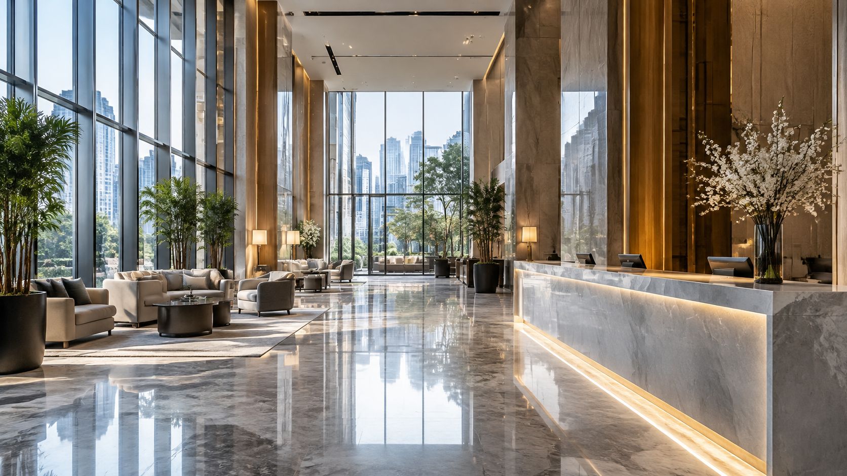
You're looking at a building photo that looked crisp on a calibrated monitor and then fell apart on a phone in a meeting. The façade is in the file. The stone joints, the entry, and the sign still don't read. That gap is what people mean when they ask for clarity in photography, even when a sharpness report says the frame is fine.
I would start with the cheapest fix. Name the one or two things a viewer must understand, then build focus, light, and framing around those things. Pushing edge contrast across the whole frame often makes a space harder to read, not easier.
What follows is the on-set sequence for architecture and brand work: the settings, the lenses, and the lines worth putting in a commission before the shoot day.
What Clarity Means in a Photograph
A photographer checks a frame of a glass-and-steel lobby on a monitor and wonders why the reception wall looks soft even though the camera was focused. The focus point sat on the desk. The wall the client cares about sits just outside that plane. The file is large. The subject still isn't easy to read.
Clarity is the ease with which a viewer reads a subject's edges, texture, and detail. Two meanings get mixed up. Technical clarity is sharpness, resolution, and edge contrast measured in the file. Perceptual clarity is how quickly the eye understands what matters in the frame. A road sign in fog can be large and high contrast and still be hard to read, because mist hides its edges. A sharp photo of a cluttered lobby fails the same way.
Clarity is the legibility of the subject, not the amount of sharpness in the frame.
Three layers build that legibility.
- Capture: focus and camera stability decide which plane is sharp.
- Contrast: light and tone at the edges decide whether texture separates from its background.
- Hierarchy: what the eye reads first decides whether the right subject wins.
A 2013 study in the Journal of Experimental Psychology: Human Perception and Performance found that viewers fixated more rapidly and more frequently on a clear region than on a comparable blurred region, even when instructed to distribute attention equally. Selective sharpness steers attention before anyone parses the wider composition.
Name the one or two things a viewer must understand within three seconds. Aperture, light, crop, and the brief all follow from that short list.
Clarity Levers and What Each One Changes
Scan the levers before you touch a dial. Each row is a tendency, not a fixed setting.
| Lever | What It Controls | Effect on Clarity | Main Trade-off |
|---|---|---|---|
| Focal length | Field of view and perspective | Longer lenses compress planes; wider lenses fit more in one frame | Wide lenses stretch edges; long lenses need more distance |
| Aperture | Depth of field and light | A wider opening narrows the sharp zone; a smaller opening widens it | Small openings cut light and add diffraction |
| Focus point | Which plane is sharpest | Places the sharpest zone on the detail that matters | A missed point leaves the key detail soft |
| Shutter speed | Motion blur | Faster speeds freeze movement and camera shake | Faster speeds need more light or higher ISO |
| ISO | Sensor sensitivity | Lets shutter and aperture stay in range | Higher values add noise that softens fine detail |
| Tripod and stabilization | Camera movement | Allows slow shutter speeds and small apertures without shake | Slower setup and less spontaneity |
| Lighting | Edge contrast and texture | Raking light shows texture; soft light separates edges | Harsh light creates deep shadows that hide detail |
| Perspective control | Converging verticals | Keeps building lines parallel to the frame edges | Shift lenses cost more and have limited range |
Three effects, not eight problems
Each lever changes one of three things: which plane is sharpest, how crisp the edges look, and whether movement blurs them.
Which plane is sharpest. Focal length, aperture, and the focus point place the sharp zone. A longer lens stacks a façade and a street tree closer together. A wider lens fits the room and stretches the corners, so you check those corners before you trust the frame.
How crisp edges look. ISO, lighting, and perspective control decide whether a joint stays a joint. Noise fills fine lines. Flat light removes the short shadow that defines brick. Lines that lean inward read as a geometry error even when focus is perfect.
Whether movement blurs them. Shutter speed, with or without a tripod, decides if the edge you focused stays an edge. A slow handheld exposure turns a mullion into a smear.
Change one lever at a time and test the frame at 100 percent. Lens quality and sensor size shift the result, so don't copy a number from another body and assume it holds.
For interiors, the focus point and aperture usually matter most. For building exteriors, perspective control and lighting usually matter most.
Aperture, Light and the Depth of Field Trade-off
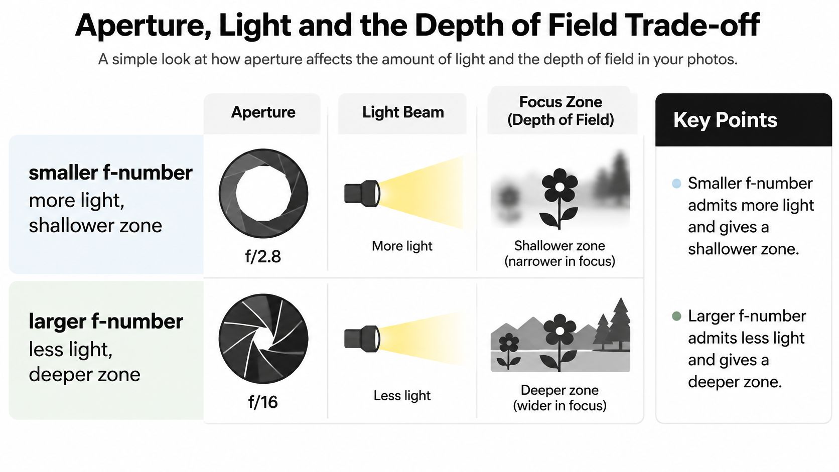
Say a hotel lobby has a reception desk four metres away and a back wall that must stay readable. At f/4 the sharp zone is too shallow and the wall goes soft. At f/8 the zone covers the wall. That step is two stops. A shutter of 1/125 second at ISO 200 becomes 1/30 second if you keep the same exposure. Handheld, 1/30 second risks shake. Keeping 1/125 second means raising ISO from 200 to 800. You trade noise for a wall that still reads.
A smaller f-number admits more light and gives a shallower zone. A larger f-number admits less light and gives a deeper zone. A University of Toronto computational photography tutorial puts the same trade-off plainly: a wider aperture produces a shallower region of acceptable focus, and a narrower aperture increases depth of field while cutting light. Stopping down forever doesn't buy more sharpness, because very small openings spread light into a blur pattern.
What each stop costs
| Aperture | Light Compared With f/2.8 | Depth of Field | Clarity Note |
|---|---|---|---|
| f/4 | Half the light | Shallow to moderate | Focus accuracy matters most |
| f/8 | One eighth the light | Moderate to deep | Often the sharpest zone on many lenses |
| f/11 | One sixteenth the light | Deep | Diffraction starts to show on high-resolution full-frame |
| f/16 | One thirty-second the light | Deeper | Softening usually visible at 100 percent view |
| f/22 | One sixty-fourth the light | Deepest | Diffraction blur often outweighs the depth gained |
Use the smallest opening that covers the required zone, not the smallest opening the lens offers. On many high-resolution full-frame bodies, past roughly f/11 the whole frame starts to soften. f/16 and f/22 look deeper on a distance scale and softer when you zoom in.
If several interior planes have to stay acceptable together, a walk-through of understanding depth of field is the reference to share with the team before anyone argues about "just stopping down."
How to Set Focus and Stability on Site
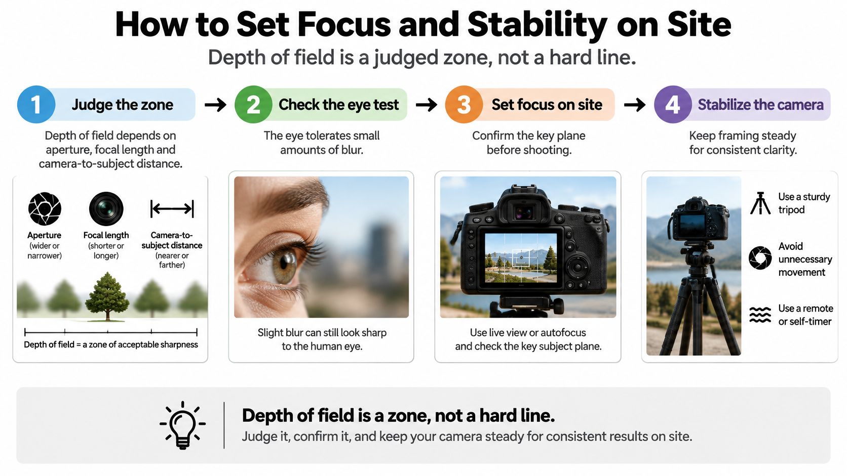
Depth of field is a judged zone, not a hard line between sharp and unsharp. The Arizona career and technical education digital photography standards tie that zone to aperture, focal length, and camera-to-subject distance, because the eye can't distinguish very small degrees of blur. A small aperture can widen the zone, and the lost light can force a slower shutter or a higher ISO, which brings motion blur or noise. You balance coverage, shutter, and sensitivity. You don't max one of them.
The on-site routine
- List the planes. Write the two or three details the viewer must read, in order. If the list is "everything," you don't have a focus plan.
- Place the point about one third into that zone. The near side falls off faster than the far side, so the point sits inside the group, not on its front edge.
- Magnify live view to 100 percent and focus on the detail that matters most. Trust the magnified edge, not the green box.
- Set the near limit on wide interiors with the lens distance scale or a hyperfocal table, so the foreground threshold stays inside the zone.
- Mount, level, and delay the release. A bubble level keeps the sensor square. A two-second timer or a remote keeps your hand off the body. A stable tripod for architectural photography is what makes the slow shutter usable.
- Use the lowest ISO that holds the shutter at or above the reciprocal of the focal length. For a 50mm lens, that floor is about 1/50 second if you are off the tripod.
- Bracket focus only when aperture can't cover the zone. Extra frames are a backup, not a substitute for a placed point.
- Review at 100 percent. Check the corners and the nearest plane before you move the tripod.
The common slip is focusing on the nearest object. That spends the zone on a chair or a sill and leaves the wall, the sign, or the face soft.
Lens Choice and Perspective Control for Buildings
Tilt the camera up to fit the top of a tall façade and the verticals converge. The walls lean inward. Viewers read that lean as a crooked building, not as a camera angle, so the lines fail before anyone judges focus.
Focal lengths clients usually ask for
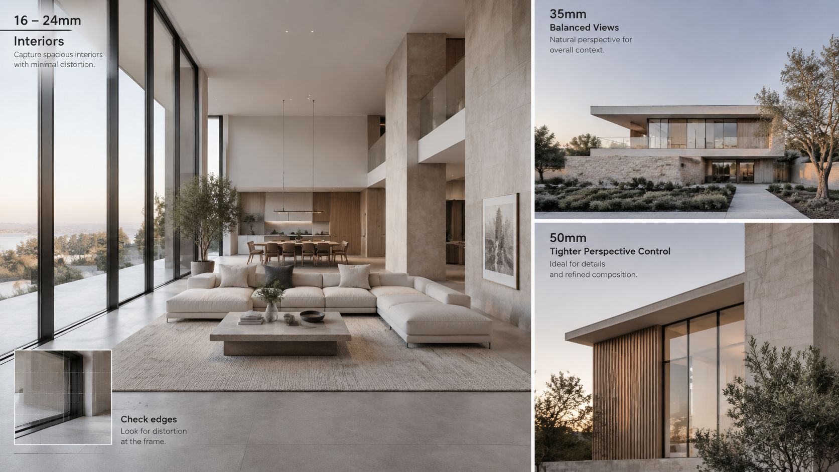
Interiors often land between 16mm and 24mm. That range fits the room. It also stretches edges, so you inspect the corners for bowed lines and stretched furniture before you accept the frame.
A 35mm view is the street lens. It holds the building and enough context that the block still makes sense, without the extreme stretch of an ultra-wide.
50mm to 85mm compresses the background. Use that range for material, a junction, a sign, or a person at the entry. The subject separates from the street without the wide-angle pull.
Two ways to hold the verticals
Take a three-storey façade from street level. With a standard lens tilted up, the walls lean in and the top floor looks narrower than the ground floor. With a shift lens kept level, the same framing keeps the verticals parallel.
A tilt-shift or view-camera lens projects an image circle larger than the sensor. MIT notes on perspective distortion and its correction describe the mechanical condition that matters: the sensor stays parallel to the façade, and the shift selects an off-center slice of that larger circle. The correction happens at capture. It isn't a crop, and it isn't a later warp that has to invent pixels along the edges.
Shift lenses cost more, their shift range is limited, and they need that larger image circle. For a tower that won't fit in one shift, stitch several level frames. Agree the lens and the perspective plan with the photographer before the shoot day, not after the selects come back leaning.
Glass has to be clean or the edges never appear. Streaks and city film hide mullions no matter how parallel the sensor is. A pass based on the Aloha Window Bros storefront cleaning guide is worth doing before the camera comes out.
Lighting and Composition That Direct the Eye
In a corporate lobby, light the reception desk and drop the corridor by about one stop. The desk reads first. The corridor stays visible, and it doesn't compete. That is hierarchy built with tone, not with a sharper file.
Raking light, early or late, throws short shadows across stone, brick, and wood. Texture appears because the surface isn't evenly lit. Overcast light is often the safer choice for glass-heavy interiors, because edges stay even and you aren't fighting a hot patch on every pane.
Polished stone, glass, and metal throw hot spots that flatten the detail underneath. Change the angle, wait for the sun to move, or fit a polarizer and rotate it until the reflection drops and the edge returns. You won't kill every reflection. You only need the subject to stay readable.
Bright windows against a dim room are the other failure. Bracket the exposures and blend them, or add light in the room, until the window and the interior sit at a similar level. If the window is the only bright shape, that is what the eye will read, even when the desk is meant to be the subject.
A subject about one stop brighter than its surroundings is usually enough to lead the eye. Leading lines and clean edges do the rest, as long as clutter isn't fighting the subject. Faces need a catchlight and a fill reflector so eyes stay readable when the architecture is the brighter shape.
Before anyone lights a furnished room, clear the competing objects. A living room styling and staging checklist is a useful pre-shoot pass so lamps, cushions, and loose decor don't steal the edge contrast you just built.
Practical rule: If you can't point to the brightest useful shape in the frame, the light isn't directing anyone yet.
Checking and Editing Clarity Without Overdoing It
Judge the file at the size it will be seen. A hero that looks crisp at 100 percent can still fail as a phone crop, and a print can show texture the screen hid.
| Delivery Target | What to Check | Sharpening Approach |
|---|---|---|
| Full-width website hero | Façade lines and signage edges at 100 percent | Light output sharpening sized to the screen |
| Phone screen | Faces and key signage at fit-to-screen | Keep sharpening subtle to avoid halos |
| Projected presentation | Hierarchy holds when contrast drops | Slightly stronger local contrast, checked on the projector |
| Print spread | Fine texture and material joins at 100 percent | Output sharpening matched to the paper |
| Social or sales detail crop | Subject still readable when cropped and small | Light sharpening only; check legibility first |
Edit in this order
- Correct exposure and colour first. Sharpening a dark, cast-heavy file only hardens the wrong tones.
- Reduce noise before you sharpen. Otherwise you amplify the grain that is already softening joints.
- Apply capture sharpening at the file's native size. This restores what the capture lost. It isn't a look.
- Apply output sharpening for each delivery target. Screen, print, and projection don't want the same amount.
- Mask sharpening to edges such as cornices, mullions, and signage. Leave skies and smooth walls alone.
- Check for halos at 100 percent. Pale or dark outlines along edges are fake clarity. Back the amount off.
- Preview on a phone and on a projector before you sign off. The laptop isn't the delivery.
Editing can lift edge contrast. It can't restore a missed focus point or motion blur from a slow shutter. When the plane is in the wrong place, start with correcting missed focus in photos only as damage control, and reshoot if the subject still doesn't read. Structural lines that leaned at capture are a different repair, covered in using post-production to fix structural photos.
Make a cropped version for social and sales decks, and confirm the subject is still identifiable when it's small. The Clarity slider in editing software adds local contrast across midtones. That is not the same thing as photographic clarity. Use it sparingly on stone and glass. Pushed hard, it exaggerates texture and draws the same halos as over-sharpening.
Write Clarity Into Your Next Photography Brief
Clarity is easiest to deliver when the brief names it. A delivery size with no priority plane leaves the photographer guessing where focus belongs.
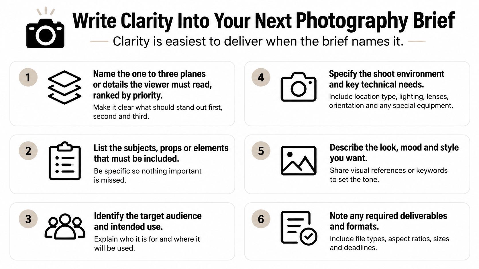
Run this list before you book.
- Name one to three planes or details the viewer must read, ranked by priority.
- List the delivery sizes and formats, from a full-width web hero to a phone screen, a print spread, or a cropped social image.
- State whether building lines must stay vertical. That decides a tilt-shift lens or a level camera.
- Set the time-of-day window. Low raking sun for texture on stone, brick, and wood. Overcast light for glass-heavy interiors.
- Confirm access, permits, and occupancy hours. Those hours limit how long you can bracket and move the camera.
- Say whether you need a cropped or accessible version, including a short description if the image will be read without the picture.
- Describe the viewing setup: phone, projector, or print. The check at 100 percent follows that choice.
Ask for a sample frame reviewed at 100 percent and a short note on the planned lens and focus approach. You can verify focus, perspective, and light before the shoot day, while there is still time to change them.
Our work sits in architectural photography and corporate brand content: sweeping exteriors and refined interiors that highlight form, light, and detail, with professional editing as part of the delivery. Send the finished checklist with three clarity priorities ranked by what the viewer must understand first.
Jimmy Clemmons Photographer builds architectural images and corporate brand content so form, light, and detail stay legible from the hero frame down to a phone crop. If your next commission needs that kind of clarity in photography, start with the priority planes and the delivery sizes. Visit Jimmy Clemmons Photographer to plan the shoot.