

The client wanted a clean lobby portrait with late-afternoon warmth coming through the glass. Ten minutes before the frame, clouds flattened the windows, the ceiling cans turned the walls muddy, and the whole scene lost its point. We killed the room, built the light ourselves, and the photograph finally said what the space was supposed to say.
Moving Beyond Available Light
Most photographers start with available light because it's there. Professionals lean on artificial lighting in photography because it gives them authorship.
That difference matters more than people admit. Available light records a situation. Artificial light interprets it. In editorial, architectural, and portrait work, that interpretation is often the whole assignment. A law office shouldn't feel like a dim office if the brand needs confidence and clarity. A founder portrait shouldn't feel flat just because the conference room faces the wrong direction. The camera only sees what's in front of it. Lighting decides what that means.
Artificial lighting isn't a modern shortcut. It has deep roots in the medium itself. In 1839, L. Ibbetson is reported to have used oxy-hydrogen light to illuminate a photograph, an early limelight process that let photographers work beyond daylight and marked one of the first documented uses of artificial light in photography, as noted in this history of flash photography.
Control changes the story
On location, natural light usually fails in ordinary ways. It drifts. It mixes color. It disappears behind weather or architecture. The mistake is treating those changes as creative fate.
A better approach is simple. Decide what the picture needs, then build the light to support that decision. In an interior, that might mean preserving the rhythm of sconces while adding shape to furniture and depth to the far wall. In a portrait, it might mean letting a room stay dim while keeping the face clear and intentional.
Practical rule: If the mood of the image matters, don't let the room make the lighting decisions for you.
The strongest photographers I know don't use artificial light to make images look "lit." They use it to make the image feel coherent. That's a different standard. It asks whether the eye goes where it should, whether the shadows support the subject, whether the color feels believable, and whether the frame holds together from edge to edge.
Architecture and portraiture aren't separate problems
Tutorials frequently fall short. They treat interiors as one craft and portraits as another. In practice, the core job is the same. You're shaping attention, carving depth, controlling contrast, and deciding what gets emphasis.
A hallway, a tabletop product, and a CEO portrait all respond to the same disciplined thinking. What is the subject. What should fall back. Where should the viewer feel texture. Where should the frame breathe. Once you understand that, lighting stops being a bag of tricks and becomes a language.
The Physics of Light You Actually Need to Know
You don't need a physics degree to light well. You need a working feel for how light falls off and why some shadows look surgical while others roll gently.
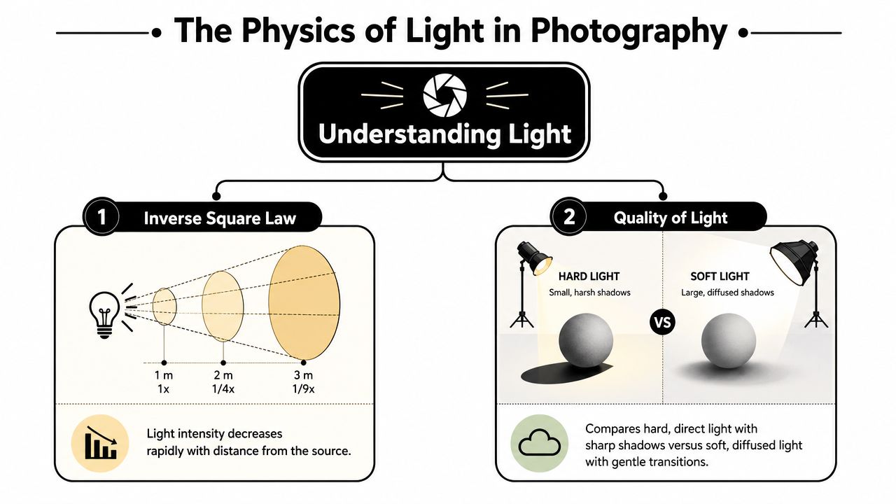
Distance changes more than brightness
The quickest way to understand light falloff is to think about a watering can. Close to the plant, the stream is concentrated. Step back, and the same water spreads wider and feels weaker. Light behaves similarly. As you move a fixture farther from the subject, the illumination drops and the spread changes.
That has practical consequences on set:
- Close light gives drama: The subject gets more exposure, and nearby surfaces can fall away quickly.
- Distant light feels flatter: The spread reaches more of the scene more evenly, which can reduce separation.
- Position affects consistency: In a portrait, moving the key light back can even out exposure from face to torso. In a room, bringing a unit too close can create one bright area and a fast collapse into shadow.
Photographers often chase the wrong adjustment first. They raise power when placement is the primary issue. Many uneven lighting problems are distance problems wearing an exposure mask.
Hard light and soft light
Light quality comes down to the character of the shadow edge. Hard light creates crisp transitions. Soft light creates gradual ones.
The easiest mental model is the sky. The sun on a clear day acts like a small, distant source, so shadows look sharp. An overcast sky behaves like a broad source, wrapping the subject and softening transitions. In the studio or on location, the principle doesn't change.
Here are the practical reads:
| Situation | Likely result |
|---|---|
| Small source far away | Harder shadows, more defined texture |
| Large source near subject | Softer shadows, smoother transitions |
| Light aimed narrowly | Strong emphasis, more control over spill |
| Light spread broadly | Gentler coverage, less precision |
If you photograph faces, flattery starts with lighting. If you photograph interiors, lighting determines whether materials either sing or go dead. Stone, wood grain, brushed metal, and fabrics all respond differently depending on whether the light skims across the surface or fills it head-on.
Hard light reveals form through edge and contrast. Soft light reveals form through transition.
Read the room like a set
Before placing anything, stop and identify three things:
The dominant surfaces
White walls bounce light. Dark wood absorbs it. Glass reflects everything you forgot to hide.The subject's shape
A person's face, a chair profile, and a kitchen island each need different shadow behavior.The desired finish
Commercial polish usually needs control. Editorial mood often benefits from selective shadow and a little restraint.
This is the bridge between architectural and portrait lighting. In both, physics isn't abstract. It's the reason a light placement works or doesn't. Once you can predict falloff and shadow character, gear choices become much easier.
Choosing Your Tools The Photographer's Light Kit
Every lighting kit is an argument about speed, control, and the kind of work you do. The two broad families are strobes and continuous lights. Neither is universally better. Each solves a different set of problems.
Strobes for power and precision
Strobes, whether speedlights or larger flash heads, give you a short burst of concentrated light. They excel when you need to freeze movement, compete with bright ambient conditions, or build clean exposures in spaces where the available light is working against you.
For architecture, strobes are useful when a room needs shape but the existing light is inconsistent. For portraits, they let you lock in expression and gesture without depending on whatever the room gives you. They also keep ISO and shutter compromises under control.
The trade-off is visibility. You don't see the final light continuously. You build, test, adjust, and repeat. Some photographers love that discipline. Others find it slower at first.
Continuous lights for seeing as you shape
Continuous sources, especially LED fixtures, let you watch the image form in real time. That makes them strong tools for photographers who also shoot motion, work closely with clients on set, or prefer to refine lighting by eye before pressing the shutter.
In editorial portraiture, continuous light can feel intuitive because the shadows and highlights are visible as the subject moves. In interiors, it can be useful when you're layering accents and want immediate feedback on reflections, practical lamps, and texture.
The compromise is output. Depending on the scene, you may need to work around longer exposures, wider apertures, or more careful ambient control. That's not a flaw. It's just part of the decision.
Strobe vs. Continuous Lighting At a Glance
| Characteristic | Strobes (Flash) | Continuous Lights (LED, Tungsten) |
|---|---|---|
| How you preview light | Built through test frames or modeling light | Visible directly in the scene |
| Power style | Strong burst, useful when you need punch | Constant output, easier to evaluate by eye |
| Motion handling | Strong choice for freezing movement | Better when motion blur isn't a problem or is intentional |
| Video use | Not suited to motion capture | Natural fit for video and hybrid shoots |
| Working rhythm | Measured, test-driven, controlled | Immediate, visual, fluid |
| Typical portrait use | Crisp, polished, highly repeatable | Naturalistic, interactive, cinematic |
| Typical architectural use | Layered control over key areas | Useful for visible shaping and practical balancing |
If you're evaluating systems for location work, Jimmy Clemmons Photographer also has a practical look at choosing the best light for a site shoot, which is worth reading alongside your own field experience.
The support gear people ignore
Bad support gear ruins good lighting faster than mediocre fixtures do. Light quality doesn't matter if the stand drifts, the boom sags, or the modifier rotates at the wrong moment.
A dependable kit usually includes:
- Stands that match the job: Lightweight stands are fine until a larger modifier or awkward location makes them unstable.
- Grip heads and arms: These let you flag spill, hold reflectors, or place a light exactly where a stand can't go.
- Sandbags: They aren't glamorous, but they keep the set safe and the frame consistent.
- Flags and diffusion: Sometimes the smartest lighting move is subtraction, not addition.
Buy fewer lights if you need to. Don't cheap out on the things that keep those lights where you placed them.
Build the kit around your assignments
A portrait photographer working in offices and conference rooms may need one reliable key, one fill option, and lightweight grip. An architectural photographer may need more control tools than actual lamps because reflections, spill, and room geometry are the main challenge.
That overlap is the useful part. A disciplined portrait kit teaches you economy. A disciplined architectural kit teaches you precision. Together, they produce the kind of editorial lighting that feels intentional without becoming heavy-handed.
The Art of Shaping Light with Modifiers
A bare fixture is rarely the final answer. The character of the light comes from what you put in front of it, around it, or in its path.
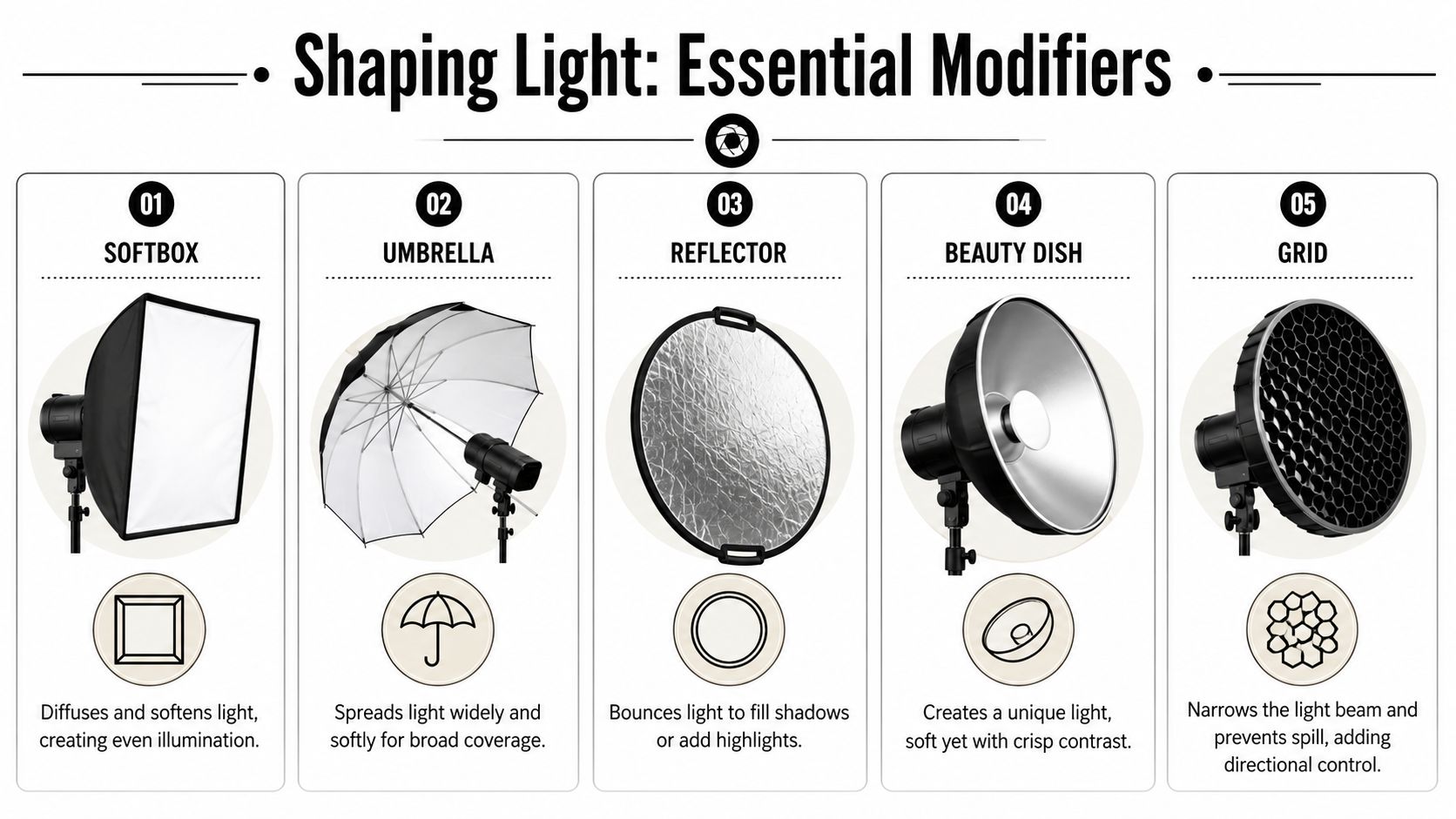
Apparent size is the real secret
Most photographers talk about modifiers as if the gear itself creates the look. That's only partly true. What really matters is apparent source size and distance. A larger modifier such as a softbox creates a larger effective source and softer shadows, while a smaller source, snoot, or grid concentrates output and hardens the light. Moving the light closer also increases softness by making the source larger relative to the subject and raises illuminance, giving photographers a way to trade shadow quality and exposure without changing fixtures, as explained in this lighting basics guide.
That principle connects portrait and architectural work directly. A softbox close to a face wraps the cheek and cleans up under-eye transitions. A broad source near a chair or banquette can make upholstery read rich instead of brittle. A tight gridded source can pull attention to a doorway, artwork, or jawline without flooding the whole frame.
What each modifier actually does
Softbox or octabank
Good when you want controlled softness. These are workhorse tools because they soften the light while keeping it directional enough for shape.Umbrella
Fast and forgiving, but less controlled. Useful for broad fill or simple location work where speed matters more than tight spill management.Beauty dish
A middle ground. It gives a distinctive combination of softness and crispness that works well on faces and selected product surfaces.Grid
Think of this as control, not softness. A grid narrows the beam and keeps light off walls, ceilings, and backgrounds you don't want affected.Snoot or barn doors
These are for carving. They isolate highlights, create accents, and help you place a small patch of light exactly where the composition needs it.
For an architectural perspective on material detail and controlled highlights, capturing texture in interior design photos gives a related way to think about surfaces.
Distance is part of the modifier
A large softbox parked too far away stops behaving large. That's one of the most common mistakes in portrait setups and interior accents. People buy a big modifier, place it across the room, and wonder why the light looks ordinary.
The fix is often straightforward:
- Bring the source closer until the transitions improve.
- Feather the edge rather than pointing the center directly at the subject.
- Watch the spill on nearby walls and reflective objects.
- Adjust the camera position before swapping gear.
The modifier isn't the look. The relationship between source, subject, and background is the look.
This matters even more in mixed assignments. Editorial environmental portraits often include furniture, windows, signage, and architecture in the same frame. A modifier has to flatter the person without flattening the space. That's why photographers who only study portrait setups often struggle in interiors, and vice versa.
A short demonstration helps more than theory alone:
When shaping light goes wrong
The usual failures are easy to recognize:
| Problem | Likely cause |
|---|---|
| Flat face or flat room | Source too broad or too frontal |
| Harsh transitions in a portrait | Source too small or too far |
| Bright walls and dead subject | Spill not controlled |
| Texture disappears | Light angle too head-on |
| Frame feels overlit | Too many sources doing the same job |
The cure isn't more equipment. It's clearer intent. Decide whether the light needs to wrap, skim, isolate, or fill. Then choose the modifier that performs that specific task.
Metering Color and Controlling the Scene
Good lighting falls apart quickly if exposure and color drift from frame to frame. This is where practice becomes craft. You need a repeatable way to judge what the light is doing, not what your eyes think it's doing.
Reflective readings versus incident readings
Your camera's built-in meter is reflective. It evaluates light bouncing off the scene. That means a dark wall, bright countertop, black suit, or white bedding can all push the reading around. The meter doesn't know what the subject should look like. It only sees reflectance.
A handheld incident meter reads the light falling onto the subject. That's why many professionals trust it when consistency matters. In portraits, it keeps skin exposure from shifting because of wardrobe or background. In interiors, it helps when one area of the room is dark wood and another is white plaster.
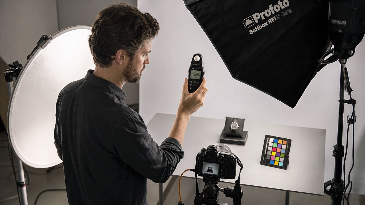
A practical metering workflow
When I walk into a mixed-light environment, I don't start by chasing perfection across the whole room. I establish a baseline, then solve one variable at a time.
A reliable sequence looks like this:
- Read the ambient first: Decide whether it helps the image, harms it, or needs to be reduced.
- Meter the key source at the subject: This gives you a stable anchor for exposure.
- Check contrast zones: Measure important secondary areas such as a background wall, a tabletop, or the shadow side of a face.
- Test and inspect the file: Meters get you close. The frame confirms whether reflections, specular highlights, and practicals are behaving.
Color is part of lighting, not cleanup
Color temperature problems usually show up in the places people ignore first. Lamps in the background go orange. Window light goes cool. A strobe lands neutral in the middle and the file splits into different visual languages.
You can solve that only three ways. Turn conflicting sources off. Match them. Or embrace the contrast on purpose.
For most commercial and editorial assignments, intention matters more than purity. If a warm practical lamp is important to the room, you may need to shift your artificial source so the final image doesn't argue with itself. In portraiture, the same principle applies when a subject stands inside an architectural environment that has its own lighting identity.
If the room has a color story, your added light has to participate in it.
Gels and custom balance
Colored gels aren't just theatrical tools. They are problem-solving tools.
Use them when you need to:
- Match practical fixtures: Helpful when lamps or sconces need to stay visible and believable.
- Control window contrast: In some mixed scenes, adjusting the added light can reduce an obvious warm-cool split.
- Create narrative separation: A slight shift in background color can support depth without looking stylized.
Custom white balance matters for the same reason. Auto settings often chase the scene and move unpredictably as the composition changes. A locked reference gives you continuity across a set of frames, which is critical when a client expects a series to feel coherent.
Architectural photographers and portrait photographers arrive at the same conclusion here. Metering is about repeatability. Color control is about trust. When those two are solid, lighting choices become deliberate instead of reactive.
Real-World Lighting Strategies and Case Studies
Theory matters only if you can carry it onto a job and make it hold. The fastest way to understand artificial lighting in photography is to watch the same principles solve two different assignments.
Case study one interior architecture
In interior work, the room almost always offers too many light sources and not enough coherence. Windows shift. Overhead fixtures produce uneven color. Practical lamps may look beautiful in person and terrible in a file.
A disciplined workflow is to separate ambient exposure from subject illumination. In architectural and interior photography, a practical approach is to set the frame with ambient suppressed to near-black, then add strobes or continuous light deliberately. That gives control over intensity, direction, and timing, especially when window light is inconsistent or mixed-color interior lighting would otherwise contaminate the image, as explained in this guide to artificial lighting techniques.
That sounds technical, but the visual logic is simple. First remove confusion. Then add meaning.
A room-by-room build
For a lobby, hospitality suite, or residential interior, I usually think in layers:
Base frame
Compose first. Lock the camera. Set the ambient exposure low enough that the room stops making aesthetic decisions for you.Primary shape light
Add the first source to describe the architecture. This often goes where it can rake gently across materials rather than blast the room frontally.Fill only where needed
Use bounce, diffusion, or a softer source to open selective shadows. The goal isn't to brighten everything. It's to keep the eye moving.Accents and corrections
Add a controlled light for artwork, a dark corner, or a foreground element if the frame needs depth.
For a practical extension of this method, lighting for interior photography presents a related workflow focused on built spaces.
The common failure in architectural lighting is over-illumination. Every corner gets "fixed," and the room loses hierarchy. Depth disappears because everything is equally visible. A better interior image leaves some restraint in place. You want legibility, not flattening.
In a strong room photograph, light should feel inevitable, not noticeable.
Case study two professional portrait in an architectural setting
Now take the same mindset into a portrait. The subject is a person, but the environment still matters. A founder in a showroom or an executive in a designed office shouldn't look lit separately from the space.
A classic three-light arrangement still works because each source has a clear job:
| Light | Purpose |
|---|---|
| Key light | Establishes form, mood, and the main exposure on the face |
| Fill light | Controls shadow density without erasing shape |
| Rim or hair light | Separates the subject from the background and adds dimensional edge |
The trick is not the diagram. It's matching the portrait lighting to the room's visual language. If the architecture is sharp and graphic, a slightly firmer key often fits. If the interior is soft and tactile, a broader source may feel more truthful.
What changes from studio to location
On location, portraits inherit architectural problems:
- Reflective surfaces: Glass, polished stone, and framed art can reveal your entire setup.
- Ceiling color casts: Warm or green overhead bounce can contaminate skin.
- Background relevance: A portrait in a designed space should still respect lines, practicals, and spatial depth.
So the portrait workflow becomes editorial. Light the face, yes. But also preserve the logic of the environment. Let the room support the person rather than act as wallpaper.
This is the bridge many photographers miss. Architectural lighting teaches patience, edge control, and background discipline. Portrait lighting teaches hierarchy, expression, and economy. Put them together, and you get commercial images that feel polished without feeling generic.
Your Path to Lighting Mastery
Lighting mastery doesn't come from owning more fixtures. It comes from making cleaner decisions.
The progression is usually straightforward. Learn what distance does. Learn what source size does. Choose tools that fit the assignment. Shape the beam with intent. Meter for repeatability. Then practice until those decisions stop feeling separate and start feeling instinctive.
Start smaller than you think
Most photographers improve faster with one light, one modifier, and a reflector than with a crowded case of gear. Limits force observation. You notice spill. You notice wall bounce. You notice when moving a source six inches matters more than changing the whole setup.
That kind of repetition builds judgment. It teaches you how to read a face, a room, a tabletop, a piece of furniture, or a polished floor before you start placing hardware.
Treat every frame like a design problem
Artificial lighting in photography rewards patience because every scene asks for a slightly different answer. Sometimes you need to add light. Sometimes you need to subtract it with flags. Sometimes the smartest move is to let one practical lamp carry atmosphere and support it unobtrusively rather than dominate it.
Start by asking what the scene is already doing. Then decide what needs emphasis, what needs restraint, and what needs to disappear.
That's true in portraits and in architecture. It is the same craft expressed through different subjects. Both demand narrative control. Both reward precision. Both punish laziness in color, direction, and spill.
The photographers who become dependable with light aren't necessarily the ones with the biggest kits. They're the ones who can enter a difficult room, identify the visual problem quickly, and solve it without noise. That's a skill built through repetition, honest test frames, and a willingness to simplify.
If you need polished architectural imagery, commercial brand content, or professional portraits with deliberate lighting and editorial control, Jimmy Clemmons Photographer offers assignment-based photography built around careful composition, on-set lighting design, and a clear visual narrative.