
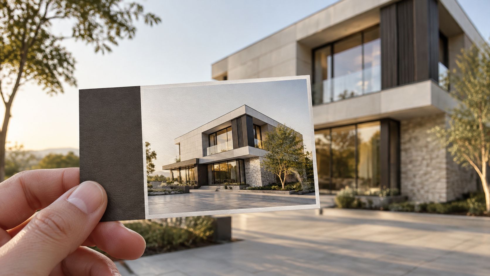
A crane, a hard hat, and a splash of safety orange is the photo most template roundups still push. It looks bold in a gallery of samples. At 2 by 3.5 inches, it usually fails the only test that matters. The person holding the card cannot tell why your company is the relevant one.
Construction pictures for business cards work when you treat the card as a conversion tool. Choose the photo for one buyer and one action, then prove it at print size before anyone approves the file. A dramatic jobsite frame can lower the response if it never establishes that relevance.
Match the Photo to the Buyer You Want to Reach
A busy jobsite with cranes, bold color, and hard hats can look strong and still miss the buyer. It says "construction" without saying what you delivered, how clean the work was, or why this meeting should continue. The frame has to prove a claim that person already cares about.
Image choice by buyer and card goal
| Buyer | Photo to use | Proof it gives | Action to print |
|---|---|---|---|
| Property developers | Completed-project exterior | Delivered scale | Project gallery link |
| General contractors seeking clients | Finished building with clean site edges | Delivered quality | Phone number and inquiry page |
| Subcontractors and trade partners | Crew at a completed detail | Coordination and field standard | Trade capability page |
| Architects | Detail-rich façade or stair | Design precision | Plans or case study |
| Interior designers and hospitality groups | Warm interior vignette | Finish quality and natural light | Portfolio gallery |
| Colleges and private schools | Finished campus building with people | Trust and community use | Admissions or project page |
Read the row for the person you want to call you. A polished exterior tells a developer the building got built at the scale they buy. Clean site edges tell a client the contractor left a finished product, not a trench. A crew on a completed detail tells a trade partner the field standard is real. A tight façade or stair tells an architect you can hold precision. A warm interior tells a hospitality group the light and finishes will photograph. A campus building with people in it tells a school the place is already in use.
The hybrid is simple. The photo creates recognition in a second, and the printed action points to the proof. In a 2025 VistaPrint survey of 800 U.S. working professionals who use business cards, 30% used both physical and digital formats. A frame prepared for a construction company portfolio still fails on a card if the action beside it opens the wrong page. Teams that already hold consistent branding for Dorset small businesses across print have an easier match, because the name treatment on the card is the same one on the page.
Decision rule: Pick one buyer, one photo, and one action. If the image doesn't prove a claim that buyer cares about, change the photo before you restyle the type.
Print Specs for a Photo-Led Card
A photo-led card fails in the RIP long before it fails in the meeting. VistaPrint's business card dimensions put a standard U.S. card at a finished trim of 3.5 × 2 inches (88.9 × 50.8 mm). At 300 pixels per inch, that photograph needs about 1,050 × 600 pixels at trim. Miss either number and window lines go soft.
Print specification for a full-bleed construction photo
| Specification | Value | Why it matters |
|---|---|---|
| Trim size | 3.5 × 2 in (88.9 × 50.8 mm) | Finished card size |
| Bleed | 0.125 in on each edge, file 3.75 × 2.25 in | Prevents white edges after trimming |
| Safe area | 3.25 × 1.75 in | Keeps text and logo clear of the cut |
| Image pixels at trim | 1,050 × 600 px at 300 PPI | Minimum for sharp edges |
| Image pixels with bleed | 1,125 × 675 px at 300 PPI | Full-bleed source size |
| Color mode | CMYK | Matches press inks and avoids gamut shifts |
| File format | Print-ready PDF | Preserves layout and color settings |
Build the file in five moves
- Set the artboard to the bleed size. A file of 3.75 × 2.25 inches gives the cutter 0.125 inch on every edge, so a full-bleed façade doesn't finish with a white hairline.
- Place the photo full bleed and crop to one subject. One exterior, one detail, or one site moment. A second subject fights the type.
- Check effective resolution at 300 PPI and reject a smaller source. Enlarging a short file softens window mullions, concrete texture, and fine linework. Interpolation can't restore detail that was never captured.
- Convert to CMYK with the printer's profile. Screens emit RGB light, and a press lays down ink. Saturated blue sky and orange safety gear shift first, so you catch them on screen.
- Keep type and the logo inside the safe area, then export a print-ready PDF. A plain guide to how to prepare print-ready artwork is worth a pass if the portal rejects fonts or missing bleed. The same discipline belongs in photography for design when the card and the project page have to agree.
A passing file shows crisp edges at 100 percent zoom, and no text sits on the trim line.
Keep Contact Details Legible Over a Photo
The failure shows up after the press, not on your monitor. A dark jobsite behind a phone number, or a bright sky behind an email, looks readable on screen and disappears on paper. Coated stock deepens the shadows and washes the highlights, so digits that passed a casual glance become a gray smear.
Section 508 color guidance points to the Web Content Accessibility Guidelines: a minimum contrast ratio of 4.5:1 for ordinary text and 3:1 for large text. Large text means at least 18-point regular type or 14-point bold type. Those floors matter on a façade, a dark interior, sky, machinery, or a textured wall.
Contrast minimums for text and graphics on a photo
| Text or graphic type | Minimum contrast ratio | Typical use on a card |
|---|---|---|
| Normal text | 4.5:1 | Phone number, email, street address |
| Large text (18 pt regular or 14 pt bold) | 3:1 | Personal name and company name |
| Graphical objects | 3:1 | Logo and icons |
Measure the lettering against the lightest and the darkest region behind it. A brand swatch on a style tile doesn't count. Uneven light on a building means the left half of a number can pass while the right half fails. Test both ends, then move the type if either end misses the ratio.
Fixes in the order worth trying
- Crop to a calmer area of the same photo so the type isn't crossing mullions and sky in one line.
- Add a solid or translucent band behind the contact block. A band is uglier than a clever overlay and far more reliable.
- Move the text onto sky or a flat wall if that region is even.
- Switch the text color lighter or darker before you start retouching the building.
- Reduce the photo's contrast, or add a gentle overlay, only after the crop and the band still fail.
Keep the phone number and the email in a solid zone. Let the photo carry the name only when that name is set large enough for the 3:1 floor.
Print a proof and read it at arm's length under normal room light. If you squint, the card isn't finished.
Add a QR Code Without Burying the Photo
Put the code beside the image, not over it. The photo keeps its hierarchy, and the code keeps a clear quiet zone of light color. A code dropped on brick or foliage fails for two reasons at once. The camera loses the modules, and the building loses its shape.
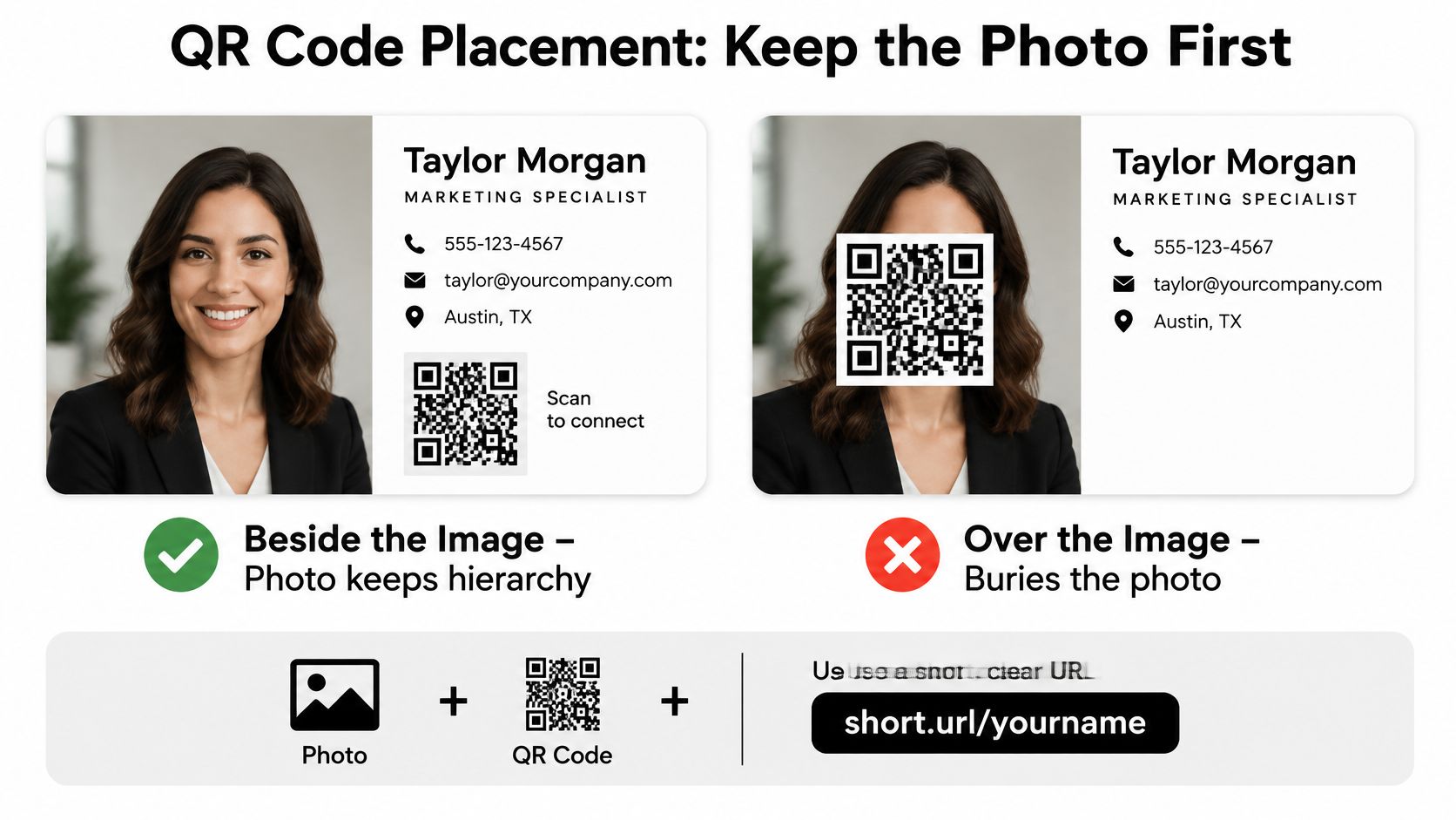
A short URL that opens a mobile landing page is more reliable than a full vCard packed with every phone, email, and portfolio address. More data means more modules and a denser symbol. DENSO WAVE's QR notes put a basic code at 21 × 21 modules, and at about 0.17 mm per module the theoretical minimum width is about 3.57 mm before the quiet zone. Real cards need to be larger so ink spread, coating, focus, and ordinary light don't break the scan.
- Pick one destination that matches the buyer. A project gallery, a contact form, or a vCard. Not all three in one symbol.
- Generate a short URL and the matching code, and keep a light quiet zone around every side.
- Size the code larger than a small icon. Leave room for ink gain, coating, and the distance across a table.
- Hold strong dark-light contrast. Don't print the code on a busy part of the photo.
- Print a physical proof and scan it with an ordinary phone under room light, then from across a table.
QR usability notes also call for a visible fallback URL in plain text for people who can't scan. Set that URL in the same solid zone as the phone number, large enough to read without the camera.
A working code scans on the first attempt, lands on the matching project, and leaves the fallback clearly legible.
Failures That Turn a Good Photo Into Mud
Five failures turn a sharp file into mud. Each one has a test you can run before you pay for a run.
A proof on the desk catches what the monitor hides. Hold the card the way a buyer will, not pinned to the screen at 400 percent.
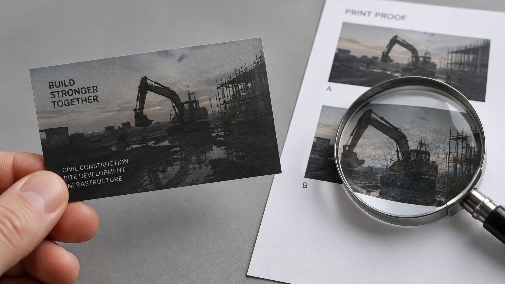
- Dark jobsite, printed as a block. Shadow detail that looks open on screen closes up on press. Test it by printing at trim size and viewing from arm's length.
- A collage of cranes, hard hats, tools, and workers. It signals the industry and makes no specific claim. Test it by asking whether the card names one project or one capability.
- A generic stock image. It communicates construction and can't prove the company built, designed, or managed that work. Test it by confirming you can show and document the project.
- A low-resolution photo enlarged to fill the card. Edges that looked fine in a layout go soft. Test the placed image against a 300 PPI trim file and reject anything short.
- A crop that cuts a façade mid-line, or parks a window edge on the trim. Test it by cropping to one simplified subject: a recognizable façade, a material detail, or a human-centered site moment.
One high-contrast image with a specific visual claim fixes the set. Hierarchy gets simpler, the card is easier to remember, and you can run each test before the file is approved.
Watching a proof get checked under a glass is a useful reset if you've only been zooming on screen.
Brief Your Photo Choice Before You Order
Name the one buyer the card serves and the single action it should drive, using the buyer rows as the filter. If you can't say both in one sentence, you don't have a photo yet. You have a folder.
Architectural photography is built for sweeping exteriors and refined interiors that highlight form, light, and detail. For work tied to our studio in Atlanta, Georgia, the number we list is 770.365.6864. That is contact information, not a substitute for the buyer's action on the card.
The five-item brief
- Subject. One completed project, one detail, or one site moment that proves the claim this buyer cares about. If the frame could belong to any firm, it isn't the subject.
- Crop. Full bleed, with one calm area reserved for the contact block, checked against the contrast floors for normal and large text.
- Specs. A 3.5 by 2 inch trim, 0.125 inch bleed, a 300 PPI source of at least 1,050 by 600 pixels, CMYK, and a print-ready PDF.
- Text. Name, role, phone, email, and a visible URL inside the safe area. Measure the lettering against the lightest and darkest part of the photo, not against a swatch.
- QR. One destination that matches the buyer, sized with a light quiet zone, plus a fallback URL in plain text.
Before you order, confirm three things. The image is one you can document. A printed proof at actual size reads at arm's length. The code scans from across a table. Shops that produce business stationery for Chester startups will still ask for those files if you don't send them. Brand work that has to live on a card and on a site belongs with commercial brand photography planned as one set, not two unrelated shoots.
Hand the designer or the printer four things and they shouldn't need to ask: the chosen image file, the buyer it serves, the action the card drives, and the approved proof.
Jimmy Clemmons Photographer photographs buildings and brand work so a card image still holds up at print size, with form, light, and detail intact. If you need a frame chosen for one buyer and one action, then checked on a proof before it goes to press, start with the work at Jimmy Clemmons Photographer. Bring the buyer you want to reach and the project you can document.