

A brand team can spend a full day photographing a beautiful office, hotel, classroom, or product and still end up with images that say very little about the people who use it. The rooms look finished, the lighting is clean, and every surface is in place. Yet a viewer may still wonder, “What would it feel like to be there?”
Commercial lifestyle photography answers that question by combining proof and aspiration. It shows real people, products, and spaces in believable situations, then shapes those moments with intentional light, composition, and color. The result should feel polished enough for a campaign and credible enough to support a buying decision.
That balance matters in a visual environment where nearly 60% of digital impressions were estimated to be driven by images, while posts containing visuals received 94% more page visits and engagements than posts without them, according to research on the rise of visual content online. A strong shoot therefore needs more than attractive frames. It needs a plan for human behavior, visual trust, accessibility, and delivery.
Why Commercial Lifestyle Photography Feels Real
The set is ready, but the people aren't posing yet. A team member moves a laptop toward a colleague, someone laughs at an unexpectedly difficult task, and a product lands naturally within the scene instead of sitting alone against a blank background. From the camera position, those small actions begin to explain the brand.
That is the difference between showing an environment and showing life inside an environment. An empty conference room proves that the room exists. A group working together in that room suggests how the space supports concentration, exchange, and shared purpose. A product on a table identifies the object. A person reaching for it, using it, and responding to it gives the object a role.
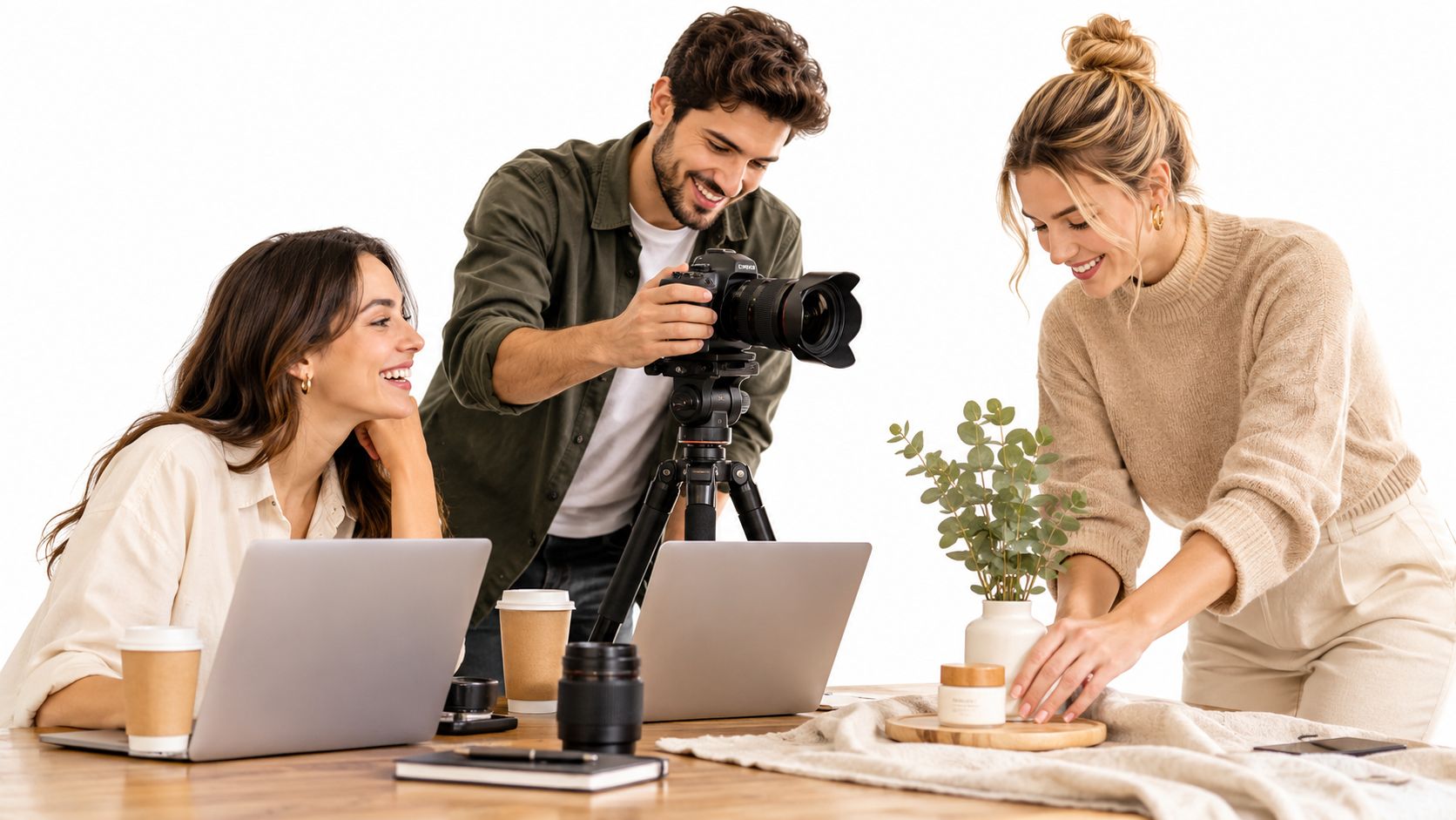
A useful test: Does this frame show credible use and emotion, or does it only show appearance?
Lifestyle photography sits between a catalog record and a magazine scene. A catalog record identifies features with clarity. A magazine scene gives those features a setting, a mood, and a human reason to matter. Commercial work needs both. The product, building, service, or organization must remain legible, but the surrounding behavior helps the viewer imagine an experience.
This doesn't mean allowing every detail to remain untouched. On set, I may clear a distracting cable, adjust a chair, or move a prop into better light. The aim is not disorder. The aim is controlled imperfection, where the scene feels directed without contradicting the brand's personality.
For teams developing a local or community-centered visual identity, practical editorial resources such as shop local with Lewis and Sheron can also help frame the relationship between place, people, and brand story. The same principle applies to photography. A recognizable context makes a message easier to enter.
If you want to study the difference between posed coverage and more observational image-making, documentary-style photography offers a useful point of comparison. Commercial lifestyle work borrows documentary signals, but it adds a deliberate layer of composition, lighting, casting, and brand direction.
Understanding the Commercial Lifestyle Visual Language
A believable lifestyle image isn't accidental. It combines visual cues that tell the viewer, quickly, that the scene could happen in real life.
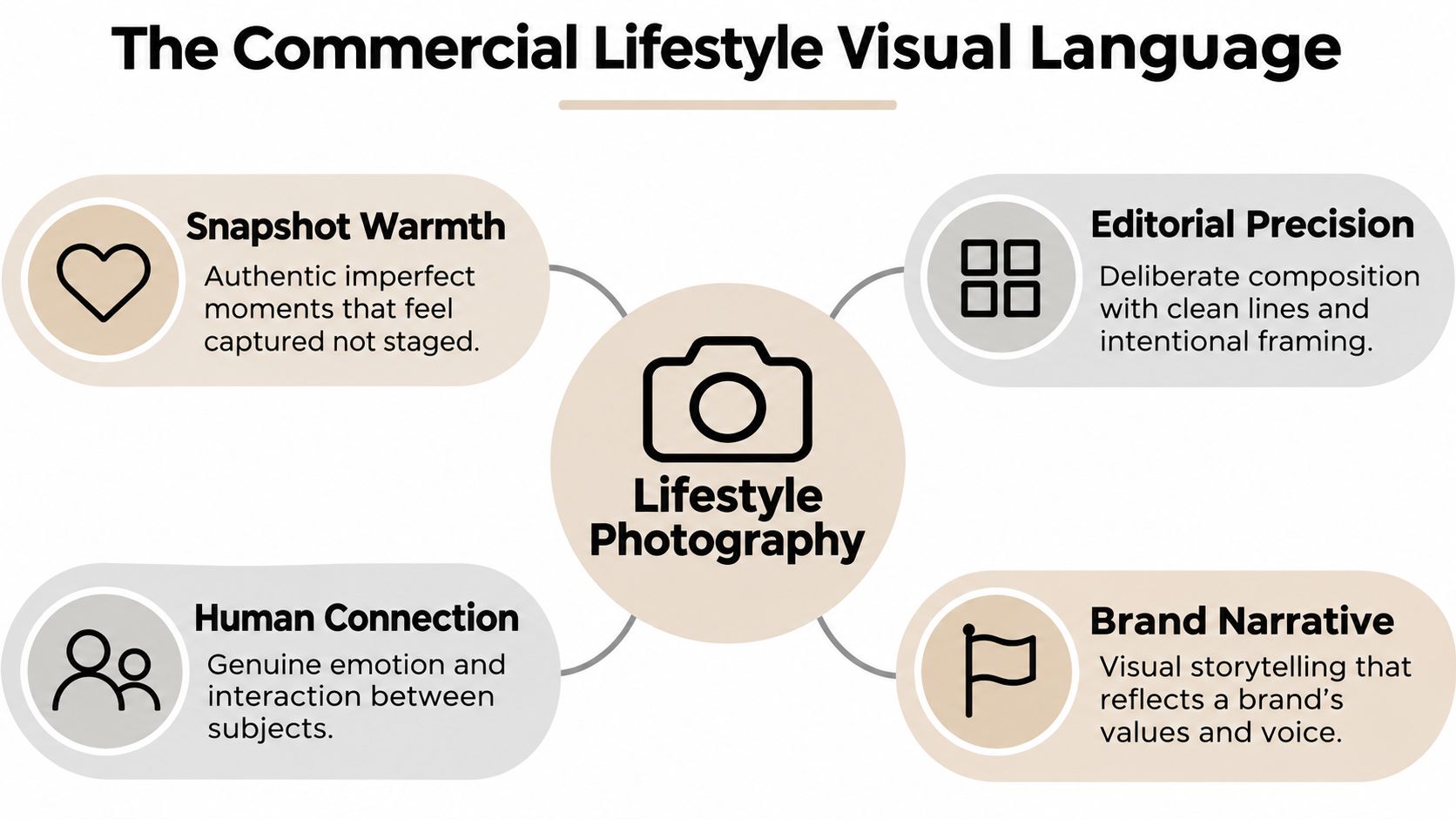
Warmth with compositional control
Start with expression and behavior. A genuine smile, a relaxed posture, or a moment of concentration can make a frame feel inhabited. The photographer still controls the lens choice, camera height, background, and exposure, but the subject isn't asked to perform a frozen expression.
A peer-reviewed study of Instagram brand imagery found that smiling facial expressions and a snapshot-style aesthetic produced higher perceived source genuineness than nonsmiling expressions and studio-style photography. The study also connected perceived genuineness with brand authenticity through source trustworthiness, leading to stronger brand attitudes and behavioral intentions, as reported in this peer-reviewed study of brand imagery.
Faces deserve careful attention because they help guide the eye and make social meaning immediate. A useful sequence might include:
- Establishing frame: Show the room, street, campus, or workplace so the viewer understands where the action occurs.
- Medium frame: Show the relationship between people, products, and furniture.
- Close frame: Capture hands, expressions, material details, and the small action that carries emotion.
Precision without stiffness
A snapshot feeling doesn't excuse weak composition. Keep verticals controlled in architecture, watch the edges of the frame, and use foreground layers to create depth. Light can remain soft and natural while still being shaped with diffusion, bounce, or a subtle source placed outside the frame.
Color also carries brand meaning. Warm neutrals may suggest welcome, while cooler tones can support a more technical or focused character. The treatment should remain consistent across the set, so one image doesn't feel like it belongs to a different campaign.
The strongest lifestyle frame feels found by the viewer, even though the photographer made many deliberate decisions before pressing the shutter.
Planning a Shoot Around Brand Personality and Place
A successful shoot starts before the location is booked. Begin with three adjectives that describe how the brand should feel in use, such as welcoming, capable, and curious. Those words become practical filters for every later decision.
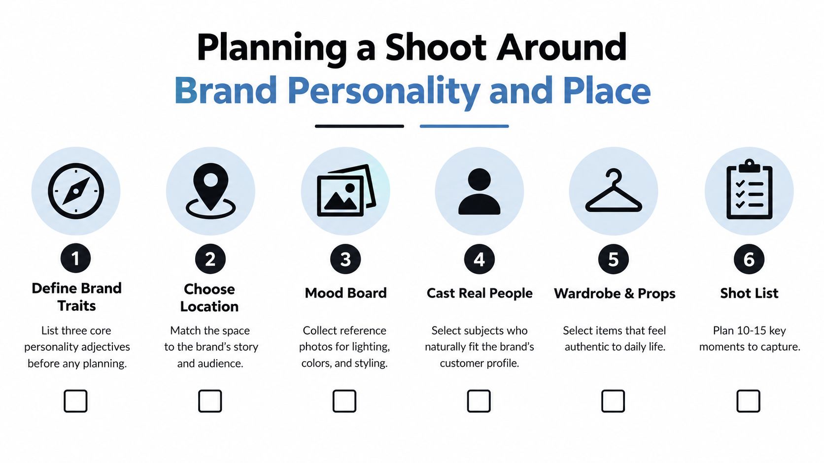
Turn adjectives into production choices
A welcoming hospitality scene may need morning light, open body language, and a clear path through the space. A capable workplace story may call for concentrated collaboration, useful tools, and compositions that show both people and infrastructure. A curious school environment may benefit from movement between learning zones rather than a line of students facing the camera.
Scout for flow, not just attractive surfaces. Note where people naturally enter, pause, gather, and work. Observe the direction of daylight, the color of practical fixtures, reflective surfaces, background clutter, and any restrictions on moving furniture. A beautiful corner that doesn't support believable activity may be less useful than a plain area with strong circulation.
Casting requires the same care. Use actual employees, occupants, students, or customers when their presence is part of the proof the image needs to provide. Use talent when you need scheduling control, a particular role, or a broader campaign narrative. Be clear about permissions, releases, wardrobe expectations, and whether recognizable individuals can appear in public-facing materials.
Teams documenting workplace culture can use employee photography as a reference point for planning images that show people at work without reducing them to formal headshots.
Build a shot list around story beats
A shot list should describe actions and relationships, not only camera angles. Write “two colleagues review material beside the window” instead of “wide office shot.” The first version tells the crew what the image must communicate.
A practical pre-production checklist includes:
- Brand traits: Define the three words that should guide behavior, styling, and location choices.
- Place: Match the environment to the audience's expected experience.
- Mood board: Collect references for light, color, wardrobe, framing, and activity.
- People: Decide who needs to appear and what they should naturally do.
- Props: Select objects that belong to daily use, not decoration added without purpose.
- Permissions: Confirm location access, releases, privacy requirements, and usage needs.
- Story beats: Organize the shoot around arrival, interaction, concentration, transition, and resolution.
Keep the list tight enough to protect attention, but broad enough to create a useful library. Each setup should have a primary frame, a vertical alternative, a detail, and a version with breathing room for design copy. Stakeholders should approve the story logic before the shoot, not debate the brand personality while subjects are waiting on set.
Lighting and Direction Techniques That Keep Moments Honest
Set the environment before directing the people. Look at the window light, identify the brightest surface, and check whether the practical fixtures create a distracting color mix. Then decide what needs to be softened, balanced, or removed from the frame.
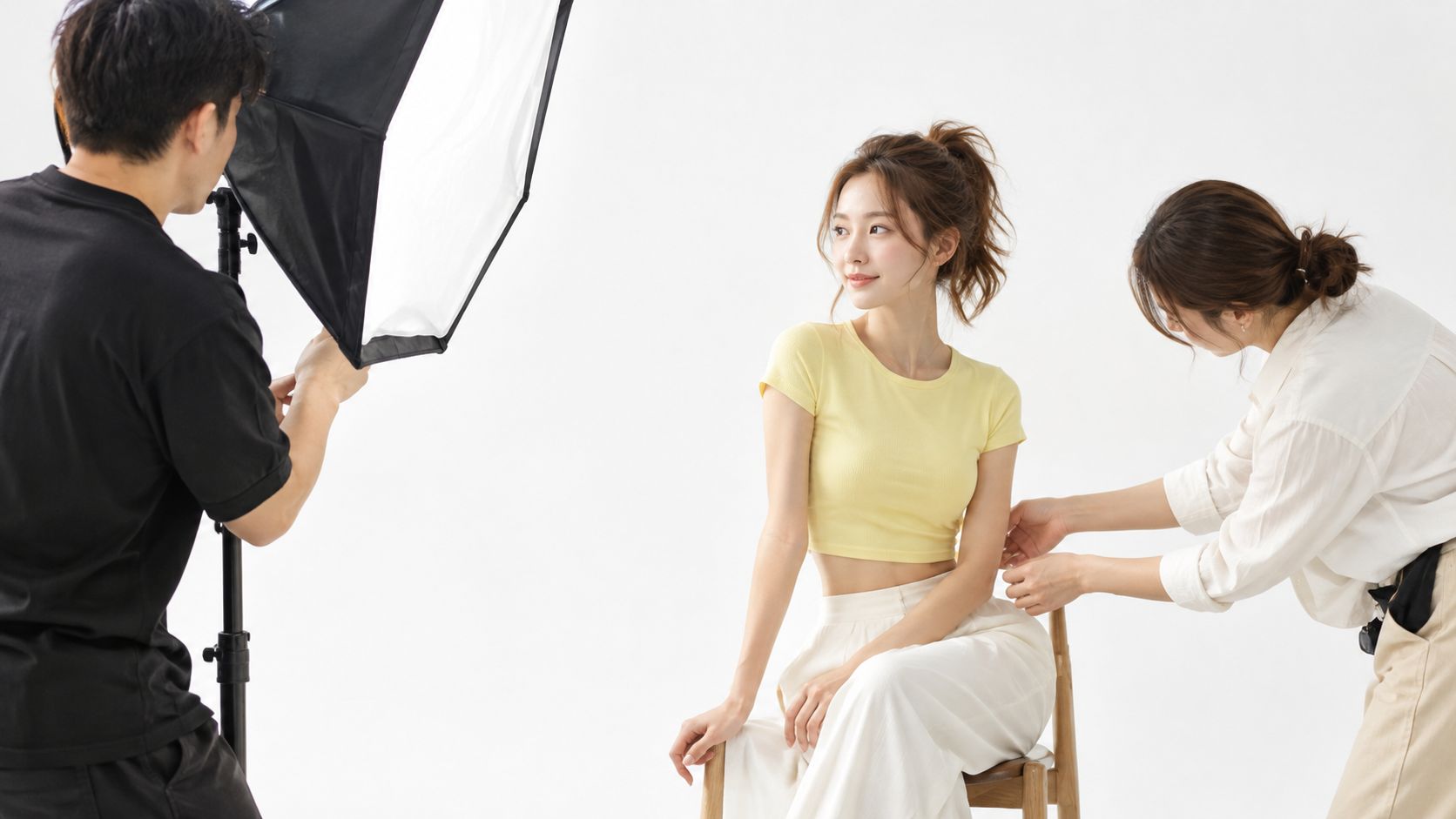
Daylight can provide a convincing base, but it may need help. A large diffusion frame can soften a hard window, while a bounced or lightly modified source can lift faces without making the scene look artificially lit. Mixed daylight, LED, and tungsten sources deserve early attention because skin and neutral surfaces can shift within the same frame.
Direct action instead of posing
People become self-conscious when a photographer asks them to “look natural.” Give them a task instead. Ask one person to explain a process, another to respond, or a group to move an object from one area to another. Once the action begins, refine posture and spacing without interrupting the social rhythm.
Useful direction sounds specific:
- “Keep talking while you move the notebook toward her.”
- “Take a breath, look at the screen, then turn when you hear his question.”
- “Walk back into the room and pause where the light crosses the floor.”
- “Repeat that exchange, but leave a little more space between you.”
The photographer can capture the first genuine reaction, then make small adjustments to hands, shoulders, eyelines, and background. That balance protects spontaneity while keeping the frame readable.
On-set rhythm: Set the environment, start real activity, then refine only what distracts from the story.
Layering helps a scene feel connected to place. Put a near object slightly out of focus, keep the main action clear, and use the background to reveal the environment without competing with the subjects. Watch for bright exits, reflective screens, crooked furniture, and visual tangents that pull attention away from faces or products.
Here is a short visual reference for how controlled light, direction, and movement can work together:
The final polish should preserve believable cues. Retouch temporary distractions and technical flaws, but be cautious about removing the marks that explain real use, such as a natural crease, a small gesture, or the texture of a working space.
Choosing Between Real Proof and Polished Campaign Imagery
Brand teams often try to make one image style serve every purpose. That creates confusion. A photograph intended to prove what a hotel room, workplace, school, or property looks like has a different responsibility from an image designed to express an aspirational campaign mood.
Proof imagery should preserve verifiable details. The space, product, people, and activity need to remain credible enough for a viewer to imagine actual experience. Campaign imagery can be more stylized, provided the visual treatment doesn't imply a reality that the audience won't encounter.
A 2025 study summarized in available industry coverage found that consumers preferred hospitality services advertised with real images over AI-generated ones. The penalty was stronger for hedonic services and high-involvement decisions, while AI-generated images were viewed as less credible and potentially misleading because they made the actual experience harder to imagine, as described in this coverage of authenticity in the AI era.
| Use case | Proof style | Campaign style |
|---|---|---|
| Showing an actual space | Photograph the real room, materials, proportions, and occupants | Shape the scene with stronger styling or a more dramatic time of day |
| Introducing a product | Show real handling, scale, texture, and use | Build a more expressive composition around the product |
| Communicating culture | Capture genuine work, exchange, and environment | Create a polished narrative moment that represents the brand's ambition |
| Editing approach | Remove distractions without changing meaningful reality | Allow stronger retouching, compositing, or color direction |
| AI-assisted changes | Preserve disclosure and avoid altering material facts | Disclose material synthetic alterations when they affect interpretation |
The decision depends on audience risk. A buyer evaluating an expensive service, an unfamiliar campus, or a physical property needs confidence that the image reflects something real. A broader awareness campaign may tolerate more visual invention, but it still shouldn't create a false expectation.
Measure both engagement and trust. Review whether sales, admissions, hospitality, or leasing teams can use the image to answer practical questions. Ask viewers what they believe is real, what they expect to experience, and where the image creates uncertainty. Synthetic tools may improve speed and consistency, but speed isn't a substitute for evidence.
Brand Aligned Case Stories Without Real Names
A boutique hotel wants to communicate calm service rather than empty luxury. The shoot begins before breakfast, with a staff member preparing a table while early light crosses the dining area. A guest enters, receives a small gesture of welcome, and settles near the window. The wide frame establishes the room, the medium frame follows the interaction, and the close frame focuses on hands, fabric, and a genuine exchange.
The selects prove that the hotel isn't only a collection of finishes. They show a morning ritual, a human welcome, and a space designed for ease. The photographer avoids exaggerated smiles and leaves enough environmental detail for the viewer to understand the experience.
A workplace team needs imagery for recruitment and client communication. Instead of arranging everyone around a conference table, the photographer follows a problem as it moves from a lounge conversation to a meeting area. One person sketches, another challenges the idea, and a third listens before contributing. The frames alternate between connection and concentration.
The final library proves that collaboration has a physical rhythm. It also gives the brand useful variety, including wide environmental views, medium interaction frames, vertical portraits, and detail images that can support layouts. For teams developing a broader business-to-business content plan, editorial planning insights for B2B can help connect individual image choices to larger communication goals.
A school wants to show community without turning students into decorative props. The photographer works with staff to identify a real learning activity, then captures movement between a classroom, shared area, and outdoor gathering space. Direction remains light. Students speak to one another, teachers respond to questions, and the camera waits for moments of attention rather than demanding identical expressions.
The resulting images prove how the campus supports learning and belonging. They also respect the difference between representation and performance. The people aren't present only to make the space look active. Their actions explain what the space is for.
Across all three examples, the reusable pattern is simple:
- Begin with a real activity: Give people something meaningful to do.
- Show the place: Use wide frames to explain the setting.
- Follow relationships: Capture how people, objects, and rooms connect.
- End with evidence: Select images that prove the brand promise through observable detail.
Delivering Accessible Libraries That Stay On Color
A shoot isn't finished when the gallery looks attractive. It succeeds when marketing teams can publish the images confidently across websites, social channels, presentations, editorial layouts, and print.
Keep a profiled master with the captured detail, then create channel-specific derivatives. For web delivery, convert a delivery copy to sRGB and embed the profile, which helps browsers and downstream systems interpret RGB values consistently, as explained in this technical guide to color spaces. Don't repeatedly convert the master. Export separate JPEG or TIFF files and document dimensions, sharpening, compression, and color space.
This workflow protects skin tones, architectural neutrals, painted surfaces, and reflective materials. It also makes future reuse easier when a communications team needs a new crop or print-ready version.
Add descriptive information at delivery
Accessibility belongs in the production handoff. Informative photographs published on websites or social channels need text alternatives that communicate their essential information and function. Decorative images can use an empty alternative, written as alt="", while complex visuals need a longer description near the image, according to image accessibility guidance from Oregon.
Write alt text according to context, not only visual inventory. An image used as a link should describe the destination or action. If nearby text already explains the same information, a null alternative may be appropriate. Avoid beginning with “image of,” since assistive technology already identifies the element as an image, as detailed in W3C guidance for image alternatives.
A delivery checklist should include:
- Color control: Tagged master, sRGB web derivatives, and documented export settings.
- Usage variants: Horizontal, vertical, detail, and copy-space options where needed.
- Metadata: Concise descriptions, captions, subject context, and usage notes.
- Accessibility ownership: A named person responsible for reviewing alt text before publication.
- Reality checks: Clear identification of proof images, stylized images, and material synthetic edits.
For brands that need reliable visual consistency across spaces, teams, and campaigns, professional color correction for photography is part of the quality-control conversation, not an afterthought. The strongest commercial lifestyle library combines emotional clarity with technical discipline. It shows people living the promise, preserves trust in what viewers see, and remains usable for everyone who encounters it.
Jimmy Clemmons Photographer offers Atlanta-based commercial brand content, location scouting, lighting design, on-set direction, and professional editing for products, people, workplaces, hospitality environments, and architectural spaces. Visit Jimmy Clemmons Photographer to plan a lifestyle shoot that turns real activity into polished, accessible visual proof.