
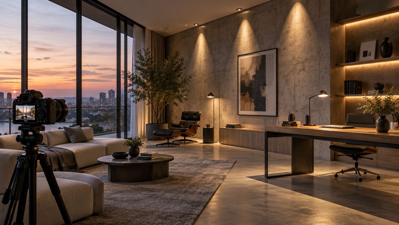
The most popular advice about lighting design is also the least useful: make the room brighter. Brightness alone doesn't create comfort, hierarchy, or a photograph that holds together. A space can be flooded with light and still leave faces flat, finishes lifeless, circulation unclear, and windows blown out on camera.
Good lighting design treats light as an architectural material. It controls where attention lands, how materials reveal their texture, how people move through a space, and how the same room performs under the human eye and a camera sensor. That matters in a market where architectural lighting has become a substantial professional discipline. One industry estimate places the global architectural lighting market at USD 11.1 billion in 2025, with a projection of USD 21.6 billion by 2035, while indoor applications accounted for more than 76% of revenue in 2024 according to architectural lighting market research.
Rethinking Light as an Architectural and Brand Asset
A fixture is not a lighting strategy. Selecting attractive pendants, adding a regular grid of downlights, and increasing output until every surface appears visible may satisfy a late-stage checklist, but it rarely produces a convincing environment. The better question is not “How much light does this room need?” It's “What should this room make visible, and in what order?”
Light can establish a threshold before a visitor reaches a reception desk. It can pull a corridor toward a destination, separate a public zone from a quiet one, or give a lobby enough depth to feel substantial without making it feel overexposed. In a showroom, the lighting can establish a visual rhythm between products. In a workplace, it can distinguish collaboration areas from focused work zones without relying entirely on partitions.
The professional discipline itself grew from this broader understanding of light. In 1969, 15 lighting designers met in New York to discuss shared concerns including insurance, contracts, and licensure, leading to an association that incorporated in October 1971. The lighting design timeline also tracks the arrival of blue LEDs, more efficient fluorescent technology, and later changes in LEDs, daylighting, energy policy, and controls. Lighting moved from basic illumination toward a specialized design practice with technical, visual, and operational responsibilities.
The room must work twice
A successful environment has two audiences. The first is the person standing inside it, adapting naturally as they move from a window to a darker interior surface. The second is the camera, which records a narrower exposure range and exposes every inconsistency in color, reflection, and contrast.
A sculptural fixture may add identity, but its bright source can become a distracting hotspot in a wide interior photograph. A dark stone wall may feel rich in person, yet disappear if the lighting doesn't provide enough grazing or reflected fill. A warm pool of light can make a lounge inviting, while a neighboring cool downlight makes the same image look accidental.
That doesn't mean every room should be designed like a photo studio. It means the visual narrative should be intentional in both situations. Practical guidance on Vivid Skylights lighting design can help project teams think about light as part of the architecture rather than as a final decorative layer. For teams developing a broader commercial strategy, commercial lighting design offers another useful reference point for connecting spatial performance with presentation.
Practical rule: The best-lit room isn't necessarily the brightest room. It's the room where light gives every important surface and activity an appropriate role.
Core Principles of Layered Interior Lighting
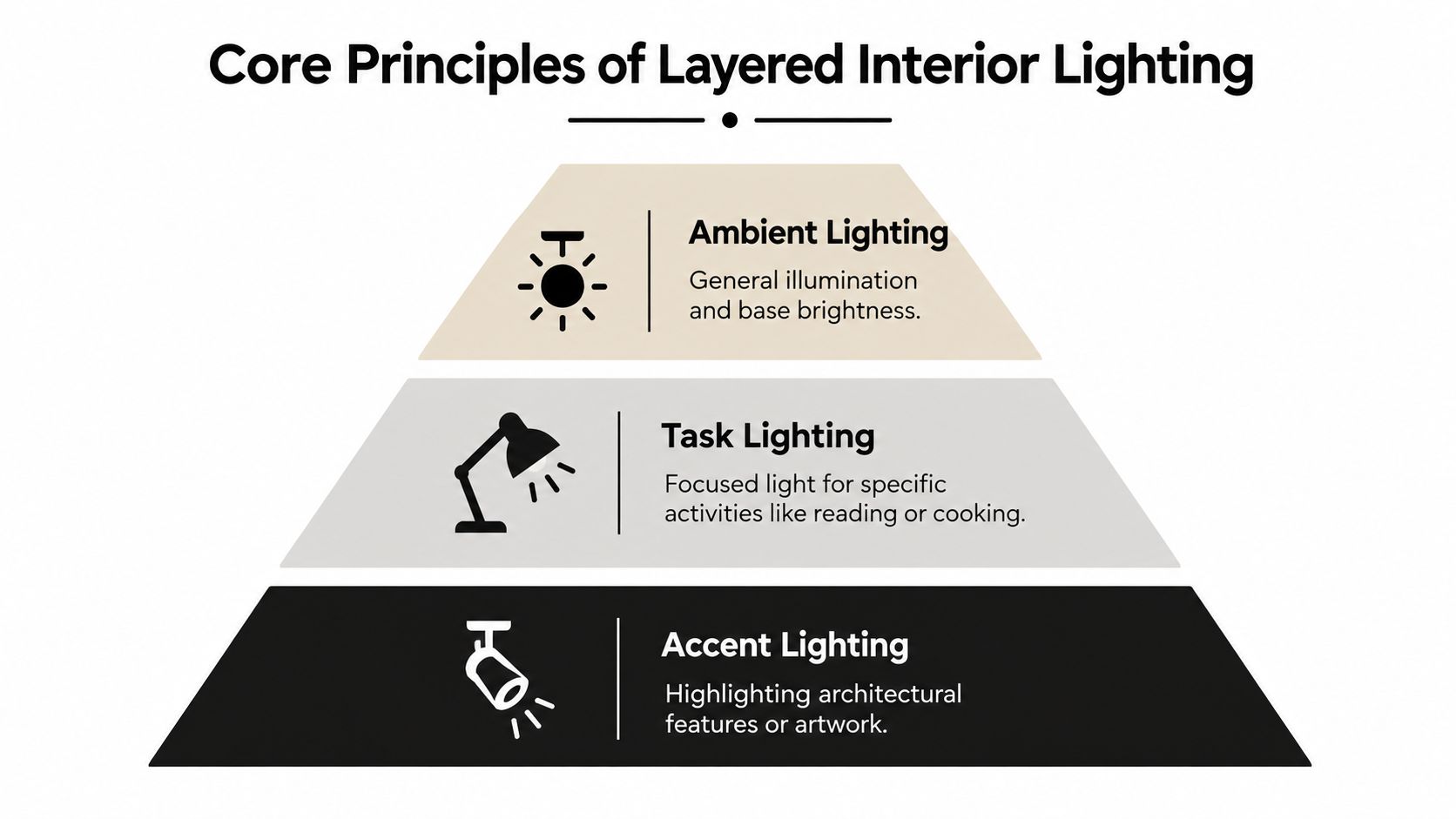
A uniform ceiling wash can make a room easy to read, yet it often gives every surface the same visual weight. Layered lighting creates a sequence of destinations for the eye, allowing a space to feel calm in one scene and energetic in another while the architecture stays unchanged. That sequence matters to both occupants and cameras. People read hierarchy through brightness and shadow, while a sensor records contrast, reflections, and color differences with less tolerance for inconsistency.
Start with the ambient layer
Ambient light establishes the room's general visual field, drawn from concealed coves, luminous ceilings, carefully spaced downlights, reflected wall light, or daylight. Its role is orientation: enough base light for people to understand the room and move through it comfortably.
Begin with the floor plan, not the fixture schedule. Mark entries, circulation paths, seating groups, work surfaces, vertical features, and areas intended to recede. Then decide where the base light should remain continuous and where it can soften. A corridor may need an even visual path, while a lounge often benefits from darker edges and brighter areas around tables or artwork. The camera also needs this hierarchy. If every zone receives the same output, the resulting image can look flat even when the room feels adequately lit in person.
Reflected ambient light often gives an interior more photographic depth than direct light aimed at the floor. A pale wall can act as a broad secondary source, while a dark wall absorbs much of the same output and may need a closer, more deliberate wash. Surface color, texture, and sheen should therefore inform fixture spacing and aiming before product selection begins.
Give tasks their own visual support
Task lighting serves a defined action, such as reading, preparing food, examining merchandise, or applying makeup. It should arrive from a useful direction and keep the user's head and hands from casting shadows onto the work. In a kitchen, light beneath an overhead cabinet supports the worktop more effectively than another ceiling fitting behind the person standing there. In a bathroom, frontal or side illumination supports the face better than a bright source directly above the mirror.
The task layer also needs control. Cleaning, focused work, conversation, and presentation call for different distributions, even within the same room. Dimming and scene control allow operational light to change without asking the architectural layer to handle every activity at once. The guidance on lighting design for interior spaces is useful when fixture locations must support both room function and the camera's view from key positions.
Use accent and decorative light selectively
Accent light establishes hierarchy. It can graze a textured wall, pick out a stair edge, frame artwork, or create a pool around a reception point. Beam angle, distance, aiming, and surface reflectance matter more than the fitting label. A narrow beam close to a rough wall can reveal texture, while the same beam on polished stone may create a hard reflection that dominates a photograph.
Decorative fixtures contribute scale, character, and visual rhythm. Their optics and position determine whether they can also carry ambient or task duties. A practical resource on energy efficient lighting Brisbane can support early discussions about efficient equipment. Efficiency still depends on correct placement, aiming, and control. A low-energy glare source remains a glare source.
Before specifying products, draw the intended pools and vertical washes on plans and elevations. Hide sources where possible, protect sightlines from direct brightness, and give each accent light a surface or object worth revealing. The embedded walkthrough shows how a reflected wall wash adds depth that a direct downlight grid cannot, which makes it useful to review before fixing the ambient layer.
Photometric calculations, surface behavior, controls, and commissioning determine whether the concept survives installation. Review the room from standing height and from the planned camera positions, then adjust aiming and scene levels before handover.
Technical Metrics That Define Visual Comfort
Wattage describes electrical demand, while lumens describe emitted light. Neither metric predicts whether people can look across a room comfortably, whether a window will dominate a meeting space, or whether a camera sensor will hold detail in skin, finishes, and shadows.
Glare needs the right metric
For indoor work environments, Unified Glare Rating, or UGR, is commonly specified at less than 19. That threshold still requires a calculation for the actual application. Visual comfort guidance shows why a product-sheet value cannot settle the question. Room geometry, observer position, luminaire brightness, background luminance, and viewing direction all change the result. On a photographic set, a bright source just outside the frame can still affect where people look, how they hold their posture, and how the camera records the surrounding contrast.
Daylight requires a separate assessment. Lux measures light arriving at a surface, while discomfort glare depends on luminance contrast across the field of view. Daylight Glare Probability, or DGP, classifies values below 0.30 as imperceptible, 0.30 to 0.35 as perceptible, 0.35 to 0.40 as disturbing, and values above 0.45 as intolerable. For office-like spaces, a main-view DGP of 0.45 or lower is commonly cited as the upper comfort limit in the daylight glare research guidance.
| Metric | Comfortable / Imperceptible | Disturbing / Perceptible | Intolerable | Typical fix |
|---|---|---|---|---|
| UGR | Below 19 is a common work-environment target, subject to application-specific calculation. | Above the project limit can create discomfort, depending on room geometry and viewing position. | No universal value applies. Calculate against the specified application limit. | Re-aim, shield, or reposition the luminaire. |
| DGP | Below 0.30 is imperceptible. | 0.30 to 0.35 is perceptible, and 0.35 to 0.40 is disturbing. | Above 0.45 is intolerable. | Add exterior shading, adjust the view, or control the window light. |
Luminance provides another useful check. A study summary suggests a 2,500 cd/m² threshold for daylit interiors, with disturbing glare around 5,015 to 8,875 cd/m² and intolerable glare above 11,719 cd/m². The daylit interior glare study supports a practical conclusion: shading, orientation, and sightline control often address glare more effectively than lowering interior output alone. They also preserve the exposure range a photographer needs.
Color quality changes the image
CRI remains familiar, but it can conceal meaningful differences between light sources. ANSI/IES TM-30 uses Rf, a fidelity index on a 0 to 100 scale, and Rg, a gamut index showing whether colors are compressed or expanded relative to a reference. The system evaluates 99 spectral samples using CAM02-UCS, as described in this TM-30 technical overview.
That distinction matters to both occupants and cameras. Two sources with similar CRI can render a painted wall, timber, fabric, or skin differently. Review Rf and Rg together, inspect the spectral distribution when available, and request a physical sample or mock-up for demanding interiors. Consistent color across fixture families usually produces a more reliable space and a more predictable image than one impressive headline number.
Designing Spaces for Photographic Production
A room can feel balanced to a visitor and still fail in a photograph. The eye adapts as it moves, but a camera records a frame with a fixed exposure and a defined color response. Windows, polished counters, dark ceilings, and bright decorative sources compete inside that frame whether the designer intended them to or not.

Design for exposure before the shoot
The most common photographic problem is excessive contrast between the interior and the view outside. If the window is the subject, interior surfaces may fall into darkness. If the room is the subject, the exterior may turn white. Dimmable interior layers, controllable shades, and a deliberate balance between window light and room light give the photographer more options without changing the architecture.
Mixed color temperatures create a second problem. A warm pendant over a cool downlight may look atmospheric in person, but the camera records the difference as a visible color split across walls and faces. Use consistent sources where a continuous surface or a single frame needs to read as one visual field. If a contrast is intentional, make it structural and repeatable rather than accidental.
Photographers can add bounced or diffused light, but temporary equipment shouldn't have to repair a confused permanent scheme. A well-designed space leaves room for supplemental production light, yet it doesn't depend on a large temporary rig to make basic circulation, material, and skin tone look credible. The lighting approach for interior photography should begin during design coordination, not on the morning of the shoot.
Let materials direct the decision
Glossy surfaces reflect the source, not the designer's intention. A narrow beam pointed at polished stone may become a white streak in the frame. A dark lacquered wall may mirror a softbox, photographer, or window. Textured plaster benefits from a low grazing angle, but that angle can exaggerate construction irregularities that weren't visible under general light.
Walk through the planned camera positions before finalizing the aiming schedule. Check what appears in the lens, what reflects back, and where the brightest source sits in relation to the composition. A simple test with a camera at eye level can reveal more than a rendered ceiling plan.
The camera doesn't replace the human eye. It exposes decisions the eye has learned to forgive.
Build in useful control
Scene-based controls are valuable when the room must support daily occupation and professional documentation. A presentation scene may reduce decorative brightness and balance the window. A hospitality scene may preserve warm pools while protecting faces. A cleaning scene may raise general illumination for practical work, but it shouldn't become the default visual identity.
Specify dimming behavior, minimum output, fade times, and control access early. A fixture that dims poorly can flicker, shift color, or become unusable at the level needed for photography. Coordinate the permanent system with the photographer's likely working positions, particularly in lobbies, galleries, showrooms, workplaces, and spaces intended for frequent brand content.
Balancing Wellness Goals With Practical Constraints
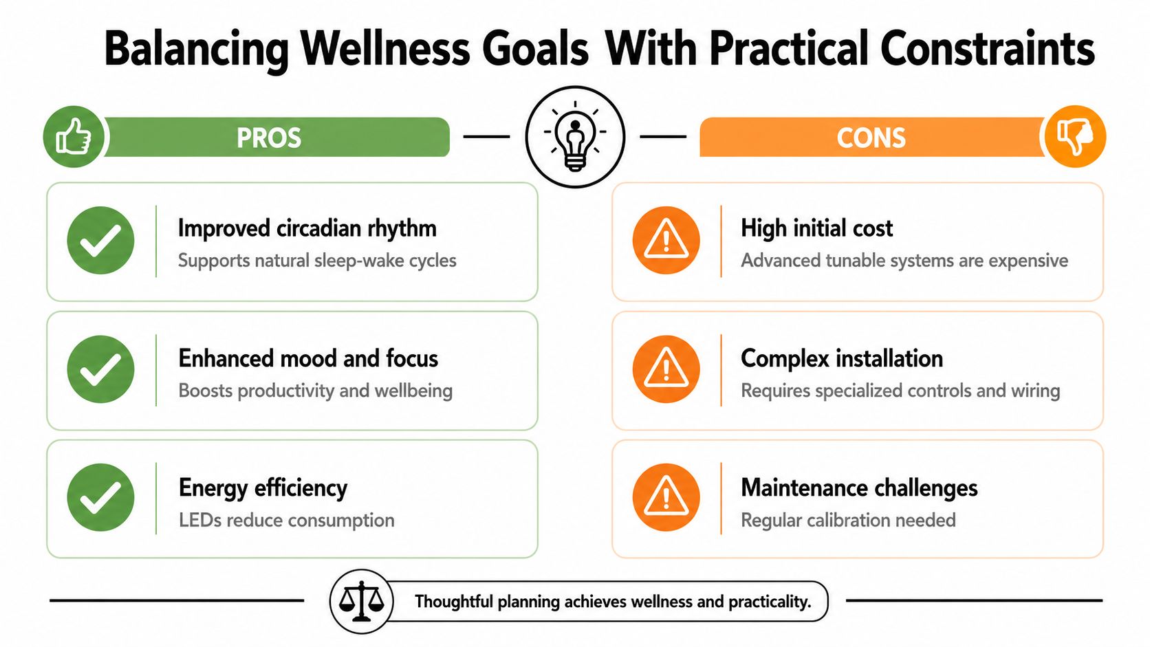
A tunable-white scheme can earn its controls cost in a workplace with 10-hour occupancy and a west-facing facade. It rarely does in a two-hour-a-day showroom where scene presets deliver the required changes. The decision affects more than energy and maintenance. A changing spectrum can alter how finishes, skin tones, product colors, and neutral backgrounds appear to a camera, especially when daylight enters the same frame.
Specify the biological target carefully
Human-centric lighting only pays back when the control schedule matches real occupancy. A circadian program that facilities staff override within a month is a specification line item, not a wellness strategy. Begin with the people using the space, their operating hours, available daylight, and the tasks the lighting must support. That assessment also shows whether the planned scenes will produce stable, repeatable conditions for photographic work.
Melanopic equivalent daylight illuminance, or melanopic EDI, is used in built-environment guidance for circadian lighting. Recent consensus recommends at least 250 melanopic EDI lux during the day, no more than 10 melanopic EDI lux in the three hours before bedtime, and about 1 melanopic EDI lux during sleep, as summarized in this circadian lighting guidance.
A workplace with long, regular occupancy may benefit from programmed variation tied to actual schedules. A short-stay environment with changing occupants may gain more from glare control, consistent color quality, and intuitive scenes. Those choices are easier to operate and easier to reproduce in a camera, where small differences between fixtures can become visible across a wall or product set.
Compare the operational trade-offs
| Design choice | What it can support | What can go wrong |
|---|---|---|
| Fixed, well-selected white light | Predictable color, simpler controls, easier replacement, and consistent photography | Less adaptable across changing schedules and activities |
| Tunable white lighting | Scene variation, adjustable appearance, and a closer relationship between light timing and occupancy | More infrastructure, more commissioning, and inconsistent color during image production |
| Exterior dynamic lighting | Identity, orientation, and nighttime presence | Light spill, unwanted brightness, and conflict with Dark Sky objectives |
| Lower-output evening scenes | A calmer visual environment and reduced late exposure | Insufficient task visibility if the scene is not matched to use |
Maintenance planning still determines whether the intended result lasts. For LED products where output is a key design criterion, relevant technical guidance says the Illuminating Engineering Society recommends using an initial light loss factor no greater than 0.70, meaning calculations may assume output falls to 70% of initial levels. The LED lifetime metrics guide supports treating depreciation as a design input. That allowance should also inform exposure tests and future reshoots.
Protect the night and the image
Outdoor light needs a boundary. Direct views of bright sources, uncontrolled uplight, and spill into neighboring areas can undermine environmental goals and the visual calm of a building at night. Bright windows, luminous ceilings, and glowing signage can create the same problem in exterior photographs, where the sensor records a stronger visual hierarchy than visitors may perceive on site.
Use shielding, aiming, dimming, and scheduled scenes from the start. The practical wellness scheme is the one facilities staff can operate, occupants can understand, and photographers can reproduce without fighting a changing color field.
The Collaboration Workflow for Lighting Projects
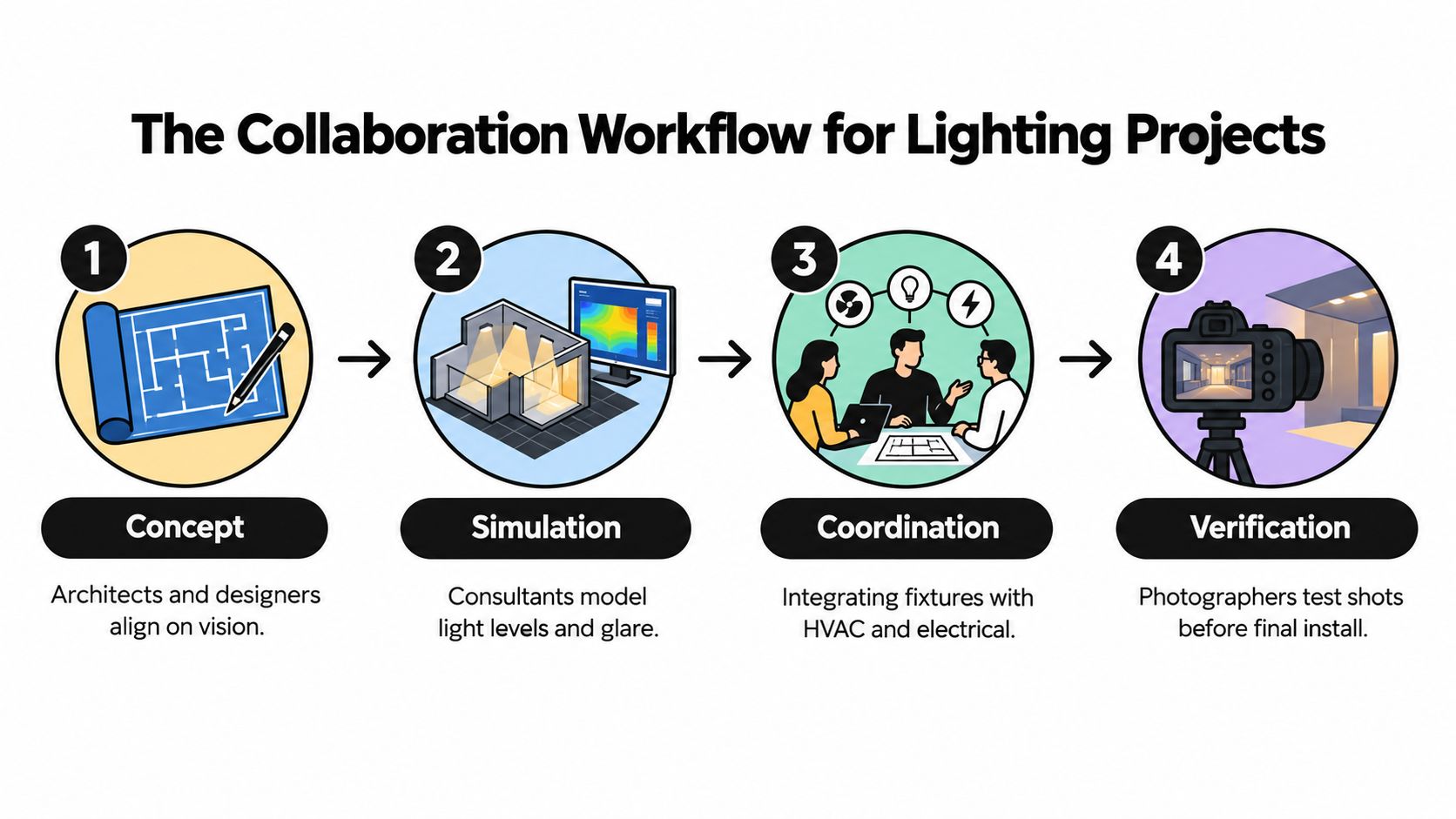
Lighting problems become expensive when the first serious review happens after ceilings, finishes, and electrical infrastructure have been fixed. A coordinated workflow gives every discipline a chance to test the visual idea before the construction details become difficult to change.
Concept establishes the visual hierarchy
At the concept stage, the architect, interior designer, lighting consultant, and brand team should agree on what the visitor needs to notice first. They should mark important axes, thresholds, seating areas, work surfaces, feature walls, and views. The photographer adds a useful challenge by identifying the compositions the finished project must support.
That conversation prevents the ceiling from becoming a collection of isolated fittings. It also clarifies whether a decorative source is an identity element, a functional source, or both.
Simulation tests what drawings hide
A consultant can model distribution, glare, daylight, and likely reflections before installation. The team should review rendered views from human eye level and anticipated camera positions, not only top-down plans. Dark materials, high windows, and polished finishes deserve early attention because they often expose conflicts between comfort and drama.
A physical mock-up is even more revealing. Test a wall wash, a pendant, a downlight cut-off, and the color relationship between adjacent fixture types. If the scene fails in a temporary mock-up, changing the design is still relatively straightforward.
Coordination protects the intent
The lighting plan must fit structure, mechanical services, sprinklers, access panels, acoustic treatments, and electrical routes. A technically elegant luminaire becomes a poor choice if maintenance access is impossible or the final ceiling forces an awkward aim.
The team should document fixture locations, aiming angles, control zones, dimming behavior, emergency requirements, and finish samples. Coordination meetings work better when participants review a shared reflected ceiling plan alongside elevations and camera views.
Verification finishes the work
Commissioning isn't the same as switching everything on. The team should aim fixtures, set scenes, check glare from occupied positions, compare adjacent color sources, and photograph representative views. The photographer can test exposure, reflections, window balance, and skin tone before the final documentation session.
A generalized project timeline might look like this:
- Concept: Establish spatial priorities and visual identity.
- Simulation: Test distribution, glare, daylight, and camera viewpoints.
- Coordination: Resolve fixtures with structure, mechanical systems, electrical work, and finishes.
- Verification: Commission scenes, conduct camera tests, and correct the details that don't survive real observation.
That sequence is practical because it places decisions where they can still influence the building. It also turns photography into a verification tool rather than a last-minute request for rescue lighting.
Executing Intentional Light in Your Next Project
Treat lighting design as a permanent part of the architecture, not as an accessory selected after the rooms are already resolved. Start with human activity and spatial hierarchy, then test the result against glare, surface reflectance, color quality, maintenance, controls, and the camera positions that will represent the finished work.
A useful schematic checklist is short:
- Define attention: Mark the features, paths, and activities that need visual priority.
- Layer the system: Separate ambient, task, accent, and decorative roles instead of asking one fixture type to do everything.
- Review comfort: Calculate UGR where relevant, assess daylight glare from occupied positions, and include shading in the solution.
- Check color: Compare fixture families using meaningful color-quality information, not a single headline metric.
- Plan for production: Test window balance, reflections, mixed color, dimming, and dark materials from likely camera positions.
- Design for operation: Confirm that facilities teams can maintain, program, and understand the system after handover.
The strongest spaces don't look lit for the sake of being lit. They feel coherent because light gives structure to movement, reveals material naturally, supports the body's needs, and creates images with enough depth to carry a brand or architectural story. That coherence comes from early decisions and disciplined collaboration, not from adding more brightness at the end.
Jimmy Clemmons Photographer offers architectural imagery, commercial brand content, location scouting, on-site lighting strategy, and professional editing for spaces that need to perform both in person and through a camera. Visit Jimmy Clemmons Photographer to discuss how a considered photographic workflow can help your next project communicate its lighting, materials, and spatial intent.