
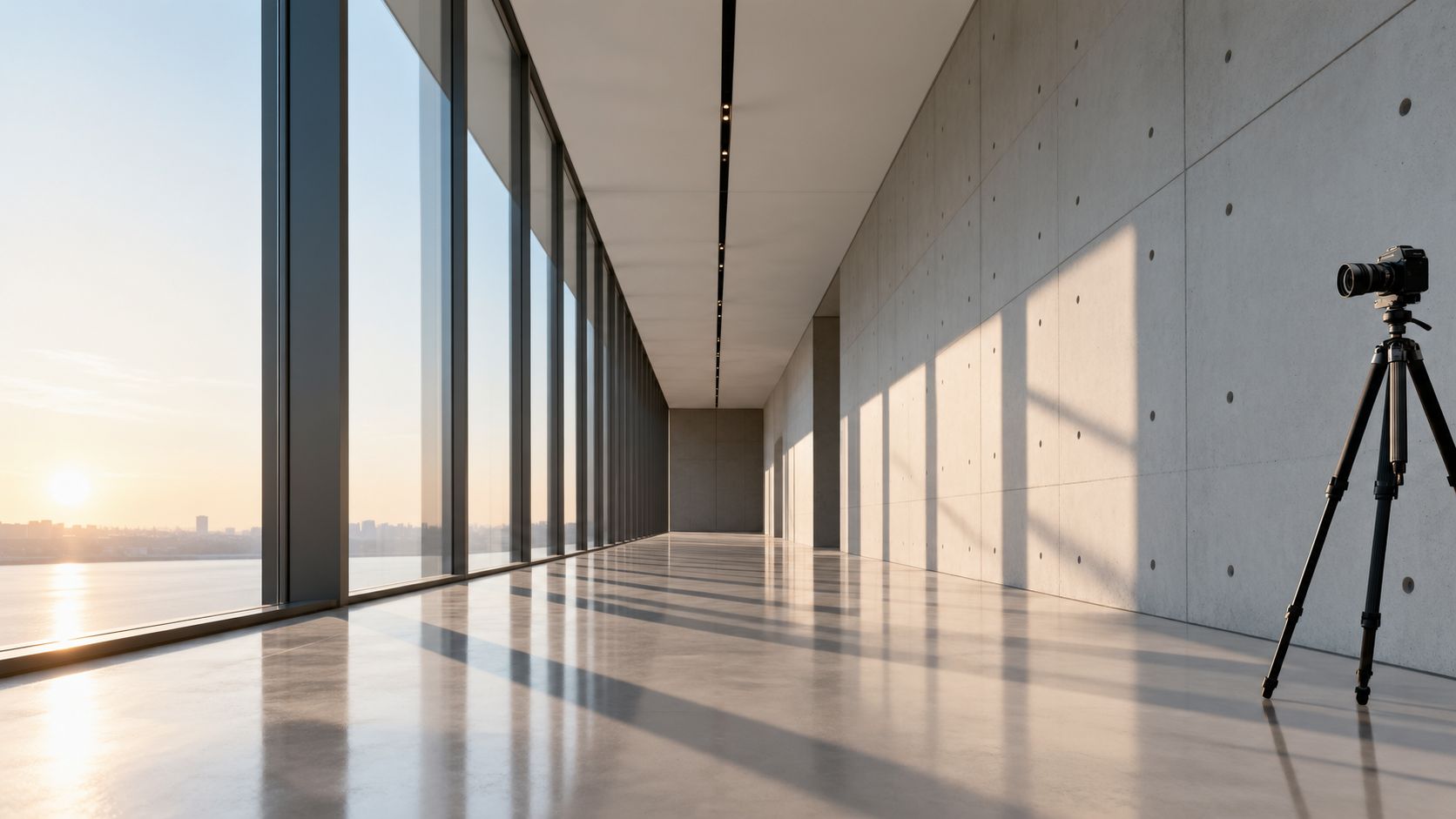
You've arrived at a beautifully designed interior, corrected the verticals, balanced the exposure, and captured every material with technical precision. Then you review the frame and notice what's missing. The room is accurate, but it doesn't feel spacious, welcoming, refined, or connected to the people who will use it.
That gap separates a record photograph from an image with editorial purpose. Design elements in photography give built spaces a visual language. Lines establish movement, shapes create order, texture communicates materiality, and space controls how the viewer breathes inside the frame. These choices matter even more when one image must work as a website banner, a social post, a printed portfolio page, and part of a brand campaign.
Why Design Elements Transform Architectural Imagery
A technically correct frame can still fail on a real assignment. The room may have a strong material palette, controlled daylight, and a clear relationship with its surroundings, yet the photograph feels flat. The camera records the architecture, but gives the viewer no clear route through it or sense of what the space should express.
The improvement often begins before editing, with the visual hierarchy already present in the building. A ceiling line can direct attention toward a reception desk. Repeated openings can establish rhythm. A dark foreground can contain a bright volume beyond it. These decisions turn a photograph from a neutral survey into a guided experience.
Built spaces need visual grammar
Architecture is encountered through movement, scale, material, and light. A still image removes physical movement, so composition must rebuild it. Line, shape, form, texture, and space carry part of the experience of walking through a building, but they must also survive the way the image will be viewed.
A strong frame may begin at a threshold, cross a floor plane, and finish at a distant window or person. Another may use negative space to make a facade feel deliberate and monumental. The better choice depends on the brief: clarity, atmosphere, intimacy, or a combination. It also depends on delivery. A composition that works across a wide portfolio spread may lose its hierarchy after mobile cropping, social-media compression, or conversion to a vertical frame.
Practical rule: Technical accuracy protects the building's credibility. Design choices communicate why the building matters.
Classic composition principles remain useful as working tools, not fixed laws. The rule of thirds divides a frame into 9 equal sections with 2 horizontal and 2 vertical lines, producing 4 principal intersection points for subject placement. John Thomas Smith first documented the concept in 1797, giving it more than 225 years of recorded history in this analysis of the rule of thirds and visual perception.
That history does not make every off-center composition effective. One controlled analysis found that rule-of-thirds placement can help viewers process an image's main subject, while another found only weak correlations between aesthetic ratings and subjective or calculated rule-of-thirds scores. The grid can clarify intent, but it cannot replace judgment.
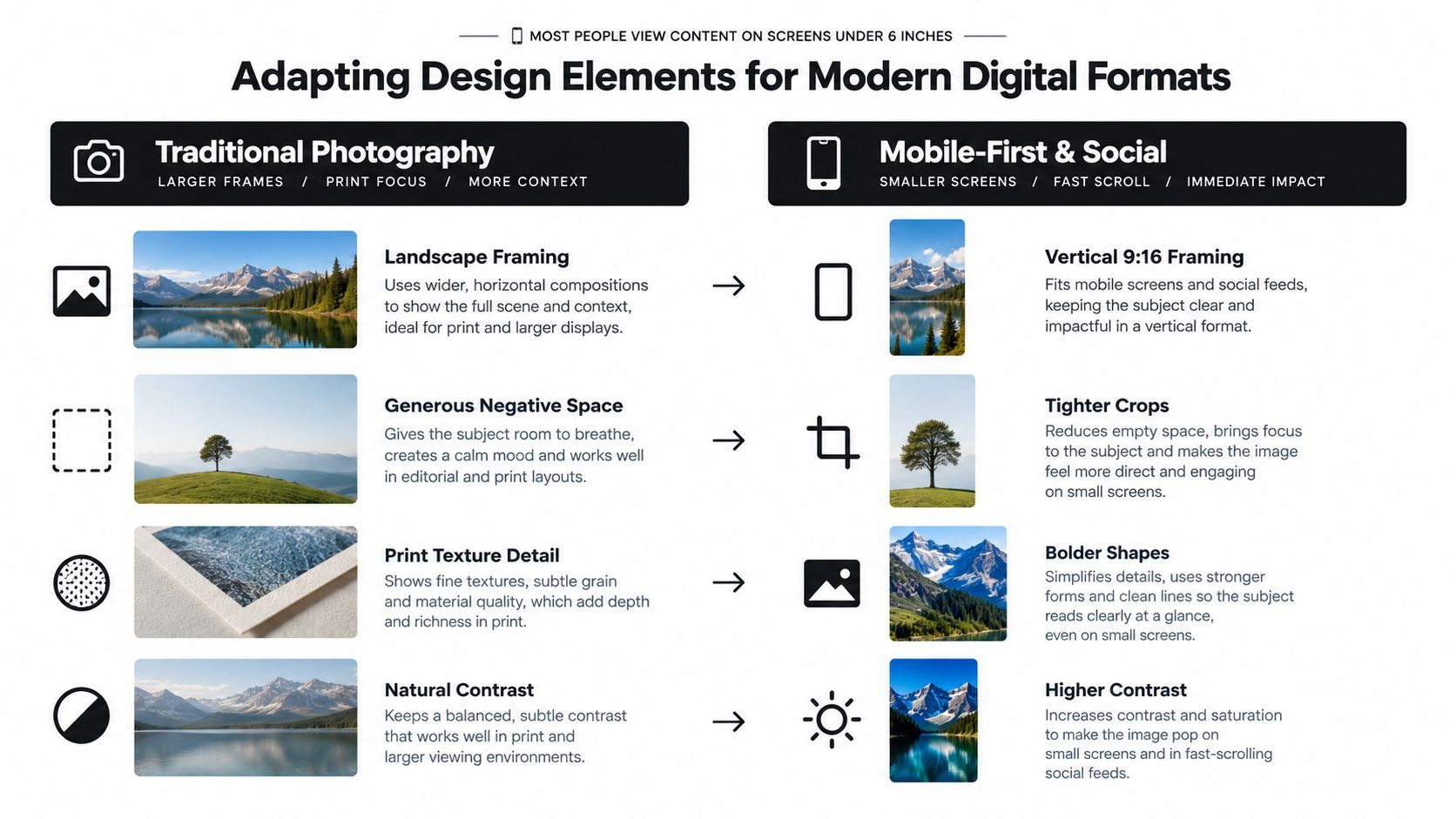
For architectural work, that judgment includes testing the frame at its final size. Keep the strongest line, shape, or subject legible after compression and cropping. In a vertical mobile placement, a carefully balanced horizontal composition may need a higher subject position, tighter spacing, or a different point of emphasis. The principle survives when the photographer preserves the intended visual order, even as the format changes.
Core Design Elements in Photography Explained
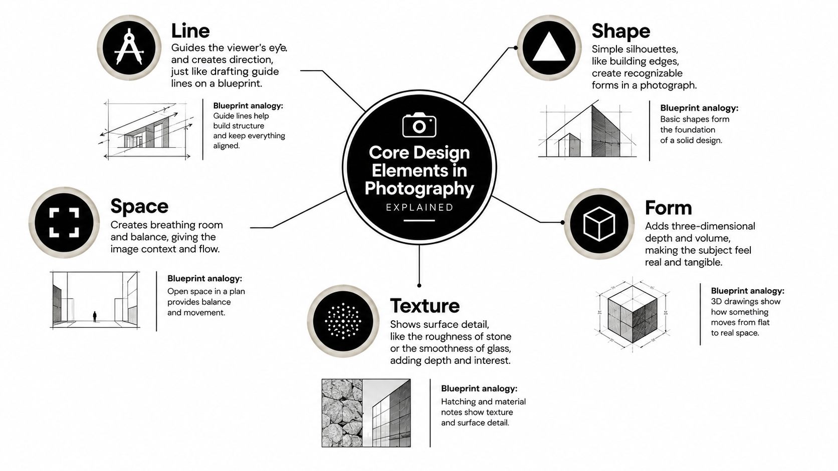
Architectural drafting offers a practical model for reading a photograph. A drawing begins with lines, organizes shapes, establishes volume, records material, and reserves areas of open space. Photography compresses those decisions into one visual plane, then asks the viewer to understand them quickly, often on a small vertical screen.
Line and shape establish order
Line sets the route through an image. Columns, stair rails, window mullions, shadows, roads, fences, and wall junctions can direct attention toward a subject or connect separate areas of the frame. Straight architectural lines suggest control and structure, while curves introduce a softer movement. Their role remains the same across formats: they organize attention as explained in this overview of leading lines and camera fundamentals.
Shape is the two-dimensional structure created by edges, contrast, and silhouette. A dark doorway can form a rectangle within a pale wall. A triangular roofline can stabilize the composition, while repeated windows create a rhythm similar to a technical elevation drawing. In a compressed social post, clear shapes usually survive better than delicate edge detail.
Form gives those shapes the appearance of volume. Light across a curved stair, projecting slab, or textured stone wall shows that the subject occupies real depth. A flat front elevation communicates precision and proportion. A corner view reveals how planes meet and can give the building greater physical presence. Choose between them according to the story the image must carry after cropping.
Texture and space create feeling
Texture supplies information that geometry cannot. Rough masonry, polished concrete, brushed metal, translucent glass, and soft upholstery each suggest a different tactile experience. Controlled light reveals those differences through small variations in highlight and shadow, though excessive contrast can make a refined surface look harsh. Fine texture may also disappear after compression, so its pattern must be supported by larger tonal or geometric cues.
Space includes the occupied area of the frame and the areas deliberately left open. Negative space can isolate a facade, reserve room for headline copy, or slow a busy composition. It becomes useful when it supports scale, hierarchy, or a planned layout. On a vertical mobile placement, open space may need to remain above or beside the subject rather than follow a balanced horizontal arrangement.
For a broader discussion of spatial relationships in architectural images, see the science of architectural composition. Photographers working with founders and brand teams may also find these branding tips from Legacy Builder useful when deciding how much environment should remain around a subject.
Composition and Lighting Techniques for Built Environments
A room can feel spacious in person yet appear flat in a photograph. The camera position determines whether the image explains that space, so choose it according to the building's strongest visual relationship rather than a familiar tripod setup. A corner can show two walls and the floor plane, helping viewers read depth. A frontal position suits a formal facade when symmetry and proportion carry the design story.
Build depth before adding drama
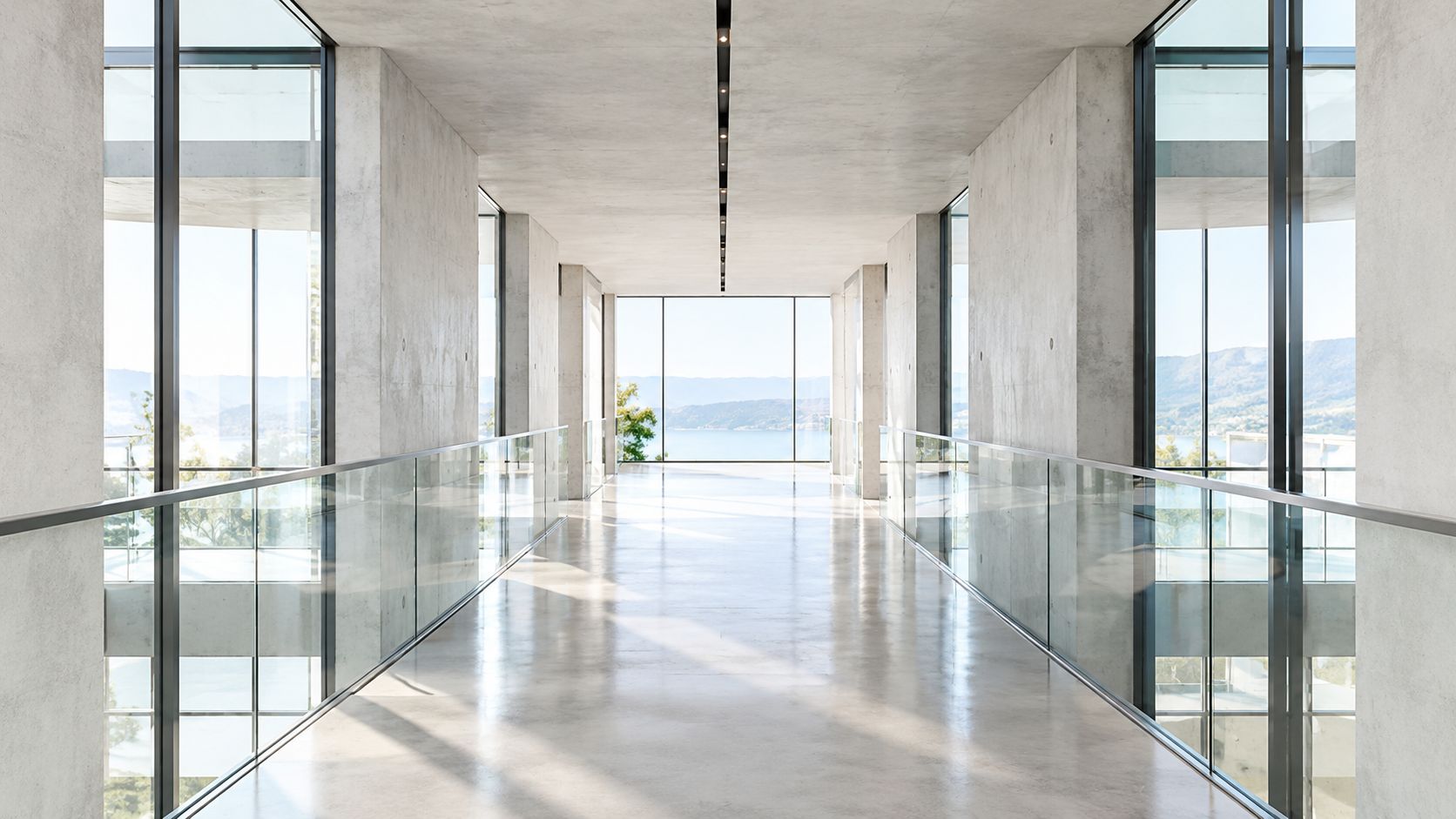
Organize the frame in layers. A foreground edge, middle-ground furniture, and background view can create a clear route through the photograph. Without separation between them, a large room may collapse into a flat collection of surfaces.
Camera height changes the balance of those layers. Keeping the camera around waist height, roughly 1 meter, can reduce the exaggerated downward perspective that makes floors dominate the frame, as outlined in these architectural photography recommendations. Adjust the height to correct the image in front of you. A lower position may give furniture more authority, while a higher one can clarify the relationship between floor, objects, and ceiling.
Leading lines need a meaningful destination. A corridor aimed at a blank wall creates movement without a reason to follow it. A floor joint that points toward a person, material transition, or exterior view gives the composition a stronger narrative.
Symmetry suits formal facades, staircases, and centered entrances, but perfect order can become static. An off-center person, tree, or carefully placed object introduces tension while preserving the main structure. That balance also matters in social crops, where a small asymmetrical cue may survive better than a subtle pattern of repeated details.
Treat exposure as structural control
Exposure controls the relationship between aperture, shutter speed, and ISO, not the overall brightness. A considered exposure retains useful information in shadows and highlights, allowing a dark timber ceiling and bright window to remain part of the same material story.
Photography's shift toward repeatable production included the first photograph in 1826, Henry Fox Talbot's viable paper negative process in 1835, John Herschel's image-fixing method in 1839, and the first manufactured photographic film in 1887 in this historical overview of exposure and photographic production. Architectural photography still relies on that same principle of controlled, repeatable capture, especially when images must be adapted for compressed mobile viewing.
Natural light can describe volume softly. Directional artificial light can separate a textured wall or establish a deliberate mood in a reception area. Before a site shoot, review this practical guide to choosing the best light for a site shoot and test how the chosen light will hold up in both wide compositions and vertical crops.
Adapting Design Elements for Modern Digital Formats
A carefully balanced architectural photograph can lose its structure on a phone. Vertical viewing changes how lines, shapes, texture, and negative space perform. A long horizontal lead may become a short diagonal after cropping. Fine material transitions can disappear under compression, while open space intended for a printed layout may look empty during a fast scroll.
Compose for survival
Start by identifying the visual information that must remain clear after reduction. Strong silhouettes, distinct tonal separation, bold shapes, and one obvious focal point usually hold together better than several delicate, low-contrast relationships.
For a multi-format assignment, photograph the subject with separate crops and uses in mind:
- Vertical priority: Keep important architectural features within a tall central corridor so they remain available for mobile crops.
- Tight detail: Photograph material junctions, hardware, lighting, and human-scale cues separately from the wide establishing view.
- Flexible negative space: Leave clean areas for possible copy, then check that the open space still feels deliberate after cropping.
- Readable contrast: Preserve the difference between subject and background without processing every image into a harsh graphic.
The aim is selective clarity, not visual noise. A quiet frame can work on a small screen when its main shape and hierarchy are immediately legible. I check the intended crop before leaving the site, because a composition that depends on edge details has little margin once a platform trims or compresses it.
Let the format change the mood
Recent trend reporting describes 2026 photography as moving toward vertical, mobile-first framing, tighter crops, handheld immediacy, and a more candid human quality in this visual culture and design trend report. The same reporting identifies authenticity, imperfect texture, and direct flash as rising visual cues.
These choices can make a built environment feel occupied rather than sterile, but each introduces a trade-off. Direct flash can reveal surface and energy while flattening depth or competing with the architecture. Handheld movement can suggest immediacy, yet an unstable frame may weaken confidence in a technical documentation assignment. Imperfect texture can add presence, though excessive roughness may obscure the material decisions the image should explain.
Plan delivery before the shoot. Guidance on optimizing firm websites for image speed helps clarify the technical limits, but the photograph still needs a hierarchy that survives resizing and compression. File treatment affects composition from the start. Capture for the phone, then confirm that the wider version still describes the building with precision.
Architectural vs Commercial Photography Choosing the Right Approach
Architectural photography usually begins with the building as the subject. The photographer's responsibility is to describe structure, proportion, circulation, light, materials, and design intent with enough accuracy that the viewer can understand the space. Lines need to remain controlled, perspective needs careful attention, and the image often benefits from a calm, deliberate pace.
Commercial photography may place the building inside a broader brand story. The same interior could be photographed to express hospitality, craftsmanship, innovation, trust, or an aspirational lifestyle. That shift changes the hierarchy. A person using the space, a close view of a material, or a warmer shadow pattern may matter more than a complete record of the room.
Compare the visual priorities
| Assignment emphasis | Design elements to prioritize | Common risk |
|---|---|---|
| Architectural documentation | Perspective, proportion, line, shape, and spatial clarity | Making the image technically correct but emotionally flat |
| Hospitality or interiors | Texture, form, light, and human-scale cues | Styling the space until it loses credibility |
| Corporate brand content | Negative space, controlled color, gesture, and environmental context | Letting the background compete with the message |
| Editorial feature imagery | Rhythm, contrast, irregular detail, and narrative sequence | Chasing novelty at the expense of clear structure |
Neither approach is purely objective or purely emotional. A documentation image still needs atmosphere, and a commercial image still needs spatial credibility. The difference lies in what the viewer should understand first.
Use materiality as brand language
Clients often want more than proof that a space exists. They want visual signals of trust, culture, care, and positioning. A carefully lit stone joint may communicate craftsmanship. A worn threshold may suggest use and longevity. A human figure at the correct scale can show that a large room is welcoming rather than intimidating.
Educational and academic discussions of built-environment photography repeatedly emphasize lines, shape, pattern, perspective, and texture, while current visual preferences support more sensory, textured, and less sanitized imagery in this discussion of materiality and visual culture. That doesn't mean abandoning polish. It means choosing where polish serves the story and where a controlled imperfection makes the space more believable.
The practical test is whether each design choice supports the client's intended perception. If the project needs precision, keep the geometry dominant. If it needs warmth, let texture, shadow falloff, and human presence carry more weight.
Client Briefing Checklist and Shot Prioritization
The brief should establish the image's job before the camera is unpacked. Ask what the client wants the audience to understand, feel, and do after seeing the photographs. A request for “wide interiors” may mean a need for website headers, a project feature, leasing material, social covers, or a presentation with generous copy space.
Ask questions that change the photographs
Use the conversation to uncover constraints that won't appear on a floor plan:
- Audience: Who needs to trust or understand the space?
- Brand character: Should the imagery feel precise, warm, bold, quiet, tactile, or immediate?
- Priority spaces: Which rooms or exterior views carry the project's identity?
- Delivery formats: Will the images appear in vertical social crops, website banners, printed layouts, or all of these?
- People and activity: Should the space appear empty, lightly occupied, or actively used?
- Visual restrictions: Are there privacy concerns, sensitive areas, temporary finishes, or objects that must remain out of frame?
- Selection needs: Does the client need a small hero set, a broad documentation library, or a sequence that tells a project story?
The answers determine whether negative space is a requirement, whether a person belongs in the frame, and whether a straight-on elevation should sit beside a more atmospheric view.
Prioritize by purpose
I separate the shot list into three practical groups. Must-have images prove the project's essential qualities, such as the primary exterior, the defining interior, the signature material, and the key circulation relationship. Message images express the brand emotion, perhaps through a human-scale detail, a carefully controlled shadow, or a view that connects interior and surrounding environment.
Useful variations come last. These may include alternate camera heights, tighter details, less formal angles, and crops designed for different placements. They're valuable only after the core story is secure.
The strongest shot list isn't the longest one. It's the one that assigns every image a job.
Before leaving, review the images at the size and orientation in which they'll be consumed. A frame that works as a portfolio spread may fail as a mobile cover. Finding that out on location gives you options. Finding it during delivery gives you a reshoot problem.
Case Studies Design Elements in Action
A generalized residential renovation provides a useful example. The first pass uses a centered wide view from the entrance. It's accurate, clean, and easy to understand, but the floor occupies too much of the frame and the new joinery reads as a flat band against the rear wall.
The revised approach lowers the visual emphasis on the floor by changing camera height, moves toward a corner to reveal two wall planes, and uses a side-lit position to describe the joinery's grain. A chair remains near the edge as a human-scale cue, while a clear area of wall preserves flexibility for a vertical crop. The result still documents the room, but the image now communicates material quality and how someone might occupy the space.
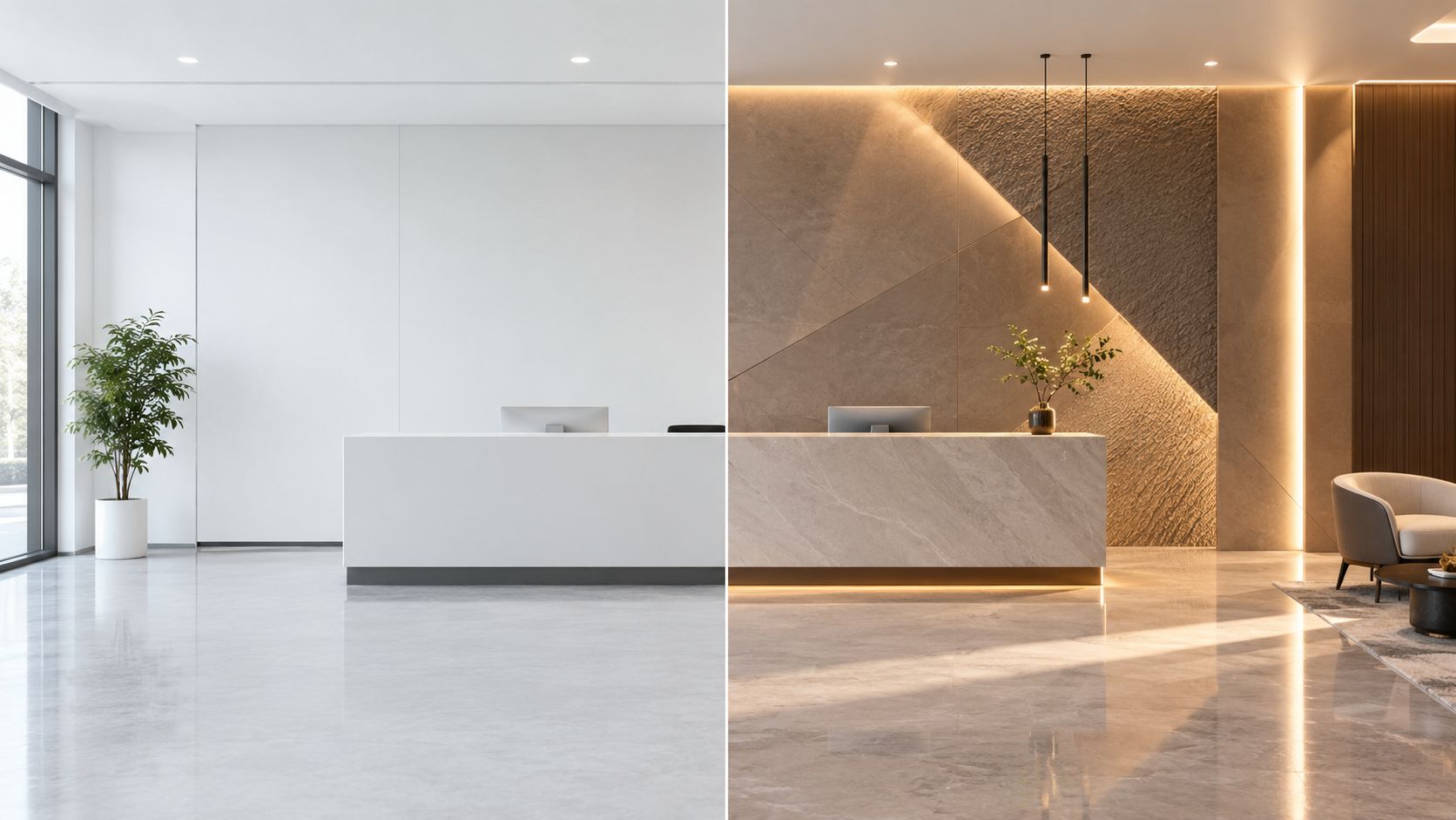
A corporate interior with no visual anchor
In another hypothetical assignment, a reception area is bright, spacious, and carefully finished. The initial photograph shows the entire room, but the desk, seating, wall graphics, and ceiling lights compete equally. The viewer sees information without knowing what matters.
The improved frame uses the desk as the primary shape, lets a ceiling line guide the eye toward it, and places a person slightly off center to create scale and activity. A darker foreground edge adds form, while a controlled highlight on the reception surface gives the material a tactile role. The photograph becomes less like a floor plan and more like an invitation into the space.
A social crop that loses the architecture
A wide facade may work beautifully in a panoramic portfolio layout and fail when cropped vertically. The original image depends on a long horizontal rhythm of windows, but the crop removes both ends and leaves an undistinguished center.
A second capture preserves the strongest vertical bay, uses the facade's shadow as a bold shape, and leaves enough breathing room above the roofline for platform overlays. The photographer hasn't abandoned the architectural view. The photographer has created a version whose essential lines survive a different delivery format.
Mastering Design Elements for Impactful Photography
Mastery doesn't mean applying every compositional rule to every frame. It means recognizing which element should carry the image's meaning. Line can direct attention, shape can establish order, form can create volume, texture can express materiality, and space can control emphasis and layout.
The most reliable photographers make these decisions before pressing the shutter, then remain willing to adjust them when the building, light, or delivery format demands something different. A centered facade may need symmetry. A brand portrait may need negative space. A mobile crop may need a stronger silhouette than the printed version. Precision comes from knowing why the frame is organized, not from making every frame look alike.
Review your next shoot at three stages: on location, during selection, and in the final delivery context. Ask what the eye sees first, which material or spatial relationship survives reduction, and whether the emotional tone matches the client's goal. Those questions turn design elements photography from a vocabulary into a working method.
Jimmy Clemmons Photographer creates architectural and commercial imagery built around precise composition, controlled light, and editorial clarity, with services including location scouting, lighting design, on-set direction, and professional editing. Visit Jimmy Clemmons Photographer to discuss a project that needs built spaces, materials, and brand stories translated into purposeful images.