

You've scheduled an executive portrait in a glass conference room, the subject is ready, and the background looks impressive at first glance. Then you review the frame. A bright window pulls attention to one side, a mullion appears to grow out of the subject's head, and the polished boardroom says more than the person does. The portrait isn't technically broken, but it isn't communicating authority either.
That's the working problem behind every professional portrait background. A background isn't wallpaper behind the subject. It's an editorial decision that establishes context, controls attention, and helps a marketing team decide whether the image belongs on a leadership page, LinkedIn profile, press kit, architectural feature, or campaign landing page. The best choice supports the face before it announces the location.
Why Your Professional Portrait Background Matters More Than You Think
A professional portrait background carries information before anyone reads the caption. A quiet gray field can make a leadership portrait feel direct and broadly usable. A softly blurred office can connect an executive to the organization's culture. A construction site, architectural interior, or active job site can establish credibility through context, provided the setting doesn't overpower the person.
The useful test is simple: the viewer's eye should land on the face first. If it goes to a bright window, a high-contrast sign, a branch, a light fixture, or a strong architectural line, the background is working against the portrait. Portrait background guidance treats those distractions as composition and exposure problems, not minor finishing details.

Backgrounds have always shaped the story
Portrait photographers have been solving this problem since the mid-1800s. Studios used plain cloth, painted scenery, and staged props to hide clutter and keep attention on the sitter. By the 1860s, hand-painted scenic backdrops had become popular, depicting architectural interiors and trompe-l'oeil scenes. Producers including Engelmann & Schneider in Dresden and L.W. Seavey in New York City helped make those settings part of studio practice. The Smithsonian Libraries account of painted photographic backgrounds documents how those backdrops remained common until the 1920s.
The eventual move toward simpler portraits followed changes in cameras and public taste. Photography was publicly announced in 1839, early portrait sessions could require exposure times of about 5 minutes, and later improvements reduced that to around 25 seconds. The arrival of Eastman Kodak's first portable mass-market 35mm camera in 1888 pushed portraiture beyond controlled studios, while paper backgrounds introduced in the late 1960s and early 1970s helped define the clean, infinite-color look still used today. This history of portrait photography shows that background design has always followed the practical and cultural needs of the medium.
Start with the message, not the backdrop
Before choosing color or location, decide what the portrait must communicate. A corporate attorney may need an image that works in a press article, a website biography, and a conference program. An architect may benefit from a restrained interior that establishes design intelligence. A contractor or construction executive may need the controlled energy of a real job site, but not a chaotic frame full of equipment and warning signs.
The same person may require more than one treatment. A neutral portrait can serve broad corporate use, while a contextual environmental portrait can support an editorial feature. Cohesion comes from consistent light direction, crop, wardrobe guidance, and color discipline, not from forcing every person against identical gray paper.
Editorial rule: Choose the background for the audience's first question. If they need to know who the person is, simplify. If they need to understand what the person does, add context carefully.
Choosing the Right Professional Portrait Background for Every Client
The right background family depends on the client's role, the platform, and the amount of context the image needs to carry. A leadership team's website may require consistency across several portraits, while a magazine commission can tolerate more atmosphere and visual variation. A professional portrait background should support the assignment's communication goal before it reflects the photographer's preferred style.
Three background families
Smooth paper and solid neutrals offer the cleanest reading. White, gray, taupe, and subdued color fields suit corporate headshots, LinkedIn profiles, press kits, and leadership bios where the face must remain immediately legible. Smooth paper also gives a team a repeatable visual system, especially when every subject needs the same crop and lighting.
Textured canvas and gradients add depth without requiring a literal location. A subtle tonal shift can keep a portrait from feeling flat, while restrained texture introduces an editorial character for creative directors, designers, executives, and speakers. The texture should support the face, not become a visible pattern competing with hair, clothing, or facial detail.
Environmental office and architectural settings provide narrative value. A blurred workplace, a well-composed boardroom, or a carefully selected interior can connect a subject to an industry and make an editorial portrait feel credible. The trade-off is control. Reflections, mixed color temperatures, signage, glass, and active employees can create problems that a studio backdrop avoids.

Match the background to the assignment
| Background Type | Best For | Trust and Brand Signal | Watch Out For |
|---|---|---|---|
| Seamless paper and solid neutrals | Corporate headshots, LinkedIn, press materials | Clarity, consistency, broad usability | Sterile sameness or weak separation |
| Textured canvas and gradients | Creative leaders, designers, editorial portraits | Individuality, polish, controlled sophistication | Texture that competes with the face |
| Environmental office and architectural settings | Leadership stories, editorial features, industry portraits | Credibility, context, connection to place | Clutter, reflections, inconsistent visual language |
For architectural and design clients, the building may be part of the subject's authority. Use geometry as a frame, not as a collection of lines behind the head. On a job site, preserve enough environmental evidence to make the location meaningful, then simplify the immediate area around the subject.
Team portraits need a related decision. Neutrals remain the safest shared foundation, but richer colors such as navy, forest green, burgundy, and charcoal can give a group more character when they align with the brand palette. The backgrounds don't need to be identical, but they should feel deliberately related through tonal range, lighting, framing, and saturation.
For a practical example of how business portrait work can be positioned across professional uses, review this business portrait photography resource. The useful lesson is not to select a backdrop by trend alone. Select it by the image's job.
How Color Texture and Tone Keep Focus on the Face
Once the background family is chosen, refine its visual behavior. Color, texture, and tone should form a quiet support system around the subject. A background can be technically attractive and still fail if it shares too much visual weight with the face or wardrobe.
Begin with the face and wardrobe
Look at skin tone, hair color, clothing value, and brand palette together. A dark suit against a charcoal wall may create a serious mood, but it can also erase shoulder definition. A pale shirt against a white background may look elegant in one lighting setup and disappear in another. The fix isn't always a different background. It may be a change in light direction, wardrobe contrast, or subject position.
Use color relationships with restraint. A navy background can support a warm complexion and connect to a corporate palette, while a burgundy field may add editorial richness for a speaker portrait. If the clothing already carries a strong color, a quieter background usually protects the face better than another saturated element.
Practical rule: Compare the background to the subject at the value level first, then judge hue. Tonal separation usually matters before color preference.
Control texture before it becomes a subject
Texture works best when it registers as depth rather than pattern. Canvas, plaster, brushed paint, and soft gradients can make a portrait feel less generic, but sharp texture near the head creates small contrasts that pull the eye away. Keep the quietest portion of the background behind the eyes and cheeks, where viewers naturally look first.
In a corporate interior, this may mean placing the subject against a wall plane rather than a bank of shelves. In an editorial set, it may mean keeping a gradient broad and smooth, with the tonal transition away from the face. A background that looks subtle in person can become assertive after sharpening and compression, so inspect the actual delivery file, not only the camera preview.
Build tonal separation into exposure
Background color matching belongs in the exposure workflow. Before the subject arrives, make a quick frame of the set and identify the brightest and darkest areas. If a window, metal surface, or white wall is brighter than the face, either reposition the subject, control the light, or accept that the location is becoming the visual subject.
Color also shifts under mixed light. A warm wood wall may become orange under practical fixtures, while daylight through glass can push nearby surfaces cooler. Choose whether that contrast supports the story. If it doesn't, turn off competing practicals, move into open shade, or use a controlled background instead.

The face should remain the most articulate area of the frame. Background softness helps, but softness can't rescue a bright sign, a hard edge, or a tonal collision placed directly behind the head. Make the background quieter before relying on post-production.
Lighting and Depth Techniques That Create Clean Separation
A corporate portrait can place the subject in a boardroom, on an active job site, or against a controlled studio field. The background should identify the setting when industry context supports the assignment, then recede enough to keep attention on the face. Separation comes from controlling distance, focal length, and aperture, with distance usually the first adjustment.
Distance gives the set room to breathe
Professional portrait guidance commonly recommends roughly 10 to 15 feet of subject-to-background separation when the space allows, as described in this portrait background technique guide. That space gives light room to fall off, reduces direct shadows, and allows depth of field to soften detail without erasing the location.
On assignment, the room may offer less. Move the subject as far from the background as the space permits, then turn the body slightly to create a cleaner plane behind the head. In a boardroom, abandoning the obvious wall for a deeper corridor or distant glass partition can make the portrait feel more editorial. On a job site, placing the subject several steps from machinery can preserve context without letting equipment compete with the expression.
The background should support the client's public role, not dictate it.
Use the lens to simplify the scene
A focal length around 85mm or longer is a reliable starting point for flattering perspective and softer background detail. Longer lenses narrow the field of view, remove distracting environment from the frame, and let you work farther from an executive who needs comfortable direction. A 105mm or 135mm lens can work well when the location has useful color or structure but too much visual detail.
Working distance is the trade-off. Longer lenses require more room and can make direction harder in a tight office. If a 135mm lens forces you into a hallway or prevents useful interaction, an 85mm lens may produce the stronger assignment, even with less background compression. For a broader explanation of subject placement, lens choice, and light control, use this professional portrait lighting setup guide.
Team portraits require another decision. Keep camera height, background treatment, and the level of blur consistent, while allowing enough environmental detail to distinguish the organization's work. Cohesion comes from shared visual rules, not identical posing against a sterile wall.
Open the aperture with intention
Wide apertures such as f/1.8 to f/2.8 produce strong blur when distance and focal length support them. Keep the eyes sharp and check both the near and far eye when the subject turns. For teams, use a more conservative aperture so multiple faces remain within a usable focus zone without giving up all background softness.
A clean white background creates a separate exposure problem. If it receives the same exposure as the subject, it can render gray rather than white. Keep the background one to two stops brighter than the subject when a clean white field is required, while watching for spill and edge flare. The goal is a controlled brightness relationship, not just more power.
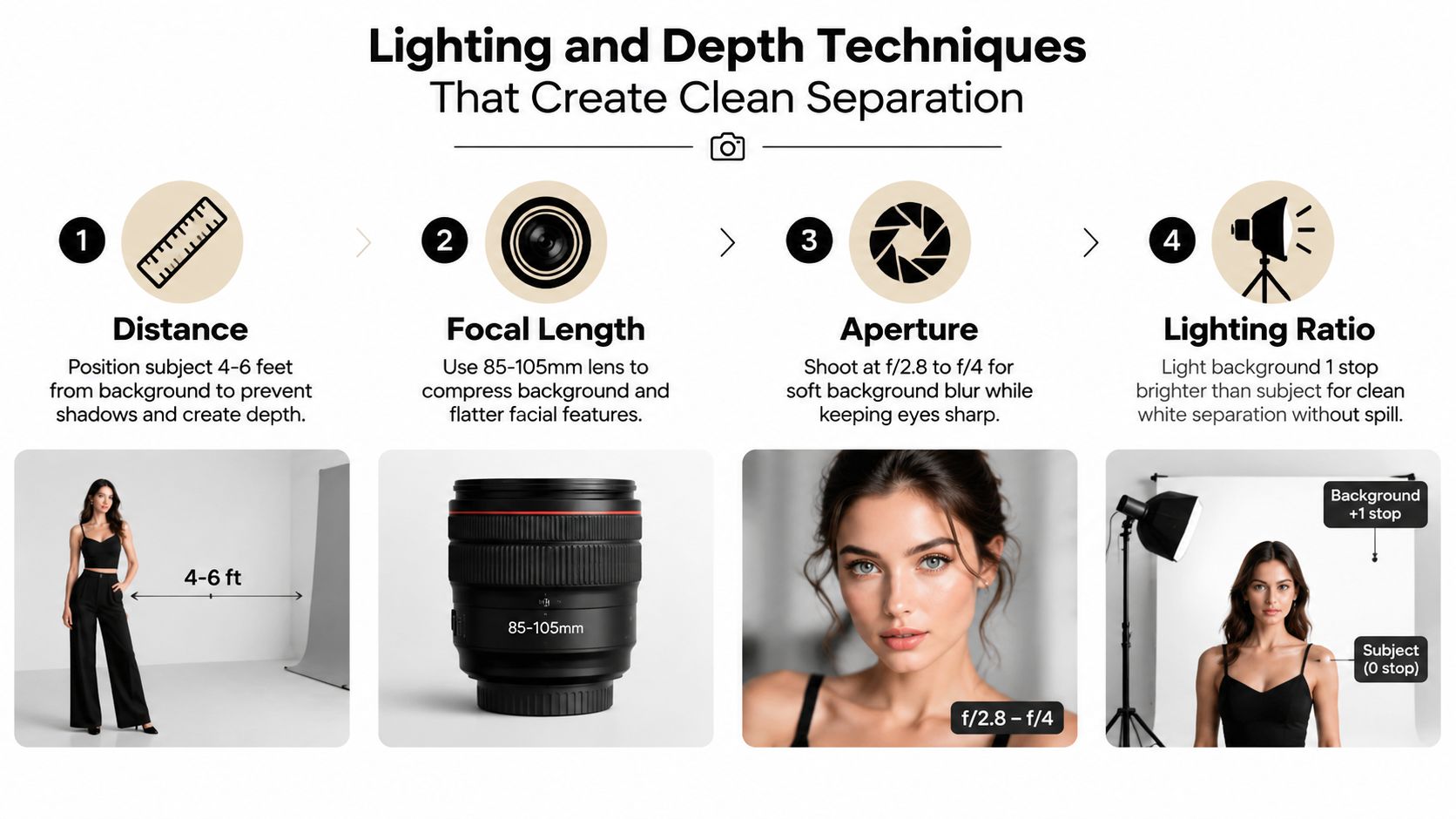
A short visual demonstration can help clients and junior photographers understand how these controls interact.
Do not chase maximum blur as a default style. Press-facing portraits may need enough background information to identify the place, while a corporate headshot often benefits from stronger simplification. Use the amount of separation that protects the face and preserves the assignment's message.
Setup Checklist and On Location Solutions That Save the Shoot
A dependable portrait setup starts before the first frame. Studio work rewards preparation, but location work rewards preparation plus the ability to abandon a bad idea quickly. A beautiful office is not automatically a useful background, and a plain wall can outperform an expensive interior when the light and composition are cleaner.
Prepare the physical set
For smooth paper, check the roll for creases, marks, and uneven extension. Secure the support stands, inspect the sweep where the floor meets the wall, and keep a clean section available for the primary portraits. Canvas and painted surfaces need a similar inspection because small folds and scuffs become more visible under raking light.
For an environmental portrait, walk the location from the camera position rather than from the subject's position. Look for the background that will appear in the frame, then decide whether the setting supports the client's role. A conference table may suggest leadership, while a cluttered workstation may suggest activity but not necessarily competence.
A useful preparation list includes:
- Clear the head zone: Remove or reposition objects that sit directly behind the subject's head and shoulders.
- Control practical lights: Turn off fixtures that create strange color patches or bright points unless they serve the composition.
- Check reflections: Glass walls, polished tables, and framed art can reflect strobes, windows, or the photographer.
- Pack for the location: Bring stands, clamps, flags, extension cords, diffusion, and a compact background option.
- Confirm the frame: Review both horizontal and vertical compositions if the images will serve websites, press, and social profiles.
Run a pre-shutter scan
The most common background failures are easy to name: bright spots, poles, branches, window frames, clutter, and lines that collide with the head or shoulders. Make a slow scan around the entire frame before directing the subject into place. Then make small camera movements left, right, up, or down before moving the person.
The fastest background correction is often a camera move of a few inches.
Open shade can calm an exterior location and reduce harsh background contrast. In a busy office, use a longer lens, choose a darker wall, or angle the subject toward a quieter depth of field. If space is tight, move the subject diagonally rather than straight back, rotate the camera to remove a bright edge, or use a flag to block a distracting practical.
Protect the schedule
Location portraits rarely fail because the photographer lacked one more backdrop color. They fail because the team spends too long trying to rescue a background that never supported the subject. The photo shoot checklist approach is useful here because it turns preparation into a repeatable process, from equipment checks to location decisions.
Keep a fallback position ready. That might be a plain wall, an open-shade exterior, a stairwell with clean geometry, or a portable background. Make the fallback look intentional, not apologetic. A controlled portrait in a quiet space is stronger than a complicated portrait in a prestigious space where the eye never settles on the face.
Final Polish and Presentation Tips for Lasting Impact
Post-production should confirm the editorial decision, not replace it. Clean small distractions, correct uneven color, and extend a background when the crop requires it, but avoid building a synthetic environment that the camera never saw. Real texture, believable falloff, and consistent edge detail help a portrait retain trust.
Background cleanup is appropriate when it removes a stray mark, cable, reflection, or small object that contributes nothing. Subtle blur can reduce detail in an office or architectural setting, but it shouldn't erase every clue of place when context is part of the portrait's value. If the background feels overdesigned after editing, reduce the effect until the subject regains priority.
Keep a team gallery related, not identical
A cohesive team gallery needs a shared visual grammar. Match crop, head position, light direction, contrast, and general tonal family. Allow individual variation in expression, posture, and background context when the people hold different roles. A creative director and a chief financial officer don't need to look interchangeable to belong to the same organization.
Review the group together on the same page. A portrait that looks balanced by itself may become too bright, too saturated, or too shallow in context. Build the final gallery as an editorial sequence, not as a folder of isolated winners.
Treat blog covers as part of the same system
The cover image at the top of a post also needs editorial judgment. A repeated stock portrait on every article makes a blog list feel mechanical, even when the articles are strong. Vary the treatment across the collection. Use a relevant stock-style image for one topic, then a design, sketch, rendering, architectural detail, or typographic composition for another.
A study of visualization thumbnails found that different chart components can attract attention and support understanding in different ways, which supports varying composition rather than repeating one header formula. Research on visualization thumbnails provides a useful basis for treating cover design as a communication choice.
Streaming interfaces offer another reminder that the first image influences selection. Research on Netflix thumbnails reported that 82% of viewers surveyed said thumbnails influenced their choice of content, according to the published thumbnail study. A blog cover doesn't need to imitate a streaming platform, but it should make the subject immediately clear and give the page a recognizable point of entry.
Don't stop visual planning at the first header. One blog-image guide recommends using imagery throughout the scroll depth rather than relying on a single featured image, while another recommends roughly one image per 200 to 300 words and a separate guide suggests one image every 300 to 400 words. See the blog image best-practices guide and image usage recommendations for those density references. The practical point is to vary placement and function, not to fill every gap with decoration.
A professional portrait background succeeds when it makes the intended message easier to understand. Choose the context, control the distractions, light for separation, edit with restraint, and present the image within a visual system that respects both the subject and the audience.
Jimmy Clemmons Photographer creates editorially precise professional portraits, architectural imagery, and commercial brand content for Atlanta organizations and regional clients. The studio handles location scouting, lighting design, on-set direction, and professional editing to build backgrounds that support corporate identity without distracting from the people or spaces. Visit Jimmy Clemmons Photographer to discuss a portrait session built around your team, location, and communication goals.