
You're probably staring at a familiar problem right now. The firm has a strong body of work, the website says the right things, and the next portfolio shoot has to do more than produce attractive images. It has to show how Bauer Askew Architecture thinks in space, not just what their projects look like from one clean angle.
That distinction matters here because this Nashville practice has 30 years of design heritage behind it, and that kind of continuity changes the way a photographer should read a building. The work isn't just about façades and polished interiors. It's about order, material restraint, and spaces that need to hold up visually long after the launch post has faded.
A Morning on Set at a Bauer Askew Project
The first thing I'd expect on a Bauer Askew shoot day is calm, not drama. You arrive before the city fully wakes, you've got the lobby or corridor to yourself, and the building still feels like it's deciding how much light to give you. That early window matters because their spaces tend to reward controlled daylight, clean edges, and compositions that let geometry do the talking.
On a Nashville adaptive-reuse or healthcare interior, the most useful frames usually come from reading the space in layers. First, I look for the primary axis, then the secondary openings, then any material shift that tells me where one function ends and another begins. If the architecture is doing its job, the photograph shouldn't fight it. It should follow it.
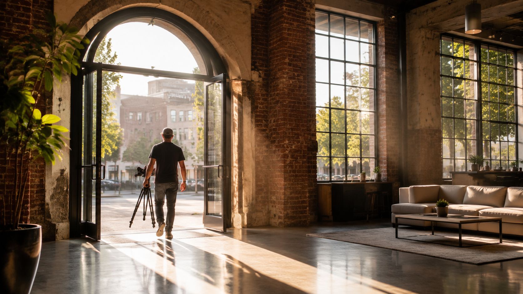
For anyone preparing a shoot, a practical checklist helps more than a vague “let's just see what happens” approach. The lighting needs to be scoped, the order of rooms needs to be planned, and the interior details need to be protected from clutter that would flatten the design intent. A useful starting point is the photo shoot checklist, because a space like this usually rewards preparation over improvisation.
Practical rule: if the room's strongest feature is spatial sequence, don't stop at a hero frame. Build the shoot so the viewer feels movement from one zone to the next.
The best Bauer Askew images usually feel unforced because the architecture already has a clear spine. That's what I'd be looking for before the first camera bag even comes off the cart.
Who Bauer Askew Architecture Really Is
Step into a Bauer Askew project, and the firm's identity becomes easier to read than any directory listing. Bauer Askew Architecture was founded in 1995 by Robert Bauer and William Askew, and its headquarters are in Nashville, Tennessee (PrivCo). That gives the practice a long operating history, and the company's own materials say this year marks 30 years of designing spaces that “endure, inspire, and serve with purpose.” For a client, that kind of continuity matters because firms build trust by staying relevant through changing budgets, code requirements, and design tastes.
The leadership profile is straightforward. Third-party business data describe the practice as a Nashville-based architecture, planning, and interior design firm whose principals Tom Bauer and Garry Askew both hold AIA and LEED AP credentials. In practical terms, that usually shows up as work that is organized around performance, clarity, and environmental discipline, not just surface finish.
What the scale tells you
The firm is not a giant commercial studio. Independent profile data place it at about 12 employees and roughly $3 million in annual revenue for 2024 (RocketReach). That points to a small but established practice structure, which usually changes how projects are managed on the ground. You are likely dealing with a tighter decision chain, more direct access to principals, and a more concentrated design voice.
The address also appears consistently in public records and directories at 1615 16th Ave South, Nashville, TN 37212. That location matters because Nashville's mix of growth, civic work, education, healthcare, and adaptive reuse tends to favor firms that can move between scales without losing discipline.
A client commissioning imagery should read that combination carefully. This is a firm with enough history to know how to carry a project across phases, but not so large that its portfolio becomes visually anonymous. That balance usually calls for a photographer who can document precision without making the images feel over-produced.
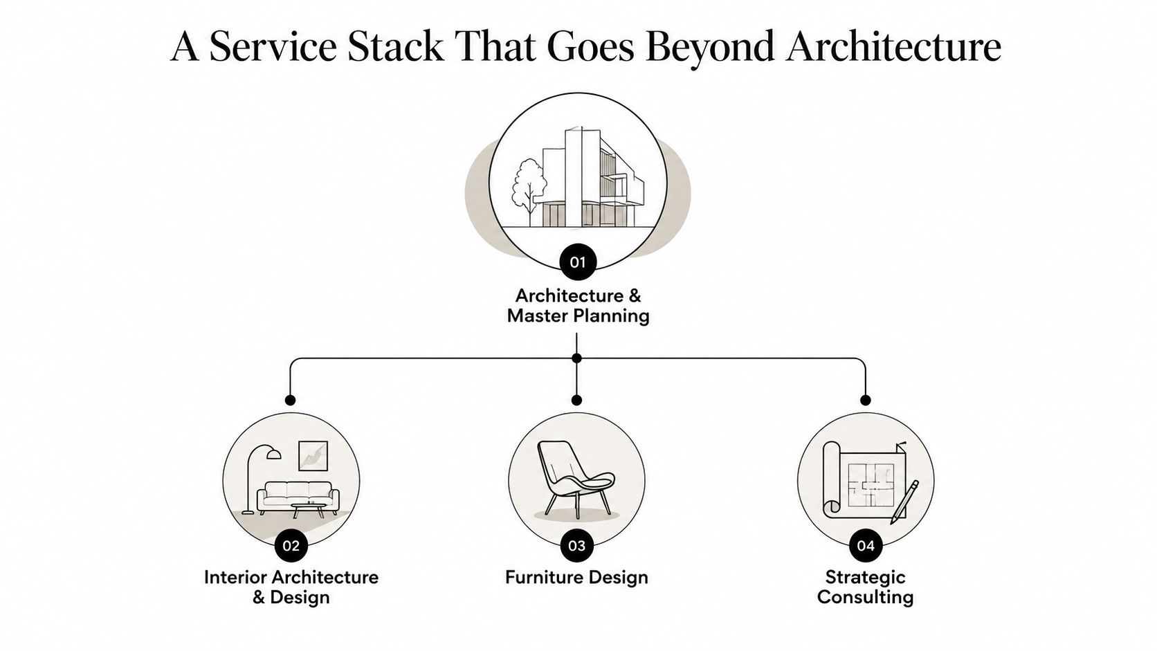
A Service Stack That Goes Beyond Architecture
Those searching for Bauer Askew expect one thing, architecture. The public profile is broader than that. Third-party listings describe architectural design, master planning, interior architecture and design, furniture design, and graphic design/detailing as part of the service stack (Clutch), and the firm's own materials describe a multi-discipline design practice. That's not a minor branding note. It changes how a shoot needs to be planned.
Why the breadth matters on camera
When a firm coordinates furniture and graphic detailing alongside the shell of the building, the smallest object starts carrying design weight. A chair, a directory sign, a reception desk edge, those details aren't filler anymore. They're part of the same language as the walls, ceilings, and circulation paths.
That means a photographer can't treat the room as a backdrop and the furnishings as temporary props. They need to be staged as evidence of the design system. If the shot list ignores the furniture layer, it misses a core part of what the firm sells. If it over-styles the scene, it turns the space into a generic editorial set and erases the restraint that makes the work legible.
The more disciplines a firm coordinates, the more every frame has to prove coordination.
There's also a sequencing issue. A project like this usually needs wide establishing views, followed by tighter frames that show how interior elements lock into the architecture. The right image order should help a viewer move from the room to the details and back again without losing the thread.
For brand teams, that means the photography brief should be about more than “capture the lobby” or “show the workspace.” It should ask which parts of the integrated system need to be visible so the image set reflects the actual practice, not just the prettiest corner.
Reading Their Design Philosophy Through a Lens
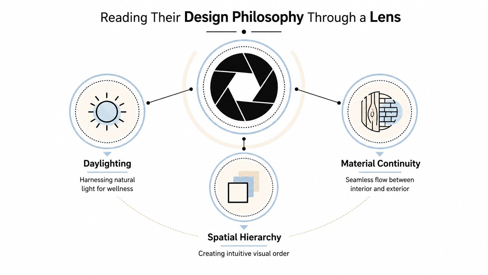
Shoot this firm on a bright morning, and the first thing that changes is not the furniture or the finish palette. It is the way the building starts working for the camera. For Bauer Askew, the public credentials point to a performance-minded practice, with daylighting, material continuity, and a clear spatial hierarchy shaping how the spaces read on site and in photographs (LeadiQ). Those qualities are visible only if the photographer plans for them instead of treating them as background conditions.
Daylight needs timing, not luck
Daylighting is easy to name and difficult to photograph well. If the windows dominate the frame, exposure has to hold the interior values and the exterior brightness at the same time, or the room will start to feel flat. On shoot day, that usually means arriving early, watching how the sun moves through the envelope, and deciding which views need a soft ambient read versus a frame with stronger contrast.
Material continuity needs color discipline
Stone, wood, metal, and painted surfaces can shift quickly if white balance is handled carelessly. A careful edit keeps the palette neutral enough for the viewer to see which materials belong together and which ones are there to create contrast. If the tonality leans too warm, the architecture can feel heavy. If it leans too cool, the room loses the human warmth many clients want in healthcare, civic, or workplace settings.
Spatial hierarchy needs visual order
This is the part many portfolio images flatten. Good hierarchy means the camera helps the viewer understand what leads, what supports, and what recedes. Long corridors, framed thresholds, and layered volumes need to be photographed so the eye moves through the image in a controlled way instead of bouncing around.
Useful test: if you cannot tell where the room wants your eye to go, the photograph probably missed the plan.
That test is simple, but it tells you a lot. It separates a technically sharp image from one that communicates the architect's intent. For a practice like this, that difference matters because the design language depends on clarity, not visual noise.
Signature Project Types and What They Look Like
Bauer Askew's public footprint includes a broad service range, so it helps to think in archetypes rather than in a list of project names. Their work reads as the kind of practice that can move between adaptive reuse, civic and healthcare interiors, and hospitality-grade commercial environments without changing its core language. The visual thread is usually the same, even when the program shifts.
In adaptive reuse, I'd expect a shoot to hinge on contrast between old structure and new insertions. That means showing brick, steel, or aged framing in relation to cleaner interior moves, and keeping the frame honest about where the original envelope ends and the intervention begins. In healthcare and civic interiors, the priority changes. The camera needs to emphasize wayfinding, calm circulation, and the dignity of materials rather than decorative abundance.
| Bauer Askew Project Archetypes at a Glance | Typical Spatial Cues | Photography Priority |
|---|---|---|
| Adaptive Reuse | Exposed structure, layered thresholds, visible old and new construction | Show contrast without making it feel chaotic |
| Civic or Healthcare Interiors | Clear circulation, restrained palettes, intuitive room sequencing | Preserve legibility and calm |
| Hospitality-Grade Commercial Space | Warm transitions, reception focus, furniture that anchors the room | Balance atmosphere with function |
A hospitality-style commercial environment asks for a different rhythm. The viewer should feel welcome, but not distracted. That usually means framing lobbies and common areas in a way that shows how the furniture, lighting, and circulation work together. If the space has long axial runs or layered glazing, I'd photograph those as transitions, not just as isolated design moments.
The images that travel best outside the client's own website are usually the ones that show both the whole and the part. An editorial feature wants context. A brand campaign wants a memorable detail. A procurement or development audience wants proof that the space functions effectively. The strongest Bauer Askew set should satisfy all three without feeling repetitive.
Awards Recognition and What It Signals
A Bauer Askew project that has earned outside recognition usually carries a different kind of pressure in front of the camera. The firm is described in independent business profiles as an award-winning practice with recognition at the local, state, and national levels. That matters less as a trophy count and more as proof that the work has already been tested against peer review and external standards.
For photography, that changes the brief in a practical way. The images are not only there to show finishes or occupancy. They often become part of the firm's public case for quality, which means they need to hold up when other designers, editors, and award juries look closely. If the project may be submitted, published, or reused across multiple channels, the documentation has to be cleaner and more controlled than a typical marketing gallery.
The standard is the same one the architecture sets. If the design is judged on restraint, coordination, and clarity, the photography should be judged that way too. That means keeping color honest, controlling contrast, and avoiding compositions that add drama where the building already has enough structure.
For teams preparing submissions, this architecture awards photography guide is a useful reference point for how award-ready imagery is usually evaluated. The same logic applies whether the final use is an awards board, a publication editor, or an internal case study.
The signal is consistency. A firm that keeps appearing in recognized circles usually expects its imagery to meet the same standard, which is why the shoot brief needs to be as disciplined as the design process.
Commissioning Photography That Fits the Work
The right photography plan starts before the shoot date is locked. For a practice like Bauer Askew, the brief should identify which spaces need daylight control, which details carry the firm's design language, and which rooms need to be sequenced together so the project reads as a whole. That's especially important when interiors, furniture, and graphic details all matter at once.
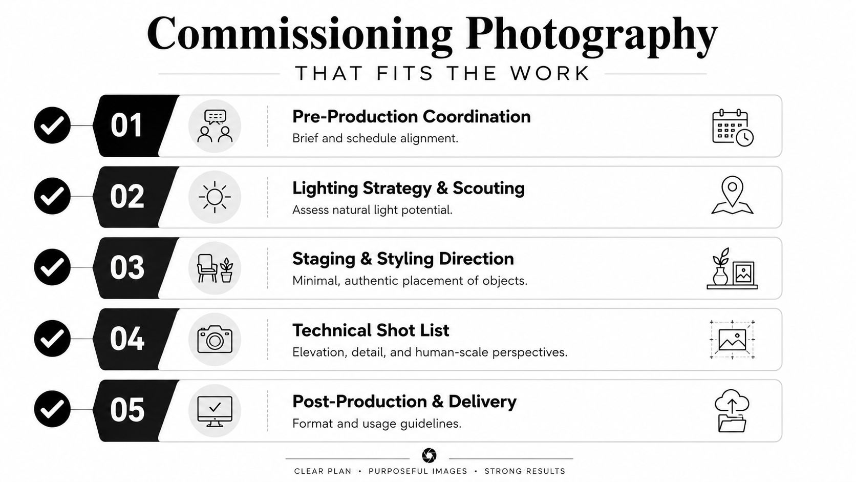
What should happen before the camera comes out
- Pre-Production Coordination: Align on room access, shot priorities, and the order of spaces so the day doesn't get wasted resetting locations.
- Lighting Strategy and Scouting: Check where natural light will help and where it will create glare, especially in glazed interiors.
- Staging and Styling Direction: Keep objects minimal and authentic, because over-styling usually fights the clean visual logic of the architecture.
- Technical Shot List: Ask for elevation views, detail frames, and human-scale images so the set feels complete.
- Post-Production and Delivery: Define usage needs early, so the final files support web, editorial, and portfolio use without awkward resizing later.
For this kind of work, the biggest mistake is treating photography as a final-day add-on. The room's sequence, the furniture placement, and even the way people are expected to move through the space should all shape the camera plan. If the design language is integrated, the images need to be integrated too.
The practical payoff is a stronger set of deliverables. You get one image that establishes the architecture, another that clarifies the interior rhythm, and tighter frames that prove the material and furniture decisions were intentional. That mix gives marketing teams flexibility without forcing them to crop away the story.
A useful reference for that kind of planning is this commercial architectural photographer guide, especially if the final images need to work across marketing, editorial, and client presentation use cases.
What Comes Next for the Firm and Its Imagery
A firm that's been working since 1995 doesn't need imagery that only feels current for one campaign cycle. It needs images that still make sense when the project is referenced years later, because the built environment ages in public. Bauer Askew's mix of architecture, planning, interiors, furniture, and graphic detailing suggests a practice that will keep relying on coordinated visuals, not isolated glamour shots.
That's why the photography conversation should be about durability. In 2026, commissioned imagery ought to account for future awards entries, case studies, website updates, and print use without needing a reshoot every time the messaging shifts. The more complete the visual record, the easier it is for the firm to show continuity between intent, execution, and public presentation.
Long-lived practices usually win on coherence. Their work feels like it belongs to a point of view rather than a trend. The best images should do the same, which is why the right shoot plan leans toward clarity, restraint, and images that can age with the portfolio instead of aging out of it.
A CTA for Jimmy Clemmons Photographer.