
I arrived just after dawn, when Atlanta's light is still cool and disciplined, and the High Museum hadn't yet filled with footsteps. At that hour, Renzo Piano's expansion doesn't read first as an object. It reads as a lens for light itself.
First Impressions Experiencing Piano's Vision of Light
The first thing to understand about the Renzo Piano High Museum is that you can't photograph it well if you approach it as a static icon. It isn't a building that gives up its character in a single frontal view. It changes with the sky, with the bounce off paving, with the brightness moving across white surfaces and slipping into glass.
That matters because the High isn't just another museum commission. It holds more than 20,000 works of art, with major strengths in American decorative arts, folk and self-taught art, modern and contemporary art, and photography, which places it among the significant cultural institutions in the United States, as noted in the High Museum overview. When you photograph the campus, you're not just documenting architecture. You're photographing a civic container for a serious collection.
What dawn reveals
Early light is unusually honest here. It describes edges without flattening them, and it lets Piano's surfaces stay luminous instead of burning out. If you arrive too late on a bright day, the white and pale materials can collapse into glare, especially if you expose for the shadows under overhangs or inside glazed thresholds.
That's why I like the building before the city fully wakes up. You can study how the expansion receives light rather than just reflects it. If you're planning a site visit, the thinking behind choosing the best light for a site shoot applies directly here. The timing isn't a stylistic preference. It determines whether the photographs describe design intent or merely record surfaces.
Practical rule: At the High, light quality matters more than dramatic sky. A plain morning often produces stronger architectural images than a flashy late-day sky with harsh contrast.
Why the building feels open
Piano inherited a difficult condition. Richard Meier's original museum had a strong identity, and strong identities are hard to extend without either submission or conflict. The expansion succeeds because it doesn't imitate Meier and it doesn't try to overpower him. It changes the conversation from monument to campus, from singular object to connected experience.
For photographers, that means your first instinct should be relational. Don't ask, “What's the hero shot?” Ask, “Where does the building explain itself through light, threshold, and adjacency?” The best frames usually include more than one condition at once. Glass and shadow. Solid wall and open court. Interior brightness and exterior structure.
That's the key to seeing Piano's work here. He doesn't stage light as decoration. He uses it as the building's primary evidence.
The Design Dialogue Between Meier and Piano
Renzo Piano's expansion worked because it accepted that the original museum already had a clear architectural voice. The commission wasn't to erase that voice. It was to answer it. In 1999, the Renzo Piano Building Workshop was entrusted with an expansion project that doubled the size of the existing High Museum of Art, which Richard Meier had designed more than three decades earlier, according to the Renzo Piano Building Workshop project record.
That single fact explains a lot about the architecture and about how to photograph it. A project that doubles a museum can easily become clumsy. It can turn into a matter of added square footage, awkward joints, and visual competition. Piano avoids that by making the addition read as a calibrated response.
Meier's firmness and Piano's permeability
Meier's architecture is disciplined, formal, and self-contained. Piano's expansion is lighter in temperament. It's more porous, more willing to let public space become part of the museum experience. When you move through the campus, the contrast doesn't feel like disagreement. It feels like an edited conversation between two ways of making modern civic architecture.
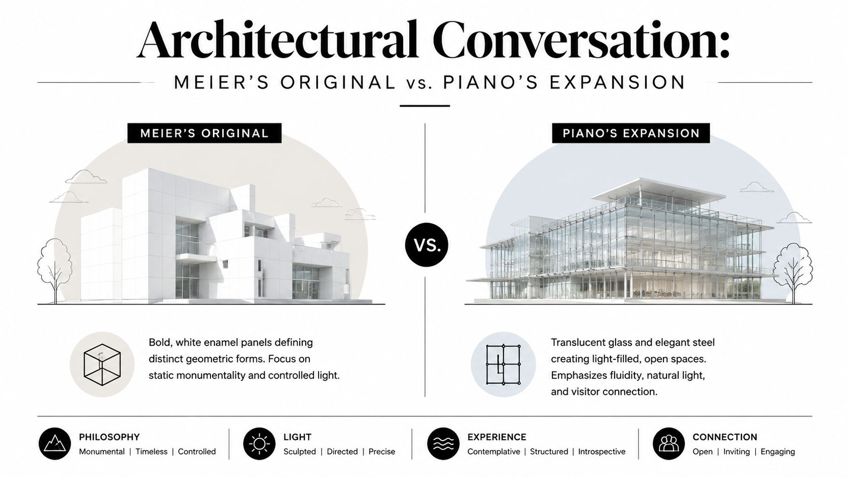
For architects, that dialogue is intellectually satisfying. For photographers, it's compositional gold. You have contrasting masses, different light behavior, and multiple opportunities to show one building sharpening the identity of the other.
| Condition | Meier | Piano |
|---|---|---|
| Spatial reading | More object-like | More campus-like |
| Light character | Controlled and formal | Diffused and connective |
| Photographic strategy | Isolate geometry | Layer views through glass and circulation |
What works in photographs and what doesn't
The most common mistake is treating Piano's work as a standalone pavilion series and ignoring Meier altogether. That loses the central idea. The expansion has force because it responds to an existing landmark. If you crop out that relationship too aggressively, you document pieces rather than a project.
A better approach is to look for moments where old and new share a frame without visual clutter. You want tension, not confusion.
- Use overlap deliberately. Let one building sit partially behind the other so the frame shows architectural succession, not just coexistence.
- Favor oblique views. Straight-on elevations can become too diagrammatic. Angled views often reveal the conversation more clearly.
- Watch vertical alignment. A slight shift left or right can clean up competing mullions, edges, and parapets.
Photographing the Renzo Piano High Museum as a sequence of isolated details misses the point. The project gains meaning in the spaces between buildings.
The campus as civic architecture
Piano's real achievement here isn't only visual refinement. It's the way he loosens the institutional edge of the museum. The expansion feels less like a fortress and more like an invitation. Open circulation, transparent boundaries, and a generous central public zone all support that reading.
That's where the building becomes especially useful as a subject for professionals. It demonstrates that a museum addition can preserve authorship while changing tone. It can stay rigorous without feeling remote. From behind the camera, that means you're always balancing two truths in the same image. The High is still a museum of serious form. It's also a place Piano worked hard to make publicly legible.
Composing with Steel Glass and Light
Materials at the High aren't just finish selections. They're instruments. Steel sets rhythm, glass moderates openness, and pale cladding catches enough light to keep the whole composition airborne rather than heavy. If you photograph the building as if material were secondary to form, the images will feel thin.
The strongest frames come when you let material behavior lead the composition. Ask what each surface does to light before you decide what each surface looks like.
The piazza as a technical and visual device
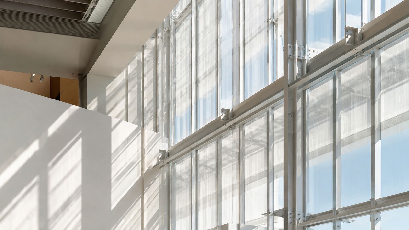
The most consequential move in the expansion is the piazza. Its significance isn't only urban or experiential. It's technical. The piazza uses a 100-foot span of structural glass to create a climate-moderated public space that acts as a thermal buffer, reducing heating loads on adjacent galleries by an estimated 15 to 20 percent compared with traditional enclosed atriums, as described by the Georgia Encyclopedia entry on the High Museum of Art.
That performance matters to photographers because it explains the space's visual calm. The glazing isn't there for spectacle alone. It supports an intermediate zone, neither fully exterior nor conventionally interior, and that in-between quality is exactly what gives the piazza its photographic depth.
How to read the material palette
Piano's language here is restrained, which means small differences matter. Steel members aren't background lines. They establish spacing and cadence. Glass isn't a blank transparent sheet. It's a surface that holds reflections, softens transitions, and can either collapse or expand depth depending on your angle.
Use the materials as compositional cues:
- Steel for structure. Let columns, joints, and rails anchor the frame when surrounding light is diffuse.
- Glass for layering. Shoot through it when you want overlapping planes. Shoot across it when you want reflected geometry.
- Pale surfaces for luminosity. Expose carefully so these areas keep texture. Once they clip, the architecture loses subtlety fast.
Trade-offs in the field
This building punishes lazy exposure. If you expose for bright glazing without watching shadow detail, interior spaces go dead. If you lift shadows too aggressively, the galleries can lose the restraint that makes them work.
A simple field checklist helps:
- Check edge highlights first. White walls and bright glass will fail before midtones do.
- Move your position before changing gear. At the High, reflection problems are often solved by shifting angle, not by adding accessories.
- Wait for separation. A visitor crossing a bright threshold can give scale and depth, but only if they're cleanly isolated.
The High rewards patience more than speed. Most of the best images happen after you stop chasing the obvious wide shot and start studying how the materials edit the light.
Navigating the Visitor's Journey and Spatial Flow
Piano's expansion is best understood in motion. The architecture isn't arranged as a sequence of isolated rooms. It unfolds through a central gathering space, then through transitions, bridges, ramps, and top-lit galleries that alternate between orientation and absorption. For a photographer, that means circulation is not background information. It's the subject.
The campus works because the route never feels accidental. Movement is guided, but not over-scripted. You're given enough visual information to keep advancing and enough pause points to register where you are.
The piazza as the spatial hinge
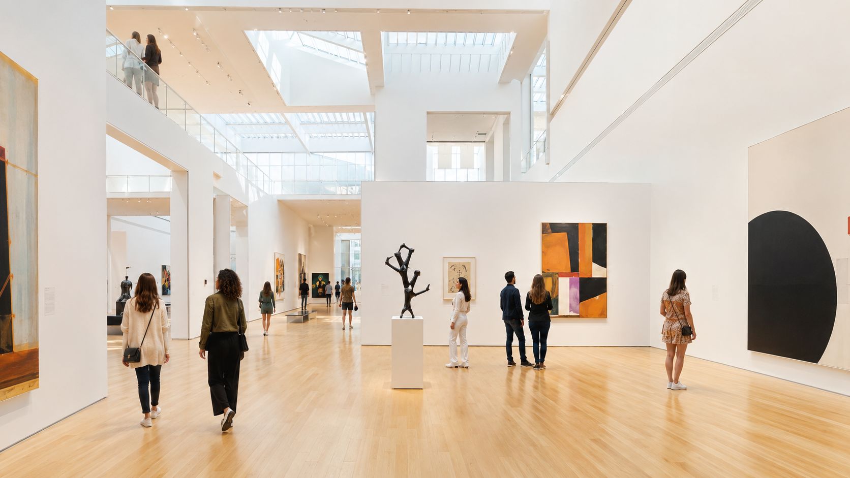
The piazza is the project's social and visual hinge. It gathers people before distributing them. It also lets you understand the campus quickly because it reveals multiple directions at once. In practical terms, it serves as the starting point for your shoot if you want to map the building before committing to a lens.
From there, the museum starts to alternate between openness and containment. Broad public volume gives way to more focused gallery conditions. Bridges and glazed passages restore orientation. Then the sequence tightens again.
That pattern matters because it creates what photographers need most in architectural storytelling: variation with coherence.
How circulation creates composition
The easiest way to miss the architecture is to stand still too long in obvious places. Piano designed transitions that produce better images than many destinations do. A bridge view, a ramp landing, or a threshold looking back into the piazza often explains the building more clearly than a centered shot in a gallery.
If you think in terms of architectural composition and visual flow, the museum gives you repeating opportunities to work with recession, framed depth, and human movement without forcing the image.
Consider these recurring spatial effects:
- Compression into release. Narrower passages make larger spaces feel brighter and more legible.
- Diagonal sightlines. These extend depth and help connect one pavilion to another.
- Pause points. Landings and bridge entries often produce the cleanest layered frames.
A useful shooting map
| Location type | What it gives you | Best compositional use |
|---|---|---|
| Piazza edge | Long views and visitor movement | Establishing frames with scale |
| Bridge or connector | Layered glazing and overlap | Depth, reflection, sequence |
| Gallery threshold | Transition from public to contemplative | Contrast in light and mood |
Don't treat visitors as interference. In this building, carefully placed human presence often completes the frame by clarifying scale and circulation.
The visitor journey also shapes mood. Public zones feel open-ended and civic. Gallery zones become quieter and more disciplined. Good coverage respects that shift. If every image is equally wide and equally bright, the story flattens. A key success of the Renzo Piano High Museum lies in how smoothly it moves people from collective space into attentive viewing.
A Photographer's Brief Capturing the High Museum Expansion
If you're photographing the Renzo Piano High Museum for architects, editors, or cultural clients, your job isn't to prove that the building is attractive. That's easy. Your job is to show why it works. The right brief is part exterior study, part circulation study, and part light study.
Too many shoots at major museums become a hunt for dramatic hero frames and little else. At the High, that approach produces a thin edit. The building's character lives in relationships: Meier to Piano, glass to structure, public court to gallery, and visitor to volume.
The shot list that earns its keep
Start with a disciplined set of essential views before experimenting. A practical framework like the one used in photographing architecture and interiors fits this project well, especially when you need a coherent final edit rather than a collection of one-off images.
Here's the shortlist I'd prioritize on location:
- Context frame with both architectural voices. Find a view where Meier and Piano share the frame without competing clutter. This image establishes the project's central premise.
- Piazza wide shot. Show the public volume as space, not just enclosure. Include enough floor and vertical structure to make the scale readable.
- Bridge or connector layer. Use glazing, rail lines, and overlapping volumes to express movement through the campus.
- Material detail study. Get close enough to show how steel, glass, and pale surfaces meet. One good detail image can rescue an otherwise generic edit.
- Gallery threshold with human scale. Wait for a visitor to cross cleanly through light. That gives proportion and life without turning the image into event coverage.
Lens choices that actually help
This building doesn't demand one signature focal length. It rewards selective restraint.
| Lens approach | Best use at the High | Common failure |
|---|---|---|
| Wide-angle | Piazzas, connectors, overall spatial logic | Distorted verticals and empty foreground |
| Normal range | Thresholds, room relationships, balanced interiors | Frames can feel too polite if composition isn't tight |
| Short telephoto | Facade compression, details, layered structure | Easy to lose context if overused |
A wide lens is useful, but only when the foreground has a job to do. Empty paving and exaggerated corners weaken this building fast. In many spots, a normal focal length gives a more faithful sense of proportion and lets Piano's geometry breathe. Short telephoto views are especially effective when you want to compress facade layers or isolate the junction between old and new.
Timing and reflections
Morning is usually the safer choice if you want calm tonal separation on pale materials. Later light can create stronger shadow patterns, but it also raises the risk of hot highlights and harsher reflections across glazing. Neither is automatically better. It depends on the story you need.
Use this simple decision guide:
- Need clarity and softness? Go early.
- Need stronger graphic contrast? Return when the sun is higher and side light defines structure.
- Need interior-exterior balance? Work when brightness difference is manageable and move constantly to control reflection angles.
Reflections at the High are rarely a problem to eliminate. They're a design condition to manage. The trick is deciding when they add depth and when they obscure form.
What not to do
A few habits consistently weaken coverage here.
- Don't over-center everything. Symmetry can be effective, but if every frame is frontal, the building loses its sense of flow.
- Don't chase only empty spaces. This museum was designed for public use. A selective amount of human presence often improves the image.
- Don't flatten the edit with all-wide views. You need a mix of context, sequence, and detail to communicate the architecture fully.
I'd also avoid oversaturating color in post. The High's strength is tonal subtlety. Push the files too hard and the material relationships start to feel synthetic. Keep whites clean, hold highlight detail, and let the structure remain crisp without making the building look brittle.
The final edit should read almost like a walk. Approach, arrival, entry, orientation, movement, pause, and detail. If the photographs can do that, they'll capture more than appearance. They'll capture intent.
The Enduring Legacy of Piano's Atlanta Landmark
The High Museum expansion lasts in memory because it solves more than one problem at once. It respects a powerful existing building, enlarges the institution's civic presence, and uses light as a spatial medium rather than an afterthought. That combination is why the project still matters to architects and why it remains such a rewarding subject for photographers.
What stays with me most is how little of its impact depends on spectacle. The building doesn't need aggressive form-making to hold attention. It works through calibration. Public and private zones are carefully tuned. Materials are restrained. Transparency is used with discipline. The result is architecture that feels open without becoming vague.
Why it still photographs well
Many museum additions date quickly in photographs because they rely on novelty. Piano's work here holds up because the images can keep finding new evidence in the building. One visit might focus on the conversation with Meier. Another might turn on circulation, threshold, or the behavior of morning light through glass.
That's a sign of durable architecture. It remains legible at multiple distances and under different readings.
The larger lesson
The Renzo Piano High Museum also offers a useful lesson for practice. Additions don't have to mimic, and they don't have to revolt. The strongest ones establish a disciplined difference. Piano achieved that in Atlanta by making the museum feel more connected, more permeable, and more publicly inhabited, while still giving art the calm and control it needs.
For photographers, that legacy matters. This isn't a building you finish in a handful of hero shots. It asks for patience, sequencing, and a willingness to let light lead the work. When you photograph it that way, the architecture gives back.
If you need architectural imagery that treats buildings with this level of precision, Jimmy Clemmons Photographer creates design-focused photography for architects, developers, brands, and editorial clients across Atlanta and the region. The work is grounded in strong composition, controlled light, and a clear narrative sense of how people experience space.