

You're on location at blue hour. The lobby looks immaculate in person. Brass pendants glow warm over the reception desk, the glass curtain wall carries a cool dusk wash, and a back corridor hides a patch of greenish overhead spill you barely noticed during the scout. Then you open the first frame and the room falls apart. The windows go electric blue, the lamps turn orange, the millwork shifts muddy, and skin picks up two different colors at once.
That's the moment mixed lighting photography stops being an abstract technical topic and becomes a professional responsibility. In architectural and commercial work, you can't hand-wave it away with auto settings or promise to sort it out later. The image has to feel controlled. Critically, it has to feel intentional.
Beyond Correction The Mindset for Mixed Lighting
The usual advice treats mixed light as contamination. Find the cast. Neutralize it. Move on. That works if all you want is damage control. It fails when the assignment asks for atmosphere, material fidelity, and a point of view.
Mixed light means multiple sources with different color temperatures existing in the same frame, often spanning roughly 1000K to 10,000K according to Photzy's mixed light overview. That's why a twilight interior can feel elegant in person and chaotic on camera. Your eye adapts fluidly. The sensor doesn't.
Correct is not always compelling
A strong architectural image often needs two things at once. It needs believable color, and it needs visual separation. Warm practicals can make a lounge feel inhabited. Cool window light can preserve the structure of the exterior and define the edge of the room. If you flatten both into one neutral compromise, the file may be technically cleaner, but the image often loses depth.
That gap shows up in how photographers talk about the problem. Discussion around the topic often defaults to simple correction, while the stronger creative opportunity is intentional white balance polarization for stylistic separation, especially in markets that want a more design-driven look, as noted in this Reddit discussion on handling mixed color shifts.
Mixed light becomes useful when you stop asking, “How do I erase this?” and start asking, “Which color story serves the frame?”
In practice, that means deciding which parts of the image should stay warm, which should stay cool, and where the handoff happens. A restaurant interior at dusk may benefit from warm pendants against cooler glazing. A corporate portrait in a glass-walled office may need a neutral face with warmer background lamps kept as accents.
Why auto settings fail
Auto white balance is the fastest way to lose control in mixed lighting photography. Cameras tend to pick a side rather than split the scene gracefully, which is exactly why those first frames often look wrong. One exposure makes the practicals feel radioactive. The next makes the windows dead and gray.
The professional mindset is different. You don't wait for the camera to interpret the room. You decide what the room should look like, then build toward that result. Sometimes the right move is correction. Sometimes it's deliberate contrast. The mistake is letting the camera make that aesthetic call for you.
The Pre-Production Blueprint for Complex Light
Mixed lighting problems are usually solved before the lights come on. If the room is complicated, the prep has to be simple and disciplined.
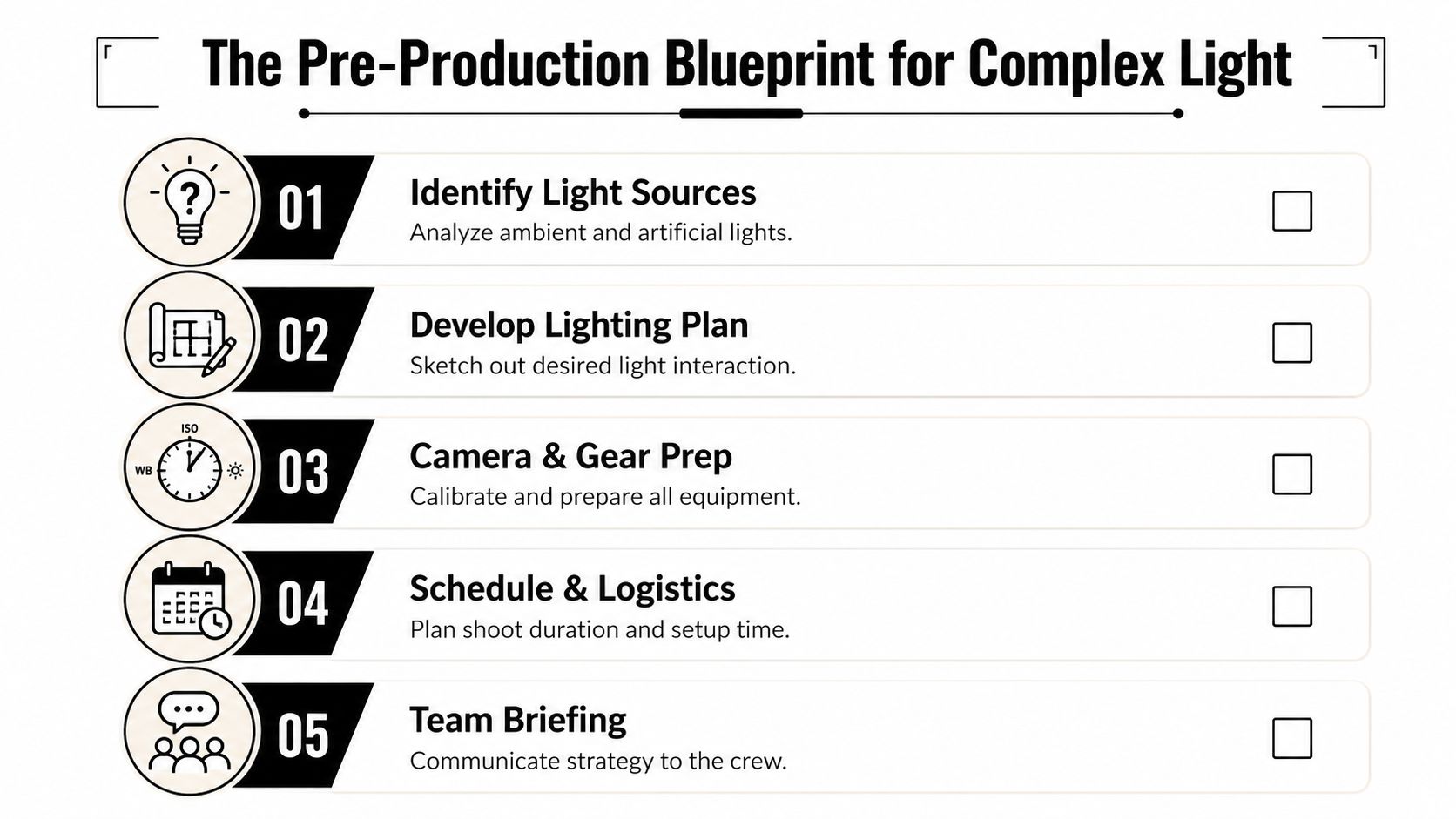
Walk the space like a lighting designer
The first pass through a location isn't about composition. It's about source mapping. Look for every contributor, not just the obvious ones. Window light, recessed cans, sconces, under-cabinet strips, decorative fixtures, hallway spill, monitor glow, elevator indicators, and daylight bouncing off exterior pavement all affect the file.
WhiteWall describes a reliable five-step process for these scenarios: analyze the sources, plan adjustments, shape the light, manually set white balance, and shoot tests in order to prevent distortion and surprise color shifts in the final frame, outlined in their guide to mastering mixed lighting scenarios.
A useful scout note should answer these questions:
- What stays on: Practical fixtures that support the design concept.
- What gets killed: Problem lights that add noise, not character.
- What changes over time: Window light at dusk, sun patches, reflections, and occupancy-driven spill.
- Where skin will sit: Any portrait element needs its own clean source strategy.
Build a shot-specific plan
I don't approach a mixed-light interior with one master setup. Each hero angle gets its own hierarchy. First, choose the dominant source. Then decide whether the secondary sources are supporting tone, background texture, or a focal accent.
A clean planning framework often looks like this:
| Decision point | What to define before setup |
|---|---|
| Dominant source | Daylight, practicals, or added flash |
| Color strategy | Neutral blend or deliberate warm/cool separation |
| Fixture control | Which lamps dim, switch off, or stay visible |
| Added light | Flash or LED placement, direction, and spread |
| Testing | Reference frames for highlights, skin, and materials |
That previsualization matters most during twilight work because the useful window is short. The room won't wait while you debate a gel choice or search menus.
Workflow note: If a location has good architecture but bad light logic, fix the logic first. Composition gets easier when the room stops fighting itself.
Prep gear for a narrow window
Complex light punishes reactive shooting. Batteries charged, gels sorted, stands labeled, triggers paired, tripod ready, custom white balance strategy decided. If you're still assembling basics at dusk, you're late.
For a practical checklist on evaluating location conditions before the shoot, I'd point photographers to this piece on choosing the best light for a site shoot. The principle is simple. You don't arrive to discover the light. You arrive to execute a plan for it.
On-Set Strategy Metering Gels and Exposure
A critical test arises when the client is standing behind you, the sky is dropping by the minute, and the room contains three different color temperatures that all look important. At that point, mixed lighting stops being a white-balance problem. It becomes a design decision about what the frame should feel like.
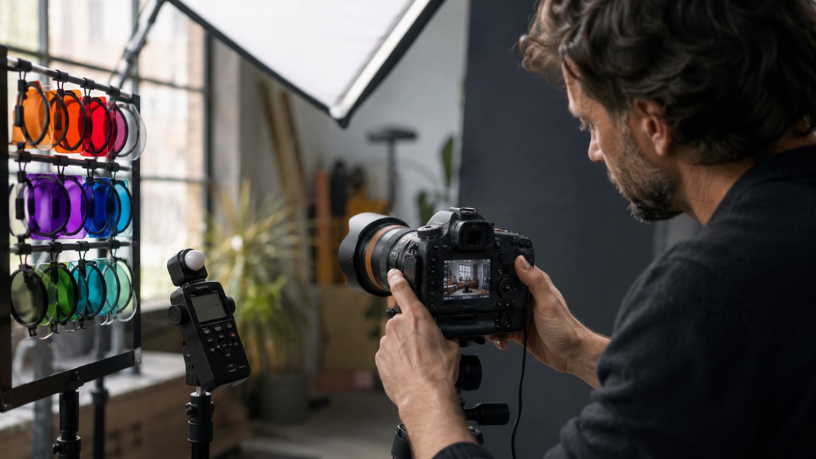
Start in manual and meter the room
Manual exposure and RAW capture are the baseline. If shutter, aperture, and ISO are drifting while you evaluate color relationships, you lose the ability to judge what each source is doing.
I meter the ambient first, with no added light. I want one clean read of the room as it exists. Then I break the scene into roles. Which source defines the architecture. Which source gives atmosphere. Which source needs to stay off the hero surfaces.
Shutter speed sets how much of the existing room tone stays in play. Aperture and flash power decide how assertively the added light shapes the subject or interior details. ISO is the pressure valve. It helps balance the system, but if ISO is doing all the rescue work, the lighting plan usually needs correction.
The practical split is simple. Either one source owns the important surfaces, or two sources stay intentionally separate. The Phoblographer lays out that choice well in their article on using speedlights to conquer mixed lighting. On set, that means deciding whether to let flash take control, or preserve a warm/cool contrast that adds depth without contaminating the same plane.
When to overpower ambient light
I use this approach when the mix is ugly, the schedule is tight, and the subject has to read cleanly. Corporate interiors are a common example. Daylight from one side, orange practicals overhead, green spill from a bad fixture in the corridor. If all of that lands on skin or a white wall, the file gets harder to trust.
The fix is controlled dominance.
- Put the flash where the believable light should come from: If the window side gives the right shape, place the strobe near that axis.
- Build enough spread for the space: Broad coverage keeps the added light from looking spotty or theatrical unless that is the intent.
- Expose for clear priority: The subject, key surface, or hero furniture piece should read under one primary source.
- Gel with purpose: If warm practicals are part of the story, bring the flash toward that color family instead of forcing a cold daylight flash into the room.
That discipline is part of stronger artificial lighting in photography. Consistency across a campaign depends on making the light look intentional from frame to frame, not just technically passable.
When to let ambient lead
Architectural photographs often get more interesting when daylight and practicals keep their separation. A cool window plane against warm interior fixtures can describe depth better than a fully neutral frame. It can also tell the truth about how the space is experienced.
That only works if the sources are assigned to different jobs.
Window light can shape the room. Practicals can give rhythm and warmth deeper in frame. A small strobe or LED can lift a dark corner, add polish to millwork, or hold detail in furniture without flattening the scene. What hurts the image is equal influence on the same critical area. Skin goes muddy first. Then white walls pick up inconsistent color, brass turns dirty, and polished stone starts reflecting confusion instead of form.
A short visual reference helps here:
Gels are not decoration
A gel is a correction tool and a storytelling tool. It changes how one source belongs with another.
If flash stays neutral while the room runs warm, the flash announces itself immediately. Sometimes that contrast is useful. More often, it looks like the added light was solved in isolation from the architecture. I would rather decide that relationship on set, in front of the scene, than try to rebuild it later across mixed surfaces and reflections.
A full CTO, half CTO, or minus green gel is rarely about technical purity. It is about protecting the hierarchy you chose earlier. Maybe the flash should disappear into the practicals. Maybe it should sit slightly cooler so the foreground stays crisp while the background drifts warm. Both are valid. The mistake is using a gel because it came in the pouch, not because the scene asked for it.
Set rule: Gel to control relationships between sources. Meter to confirm placement. Expose to protect the story of the room.
On a high-stakes commercial shoot, that sequence saves time. More important, it gives you a frame with intention built into it before post ever starts.
Tethering for Real-Time Precision
A mixed-light frame can look settled on the camera and still fail on a calibrated screen. I have seen a lobby shot pass review on the rear LCD, then open on the laptop with a sick green strip across the ceiling and a magenta drift in the marble near the windows. By then, the crew is waiting and the client wants to move to the next setup. Tethering prevents that kind of expensive optimism.
Why the camera screen misleads
The problem is not only screen size. It is context. You are reviewing color on a bright, non-reference display while standing inside the same warm practicals, cool window spill, and overhead contamination you are trying to judge. Your eyes adapt to the room faster than you realize, so the preview starts to feel more correct than it is.
A tethered, calibrated display breaks that spell. The file appears with enough scale to judge transitions between zones, not just overall exposure. White paint that looked clean on camera may show a green bias near the sconces. A neutral sofa may shift blue where it catches skylight. Those are not post-production details. They are design decisions that still need to be made on set.
What I check once the file lands
I do not tether for convenience. I tether to evaluate relationships.
First, I check the frame globally. Does the room hold together, or does each light source announce itself as a separate event? Then I zoom into the problem surfaces: white walls, stone, brushed metal, glossy millwork, and fabric near windows. Those materials reveal small color conflicts fast.
The next pass is comparative. I will review one frame with the practicals dominant, another with flash carrying more of the foreground, and a third with a slightly different white balance or gel choice. Side by side, the right answer usually becomes obvious. That is also the moment to confirm whether the scene wants neutrality or a controlled split between warm and cool zones. If the mood is the point, I protect it here and leave cosmetic cleanup for later. A good reference for that broader visual intent is strong color grading in photography, but the foundation still has to be built in capture.
What tethering improves on set
- White balance decisions get clearer: You can judge whether neutrals stay believable while the room keeps its intended warmth or coolness.
- Gel mismatches show up early: A light that feels close enough on camera often reads as obviously wrong on a proper display.
- Material rendering stays honest: Stone, wood, brass, and painted surfaces keep their identity instead of drifting toward muddy compromise.
- Client review becomes more precise: Designers and art directors respond better when they can assess atmosphere and finish color at full size.
- Retouching gets smaller: Small on-set corrections preserve texture and save time compared with broad color surgery later.
On architectural and commercial assignments, tethering is how you verify that the color story survives contact with real materials, reflective surfaces, and client scrutiny.
That feedback loop protects more than exposure. It protects intent. You do not finish the setup hoping the frame will hold together in post. You finish knowing the warm pool from the practicals, the cooler daylight edge, and the neutral anchor points are all doing the job you assigned them.
Post-Processing The Final Blend and Polish
Good post work finishes the lighting design. It doesn't invent one from scratch. If the capture is disciplined, editing becomes selective and precise rather than desperate.
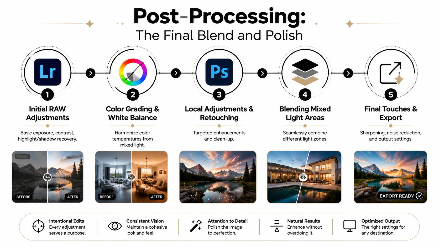
Build the file in stages
I start in Lightroom with a base RAW interpretation that respects the dominant intention of the frame. Not every zone needs to be neutral. The target is coherence.
A practical sequence looks like this:
- Set the global baseline: Exposure, highlights, shadows, and overall white balance.
- Check key neutrals: Walls, stone, fabrics, and skin if people are present.
- Identify outlier color patches: Cyan window spill, orange practical bounce, or green overhead contamination.
- Apply local corrections before stylizing: Fix the problem areas first.
- Move to Photoshop only when the file needs blending or deeper retouching.
Use local color control, not brute force
One of the most useful tools in mixed lighting photography is Lightroom's Color Range Masking. Professionals use it to isolate outlier colors like cyan or orange and then correct with Temp, Tint, or Hue adjustments, which is far safer than globally desaturating channels and risking the “weird looking artifacts” described in this video discussion of mixed-light skin correction.
That matters because global fixes often break the frame. Pull too much blue from the whole image and the twilight windows go lifeless. Pull too much orange and the practicals stop feeling intentional.
A better edit separates the problem from the atmosphere.
- Select the offending color range: Don't paint broad adjustments unless you have to.
- Feather the correction carefully: Hard edges look synthetic fast.
- Watch surfaces, not just color patches: Metals, skin, and painted walls react differently.
- Preserve designed warmth: Correct contamination, not mood.
For broader finishing decisions beyond neutral correction, thoughtful color grading in photography helps keep the image feeling designed rather than mechanically balanced.
Blend exposures when the room needs it
Some architectural scenes need more than one frame. One exposure might hold the windows properly while another gives the interior the tone and presence it needs. In Photoshop, layer masks let you merge those strengths with much more finesse than trying to force one compromised exposure to do everything.
I prefer simple blends with clear intent. Window pull from one frame. Cleaner lamp tone from another. A refined flash layer only where it improves material definition or shape. The point is never to make the edit invisible for its own sake. The point is to make the final image feel natural, stable, and exact.
The best post-processing decision is often restraint. If a warm pool of light gives the room character, keep it. Fix the spill, not the personality.
Fix crossing light without flattening the frame
The hardest files are the ones where two color temperatures crossed on the same important area. Skin is the obvious example, but white furniture and pale architectural finishes can be just as unforgiving. Here, local brushes and selective masks do better than broad white balance changes.
A reliable approach:
| Problem | Better fix |
|---|---|
| Cyan contamination from window side | Color Range Mask and local Temp/Tint adjustment |
| Orange practical spill on neutral wall | Targeted mask with restrained hue correction |
| Uneven face color from two sources | Local balancing on each side, preserving natural contour |
| Flat result after global desaturation | Restore warmth and coolness selectively by zone |
That's the final polish. Not making every part of the image the same, but making every part belong.
From Technical Challenge to Signature Style
At a certain level, mixed lighting photography stops being a troubleshooting skill and becomes part of authorship. The photographer who can control warm and cool relationships with intent doesn't just solve ugly files. They shape how the space feels.
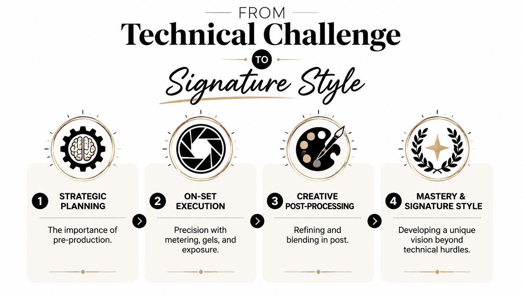
What clients actually see
Architects, designers, marketers, and editors may not describe the process in technical language, but they notice the result immediately. They see a room that feels coherent. They see materials that read correctly. They see atmosphere that supports the design instead of distracting from it.
That polish comes from a chain of decisions:
- Pre-production gives the frame logic: You already know which sources matter.
- On-set control protects the hierarchy: One source leads, the others support.
- Tethered review catches drift early: Problems get solved while the room is still in front of you.
- Post-production refines, rather than rescues: The final image keeps its mood and gains precision.
Signature style lives in the transitions
A lot of photographers can expose a room. Fewer can manage transitions. The edge where cool glass meets warm interior. The point where a lamp glow falls off across a textured wall. The subtle handoff from a neutral face to a warmer background. Those transitions are where taste shows up.
Mixed light gives you a rich palette if you treat it with respect. Warmth can imply hospitality. Cooler zones can suggest clarity, scale, or evening calm. Separation can guide the eye through a space without a single obvious lighting gimmick.
Great mixed-light images don't feel corrected. They feel composed.
When that level of control becomes habitual, the work gains a recognizable character. Not because every frame uses the same recipe, but because every frame reflects the same discipline. Analyze first. Decide what matters. Shape the light to support the design. Finish the file without stripping out its life.
That's how a technical headache turns into a visual signature.
If you need architectural, commercial, or portrait imagery that handles mixed light with this level of control, Jimmy Clemmons Photographer brings an editorial eye, disciplined lighting design, and a polished production workflow to every assignment.