
You're probably sitting on a set of frames that looked strong on location, then somehow turned slippery once they hit the computer. Lines don't feel quite square. One room is too warm, the next too cool. A hero shot turns into ten micro-decisions, then twenty, then a full afternoon disappears into revisions that shouldn't have existed in the first place.
That's the moment when most photographers start dragging sliders harder. In architecture, that's usually the wrong move. The problem is rarely a lack of tools. The problem is a weak system.
A professional photo editing workflow isn't a chain of software tricks. It's a disciplined method for protecting intent from capture through delivery. That matters more in architectural work than almost anywhere else, because the image has to satisfy several audiences at once. The architect wants fidelity to design. The interior designer wants material tone and finish to read correctly. The marketing team wants cohesion across a campaign. The publication wants polish without looking processed.
Beyond Sliders A Systematic Approach to Editing
Messy workflows create the same symptoms every time. Files land in random folders. Similar exposures get edited three different ways. Local corrections happen before the foundation is stable. Then the photographer ends up fixing the same problem twice, once in Lightroom and again in Photoshop.
That isn't a talent issue. It's a sequencing issue.
Modern software has made the need for order even more urgent. AI now sits inside many professional workflows, with 75% of professionals using AI tools, and some tools processing 1,500 photos in under 10 minutes while cutting traditional editing time by up to 96% according to Imagen's workflow data. Speed like that doesn't remove the need for judgment. It exposes weak judgment faster.
What a real system does
A working photo editing workflow does four jobs at once:
- Protects consistency so a full project feels like one visual statement, not a pile of individually edited files
- Reduces decision fatigue by making the order of operations automatic
- Preserves flexibility through non-destructive edits, smart exports, and layered files
- Translates intent so the final image still reflects what the architect, designer, or brand team values
Practical rule: If you're solving composition, color, perspective, and retouching all at once, you're already behind.
Architectural photography punishes improvisation. A hospitality lobby, a private school campus, and a commercial office interior each ask for a different editorial voice, but the workflow underneath them should stay stable. That repeatability is what allows you to move quickly without getting careless.
Precision beats activity
A lot of editing advice still treats software like a creative playground. That works for personal work. It doesn't hold up when a client is reviewing millwork edges, glass reflections, exterior color temperature, and signage all in the same set.
What works is simpler and stricter:
- Define the visual target before editing
- Cull hard
- Build global corrections first
- Move to Photoshop only when the file earns it
- Grade at the end
- Export for purpose, then inspect everything
That sequence is what keeps a polished set from turning into a bloated one. Good editing feels deliberate. Great editing feels inevitable.
Phase One The Foundation of Intentional Editing
Strong editing starts before Lightroom opens. If the visual direction is vague, every later decision gets slower and more subjective. In architectural work, that drift shows up quickly. White walls go too cool, wood tones lose warmth, window light stops feeling believable, and the set no longer matches the space the client designed.
The fix is to create a clear target before you touch a single slider.

Start with a moodboard, not a preset
Most editing guides skip this step. That's a mistake. A significant gap in 90% of editing guides is the omission of pre-editing moodboard integration, and workflows that begin with pre-set visual goals improve output consistency by 35% according to the cited workflow note on moodboard integration.
For architecture, a moodboard doesn't need to be elaborate. It needs to answer practical questions:
- How clean should the tonal range feel
- Should the project lean editorial, commercial, or documentary
- Are blacks open and soft, or more anchored and contrasty
- Do materials need neutral rendering, or a slightly warmer finish
- Is the final set meant for a portfolio, a design award submission, a leasing campaign, or press
A moodboard keeps the file from becoming a negotiation with yourself. It also gives the client a reference point before you spend hours refining images in the wrong direction.
Build order on set
Editing efficiency starts during capture. That means every bracket, composition variant, and hero angle needs a naming and folder structure that survives the handoff from card to workstation.
Use a repeatable project structure such as:
- Job root folder with client, location, and shoot date
- RAW folders grouped by scene or camera position
- Selects folder for frames that survive the first pass
- Exports folder split by web, print, and archive
- PSD or TIFF folder for layered finals
On location, tethered capture helps because it reveals perspective problems, clipped practicals, and styling distractions before they become post-production chores. A shot that looks acceptable on a camera LCD can fall apart on a larger screen, especially when verticals are close to the edge of frame.
The cheapest retouch is the one you never create for yourself.
That same discipline applies to checklists. A simple preflight list for spaces, styling, lights, reflections, and capture sequence prevents a lot of avoidable cleanup later. If you want a field-ready framework, this photo shoot checklist is the kind of document that helps keep production decisions connected to the edit.
Decide what the file will need later
Not every frame needs the same treatment. Some files want only RAW work and perspective control. Others need a full Photoshop build with blended windows, practical light control, and object cleanup.
Before import, sort images mentally into three buckets:
| File type | Likely treatment | Why it matters |
|---|---|---|
| Clean single exposure | Lightroom first, minimal retouch | Fast delivery, low complexity |
| Bracketed hero shot | Lightroom plus Photoshop blend | Better control of windows and tonal balance |
| Problem frame | Photoshop-heavy cleanup | Saves time by identifying complexity early |
Professionals save time. They don't pretend every file deserves equal labor. They identify where the client will notice refinement, then reserve their energy for those frames.
Phase Two Culling and Global Adjustments in Lightroom
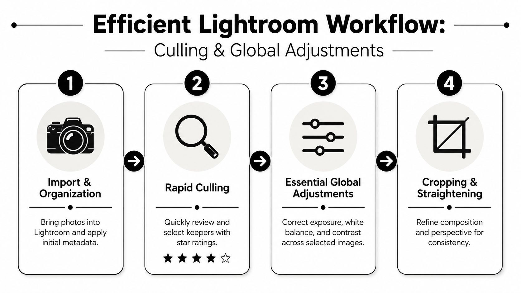
You get back from a full day on site with 300 frames from one property. The critical work begins when those files hit Lightroom. A disciplined cull and a clean RAW baseline decide whether the edit stays efficient or turns into hours of avoidable correction.
Culling is not clerical work. It is where the final set starts to reflect the architect's intent. If you keep every near-match, you dilute the sequence, create inconsistency in the set, and spend retouching time on frames the client was never going to choose.
Cull in passes, with the final story in mind
I cull in rounds because each pass answers a different question.
Pass one removes obvious failures fast. Soft frames, awkward furniture alignment, bad reflections, clipped practicals with no recovery, and duplicates with no compositional advantage go out immediately.
Pass two identifies frames that serve the project. The question is simple. Does this image add something the set needs? That might be a clean establishing view, a tighter composition that explains a material choice, or a transition image that helps the series read like a designed space instead of a folder of unrelated files.
Pass three builds order. Architectural delivery is editorial. A strong sequence controls pace, reveals the project clearly, and prevents two similar images from competing with each other.
Good culling protects the edit. It also protects the concept established earlier in moodboarding. If the target mood was restrained, graphic, and calm, the selects need to support that direction before any adjustment starts.
Build one RAW baseline per lighting condition
After the shortlist is set, choose one anchor frame for each lighting scenario and build that file carefully. Interior daylight, twilight exterior, mixed-light kitchen, and detail close-up rarely want the same treatment, even within one project.
The adjustment order matters because each choice affects the next:
- Crop and straighten first so later corrections support the final composition
- Apply lens corrections before judging shape, spacing, and edge behavior
- Set exposure and broad tonal balance so the room reads naturally
- Correct white balance for material accuracy, not for dramatic effect
- Refine contrast, highlights, and shadows with restraint
- Leave local fixes for later unless a problem prevents accurate global judgment
Architectural photographers often get into trouble by reaching for masks too early. Global corrections should establish a believable file first. If the room still feels wrong after that, the problem is usually local and can be handled with precision later.
Sync patterns, not assumptions
Sync saves time only when the files share the same conditions. A camera position shift of two feet can change window brightness, reflection behavior, and the way converging lines feel. That is enough to make a copied setting look careless.
A practical split looks like this:
Usually safe to sync
Lens corrections, profile choice, baseline white balance approach, broad exposure direction, and general contrast intentUsually worth checking frame by frame
Crop, transform adjustments, highlight recovery near windows, local masks, and any image with a different balance of daylight and practical fixturesAlways review after syncing
Wall neutrality, verticals, edge stretch, and whether the room still feels proportionally honest
This is also the stage to watch for corrections that should stay inside RAW versus work that belongs later in Photoshop. If a frame already shows structural distortion or perspective issues beyond a normal transform adjustment, a more deliberate approach to fixing structural problems in architectural photos during post-production will save time and preserve realism.
Keep the file believable
Architectural editing fails fast when the room stops feeling true to the built space. Over-bright shadows flatten depth. Over-corrected verticals stretch the room. White walls pushed too neutral can lose the warmth that was part of the design.
Use a short checkpoint on every selected frame:
- Verticals: straight, but not forced into a warped geometry
- Color: neutral enough to feel clean, specific enough to preserve material character
- Tonality: open shadows with shape still intact
- Windows: exterior view present without making the interior collapse
- Surfaces: texture visible without crunchy clarity or heavy-handed presence
Restraint is a professional skill. Magazine-quality work does not announce the edit. It presents the architecture clearly, keeps the set consistent, and leaves the heavy lifting only for the files that need more than Lightroom can give.
Phase Three The Art of Compositing in Photoshop
A strong architectural composite is usually decided before Photoshop opens. By this point, the visual direction should already be clear from the pre-editing moodboard and the Lightroom pass. Photoshop is where that intent gets built into the file with precision.
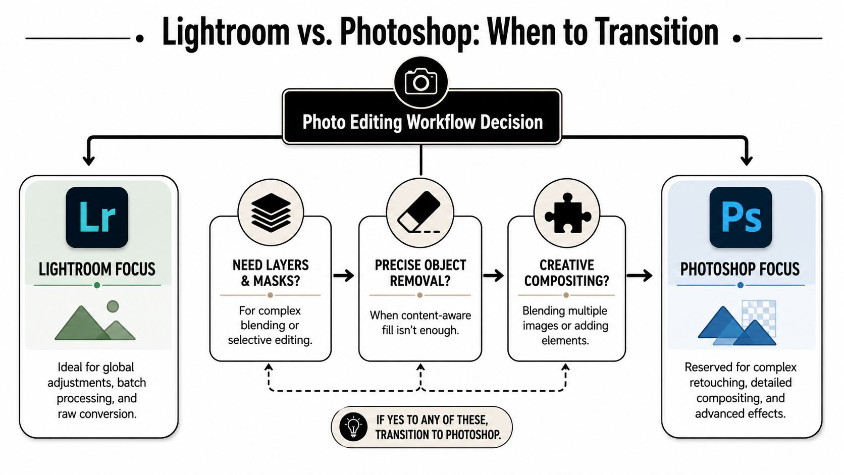
Lightroom handles broad correction well. Photoshop handles conflict. Conflicting exposures. Conflicting color temperatures. Conflicting details between what the eye accepted on site and what the camera exaggerated. Send only the frames that need that level of control, and the workflow stays fast.
Send the right problems to Photoshop
Photoshop earns its place when a file needs selective decisions, not broader slider work.
Typical reasons to move a frame over include:
- Bracket blending for interiors with bright glazing or exterior views
- Mixed-light correction when daylight, LED, tungsten, and practical fixtures pull surfaces in different directions
- Object removal for alarms, outlets, cords, exit signs, stains, and temporary distractions
- Frame compositing when the cleanest result comes from combining multiple captures
- Surface-specific retouching on plaster, stone, timber, metal, glass, and textiles
That divide matters for efficiency. Architectural post-production slows down fast when Photoshop is used as a default instead of a targeted tool.
Build files another retoucher could understand
A layered file should stay readable under deadline pressure and six months later. I group by function, label clearly, and keep destructive edits to a minimum because revision requests rarely arrive at a convenient time.
A clean PSD often includes:
- Base RAW render
- Primary exposure blend
- Window detail pulls
- Cleanup and removals
- Local contrast and tone shaping
- Color corrections
- Output sharpening prep
If the layer stack takes a full minute to decode, it is already too messy.
That discipline separates architectural work from quick property listing edits. The goal is not brighter files. The goal is a controlled interpretation of the space that still respects scale, material behavior, and the architect's intent. For frames that need heavier geometric repair, a more deliberate method for fixing structural problems in architectural photos during post-production usually produces a cleaner result than forcing the issue with broad transforms.
Blend exposures with restraint
Good compositing disappears into the photograph. Window views should read clearly, but they should not pull more attention than the room. Interior shadows should open enough to show form, while still holding the depth that gives the space credibility.
A reliable blend process is straightforward:
- Auto-align the bracketed captures
- Use the interior exposure as the base frame
- Mask in exterior detail only where the view adds value
- Refine transitions around mullions, frames, and reflections
- Inspect edges at high magnification
- Protect shadow density so surfaces keep shape
Most architectural blends do not require elaborate masking tricks. They require judgment about where to stop. If the exterior looks louder than the interior, the blend has gone too far.
Retouch for clarity, not perfection
The camera records distractions with a level of bluntness the eye never does. Photoshop gives you the chance to remove that noise and return attention to the design.
Remove elements that break the composition:
- Temporary clutter
- Dust, smudges, scuffs, and patchy wall marks
- Small utility items that steal attention
- Bright edge distractions and awkward reflections
Keep the evidence that makes the space feel built and real:
- Material texture
- Natural falloff in light
- Believable reflections
- Subtle surface variation
Heavy retouching can make an interior feel synthetic in seconds. Magazine-quality architectural work depends on selective cleanup, controlled blending, and a file structure that supports revision without slowing the entire job down.
Phase Four Color Grading and Final Polish
A clean composite can still miss the architect's intent. The structure is right, the lines are right, the view is controlled, but the set feels disconnected because the color language was never defined. That decision starts before editing. Moodboards, reference tears, material palettes, and the client's brand standards set the target so grading becomes a controlled translation, not slider drift.
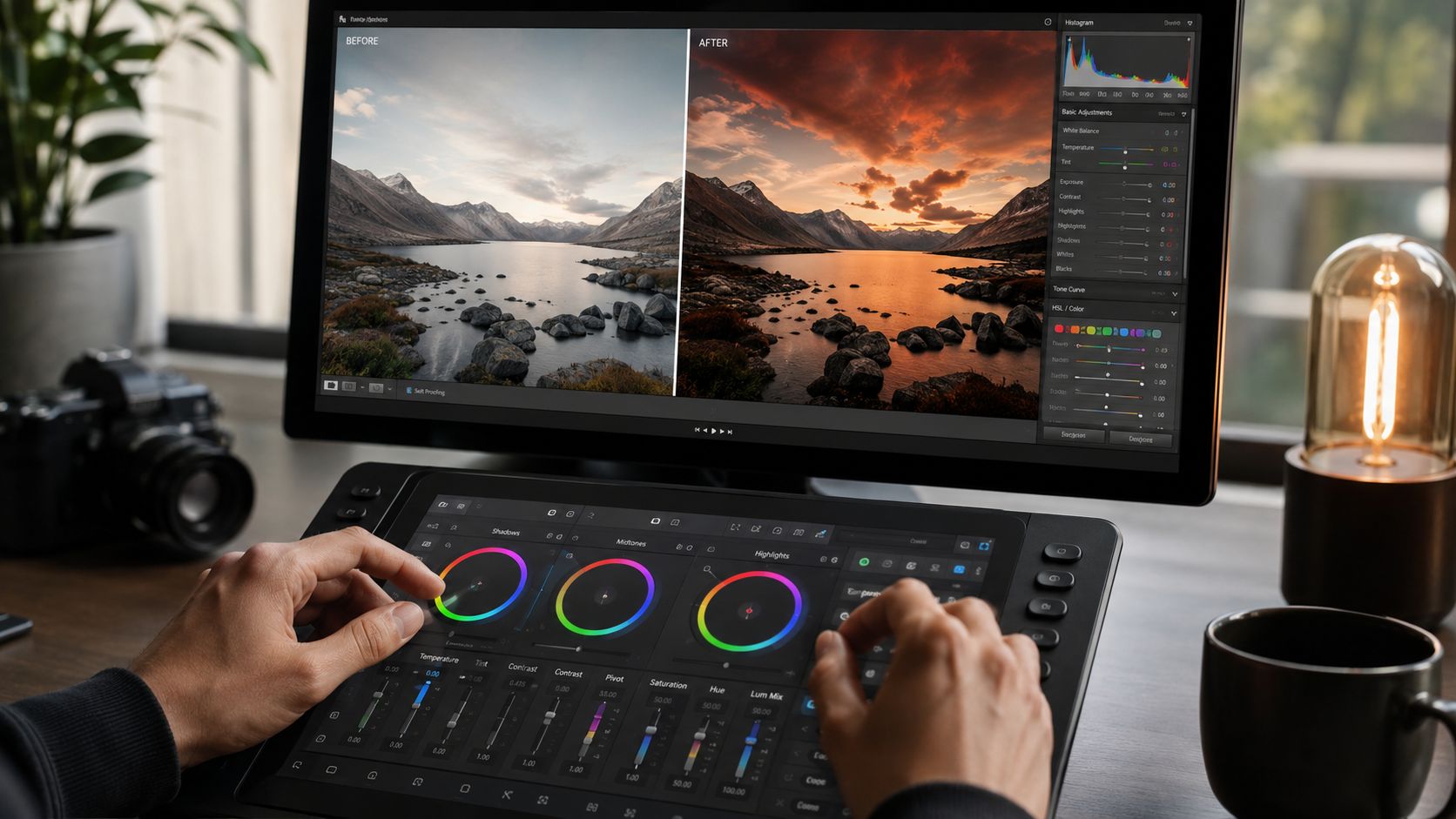
Correction establishes factual color. Grading establishes intent across the full story.
That distinction matters in architectural work because materials carry meaning. Oak should still read like oak, concrete should keep its temperature, and white walls should not shift from frame to frame just because one image looked better with a warmer balance. The goal is consistency with purpose.
Grade the set from a defined target
I build the grade around the project brief, not around whichever hero frame happens to look strongest. A hospitality interior may call for warmer mids and gentler contrast to support comfort. A commercial project often needs cleaner neutrals and tighter separation so finishes, glazing, and structure read with precision. Editorial work usually benefits from a quieter hand.
Useful references for this stage include moodboards assembled before editing, finish schedules from the design team, and a few approved benchmark frames from the set. Those references keep the grade disciplined. They also save time because every adjustment has a direction behind it.
Apply the grade across the series with tools that allow control, not novelty:
- HSL for refining individual material families without shifting the whole file
- Color Balance or Selective Color for steering shadows, midtones, and highlights with restraint
- Calibration controls for broad palette shaping when the camera profile needs a better starting point
- Local color adjustments when one problem area needs correction without changing the image globally
For a more detailed examination of this stage, this guide to color grading photography shows how grading choices change the final read of an image.
Keep materials believable
Architectural grading fails when surfaces start looking processed instead of built. Stone loses mineral variation. Timber turns orange. Black metal picks up a blue cast that was never in the space. Those mistakes usually come from chasing mood too aggressively.
Restraint protects credibility. Increase separation only until the materials read clearly. Warm an interior only until it feels inhabited, not amber. Cool a commercial frame only until it feels clean, not sterile.
A simple check helps. Compare images side by side and watch the repeat elements: white ceilings, window frames, concrete, oak, skin tones if people are present. If those anchors drift, the set loses trust.
Finish in the right order
Final polish works best as a sequence. Tone and color come before cleanup decisions that depend on them. Noise reduction stays late because tonal changes reveal whether noise is distracting. Sharpening belongs near the end because the right amount depends on how the file will be viewed. Native resolution stays intact until export so the master remains flexible.
That order protects two things at once. Image quality and speed.
Color grading should unify the project. It should never read like an effect.
A quick visual demonstration can help at this stage, especially when you're comparing correction against stylistic finish.
Use polish to direct attention
The last pass is editorial judgment. The point is not to make every surface equally crisp or every shadow equally open. The point is to tell the eye where to land first, where to travel second, and what should stay quiet.
That usually comes down to a few controlled moves:
- Selective sharpening on edges, fixtures, and material transitions that carry the design
- Measured micro-contrast so texture reads cleanly without turning brittle
- Subtle edge control to keep bright corners and reflections from pulling attention away
- Consistent tonal separation so the full gallery feels like one commissioned body of work
When this stage is handled well, the grade disappears and the architecture gains clarity, atmosphere, and intent.
Phase Five Exporting and Quality Control
A file can look finished at 5 p.m. and still fail at 5:15 when the export leaves the workstation. I have seen strong architectural images lose credibility in the last mile because a web resize exaggerated halos, a TIFF went out in the wrong color space, or a dust spot survived until the client viewed it full screen. Export is part of the edit. It is where intent either survives intact or gets diluted.
That discipline starts earlier than export day. If the moodboard defined a restrained, natural palette for the project, the delivered files need to hold that character whether they land in a magazine layout, a firm's portfolio, or a developer's approval deck. Output settings are not clerical choices. They protect the original visual strategy.
Build export presets around actual deliverables
Manual exporting invites inconsistency. Presets keep the process fast and repeatable, especially when one shoot has to serve several audiences.
A working set can be simple:
| Output type | Recommended settings | Use case |
|---|---|---|
| Web delivery | JPEG in sRGB, resized for screen use with moderate compression | Websites, digital portfolios, email review |
| Print delivery | TIFF or maximum-quality JPEG at full print resolution in the color space requested by the publication or vendor | Print vendors, editorial, brochures |
| Archive master | Full-resolution master in the retained working format | Long-term storage and future repurposing |
Keep the master untouched. Export versions built for purpose.
In practice, I also separate review exports from final client assets. Review files need to load quickly, look clean on common screens, and carry clear filenames or watermarks if required. Final assets need exact sizing, correct profiles, and no ambiguity about use.
Inspect the exported files, not just the layered master
Problems often appear after resizing, output sharpening, or compression. A composite that looks perfect in Photoshop can break at window edges once it is flattened and downsized. Fine textures can turn brittle. Neutral walls can shift if the profile is wrong.
Use the same checklist every time:
- Open the exported files at 100%
- Scan edges around windows, railings, fixtures, and furniture
- Check for clone repetition in broad surfaces
- Review neutral materials for color casts
- Confirm verticals still read clean and intentional
- Compare the full set side by side for consistency
Clients rarely see the PSD. They see the export.
Match delivery to the client's real use
Architects, interior designers, developers, and editorial teams often need different file sets from the same commission. Sending one generic folder saves a few minutes and creates confusion later. A better system is to package files by destination and label them so nobody has to guess.
A practical sequence looks like this:
- Prepare the archive-ready master set
- Export lightweight JPEGs for review or approval
- Create web versions sized for digital use
- Generate print files only after final specs are confirmed
- Name folders and files by project, orientation, and usage
That last step affects how your work is perceived. Clean delivery signals the same thing a clean composition does. Control, judgment, and respect for the project.
Conclusion Archiving for a Lasting Legacy
A disciplined photo editing workflow doesn't end when the images are delivered. It ends when the project can be found, reopened, revised, and trusted later.
That matters more than photographers sometimes admit. Architectural imagery has a long shelf life. A project may need fresh exports for a magazine feature, a firm anniversary, a new website, an awards submission, investor materials, or a leasing campaign long after the first invoice is paid. If the files are scattered, flattened, or partially lost, the service was incomplete.
Archive what has future value
Not every file deserves permanent storage. The key is to save what protects flexibility.
Keep these:
- RAW selects that made it through the final edit
- Layered PSD or TIFF hero files for images that required meaningful compositing
- Final delivered exports
- Project notes that explain naming, color decisions, or client-specific delivery needs
Discard cautiously:
- Obvious rejects
- Temporary exports
- Intermediate files with no future use
- Redundant duplicates created during testing
The archive should stay useful, not bloated.
Use a backup system you'll actually maintain
The standard rule is the 3-2-1 backup strategy. Keep three copies of the data, use two different media types, and keep one copy off-site. The idea is simple. One working copy isn't a backup. One local backup isn't enough. A second drive sitting next to the first one still shares the same physical risk.
In practice, that often means:
- Primary working storage for active projects
- Local backup drive for immediate redundancy
- Off-site or cloud copy for disaster protection
This isn't glamorous. It is professional.
The workflow is part of the service
Clients rarely ask how the archive is structured. They notice the result when they need something later and you can retrieve it cleanly. That reliability becomes part of your reputation.
The photographers who last aren't just the ones who can make a room look good. They're the ones who can deliver consistent files, maintain edit integrity, protect original intent, and support the client long after the shoot is over.
That's what a serious photo editing workflow does. It creates better images now, and it creates a stronger business around those images later.
If you need architectural, commercial, or editorial imagery handled with that level of production discipline, Jimmy Clemmons Photographer provides photography and post-production for built environments, brand content, and professional portraits with a process built around precise capture, efficient editing, and clean delivery.