

The first time you approach the Strom Thurmond Gym from across campus, the scale lands before the details do. Then the details start to separate out: glass, brick, long spans, and the kind of circulation that tells you this building was designed to handle constant movement rather than occasional use.
An Architectural Landmark for Campus Wellness
At the University of South Carolina, the Strom Thurmond Wellness and Fitness Center reads less like a standard student gym and more like a major campus building with recreational programming inside it. Its footprint, circulation, and amenity mix give it the presence of a civic project. For visitors, that means it's easy to understand why the building became a destination. For photographers, it means the architecture carries enough visual weight to justify a full editorial-style shoot.
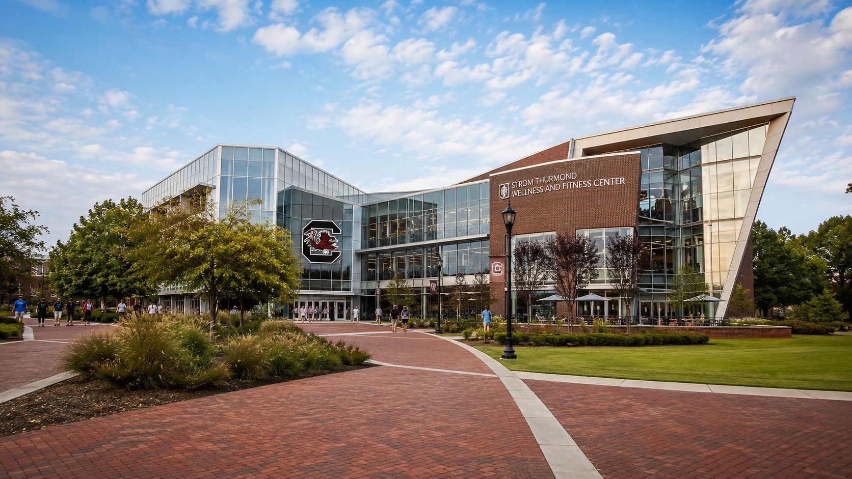
What stands out first is how the building balances utility and identity. Recreation centers often photograph as a collection of disconnected functions: courts in one wing, cardio in another, offices somewhere else. This one holds together as a single architectural statement. The exterior massing gives it institutional credibility, but it doesn't feel severe. It's active, legible, and made to be occupied at scale.
Why the building matters visually
From a photographer's perspective, the Strom Thurmond Gym offers three things that make a facility worth documenting:
- Clear hierarchy: Main volumes read cleanly from a distance, so establishing shots make sense.
- Varied program: Courts, climbing, aquatics, strength areas, and circulation routes create different image types without leaving the site.
- Human energy: Even when you're shooting architecture, people help explain proportion, purpose, and flow.
That mix is why the building appeals beyond campus recreation. Architects can study how a large wellness facility organizes movement. Marketing teams can use it as a model for lifestyle-driven institutional imagery. Developers and designers can read it as an example of how a recreation building becomes part of a broader campus brand.
A strong recreation building doesn't just house activity. It turns activity into part of the institution's visual identity.
The Strom Thurmond Gym also fits into a larger Southern campus design conversation, where major public-facing buildings have to perform both operationally and symbolically. If you follow work that documents significant built environments, the same public-facing design logic appears in studies of architectural landscapes in Atlanta. The lesson is similar here. Big buildings need a coherent exterior story before anyone steps inside.
The History and Vision Behind the Center
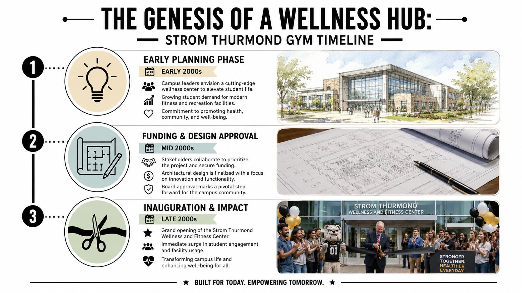
The clearest way to understand Strom Thurmond Gym is to start with the brief behind it. This was conceived as a major campus recreation project, not a minor student amenity, and that original intent still shows in how the building is read, used, and photographed.
The facility opened in 2003 as a large, purpose-built wellness center funded in substantial part by students, as noted earlier. That funding model matters because it usually changes the design priorities. A project backed so directly by its user base has to work hard every day. Flashy features are less important than long service life, clear circulation, and enough program range to keep the building relevant after the opening-year attention fades.
From an architectural photography standpoint, that origin story changes the assignment. The goal is not just to make the center look polished. The stronger approach is to show proof of planning. I look for the decisions that signal institutional seriousness: how entries announce the building, how public and active zones are separated, and how the plan handles heavy student traffic without visual chaos.
What the original vision still communicates
The center's name ties it to a public figure with a complicated legacy. That gives the building symbolic weight whether a visitor arrives focused on recreation, campus history, or public image. For photographers, architects, and marketing teams, that means the building cannot be treated as a neutral backdrop.
Images need context.
Wide exterior views, signage, thresholds, and occupied interior frames all help explain that this is a civic campus building as much as a fitness facility. Clean images still matter, but empty glamour shots can flatten the story. A stronger set shows how the university positioned the center within campus life and how people inhabit it.
Why the project drew attention early
The center earned recognition soon after opening, as noted earlier, which suggests the project landed as more than a routine recreation build. Awards do not prove long-term success on their own, but they do indicate that peers saw the facility as a strong example of its type at the time.
That early attention raised the standard for how the building would be judged. It also affects how it should be documented now. Buildings that entered campus life with this much visibility need more than attractive coverage. They need photography that records performance, identity, and age accurately.
Here is the practical read on its history and vision:
| Factor | Why it matters |
|---|---|
| Student-backed investment | The design had to justify daily use, not just opening-day excitement. |
| Public naming significance | The building carries cultural meaning beyond sports and fitness. |
| Early professional recognition | Expectations for design quality and public image were high from the start. |
Practical rule: Photograph a building with this kind of institutional weight as part of the university's public identity, not just as a collection of amenities.
One more trade-off is worth stating plainly. Recent online discussions around the center's name create reputational context, but aesthetics cannot settle that issue. For brand teams and architectural photographers, the better approach is accuracy. Show the building clearly, show how it functions, and avoid visual choices that try to overwrite the history attached to it.
A Tour of the Facility and Its Features
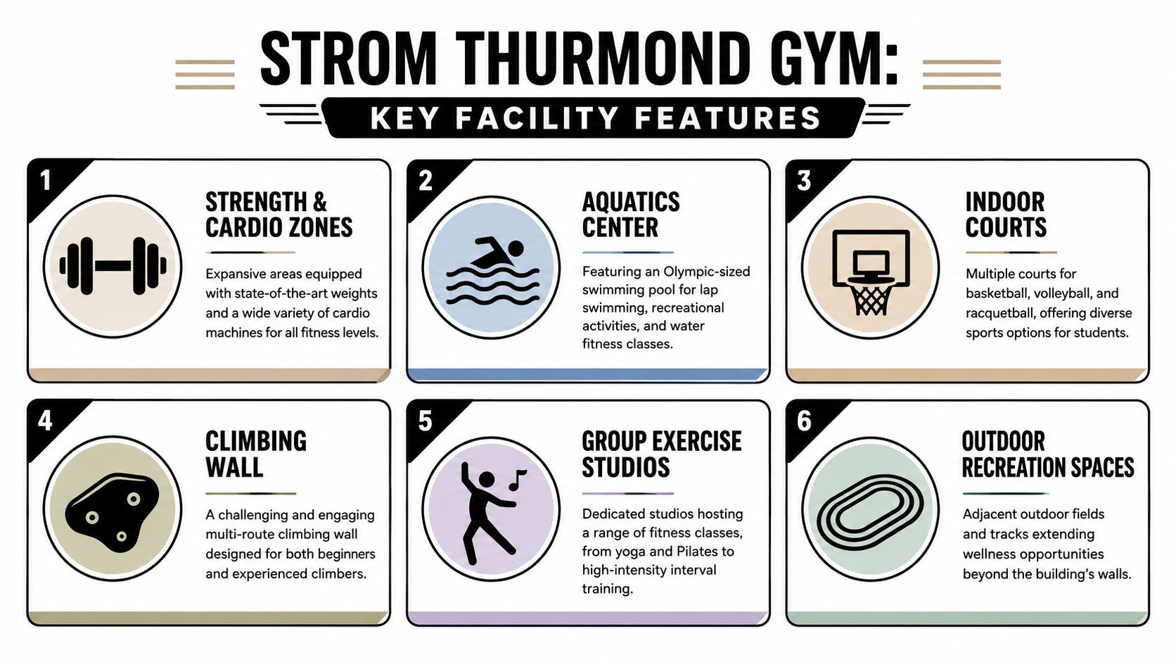
The first time I study a recreation building like this, I do not start with the equipment list. I start with movement. At Strom Thurmond Gym, the revealing detail is how many activities can run at once without the building collapsing into noise, visual clutter, or confused circulation. That kind of control is hard to achieve in a large student fitness center, and it is one of the reasons the facility reads well both in person and through a camera.
Program range matters here, but layout matters more. The building brings together courts, aquatics, track space, climbing, and training areas in a way that gives each zone a clear identity. For visitors, that makes the place easier to read. For staff, it supports supervision. For photographers, it creates a useful sequence of wide establishing views, mid-range transitional frames, and tighter detail shots that explain how the building works.
Strength and cardio zones
The clearest published technical description comes from the design firm's project page, which identifies a 20,000-square-foot weight room, a 19,000-square-foot strength and conditioning area with high-bay ceilings for safety monitoring, and a cardio deck where over 80% of machines feature integrated TVs, according to WBGUimarin's project page for the fitness center.
Those details are useful because they explain the building's operating logic, not just its scale.
A weight room this large succeeds or fails on spacing, sightlines, and visual order. If equipment islands are too dense, the room feels chaotic fast. Here, the better reading is controlled openness. The strength and conditioning area benefits from the extra height as well. High-bay volume reduces the compressed feeling that heavy training rooms often produce, and it gives staff cleaner views across active zones.
The cardio deck serves a different purpose. It is built for repeat use and longer dwell time, so the experience has to feel stable rather than dramatic. Rows of machines with integrated screens are not just a convenience feature. They affect how people occupy the room and how the room photographs. Long lines become more legible, and the repetition can be framed as an intentional composition instead of visual monotony.
Signature amenities that shape the experience
The climbing wall remains one of the building's strongest visual anchors. Because published descriptions conflict on the exact height, the safer and more accurate description is simple: it is a multi-story vertical element that breaks up the building's horizontal spread and gives the interior a clear focal point.
That vertical emphasis matters. Large recreation centers often flatten out in photographs because so much of the program is organized across broad floor plates. A climbing wall restores proportion. It gives the eye a stopping point and gives a photographer an obvious subject for sectional views, diagonal compositions, and people-in-space images that communicate scale.
Other spaces contribute in quieter ways:
- Aquatics areas broaden the building's appeal and introduce a different material and light quality than the harder training zones.
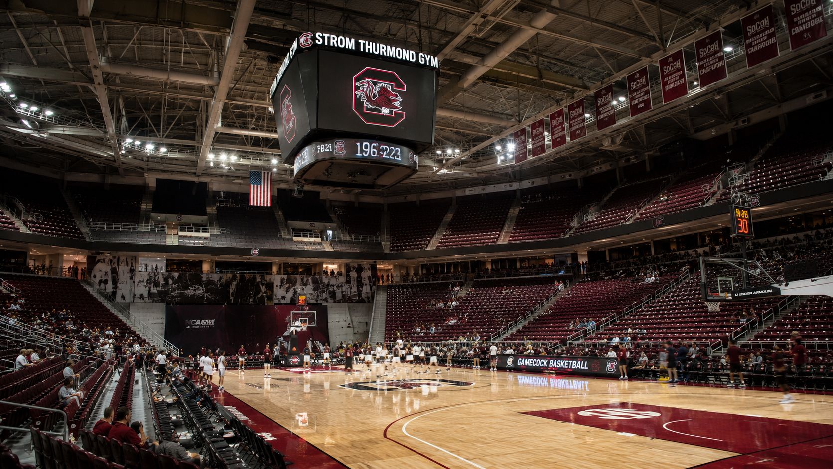
- Court spaces provide some of the cleanest geometry in the facility, especially for wide frames that show linework, ceiling structure, and occupancy.
- Racquetball and squash courts add depth to the program mix and help document the center as a serious multi-use recreation building rather than a standard weight-room-first gym.
The strongest image set will not rely on one dramatic room. It will show range, sequence, and daily use patterns.
What reads well, and what to watch for
Several design choices stand out as practical successes. Open sightlines near busy areas improve orientation and oversight. Distinct room identities keep one activity zone from visually swallowing the next. The mix of large social spaces and more focused training areas gives the building both public energy and routine usefulness.
There is a trade-off, though.
Buildings with this much program variety can feel disjointed if the transitions are weak. Circulation corridors, thresholds, and overlook points need as much attention as the feature spaces. Visitors notice that immediately, and a camera notices it even faster. A striking court or climbing view cannot compensate for awkward dead zones, cluttered edges, or confusing movement paths.
Strom Thurmond Gym is most convincing when it is documented as an organized system of spaces, not as a stack of amenities. That is the right way to tour it, and it is the right way to photograph it.
Planning Your Visit Hours Access and Information
The first time I scout a university recreation building, I do not start with the camera. I start at the front desk.
That approach matters at Strom Thurmond Gym because access shapes the entire visit. Hours can change with the academic calendar, staffing, campus events, and break periods. Entry rules can also differ by user category, so treat every visit as something to confirm in advance rather than assume on arrival.
Strom Thurmond Gym functions within the university recreation system, not as a public drop-in fitness club. As noted earlier, that affects who can enter, what identification is accepted, and whether guests can use the facility without prior approval. For anyone visiting to assess the building, whether for design reference, marketing, or photography, that distinction saves time.
Before you go
A little prep avoids the usual friction at check-in:
- Check the official campus recreation hours: Third-party listings often miss holiday schedules, reduced summer access, and space-specific closures.
- Verify your access status: Student, faculty, staff, alumni, and guest policies may not match.
- Bring the right ID: Front desk staff usually need a university credential or approved guest documentation.
- Ask about specialty areas: Courts, aquatics, climbing, and group exercise rooms may follow their own schedules or reservation rules.
- State your purpose clearly: A workout visit, a facility tour, and a photography scout are handled differently.
That last point is where many visits go sideways.
If you arrive with a camera bag and no prior contact, staff will usually default to caution. That is reasonable in an active campus gym where privacy, member flow, and risk management come first. A quick call or email ahead of time often tells you what is visible from public circulation, whether a casual walkthrough is allowed, and who approves still photography or video.
What first-time visitors should expect
Give yourself extra time.
Large recreation centers rarely reveal themselves in the first two minutes. You may need to sort out parking, find the correct entrance, complete check-in, and get oriented before you can judge the building properly. For photographers and design teams, that early sequence matters because it tells you how the facility presents itself to actual users. Entry signage, lobby sightlines, queue space, and the first interior reveal are part of the architecture, not just prelude.
Visit timing also changes what you learn. Midday often gives a cleaner read on circulation and daylight. Late afternoon shows the building under pressure, with fuller courts, busier fitness zones, and more visual noise. Both are useful. One helps you study space. The other shows whether the design still reads clearly when the gym is doing real work.
If your goal is documentation rather than exercise, ask for permission before making images. Public-facing views may be straightforward. Staff-controlled spaces, occupied training areas, and any shot with recognizable people usually require more care.
The Photographer's Brief Documenting the Gym
Most shoots at the Strom Thurmond Gym fail in one of two ways. They either treat the building like a sterile architecture subject and lose all sense of energy, or they chase activity so aggressively that the architecture disappears. The better approach is to document how the building holds movement.
For architects, designers, and institutional marketing teams, the assignment is usually broader than “get pretty pictures.” They need a set of images that proves several things at once: the scale is real, the design is functional, the building feels occupied, and the space supports a wide range of users without visual confusion.
Build the shot list around use and structure
A complete brief for the Strom Thurmond Gym should include at least these image categories:
- Exterior establishing views that show massing, campus context, and entry sequence.
- Interior wides that explain circulation and the relationship between major program zones.
- Feature images of signature spaces such as courts, the climbing area, strength spaces, and aquatics.
- Human-scale moments that show how users move through the building without turning the shoot into sports coverage.
- Material and detail frames for finishes, signage, railings, glazing transitions, and equipment integration.
The order matters. Start with architecture, then add use. If you start by chasing people, you often lose control of the geometry.
What clients usually need from the final set
Different stakeholders read the same building differently. A design firm wants clarity, alignment, and evidence of good spatial planning. A university communications team wants activity, belonging, and campus pride. A magazine editor wants a narrative arc. The shot list has to anticipate all three.
Here's a practical way to frame the deliverables:
| Image type | Best use |
|---|---|
| Hero exterior | Recruitment materials, project features, web headers |
| Lobby or circulation wide | Architectural storytelling, orientation, campus publications |
| Strength or cardio overview | Amenity marketing, donor presentations, operational reporting |
| Court action within architecture | Social, admissions, athletics-adjacent branding |
| Tight detail shot | Design awards, brochures, editorial layouts |
If the image only shows activity, it could have been shot anywhere. If it only shows architecture, it might feel empty. The job is to prove that this specific building supports this specific kind of use.
Permissions change the shoot more than gear does
On active campuses, access shapes the result. If you're working with a crew, directing talent, using lights, or planning commercial usage, get written permission in advance. Even a simple tripod can trigger questions in a student recreation setting if staff doesn't know why you're there.
Privacy is the other practical constraint. You're photographing in a place where people expect to work out, not to appear in marketing collateral by default. That affects where you can stand, when you should shoot, and how much staging is appropriate.
The strongest shoots usually happen during quieter windows, with a tight route, a short equipment list, and a clear understanding of which spaces matter most.
Mastering the Shot Lighting and Composition
The Strom Thurmond Gym presents the kind of mixed lighting problem that exposes weak technique quickly. Large wellness facilities combine daylight, overhead sports lighting, reflective flooring, bright signage, dark equipment, and moving subjects. If you don't control the frame deliberately, the images flatten out fast.
Lens choice and camera position
Use an ultra-wide lens carefully. It's useful for showing scale, but if you push it too far in court spaces or weight areas, straight lines start to bow and people near the frame edges distort badly. A tilt-shift lens is usually the better choice for hero architecture shots because it keeps vertical lines clean and lets the room retain its dignity.
Camera height matters as much as focal length. In giant interiors, photographers often stand too high or too low and make the room feel accidental. A measured eye-level position usually preserves both architecture and user proportion.
For mixed assignments, this setup tends to work well:
- Tilt-shift lens: Best for exteriors, lobby views, and highly geometric interior compositions.
- Moderate wide zoom: Useful when you need speed in active spaces.
- Sturdy tripod: Essential for consistency, alignment, and bracketed exposures during off-hours.
- Polarizer with caution: Helpful on some glazing and floor reflections, but easy to overdo indoors.
Lighting strategy for a building like this
Natural light is the cleanest option whenever the building gives it to you. It preserves atmosphere and helps different zones feel connected. But large recreation interiors rarely cooperate evenly, so supplemental lighting often becomes necessary for selected frames.
The key is restraint. You're not trying to relight the entire facility into a studio set. You're shaping depth, lifting dark foregrounds, and controlling hot spots on glossy surfaces. If you want a useful technical reference for interior work, this guide to lighting for interior photography aligns with the practical challenges that show up in institutional spaces like this.
Field note: Light the room so it still looks like itself. If viewers notice the lighting before they notice the architecture, the setup is too heavy-handed.
Composition that sells the design
The best compositions in the Strom Thurmond Gym come from lines already built into the facility. Court markings, track edges, equipment rows, stair rails, and overhead structural rhythms all help organize the frame. Use them.
A few principles work consistently:
- Lead with geometry. Let courts and circulation lines direct the eye.
- Use people as scale markers. One or two figures can explain volume better than a crowded frame.
- Protect vertical features. If you're framing the climbing area or high-bay training spaces, keep the sense of height intact.
- Wait for order. In active gyms, timing is composition. A frame often improves just by waiting for one person to leave the edge or for a clear lane to open.
What doesn't work is visual greed. Trying to show every amenity in one frame usually produces a confused image. Pick one idea per photograph. Scale. Flow. Texture. Occupancy. Don't ask a single shot to do all four.
Events Bookings and Commercial Use
The Strom Thurmond Gym isn't only a daily-use recreation center. Facilities like this can also support organized events, tournaments, wellness programming, institutional communications, and controlled media production. But the process matters. University buildings don't function like private studios, and the wrong assumption at the scheduling stage can shut down a shoot before it starts.
How to approach a booking
Start with the university office responsible for campus recreation operations or facility reservations. Ask specific questions. General inquiries get general answers. If you need a court, meeting space, common area, or visual access to certain rooms, list each one clearly and explain the intended use.
That inquiry should cover:
- Type of use: Event, editorial shoot, brand content, documentary coverage, or internal communications.
- Crew size: A solo photographer is one thing. A production team with stands, cases, and talent is another.
- Equipment footprint: Tripods, strobes, audio gear, and video support often trigger added review.
- Timing: Off-peak hours are easier to approve and easier to shoot.
- Deliverable use: Internal documentation, commercial advertising, editorial publication, and social promotion may not be treated the same way.
Commercial photography needs more than access
Getting into the building isn't the same as getting permission to use images commercially. That distinction catches a lot of teams off guard. If the final images will promote a brand, support paid marketing, or live in commercial collateral, ask about usage rights, releases, signage concerns, and institutional approval.
A good baseline is to think through the same issues covered in this overview of licensing a photo for commercial use. In a university environment, those considerations often expand to include trademarks, student privacy, and the visibility of branded athletic or campus materials within the frame.
The easiest shoot to manage is the one that's fully defined before anyone unloads a case from the car.
What works best on site
For event organizers and production coordinators, the practical approach is simple:
- Book early: Campus calendars fill quickly, especially around active academic periods.
- Scout in advance: Don't assume circulation, power access, or sightlines from floor plans alone.
- Keep the footprint tight: Smaller crews move faster and disrupt less.
- Plan around live use: Recreation buildings serve members first.
The Strom Thurmond Gym rewards preparation. It's visually rich, operationally busy, and institutionally important. That combination can produce excellent work, but only if the logistics are handled with the same care as the photography.
If you need polished architectural imagery, commercial interiors, or design-forward campus photography, Jimmy Clemmons Photographer creates editorial-quality visuals for architects, developers, marketing teams, and institutions that want their spaces documented with clarity and purpose.