

On one shoot, the room looked expensive, but the photographs felt flat. We removed half the accessories, rotated one chair a few degrees, opened a sightline to the window, and suddenly the images stopped documenting furniture and started telling the story of the design.
Beyond Pretty Pictures The Goal of High-End Staging
High-end staging isn't decoration for decoration's sake. In an editorial context, it functions more like visual editing. Every object in the frame either supports the architect's intent, reveals the designer's material choices, or distracts from both.
That distinction matters because a camera is brutally selective. A room can feel composed in person and still fall apart in a photograph. The eye forgives clutter, awkward spacing, and muddled focal points. The lens doesn't. It isolates relationships between form, light, texture, and negative space, and it turns small staging mistakes into dominant visual problems.
Editorial staging starts with a point of view
Magazine-quality interiors have a point of view. They don't just show that a living room exists. They communicate what the room is trying to be. Quiet. Formal. Layered. Minimal. Sculptural. Relaxed. That narrative should come from the project itself, not from a bag of generic props dropped in at the last minute.
A strong staged frame usually answers three questions at once:
- What is the design idea? Is the story about restraint, craftsmanship, warmth, symmetry, or contrast?
- What should the eye notice first? A limestone fireplace, a floating stair, a paneled ceiling, a custom banquette.
- What feeling should remain after the viewer moves on? Calm, intimacy, grandeur, hospitality, precision.
When staging misses that, the result is common and forgettable. You get a "nice room" image instead of a photograph that looks publishable.
Staging for High-End Interior Shoots works when the room reads clearly in a single frame. If the viewer can't tell what matters, the styling has already failed.
The business case is real
This isn't only an aesthetic exercise. The commercial value is well documented. Properties staged before photography generated 73% more online views, sold in 23 days versus 47 days for non-staged homes, and achieved a 4.8% higher sale price, according to DDH Home's staging statistics roundup.
Those numbers are especially relevant because most clients aren't commissioning photographs for private enjoyment. Architects need images that support awards, features, and new business. Designers need a portfolio that reflects their taste accurately. Developers and hospitality teams need visuals that create immediate confidence. In each case, staging affects how quickly a viewer understands the value of the space.
What staging is really doing
At the high end, staging should do four jobs at once.
| Job | What it looks like in practice |
|---|---|
| Clarify | Remove objects that muddy lines, edges, and transitions |
| Scale | Use furnishings to show proportion without crowding the architecture |
| Sequence | Lead the eye through foreground, middle ground, and background |
| Humanize | Suggest life in the space without making it feel occupied |
The best staged interiors feel inevitable. Nothing seems forced. Nothing looks random. That's the standard worth aiming for, and it's the difference between serviceable listing photos and an image set that can carry a feature, a presentation deck, or a campaign.
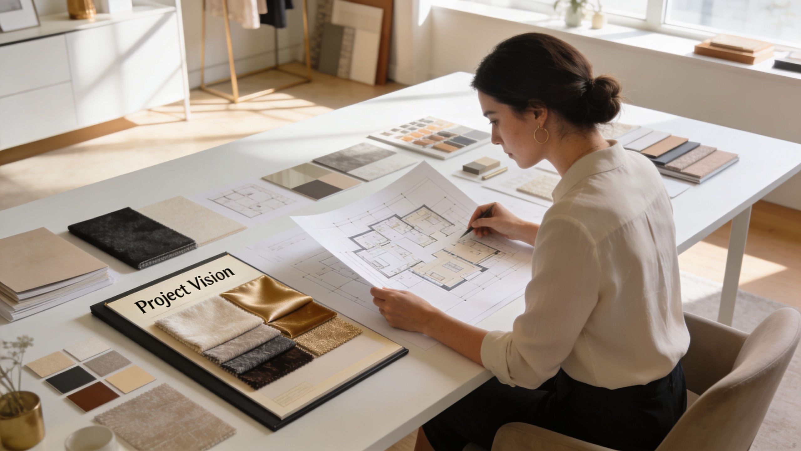
The Pre-Shoot Blueprint for Flawless Execution
The strongest interiors are usually won before the camera comes out. By the time the crew arrives, the major decisions should already be made. What is the hero room. Which materials deserve close attention. What needs to disappear. Which angles support the design story and which ones dilute it.
Start with the walkthrough, not the furniture
The first walkthrough should include the people who shaped the space and the people responsible for translating it visually. That usually means some combination of photographer, interior designer, architect, marketing lead, property team, and stager.
The conversation should stay focused on intent. Not "Where can we put a vase?" but "What is this room doing?" A breakfast room might be about morning light on plaster walls. A hotel lobby might be about layered circulation and material contrast. A law office reception area might be about restraint and trust.
A useful planning conversation covers:
- Primary story. What should the finished image set say about the project?
- Priority spaces. Which rooms carry the narrative most strongly?
- Non-negotiable features. Built-ins, art walls, millwork details, light fixtures, exterior views.
- Visual liabilities. Cords, temporary furniture, mismatched lamps, signage, damaged finishes, seasonal clutter.
- Usage needs. Editorial submission, portfolio, leasing deck, website banners, print collateral.
National Association of Realtors survey data summarized by The Zebra's home staging research notes that 81-83% of buyers' agents say staging helps people visualize a property as their future home. That same principle applies well beyond residential sales. If the frame makes the use of the space legible, the image becomes persuasive.
Build the shot list from narrative priority
A weak shot list is just a room inventory. A strong one is hierarchical.
Start with the defining wide shots. Those establish the architecture, circulation, and mood. Then identify medium views that explain transitions between spaces. Last come the details that support the story, such as a curved plaster return, custom hardware, a breakfast nook, or the way light skims across a textured wall.
I prefer a shot list that separates images into three groups:
- Hero frames that have to carry the project
- Support frames that explain sequence and function
- Detail frames that add editorial texture
That structure keeps a team from wasting the best light on minor scenes.
Practical rule: If a room only works from one angle, the staging probably isn't resolved yet.
Decide what the room is about before styling it
Many projects frequently drift. Teams begin styling before they decide what the camera needs to say. Once that happens, accessories take over and the architecture starts competing for attention.
Use a simple planning table.
| Space | Story focus | What stays | What goes |
|---|---|---|---|
| Living room | Volume and conversation | Primary seating, sculptural table, one reading object | Extra side chairs, busy florals, small decor clutter |
| Kitchen | Material precision and workflow | Counter stool set, one functional vignette, clean appliance lines | Counter appliances, dish racks, branded packaging |
| Bedroom | Quiet and softness | Tailored bedding, single bedside story, controlled drape folds | Excess pillows, personal items, tangled charging cables |
For larger or more technical assignments, a pre-production reference folder helps. Floor plans, finish schedules, inspiration images, window orientation notes, and brand usage needs should live in one place. A practical reference for site readiness is this guide to preparing a site for a photoshoot, which aligns well with a disciplined pre-shoot staging workflow.
Timing matters more than teams expect
A rushed styling day creates avoidable problems. Furniture arrives late. Creases remain in textiles. Plants look tired. The client starts making design decisions while the photographer is trying to meter light.
A better rhythm is to lock core staging before shoot day whenever possible. That gives the team enough distance to review test phone images, reconsider weak corners, and remove anything that feels too eager or too empty.
Pre-shoot planning also protects the budget. It is far cheaper to reject an unnecessary prop on a shared walkthrough than to move it around for three hours on set while the best daylight disappears.
Composing the Scene with Furniture Layout and Flow
Furniture arrangement for photography is not the same as furniture arrangement for living. People live by habit. Cameras read structure. What feels natural in person can look blocked, cramped, or visually indecisive in a frame.
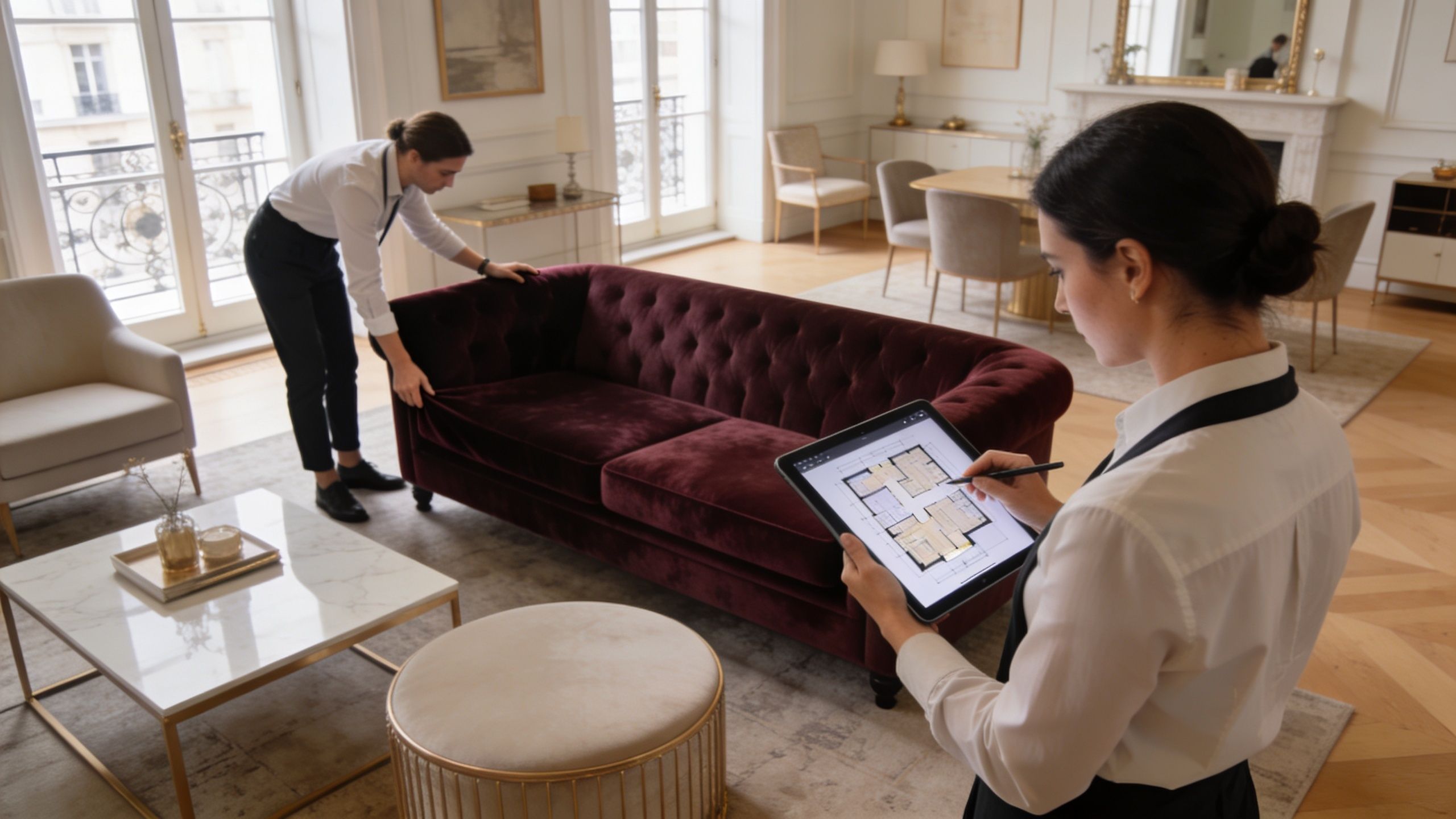
A photograph needs order. It needs enough space between elements for the eye to travel. It needs a clear relationship between foreground and background. And it needs restraint, especially in large open-plan interiors where every zone is trying to be seen at once.
Rooms should read in one glance
The first pass through a space isn't about styling details. It's about legibility. Stand at the likely camera positions and ask a blunt question. Does the room make sense immediately?
If not, the layout usually has one of three problems:
- Competing focal points that split attention
- Poor breathing room between major pieces
- Broken sightlines caused by furniture height or angle
A common correction is subtraction. Remove a chair instead of sliding it around. Pull a console away instead of filling the corner above it. In photography, less furniture often produces more information because the architecture can finally be seen.
The photographic layout is slightly artificial on purpose
Good staging often looks a little more disciplined than daily life. That isn't fakery. It's translation. A lens compresses and flattens space differently than the eye experiences it, so the room usually needs small adjustments to appear natural in the final frame.
This often means:
- rotating lounge chairs so they don't block a fireplace surround
- pulling seating off the wall to create dimensionality
- centering a rug to support the composition rather than the traffic pattern
- spreading grouped objects farther apart than you'd do in person
Leave enough air around key furniture pieces so edges stay readable. When objects touch visually, the frame starts to feel crowded even if the room itself is large.
Open plans need zones, not furniture islands
Large rooms are where staging either becomes refined or collapses into showroom noise. The fix is to create intentional zones that photograph as part of a whole.
Instead of scattering furniture evenly, define purpose. A seating zone, a dining zone, a reading zone. Each should have its own center of gravity, but the transitions between them should remain calm. Rugs, lighting, and orientation do most of that work.
A useful way to consider this:
| Layout problem | What it looks like in camera | Better move |
|---|---|---|
| Furniture pushed to perimeter | Empty center, no intimacy | Pull pieces inward to form a conversation area |
| All seating faces TV wall | Flat, transactional composition | Angle seating to create depth and connection |
| Overscaled rug or tiny rug | Room loses proportion | Choose a rug that anchors the grouping without swallowing it |
| Too many occasional tables | Busy edges and cluttered corners | Keep only the surfaces the frame actually needs |
The details matter here. Rug placement affects how grounded a room feels. Chair angle affects whether the image feels formal or relaxed. A single missing lamp can improve balance more than an expensive prop ever will.
Use asymmetry with discipline
Perfect symmetry can work, especially in classical or hospitality spaces, but many high-end interiors look stronger with controlled asymmetry. One larger object on the left can balance two smaller shapes on the right. A bench can offset a substantial bed. A tall branch arrangement can counter the weight of millwork.
The key word is controlled. Random imbalance looks accidental. Intentional asymmetry gives a frame tension and movement.
This kind of spacing and flow is easier to understand visually:
Edit for the frame, not for the room
Photographic decluttering is not the same as standard tidying. The goal isn't to make the room sparse. The goal is to remove anything that doesn't contribute to the composition.
That usually includes:
- Small objects with no visual role such as extra candles, remotes, tissue boxes, and promotional materials
- Distracting verticals like floor fans, visible cords, and cleaning tools
- Pattern conflicts between textiles, artwork, and surrounding finishes
- Furniture duplicates that add weight without improving the shot
What remains should feel chosen, not merely left behind.
A living room might keep one large art book, a sculptural bowl, and a low branch arrangement. A dining room may need nothing beyond seating, table surface, and one restrained centerpiece. When staging for high-end interior shoots, the composition almost always improves when each object has a reason to be visible.
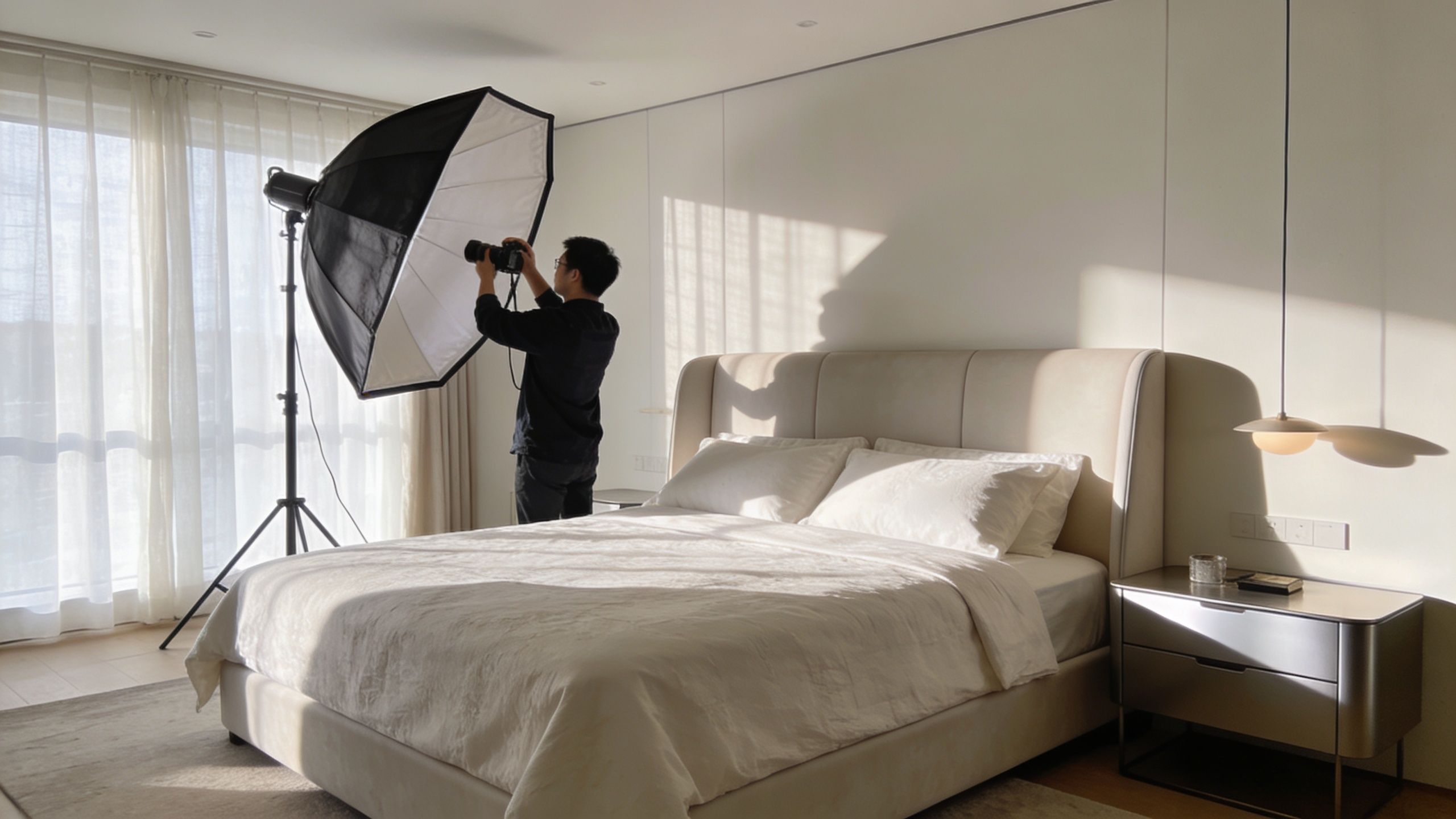
Mastering Light and Shadow in Interior Photography
A well-staged room can still fail if the light is unresolved. Proper light management sets high-end interior work apart from basic listing photography. Light isn't there just to illuminate the room. It shapes mood, reveals material, controls attention, and protects the view beyond the glass.
Windows are where many interiors fall apart
One of the most common failures in interior photography is the gap between interior brightness and exterior brightness. The room looks correct and the windows blow out. Or the exterior view holds and the room goes dull and underexposed.
As described in this Fstoppers breakdown of luxury interior lighting challenges, that imbalance often turns windows into overexposed "white holes." The practical solution is usually a combination of bracketed exposures and composite work, or more deliberate strobe lighting that lifts the room to meet the window view without falling into artificial-looking HDR.
That choice depends on the project. A minimalist residence with soft daylight may benefit from a careful ambient-led blend. A commercial lobby with deep shadows, reflective stone, and important exterior context may need more active lighting control.
Strobes should support the architecture
The mistake isn't using strobes. The mistake is letting strobes announce themselves. High-end work rarely benefits from light that feels sprayed across the room. It should seem plausible, directional, and consistent with the design.
A useful decision framework looks like this:
| Situation | Better approach | Why |
|---|---|---|
| Soft north light and gentle contrast | Ambient-led exposure blend | Preserves the room's natural mood |
| Bright windows with darker interior finishes | Controlled strobe support | Holds exterior detail and interior texture together |
| Highly reflective surfaces | Selective lighting and flagging | Reduces unwanted glare and bright hotspots |
| Layered decorative lighting | Balance practicals with supplemental light | Keeps atmosphere without muddy color |
This is also where planning helps. If a shoot involves difficult glazing, polished marble, dark wood, or mirrored surfaces, test frames save time. So does knowing whether the client values realism, atmosphere, publication polish, or a mix of all three.
For teams comparing approaches to daylight timing, practical fixtures, and supplemental lighting, this guide on choosing the best light for a site shoot is a useful reference point.
Shadow gives the room structure
A fully bright image isn't automatically a better image. Rooms need tonal shape. Shadow is what gives columns depth, reveals the profile of millwork, and helps upholstery look dimensional instead of flat.
Three lighting habits improve interiors quickly:
- Keep some falloff so the room retains depth
- Light textures from an angle when stone, plaster, tile, or fabric needs to read clearly
- Watch mixed color temperatures because cool daylight and warm practicals can either create richness or create a mess
If every surface is equally bright, nothing feels designed.
Reflections need as much attention as furniture
Glass, glossy cabinetry, framed art, polished metals, and stone tops all report back on the photographer's decisions. They show poorly placed lights, reveal clutter outside the frame, and flatten the room if not managed carefully.
The fix is rarely one trick. It is a combination of camera placement, modifier size, feathering light, and patience. Sometimes moving a light a small distance changes everything. Sometimes the right answer is to remove a practical lamp from the composition rather than fight its reflection for half an hour.
In staging for high-end interior shoots, lighting isn't separate from styling. They shape each other. A pale linen chair may need a different placement once the window light starts grazing it. A glossy table may need fewer objects because reflections are already adding visual activity. The room only resolves when both staging and light agree on what matters.
The Final Layer Styling with Props Color and Texture
Once the furniture and lighting are doing their jobs, the last layer begins. Many otherwise strong shoots get overworked at this stage. A space that needs a touch of life gets buried under objects. A clean kitchen receives a bowl, a cookbook, a tray, a vase, a towel, and a cutting board, all asking for attention at once.
The final styling pass should feel closer to editing than decorating.
Choose props that belong to the design language
A modern residence with quiet millwork and restrained materials doesn't need whimsical accessories to seem interesting. A hospitality suite with sculptural lighting doesn't need ten decorative objects on every surface. Props should extend the design vocabulary that already exists in the room.
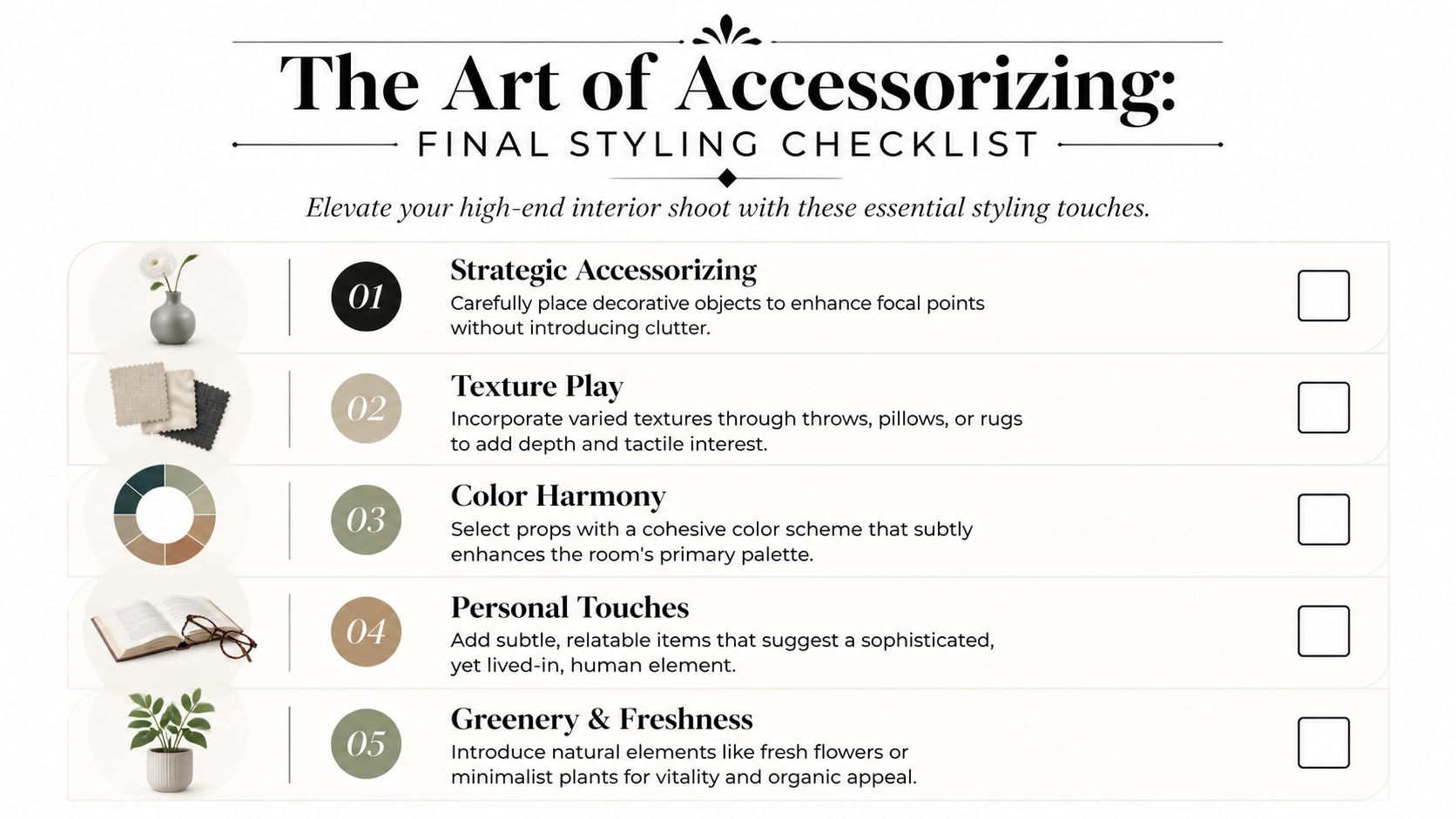
The most useful styling pieces are usually quiet:
- Books with graphic presence rather than loud jackets or distracting titles
- Ceramics with shape rather than novelty
- Textiles with tactile value such as linen, wool, bouclé, or washed cotton
- Greenery with clean line rather than dense bouquet arrangements
High-end shoots benefit from discipline here. Gady Studio's staging roundup notes that the most impactful rooms to stage are the living room at 91%, primary bedroom at 83%, and dining room at 69%, while over-accessorizing can reduce appeal by 20-30% according to agent surveys, as summarized in these home staging statistics from Gady Studio.
A kitchen and a bedroom need different kinds of life
The strongest props suggest use without becoming literal.
In a kitchen, one stoneware bowl, a board with visual weight, or a restrained stem arrangement can be enough. The point isn't to stage a meal. It's to give scale and soften hard surfaces. A countertop cluttered with aspirational lifestyle objects starts to feel like a catalog set.
In a bedroom, texture carries more of the story. A well-fitted duvet, one throw with a visible weave, and a single bedside object can do more than a pile of pillows. Bedrooms should feel edited and breathable. They fall apart quickly when every soft good is trying to add luxury at the same time.
A helpful working method is to style in passes:
- First pass. Add only what the room needs functionally.
- Second pass. Introduce one or two pieces that add warmth or tactility.
- Third pass. Remove anything that now feels explanatory or repetitive.
One elegant object that catches light well will outperform five decorative items that compete for attention.
Color should support, not interrupt
Color in props needs to relate to the architecture and materials already present. That doesn't mean everything has to be beige. It means the accents should feel earned.
If the room is built around walnut, plaster, and charcoal stone, strong saturated accessories may hijack the frame. If the palette is pale and quiet, a single dark object can help anchor it. If the interior is already rich with color, props may need to become more neutral so the architecture keeps the lead role.
Texture is often the safer and smarter move. A cashmere throw, a heavy linen drape, a matte ceramic vessel, or a hand-thrown bowl adds depth without shouting.
For designers who want material richness to photograph clearly, this article on capturing texture in interior design photos is directly relevant to prop selection and styling restraint.
Keep a short list of reliable styling moves
Some additions work in nearly every high-end context when used sparingly.
| Space | Reliable styling move | Why it works |
|---|---|---|
| Living room | One large-format art or architecture book | Adds scale and intention |
| Bedroom | Tailored textile with visible weave | Brings softness without clutter |
| Dining room | Low centerpiece with negative space around it | Preserves sightlines |
| Bath | Single folded towel and one small object | Signals care without looking staged for retail |
| Office or study | One meaningful desktop object | Suggests use while keeping authority |
The best final styling leaves the viewer with a sense that the room has been thoughtfully inhabited, but not busied up for the camera. That's the editorial line. Cross it, and the image starts selling props instead of space.
On-Set Workflow and the Post-Shoot Handoff
Shoot day rewards teams that arrive with decisions already made. The rhythm should feel deliberate, not frantic. If the crew is still debating the identity of the room while lights are going up, the schedule is already under pressure.
A reliable workflow starts with the widest architectural frames. Those images need the freshest room, the cleanest surfaces, and often the best available light. Medium compositions follow once the broad structure is secured. Detail vignettes come later, when larger furniture shifts are no longer a risk.
Work from broad to specific
This order keeps the room from degrading too early. Pillows collapse. stems droop. chairs drift. The more a set is touched, the less precise it becomes.
A disciplined sequence looks like this:
- Arrival check. Walk every priority room and compare it against the shot list
- Wide frames first. Secure the images that define the project
- Secondary angles next. Capture transitions, adjacencies, and alternate storytelling views
- Detail work last. Move into surfaces, materials, and smaller editorial moments
That progression also helps with client communication. Once the anchor images are captured, everyone can relax a little. The project already has a backbone.
Keep client feedback structured
Client presence on set can be useful or chaotic. It depends on whether comments are tied to the agreed narrative. A designer may catch a pillow seam, a crooked shade, or an object that contradicts the intended aesthetic. That's valuable. A stream of spontaneous styling ideas from multiple stakeholders usually is not.
The easiest fix is to define feedback lanes early. One person signs off on design intent. One person confirms marketing needs. The photographer controls composition, exposure, and what the frame can realistically hold.
A short on-set checklist helps maintain that boundary:
| Checkpoint | Question |
|---|---|
| Composition | Does the frame clearly state what the room is about? |
| Styling | Is any object drawing attention away from the architecture? |
| Light | Does the mood match the space, and are key surfaces reading well? |
| Brand use | Is there enough negative space for possible crop or text placement? |
Do a formal close before packing
Packing up without a final review is how missed shots happen. Before the last stand goes down, compare captured images against the approved shot list. Confirm hero spaces. Confirm alternates. Confirm any requested verticals, detail crops, or usage-specific compositions.
Then reset the room respectfully. That matters in occupied homes, hotels, workplaces, and model units. A professional finish isn't just about the files. It's about leaving the site in a controlled, orderly condition.
Post-shoot, the handoff should be clear and brief:
- Back up immediately to primary and secondary storage
- Review for completeness before the day is considered closed
- Set expectations for editing scope, proofing, and delivery timing
- Note any retouching flags such as visible exterior distractions, surface imperfections, or color-sensitive materials
Good staging pays off twice. First in the frame, then in the edit. When the room has been composed with discipline, post-production becomes refinement instead of rescue.
If you're planning Staging for High-End Interior Shoots with Jimmy Clemmons Photographer, the process can include location scouting, lighting design, on-set direction, and polished editing built around the design story of the space. For architects, interior designers, developers, and brand teams, that means images shaped for publication, portfolio use, and marketing with the same editorial discipline that high-end interiors deserve.