

You’ve probably lived this version of the same meeting.
The traffic model is sound. The land-use logic holds up. The budget is defensible. The presentation deck is packed with diagrams, sections, policy language, and carefully worded benefits. Then the room goes flat. Residents don’t see themselves in it. Elected officials hesitate. Developers ask for a clearer story about value, identity, and public response.
That gap usually isn’t about planning quality. It’s about translation.
Urban plans fail visually long before they fail technically. They fail when the people looking at them can’t connect the proposal to daily life. A better sidewalk means little as an abstract improvement. A safer walk to school, a main street that feels active after work, or a public square people want to stay in, that lands immediately.
Beyond Blueprints Moving Communities with Narrative
The most effective visual storytelling for urban planners starts when you stop treating images as decoration for the final presentation. They belong much earlier than that. They shape how a project is understood, remembered, and discussed.

A planning team can show a cross-section of a redesigned corridor and still lose the room. Why? Because a section drawing explains geometry, not lived experience. People respond when they can see sequence, character, and consequence. They want to understand what changes at eye level, how movement feels, who benefits, and what kind of place emerges afterward.
That’s why narrative matters. In a European initiative across 9 cities, storytelling increased resident engagement by up to 40% in participatory processes, and the approach later spread to over 50 URBACT projects, where visual storytelling through photos, videos, and infographics improved public perception of urban transformations by 28% on average, according to URBACT’s account of storytelling in urban change.
Why technical clarity still isn’t enough
Planning documents usually answer professional questions first. Is the circulation resolved? Does the frontage work? Are setbacks compliant? Those are necessary questions, but they aren’t the whole job.
Public-facing visuals have to answer a different set:
- What kind of life does this create
- What gets easier or better
- What stays familiar
- Why should people trust this change
An editorial photographer learns this early. A strong image doesn’t merely record a building. It frames a point of view. It decides what matters in the scene and what can stay out. That discipline is useful in planning because stakeholder attention is limited, and confusion fills the frame fast.
Practical rule: If your visual can’t communicate its purpose without a presenter narrating every detail, it isn’t finished.
The shift from proposal to story
A good urban planning image does three jobs at once. It documents conditions accurately. It gives viewers emotional orientation. It supports a strategic message.
That combination is why polished architectural photography belongs in planning conversations, not just marketing after construction. Renderings can suggest a future, but photography establishes credibility in the present. It shows material reality, context, maintenance conditions, edges, sightlines, and the difference between what the plan says and what the street feels like.
Visual storytelling for urban planners works best when it respects both audiences in the room. Residents need clarity and recognition. Decision-makers need confidence that the proposal is coherent, serious, and buildable. Strong imagery can satisfy both, but only if it’s planned with narrative intent.
Finding Your Narrative The SAMS Framework
Most weak planning visuals don’t fail because the camera was bad. They fail because nobody decided what story the images needed to tell.
The cleanest way to fix that is the SAMS framework, which stands for Story, Audience, Message, Style. Used well, it gives structure before anyone starts scouting locations or making shot lists.
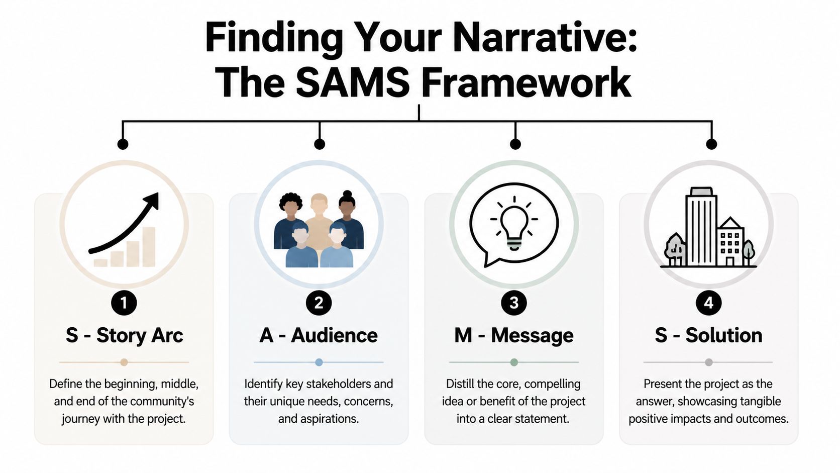
In workshops for the +CityxChange project, applying SAMS led to 80% higher resident engagement in participatory narrative-building, and projects using the framework saw a 40% improvement in public buy-in compared with traditional methods, as described in Planetizen’s discussion of storytelling in urban planning.
Story
Start with the human arc, not the project description.
“The corridor will receive traffic calming, expanded sidewalks, and planted buffers” is a scope statement. It isn’t a story. “Children can walk to school with fewer conflict points” is a story. “An underused commercial strip becomes a place people linger in” is a story.
A useful test is whether the narrative can be understood without planning jargon. If it can’t, it probably won’t travel well in public meetings, presentations, or press coverage.
Try framing the project in one of these ways:
- A daily-life story such as the trip to school, the bus stop, or the walk from parking to storefront
- A place-repair story where a fragmented area gains continuity, comfort, or identity
- A future-memory story that helps people picture how a place will be used over time
Audience
The same image won’t persuade every stakeholder.
Residents often need to see familiarity, access, and practical benefit. A city official may focus on legibility, political risk, and public reception. A developer usually looks for coherence, value communication, and confidence that the project feels professionally resolved.
That changes visual choices. For a community workshop, images should show eye-level experience, faces, movement, and recognizable landmarks. For an approval board or investment meeting, images should show composition, hierarchy, and control. A polished set of visuals signals discipline before a word is spoken.
The audience doesn’t need more images. They need the right evidence in the right visual language.
If you want a sharper eye for how composition guides interpretation, study architectural composition techniques in this photography guide. The principles apply directly to planning visuals because composition determines what people read first and what they trust second.
Message
Every visual sequence needs one central takeaway.
Not five. Not a stack of benefits. One.
Maybe the message is that the proposal restores safety without killing street activity. Maybe it’s that a civic investment creates a stronger public realm around existing businesses. Maybe it’s that the project preserves local identity while updating infrastructure. Once you decide that, every image either supports the message or gets cut.
A common mistake is trying to make one board or slideshow carry every argument at once. That produces clutter. Better to build a sequence where each image advances the same claim from a different angle.
Style
Style is where many planning teams drift into inconsistency. They mix smartphone documentation, glossy renderings, consultant diagrams, and stock lifestyle images. The result feels assembled, not authored.
Choose a visual style that matches the project’s purpose:
| Style | Best use | Risk if overused |
|---|---|---|
| Documentary photography | Existing conditions, trust-building, reality check | Can feel flat if there’s no clear framing |
| Aspirational rendering | Future vision, fundraising, broad imagination | Can feel generic or unbelievable |
| Technical diagrams | Process, circulation, phasing, policy alignment | Can lose non-expert audiences |
| High-end architectural photography | Authority, design intent, material credibility | Can feel detached if people never appear |
The strongest planning narratives usually combine them, but they do so intentionally. Style should clarify the message, not compete with it.
Creating a Shot List That Tells Your Story
Once the narrative is set, the next job is translating it into a shoot plan. For this, planners can borrow from editorial production. You don’t show up and “get coverage.” You decide what each frame must accomplish.
A shot list is a visual script. It prevents the two failures that waste most shoot days: capturing too much without purpose, or missing the one image the whole campaign needed.
Think in sequence, not singles
A persuasive set of planning images usually works like a short feature. It opens with context, moves into experience, then lands on proof. That means you need range.
Start wide. Show the block, corridor, frontage, or civic edge in context. Then move to medium shots that show how people interact with crossings, benches, storefronts, bus stops, or public space. Finish with details that prove quality, conflict, wear, craft, or opportunity.
That sequence gives a reviewer or resident enough information to understand both the scale of the project and the texture of daily use.
Essential Shot List Checklist
| Shot Type | Narrative Purpose | Key Elements to Capture | Notes for Photographer |
|---|---|---|---|
| Establishing shot | Show context and urban relationship | Street edge, buildings, sidewalks, trees, traffic pattern | Shoot from a position that clarifies spatial hierarchy |
| Arrival view | Show first impression of the place | Entry point, signage, curb condition, visibility | Capture what a first-time visitor would notice |
| Human interaction shot | Show lived experience | Pedestrians, cyclists, waiting, crossing, gathering | Time the frame for authentic activity, not staged clutter |
| Circulation shot | Explain movement | Paths, crossings, bottlenecks, turning conflicts | Use angle and depth to show how movement actually works |
| Detail shot | Prove material condition or design quality | Paving, seating, lighting, planting, facade edge | Look for craftsmanship or points of failure |
| Contrast shot | Support before-and-after storytelling | Underused zone next to active edge, fragmented sidewalk next to continuous path | Keep framing consistent if comparing conditions |
| Stakeholder view | Match decision-maker concerns | Development parcel, public interface, visibility line | Prioritize clarity over drama |
| Hero image | Anchor the presentation or campaign | Strong composition, recognizable identity, usable negative space | This is the image that carries the whole narrative |
A good reference for thinking through coverage is this portfolio shot guide for architectural work. The categories map well to planning because they force intention into each frame.
What belongs on the shot list besides shot names
The best shot lists include more than “wide exterior” or “street scene.” They include story notes.
Add these fields before the shoot:
- Narrative purpose so each frame serves a reason
- Priority level so the crew knows what can’t be missed
- Time of day because light changes what the place communicates
- Stakeholder use such as board deck, public open house, website, or press outreach
- Access notes including vantage point, permits, and safety constraints
A shot list should tell the photographer what the image must mean, not just what it must include.
That one distinction changes the whole production. It turns the camera from a recording device into a planning tool.
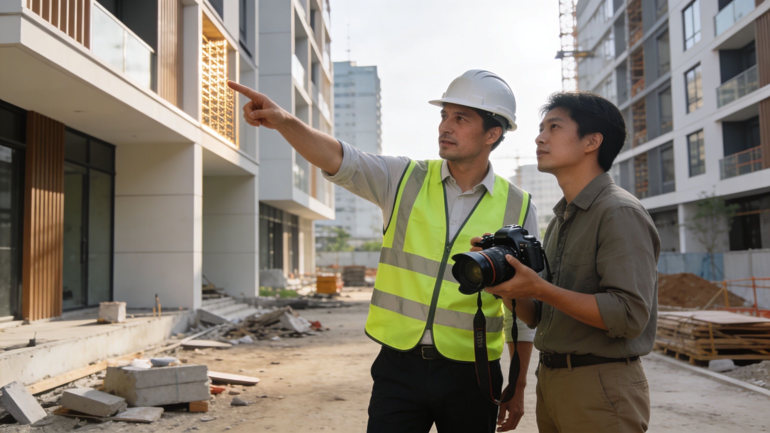
Directing the Shoot On-Site Collaboration
On-site direction is where narrative discipline gets tested. If the brief is vague, the shoot turns reactive. People chase nice light, attractive corners, or obvious landmarks while the intended story goes uncaptured.
That’s why planners should direct with intent, even when a professional photographer is leading the technical side.
Write a brief that a photographer can actually use
A creative brief for visual storytelling for urban planners should answer a few concrete questions.
- What is the project trying to prove
- Who needs to be persuaded
- Which spaces matter most
- What should the mood feel like
- What must be avoided in the frame
That last part matters. If the story is about inclusive access, don’t let every frame center empty paving with no sign of use. If the proposal is about reconnecting a fragmented district, don’t isolate cropped architectural fragments that erase context.
A useful brief also identifies whether the shoot is documenting existing conditions, supporting a proposal, or building a campaign that spans both. Those are different assignments and they demand different image behavior.
Use photography language that shapes the outcome
Planners don’t need to become camera technicians, but a few visual concepts make collaboration much better.
Leading lines help the eye follow movement through a street, plaza, or building edge. Visual rhythm comes from repeated columns, trees, lights, facades, or paving joints, and it can make order feel present or absent. Compression from a longer lens can make congestion feel more intense. A wider lens can reveal spatial relationship, but it can also distort scale if used carelessly.
Light matters just as much. Early and late daylight can make a public space feel inviting and layered. Flat overhead sun often hides texture and weakens atmosphere. Interior or under-canopy spaces may need added lighting strategy if the goal is to show depth and legibility rather than murk.
Co-create instead of extracting images
The URBZ Visual Narratives methodology is useful here because it emphasizes co-creation with residents and multi-dimensional storytelling. It also warns where projects go wrong. 60% of projects fail due to spotlight neglect on marginalized areas, and 55% experience message misinterpretation when visuals are generic and not integrated with audience needs. In Mumbai pilots, the method achieved 65% community-led adoption of plans, compared with 25% in non-visual baselines, according to URBZ’s article on visual narratives in participatory urbanism.
That should change what happens on site. Don’t only photograph the polished frontage. Photograph the missing connections, the edges people avoid, the overlooked block, the transition between investment and neglect. A plan gains credibility when its visuals acknowledge uneven conditions in their entirety.
Here’s a useful production reference before the shoot day begins: how to prepare a project site for a professional photoshoot.
A short visual example helps when discussing pacing, framing, and spatial coverage with your team:
What works on site and what doesn’t
What works is simple. Walk the site before the camera comes out. Check sightlines. Confirm where the story begins and ends. Watch how people move.
What doesn’t work is treating the site like a brochure. Over-staged scenes look false. Over-edited previews feel untrustworthy. Randomly mixing moody lifestyle shots with technical evidence creates friction instead of persuasion.
Good on-site direction protects two things at once: accuracy and impact.
That balance is what gives imagery authority.
From Capture to Campaign Integrating Visuals Effectively
A strong shoot still fails if the assets only live in one slide deck. Planning visuals create value when they’re edited, organized, and deployed for specific contexts.
The first decision is how far to polish the imagery. Clean color, corrected perspective, consistent contrast, and thoughtful cropping usually improve trust because they improve legibility. Heavy stylization can do the opposite. If the image feels manipulated, people start doubting the proposal along with the photograph.
Match the format to the stakeholder
Not every audience should see the same edit or sequence.
For public engagement sessions, large-format boards and simple side-by-side comparisons work well because people read them while standing, talking, and moving around the room. For city officials and developers, a tighter digital presentation with a clear hierarchy tends to work better. For project websites and social channels, a small set of hero images and short visual series is often stronger than uploading everything.
A practical distribution stack might look like this:
- Public meeting boards that use one dominant image per theme, supported by concise labels
- Approval presentations built around a clean narrative arc, with each image tied to a decision point
- Project websites that lead with a hero image and then move into context, use, and detail
- Social posts or newsletters that isolate one story at a time, such as safety, identity, or public realm quality
Pair imagery with data instead of making them compete
Visuals become more persuasive when they carry evidence without becoming cluttered. A well-composed site image next to one strong diagram or one clear annotation often outperforms a slide crowded with bullet points.
Planning teams should think like editors. Give each spread, board, or slide one job. If the frame is about pedestrian comfort, let the image carry comfort and let the data support it. If the frame is about development readiness, let the image communicate order, frontage, and access while the supporting information handles specifics.
A 2023 Urban Land Institute report found that 78% of urban planning proposals using high-quality architectural visuals secure 25% faster stakeholder approvals, and visual data analysis has been shown to increase planning decision accuracy by 52% and stakeholder buy-in by 65% compared with text-only reports, as cited in this urban visual data analysis reference.
Build an asset library, not a one-off folder
Treat each shoot as part of a longer campaign. Rename files clearly. Group by location, stakeholder use, and narrative purpose. Keep selects for board presentations separate from documentary archives. Save alternate crops for web, print, and vertical formats.
That kind of organization sounds mundane, but it has strategic value. Planning teams often revisit the same project through consultation, revision, approvals, procurement, and communications. If the imagery is coherent from the start, the project continues to look coherent as it moves through those stages.
The best visual storytelling for urban planners doesn’t stop at capture. It survives contact with meetings, public feedback, staff turnover, and shifting political context because the imagery was built to travel.
Conclusion Your Role as Urban Storyteller
Urban planning already involves storytelling. The central question is whether you’re doing it deliberately.
A plan tells a story about movement, belonging, safety, investment, and public life. The drawings matter. The policies matter. The data matters. But people still decide with their eyes before they fully process the language around them.
That’s why visual storytelling for urban planners should be treated as a core professional skill, not a finishing touch. The narrative has to be chosen. The audience has to be understood. The message has to stay focused. The style has to support trust. Then the shoot has to be directed with the same care you’d give any other public-facing part of the project.
Architectural photography brings a useful discipline to this work. It insists on composition, perspective, timing, light, and editorial clarity. It asks what the image says before it asks whether the image looks good. That mindset helps planning teams produce visuals that are emotionally legible to residents and authoritative enough for officials, boards, and development partners.
The most successful urban projects don’t only solve technical problems. They give people a believable picture of a better place. When that picture is honest, well-crafted, and strategically deployed, it becomes easier for communities to recognize themselves in the plan.
That’s part of the planner’s job now. Not just shaping space, but shaping how that space is understood.
If your team needs architectural imagery that communicates design intent with clarity and editorial discipline, Jimmy Clemmons Photographer creates visual assets for architects, developers, planners, and design-driven organizations that need more than generic project photos. The studio’s approach combines composition, lighting, and narrative structure to produce images that help proposals read clearly and persuasively across presentations, publications, and stakeholder campaigns.