

You’re probably looking at a proposal that’s technically correct and visually forgettable.
The plans are solid. The engineering is sound. The phasing logic holds up. But when a client opens the file, they don’t experience any of that as momentum. They see pages of intent without much feel for how the project will live in space. That gap is where proposals lose force.
A good walkthrough closes it. Not a lazy screen capture of a model spinning on screen, and not a flashy reel that hides the substance. Video Walkthroughs for Engineering Proposals work when they translate technical intent into something a reviewer can grasp quickly, trust instinctively, and remember after comparing five other submissions. The strongest ones borrow from editorial photography and film craft. They guide attention. They control light. They reveal sequence. They make detail legible without killing the rhythm.
Why Your Engineering Proposal Needs a Visual Narrative
A common mistake in proposals is assuming that clarity and persuasion are the same thing. They aren’t.
A proposal can be precise and still feel inert. It can answer every requirement and still fail to show judgment. Review committees, developers, architects, and contractors don’t just need proof that a team can do the work. They need to see how that team thinks, how it anticipates risk, and how it communicates under pressure.

A visual narrative does that differently than a stack of rendered views. It gives sequence to information. It lets you move from site context to circulation, from structure to finish, from broad concept to problem area. The reviewer stops decoding isolated images and starts following an argument.
A walkthrough is not a screen recording
A basic screen recording shows geometry. A crafted walkthrough shows intent.
That distinction matters. In proposal work, the job isn’t to prove that a model exists. The job is to show why decisions were made, what problems have already been anticipated, and how the design will function for people who have to build, approve, fund, or occupy it.
That’s where photographic discipline changes the result. Camera height affects authority. Lens choice affects perceived scale. Exposure affects whether finishes read as premium, clinical, or flat. Movement affects whether a corridor feels compressed or inviting. Those are visual decisions, but they shape business outcomes.
The strongest proposal videos don’t just display a project. They make the viewer feel that the team has already thought two steps ahead.
There’s also a market reason to raise the bar. An analysis of the market found that video proposals are rising 40% in construction sectors, while the collaboration angle between photographers and proposal teams remains underserved, especially regarding precise exposure and narrative composition for built environments, according to this market analysis on proposal video trends.
What works and what falls flat
Weak proposal videos usually have one of three problems:
- They mimic software demos. The pacing is mechanical, the framing is accidental, and nothing important gets emphasis.
- They overcorrect into marketing gloss. The video looks polished, but the technical meaning disappears.
- They ignore audience hierarchy. An architect, owner’s rep, and general contractor don’t watch the same way. One wants design coherence, one wants confidence, and one wants buildability.
The better approach is editorial. Start with the big read. Establish the site or building in one clean motion. Then narrow the lens. Show the junction, the sequence, the risk area, the user path, the coordination point. Let the viewer feel guided, not buried.
That’s why Video Walkthroughs for Engineering Proposals shouldn’t be treated as an add-on file at the end of a submission. They function best as a visual argument inside the proposal itself. When done well, they don’t decorate the engineering. They make the engineering easier to trust.
The Pre-Production Blueprint for Your Walkthrough
Most weak walkthroughs fail before anyone arrives on site or opens a rendering program. The problem isn’t the camera. The problem is that no one decided what the video must prove.
If the objective is fuzzy, the footage will be too. You’ll end up with handsome clips that don’t answer the client’s actual concerns.
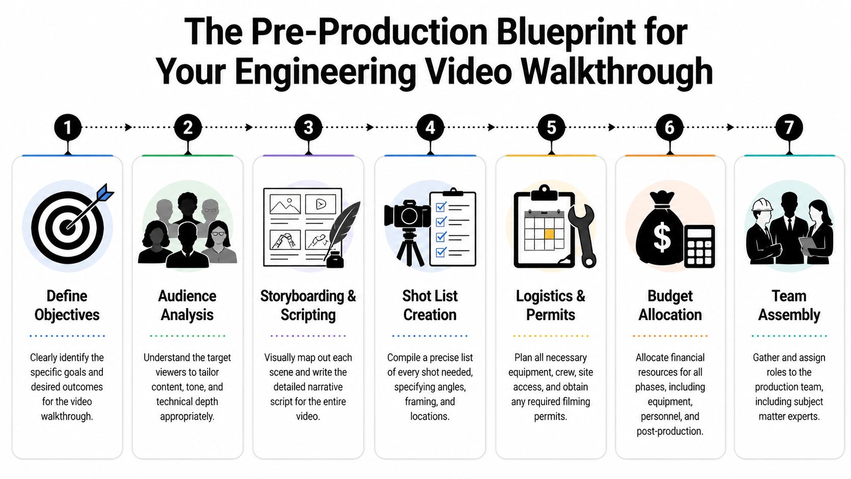
Define the single job of the walkthrough
Every proposal video needs one primary job, even if it supports several secondary ones. That job might be to clarify phased construction, show how a lighting strategy affects occupant experience, explain circulation in a complex interior, or demonstrate how envelope detailing addresses a known risk.
If you can’t say the main purpose in one sentence, the concept isn’t ready.
Planning question: What should the client understand after watching the walkthrough that they would not grasp as quickly from drawings and text alone?
A strong objective also helps you decide what not to shoot. Not every room deserves screen time. Not every system needs equal emphasis. In proposal work, selectivity reads as confidence.
Build a brief that engineering and creative teams can both use
The most useful creative brief is half technical document, half editorial assignment. It should be clear enough for engineers to trust and visual enough for a photographer, director, or motion team to execute without guesswork.
Include these elements:
- Primary audience: Architect, developer, school administrator, contractor, owner’s rep, or mixed review panel.
- Decision pressure: Are they worried about schedule clarity, coordination risk, user experience, durability, or value?
- Key proof points: The exact moments the video must make unmistakable.
- Visual tone: Clean and restrained, cinematic and aspirational, or documentary and factual.
- Delivery context: Embedded in a proposal, shown live in an interview, or hosted on a proposal platform.
Site readiness belongs in this phase too. If the location is active, cluttered, unsafe, or visually noisy, the final piece suffers no matter how strong the concept is. A practical site-prep checklist like this guide on how to prepare a site for a professional photoshoot is useful because proposal visuals often fail for ordinary production reasons, not conceptual ones.
Storyboard the route, not just the scenes
Teams often build a shot list without building a viewer journey. That’s backwards.
A storyboard should map the viewer’s path through information. In architecture and engineering proposals, path is meaning. You might begin outside to establish context, move through entry and circulation, pause where material transitions matter, then shift to details that answer likely objections.
Here’s a practical storyboard sequence for a proposal walkthrough:
Arrival and context
Open with the exterior relationship to site, access, or neighboring conditions.Threshold moment
Move through the entrance or first user touchpoint. This gives orientation and scale.Core functional sequence
Show how the main space operates. In a school, that may be circulation and supervision. In a hospitality project, it may be flow and lighting mood. In a facility upgrade, it may be service access or equipment adjacency.Risk detail
Pause on the place where misunderstandings usually happen. This is often where annotations later matter most.Resolution shot
End with a frame that reinforces competence and completion, not just aesthetics.
If a storyboard can’t explain why the camera moves from one place to the next, the viewer will feel that confusion even if they can’t name it.
Write the shot list like a technical document
The shot list should be specific enough that a crew can execute efficiently and a proposal manager can verify coverage. Vague entries like “interior sweep” invite weak footage. Better entries define framing, motion, purpose, and technical note.
A useful shot list line includes:
| Shot | Framing | Motion | Purpose |
|---|---|---|---|
| Lobby entry | Wide, eye-level | Slow gimbal push | Establish arrival sequence and sightlines |
| Equipment room detail | Medium close | Locked tripod | Clarify service access and component spacing |
| Facade corner | Low angle | Slider move | Show material transition and weathering logic |
| Corridor intersection | Wide | Gimbal pass-through | Explain circulation and supervision lines |
Pre-production is where discipline saves money. It’s also where storytelling becomes practical. Once the route, proof points, and coverage are locked, the walkthrough stops being a “nice extra” and becomes a controlled piece of proposal communication.
Capturing the Vision On-Site
Production day should feel deliberate, not reactive.
When I walk a site for a proposal shoot, I’m not hunting for random dramatic angles. I’m looking for the frames that make technical decisions readable. The camera has one job on-site. It must turn complexity into orientation.
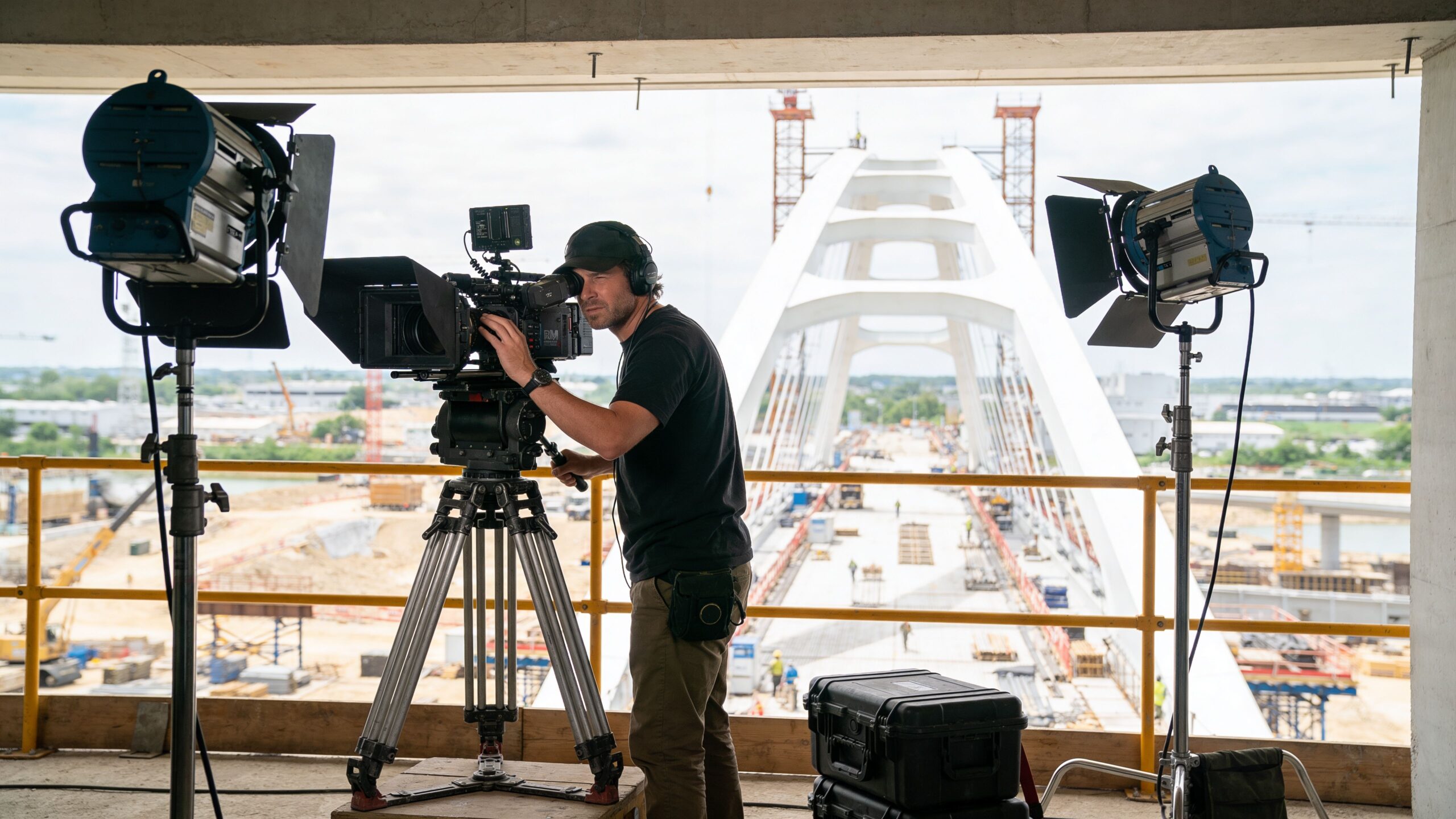
Choose gear for legibility, not prestige
A full-frame camera in low light interiors gives you flexibility, but the tool matters less than the reason behind it. Wide lenses can establish scale, yet if you go too wide, walls bow and spaces start to feel dishonest. Longer lenses isolate details beautifully, but too much compression can hide how elements relate in plan.
On technically dense projects, I prefer to mix three visual modes:
- Controlled wide views: For orientation, circulation, and overall massing.
- Mid-range moving shots: For walking the viewer through transitions without distortion.
- Tight locked details: For materials, interfaces, equipment, and problem points.
Some proposals need more than photography and conventional video. To avoid the 55% of proposals that fail due to non-specific visuals, high-end teams use tools such as LiDAR scanners for sub-1cm 3D model accuracy and cinema-grade cameras like the RED Komodo, according to this walkthrough integration reference from Better Proposals. That matters because vague visuals often create the exact uncertainty a client is trying to eliminate.
Light the space so the engineering reads clearly
Bad lighting makes technical work look unresolved.
A room can be beautifully designed and still collapse on camera if windows clip out, ceiling planes disappear, or surfaces merge into one muddy tone. Proposal footage needs separation. The viewer should read material, depth, and hierarchy at a glance.
Natural light is often the starting point, especially in architecture. But relying on it blindly is a mistake. If daylight makes one side of a space feel dead or throws critical detail into shadow, supplement it. Even small lighting adjustments can define edge conditions, reveal texture, or keep reflective finishes from blowing out.
This is where field judgment matters. A practical resource like choosing the best light for a site shoot helps because the right time of day can do more for credibility than expensive post work later.
A proposal viewer won’t say, “the exposure is off.” They’ll say, “something about this feels unclear.”
Move the camera with intention
Movement is where a walkthrough either earns trust or loses it.
A gimbal shot should feel like guided attention, not floating spectacle. Sliders help when you want a small reveal across a surface or around a structural element. Tripods still matter because some moments need steadiness more than motion. If you’re explaining equipment clearance, waterproofing transitions, or façade alignment, locked composition usually wins.
A good on-site rhythm often looks like this:
- Start stable: Give the viewer one fixed frame to understand the space.
- Introduce motion: Walk them through the next decision point.
- Pause again: Let the important detail land.
- Finish clean: Exit on a composed shot that suggests completion.
Capture what the proposal team usually forgets
Many teams cover hero views and miss the frames that help win work. They forget the service corridor, the underside condition, the threshold detail, the drainage point, the turn radius, the junction where one trade can misread another.
Those aren’t glamorous shots, but they’re persuasive. They show that the team understands where drawings stop being abstract and start becoming field conditions.
That’s the craft of on-site production for Video Walkthroughs for Engineering Proposals. The work isn’t just to make a space look impressive. It’s to make the design easier to believe in.
The Art of Narration and Annotation
Beautiful footage can still leave a reviewer with questions. That’s where narration and annotation do the heavy lifting.
This layer is what turns a polished visual sequence into an engineering communication tool. It gives the viewer context without forcing them back into the drawing set every few seconds.
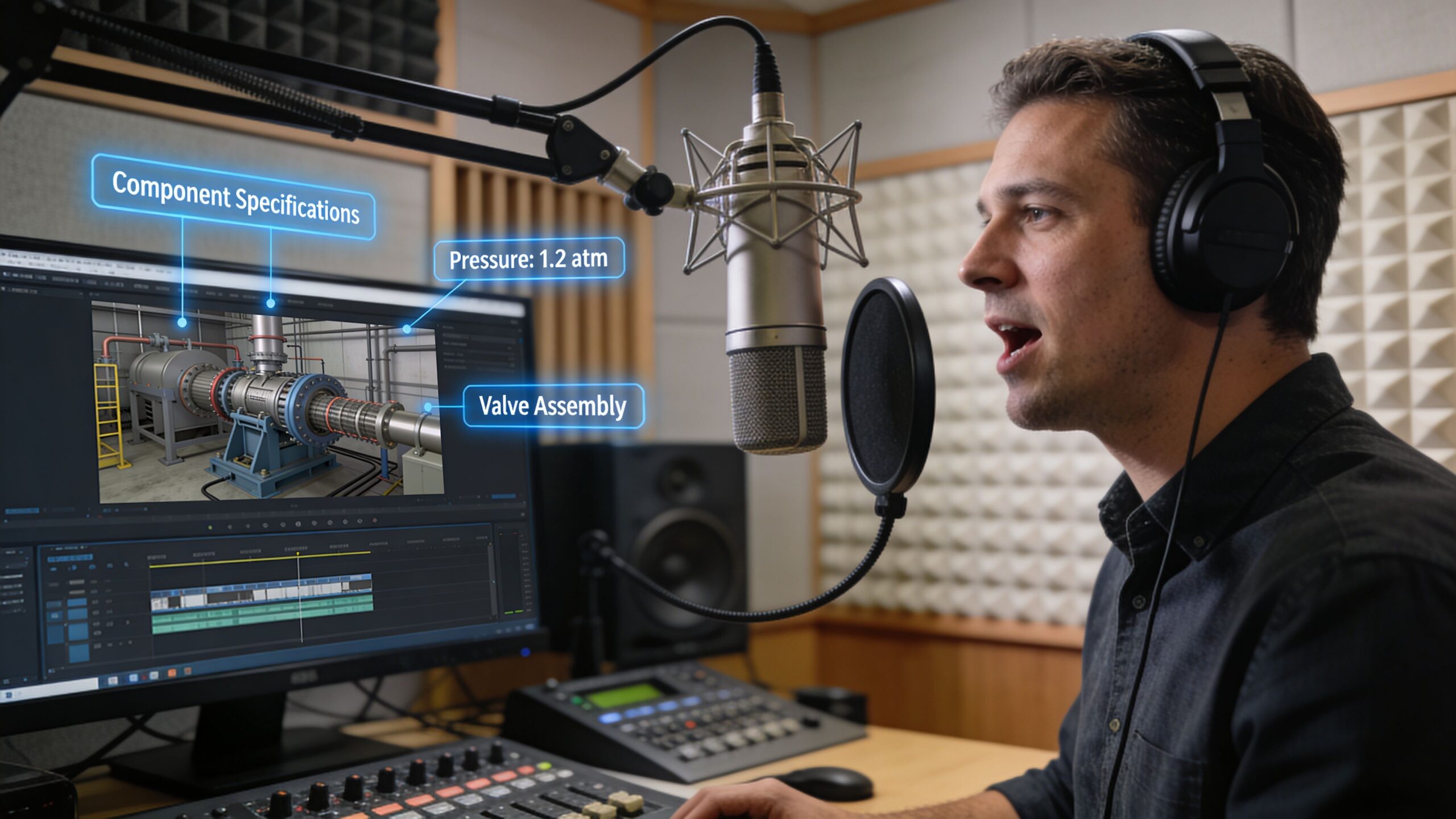
Write narration that explains significance
The script shouldn’t read like a spec sheet spoken aloud. That kills pace immediately.
Instead, narration should answer three things in plain language. What is the viewer seeing. Why does it matter. What risk, benefit, or design logic sits behind it. If a corridor widens at a junction, say why. If a roof detail changes, explain the intent. If a material shift supports durability or maintenance, state that directly.
A useful script line sounds like this in practice: this sequence shows how the service route stays separate from the public approach, protecting both circulation clarity and day-to-day operations. It doesn’t sound like a line item from a submittal log.
Field note: The best narration sounds like the lead designer or engineer speaking clearly in a client meeting, not an announcer performing authority.
Keep the tone calm. Confident voices carry technical material better than dramatic ones.
Use annotations as translation, not decoration
On-screen graphics should point, trace, label, and clarify. They should not compete with the footage.
I like annotations that feel close to markup language the construction team already understands. Clean line weights. Minimal color palette. Labels that appear where the eye naturally lands. Motion that supports direction of travel. If the path of water, people, airflow, or service access matters, the graphic should reinforce that path.
Use annotations for moments like these:
- Component identification: Structural elements, finish transitions, equipment zones.
- Sequence clarification: Phasing, circulation routes, access points.
- Risk reduction: Waterproofing edges, clearances, interface conditions.
- Coordination cues: Where one trade hands off to another.
According to engineering experts, clear descriptive video callouts and annotations can reduce contractor misinterpretation by up to 65%, helping prevent change orders that average $150,000 per project in US markets, as noted in this engineering proposal walkthrough discussion. That’s the business case for keeping graphics disciplined and specific.
Keep the information layer visually quiet
A common failure is over-animating everything. Labels fly in. Arrows pulse. Panels slide across the frame. The result feels busy and insecure.
Better annotation is restrained. It appears only when needed, stays long enough to be absorbed, and gets out of the way. The footage still leads. The graphic supports.
A simple review checklist helps:
| Checkpoint | What to ask |
|---|---|
| Narration | Does each line add meaning beyond what the eye can already see? |
| Labels | Are they short enough to read instantly? |
| Placement | Do graphics avoid blocking the critical detail? |
| Timing | Does the viewer have enough time to absorb the note before the shot changes? |
A good walkthrough often succeeds because it answers a reviewer’s unspoken questions before they ask them. Narration and annotation are how you do that without turning the video into a lecture.
Finalizing and Integrating Your Video
The last stage is where polished work often gets undermined by careless delivery.
A strong walkthrough can still feel amateur if the export is bloated, the color is inconsistent, or the embed stutters inside the proposal. Clients rarely separate technical delivery from overall competence. If playback is clumsy, they attach that friction to the team.
Finish the edit with restraint
Proposal videos benefit from pacing that feels efficient. Cut too slowly and the viewer drifts. Cut too quickly and they don’t have time to absorb what matters.
Color grading should support realism first. If your grade is too stylized, surfaces stop looking trustworthy. For architecture and engineering work, the goal is usually clean neutrality with enough contrast to separate planes and enough warmth or coolness to stay consistent with the brand and project type.
Background music, if used at all, should stay subordinate. Many proposal videos are stronger with minimal music or none. If music starts to tell a different emotional story than the footage, remove it.
Export for the way the proposal will be consumed
The right settings depend on whether the video will be embedded in a digital proposal, hosted on a platform, emailed as a link, or played live in an interview. H.264 is still the safer choice for compatibility. H.265 can save space, but some review environments still handle it less gracefully.
If you’re delivering several versions, keep one master file and derive the rest from that. Don’t keep recompressing exports. That’s how detail falls apart.
The proposal development workflow in the verified material also notes a final compliance check and recommends compressing videos to under 50MB for smooth embedding, cited in the earlier engineering proposal methodology source. That’s a useful ceiling when file size becomes the gating issue.
Video delivery specifications for proposals
| Platform / Use Case | Recommended Resolution | Codec | Target Bitrate | Max File Size |
|---|---|---|---|---|
| Embedded in digital proposal | 1080p | H.264 | Moderate, tuned for smooth playback and clarity | Under 50MB |
| Proposal platform hosting | 1080p or 4K master with 1080p delivery copy | H.264 or H.265 if platform supports it well | Adjust to platform playback needs | Keep lightweight enough for fast loading |
| Live presentation in interview | 4K master, 1080p backup | H.264 | Higher than embedded version for local playback | Sized for reliable local playback |
| Email follow-up link | 1080p | H.264 | Web-friendly compression | Small enough to load quickly on mobile and desktop |
Integration details that protect professionalism
Before sending the proposal, test the video in the exact environment the client will use. Open it on a laptop, a phone, and the proposal platform if one is involved. Check captions if used. Check thumbnail selection. Check whether the first frame looks intentional or awkward.
The best export is the one the client never notices because it simply works.
Also make sure the video earns its place in the document. Introduce it with one sentence that explains why the reviewer should watch. A link with no framing gets skipped. A short note that tells them what the walkthrough clarifies gives it purpose.
Demonstrating Technical Intent and Winning the Bid
At bid stage, a walkthrough earns its keep when it reduces doubt.
That's the critical threshold. Not whether the video looks expensive. Not whether the transitions are smooth. The question is whether the client finishes the proposal feeling that your team has a clearer grip on the project than the competitors do.
A walkthrough changes how risk is perceived
Owners and review teams are always judging risk, even when they speak in softer language. They want evidence that the team can see around corners. A good walkthrough helps because it makes foresight visible. It shows circulation before congestion becomes a problem. It shows interfaces before trades clash. It shows user experience before someone asks whether the plan will feel right in use.
That’s why the best videos are specific. They don’t just present a polished vision of the finished space. They demonstrate technical intent in a way that lowers uncertainty.
There’s a practical business case for that investment. Data from bid platforms in 2025-2026 shows that video-enhanced proposals win 25% more contracts in major construction markets, and typical project budgets for these videos range from $5,000 to $15,000, according to this bid-platform summary on proposal video performance. Framed properly, that’s not a vanity line item. It’s a bid strategy.
Put the video where it strengthens the argument
A walkthrough shouldn’t sit in the proposal like an optional bonus. It should support the exact point where the client needs confidence.
That might mean placing it alongside:
- Project understanding, where it shows the team has read the site and user flow correctly.
- Approach and methodology, where it clarifies sequencing or coordination.
- Risk mitigation, where it resolves likely objections before interview stage.
- Team capability, where it demonstrates how technical and visual communication work together.
If aerial context matters, a resource like drone photography for site surveying shows how overhead visuals can support site understanding, access explanation, and broader project context without forcing the client to infer everything from plans.
What clients respond to
In practice, clients tend to respond to three things.
First, they respond to orientation. If they can understand the project quickly, they feel less friction. Second, they respond to specificity. If the walkthrough shows details that are often overlooked, they read the team as careful. Third, they respond to coherence. When the visual story, written proposal, and technical logic all align, trust goes up.
What they don’t respond well to is generic polish. A glossy video with weak substance can hurt a proposal because it suggests the team spent more time on presentation than on judgment.
A proposal video wins work when it makes the client think, “They already understand the hard parts.”
Treat the budget as leverage
The budget range often causes hesitation, especially when teams already have renderings, photography, or a marketing library. But those assets are not interchangeable with a proposal walkthrough built to answer bid-stage questions.
The return comes from using the video strategically, not ornament. Use it to shorten explanation. Use it to make complex phasing easier to follow. Use it to reveal built-environment quality with the kind of visual precision still missing from many engineering-focused tutorials. Use it in interviews as a controlled narrative, not just a file attachment.
That’s the larger point. Video Walkthroughs for Engineering Proposals work best when they combine engineering rigor with the visual discipline of architectural storytelling. The camera should reveal, not distract. The edit should support judgment, not show off. The final piece should feel as considered as the work it represents.
When that happens, the video doesn’t sit beside the proposal. It becomes part of the reason the proposal feels harder to dismiss.
If your firm needs visuals that do more than document a project, Jimmy Clemmons Photographer creates architectural imagery, brand content, and polished visual assets with an editorial eye for detail. For proposal teams, architects, developers, contractors, and design firms, that means visuals built to communicate space, intent, and trust with clarity.