
You're probably looking at two problems at once. First, how to experience the Sagrada Família without reducing it to a checklist stop in Barcelona. Second, how to photograph it without coming home with files that feel flat, clipped, or sentimental compared with the live scene before your eyes.
That tension is exactly what makes the Sagrada Família stained glass so compelling. It isn't just beautiful craft mounted into openings. It's a light instrument built into the architecture itself, and it behaves differently hour by hour, season by season, and angle by angle. For a photographer, that means the subject is never only the window. The primary subject is what the window does to stone, air, columns, people, and spatial perception.
For design professionals, that's the deeper lesson. Gaudí didn't treat glazing as finish material. He treated light as structure, atmosphere, and meaning. If you walk in expecting a decorative program, you'll miss the point. If you walk in watching how color migrates across the nave, you'll understand why this interior stays with people long after they leave.
An Introduction to Gaudí's Forest of Light
The first surprise inside the basilica is that the room doesn't read like a conventional church. It reads like an environment. Columns rise and branch like trunks lifting into a canopy, and the space feels less assembled than grown.
Then the color starts working on you.
Morning light can feel hushed, almost aquatic on one side of the interior. Later, the atmosphere thickens into warmer bands that push across the stone and make the same architecture feel more dramatic, even theatrical. The shift is so strong that if you visit at different times, you're not really seeing the same room twice.
That's why I never think of these windows as objects first. I think of them as active equipment inside the building. They tune the emotional temperature of the nave. They slow people down. They also scramble the instincts of first-time photographers, because your eye keeps chasing the light and forgetting the frame.
The strongest images here usually come from photographing the effect of the glass, not the glass in isolation.
A lot of famous sacred interiors ask you to look at ornament. This one asks you to stand still and watch illumination travel. Stone columns become screens. The floor becomes a reflector. Even the air can feel tinted when sunlight is strong enough.
That's the core of the experience. The Sagrada Família stained glass doesn't decorate Gaudí's architecture. It completes it. Without that moving color, the interior would still be impressive. With it, the space becomes alive.
The Masterminds Behind the Glass
The authorship matters here, because these windows are the result of both a conceptual mind and a disciplined craft hand. If you want to understand why they work, separate the original idea from the later execution, then put them back together.
Gaudí set the logic
Antoni Gaudí conceived the building's light and color system as part of the architecture's symbolic order. He wasn't adding religious imagery after the fact. He was designing how illumination itself would shape the experience of movement, contemplation, and vertical ascent.
That distinction is practical, not academic. It explains why the windows feel integrated rather than applied. The color choices, the placement, and the relationship between glazing and vaults all serve a broader spatial intention.
Vila-Grau made the vision buildable
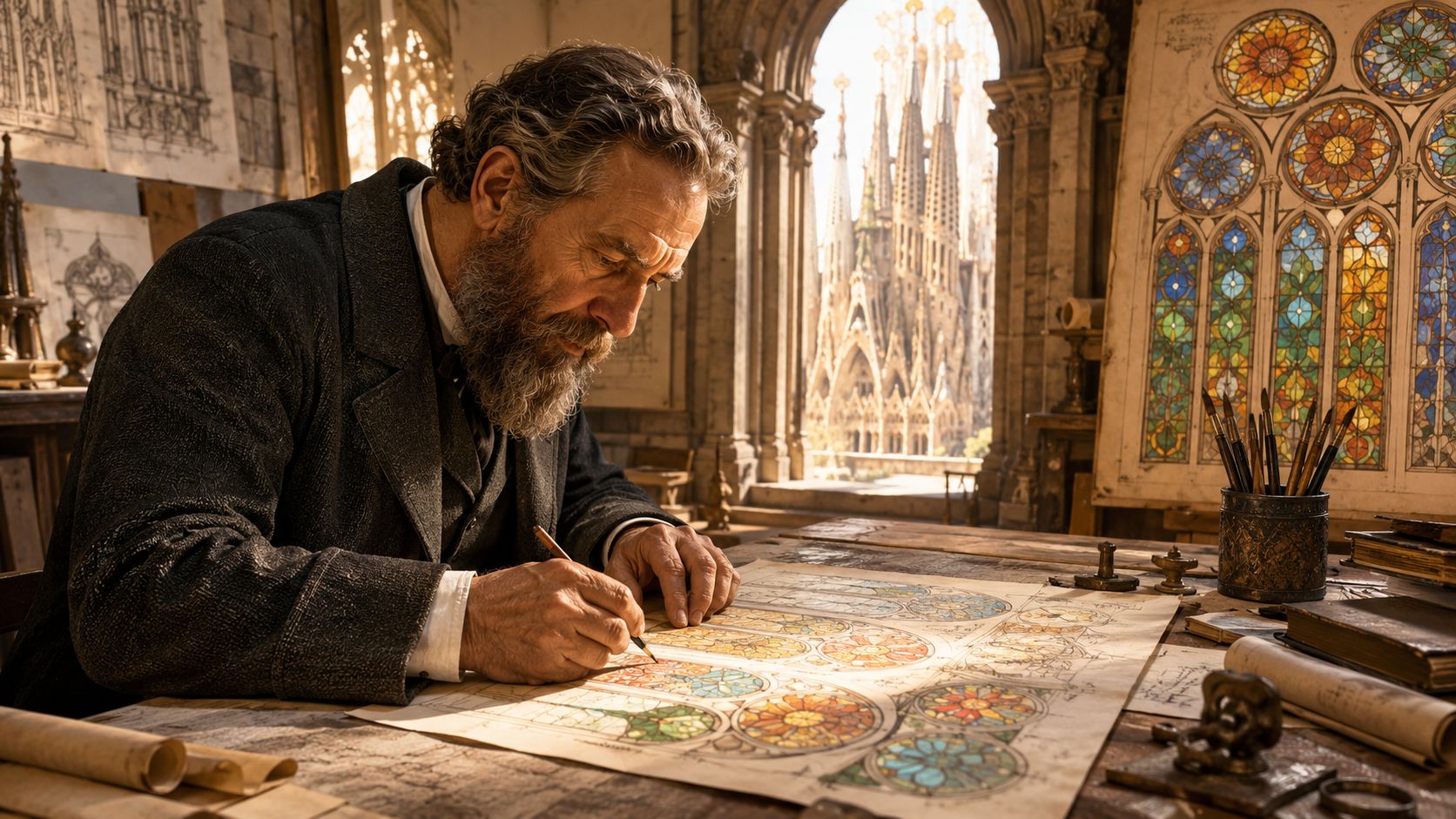
Master glazier Joan Vila-Grau carried that intent into material reality. According to this detailed overview of the stained glass execution, he used traditional leaded glass technique with H-shaped lead channels, selected 16 distinct glass types for the upper high-transparency sections, and executed the windows over a 20-year span from 1999 into the 2010s while adhering to Gaudí's pre-1926 color-light principles.
For photographers and designers, that sentence contains the technical story. The lead caming isn't only a visual grid. It works as structural tensile reinforcement and as a drawn line moving the eye across the composition. That's why close studies of the windows still hold up. The geometry has rhythm.
What works and what doesn't in reading the craft
A useful way to look at the glass is to evaluate it at two distances.
| Viewing distance | What to look for | Common mistake |
|---|---|---|
| From across the nave | Color fields, directional light, emotional tone | Treating the window as a flat backdrop |
| Up close | Lead lines, glass density, transparency shifts, edge behavior | Looking only for iconography and missing construction logic |
The strongest appreciation happens when you move between those two modes.
- At a distance: read the glass as atmosphere.
- At mid-range: watch how the lead network organizes visual movement.
- Up close: study the material transitions, especially where transparency changes.
- Overhead: notice how upper sections lighten the vault zone rather than compete with it.
Practical rule: If you only admire the color, you've seen half the work. The engineering and linework carry the other half.
Decoding the Symphony of Color and Symbolism
You feel this room before you fully read it. Step into the nave, pause, and the building starts sorting your attention through color, direction, and height. That is not decorative excess. It is controlled visual sequencing, and Gaudí's system still rewards careful looking more than quick consumption.
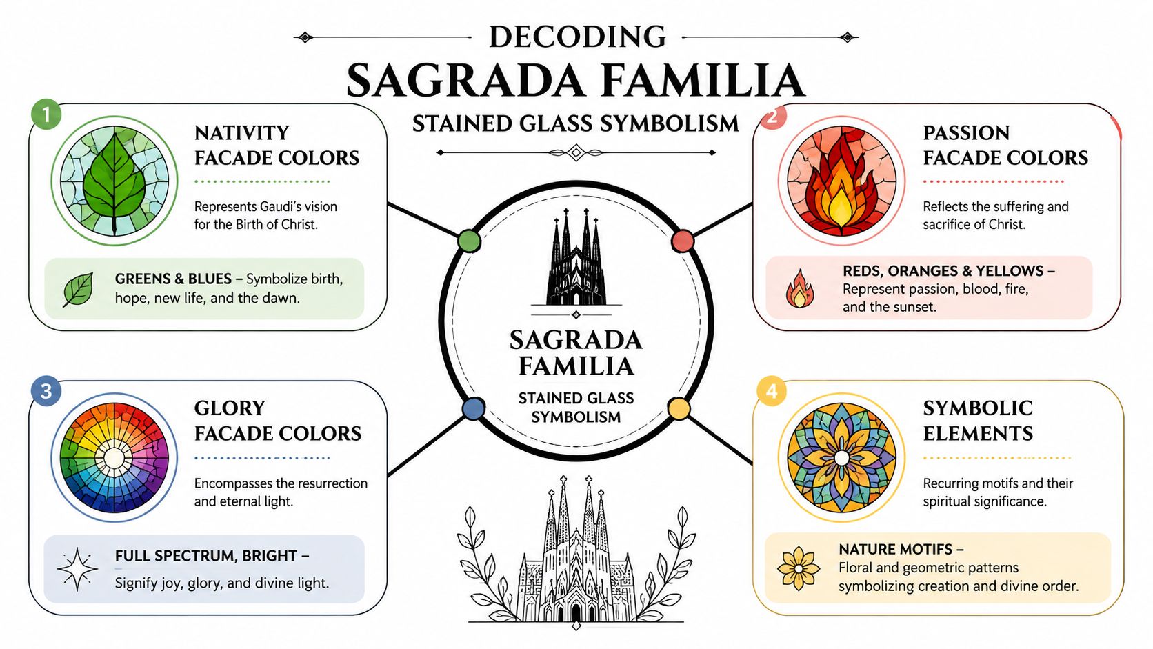
The east and west sides do different emotional work. The Nativity side carries cooler blues and greens. The Passion side turns toward reds, oranges, and golds. In person, that shift does more than signal theological themes. It changes how the stone feels, how the columns separate from the background, and how your eye moves through the volume. Architects can read it as spatial programming. Photographers should read it the same way.
East and west are directing mood, not just meaning
The cool side suggests birth, dawn, and stillness. The warm side carries sacrifice, intensity, and late-day weight. What makes the scheme persuasive is that the message is delivered through atmosphere rather than literal illustration. The glass colors the air, the floor, and the shafts of the columns. The room becomes the image.
That distinction matters if you photograph architecture for clients. Symbolic intent often reads more clearly in the effect of light on surfaces than in a straight-on frame of the window itself. I usually make a few descriptive elevations for completeness, then spend more time watching where color lands on stone. Those secondary moments often produce the stronger publishable image because they show how the design performs, not just how it looks in isolation.
Height controls legibility
The lower windows carry more visual weight at human level. The upper glazing opens the vault and lets light travel farther into the interior. As noted earlier, Gaudí used that vertical distribution with real discipline. Dense color low. Greater luminosity high. It is a smart trade-off between symbolism and spatial clarity.
For design professionals, this is one of the clearest lessons in the basilica. Too much saturated glass overhead would compress the volume and muddy the structure. Too little color at eye level would weaken the emotional register. The project avoids both problems.
A practical way to study it is to look in layers:
- At eye level: read names, density, and immediate color pressure.
- At mid-height: watch how the chromatic field starts to loosen.
- At the vault: notice how brightness supports the ceiling rather than competing with it.
- On the floor and columns: track the cast light. It often explains the composition better than the glazing alone.
The same observational discipline used in choosing the best light for a site shoot applies here, except the building is editing daylight before it reaches your lens.
Read the symbolism through performance
Visitors usually flatten the experience in one of two ways. Some treat the windows as ornamental color. Others hunt for coded meaning and miss the spatial result. A better reading combines both.
Start with orientation. Then judge color temperature. Then check where the strongest saturation sits in the vertical field. Finally, look away from the window and study what the light is doing to the architecture. That last step separates casual viewing from professional seeing.
For photographers, it also solves a common problem. A head-on shot of stained glass can feel descriptive and thin, especially in a crowded nave. Reflected color on stone, a warm band crossing a column, or cool light settling into the side aisles usually carries more depth, more atmosphere, and more evidence of Gaudí's intent.
Planning Your Visit for Peak Light
Arrive at the wrong hour and the basilica can feel visually impressive but incomplete. Arrive when the sun is doing real work through the glass, and the interior reads the way a photographer, architect, or lighting designer needs it to read. Time matters here as much as lens choice.
Start with intent. Decide whether you want to study cool light, warm light, or the transition between them. That choice should shape your ticket time more than general sightseeing convenience.
A working game plan
The building rewards a site-visit mindset. If you already plan shoots by sun path, weather, and reflected light, the same discipline applies here. The difference is that the building is filtering and recoloring daylight before it reaches the stone, the floor, and your sensor. The logic behind choosing the best light for a site shoot holds up well inside the nave.
Use this framework:
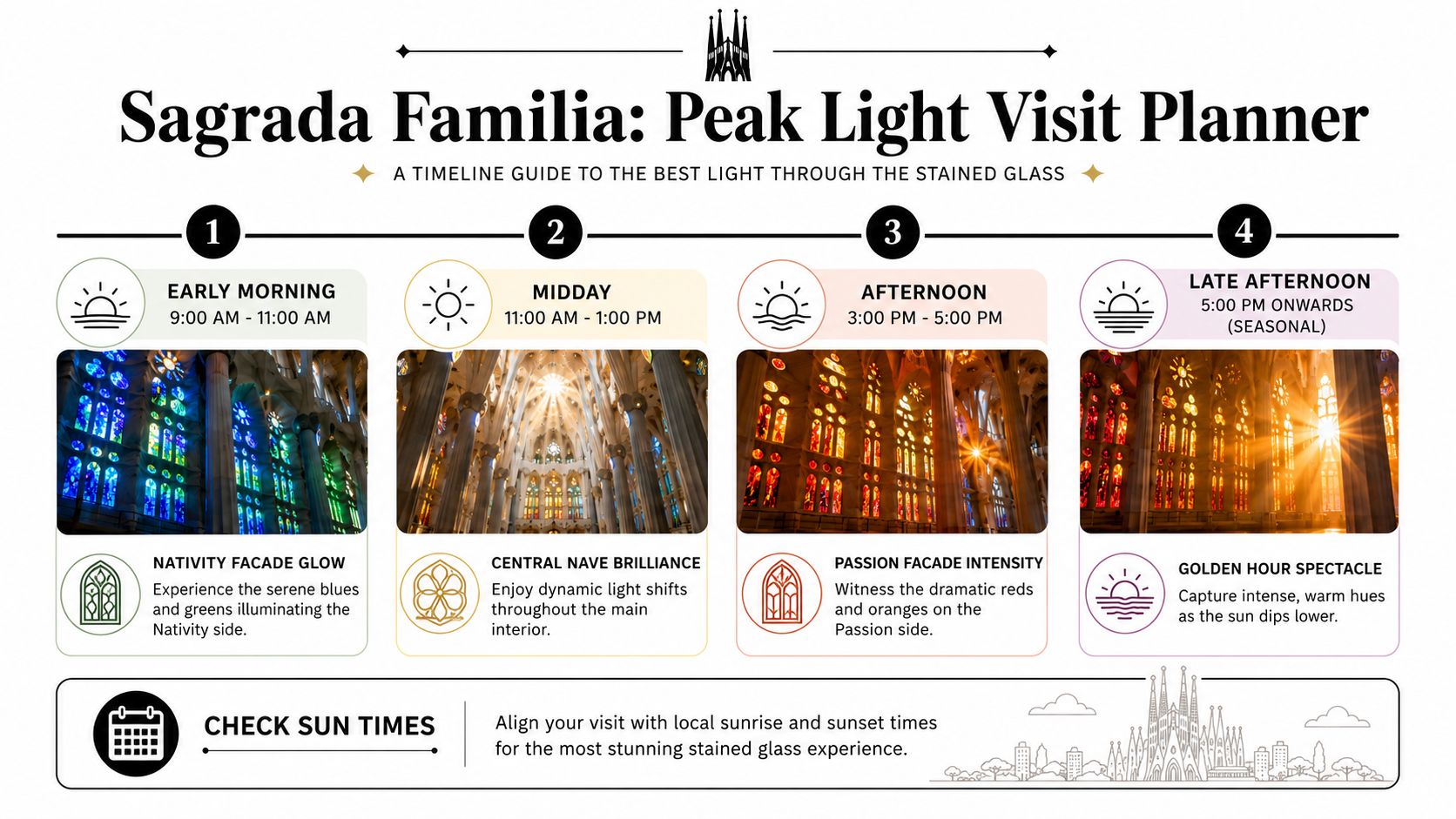
- Morning visit: best for cooler color, gentler contrast, and a quieter reading of the interior.
- Midday stay: useful for studying balance, circulation, and how much residual color remains when the light is less directional.
- Late-day return: best for warmer spill, stronger shafts of light, and more theatrical color on the columns and floor.
- Seasonal timing: useful if you care about how far the cast light travels across the nave rather than just how the windows themselves look.
Winter rewards patient visitors. Lower sun angles can send color farther into the interior, which changes the experience from viewing stained glass to standing inside projected color. A similar effect can appear at other times of year in the late afternoon, but it is usually less expansive and less sustained.
That distinction matters in practice. If your goal is appreciation, the lower-angle light gives you a clearer sense of how the glass edits the whole volume of the church. If your goal is photography, it gives you more material to work with on columns, pavement, and side aisles, which usually produces stronger images than framing the glazing alone.
What works better than a single timed entry
One ticket can work. Two visits work better.
A single morning entry gives you clarity and cooler atmosphere. A late-day visit gives you heat, contrast, and stronger color projection. A longer stay through the middle of the day helps if you are sketching, studying, or waiting for crowds to thin in certain zones, but it can also flatten your attention. After an hour or two, many visitors start reacting to spectacle instead of observing changes in light with any discipline.
Here is the practical trade-off:
| Strategy | Best for | Limitation |
|---|---|---|
| One morning visit | Cool palette, calmer mood | You miss the warm-side build later in the day |
| One late-day visit | Warm spill, stronger drama | You do not see the full chromatic range |
| Two shorter visits | Comparative study, better image selection | Requires more coordination |
| One long interior session | Slow observation, evolving light patterns | Fatigue and shifting crowds can work against you |
For creative professionals, I usually recommend two shorter visits if the schedule allows it. The first visit is for orientation. The second is for intent. That approach saves time, improves your compositions, and gives you a much better read on what the Sagrada Família stained glass is doing to the space.
A Professional Guide to Photographing the Glass
This is one of those interiors that exposes weak technique fast. The contrast can be punishing, the crowds can wreck clean lines, and the emotional pull of the color can make even experienced photographers compose too loosely. The fix is discipline.
Start by treating the Sagrada Família stained glass as an architectural lighting problem, not as a travel snapshot opportunity.
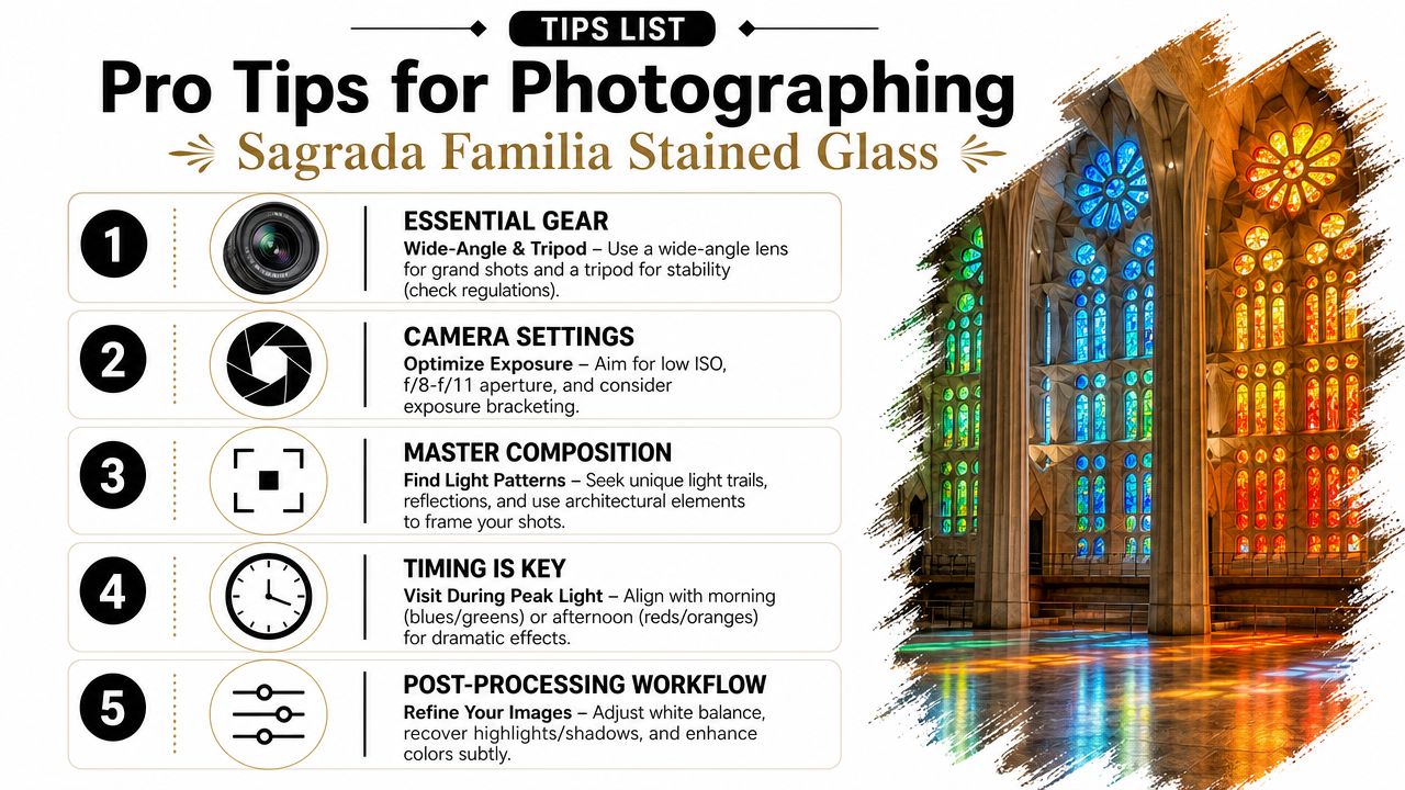
Gear choices that actually matter
A wide lens is obvious here, but not always enough. I'd carry two bodies if possible, or at least work with two focal-length ranges in mind.
- Ultra-wide zoom: useful for the nave, branching columns, and full environmental compositions. It helps when you want the glass as part of a larger spatial story.
- Moderate wide or normal lens: often gives the most believable architectural frames because it controls edge distortion better.
- Short telephoto: ideal for extracting color hitting columns, isolating lead patterns, or finding details in the upper glazing.
What doesn't work well is committing only to the widest glass in your bag. That approach often produces spectacle without structure.
Exposure is the real battle
The windows can be much brighter than the stone they illuminate. If you expose for the interior, highlights can collapse. If you expose for the glass, the room can go dead. You need to decide what the picture is about.
For many frames, I'd work in RAW, keep ISO low, aim around f/8 to f/11 when depth is useful, and adjust shutter speed to suit the scene. Exposure bracketing can help when the composition is stable enough for blending later.
If the color in the glass clips, recovery usually feels fake. Protect the highlights first, then bring the room back carefully.
That's especially true when reds and oranges intensify. Once those channels are gone, the file rarely feels convincing again.
Here's a practical decision table:
| Situation | Priority | Suggested approach |
|---|---|---|
| Full nave view with windows included | Highlight retention | Slightly protect bright panes, lift shadows later |
| Abstract color on columns | Midtone richness | Expose for the reflected light, not the window itself |
| Close-up of leaded sections | Texture and line | Watch micro-contrast, avoid over-brightening |
| Visitors in frame | Motion control | Raise shutter speed before lowering standards on composition |
A more general architectural workflow can help keep the process clean, especially if you already shoot built environments professionally. This broader guide to photographing architecture and interiors aligns well with the discipline this space demands.
To see the space in motion before you shoot, this walkthrough is useful context:
Composition under crowd pressure
Many will point straight at the windows. That's understandable, but it's rarely the strongest composition.
Better options usually involve one of these moves:
- Use columns as anchors. Let the color strike the stone, then frame the illuminated surface against receding structure.
- Shoot obliquely, not frontally. Angled views often show how light inhabits the volume.
- Wait for spacing. A few seconds of patience can clear a sightline around a column base or aisle.
- Include scale selectively. One or two figures can help the image breathe. A crowd blob usually kills the geometry.
- Look down occasionally. Reflected color on the floor can be more graphic than the window itself.
White balance and color honesty
Many edits go astray. If you neutralize too aggressively, you destroy the experience. If you saturate too hard, the image turns into stained-glass candy.
I prefer to think in terms of color honesty. Let the cool and warm zones stay distinct. Keep stone believable. Don't force every part of the frame toward a single “correct” white balance, because the whole point of the room is that it isn't neutral.
Post-processing without overcooking it
My workflow would stay restrained:
- Recover highlights first: especially in the brightest colored panes.
- Open shadows selectively: global shadow lifting can flatten the nave.
- Correct perspective carefully: too much vertical correction can make the room feel stiff.
- Manage local color contrast: use masks if one area dominates.
- Leave some mystery: not every dark recess needs detail.
The image should feel like light passing through architecture, not software passing over a file.
That last standard keeps you from over-editing. The most successful photographs of this space usually preserve atmosphere instead of proving technical completeness.
Image Rights and Commercial Licensing Notes
This part gets ignored far too often by otherwise careful photographers. Don't treat access and image use as the same thing. They aren't.
You may be allowed to photograph a site for personal use and still have restrictions on publication, print sales, client campaigns, stock licensing, or broader commercial exploitation. Religious landmarks and major cultural sites often maintain their own terms, and interiors can carry tighter controls than exteriors.
The practical distinction that matters
Think in three buckets:
- Personal use: your own memories, private sharing, non-commercial display.
- Editorial use: journalism, criticism, documentary publication, or cultural coverage.
- Commercial use: advertising, branded campaigns, product promotion, merchandising, some print sales, and licensing to clients.
Those categories can blur in practice, which is exactly why due diligence matters. If a hotel brand, design firm, publisher, or agency wants to use your image, the question isn't only whether you took it lawfully. The question is whether you have the rights needed for that use.
What professionals should do before licensing
Start with the venue's current photo policy. Then verify whether additional permissions apply for commercial exploitation, interior publication, tripod use, crew access, or staged shoots. If the project has budget or visibility, confirm the terms in writing and keep records.
For a broader professional framework, this guide to architectural image rights and licensing is a useful starting point.
This isn't legal advice. It's professional hygiene. The more serious the client and the broader the distribution, the less room there is for assumptions.
The Final Image A Living Work of Art
You arrive with a shot list, then the light starts sliding across the columns and dissolves the plan. That is part of the Sagrada Família's discipline. The stained glass does not sit on the walls as decoration. It behaves as an active part of the architecture, changing color, contrast, and mood as the day shifts.
For designers and historians, that makes the basilica unusually rich to study. Gaudí's spatial logic and the later glass program work together, so meaning is carried by orientation, color temperature, and intensity, not by iconography alone. For photographers, it creates a more demanding brief. A strong image here is rarely about collecting the widest view. It comes from recognizing when the interior light is structuring the space with enough clarity to give the frame hierarchy.
The building remains under construction, and that unfinished condition suits the experience. Sagrada Família is not a frozen monument. It is a living project, and the glass reinforces that feeling every hour the sun is out.
Stay longer than feels efficient.
I usually tell creatives to give up the idea of a single definitive photograph. Make the wide establishing frame, then wait for the quieter image where colored light lands on stone, visitors, or one line of columns. That is often the photograph with editorial value because it shows how the building performs, not just how it looks.
If you go, work with patience. Watch the light move. The basilica rewards people who treat it less like an object to document and more like a space to read.
If you need architectural photography that treats light, space, and structure with that same level of care, Jimmy Clemmons Photographer brings an editorial eye and built-environment discipline to interiors, exteriors, and commercial spaces.