
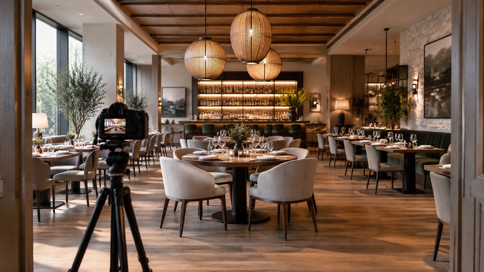
You're on a phone at eight in the evening, choosing where to eat tomorrow. The restaurant's website offers one image: a tight crop of the bar, a single warm bulb, no seating, no door. You book anyway, then spend your first two minutes inside working out where to wait, whether the step at the entrance has a ramp, and how loud the room gets when it fills.
That gap between what a picture promises and what a room delivers is a production problem. Restaurant interior photography has always carried two jobs at once, selling the space and recording it. The Smithsonian Libraries' restaurant-interior collection holds documented dining rooms from Lyon, Paris and Germany dated to roughly 1925 to 1927, credited to designers including Louis Sognot and Otto Eisler, kept as evidence of furniture, lighting and spatial organization rather than as advertising.
A good frame of a dining room is marketing and building documentation in the same file. Shoot as if only one of those matters and the other becomes the client's complaint three months after delivery.
The Shot List Every Restaurant Interior Needs
The brief usually arrives as one sentence: we need a hero shot of the room. The owner already has one, a low-key bar frame with a pendant burning in it, and it has done two years on the homepage. It's the best photograph of the restaurant and it answers none of the questions guests ask. Where's the entrance? Is there a step? Which side stays quiet at nine?
A restaurant shoot is a set of images with separate jobs, and the hero frame is one of them. The commercial case is easy to state. A 2021 peer-reviewed study on menu presentation reported that respondents were 3.18 times more likely to purchase an item shown with a picture than with a written description alone, and 2.49 times more likely when a description and a picture were combined. A diner reading a room works the same way. The picture does the work the paragraph can't.
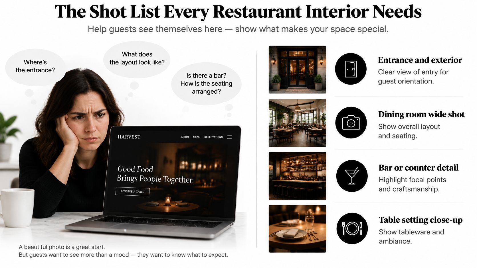
The list below is the one worth planning against. Camera positions and focal lengths are full-frame equivalents, so a crop body or a phone with a 24 mm-equivalent main lens can be matched to it without converting anything.
| Shot | Purpose | Camera position and lens | Best timing |
|---|---|---|---|
| Establishing wide view | Shows layout, scale and circulation | Back corner or doorway, 24-35 mm equivalent, camera level at chest height | Before opening, house lights on |
| Table vignette | Shows seating, tableware and materials | Standing at a table edge, 35-50 mm equivalent | Quiet service or before guests arrive |
| Bar and back bar | Shows lighting and bottle wall | On the bar's axis, 35-50 mm equivalent, lens at bar-top height | Before service |
| Open kitchen or pass | Shows the relationship between kitchen and dining room | Corner position, 35 mm equivalent | Set-up, with no active cooking in frame |
| Detail shots | Shows finishes, fixtures and textures | Close, 50-100 mm equivalent, controlled light | Any time the lighting is fixed |
| Entrance and threshold | Shows the arrival experience and route | From outside at eye level, 35-50 mm equivalent | Opening hours |
| Restroom and accessible route | Documents access and wayfinding | Straight-on, level camera, 24-35 mm equivalent | Empty room |
Timing does more work than gear on most of these rows. The wide view and the bar want the room before service, house lights up, no staff cutting through frame. The threshold wants daylight and a working door, which means opening hours. The detail frames can be made any time the light is stable, and that's usually the block to schedule around whatever else the room is doing.
The empty room and the occupied room are two different deliverables. The empty set carries the layout, the finishes and the access documentation: it's what an architect, a developer or a guest planning a wheelchair route needs. The occupied set carries atmosphere and belongs later in the day. Sending both in one folder without separating them is how clients end up choosing the moody frame for a page that needed the floor plan.
The investment is moving toward the interiors anyway. In Restaurant Development + Design's August 2024 reader-pulse survey, 31% of restaurant-development and design respondents said remodeling interiors received the greatest operator investment (rd+d pulse survey). New finishes need new photographs, and finishes are exactly what the detail rows exist to record.
Every row hides a decision set, and the rows fail in predictable ways: colour under mixed light, geometry under a wide lens, atmosphere under a phone camera, systems when nobody points a lens at the ceiling, and access when the room is styled for looks alone.
Balancing Mixed Light So Colors Stay True
The first frame of the day usually looks wrong. Wood that reads honey in the room comes out orange on the left of the file and grey on the right, a brand paint drifts toward mustard, and a plate that looked fresh at the pass looks tired. None of that is a camera fault. It's mixed light, with pendants, a window and kitchen spill hitting the same surfaces at different colour temperatures.
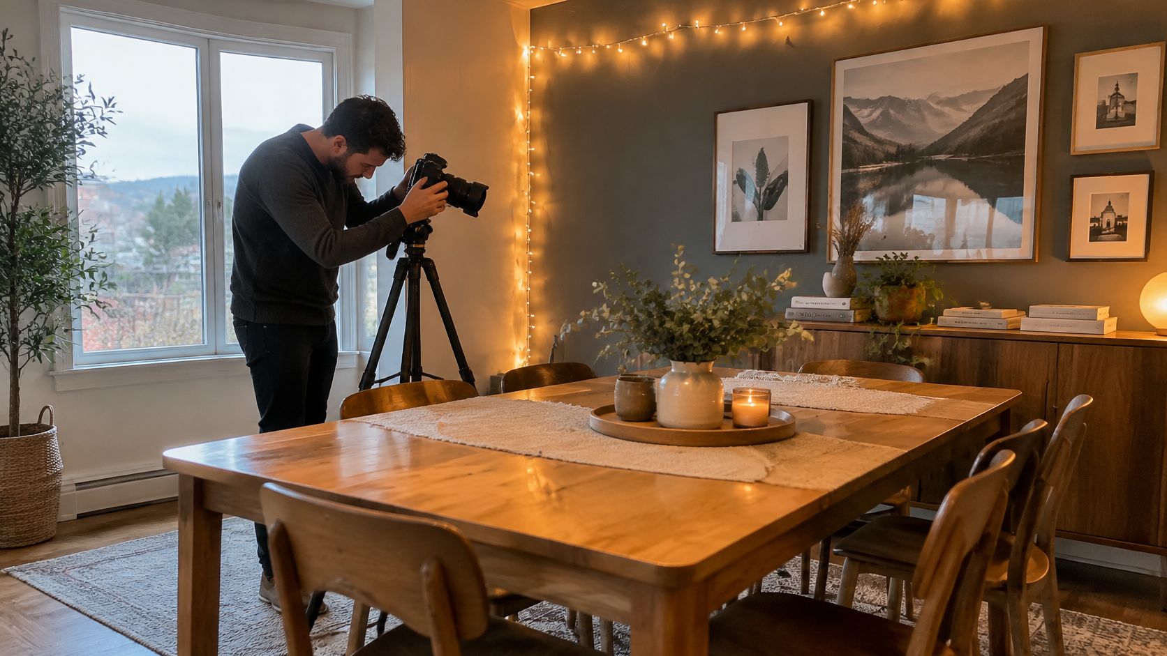
Lighting guidance for hotels and restaurants gives the vocabulary to use on site. Warm white is below 3300 K, neutral white runs 3300 to 5300 K, and daylight white sits above 5300 K. It also recommends a colour rendering index of at least 80 Ra/CRI for restaurants, with 90 or higher where food appearance matters.
| Light source | Colour temperature | Ra/CRI target | Handling on the shoot |
|---|---|---|---|
| Warm decorative LEDs | Below 3300 K | 80 minimum, 90 preferred for food | Keep on, set white balance to match, verify with a grey card |
| Neutral white fixtures | 3300-5300 K | 80 minimum, 90 preferred for food | Balance to one target across the frame |
| Window daylight | Above 5300 K | 80 minimum, 90 preferred where food or finishes are in frame | Time the shoot around it, or balance against the interior and bracket the contrast |
| Kitchen spill and flash | No fixed rating | Match the room's dominant source, with flash heads rated 90 or higher | Switch the spill off where possible, and diffuse flash so it doesn't punch hot spots |
The order I work in
- Find the dominant source first. One test frame at the principal table tells you whether the room is being lit by its pendants, its window or the kitchen. Every later decision depends on that answer.
- Kill or match the conflicts. Switch off decorative fixtures that fight the main source, or bring diffused flash up until it matches. Half measures survive as colour casts you can't retouch away.
- Place a grey card twice. One at the principal table, one in the darkest zone of the room. Raw conversion needs both references, or one side of the frame stays amber while the other goes blue.
- Set white balance to the actual light. Matching the camera to the architecture beats applying a global preset later, because coloured walls and tabletops throw local reflections that a single correction won't fix uniformly.
- Bracket when the window is in frame. A bright shopfront window beside a dark banquette is a contrast range no single exposure holds. HDR gets both ends.
- Keep a neutral master. Deliver the warm variant the client wants for the website, but only after the accurate file exists.
Retouching a colour cast is guesswork. Setting it on site takes ninety seconds.
The check at the end is simple: put the file next to the room. If the oak table, the banquette fabric and the bread basket look like what's physically in front of you, the balance is right. For a fuller walkthrough of the technique, this guide to handling mixed lighting in interiors covers the on-site sequence in more depth.
Framing Rooms Without Distorting Proportions
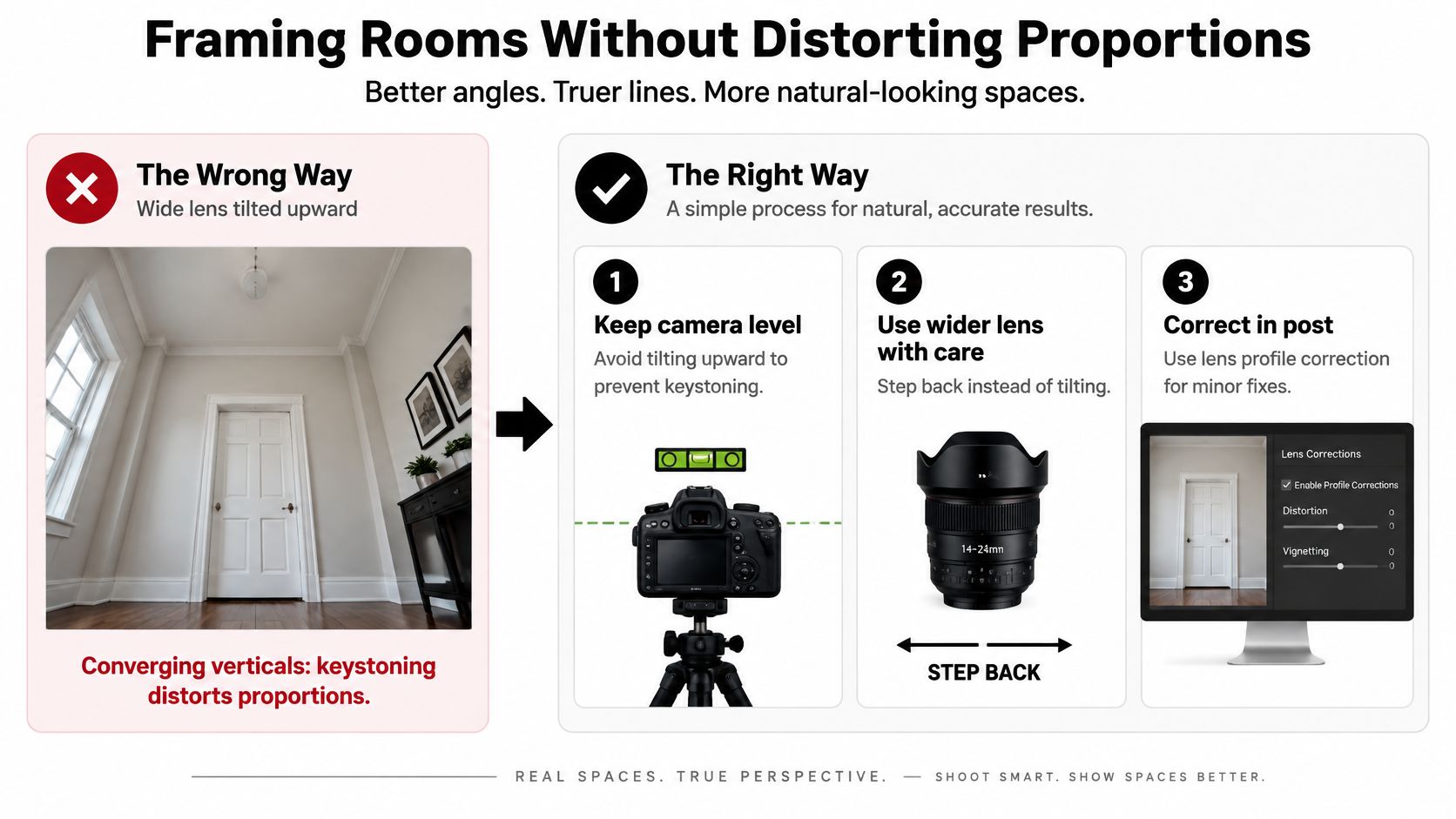
Hold a 24 mm lens at chest height and tip it back to catch the ceiling. A well-built dining room starts to look cheap. Walls lean inward, door frames bow, and the room reads taller and narrower than the floor plan. Run a lens profile and the barrel distortion goes. The walls still lean.
Those are two separate problems. Converging verticals, keystoning, come from the camera plane not sitting parallel to the wall plane, and the geometry behind perspective distortion and its correction doesn't care which lens you mounted. A nonlinear profile corrects radial distortion. It will not straighten a leaning door frame.
Perspective here is a measurement, not a mood. If the sensor is not square to the architecture, the frame records a false room: wrong height, wrong width, and the wrong relationship between table, banquette and pass. I treat the level as the first decision on a restaurant set, ahead of any wider lens.
Steps that keep verticals vertical
- Level the camera. A hot-shoe bubble level or a grid overlay, checked after every move. Three degrees of tilt is visible in a finished interior frame.
- Step back instead of tilting up. In a tight room that means standing in the doorway or against the opposite wall. Move furniture, not the camera angle.
- Use a shift lens where you have one. Rising front movement keeps the sensor parallel and places the ceiling where it belongs in the frame.
- Leave margin at the edges. When the walls are close, frame slightly wider than the final crop so a controlled projective transform has room to work.
- Stand on the room's axis. A centred, axial viewpoint communicates proportions more faithfully than a corner view that flatters the furniture.
- Take the long lens from further away. Greater distance with a longer focal length reduces the exaggerated foreground-to-background scale that makes a small room look like a corridor.
Brightness raises the stakes for that geometry. In a November 2023 survey of design professionals reported by Restaurant Development + Design, 34% identified white or bright interiors that highlight cleanliness and transparency as the leading 2024 aesthetic trend. Pale walls and pale floors give a leaning jamb nothing to hide behind, so the level has to be right before the file leaves the camera.
A wide lens is sometimes the only way through a tight dining room, and the proportion problem is still manageable. What doesn't change is the principle: great photography is crafted rather than caught, and a defensible frame documents spatial relationships instead of producing an attractive wide-angle impression of building proportions.
Capturing Atmosphere and the Guest Experience
Thirty minutes after opening is the window I want. The room is maybe a third full, a pair at the window, a four-top mid-room, two servers moving with purpose rather than urgency. The light has settled, the tables look used but not messy, and nobody is waiting for a seat. Ten minutes later it's a crowd, and the same frame becomes a document of someone's back.
That window is also when a room reveals whether guests will photograph it themselves. A 2025 peer-reviewed study of restaurant photo sharing, drawing on 362 questionnaires, found that food quality, service quality and the overall dining atmosphere positively influence tourists' attitudes toward sharing restaurant photographs. The sample was predominantly Chinese, so it isn't universal market proof, but it kills the assumption that a dramatic room alone generates social content.
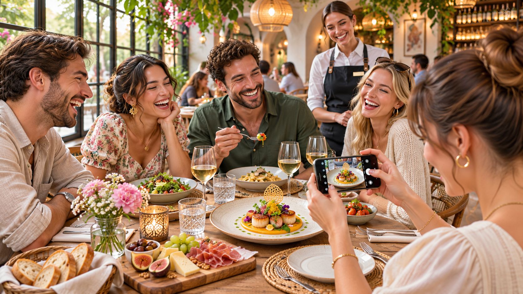
Shareability by design is the practical translation. Map these during the recce rather than discovering them at the table:
- An identifiable anchor. One fixture, one wall, one threshold a guest can put in a phone frame and be recognised by.
- Light that flatters people, not just surfaces. A pendant that lights a face from above and a banquette that lights it from behind are two different rooms.
- Layered sightlines. Views through a doorway or past a column give a phone camera depth without a wide lens.
- Uncluttered tabletops. Condiments, table numbers and QR stands are what make guest photos look like a canteen.
- Thresholds worth turning around for. The entry is the most photographed two metres on the property.
Props stay real. The restaurant's own tableware, its own menus, its own glasses. Anything brought in for the camera and left on the table will read as a lie in a frame a guest could have taken themselves.
Consent comes before any of it. Before a guest or a staff member appears in a frame, confirm permission and sign a release, and keep a list of which files include identifiable people so any of them can be withheld from the website if someone objects later. The best atmosphere images show the experience as a whole, food and service and room together, rather than décor in isolation.
Documenting Design Intent in Finishes and Systems
Saturday night, a full dining room, brick, glass and hard banquettes. The room looks sharp and speech is already bouncing off every surface. That bounce is a measurable condition, and it decides which finishes belong in the frame.
DIN 18041 places dining rooms in room group B3 and sets a maximum reverberation time of 0.90 seconds across example volumes of 200, 500 and 1,000 cubic metres, with a minimum sound absorption of 0.20 square metres per cubic metre for rooms up to 2.5 metres high (DIN 18041 reverberation targets for dining rooms). Those targets are what the soft surfaces in the photograph are doing. Most of them never get a dedicated frame.
I would shoot the absorbers as design, not as background. Acoustic panels, baffles and perforated linings need an angle that shows the panel and the room behind it, so the frame records both intent and function. Upholstered banquettes and soft textiles are how a hard room reaches that reverberation time without changing its look. The ceiling plane wants a level camera and a slightly longer lens. A tilted wide shot of the same area crops the treatment and bends the grid.
Services are the other half of the record. The ASHRAE 62.1 ventilation table sets per-person and per-area ventilation rates for restaurant dining rooms and kitchens, so the air-handling systems are sized for a full service. Supply diffusers, return grilles and the pass hood are the hardware that keeps a packed room from feeling stale. They belong in the set.
One extra frame per location is enough, often from the pass looking back across the ceiling. Architects, developers and mechanical teams read that relationship faster than a paragraph of specification: dining room, kitchen and air in one view.
Accessibility Images That Show Real Conditions
A polished set that hides a narrow aisle or a step at the entrance misleads the people who most need the detail. An EU-backed restaurant accessibility manual recommends publishing photographs alongside factual details such as thresholds, routes, seating and restroom access, so customers can decide for themselves whether a space presents an obstacle.
Plan a parallel image set with the hero frames: entry from the street, aisle widths through the room, seating alternatives including low tables and stools, door thresholds, restroom approaches, lighting along the route, and wayfinding signage. Shoot them straight-on, camera level and about seated eye height, in the light the room uses.
Clear floor space at each accessible seat, and a route kept free of protruding lights, signs and other fixtures, should govern how furniture is moved on the day. Shifting a table to tidy a composition and blocking the aisle produces an image that misrepresents the room. I treat that as a failed frame, not a styling choice.
Practical rule: if the furniture had to move for the photograph, either note it in the caption or move it back before the frame is made.
Captions carry the measurements. State the clear floor space at the accessible table, name the step height at the entrance, and say whether the accessible restroom is on the same level. A photograph of a threshold without its height is only a picture of a threshold.
Wide establishing views do the orientation work. Tight, neutral details prove the specifics: the width left in the aisle, the lip at the door, the light level on the path to the restroom. For a design-facing audience, photography for design documentation earns its place here, brand storytelling and transparent pre-visit information delivered as one package rather than two separate budgets.
A Hypothetical Shoot From Brief to Delivery
Take a 60-seat neighbourhood restaurant: brick walls, warm pendants over the tables, a skylight above the bar, and a single narrow step at the entrance. The project includes three things: website hero images, press images, and an accessibility page for the site. That's a day, not a week, when the plan is written first.
07:30, before opening. The establishing wide view comes first, from the back corner with the camera level and the house lights on. The room is empty, chairs straight, no jackets over the banquettes. Two frames, one at 35 mm and one tighter, before anything gets touched.
08:10, colour. A grey card goes at the principal table and another in the darkest corner beside the bar. The pendants run warm, the skylight runs cool, and the two meet over the front third of the room. White balance is set against the mixed reality, not against either source alone, and the bracketed frames cover the skylight.
08:40, geometry. The axial frame from the doorway shows the room the way a guest sees it on entry. Stepping back through the door instead of tilting up keeps the brick coursing straight, and the extra margin at the edges leaves room for a small correction later.
09:15, the small frames. Table vignettes at 50 mm from a table edge, bar detail at bar-top height, the pass from the corner with no active cooking in frame. These take longer than expected, because each one is a colour and finish decision rather than a composition.
10:00, the threshold and the route. Straight-on, neutral, level. The step gets photographed with its height measured, and the accessible route runs from the street through to the restroom approach.
The delivery is three files per key shot: a neutral master for press and archive, a warmer variant for the website, and captions stating the measured route and seat dimensions. One change hits mid-morning. A service station has been moved into the aisle since the recce, so the planned route shot no longer shows a clear path. The route gets re-shot from the other end with the obstruction recorded in the caption rather than cropped out. That's the judgement the day is made of.
Covering this many genres in one location isn't new to the studio. In the film era, shooting a wedding meant covering fashion, portraits, still life, food and architecture at once, often across multiple film formats and 30+ rolls of film per day. A restaurant is the same problem with better lighting.
Confirm Your Shot List Before the Shoot Day
Three things get confirmed in the week before, and all three cost nothing to fix early.
- The shot list against the brief. Every required image gets a purpose and a focal range, and the client signs off on the set rather than the style.
- The lighting targets and the grey card. Which fixtures stay on, which get switched off, and the room's dominant colour temperature. A test frame at the same hour as the shoot settles it.
- The accessibility set. Routes, thresholds, seat clearances and restroom approach identified on the recce, with the furniture in its real position.
The sheet you take to the owner is short: required shots with purpose and focal range, the window before opening, the sources to switch off or balance, the accessible seat and route to document, consent and release forms for anyone who may appear in frame, and the delivery format with a neutral master plus a warm variant for each key image.
Then the next step. Send the shot list and the floor plan to a photographer who works on architectural interiors, and ask for a shot list review before you book the date. Architectural photography offers images of sweeping exteriors and refined interiors that highlight form, light and detail, and the current focus of our work is architectural photography and corporate brand content, which means a plan built on measurable conditions rather than a mood board. A review takes an hour and saves a reshoot.
Restaurant interiors need a photographer who can hold two things in one frame: the atmosphere that sells the room and the measurable conditions that let someone decide whether they can use it. Jimmy Clemmons Photographer brings editorial discipline and architectural precision to that balance, with controlled lighting, on-site direction and professional editing for hospitality and commercial spaces. If you have a restaurant, hotel or workplace interior coming up, visit Jimmy Clemmons Photographer and send the floor plan along with your shot list for a review before the date is set.