

You're probably looking at a property that deserves better than the usual quick wide-angle treatment. Maybe it's a carefully detailed custom residence, a hospitality interior, a new multifamily development, or an architect's portfolio project that needs to communicate design intent, not just room count. That's where a standard real estate photography tutorial stops being enough.
High-end architectural and development work asks for a different mindset. The job isn't only to make rooms look bright. It's to control perspective, shape light, protect material color, show circulation, and deliver files that a developer, architect, designer, and marketing team can all use without apology. I approach those assignments less like listing coverage and more like editorial production with a commercial objective attached.
The Art of Intentional Architectural Imagery
A listing snapshot says, “Here is the kitchen.” Intentional architectural imagery says, “Here is how the kitchen sits within the home, how the light moves across the millwork, and why the design choices matter.” That difference starts with intent, but it ends with outcomes.
Professional visuals affect the business side of a property. Listings with professional photos sell 32% faster, averaging 89 days on market versus 123 days, and properties with professional images can close for $934 to $116,076 more according to compiled industry statistics on professional real estate photography performance. Those numbers matter because they change how clients think about photography. It stops being a line item and becomes part of the sales strategy.
For architects and developers, the stakes are broader than a single transaction. The images may live in a proposal deck, a leasing campaign, a design award submission, a brochure, an investor presentation, and an editorial pitch. One careless frame with bowed verticals, dead windows, or muddy color can make an expensive project feel ordinary.
Practical rule: If the client built, designed, or financed the space with precision, your photographs have to show the same precision.
That's why I don't treat architectural work like volume listing coverage. The composition is slower. The lighting decisions are more deliberate. Styling gets tighter. Post-production gets more exacting. Even the “easy” frames usually need decisions about what story the image should tell. Is it about material texture, circulation, symmetry, contrast, or light quality?
A good real estate photography tutorial should teach camera mechanics. A useful one also teaches judgment. The camera records surfaces. The photographer decides what the project means.
Pre-Production Planning for Precision
Most weak shoots fail before anyone mounts a camera on a tripod. The photographer arrives with gear but without clarity. The client assumes certain views are obvious. A superintendent is still finishing punch-list items in the hero spaces. Sun is wrong for the façade. The styling isn't resolved. Everybody loses time.
For serious architectural work, pre-production is not administrative overhead. It's where the job gets shaped.
Start with the client brief
I want a short but specific kickoff conversation before the shoot is scheduled. Not a vague “we need interiors and exteriors.” I want to know what the images must do.
Ask for the answers to these:
- Primary use: Are the files for leasing, editorial submission, an architect portfolio, investor materials, or a brokerage campaign?
- Decision-makers: Who approves selects and retouching? Marketing director, architect, developer, interior designer, or agency?
- Priority spaces: Which rooms or features are essential?
- Visual tone: Crisp and neutral, warm and lived-in, dramatic twilight, or magazine-clean and minimal?
- Deliverables: Stills only, or stills plus vertical video clips, drone, and detail coverage?
That last point changes how I build the day. A team expecting mixed media needs a tighter sequence on site so one setup can produce multiple outputs efficiently.
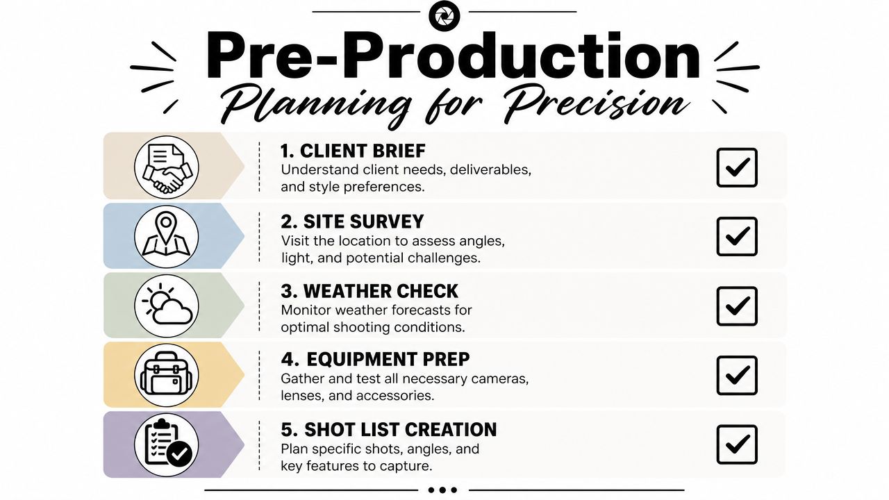
Scout the property before shoot day
A scout saves you from making expensive guesses on set. If I can walk a site ahead of time, I do. If I can't, I request current phone snaps, plans, finish schedules, and a rough room list.
During a scout, I'm looking for three things:
Light direction
Which elevations work in the morning, which interiors need softer afternoon light, and where glare will become a problem.Camera positions
Some spaces look strongest from the threshold. Others need a backed-up angle from an adjacent room. A scout tells you where furniture or walls will limit lens choice.Problem areas
Reflections, mixed color temperatures, unfinished details, signage, safety gear, parked vehicles, and clutter all show up in photographs harder than they read in person.
If your client needs help getting the site ready, send them a practical prep guide like this checklist for preparing a project site for a professional photoshoot. It gives everyone a shared standard before the first frame is made.
Build a shot list that reflects hierarchy
Not every frame deserves the same effort. Some are hero images. Some are support frames. Some are pure documentation. If you don't separate those categories, the day becomes flat and inefficient.
I usually structure the list this way:
| Shot type | Purpose | How I treat it |
|---|---|---|
| Hero views | Campaign, portfolio, cover image | Most time, full styling, refined lighting |
| Supporting wide shots | Show plan and flow | Clean execution, efficient coverage |
| Detail images | Materials, joinery, fixtures, moments | Tighter composition, shallower visual story |
| Context frames | Exterior relation, approach, circulation | Clear but less stylized |
| Utility frames | Documentation for teams | Accurate and straightforward |
Plan logistics like a producer
Beautiful images come from control. Control comes from planning.
The smoothest shoots feel calm because the hard decisions were made the day before.
A practical pre-production checklist should include:
- Access timing: Keys, alarms, loading docks, elevators, gate codes.
- Site readiness: Cleaning, landscaping, styling, and whether construction is complete.
- Weather backup: Alternate sequence if exterior conditions turn.
- Power and staging: Where lighting gear can live without contaminating the set.
- People management: Who has authority to move furniture, turn lights on or off, and approve styling changes.
I've found that developers and architects appreciate this level of structure because it mirrors how they already work. The shoot stops feeling like an add-on and starts feeling like part of the project.
Assembling Your Architectural Photography Toolkit
You arrive at a finished residence before sunrise, the stylist is still placing the last objects, and the architect wants one calm, perfectly corrected hero frame before trades start moving through the site. In that moment, the kit has one job. Hold the camera exactly where the composition needs it, render materials accurately, and let you work fast without giving away control.
For high-end architectural work, I build a kit around precision and repeatability because the files often need to serve more than one use. A developer may want campaign imagery, an architect may want portfolio-grade detail, and the design team may still need accurate documentation. The gear has to support all three.
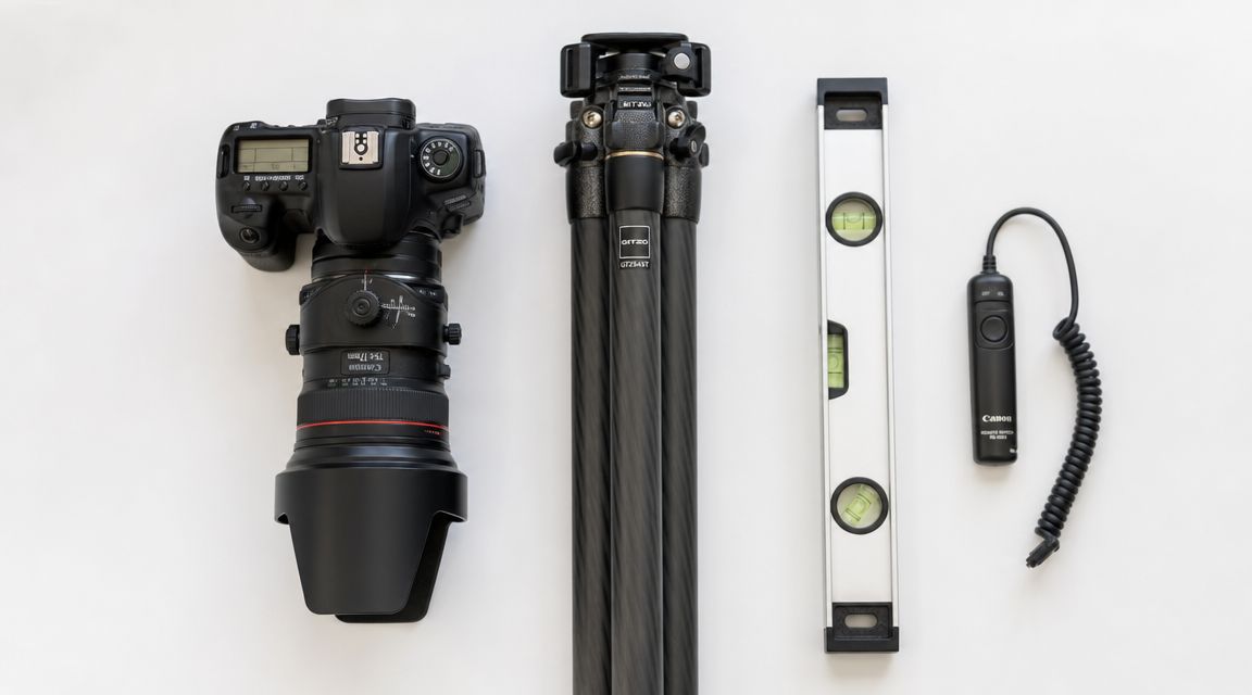
The camera body and lens set I actually rely on
A full-frame body is still the practical baseline. It gives me clean files at low ISO, enough dynamic range for bright window conditions, and resolution that holds up when a client wants both web crops and large-format print use from the same capture.
Lens choice does more to shape the look of the project than many photographers admit. I keep the range tight and deliberate:
- Ultra-wide zoom: Reserved for genuinely constrained rooms. Useful, but easy to abuse.
- Moderate wide-angle: My main interior focal length because it shows space without distorting the architecture.
- Standard lens: Better for detail frames, exterior studies, and rooms that look stronger with a little compression.
- Tilt-shift lens: The tool that separates polished architectural work from corrected real estate coverage.
A tilt-shift lens earns its place quickly. Keeping the camera level and shifting upward preserves verticals at capture, protects file quality, and reduces the stretched look that appears when perspective correction is pushed too far in post. On luxury interiors with cabinetry, stone joints, and tight mullion spacing, that difference is visible.
Support gear decides whether the frame feels controlled
I would rather give up an extra lens than give up a solid tripod and geared head.
Architectural compositions depend on tiny adjustments. A few millimeters of camera position can clean up a door reveal, separate overlapping edges, or stop a countertop line from tangling with a window frame. A geared head lets me make those changes slowly and predictably. Ball heads are faster, but speed is not the main problem on this kind of shoot. Accuracy is.
The rest of the support kit stays simple and practical:
- Remote release or tethered trigger: Keeps the camera stable and makes review easier with clients or designers on set.
- Bubble level or in-camera electronic level: Helps keep verticals honest before post begins.
- Microfiber cloths and glass cleaner: Dark finishes, mirrors, and glazing punish sloppy prep.
- Extra batteries and memory cards: Long exposures, tethering, and live view drain power fast.
- Laptop or tablet for review: Useful when architects want to inspect alignment, material rendering, or reflected problem areas before you move on.
If you are still refining your schedule around daylight conditions, this guide on choosing the best light for a site shoot pairs well with gear planning because the lens and support choices only work when the room is photographed at the right time.
Lighting gear belongs in the toolkit from the start
Many real estate tutorials treat flash as optional. For MLS coverage, that can be true. For architects, builders, and developers, it usually is not.
I carry compact strobes, stands, modifiers, flags, and grip because I want the option to shape the room instead of accepting whatever mixed light happens to be there. Even when the final image feels natural, there is often a controlled flash frame behind it, or at least a targeted pop to open a dark millwork wall, clean up a ceiling, or restore color in a corner that ambient light leaves dull. That is the foundation of a flambient workflow. It is less about making the scene look lit and more about making the architecture read clearly.
Camera settings that stay predictable in post
Architecture rewards consistency. I keep variables controlled so the edit stays clean across a full set of final images.
My baseline usually looks like this:
- Aperture around f/8 to f/11
- Low ISO
- Shutter speed adjusted from the tripod
- Manual white balance when mixed lighting needs to match across frames
- Manual focus or confirmed single-point autofocus
- Electronic shutter or shutter delay when the camera supports it
Those settings are not rigid rules. If I am shooting a detail image for an architect's portfolio, I may open up the lens for a little depth separation. If I am photographing a facade with layered planes, I may stop down further and check diffraction against the file needs. The point is to make intentional changes, not casual ones.
This section of the workflow is easier to understand if you watch a working shooter set up an interior from the ground up:
A good architectural kit removes friction from the decisions that matter. Clean verticals, stable framing, reliable color, controlled light, and files that can survive close scrutiny by architects, developers, and design teams. That is the standard I build for.
Mastering Natural and Artificial Illumination
Light decides whether a room feels expensive, calm, clinical, inviting, or flat. In architectural photography, composition gets most of the attention, but lighting is what makes the materials read correctly. Stone, wood veneer, polished concrete, brushed metal, and glazing all need different handling if you want the final image to feel believable.
I don't treat natural light and artificial light as opposing camps. They're tools with different strengths.
Working with available light first
Before adding a strobe, I study what the natural light is already doing. Some spaces are best when the sun is indirect and the room glows evenly. Others need a little directional contrast so the architecture doesn't collapse into soft gray sameness.
For exteriors, timing matters a lot. East-facing façades and west-facing façades rarely want the same schedule. For interiors, I'm watching window direction, reflectivity of finishes, and how quickly a bright patch of sunlight might blow out a floor or sofa.
A few decisions help immediately:
- Turn off bad practical lights when they introduce ugly color contamination.
- Keep some practicals on if they contribute to the intended mood and don't fight the overall color.
- Use window light as a design element rather than something to overpower by default.
- Wait for balance if the room improves noticeably within a short time window.
If you're evaluating time of day for a location shoot, this guide to choosing the best light for a site shoot is a useful planning reference.
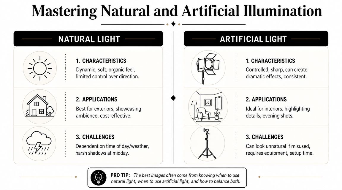
Introducing flash for control
Natural light is attractive because it feels organic. It's also unreliable. Large windows can leave corners dead. Mixed bulbs can stain walls green or orange. Bright glass can force the interior into a muddy compromise. That's when controlled artificial light earns its place.
I usually use flash for one of three reasons:
- To fill depth in a room where ambient light falls off too quickly.
- To clean up color when practical fixtures contaminate ceilings or walls.
- To restore shape so cabinetry, texture, and furniture don't look lifeless.
The mistake is blasting the room with obvious flash and flattening everything. Good architectural flash work shouldn't announce itself. It should look like the room was well-photographed.
Lighting note: If the viewer notices your flash before they notice the architecture, the light is doing too much.
The flambient method for polished interiors
For demanding interiors, I rely on a flambient approach. The method combines HDR ambient frames with flash-lit frames, then uses layer masking in Photoshop to replace dark or color-contaminated areas selectively. That workflow helps overpower mixed lighting and improves exposure consistency across a room, as demonstrated in this flambient workflow demonstration on YouTube.
The practical sequence looks like this:
| Frame type | What it captures | Why it matters |
|---|---|---|
| Ambient bracket set | Natural room brightness and window range | Preserves the room's real atmosphere |
| Flash frame | Controlled neutral light | Cleans color and opens muddy areas |
| Additional flash positions | Targeted problem solving | Helps with corners, ceilings, and built-ins |
| Layered blend | Best parts of each file | Produces a natural but refined result |
The benefits are clear in difficult rooms. White walls stay clean instead of yellow. Dark wood keeps detail. Ceiling color evens out. Window transitions become smoother. Most important, the image still feels like architecture rather than studio product photography.
What doesn't work
A lot of beginners jump between two bad extremes. One is single-exposure ambient shooting that leaves windows blown and shadows clogged. The other is heavy-handed flash that turns every surface shiny and every room into a showroom set.
Watch for these errors:
- Over-flashing glossy finishes
- Ignoring reflections in mirrors and appliances
- Mixing too many color temperatures without a plan
- Lighting every corner equally
- Correcting too much in software instead of capture
The strongest high-end interior images usually carry a balance. They keep the honesty of natural light, but they use flash strategically enough that the room looks clean, intentional, and controlled.
Composition Styling and Solving Difficult Spaces
A strong frame doesn't just describe a room. It edits the room. The camera decides what feels orderly, what feels generous, and what feels like clutter. That's why composition in a real estate photography tutorial can't be reduced to “shoot from the corner with a wide lens.”
That advice works often enough to become common. It also fails often enough to become limiting.
Compose for structure first
In most rectangular rooms, I start by asking whether the image wants a two-wall view, a one-point perspective, or a tighter vignette. The answer depends on the nature of the architecture.
A two-wall composition often works because it gives depth and orientation without feeling forced. One-point perspective can be excellent for corridors, kitchens, and strong axial designs. A vignette can be the better answer when the room itself isn't impressive as a whole, but the materials or detailing are.
I pay attention to:
- Verticals: They need to stay straight unless there's a very intentional reason otherwise.
- Edge control: Cropped furniture arms, clipped pendants, and accidental tangents make an image feel rushed.
- Visual rhythm: Repeating windows, beams, casework lines, and openings should support the eye path through the frame.
- Foreground weight: Too much foreground can make a room feel cramped. Too little can flatten the depth.
A room can be beautiful in person and still make a bad photograph from the wrong height.
Camera height is one of the quietest but most important choices. Too high and the furniture loses presence. Too low and counters, tabletops, and bed lines dominate the frame. I adjust based on what the room needs to reveal, not based on a rigid formula.
Styling without over-styling
Architectural photography usually looks best when the styling supports the space rather than competes with it. I'm not trying to create a lifestyle scene unless that's the brief. I'm trying to remove distractions and emphasize design intent.
On set, that often means small moves:
- rotate a chair so the geometry reads cleaner
- straighten bed linens and pillows
- hide trash cans, cords, remotes, and tissue boxes
- simplify countertops
- open or close doors based on how they affect depth
- remove items that catch attention for the wrong reason
There's a threshold where styling becomes dishonest. I don't like crossing it. If the image promises a kind of spaciousness or finish that the visitor won't experience, the photograph may win the click but lose trust later.
Photographing tight and awkward spaces
Bathrooms, hallways, utility rooms, and oddly shaped spaces expose weak technique fast. The usual response is to grab the widest lens available. That often creates a more dramatic image, but not a more truthful one.
A better approach is more selective. Guidance on photographing difficult real estate spaces recommends choosing the longest focal length that still captures the scene, adjusting camera height strategically, and sometimes favoring vignettes over one exaggerated wide shot to preserve spatial truth, as discussed in this article on real estate photography tips for difficult spaces.
That matches my experience exactly.
Better choices for difficult rooms
Use less width when possible
If backing into a doorway allows a more moderate focal length, do that. The room will appear more naturally.Lower or raise the camera deliberately
In a bathroom, a slight height shift can clean up sink-to-mirror relationships and reduce visual chaos from tile cuts and fixtures.Let the room become a sequence
A hallway may work better as two or three images than one stretched, unnatural master.Feature the strongest element
In a tiny powder room, the vanity, sconce, mirror, and finish palette may tell the story better than trying to force every wall into frame.
What to avoid
| Problem | Why it hurts the image | Better move |
|---|---|---|
| Extremely wide focal length | Makes the room look false | Back up or split coverage |
| Tilted camera upward | Distorts verticals | Keep level and reframe |
| Trying to show everything | Creates visual clutter | Prioritize one idea per frame |
| Ignoring door swing and thresholds | Wastes available space | Use adjacent spaces intelligently |
Good composition is not about making every room look bigger. It's about making every room look coherent, useful, and believable.
The On-Set Capture and Bracketing Workflow
Actual pressure on set usually arrives after the room looks ready. The architect is watching the monitor, the developer wants to keep the day on schedule, and a wall of glass is holding detail outside while the interior still needs shape and color. That is the moment when a repeatable capture workflow matters.
I shoot in a fixed sequence so the files are easy to edit and the client can follow the logic of each setup. For high-end architectural work, that matters more than speed alone. The goal is not just to gather enough exposures for an MLS delivery. The goal is to leave with controlled source material that can support polished blending, accurate finishes, and publication-quality retouching.
Lock the frame and review in real time
I start by setting the tripod, leveling the camera, and refining the composition before I think about exposure. Once the frame is approved, I treat it as locked. Small bumps cost time later, especially if the room needs ambient frames, flash frames, and a window pull.
If the production allows it, I tether to a laptop. A larger preview catches things the rear screen hides: mixed color in the shadows, a clipped lampshade, a crooked chair leg, a reflection in metal trim, or a styling issue near the edge of frame. Tethering also improves client communication. Architects can confirm which lines and materials matter, and developers can spot branding or staging problems before the room changes.
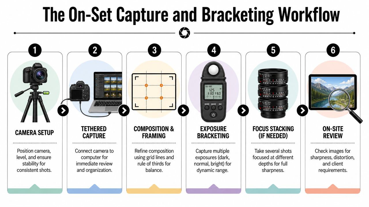
Bracket exposures with discipline
For most interiors, I keep aperture and ISO fixed, then bracket with shutter speed only. A typical starting point is f/8 to f/11 at base ISO, adjusted for the lens and the depth I need in the room. That gives me a stable set for blending and keeps noise under control in the darker frames.
I usually capture an ambient bracket first. Then, if the space has ugly mixed light, dark cabinetry, or bright glazing that needs cleaner control, I add flash frames for a flambient blend. That extra step takes longer on site, but it often saves far more time in post and gives walls, ceilings, and millwork a cleaner result than HDR alone.
A clean sequence looks like this:
- Set the composition and level the camera
- Choose aperture for depth and lens performance
- Lock ISO at the lowest practical setting
- Bracket shutter speed for highlights, mids, and shadows
- Check histogram and preview for clipped windows or muddy corners
- Add flash frames or a window pull if the room needs more control
The tripod stays untouched until the sequence is complete. If I need to change anything, I reset deliberately rather than trying to guess my way back into the frame.
Capture the support frames you will want later
Experienced architectural shooters rarely stop at the hero exposure set. I also capture the frames that solve predictable problems in post.
That usually includes:
- a clean plate with no crew, bags, or stands
- a reflection-safe frame for mirrors, glossy stone, or appliances
- a flash frame to correct color contamination from practical lights
- a detail or tighter composition while styling is still perfect
Those extra files give me options without forcing heavy retouching. If you want a useful reference for how these captures come together in post, this real estate photography editing workflow walkthrough is a solid companion to the on-set process.
I have learned to shoot for the final deliverable, not just the scene in front of me. A brokerage may only need coverage. An architect or developer often needs a cleaner, more controlled file set that can stand up in a portfolio, award submission, or press package. The capture workflow has to reflect that standard.
Post-Processing Delivery and Client Collaboration
At the end of a long shoot day, the difference between a listing photo set and an architectural delivery becomes obvious on the monitor. The room may have looked clean in camera, but the final file still needs disciplined color, believable contrast, straight geometry, and retouching that never calls attention to itself. That work decides whether the images feel merely usable or publication-ready.
I split post into two clear stages. Lightroom is for intake, culling, lens profiles, global tonal work, and keeping the set consistent. Photoshop is where I finish the photographs. That includes exposure blending, flambient masking, cleanup, perspective control, window pulls, and the small corrections that protect the design intent.
Restraint carries the whole process.
Architectural clients are usually more sensitive to overediting than real estate agents. An architect will notice if verticals are forced too hard and the room starts to feel stretched. A designer will notice if white oak shifts orange or limestone turns cold gray. My goal is a polished file that still feels true to the space a client built.
I keep the edit order repeatable so quality stays high under deadline:
- Cull to the strongest composition first and ignore near-duplicates
- Set white balance and tonal direction across the full project so the gallery feels unified
- Correct perspective with care and stop before the file starts to distort
- Blend ambient, flash, and bracketed frames only to solve a specific problem
- Retouch distractions like outlet covers, scuffs, dust spots, wrinkles, and minor inconsistencies
- Export different versions for different uses instead of handing off one generic set
If you want to compare that structure with a step-by-step post pipeline, this real estate photography editing workflow walkthrough is a useful companion.
Delivery needs just as much intention as capture. Architects, developers, brokerages, and editorial teams do not buy the same thing, even when they license the same image. I usually send organized sets based on actual use, not just file size.
| Delivery type | Typical use | What matters most |
|---|---|---|
| High-resolution master files | Print, portfolio, large-format marketing | Clean retouching and maximum detail |
| Web-optimized files | Websites, email, digital listings | Controlled compression and consistent color |
| Cropped social versions | Vertical, square, and story layouts | Flexible framing without awkward trims |
| Contact sheet or gallery | Review and approvals | Fast selection and clear file names |
Good delivery also includes context. I tell the client what is final, what is an alternate, how files are named, and what can be revised quickly if a marketing team needs new crops. That sounds simple, but it saves rounds of confusion and makes larger projects run better.
Client feedback is part of the workflow, not a nuisance. Architects often want tighter attention on alignment, massing, and how one image fits the narrative of the full project. Interior designers may care most about fabric color, stone character, and whether the wood finish matches the installed work. Developers usually want broader coverage so the same shoot can serve leasing, investor decks, web pages, and press outreach.
The best collaborations I have had follow two habits:
- Invite informed feedback while keeping technical standards intact
- Track client preferences so the next production starts with better assumptions
Architectural specialists are not immune to the market's shift toward mixed-media delivery. Clients now ask for stills, short motion clips, vertical crops, and walkthrough assets from the same production day. That does not mean every photographer needs to offer every service. It does mean the conversation should happen before the shoot, while the schedule, styling, lighting plan, and licensing are still easy to shape.
The finished set has to do more than look good. It needs to respect the architecture, support the client's business goal, and hold up under close review from people who know the project well.
If you need architectural or real estate imagery that's built around planning, lighting control, and polished post-production, Jimmy Clemmons Photographer works with architects, developers, design teams, and commercial clients to create intentional visual assets for marketing, editorial, and portfolio use.