

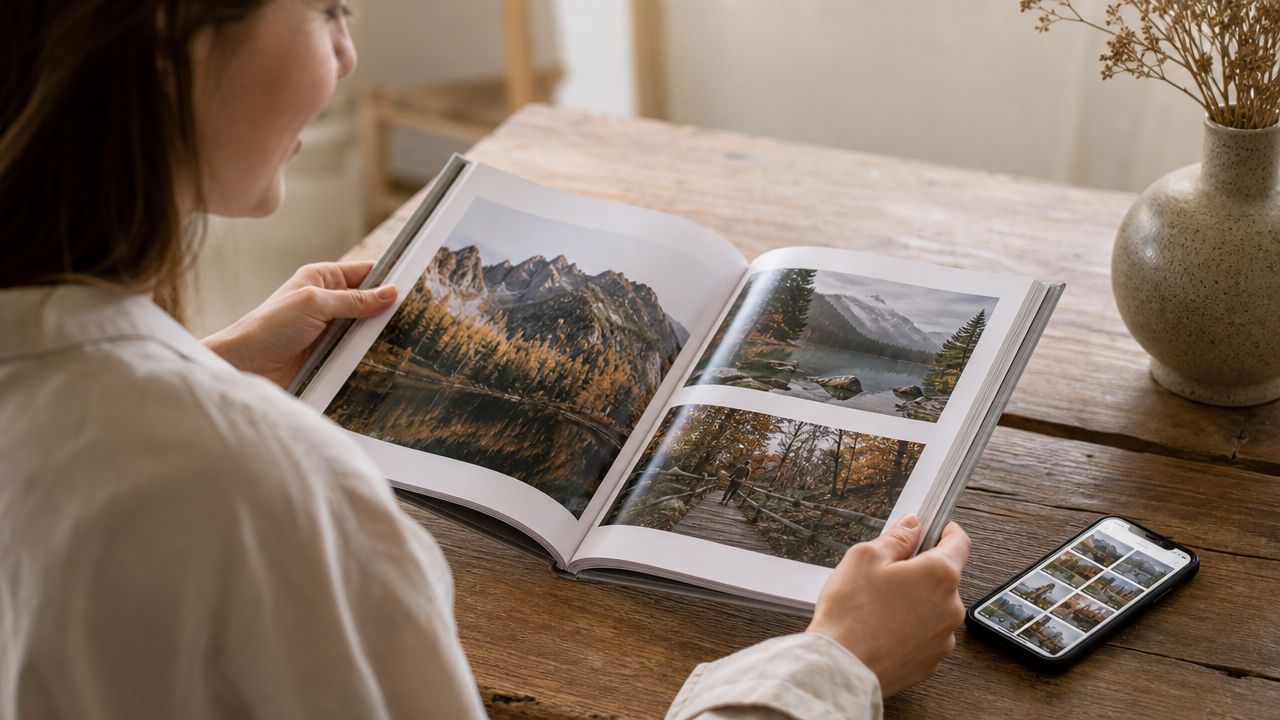
Most advice about making a professional photographer photo book is too small-minded. It starts with templates, page counts, cover options, and drag-and-drop software. That's backward.
A serious photo book isn't a craft project. It's an editorial object with a business job to do. For architects, designers, developers, hospitality groups, and premium commercial clients, the book becomes part portfolio, part leave-behind, part brand signal. It tells people how you see, how you edit, and whether you understand material quality at the same level they do.
The mistake isn't choosing print over digital. The mistake is assuming a printed book only matters as a nostalgic alternative to a website. The strongest books don't compete with your site. They sharpen it. They distill your point of view into something slower, more selective, and harder to dismiss.
Why a Physical Photo Book Still Matters
Is print worth the trouble anymore? It is a fair question, but it points to the wrong decision. The useful question is whether a physical book can do work your website, PDF, or Instagram grid cannot. For high-end photographers, especially in architecture, interiors, hospitality, and design, the answer is yes.
Recent discussion around photobooks has a point. Too many books feel templated, interchangeable, and thin on editorial judgment. The ones that hold value do something sharper. They present a point of view, show restraint, and act as a serious credibility tool rather than a generic container for images, as discussed in this commentary on whether the photo book is dead.
Physical format still solves a specific business problem. Screens encourage speed. A book controls sequence, scale, and tempo. In a client meeting, that control changes what gets discussed. Instead of skimming for a quick impression, the client starts reading your work as a body of decisions.
Why clients read print differently
Architecture and design clients are object-literate. They notice paper stock, trim accuracy, binding, tonal subtlety, and whether the materials suit the work. They also notice when those choices are generic. If the book feels careless, they read that as a mismatch between the standards you claim and the standards you practice.
This is partly about psychology. A printed book asks for attention in a way a browser tab does not. It also signals commitment. Anyone can upload images. Fewer photographers can edit tightly, print faithfully, and put an object on the table that reflects the same level of care their clients expect in built work. That is the same discipline behind managing client visual expectations in high-stakes projects.
The commercial relevance is still real. The global photobook and album market was valued at USD 3.51 billion in 2025 and is projected to reach USD 5.61 billion by 2034, reflecting a 5.61% CAGR. North America accounted for 37.60% of the market in 2025, or about USD 1.32 billion, according to Fortune Business Insights on the photo album market. That does not mean every photographer needs a book. It shows that print remains an active commercial category, not a sentimental leftover.
Practical rule: A book earns its place when it creates a better client experience than a screen can. Usually that comes down to pacing, material presence, and disciplined editing.
What a book does in the room
A strong professional photographer photo book changes the temperature of a meeting.
Clients stop hopping between categories and start noticing continuity. They see how you handle transitions from exterior to interior, wide view to detail, daylight to dusk, hero frame to supporting image. That is where judgment becomes visible, and judgment is what premium clients hire.
The book also keeps working after you leave. It can sit in an architecture studio, on a conference table, in a developer's office, or in a private client library. It stays available, physical, and hard to ignore.
A weak book sends the opposite message. If it feels mass-produced, overfilled, or disconnected from the standards of the clients you want, it suggests that you shoot well enough but do not edit, produce, or present at a high level. Print still matters for one reason. In the right hands, it makes taste tangible.
Defining the Book's Purpose and Narrative
Before you export a single JPEG or open InDesign, write a brief. Not a vague intention. A usable document.
Most failed books fail before sequencing starts. The photographer never decided whether the book was meant to win architecture commissions, support editorial assignments, commemorate a major build, or present a personal body of work. Those are different books, even if some of the same images appear in all of them.
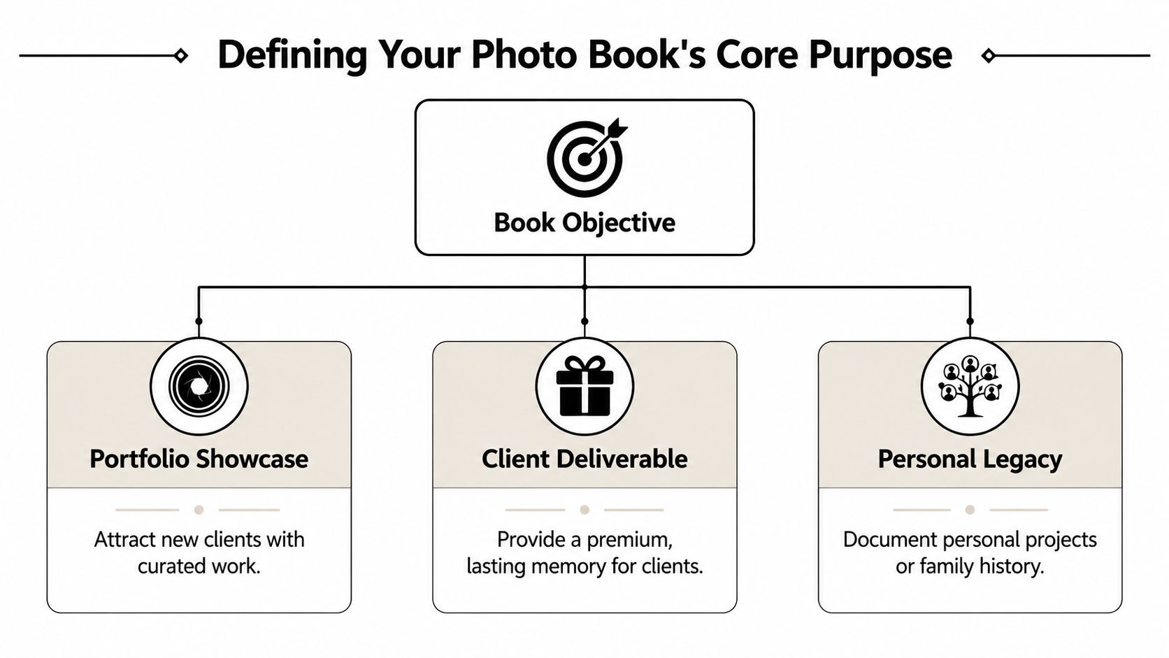
Start with one sentence
Write a single sentence that finishes this phrase:
This book exists to...
If the rest of the sentence turns into three goals, start over. One book can support multiple outcomes, but it needs one dominant purpose.
Here are examples that are focused enough to guide decisions:
- Win architecture and interiors clients by showing control of space, light, and material detail.
- Serve as a premium client deliverable for a completed residential or hospitality project.
- Establish an authored visual voice around a long-term personal documentary or fine art subject.
Each purpose changes what belongs in the edit. A leave-behind for design firms needs confidence, consistency, and market relevance. A monograph can tolerate slower pacing and more ambiguity.
Define the audience before the sequence
A book for architects isn't a book for brand marketers. Architects want to understand spatial logic. Interior designers care about finish relationships and how your eye handles texture, color, and daylight balance. Developers often respond to scale, clarity, and how well the work communicates value. Editorial clients may care more about narrative control and range.
A short planning grid helps:
| Question | Useful answer |
|---|---|
| Primary reader | Architect, interior designer, developer, editor, collector |
| Desired response | Request a meeting, commission a shoot, remember your style, keep the book |
| Tone | Minimal, editorial, warm, formal, tactile |
| What must be obvious | Range, specialization, authorship, technical precision |
That same discipline applies when you're discussing scope with clients. Managing expectations early is part of making the finished object feel coherent. The thinking behind managing client visual expectations applies directly here. If the client expects a glossy trophy piece and you design a restrained editorial book, the disconnect starts long before printing.
A quick visual overview can help frame the decision before you begin:
Build the narrative spine
Once the purpose is clear, identify the book's narrative spine. That is the governing idea that holds the sequence together.
For architecture, the spine may be:
- Process of arrival, moving from exterior context to threshold to interior experience
- Material conversation, pairing wide views with details that explain craft
- Use of light, showing how space changes across conditions
For commercial lifestyle or brand work, it may be behavior, product integration, or atmosphere. For a personal project, it may be place, memory, or repetition.
If you can't describe the narrative spine in plain language, the viewer won't feel it on the page.
The book doesn't need a plot. It needs intention. That intention is what keeps it from becoming a stack of attractive files bound together.
Curation and Sequencing for Visual Storytelling
Strong books are usually edited harder than their makers expect. The problem is rarely a shortage of good photographs. It is an excess of near-duplicates, especially in architecture, where one project can produce ten competent versions of the same idea.
Photographers often begin with too many images because screens isolate frames. A vertical on its own can feel distinct from the horizontal beside it. Two detail shots can both look persuasive at 100 percent. In sequence, those differences collapse. Repeated camera heights, repeated gestures, repeated moments of light make the book feel less considered, and clients notice that kind of drift even if they cannot name it.
Make the first cut wide, then get ruthless
The first edit should collect possibilities, not defend favorites. Pull everything that could earn a place. Then print it small and get it off the monitor.
Work prints change the conversation. Spread them across a table and the redundancies show up fast. So does the true strength of a project. An image that looked impressive on a backlit screen may fall apart when it has to hold space next to six others. Another frame, quieter on screen, may become the one that gives the sequence credibility.
Use three tests:
- Does this image move the narrative forward?
- Does it add information, mood, or scale that another frame does not?
- Does its removal weaken the book in a noticeable way?
If the answer to the third question is no, cut it.
That discipline is commercial, not just aesthetic. A book that edits itself properly signals judgment. For architects, designers, hotel groups, and developers, judgment is part of what they are hiring.
Sequence for pacing and client psychology
The first spread establishes competence. The next few spreads establish trust.
Many photographers make the same sequencing mistake. They stack their loudest work at the front, hit a peak too early, and spend the rest of the book recovering. That approach can work on a scrolling portfolio because speed hides weak pacing. In print, every turn is a claim about what matters.
A stronger sequence controls pressure. Open with a frame that states the project clearly. Follow it with something tighter or quieter that rewards attention. Then widen the field again. That change of scale keeps the viewer engaged and prevents visual fatigue.
A practical rhythm often looks like this:
- Lead with authority. Start with an image that defines the project and your command of it.
- Narrow the focus. Move to a detail, threshold, or transitional frame.
- Re-establish context. Return to a broader view with new information.
- Vary the tempo. Alternate intensity and restraint so the sequence keeps its shape.
For photographers refining their edit, a guide to must-have shots for your next portfolio can help identify missing image types. The value is not the checklist itself. The value is seeing whether your sequence has enough range to hold attention without losing coherence.
Build spreads that argue, not just match
A good spread creates tension or resolution between the pages. One image asks a question. The facing image answers it, complicates it, or shifts the meaning.
In architecture and design books, pairings do real work. A material detail facing a wide lobby view proves that the surface language holds up under scrutiny. An exterior at dusk opposite an interior in warm practical light shows command over atmosphere and continuity. A quiet circulation space after a dramatic opening spread can reset the eye and make the next reveal land harder.
Use pairings with intent:
| Pairing type | What it does |
|---|---|
| Wide plus detail | Builds credibility through specificity |
| Daylight plus dusk | Shows control across conditions |
| Exterior plus interior | Explains transition and context |
| Finished space plus human trace | Adds scale and lived relevance |
The strongest books also leave strategic gaps. A pause matters. One restrained spread between larger visual statements can make the whole sequence feel more expensive, more editorial, and more sure of itself.
The strongest sequence usually isn't the one with the most good photographs. It's the one with the fewest unnecessary ones.
Mastering Layout Design and Typography
Layout is where many otherwise strong books lose authority. The photographs may be excellent, but the pages start fussing around them. Oversized captions, trendy fonts, inconsistent margins, awkward centering, decorative rules, gratuitous bleeds. The design begins asking for attention that belongs to the work.
A serious photo book needs a layout system, even if the final result feels effortless.
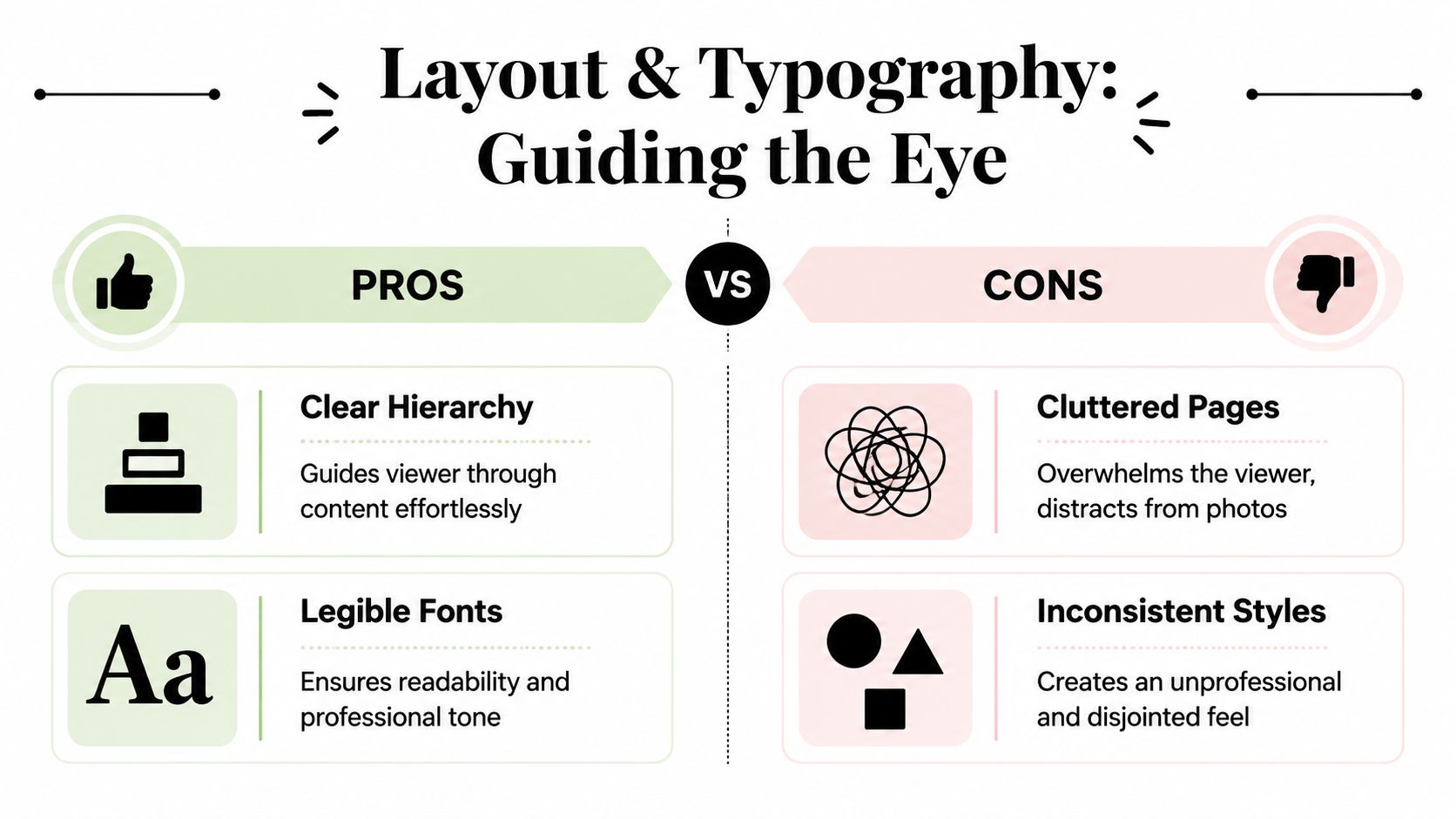
Build a quiet grid
Start with a grid and keep it simple. That might be a single image per page, a two-column text structure for essays and captions, or a modular system that allows occasional diptychs and full bleeds without making every spread look unrelated.
For architectural photography, I prefer layouts that feel measured. Wide margins and consistent alignments echo the discipline of the subject. If every page uses a different logic, the book starts to feel improvised.
A restrained grid helps with three things:
- Pacing: it creates continuity across the book
- Focus: it tells the eye where to start
- Authority: it signals that decisions were made, not guessed
Breaking the grid can be powerful, but only when the default structure is clear. A full-bleed spread lands harder when it interrupts a book that has otherwise shown restraint.
Use white space as part of the edit
White space isn't empty. It's timing.
A photograph surrounded by generous margins feels considered. The viewer pauses. A full-bleed image feels immersive and immediate. Neither is necessarily better. The point is to match the treatment to the image's job.
Use white space when:
- the image has fine tonal nuance
- the subject needs separation from adjacent material
- you want a detail or quiet frame to hold attention
Use larger reproduction or bleed when:
- the image carries structural importance
- scale is the message
- the spread depends on immersion rather than contemplation
Design note: If every image runs large, none of them feel important. Scale only works when it varies.
Keep typography subordinate
Typography in a photography book should support orientation, not perform personality. Choose one serif and one sans-serif at most, or just one family with multiple weights. The fonts need to disappear into the reading experience.
What matters most is consistency:
| Element | Good practice |
|---|---|
| Titles | Keep them short and visually restrained |
| Captions | Use one position and one style throughout |
| Essays | Set comfortable line lengths and honest spacing |
| Project data | Group it consistently so it reads as reference, not decoration |
Avoid typefaces that signal a trend cycle. A book with disciplined photography doesn't need fashionable typography to feel current. It needs proportion, legibility, and tonal fit.
Caption with purpose
Some books need almost no text. Others need concise context. Architecture books often benefit from basic project information, location, collaborators, or a short note about design intent. But captions should answer a real question. They shouldn't narrate the obvious.
Bad caption:
A beautiful interior hallway with natural light.
Useful caption:
Reception corridor, north light, oak paneling, custom bronze hardware.
The second tells the viewer what to notice. It adds editorial value.
Good layout does one thing above all else. It gets out of the way while making the photographs easier to see.
The Tangible Experience Print Materials and Finishes
Material choices aren't garnish. In a professional photographer photo book, they carry part of the argument.
If you photograph architecture, interiors, hospitality, products, or branded spaces, your clients already think in materials. They compare stone finishes, wall paints, textiles, woods, metals, glazing, and surface sheen for a living. Hand them a book with muddy neutrals, flimsy pages, or a slick cover that feels generic, and the object undercuts the work before they fully absorb the images.
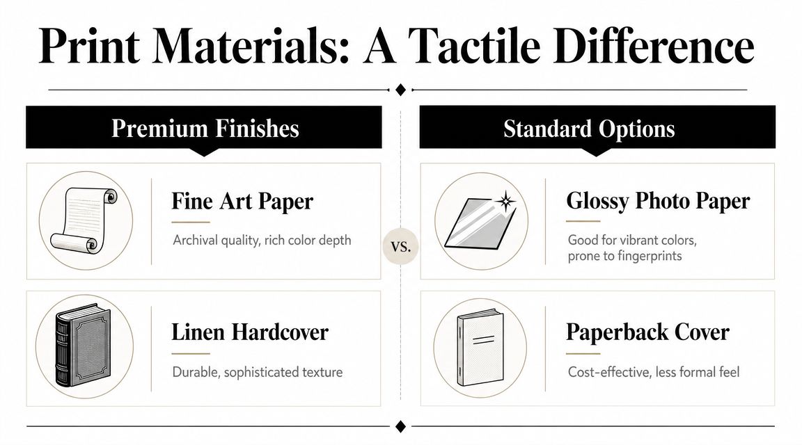
Paper changes the image
Paper stock doesn't just affect feel. It changes contrast, color separation, shadow openness, highlight roll-off, and how texture presents under light.
Gloss and high-sheen surfaces can make color look snappy, but they also introduce reflections and fingerprints. Uncoated and matte stocks often feel more refined, but they can mute blacks and soften perceived sharpness. Lustre and satin papers usually sit in the middle and often suit architectural work because they preserve detail without becoming flashy.
When comparing options, pay attention to these trade-offs:
- Matte and uncoated stocks often feel editorial and tactile, but deep shadows may compress.
- Glossy papers can boost punch and apparent contrast, but they may feel too consumer-oriented for luxury presentation.
- Lustre or satin finishes usually provide the safest balance for mixed subject matter.
If your work relies on subtle tonal transitions, especially concrete, plaster, limestone, white walls, brushed metal, or pale wood, ask for paper samples and printed swatches before committing.
Binding affects how the story reads
Binding isn't just production trivia. It determines whether certain photographs should exist in the book at all.
Lay-flat binding is often the right choice for architecture and interiors because panoramic spreads, long sightlines, and symmetrical spaces suffer when critical detail disappears into the gutter. Sewn bindings can look beautiful and durable, but they require more caution with cross-spread images. Perfect binding may be acceptable for smaller editorial books with modest image sizes, but it rarely carries the same physical authority.
A practical comparison:
| Binding type | Best use |
|---|---|
| Lay-flat | Panoramas, symmetrical interiors, high-end presentation |
| Sewn hardcover | Monographs, essay-driven books, durable trade feel |
| Perfect bound softcover | Promotional leave-behinds, lighter editorial pieces |
Cover materials matter too. Linen, cloth, debossing, and restrained foil can all work. What doesn't work is a finish chosen purely to seem expensive. A flashy cover with ordinary interior reproduction feels dishonest.
Print fidelity is not optional
Among professionals, one recurring concern is whether a print service provides ICC profiles for soft proofing, because the pain point isn't lack of design inspiration. It's whether the book can preserve tonal detail, neutral grays, and accurate reproduction across pages, as reflected in this discussion about the highest-quality online photo book options.
That concern is well founded. Architectural work is unforgiving. Neutral walls drift magenta. Concrete turns green. Warm wood can go orange. Deep shadows can block up. Skin tones in hospitality or branded spaces can split away from the environment.
Calibrate the monitor. Soft-proof to the printer's profile if they provide one. Then order a proof copy and inspect it under controlled light, not by window glare at noon.
A few essential items help:
- Calibrate your display before final color decisions.
- Ask the printer for ICC profiles and proofing guidance.
- Check gray balance on neutral interiors and mixed-light scenes.
- Review skin and wood together if the book includes people in designed spaces.
- Inspect the proof physically for gutter loss, black density, and paper behavior.
A demanding book should feel accurate in the hand, not merely attractive on screen.
Production Logistics Budgeting Timelines and Delivery
At this stage, elegant ideas become a job with deadlines, invoices, shipping risk, and revision fatigue. Production isn't glamorous, but it decides whether the book arrives looking deliberate or compromised.
The three variables always push against each other. Budget affects materials. Timeline affects proofing. Vendor choice affects both. Treat them as one system, not separate decisions.
Choose the printer for the job, not for convenience
Some projects need a bespoke printer or bindery with close proofing control and premium finishing options. Others work well with a quality-focused online service that offers reliable reproduction, straightforward ordering, and useful sample packs.
Evaluate print partners on practical criteria:
- Color management support: Can they provide ICC profiles, proofing guidance, and clear file specs?
- Paper and binding range: Do they offer the combinations your book requires?
- Proofing options: Can you order a single proof or mockup before the final run?
- Packaging and shipping reliability: Will the book arrive presentation-ready?
- Customer communication: If something shifts, do they answer like a production partner or like a help desk?
Don't choose a vendor because their template software looks easy. That's a consumer feature. For professional use, output quality and predictability matter more.
Build the schedule backward
Books go wrong when photographers think only about print time. The primary time sink is review and revision.
Work backward from the date the book must be in hand. Then add margin for second thoughts, proof corrections, and shipping delays. A useful schedule usually includes:
- Image lock after final edit and sequencing
- Design round one with real pages, not loose concepts
- Internal review for pacing, typography, and production errors
- Proof order
- Physical proof review under proper light
- File corrections and final approval
- Production and delivery
- Packaging for presentation or shipment
If the book is meant for a client handoff tied to a launch, installation, opening, or award submission, don't schedule the final delivery for the week of the event. That's how rushed approvals get baked into the object.
Budget for the parts people forget
Photographers often budget for the printed unit and little else. The hidden costs usually sit around it.
Commonly overlooked items include:
| Cost area | Why it surprises people |
|---|---|
| Proof copies | One proof is often not enough |
| Shipping | Expedited delivery and protective packaging add up |
| Sample kits | Small cost, but worth planning for |
| Rush production | Premium fees appear fast when deadlines tighten |
| Small-batch orders | Lower quantities can raise per-book cost sharply |
Presentation also belongs in the budget. If you're handing the book to a design client, an archival slipcase, simple wrap, or even a clean branded belly band can make the exchange feel intentional. If you're mailing it, packaging needs to survive transit without looking industrial or careless.
A premium book that arrives with dented corners and scuffed wrap no longer reads as premium.
The last delivery decision is strategic. Some books should be left behind after a meeting. Others should be shown in person and retained. A costly or highly customized volume may function better as a studio object than as a handout.
Production discipline doesn't make the book less creative. It protects the creative decisions you've already made.
Your Book as a Cornerstone of Your Brand
A well-made book does more than display images. It proves that you can edit, sequence, and present work with judgment. In crowded fields, that matters.
The U.S. Bureau of Labor Statistics reports 151,200 photographers in 2024, a median hourly wage of $20.44, a median annual wage of $42,520, and projects 2% employment growth from 2024 to 2034, with about 12,700 openings per year driven largely by replacement needs, according to the BLS occupational outlook for photographers. In that kind of professional environment, differentiation isn't cosmetic. It's survival.
What the book signals
A serious book tells clients and collaborators a few important things at once:
- You know how to edit. You didn't dump a gallery onto paper.
- You understand audience. The object feels matched to the people meant to receive it.
- You respect craft. Materials, color, and pacing reflect care.
- You have a point of view. The work reads as authored, not assembled.
That last point is the one many photographers miss. A website can show range. A book can show conviction.
If you're weighing cost against value, the right comparison isn't just print versus digital. It's whether the object deepens the perception of your work and helps the right people remember it. That's the same strategic thinking behind the ROI of professional photography. The book becomes part of how your brand is experienced, not just how your images are stored.
A definitive professional photographer photo book doesn't need to be flashy. It needs to be selective, coherent, and physically honest. Make one when you have enough work, enough clarity, and enough discipline to produce something that feels inevitable.
If you're investing in imagery that deserves that level of presentation, Jimmy Clemmons Photographer creates architectural, commercial, and editorial photography with the sequencing, precision, and design sensitivity that translate naturally into a standout printed portfolio or client book.