
You're on set, the room is finished, the client is standing behind you, and the file looks almost right until you zoom in on the monitor. The baseboards bow a little, the window mullions don't feel vertical, and the far corner of the ceiling seems to drift just enough to make the whole frame uneasy. That's the core problem with lens distortion correction in architectural photography, it's never just one problem, and the file reminds you of that the moment the shutter clicks.
A lot of guides collapse everything into a single fix. They talk about distortion as if a profile slider, a transform tool, or a wide-angle lens setting can solve every geometry issue in one pass. In practice, the image usually contains two separate issues, optical geometry from the lens itself, and the camera position you chose in the room. The distinction matters because the wrong fix can make a clean interior look stretched, flat, or fake.
When a Corner Will Not Stay a Corner
I still remember shooting a compact kitchen for an editorial client where the island had to stay centered, the fridge couldn't move, and there was barely enough space to stand behind the tripod. The frame looked disciplined on location, but back on the monitor the tile lines wanted to run away, the cabinet faces felt slightly swollen, and the verticals leaned just enough to nag at me. Nothing was broken in the camera, the room was asking for a geometry decision before the shutter.
That's the moment most photographers recognize. The photo isn't soft, the exposure isn't wrong, and the color can be fine, yet the architecture doesn't feel anchored. You can see the scene, but the building doesn't sit still.
The file that almost works
That near miss is why architectural work feels different from general interiors or travel. Straight lines aren't a bonus, they're the subject. A wall edge that drifts a little in a portrait can feel casual, but the same drift in a lobby or façade pulls attention away from the design.
The history of optical correction matters here because this isn't a brand-new digital trick. Lens design had already been systematized in the 18th and 19th centuries, from the achromatic lens work of Chester Moore Hall and John Dollond to the apochromatic objective developed by Ernst Abbe, Otto Schott, and Carl Zeiss in 1886, which corrected chromatic aberration for three wavelengths and largely minimized spherical aberration. Those milestones helped establish the optical principles that later made geometric correction practical in photography and imaging. Bitesize Bio's overview of corrected lenses and objectives lays out that lineage clearly.
In the field, though, the old lesson still holds. You don't fix a building file by guessing at a slider. You identify which geometry problem you're seeing, then correct it in the right place.
Practical rule: If the image feels wrong at the edges, think lens geometry. If the image feels wrong in the whole frame, think camera position.
That distinction is the rest of the workflow in miniature. The lens can distort the edges. Your stance can lean the building. The best architectural files deal with both, but not in the same way.
The Four Faces of Lens Distortion
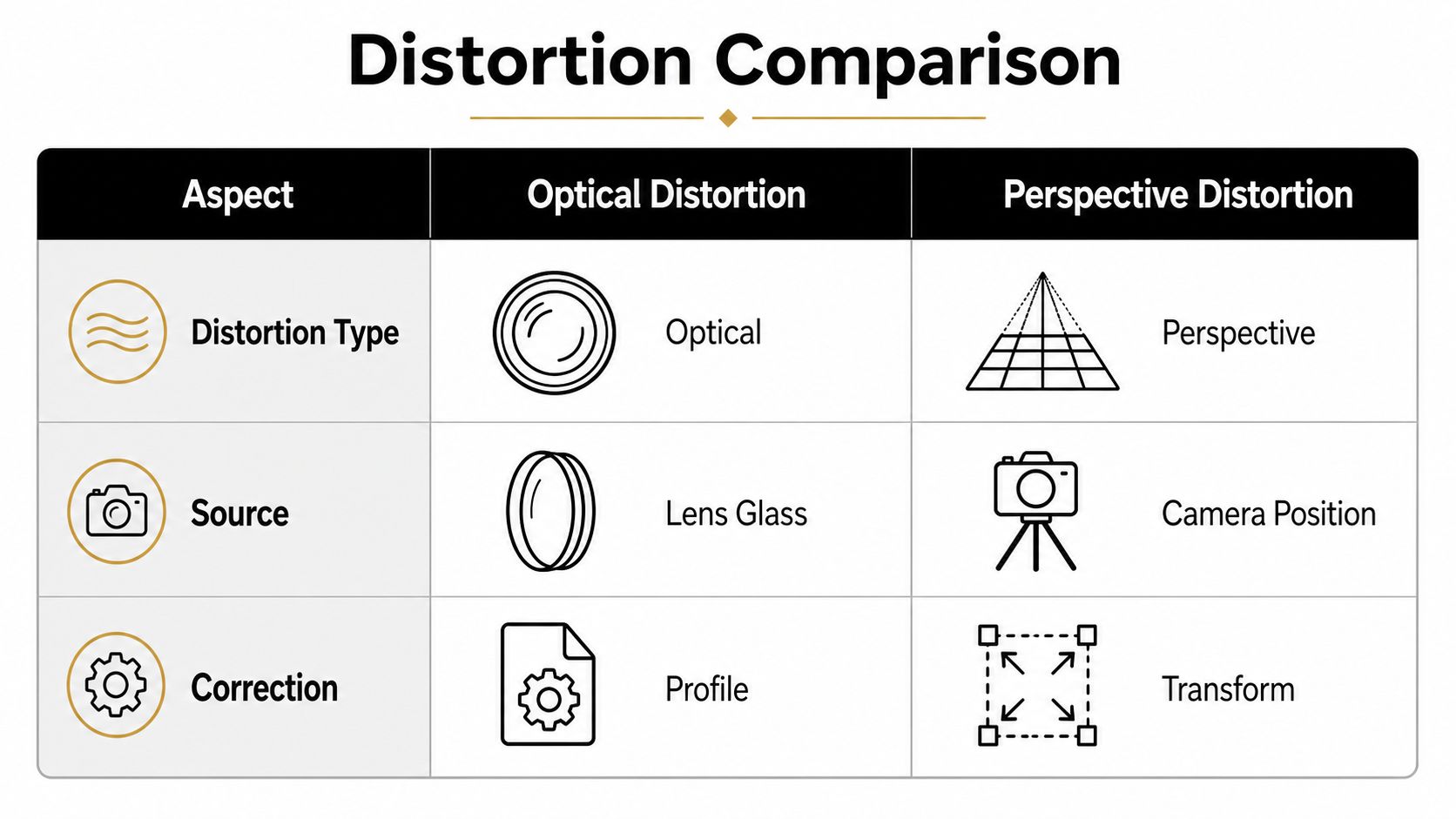
Optical distortion shows up in a few predictable forms, and it helps to name them before touching a raw converter. Barrel distortion pushes straight lines outward, so a wall can feel like it's wrapped around a fishbowl. Pincushion distortion pulls lines inward, like the frame is being pinched at the corners. Mustache distortion bends the line in one direction and then another, which is why it can look like a soft wave running across the frame.
Optical distortion is not softness
Many photographers waste time here. Distortion is geometric, while softness, chromatic fringing, and vignetting are different optical behaviors altogether. A corner can be sharp and still bend. A lens can be crisp in the center and still bow a window frame at the edge.
The Cooke triplet, patented by Dennis Taylor in 1893, mattered because it was described as the first lens system that let photographers eliminate most optical distortion or aberration at the outer edge of the image. That's a useful historical marker because edge geometry is exactly where architectural clients notice problems first. Straight moldings, railings, and façades make every bend obvious. The Cooke triplet summary is a good reminder that lens engineering has been chasing cleaner geometry for a long time.
What each shape looks like in practice
Barrel distortion is common at wider focal lengths, especially when a lens is being pushed hard near the wide end. Pincushion often shows up as you move longer, where the frame can feel slightly tightened. Mustache distortion is the one that catches people off guard, because a simple correction can fix one part of the frame while leaving another part still wrong.
Perspective distortion is different. It's not the glass bending lines, it's the camera position making the subject converge. A building that leans inward isn't necessarily distorted by the lens at all. It may just be tilted because the camera wasn't kept level or the viewpoint was too low.
Straight lines on the monitor are not proof of the right fix. They're only proof that something was corrected.
That's why architectural photographers need a working vocabulary for the problem, not just a preset. Once you can tell barrel, pincushion, mustache, and perspective apart, you can stop fixing the wrong thing.
Lens Optics Versus Camera Position
Adobe's Camera Raw documentation is useful precisely because it separates lens distortion controls from vertical perspective controls, which is how the problem should be thought about in the first place. The lens profile addresses what the glass did. The perspective tool addresses where you stood. Those are not interchangeable corrections, even if they can look similar in a casual before-and-after. Adobe Camera Raw's lens correction documentation makes that split explicit.
The common advice to “just step back” sounds clean until you're in a tight bath, a narrow hall, or a façade shot from a sidewalk with traffic behind you. In those spaces, backing up is often impossible. Sometimes the wide lens is the only way to capture the room at all, even if it brings visible edge distortion with it. That's why architectural work is really a negotiation between the room, the lens, and the camera position.
Two problems, two tools
A profile correction can straighten optical bowing without touching the perspective of the room. A transform can level verticals and horizontal lines, but it won't magically fix a lens that bends the edges. If you try to use only one, you usually get a compromise that looks acceptable on a phone and weak in print.
That compromise gets even harder in façades. Adobe separates vertical perspective because a building can lean from camera angle, while Samsung's support forum notes that some mixed horizontal and vertical distortion cases are difficult to correct cleanly after capture. In other words, the file may contain more than one geometry issue at once, and not every combination cleans up perfectly after the fact. The practical question becomes how much correction you can apply before corners, scale, and resolution start to suffer.
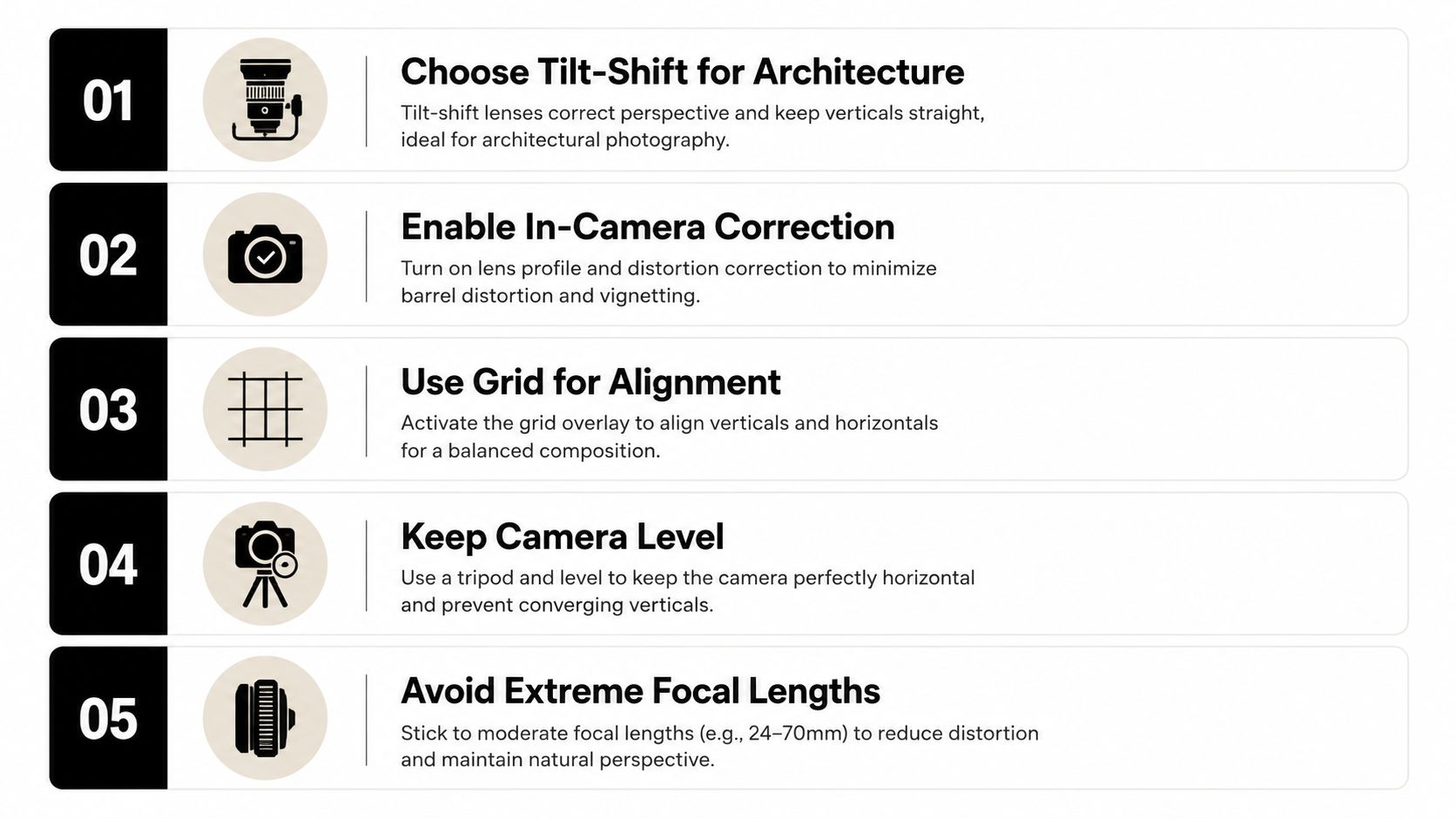
Recent camera-side tools show how much of this work is moving upstream. Canon's EOS M50 Mark II documentation describes built-in lens aberration correction that can be enabled in-camera, which means some distortion management is happening before the raw file even reaches editing software. That's useful in daily production, but it also reinforces the main point. Optical correction and perspective correction are different jobs.
The diagnostic habit that saves time
If the outer edge of a cabinet door curves, you're looking at lens geometry. If the whole kitchen seems to tip backward, you're looking at camera position. If both are happening, the correction order matters.
I've found the simplest check is to ask which part of the frame looks wrong first. Edges point to the lens. Convergence points to the viewpoint. Once you know that, the tool choice stops being a guess.
Wide-angle lenses and building proportions is a useful companion read if you're trying to keep proportions believable while still fitting a room into the frame.
Capturing Better Geometry Before the Shutter
The cleanest correction is the one you never need. On an interior shoot, that usually means thinking about geometry before lighting, styling, or bracketed exposures. If the camera is in the wrong place, no amount of post work will make the room feel naturally proportioned.
Lens choice is not cosmetic
A tilt-shift lens and a regular rectilinear wide-angle lens are not the same tool, even if they share a focal length number. The tilt-shift gives you movement, which matters when you need to keep verticals honest without tilting the body. A standard wide lens just gives you a wider field of view, which helps you fit the room but doesn't solve the geometry issue by itself.
That difference matters most in tight interiors. A 24mm tilt-shift can be a disciplined architectural tool. A 24mm rectilinear can still be the right choice, but only if you're prepared to manage the perspective later. If you're choosing between coverage and correction, coverage usually wins at the capture stage, but it shouldn't be confused with a finished result.
Leveling, position, and parallax
A bubble level and a hot-shoe bulls-eye sound basic because they are basic, and that's why they work. Keeping the camera level is often the quickest way to avoid leaning verticals in the first place. For exteriors, that one habit can save a lot of repair time later.
When stitching is involved, the nodal point matters because parallax can create seams and bending that have nothing to do with lens distortion in the usual sense. If the camera rotates around the wrong point, foreground and background relationships shift between frames. That's how a clean row of cabinets can become a difficult panorama.
Field habit: lock the tripod height, level the body, then test the frame edges before committing to a whole series.
The practical capture checklist is simple. Decide the framing height first, then set the lens axis, then position the camera so the architecture reads naturally from the chosen viewpoint. If a perspective-control adapter or tilt-shift lens is available, use it when the assignment demands control at capture. If not, give the file the cleanest possible starting point.
For a deeper take on lens selection in smaller spaces, best lens for interior design photography is worth reading after this.
Automatic Lens Profile Corrections
Automatic profile correction is the fastest reliable first pass in a modern workflow. Lightroom, Adobe Camera Raw, and Capture One all rely on lens profiles or correction data to compensate for the known geometry of a specific lens. That's a defensible way to start because it uses measured behavior rather than guesswork.
What the profile actually does
A profile addresses the lens, not the room. It can reduce barrel, pincushion, and some higher-order warping, but it won't fix a leaning wall caused by camera position. That distinction matters because a file can look “better” after profile correction and still be compositionally off if the camera was tilted up too far.
Open-source tools show how technical this can get behind the scenes. The Stanford project report on distortion correction emphasizes calibration from grid images and measurable lens parameters rather than a universal slider. It also reflects the broader reality of production work, where correction is tied to repeatable lens behavior, not aesthetic preference. The Stanford report on distortion correction is old, but the calibration logic still holds.
When automatic is enough
If you're working with a regular lens and a supported profile, the built-in correction is often the cleanest move. It's especially useful when you're processing a lot of files from the same kit, because profile-based correction keeps the workflow consistent. Tools such as Lensfun are valuable here because they provide an open database and library for distortion correction, which helps when the software vendor doesn't have a strong native profile.
PTLens is interesting for a different reason. Its ability to address higher-order nonlinear components makes it relevant when a lens doesn't behave like a simple one-curve fix. That's the point where a custom calibration or a more specialized profile can earn its keep, especially if the same lens is used across a repeated editorial or commercial workflow.
What to watch for
Automatic correction is fast, but it can crop or stretch the edges. That's not a flaw so much as the cost of making the geometry behave. On architectural files, that cost can matter if the composition already lives close to the edge of the frame.
If the profile is doing the right thing, keep it. If the file looks over-processed, don't assume the answer is a different preset. Sometimes the issue is that the lens profile was enough, but the perspective correction was too aggressive.
Manual Correction and Perspective Rectification
Manual correction is where the file becomes an editorial decision instead of a technical one. In Photoshop, Lightroom, or Capture One, the first job is to fix the viewpoint, not to chase perfect mathematical straightness at the expense of believable architecture. The best results usually come from small, deliberate moves.
Use the right sequence
Start with the profile, then correct vertical perspective, then horizontal perspective, and only then adjust scale. That order matters because each step changes the frame geometry in a different way. If you scale too early, you end up compensating for a transform you haven't finished yet.
In Lightroom, the upright modes can do a lot of heavy lifting when a façade leans or a hallway narrows unnaturally. Photoshop's free transform and perspective tools give you more direct control when one side of the frame needs a different treatment than the other. Capture One's geometry tools are also useful when you want a more deliberate correction path rather than a blunt automatic fix.
A façade example that feels real
A leaning façade often tempts photographers to overcorrect. The first pass straightens the verticals, and the building suddenly feels a little too tall, a little too thin, or faintly synthetic. That's the danger zone. If the parapet starts to sag visually or the windows look miniature, the correction is too strong.
What works better is a restrained transformation. Correct enough that the structure reads as upright, then stop before the proportions become theatrical. Corners should stay believable, not mathematically perfect. Architectural clients usually respond better to a file that feels true than one that looks like a rendering.
Practical rule: believable proportions beat perfect straight lines when the two conflict.
For structural and architectural files, using post-production to fix structural photos is a helpful way to think about the balance between repair and realism.
The trap of “perfect”
A file can be technically straight and still feel wrong. That happens when the transform stretches the foreground too much or flattens the scene until depth disappears. The room becomes believable only if the correction respects the camera's original vantage point.
That's why manual rectification is part judgment, not just mechanics. You're not trying to make the image look corrected. You're trying to make it look as if the geometry was always stable.
Quality Control for Magazine-Ready Architecture
The QC pass is where good files become deliverables. I've found the most useful check is not whether the image looks nice on a quick glance, but whether it can survive a slow visual audit against the architecture itself. If I have the drawings, I compare the corrected file against them. If I don't, I compare the frame edges against the structure that was present on set.
What I check on every file
The first pass is for parallel lines. Window heads, door casings, floor seams, and ceiling edges tell you quickly whether the correction held. Then I zoom to 100% along the frame edges, because that's where profiles can hide residual warping or soft stretching.
A second monitor helps because viewing distance changes the way proportion reads. A file that feels crisp at arm's length can still look slightly off when viewed from farther back, which is how clients often encounter it in layouts or print proofs. Stepping away for a few minutes before signing off also helps because your eye stops forgiving the same mistake.
A short checklist that catches most errors
- Compare to the original raw: confirm the correction improved geometry without flattening the scene.
- Scan edge geometry: watch for warped trim, bent mullions, and over-stretched corners.
- Check scale relationships: make sure furniture, openings, and ceiling height still feel plausible.
- Inspect the crop: confirm the crop didn't cut away too much useful edge detail after correction.
- Review at output size: what works at full-screen doesn't always work at print or magazine size.
The point isn't perfection for its own sake. It's consistency. Magazine-ready architecture needs a file that reads cleanly at the size the client will see it, not just at a zoomed-in editing view.
If the corrected image still feels slightly tense, I usually trust that instinct. The final check is where you catch the file that technically passed but still doesn't feel like the room you photographed.
A Defensible Workflow You Can Run on Monday
Shoot with the right lens and keep the camera level. Capture from the cleanest position you can manage, then apply the lens profile, fix vertical and horizontal perspective, scale the frame, and run a proper QC pass. That sequence respects the two-layer reality of architectural geometry, the lens and the camera position, instead of pretending they're the same issue.
The most common mistake is treating distortion correction as a single slider. The second is chasing perfect straight lines so aggressively that the room stops feeling true. What works is a layered workflow that protects proportions first, then cleans geometry, then verifies the result against the actual architecture.
Jimmy Clemmons Photographer creates architectural imagery with the same discipline this workflow demands, precise geometry, clean perspective, and edits that still feel believable in print and on screen. If you want built environments photographed with the kind of care that keeps lines honest and spaces readable, visit Jimmy Clemmons Photographer and see how that approach translates to your next project.