
You can have a folder full of beautiful room photos and still feel stuck when the inquiries don't change. That usually means the work is fine, but the presentation isn't proving enough. An interior designer portfolio has to do more than look polished, it has to show judgment, process, and results fast enough for a client, editor, or hiring manager to trust what they're seeing.
That pressure is real in a crowded field. The U.S. Bureau of Labor Statistics reported 69,580 employed interior designers in 2025, and the 2025 ASID State of Interior Design report estimated 56,449 additional self-employed designers, which puts the working base well above 126,000 when combined. The same ASID report projected nearly 17,500 U.S. interior design firms in 2025, up 3.4% year over year, with industry payroll estimated at $2.23 billion. In a market shaped by small businesses, reputation and visual proof matter because portfolios are often the first thing people use to decide whether your taste can also handle execution. ASID's 2025 State of Interior Design report
Why Your Portfolio Is a Proof System, Not a Gallery
The strongest portfolios I've reviewed rarely win because they're the prettiest. They win because they answer the hard questions before anyone has to ask them. A client might open your deck expecting inspiration, then close it if they can't tell what you did, what problem you solved, or whether you can handle a project like theirs.
That's why the portfolio needs to work like a proof system. Every image should support a claim, and every project should show a chain of evidence, from the brief to the result. In practice, that means treating each case study like a miniature argument for your design judgment.
Why pretty alone doesn't convert
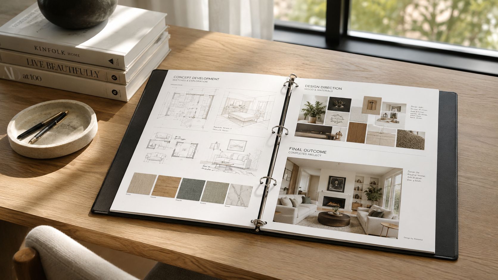
A lot of designers start with finished room images and stop there. The problem is that a finished room only proves the photographer had good access and the space looks finished, not that you can diagnose constraints, direct a team, or make smart material choices. If the deck feels thin, people assume the process was thin too.
The hiring market reinforces this. A 2025 analysis summarized by industry sources found that 78.7% of 1,000 live interior designer job descriptions required a portfolio, while fewer than 11% specified what it should include. That leaves the structure up to you, which is exactly why a weak portfolio gets ignored and a disciplined one stands out. Portfolio requirements analysis
Practical rule: if a project can't explain the brief, the challenge, the approach, and the result, it isn't ready for the portfolio.
The best portfolios make that structure obvious without sounding academic. They lead the eye with images, then prove competence with captions, sequence, and process evidence. That's the mindset that turns a pretty set of spreads into a working business asset.
Choosing and Sequencing the Projects That Earn Their Place
Most designers don't need more projects. They need better editing. A focused interior designer portfolio usually lives in the 8 to 12 strong project range, because beyond that the signal starts to blur and weaker pages drag down the stronger ones. The goal isn't to show everything you've ever done, it's to show the right range with enough consistency that the reader trusts your taste.
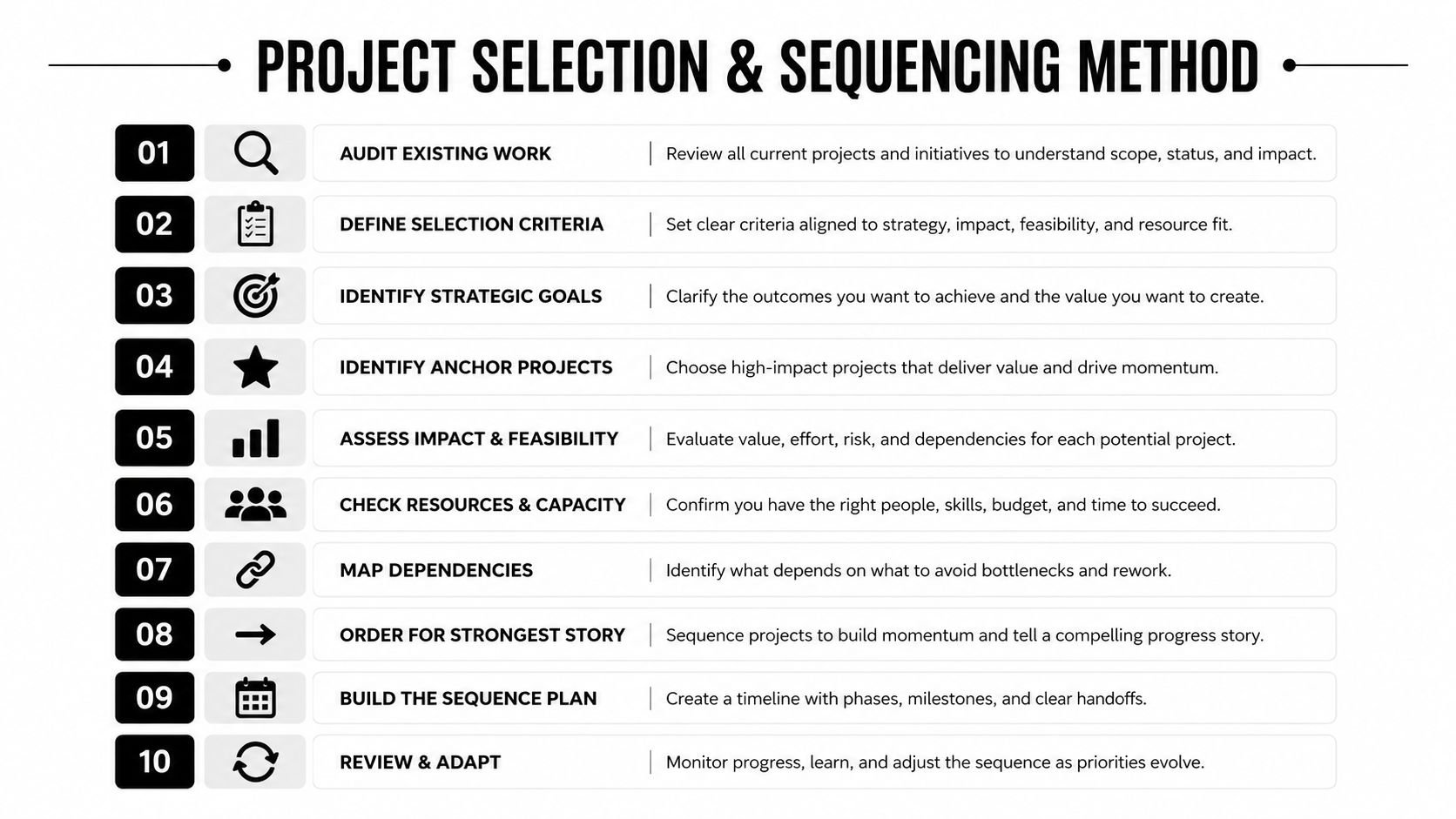
Start by auditing what you already have. Pull every project into one list, then sort them into three buckets, anchor projects, support projects, and archive. Anchor projects are the ones that clearly show your best work, your best photography, or your most relevant typology. Support projects can stay if they fill a useful gap. Archive the rest.
Build the order before you polish the pages
Lead with the strongest story, not the oldest job. A portfolio opens better when the first project signals competence quickly, then the next few expand the range without repeating the same visual rhythm. If you have one project with unusually strong before-and-after evidence or unusually clear documentation, give it a prominent spot even if it's quieter visually.
I'd sequence projects by a mix of typology, scale, and visual contrast. A kitchen remodel can follow a residential lounge, then a hospitality corner, then a detail-led project with strong material close-ups. That variation keeps the reader moving without feeling random. When every project looks similar, the portfolio starts to feel like one repeated idea instead of a body of work.
Use a written shortlist, not memory
A practical sequencing pass is simple:
- Audit existing work and remove anything that weakens the standard.
- Identify anchor projects that show your strongest judgment.
- Check coverage across project types, scales, and room categories.
- Flag gaps where you need new photography or more process evidence.
- Write brief notes for the brief, challenge, approach, and result.
- Order for the strongest opening so the first project earns attention.
- Break visual repetition with a quieter, detail-driven project when needed.
- Confirm mobile readability before you finalize the sequence.
- Review the contact path so action is obvious after the last page.
- Trim again until every project earns its place.
That list sounds simple because the real work is in the edits. The portfolio gets stronger when you remove the almost-good pages that dilute your best ones. For more background on project ordering and page structure, the layout logic in this portfolio sequencing guide lines up well with what works in practice.
Briefing the Shoot So Every Image Earns Its Frame
A portfolio falls apart fast when the images don't behave like a set. One project opens with a wide room shot, the next jumps straight to a close-up of hardware, and the third is so dark that the finish reads muddy. The fix is a proper photography brief, even if you're shooting the project yourself.
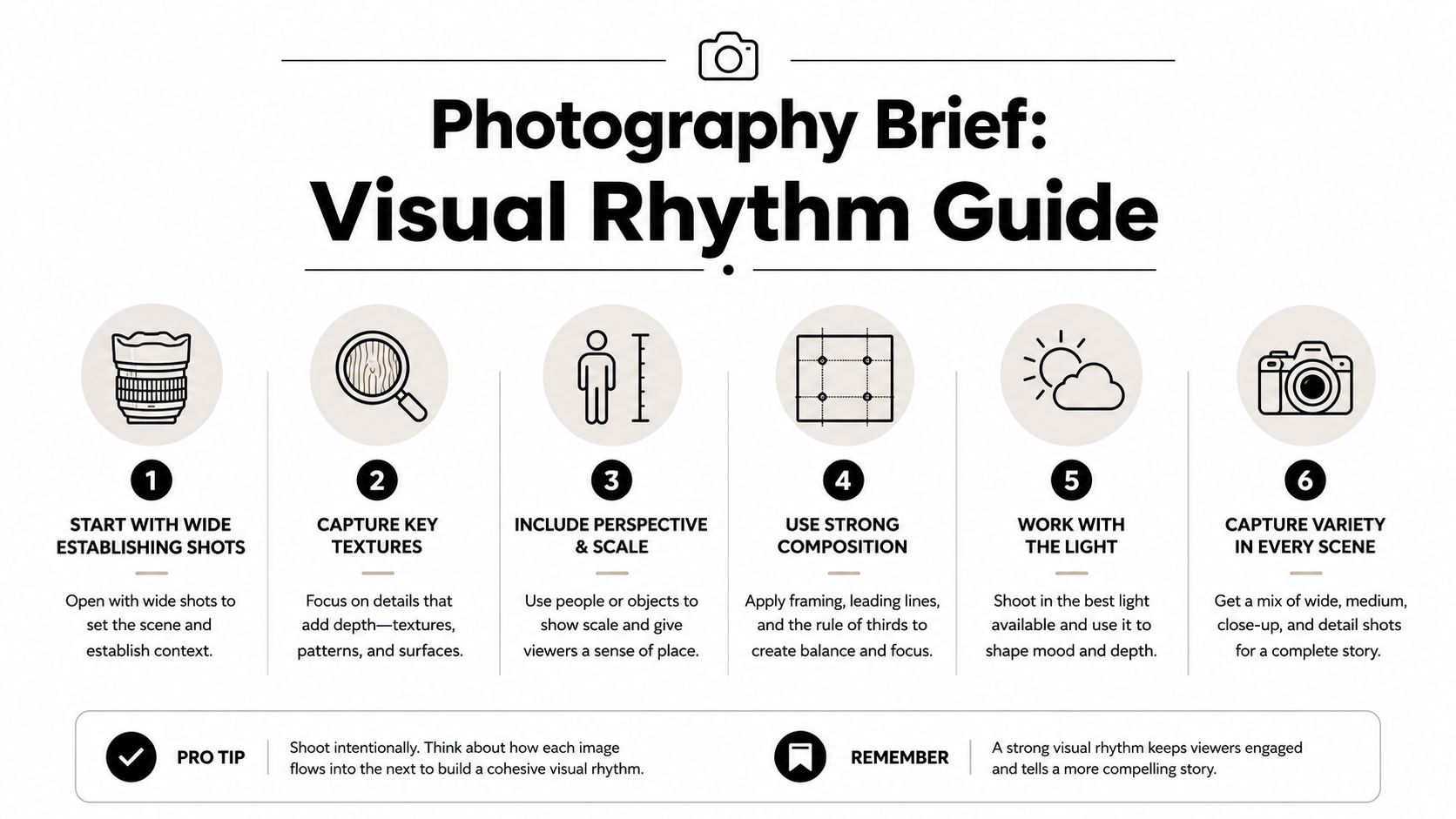
Start with the visual rhythm. Ask for, or plan, wide establishing shots to show layout, mid-range views to explain relationships, and tight material vignettes to prove the quality of the details. That mix gives the reader scale, context, and texture without forcing them to guess what matters.
What to ask for on shoot day
A useful brief covers four things. First, natural or controlled light, depending on how the room performs. Second, lens choice that respects the architecture, usually a perspective that doesn't warp cabinetry or pull the walls out of line. Third, styling that supports the design instead of hiding it. Fourth, a list of priority frames so you don't leave without the images you need most.
Good composition hides expensive problems and exposes careless ones.
That's why editorial discipline matters more than gear. A well-lit, well-composed frame from a modest setup will outperform an overproduced image that can't describe the room accurately. The portfolio is not the place to exaggerate sheen or over-stylize surfaces until they stop reading like the actual project.
A strong capture list also keeps post-production clean. Name files clearly, keep the color consistent across the set, and ask for deliverables that are easy to place into web and PDF formats without extra cleaning. If you're coordinating with a photographer, a useful starting point is this photo shoot checklist, especially if you're trying to align room coverage, styling notes, and handoff expectations.
Deliver the files in a usable state
The portfolio looks more polished when every image feels like it belongs to the same system. That means consistent crop logic, consistent exposure treatment, and a predictable naming pattern. It also means choosing files that are clean enough for layout without forcing the design to compensate for sloppy source material.
For image handoff and usage, it helps to understand usage rights as well as selection. Architectural image rights and licensing matter when you're planning how far the portfolio can travel across web, PDF, and social channels.
Designing the Layout for Web and PDF Portfolios
The format should match how your audience reviews work. A recruiter may skim on a phone. A potential residential client may sit with a PDF on a laptop. An editor may want a cleaner, more presentation-ready package. The wrong format slows all three down.
For digital portfolios, the priority is simple. Keep the layout clean, keep the descriptions concise, and make sure the images load quickly enough that the viewer doesn't feel punished for scrolling. Mobile viewing matters because a lot of first impressions happen on a small screen, where dense text blocks and cramped grids quickly become unreadable. If the contact path is buried, people won't hunt for it.
Web first, PDF first, or hybrid
A website-first portfolio works best when you need discoverability, easy updates, and a clear route to inquiry. A PDF-first portfolio is useful when you're sending a curated package for a specific application or commission. A hybrid approach gives you the flexibility of both, which is what most working designers need once the portfolio starts serving different audiences.
For print, one benchmark that holds up well is A3 on 250gsm paper. That size gives enough room for images, captions, and diagrams without the pages feeling flimsy or cramped. It also helps detail spreads breathe, especially when you need to show floor plans, elevations, or process pages alongside photography. A practical print and digital portfolio guide is a useful reference for that balance.
What each format does best
| Format | Best for | Key standard |
|---|---|---|
| Web | Discovery, mobile viewing, frequent updates | Clean grids, fast loading, obvious contact path |
| Job submissions, client follow-ups, curated presentations | Concise copy, strong hierarchy, export-ready images | |
| Meetings, reviews, tactile presentations | A3 landscape on 250gsm paper |
The layout itself should never compete with the images. Use generous margins, predictable spacing, and typography that doesn't fight the photography. If your website is image-heavy, keep in mind that image performance also affects how smoothly people experience the page, which is why the page speed considerations in this optimization guide are worth applying before you publish.
Writing Captions and Crediting Every Contributor
A lot of portfolios fail because the images are strong but the words are lazy. Captions are not decoration. They're part of the proof system, because they tell the reader what they're looking at and why it matters.
Think of each project caption as a compact case file. Include the role, scope, location, completion date, and the key collaborators who made the work possible. If the project involved a photographer, contractor, architect, millworker, or consultant, credit them clearly and keep the tone professional. Good crediting protects relationships and makes the portfolio feel more credible, not less.
A clean caption sequence
A strong project page usually moves in this order. One short line for the project identity. One line for the challenge or brief. One line for the design approach. One line for the result. Then a credit block. That's enough to orient the reader without turning the page into a report.
For example, a case study might begin with a room overview, then include a few lines on how circulation was improved, how finishes were selected to handle wear, and how the final space supports the client's daily use. A sketch or material board can sit between the opening image and the result section to show how the idea developed.
Useful standard: if a caption can't be read in a few seconds, it's too long for a portfolio page.
Keep the language direct. “Residential living room renovation, Atlanta, lead designer, completed 2025” tells a reader more than a half-page of self-congratulation. If you need a model for how image credit and usage should be handled, this rights and licensing reference is the place to review before publishing anything public-facing.
Caption blocks you can adapt
- Project ID: project name, city, project type, your role.
- Scope: a short description of what was redesigned or documented.
- Process note: one line on the main constraint or design decision.
- Result note: one line on what changed in the finished space.
- Credits: photographer, contractor, architect, vendor, or consultant as applicable.
That structure keeps the page readable and makes the evidence easy to verify. It also creates consistency across projects, which matters more than ornate writing when the portfolio is doing real business development work.
Building a Case Study When You Have Limited Finished Work
Thin project history doesn't mean thin credibility. It means the portfolio has to work harder on documentation. Early-career designers, career changers, and students often assume they need more completed client work before they can publish anything serious, but that's not really the issue. The core question is whether the work shown has enough evidence behind it.
One strong move is to rebuild a single project as a full case study. Gather the brief, sketches, mood boards, materials, annotated plans, and any before-and-after material you have. Then write it like a complete story rather than a sample page. That one project can show more seriousness than five loose renders with no context.
Turn partial work into credible evidence
Conceptual work can belong in a portfolio if it's presented transparently. Student projects can work too, as long as they're labeled clearly and framed around the design problem, not fake client outcomes. Personal projects can also earn a place if they demonstrate skill in space planning, sourcing, finish selection, or visual communication.
What doesn't work is pretending concept images are client results. AI imagery alone is not proof of execution, and it shouldn't be treated as such. Pair it with real-space photos, process pages, material references, or documented stages of development so the reader understands exactly what is concept, what is built, and what is speculative.
The practical threshold is simple. If the work shows a clear brief, a visible process, and a responsible label for what's real, it can contribute to the portfolio. If it only shows a polished render with no path from idea to outcome, it belongs in a sketchbook, not as primary evidence. The strongest nontraditional portfolios use the same structure every time, then add new projects with better documentation from the start.
Promoting the Portfolio with SEO and a Clear Call to Action
A finished portfolio still has to get found. The best pages I see don't just look polished, they're written and labeled so search engines and people can understand what the work is about. That starts with project page titles, descriptive alt text, and metadata that tells a clear story about your services, your location, and your specialty.
Use each project page like a small landing page. The copy should describe the room type, the project type, the aesthetic, and the market in plain language. Image file names should match the actual content, and alt text should describe the scene for accessibility first, then add context where it fits naturally. That combination helps your portfolio work harder on search and on sharing.
Distribution that actually matters
Instagram, Houzz, and LinkedIn each serve a different purpose. Instagram helps with visual discovery. Houzz supports home-design browsing and social proof. LinkedIn helps when you're reaching corporate, hospitality, developer, or consultant audiences. The portfolio itself should be the destination, because that's where the reader can assess the full proof system instead of a single polished image.
You should also make the contact path obvious on every page. Don't make people hunt through navigation to find out how to reach you. A visible button, a short inquiry line, and a clean contact page reduce friction at the moment interest is highest.
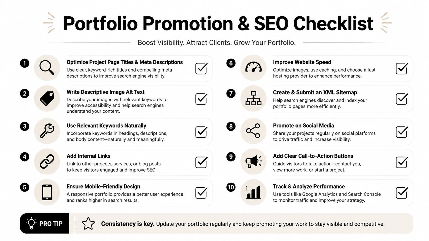
A portfolio earns trust when the visuals, captions, and structure all point in the same direction.
Before you publish, run a quick checklist. Are the strongest projects first? Are the captions specific? Do the images read well on mobile? Is every contributor credited? Is the contact path visible? If you can answer yes to those questions, the portfolio is ready to do its real job, which is to turn attention into inquiries.
If you want imagery that makes an interior designer portfolio feel as credible as the work behind it, Jimmy Clemmons Photographer creates architectural photography with the structure, clarity, and editorial discipline this kind of proof system needs. Visit Jimmy Clemmons Photographer to see how purposeful project imagery can strengthen your portfolio, sharpen your presentation, and help the right clients trust what you do.