

You're usually in one of two situations when you start looking for interior design photography tips. Either the project is finished and everyone wants images that feel as polished as the space itself, or the room looks excellent in person but falls flat the second you raise a camera. That gap is where most interior photography succeeds or fails.
A strong interior photograph doesn't just record furniture, finishes, and square footage. It explains how the space works, what the designer prioritized, and how someone is meant to feel inside it. That's why the best frames read more like editorial storytelling than simple documentation. They guide the eye, control mood, and make design decisions legible.
For architects, designers, developers, hospitality teams, and brand marketers, those images do real work. They shape perception before anyone visits in person. A 2025 property-industry guide says professionally photographed properties see a 55 to 65% increase in enquiries and sell about 35% faster on average, with typical residential shoot fees ranging from £300 to £800, according to Skywall Photography's 2025 interior photography guide. That's one reason serious clients no longer treat photography as an afterthought.
The deeper point is editorial. A publication-quality image doesn't ask, “What's in the room?” It asks, “What is this room saying?” The eight techniques below are built around that standard, so your photos don't just show a project. They present a clear design story with control, taste, and intent.
1. Master Lighting Control with Three-Point Lighting Setup
Most interiors already have light. That doesn't mean they're well lit for a photograph. Ambient daylight may be beautiful at the windows and dead in the corners, while decorative fixtures can create hotspots, yellow casts, and uneven pools that confuse the frame instead of shaping it.
Used well, a three-point setup gives you hierarchy. A key light establishes direction, a fill light opens shadow detail, and a back or accent light separates important forms from the background. In a modern living room, that might mean using the key to define the sofa and rug texture, the fill to hold detail in cabinetry, and a controlled accent to wake up artwork or millwork.
Here's the kind of controlled setup many teams aim for:
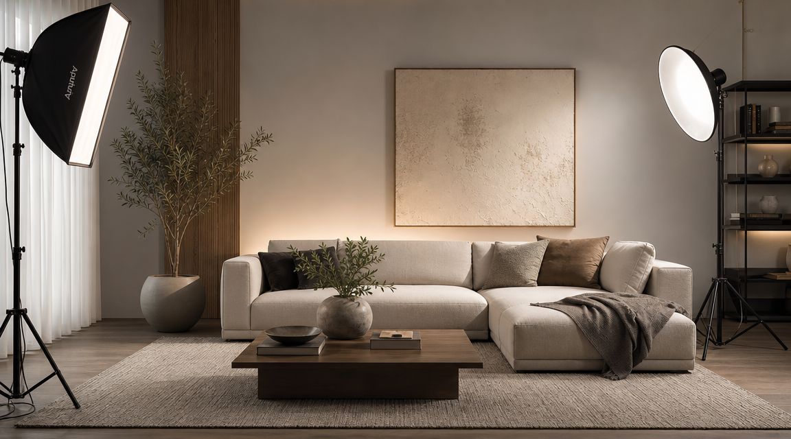
Build the light around the room's story
Editorial interiors rarely benefit from blasting every corner equally. Flat exposure makes expensive materials look cheap because it removes shape. If you're photographing a hospitality lounge, for example, you want shadow to remain in the right places so the upholstery, stone, and metal finishes retain depth.
The fastest way to lose control is to add light before you understand the room's ambient behavior. Start with a clean ambient frame. Then add one source at a time and compare. That sequence tells you whether the room needs lift, direction, separation, or restraint.
Practical rule: Light the frame for texture and hierarchy, not for maximum brightness.
A repeatable workflow helps. Many interior photographers begin with natural light as the base, then add artificial light selectively when parts of the room collapse into darkness or lose separation. That approach aligns with MyClick Magazine's interior photography guidance, which recommends a tripod, a level camera position, moderate apertures in the f/4 to f/9 range, and natural light as the starting point.
What works and what doesn't
A few lighting choices consistently improve editorial results:
- Diffuse the key light: Soft light reveals plaster, wood grain, textiles, and stone better than a hard undiffused source.
- Keep fill subtle: Fill should recover detail without creating a second obvious lighting direction.
- Accent with restraint: A small lift on shelving, artwork, or a textured wall can sharpen visual hierarchy without making the shot theatrical.
If you want a deeper breakdown of controlled lighting choices for interiors, lighting for interior photography is worth studying.
A short demonstration helps make the point clearer:
What doesn't work is treating every room like a flash problem. If the light feels imposed rather than motivated by the architecture, the image stops reading as believable. Editorial photography always depends on control, but it still has to feel like the room could look this good.
2. Strategic Camera Positioning and Angle Selection
You walk into a beautifully designed room, set the tripod a few inches too low, and the coffee table suddenly becomes the subject. Raise the camera too high and the seating group loses its presence. Position is not a technical afterthought. It is the decision that determines what the image says about the design.
Editorial interior photography starts with intent. Decide whether the frame needs to explain the architecture, sell the atmosphere, or spotlight a designer's key move. A publishable image usually does one of those jobs with clarity. Trying to do all three at once often produces a frame that records the room but does not interpret it.
Use height and perspective deliberately
A level camera at a modest height usually gives residential interiors their strongest reading because it keeps the viewer grounded in the space. In my experience, that tends to preserve the scale of seating, tables, millwork, and openings without making the room feel surveyed from above. Straight verticals and level lines remain necessary for professional results, which is also emphasized in Nikon's guide to photographing architecture and interiors.
Height should respond to the story. Living rooms often work well around seat height because the arrangement feels inhabited and balanced. Kitchens and workspaces may benefit from a slightly higher position if the layout is part of the design brief. Bedrooms usually ask for restraint. Too much height can flatten the bed and diminish the layering that gives the room its character.
Tilt is where many interiors start to look amateur. Tilting the camera to include more ceiling or more floor usually trades one problem for three others: converging verticals, strained proportions, and a frame that feels less expensive. The better fix is to step back, refine the crop, or choose a focal length that holds the geometry together.
A one-point composition can be powerful when the room has axial symmetry or a strong terminating feature. A corner view is often better when the design story depends on relationships between planes, furnishings, and circulation. I use head-on compositions sparingly. They are strongest when the architecture has earned that formality.
Choose the angle that edits the room
Camera position is also an editing tool. Move six inches left and a lamp no longer merges with artwork. Shift slightly right and the edge of a doorway stops cutting into a cabinet. Small corrections often matter more than changing lenses because they clean up the frame before post-production ever begins.
That is especially true in styled interiors. Decorative objects, chair arms, and table edges can stack into visual clutter very quickly. Good angle selection separates those forms so the eye understands the hierarchy at a glance. The image feels calmer, and the design reads as more deliberate.
A few positioning mistakes come up repeatedly:
- Shooting too wide from too close: foreground pieces swell, side walls stretch, and the room starts to feel less credible.
- Defaulting to dead center: symmetry only works when the space has a clear central axis worth honoring.
- Ignoring frame edges: clipped chairs, partial sconces, and thin doorjamb slivers pull attention away from the design.
- Prioritizing square footage over story: showing more of the room is not always better if the added area weakens the focal idea.
The strongest photographers make more than one position in the same room because clients rarely need only one kind of image. One frame may explain the architecture for a magazine opener. Another may isolate a material transition, a custom joinery detail, or the styling around a fireplace for marketing use. Same room, different editorial purpose.
3. Proper White Balance and Color Temperature Management
A designer signs off on undertones, metal finishes, stone veining, and wood stain with painful precision. One bad white balance decision can flatten all of it. In an interior photograph, color accuracy is not a technical footnote. It is part of the design brief.
RAW capture gives you room to correct white balance cleanly and protect subtle tonal separation in paint, textiles, and reflective surfaces. Adobe's guidance on understanding white balance and color temperature is useful here, but the working principle on set is simpler. Record as much information as possible before you start making aesthetic choices in post.
The most challenging rooms have competing light sources
Daylight from the windows might read cool. Pendants over a kitchen island may swing warm. LED tape under cabinets often introduces a different cast again, and decorative lamps can push amber into corners that should stay neutral. If those sources all stay in play, white walls stop reading as white and material relationships start to drift.
Editorial work usually benefits from choosing a dominant light source first. In many residential spaces, that means building the frame around daylight and deciding whether each practical light adds story or just contamination. I often switch fixtures off unless they contribute shape, mood, or a clear point of interest in the composition. A glowing sconce can help in a hospitality image. Four mismatched bulbs in an open-plan living area usually create correction problems that are harder to solve than they are worth.
A reliable workflow helps:
- Set a neutral reference frame: Capture one whenever the room or lighting condition changes.
- Judge color on key materials: White paint is only one clue. Oak, marble, brass, linen, and concrete reveal different mistakes.
- Keep neighboring frames aligned: If a kitchen, scullery, and dining area are photographed as one story, their color should feel intentionally related.
Mood still matters. Accuracy comes first.
Warm grading can flatter a residential project, but blanket warmth makes white cabinetry look dirty and cool stone lose its edge. Overcorrecting the other direction creates a sterile frame that no longer matches the lived character of the room. Publication-ready interiors sit in the middle. Materials read truthfully, then the grade supports the atmosphere the designer built.
Tethered capture makes this easier because small shifts in green, magenta, or amber show up faster on a larger monitor than on the camera screen. That matters in high-end marketing and editorial submissions, where the goal is not only to show the room clearly but to preserve the logic of the palette from frame to frame.
4. Composition Techniques for the Rule of Thirds and Visual Hierarchy
Great interior composition is less about decoration than about power. It tells the viewer what matters first, what matters second, and what holds the frame together. Without that hierarchy, even a beautiful room feels visually scattered.
The rule of thirds is useful here, not because it's sacred, but because it prevents the dead-center habit that makes many interiors feel stiff. Placing a sculptural chair, stone fireplace, or dramatic light fixture near a third-line intersection usually creates more energy than dropping it in the middle by default. Straight verticals and level lines remain essential, but within that structure you still need rhythm.
Compose for movement through the room
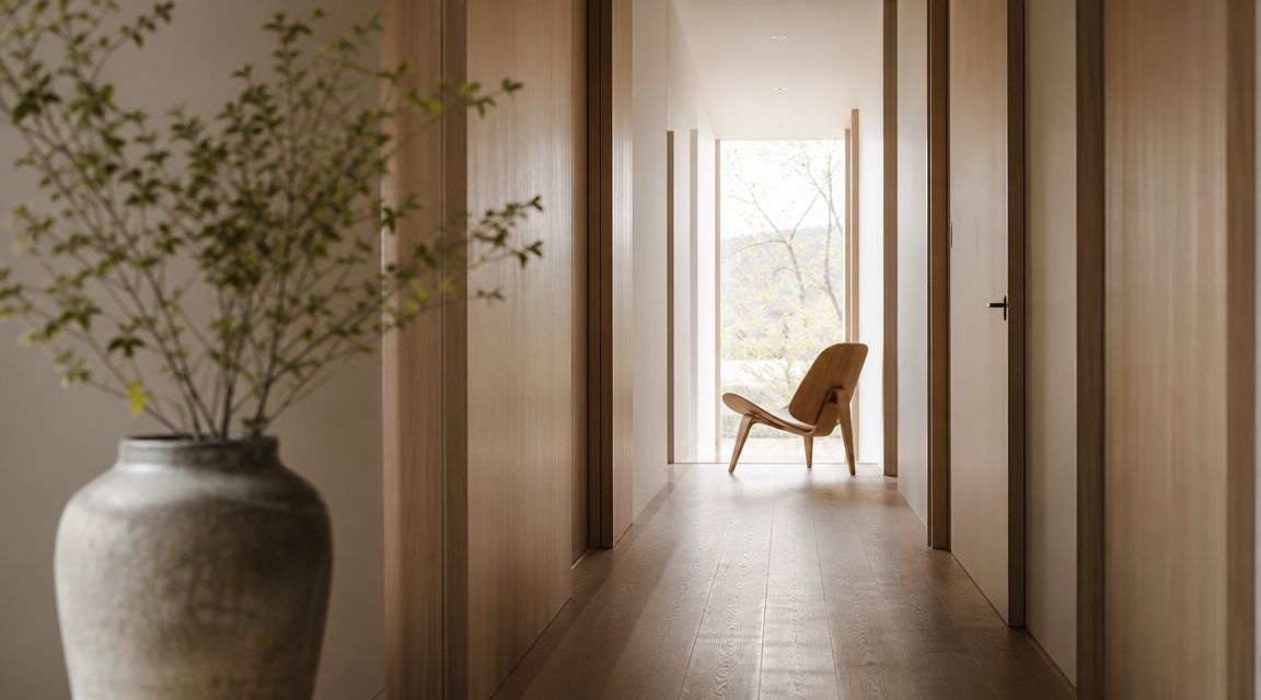
Interiors work best when the eye has somewhere to travel. Hallways, kitchen runs, stair rails, ceiling beams, and window openings can all act as leading lines. In editorial work, those lines don't just guide attention. They suggest how someone lives in the space.
This hallway image shows that principle clearly. The architecture, sunlight, and restraint do most of the compositional work.
Foreground is another editorial tool that people either overuse or ignore. A slight foreground element can create depth and invitation. Too much foreground, especially soft blur with no architectural purpose, turns the image into lifestyle cliché.
A better way to decide what belongs in frame
Before pressing the shutter, identify the sentence the room needs to say. In one frame, the subject may be the relationship between millwork and window light. In another, it may be the dining pendant anchoring the room. If you don't know the sentence, the composition won't know where to land.
A few framing decisions usually improve hierarchy:
- Place the hero element off-center: That gives the image tension and breathing room.
- Use symmetry when the design is formal: Entry halls, baths, and certain hospitality spaces often benefit from centered balance.
- Leave visual exits controlled: Doorways and windows can lead the eye out of frame. Make sure that departure feels intentional.
Study published interior spreads and you'll notice that the strongest images are almost never crowded. They feel edited. The room may contain many elements, but the frame chooses only what helps the story.
5. Lens Selection, Perspective Correction, and Equipment Strategy
A designer can spend months refining proportion, material balance, and sightlines, then lose all of it in one frame shot too wide and corrected too hard in post. Lens choice shapes more than coverage. It determines whether the room reads with authority or with real-estate exaggeration.
Editorial interior photography asks for restraint. The goal is to describe the space convincingly enough that an editor, designer, or prospective client believes the scale, not just the styling. Ultra-wide lenses have their place, especially in tight baths, compact kitchens, or commercial interiors where you physically cannot step back. They also stretch edge detail, widen gaps between furniture, and make millwork feel less disciplined than it is. That trade-off is acceptable only when the wider view adds more story than distortion.
Choose focal length based on design intent
A large lobby, open-plan office, or hospitality space often needs a wider focal length to explain circulation and spatial flow. A study, bedroom, or dining area usually benefits from a longer, calmer view that holds proportions together and lets the design feel inhabited rather than inflated. In my own work, the strongest published frames often come from backing up and using a more moderate lens than the room first seems to demand.
Tilt-shift lenses earn their keep on architectural assignments where line control matters and the file may be used for print, press, or large-format marketing. Correcting perspective in camera preserves more of the composition and avoids the heavy cropping that comes with aggressive software repair. If a tilt-shift lens is not in the kit, keep the camera level and compose with correction in mind. That one decision protects both geometry and resolution.
A dependable support kit matters just as much as glass. Interiors are slow work. Long exposures, repeatable framing, and small positional adjustments require a solid tripod, a head that locks precisely, spare batteries, clean cards, and tethering gear that will not fail halfway through a client review. Preparation is rarely glamorous, but it is what keeps the shoot on schedule when the room is ready.
What to prioritize in your setup
A few equipment habits improve files immediately:
- Keep the sensor plane upright: Vertical lines stay cleaner, and post-production corrections stay lighter.
- Use distance to reduce distortion: If the room allows it, step back before reaching for a wider lens.
- Match the lens to the story: Use wider views to explain layout. Use longer focal lengths to isolate detail, rhythm, and material relationships.
- Correct perspective with discipline: Small refinements are normal. Heavy correction can thin furniture, crop away architecture, and leave the frame feeling forced.
Lens strategy also affects styling decisions. A wider frame includes more floor, more ceiling, and more peripheral objects that need to be resolved before capture. That is one reason careful staging for high-end interior shoots should be considered alongside lens choice, not after it. For a more detailed gear discussion, best lens for interior design photography offers a useful framework for matching lens choice to room type and output needs.
Good equipment does not make an image editorial. Good judgment does. The camera, lens, and support kit should protect proportion, preserve design intent, and give you files that still look believable after correction.
6. Furniture and Decor Staging for Design Emphasis
A room can be beautifully designed and still photograph poorly if styling isn't edited for the frame. Cameras are ruthless about clutter, small distractions, and awkward spacing. They flatten what the eye politely ignores.
That's why staging for photography isn't the same as staging for living. A side table may need to move two inches. A chair may need to rotate slightly to open a sightline. A shelf may need half its objects removed so the architecture can breathe. None of that betrays the design. It translates it.
Style for the image, not the inventory
In high-end residential work, I'd rather photograph a room with fewer objects and clearer intention than a room full of expensive accessories fighting for attention. The same applies to hospitality and office interiors. Every visible item should either support scale, reinforce palette, or add a useful note of life.
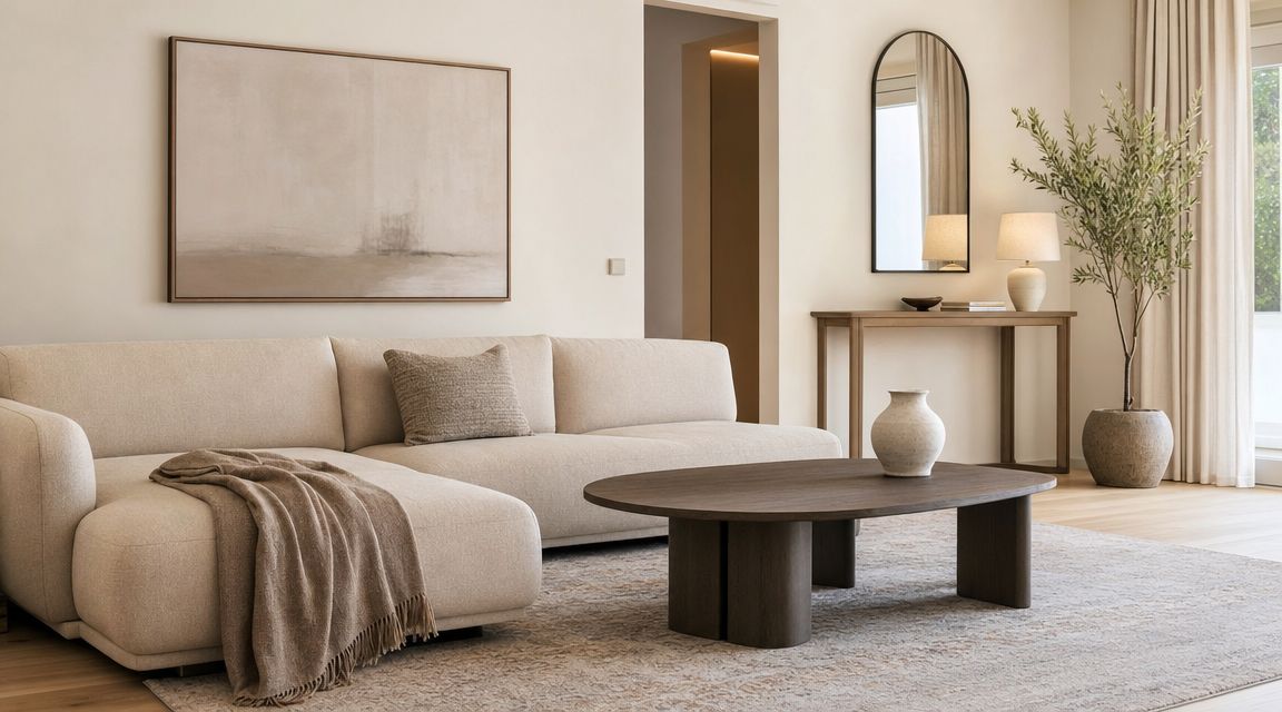
This kind of clean, restrained staging usually reads better than a room crowded with props:
A few staging adjustments consistently improve photographs:
- Remove personal clutter: Family photos, cables, remotes, paperwork, and branded odds and ends pull attention away from design.
- Create realistic negative space: Don't pack every surface. Empty space is what gives premium interiors composure.
- Use soft elements carefully: Throws, books, florals, and ceramics can add warmth, but only if they support the room's palette and geometry.
Collaboration beats improvisation
The best staging happens before the shoot day gets tight. Designers, stylists, and photographers should decide early what the hero elements are and which items are negotiable. On site, that frees everyone to make small, smart refinements instead of arguing with a crowded room.
Good styling doesn't add more. It removes whatever competes with the design.
If you want a practical reference for this side of the process, staging for high-end interior shoots is directly relevant.
What doesn't work is styling on impulse once the camera is already up and the light is moving. That wastes time and usually leads to decorative choices that feel random rather than authored.
7. Natural Light Utilization and Window Management
You walk into a finished interior at 1:30 p.m. The designer wants the space to feel calm, layered, and expensive. The windows are blasting, the floor is throwing hard reflections, and the exterior view is several stops brighter than the room. At that point, natural light is not a mood. It is a technical problem and a storytelling decision.
Daylight remains the best base for many interiors because it renders material, depth, and atmosphere in a way artificial light rarely matches on its own. But editorial-quality interior work depends on shaping that daylight, not passively accepting whatever the room gives you. The time of day matters because angled light gives surfaces definition. Flat midday sun often strips a room of nuance and makes glazing much harder to control.
Windows should support the frame
A well-managed window reads as a believable source of light and, where appropriate, a contextual view. It should not dominate the composition or collapse into a blank white block. I usually aim for a bright window with detail where the view adds value, and a softer, higher exposure where the room itself is the story. The choice depends on the assignment. A city apartment may need the skyline. A minimalist residence may photograph better if the glass stays luminous and secondary.
That judgment starts before the tripod goes up. East-facing rooms, shaded courtyards, deep roof overhangs, and neighboring buildings all change contrast and color. Sheers can save a composition or flatten it. A white exterior wall can act like a giant bounce and lift the room. A dark garden outside can force a very different exposure strategy.
A few on-site methods consistently work:
- Diffuse direct sun when it creates hard patches: Softening the source helps walls, fabrics, and wood finishes hold detail without looking chalky.
- Return light into the shadow side of the room: A reflector or controlled bounce usually keeps the image believable with less effort than forcing the exposure in post.
- Set exposure room by room: Open-plan spaces still break into zones. A breakfast nook beside full-height glazing needs a different treatment than the hallway behind it.
- Decide early whether the exterior matters: If the view contributes to the narrative, protect it. If it distracts, let it stay bright and subordinate.
Subtle intervention usually produces the strongest result. A small fill source in a dead corner, a scrim on the harsh side of a window, or a twenty-minute wait for the sun to clear the frame can preserve the architecture without making the lighting feel manufactured. That is the editorial balance. The image should feel observed, not engineered.
Window management also changes with deliverables. A wide hero image for a magazine spread can tolerate brighter glazing if the room carries the composition. A vertical crop for social or press use often brings the windows closer to the edge of frame, where they pull more attention and need tighter control. Planning for multiple orientations from the start avoids rebuilding the lighting strategy every time the camera turns.
For a practical outside reference on reading and using daylight indoors, Nikon's guide to natural light photography is useful. The principle applies cleanly to interiors. Use daylight for shape, then manage contrast so the design remains the subject.
Natural light works best when it feels inevitable. The room should look like it was seen at the right moment, with the right restraint, by someone who understood what deserved attention.
8. Post-Processing Workflow and Color Grading Excellence
A polished interior image is built twice. First in camera, then in post. If the capture is careless, editing turns into damage control. If the capture is disciplined, post-production becomes refinement.
Many otherwise competent photographers often overreach. They chase brightness, micro-contrast, and heavy color mood until the room no longer looks inhabitable. Stone gets crunchy. Wood grain goes brittle. Fabrics start to look synthetic. Editorial post work should feel invisible unless you compare before and after.
Edit for consistency across a project
Single images matter, but clients usually deliver projects as sets. A residential portfolio, hotel campaign, or office case study needs visual continuity from frame to frame. That means your editing decisions can't reset wildly every time the room changes.
Keep a structured workflow. Import, apply lens correction, neutralize white balance, solve exposure and geometry, then move into local refinements. Save the stylistic grading for last. That order keeps you from decorating an image before you've made it accurate.
The best post-processing protects the design from the camera's limitations without advertising the editor's hand.
A few habits help maintain quality:
- Use selective adjustments with purpose: Lift a shadowed chair, soften a hotspot on stone, or tame a bright window edge without flattening the whole frame.
- Keep texture and clarity restrained: Interior materials should feel tactile, not sharpened into grit.
- Export for use, not ego: Web, print, editorial submission, and social crops all need slightly different output decisions.
Finish with the publication mindset
Think like a photo editor. Does the image still feel credible at full size? Does the wall color match across the series? Are verticals stable? Does the grade support the room's mood without imposing a trend that will date quickly?
That publication mindset is what separates serviceable documentation from portfolio-level work. The strongest interior design photography tips all lead back to the same standard. Every technical decision should make the design easier to understand, more attractive to view, and more useful to the client.
8-Point Interior Design Photography Comparison
| Technique | 🔄 Implementation Complexity | ⚡ Resources & Efficiency | 📊 Expected Outcomes ⭐ | Ideal Use Cases | 💡 Key Tips |
|---|---|---|---|---|---|
| Master Lighting Control with Three-Point Lighting Setup | High, requires technical lighting knowledge and setup time | High resources, multiple continuous/strobe lights, modifiers, power; time‑intensive | ⭐⭐⭐⭐⭐, editorial, high‑detail, reproducible lighting and texture rendering | High‑end editorial, hotel/residential features, marketing materials | Scout power/ambient light, diffuse key, use backlight for separation |
| Strategic Camera Positioning and Angle Selection | Medium, needs scouting and compositional decision‑making | Low–Medium, tripod, ladder/boom for elevation; efficient once positions planned | ⭐⭐⭐⭐, improves perceived scale and flow; strong narrative impact | Real estate listing, architectural portfolios, hospitality shoots | Bracket angles, keep camera level, avoid wide‑angle distortion by stepping back |
| Proper White Balance and Color Temperature Management | Medium, technical color knowledge and on‑set control | Medium, gray cards, ColorChecker, gels; RAW workflow reduces reshoots | ⭐⭐⭐⭐, accurate color fidelity and trust with clients/publications | Corporate branding, product/finishes documentation, editorial print work | Shoot RAW, use gray card first frame, test LEDs and apply gels if needed |
| Composition Techniques: Rule of Thirds and Visual Hierarchy | Low–Medium, requires visual literacy more than gear | Low, no extra equipment; time for framing and repositioning | ⭐⭐⭐⭐, increases visual appeal and editorial quality | Magazines, portfolio images, marketing where narrative matters | Use grid overlays, place focal points at intersections, add foreground layers |
| Lens Selection, Perspective Correction, and Equipment Strategy | High, technical lens choices and post‑processing skills | High, tilt‑shift/wide lenses, full‑frame bodies, sturdy tripods; considerable cost | ⭐⭐⭐⭐⭐, optical accuracy and publication‑ready perspective | Architectural commissions, high‑end editorial, precision real estate | Prefer primes for quality, keep camera level, consider tilt‑shift for convergence |
| Furniture and Decor Staging for Design Emphasis | Medium, coordination and styling skills required | Medium, stylists, props, time; can be crew‑intensive for full staging | ⭐⭐⭐⭐, elevates emotional appeal and marketability | Luxury real estate, hospitality, design firm portfolios | Collaborate with stylists, remove clutter, use plants/art as focal accents |
| Natural Light Utilization and Window Management | Low–Medium, timing and environmental dependency | Low, reflectors/diffusion; minimal gear but schedule‑dependent | ⭐⭐⭐, flattering, cost‑effective imagery; variable consistency | Residential real estate, lifestyle editorials, hospitality at golden hour | Scout time‑of‑day, use diffusion on windows, bracket exposures for windows |
| Post-Processing Workflow and Color Grading Excellence | Medium, software proficiency and color theory needed | Medium, powerful computer, Lightroom/Capture One, calibrated monitor; time‑consuming | ⭐⭐⭐⭐, cohesive visual identity and salvage of suboptimal captures | Any commercial/editorial work requiring consistent deliverables | Build presets/LUTs, process in batches, use selective masks and subtle texture adjustments |
From Technical Skill to Client Success
Mastering interior design photography tips isn't just about making cleaner files or more attractive rooms. It's about giving clients images that carry strategic weight. A well-made interior photograph helps a designer present authorship, helps a developer market value, helps a hospitality brand shape expectation, and helps an editorial team understand the project at a glance.
That shift matters. Once you stop treating interior photography as basic documentation, your decisions become sharper. You light for material and mood, not brightness alone. You choose camera position for narrative clarity, not convenience. You stage to support architecture. You edit for consistency and trust. Every step moves the work closer to publication quality.
Clients notice that difference quickly. They may not talk about vertical convergence, color temperature discipline, or layered visual hierarchy, but they respond to the result. The room feels expensive, intentional, and believable. Beyond that, the design intent survives the translation from physical space to image.
This is also where trade-offs become part of the job instead of obstacles. Sometimes natural light gives you honesty but not enough separation, so you supplement carefully. Sometimes the widest lens explains the room but distorts the furniture, so you back up and simplify. Sometimes a styled vignette is beautiful, but the full-room frame tells the stronger story. Good interior photography isn't rigid. It's selective.
The editorial standard is useful because it forces every choice to answer one question: does this make the story of the space clearer? If the answer is no, it probably doesn't belong in the frame, in the lighting plan, or in the final grade.
That's the approach studios like Jimmy Clemmons Photographer bring to this kind of work. Jimmy Clemmons Photographer is an Atlanta-based studio focused on architectural imagery, commercial brand content, and portraits, with an editorial background shaped by publication work and a design-forward approach to composition, exposure, and narrative. For firms that need images of built environments to function across marketing, editorial, and brand channels, that mindset is directly relevant.
In practice, better interior photography leads to better client relationships because the images do more than look polished. They solve communication problems. They help clients pitch, publish, market, archive, and sell. That's when photography stops being a line item and starts becoming part of the project's value.
If you need interior images that present architecture, design intent, and brand story with editorial discipline, Jimmy Clemmons Photographer is one option to consider for architectural and commercial photography in Atlanta and the surrounding region.