
You're on a job site with the client walking the space behind you, the architect looking for honesty, and the marketing team waiting for something that feels premium. The room looks good, but not every good room photographs well, and that gap is where composition planning earns its keep. By the time the camera comes out, the image usually feels decided already, because the work happened in the brief, the scout, the angle choice, and the way the day got run.
That's why the rule of thirds can't be the whole conversation. It matters, and John Thomas Smith's 1797 framing idea still gives creators a clean structural way to balance focus and negative space, including the classic two-thirds to one-third proportion he described in Remarks on Rural Scenery (Will Kemp Art School). But in architectural photography, the harder choices live elsewhere, in translating vague goals into visual decisions, choosing between drama and accuracy, and protecting the shot list when reality starts moving the furniture around.
Why Composition Planning Changes the Whole Shoot
The first mistake on a lot of architectural jobs is thinking the building will arrange itself. It won't. A space can be beautifully designed and still photograph flat, cluttered, or misleading if the framing is chosen on instinct instead of intent.
That's where composition planning changes the result. It gives you a way to decide, before the tripod opens, whether the image needs to feel calm, expansive, intimate, or editorial. The camera only records what you've already chosen to emphasize, and on a working shoot, those choices are usually shaped by competing priorities, not by a perfect scene.
The pressure is real because each stakeholder is asking for something slightly different. The client wants the image to sell, the architect wants the work to read truthfully, and the marketing team wants it to look like a brand asset, not just a documentation frame. If you don't sort those priorities early, you end up making framing decisions reactively, which usually means the most attractive angle wins even when it's not the most useful one.
Practical rule: if you can't say what the frame is supposed to prove, it's too early to shoot the hero image.
Historically, planning has always been part of image-making. In the Western tradition, historian sources trace formal calculation in composition back at least 1,000 years. That long arc matters because it shows the job has never been pure intuition, and modern architectural photography sits in the same lineage of deliberate structure, not lucky instinct (ACM).
The goal is simple. Get the composition to serve the story, the use case, and the space itself, instead of letting the most obvious angle decide everything for you.
Translating the Client Brief into Visual Decisions
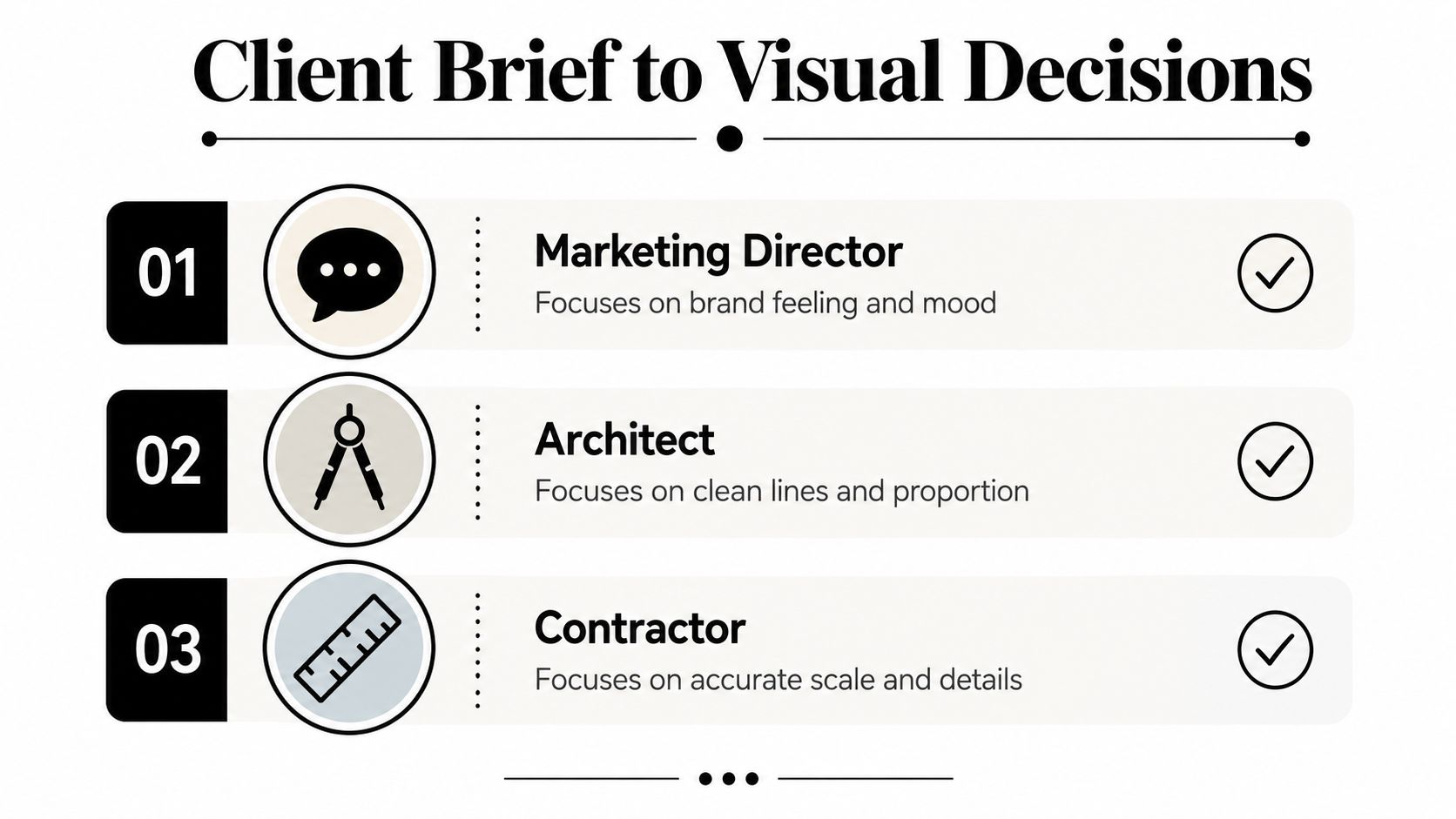
A client brief usually arrives as three different languages at once. Marketing talks about feeling, architecture talks about line and proportion, and contracting talks about scale and finish. If you leave those words as-is, you get a vague shoot. If you translate them into visual decisions, you get a useful one.
Start by separating the three jobs the image has to do
The first question isn't, “What should I photograph?” It's, “What should this frame accomplish for each person involved?” That matters because the brief often hides conflicting expectations inside polished language. A “warm, inviting, contemporary” lobby can mean very different things depending on whether the person speaking is responsible for brand perception, geometry, or build quality.
I like to pull the brief apart into three columns before I touch gear.
- Marketing director: brand feeling, audience fit, and whether the image belongs in a homepage banner, brochure, or campaign deck.
- Architect: clean lines, proportion, and whether the frame respects the design logic.
- Contractor: accurate scale, material honesty, and whether the details are shown without distortion.
That one move makes the conversation sharper. You stop asking for generic preferences and start asking for the decisions that matter, like where the eye should land first, what must be visible in the frame, and what can be omitted without damaging the story.
Ask for use case, not adjectives
Adjectives are slippery. “Sophisticated” can mean dark, minimal, polished, spacious, or all four. Better questions pull out usage and intent. Ask where the image will live, who needs to approve it, and what the client would consider a failed frame.
A useful kickoff line is, “If this image works, what will people understand in three seconds?” Another is, “What do you never want to lose in the shot?” Those questions reveal hierarchy faster than a long discussion of style references.
When the answers come back, turn them into a one-page creative direction. Keep it short and practical, with notes on framing priority, dominant light quality, allowed distortion, and whether people need to appear in the scene. If you want a deeper framework for expectation-setting before the day begins, this guide on managing client visual expectations is worth reading.
Translate vague language into frame choices
A commercial interior brief might say the space should feel “open, premium, and efficient.” In practice, that can translate into a wider camera position, a cleaner foreground, controlled reflections, and less clutter at the edges of frame. If the client wants the room to feel larger, but also needs the finishes to read accurately, you don't chase the most dramatic corner. You pick a position that protects the architecture while still letting the space breathe.
That translation is the work. The camera doesn't interpret intent for you, so the brief has to become a list of visual decisions before the shoot day starts.
Scouting the Location Like a Shoot Day Already Started
A real scout is a dry run under working pressure. Move through the space as if the client is already on site, the clock is already moving, and every setup has to justify itself. The goal is to leave with fewer surprises and a shot list that will hold up when the space stops being empty and starts behaving like a real production.
Bring back information, not just impressions
Start with the basics. A tape, notebook, lens cloth, flashlight, phone notes, and something to mark sightlines are enough for most scouts. The point is not to collect a stack of pretty observations. The point is to find where a composition can exist, and where it falls apart the moment people, reflections, or light changes enter the frame.
Look for these practical blockers and opportunities:
- Sightlines: where the eye naturally travels, and where the room visually collapses.
- Sun direction: which side of the building gets hard light, soft light, or unwanted glare at the planned time.
- Interior and exterior balance: whether a windowed room can be held without losing detail outside.
- Ceiling height and vertical clearance: whether the frame can stay honest or needs a lower viewpoint.
- Power access: where lighting support can be placed without trip hazards or ugly cable runs.
- Obstructions: temporary signage, parked cars, cords, clutter, and anything that will be in the frame by accident.
If you are scouting remotely, use a virtual location scouting pass to catch layout problems before you waste a full visit. The same discipline applies. Mark where the camera can stand, where light will likely land, and where the frame will break once the shoot starts.
A scouting pass should also decide the coverage structure. Don't just note “great lobby.” Break the space into wide, medium, detail, and contextual frames. That keeps the shoot from turning into a pile of establishing shots or a set of attractive fragments with no sense of place.
Turn scout notes into a usable shot list
The shot list should reflect what the location can really support. If the best angle depends on a specific sun position, write that down. If one hallway only works from one side, mark it. If the lobby needs to be shot before foot traffic builds, sequence it early. Those details save time later, and they also keep the day from being run by guesswork.
A few notes become especially valuable once you are shooting:
- Best first frame: the shot most likely to set the visual tone.
- Backup angle: the safer composition if a set fails or gets blocked.
- Movable elements: chairs, plants, cords, signage, and decor that can improve the frame quickly.
- Client sensitivities: areas where accuracy matters more than drama.
Adjectives are slippery. Refined can mean polished, minimal, quiet, or expensive-looking. If the brief uses a word like that, the scout has to translate it into placement, height, lens choice, and what gets kept out of frame.
That is how the scout turns into production planning. You are not just identifying pretty spots. You are identifying which compositions will survive a working day, which ones need a very specific setup to function, and which ones only looked possible when the space was empty.
Framing and Perspective Choices With Real Tradeoffs
Most composition advice stops too soon. The rule of thirds is useful, but in architecture and interiors, the bigger question is how the frame behaves when you change distance, height, and focal length. The choice is rarely between right and wrong. It's usually between different kinds of compromise.
Wide lens drama versus spatial honesty
A wide lens can make a room feel generous and energetic, especially when the brief wants impact. The risk is obvious. Too wide, too close, or too low, and the room starts to feel stretched, with edges pulling apart and scale becoming hard to trust. That's fine if the client wants a dramatic read. It's a problem if the image needs to sell layout and proportion accurately.
A longer lens does the opposite. It tends to compress perspective and protect geometry, which is often helpful for exteriors and detailed interiors where accuracy matters more than spectacle. The downside is that the space may feel tighter or less immersive. You gain control, but you can lose atmosphere if every frame feels flattened.
The practical decision is simple: use the lens choice that matches the promise of the image. If the image is supposed to persuade someone that the space feels open, a modestly wide, carefully positioned frame may be right. If the image is supposed to document craftsmanship, material alignment, or design restraint, step back and let the proportions stay closer to reality.
One-point and two-point perspective send different messages
One-point perspective works when you want order, depth, and a strong pull into the frame. Corridors, long hallways, and axial views benefit from that structure because the eye reads the vanishing point immediately. It feels deliberate and controlled, which is why it can be so effective for symmetrical architecture.
Two-point perspective is better when the building mass itself matters more than the symmetry of a single axis. Corners, facades, and rooms with strong side walls often read more naturally that way. The frame becomes less about the tunnel effect and more about the object in space.
Don't force symmetry just because it feels clean. If the building was designed around mass and offset, the composition should respect that.
Use the angle to protect the room
The under-answered problem in interior work is how to choose camera angle without making the room feel smaller or distorted. Low angles can dramatize a ceiling or make furniture look heroic, but they can also distort verticals and hide the actual lived feel of the room. Higher viewpoints can clarify layout, but they can flatten the experience and make the space feel more diagrammatic.
My rule is blunt. If the goal is persuasion, you can lean into drama, but you still need the frame to feel believable. If the goal is trust, go with the angle that keeps the room readable first. Architectural photography works best when the viewer feels both attraction and confidence in the space.
Lighting Design and Scheduling as One Problem
Light isn't a separate setup after composition. It's part of the composition itself. A frame that depends on late sun, soft window glow, or a controlled balance between ambient and supplemental light needs the schedule built around that reality from the start.
Read the building before you read the clock
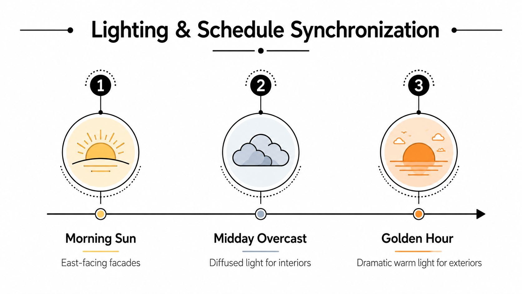
The building's orientation tells you what kind of light each side will receive, and that changes which compositions are worth protecting. East-facing facades want a different timing strategy than shaded courtyards or west-facing exteriors. Interior spaces with large windows also behave differently depending on whether direct sun, overcast sky, or reflected ambient light is doing the heavy lifting.
In practice, that means you're planning two things at once. You're choosing the shot order, and you're choosing the kind of light each shot will get. If a room needs soft, diffused daylight to keep finishes readable, it belongs in the schedule when the light is least harsh. If an exterior is strongest when the sun creates edge separation, it needs its own protected window.
Plan the schedule around light windows
The cleanest shoot days are the ones where the strongest compositions are placed in the right light, not squeezed into whatever time is left. If weather shifts, the schedule should already have pivot points. Overcast skies can be a gift for interiors, while a clear break in the clouds may be the only moment worth stopping for outside.
Here's the operational approach:
- Sequence protected frames first: the shots that depend on specific light or low traffic.
- Group nearby setups: avoid losing light while moving gear across the property.
- Keep a weather pivot list: indoor angles ready when the exterior window disappears.
- Decide when supplemental light is worth it: use it to balance the space, not to fight the building's natural character.
For practical light planning, this guide on choosing the best light for a site shoot is a useful companion.
Use light to support, not overwrite, the architecture
Supplemental lighting should solve imbalance, not erase the scene. If the ambient exposure already carries the story, adding more light can make the image feel overbuilt. If the room is too dark to read, then a controlled strobe or added source can restore clarity without flattening the mood.
The best scheduling and lighting plans work together. One protects the moment, the other protects the read of the space.
On-Set Direction and Recovering When the Plan Breaks
The moment the first setup starts, the shoot stops being a plan on paper and becomes a negotiation with reality. Furniture has shifted, the client has a new preference, the cleaner is still in one hallway, or a person in the frame doesn't know where to stand. Good on-set direction isn't about controlling every variable. It's about making fast, useful decisions without losing the composition.
Say the frame out loud
People work faster when they know what the frame is trying to do. I'll often say exactly what matters first, like “I need the ceiling line clean,” or “Keep the left edge open,” or “Let's protect that reflection.” That kind of direction gives the team a target that's visual, not abstract.
When a person is in the scene, keep the instructions simple. Ask them to hold still, turn slightly, or clear a path through the architecture. Don't overdirect if the human presence is secondary to the space. The frame should still read as an architectural image, not a portrait session that wandered into a lobby.
Triage the problem instead of chasing every problem
When a composition breaks, don't fix everything at once. Ask what failure is most expensive. If the light is wrong, maybe the angle still works but the timing doesn't. If the furniture is off, maybe the shape of the frame still holds but the foreground needs clearing. If the client wants a different mood, maybe the camera position stays and the exposure strategy changes.
A useful triage order is:
- Protect the architecture first.
- Then protect the approved story.
- Then improve the polish.
That sequence keeps you from sacrificing the building just to rescue a decorative detail.
Backup shots aren't optional on a real shoot day. They're the difference between a solved problem and a reshoot.
Review frames before moving on
The most reliable habit on set is checking frames between setups, not after the shoot is over. That's where small failures get caught early, like a line that drifted, a chair that entered the edge, or a highlight that clipped in the one angle you planned to deliver. A few seconds of review can save a broken deliverable.
When the plan cracks, stay calm, reset the frame, and move. Architectural photography rewards the person who can recover without making the room feel like a rescue operation.
Test Shots, Contingencies, and Post-Production Handoff
A strong plan doesn't end when the shutter clicks. It ends when the editor knows what the image is supposed to become. That final handoff matters because post-production can sharpen a good decision or undo it.
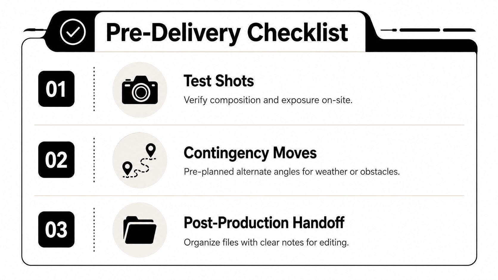
Use test shots to verify the composition, not to admire it
A test frame should answer a question quickly. Is the geometry working, is the exposure believable, and is the visual hierarchy clear? If the answer is no, adjust before you invest time in a full sequence.
Contingency thinking matters just as much. Weather changes, access shifts, and people step into the exact area you needed. Keep alternate angles ready, and don't build a whole day around a single fragile frame. The best architectural shoots have a little redundancy baked in, so the job keeps moving when one setup falls apart.
Make the handoff specific
The edit should reflect the original plan, not reinterpret the brief from scratch. That means notes matter. Flag the intended hero frame, mention which image needs the cleanest verticals, and call out which shot depends on preserving the feel of natural light. If a frame is supposed to feel airy and calm, the retoucher shouldn't push it into something glossy and heavy.
A simple handoff can include:
- Hero priority: which image matters most to the client.
- Technical concerns: distortion, reflections, or exposure balance.
- Story notes: mood, scale, and what the image has to communicate.
- Selection order: which backups exist if the first choice fails.
That handoff keeps the final gallery aligned with the brief instead of drifting into generic polish.
The habits that separate consistent work from lucky work
Consistency comes from repeatable discipline. Test the frame before committing, keep backup angles, and write clean notes while the shoot is still fresh. Editors can do excellent work, but they can't recover intent that never got stated.
Use composition planning as a live system, not a theory. If you treat the brief, scout, light, framing, and edit as one connected process, the images stop depending on luck and start reflecting deliberate choices.
Jimmy Clemmons Photographer builds architectural and commercial imagery with the same kind of discipline described here, from scout to final delivery. If you want a shoot that treats composition planning as part of the production, not an afterthought, visit Jimmy Clemmons Photographer and see how that approach can support your next project.