
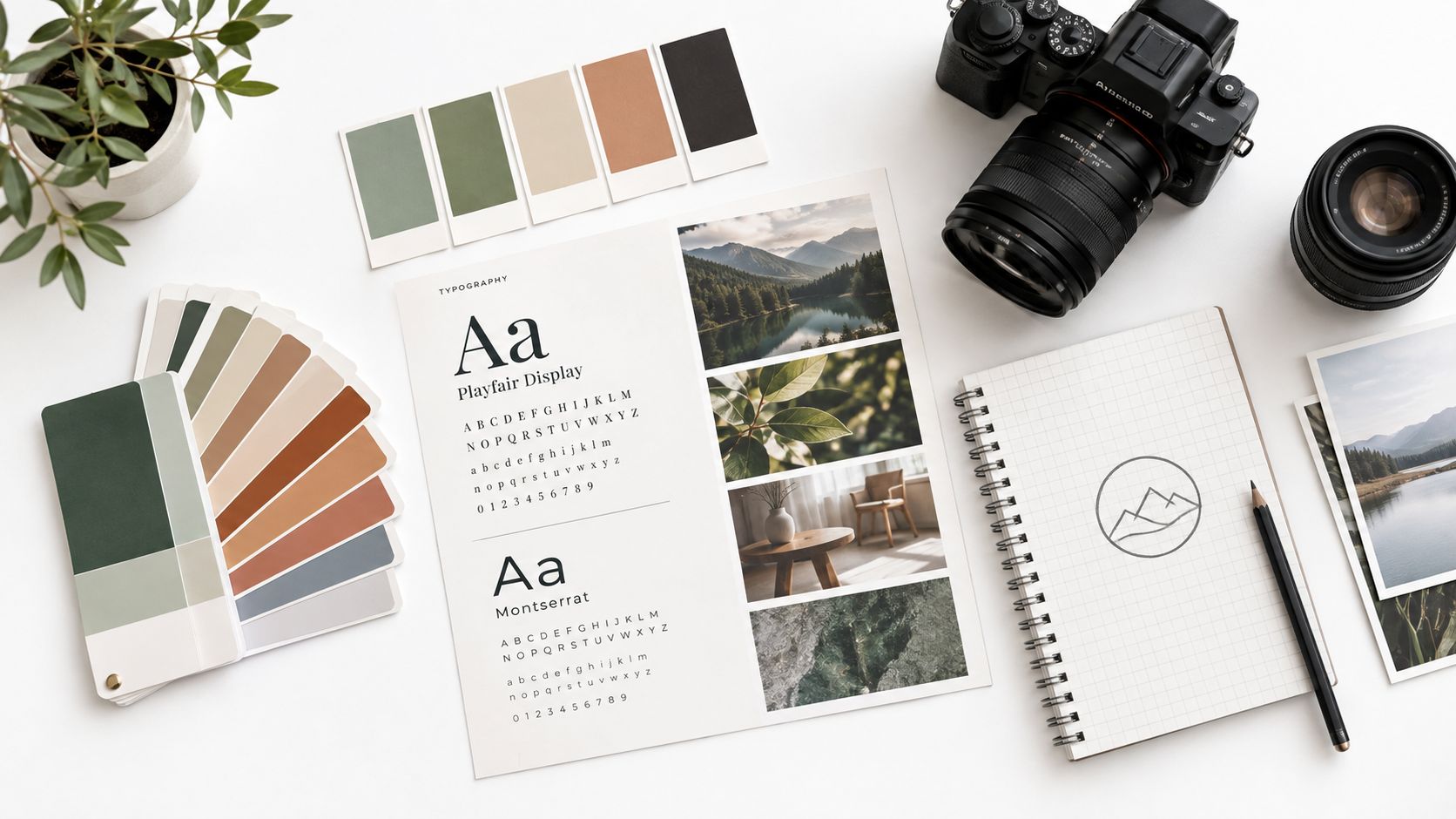
You've probably seen this happen in your own business. The website feels polished, the social feed looks energetic, the presentation deck is perfectly usable, and the printed materials are technically on-brand. Yet when everything appears side by side, the pieces could belong to several different companies.
That gap is where visual branding becomes practical. It isn't the logo, the colour palette, or a collection of attractive photographs. It's a recognition system that helps people identify your work before they've read the headline, opened the brochure, or remembered your name. As a photographer working across architecture, interiors, corporate culture, and commercial campaigns, I see the system succeed or fail most clearly in the production workflow, especially when real images have to carry the brand from one channel to another.
Why Visual Branding Breaks Before You Notice It
A founder approves a major rebrand and receives a beautiful identity presentation. The new logo is precise, the colour palette feels considered, and the typography has a clear hierarchy. A few months later, the Instagram grid uses a slightly different blue, the trade show booth has substituted fonts, and a new employee's proposal deck contains stretched logo files and stock photographs with unrelated lighting.
Nothing has failed dramatically. The brand has simply drifted.
That drift usually begins with small compromises:
- Colour substitutions: A screen colour is approximated for print, then reused digitally without checking how it behaves.
- Convenience typography: A designer or employee replaces the approved typeface because the correct file isn't available.
- Damaged logo files: Someone enlarges a low-resolution mark, stretches a lockup, or removes the required clear space.
- Mixed photography: One assignment is bright and spacious, another is dark and cinematic, and a third looks like generic stock content.
Each decision may seem harmless in isolation. Together, they create recognition noise. People have to work harder to decide whether two assets belong to the same organisation, and sales conversations begin with clarification instead of familiarity.
Practical rule: If the identity only looks coherent inside its original PDF, it isn't yet a working visual system.
The business cost is often quiet. A buyer may not complain about inconsistent imagery, but the company becomes harder to remember. A marketing team spends time repairing files instead of producing campaigns. A photographer receives vague instructions because nobody has translated the brand into decisions about light, composition, colour, or subject matter. Rework accumulates across every new asset.
A 2024 systematic literature review examined 559 articles published between 2004 and 2024 and found that visual elements including logos, colour, names, typography, and font shape can affect perceived quality, brand personality, satisfaction, loyalty, liking, purchase intentions, and social perceptions (systematic review of brand visual identity). The review also found that only 34 studies met its stricter eligibility criteria, which shows that the field is substantial but still developing.
The useful conclusion isn't that a logo solves recognition. It's that visual branding consists of identifiable components that must work repeatedly. The logo is only one signal. Photography, layout, colour behaviour, and production habits determine whether the identity survives outside the guidelines document.
The Core Concept and Five Building Blocks
A practical answer to what is visual branding starts with a simple test. Can a stranger recognise the organisation in under three seconds, before reading a single word? Treat that as a design target, not a magical threshold. The aim is to make the combination of visual cues distinctive enough that the viewer doesn't need the logo to understand who made the asset.
Visual branding is the operational layer beneath brand strategy. Strategy may define the audience, position, promise, and personality. The visual system converts those ideas into repeatable choices that a designer, photographer, marketing manager, or external supplier can apply without guessing.
Colour
Choose a limited palette anchored to actual colour values, not descriptions such as “warm blue” or “premium green.” For example, a deep base colour may support long-form layouts, a pale neutral may frame photography, and a restrained accent may identify calls to action. The rule should also explain what happens when the colour appears on coated paper, an uncoated stock, a mobile screen, or a dark photographic background.
Typography
Pair a primary and secondary typeface, then define their jobs. A geometric sans serif might handle navigation and captions, while a humanist serif gives editorial weight to feature headlines. Specify size, weight, line height, alignment, and fallback behaviour. Without those rules, every deck and landing page develops its own voice.
Imagery
Photography needs a point of view. Define subject matter, lighting, camera distance, human presence, colour treatment, and acceptable retouching. “Professional images” isn't a direction. “Quiet architectural spaces, directional daylight, honest material colour, and restrained contrast” gives a photographer something operational.
Layout
A layout system controls how content sits together. Set a grid, spacing scale, image ratios, text widths, and reusable components. A social post, case study page, and printed card can vary in format while still sharing the same visual rhythm.
Logo
The logo includes the mark, wordmark, lockup variations, clear-space rules, minimum size, and examples of misuse. It provides shorthand, but it won't carry the identity when it's cropped from a photograph, omitted from a social tile, or hidden below the fold.
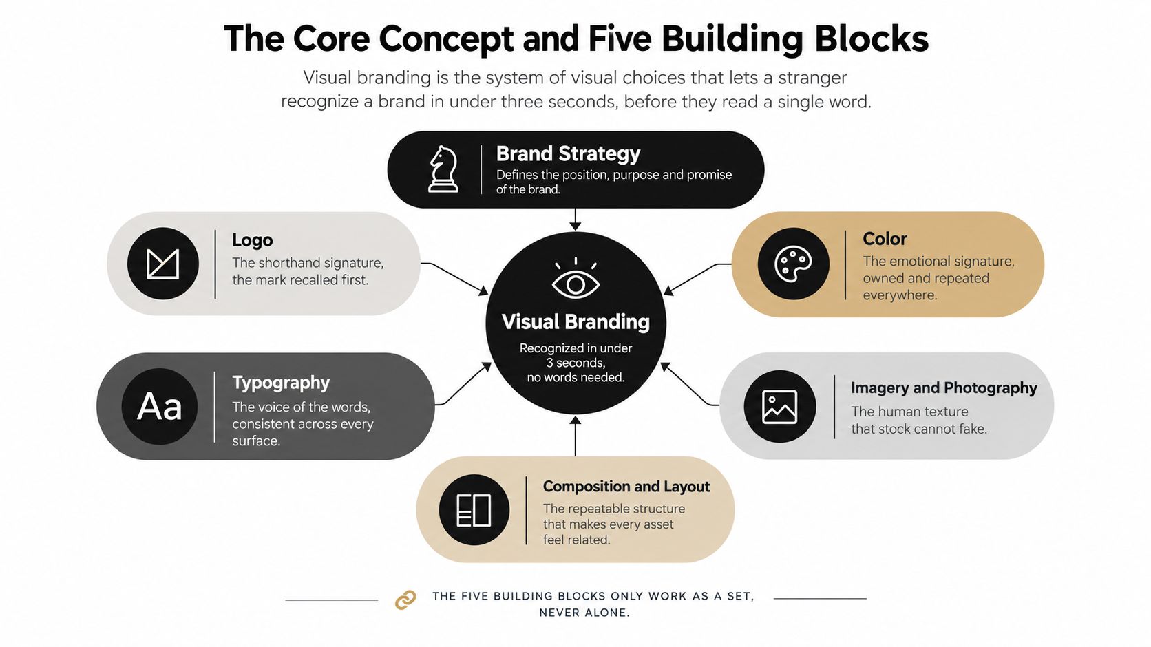
The five parts only become useful as a set. If the logo is absent, colour, typography, imagery, and composition should still create a related impression. A useful companion is this collection of actionable branding takeaways for seeing how identity decisions become repeatable applications rather than isolated artwork. It also helps to distinguish visual identity from the broader narrative and meaning explored through brand storytelling.
How Colour Typography and Imagery Carry Brand Meaning
Colour, type, and photography communicate before a viewer consciously analyses them. They act as encoded signals, and each one can pull the audience toward a different interpretation of the same product or service.
Take two imaginary firms selling the same high-value design service. One uses a saturated primary palette, sharp geometric type, and tightly cropped images with hard directional light. The result feels energetic, contemporary, and decisive. The other uses muted earth tones, a restrained serif, and spacious editorial photographs with visible material texture. The same service now suggests patience, heritage, and refinement.
Neither approach is automatically better. The correct choice depends on the position the brand needs to occupy.
| Element | Saturated | Geometric Choice | Muted | Editorial Choice |
|---|---|---|---|---|
| Colour | Strong contrast and vivid accents signal energy | Limited digital palette with hard boundaries | Lower intensity suggests restraint and quiet confidence | Tonal variation supports texture and atmosphere |
| Typography | High contrast between weights creates urgency | Structured sans serif reinforces precision | Softer contrast slows the reading experience | Serif or humanist forms add narrative character |
| Imagery | Clean surfaces and direct light feel immediate | Repeated angles and tight crops create control | Reduced colour keeps attention on form and material | Natural light, grain, and context create authorship |
Research on visual branding shows that hue, saturation, and brightness can change perceived personality, perceived product quality, emotional response, and purchase choice (research on colour and brand perception). The same source reports that lower-saturation visuals can increase perceived luxury status, with an observed inflection between 20% and 30% saturation, while highly saturated logo treatments can increase perceived brand energy and improve attitudes, particularly for international brands.
That makes colour selection a strategic decision rather than a matter of personal taste. A muted palette can support a premium, established position, but it may disappear in a fast-moving feed. A saturated palette can improve energy and separation, but excessive intensity can make a high-trust service feel loud or disposable.
Photography carries the most information per square inch. It can show the location, material, scale, time of day, human presence, and relationship between objects at once. A black-background portrait shot in moody key light may look compelling on a website, but it can overwhelm a pale editorial layout if the rest of the image library uses bright ambient light. A single uncooked image can interrupt the rhythm of an otherwise controlled social feed.
Typography creates similar production problems. A serif headline that feels elegant on a desktop page may wrap awkwardly on a 320-pixel mobile view. A brand needs hierarchy rules that protect readability across formats, not just a typeface chosen for a presentation mock-up.
Colour grading is where the visual system becomes tangible. A photographer or editor working through photo colour grading on Mac should know whether the brand wants neutral whites, warm highlights, lowered saturation, deep blacks, or visible grain. Those choices need to be documented and tested on representative images, not applied as a vague filter at the end.
The Role of Photography in a Living Brand System
A single hero shoot can make a launch look coherent. It gives the website a strong opening image, supplies campaign assets, and creates a short-term sense of polish. The problem appears later, when the team needs fresh material for a new project, a staff announcement, a case study, a proposal, and a series of social posts.
If every new image comes from a different source, the identity loses its visual grammar.
A more durable approach uses a recurring assignment cadence or a planned library that covers the brand's real content needs. For an architecture practice, that may include exteriors, circulation, material details, occupied spaces, process photographs, portraits, and alternate crops. For a corporate brand, it may include leadership portraits, working interactions, environmental details, products, meeting scenes, and images with usable negative space for copy.
What consistency looks like in a photograph
Architectural photography and corporate brand photography share more than lighting technique. Both depend on spatial honesty, material accuracy, scale, and a consistent point of view.
A recognisable image system may use:
- Related camera positions: Viewers learn whether the brand favours eye-level observation, high-angle perspectives, or carefully controlled axial views.
- Stable colour temperature: Warm interiors and cool daylight can coexist, but the relationship must feel intentional.
- Repeatable depth of field: Consistent sharpness and background treatment create a recognisable visual pace.
- Planned cropping ratios: The same photograph should have a credible vertical crop, banner crop, and square adaptation.
- Controlled retouching: Reflections, people, and imperfections need a defined treatment rather than a different decision on every file.
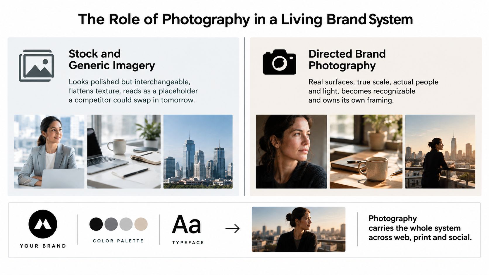
Generic stock imagery may be polished, but it often remains interchangeable. Directed photography records real surfaces, actual people, true scale, and the circumstances that make the organisation's work specific. That specificity gives the image a stronger relationship to the rest of the identity.
A brand can use illustration, templates, and motion to extend its visual language, but photography is where the system encounters reality. It has to represent the actual building, the actual team, or the actual product without losing the chosen point of view. Guidance on brand photography examples can help teams compare isolated hero images with broader visual coverage.
The production test is simple. Place six images on a webpage without the logo, then remove the text. If the set still feels authored by one organisation, the photographer and brand team have created a living system. If every image seems to come from a different visual world, the guidelines need to become more specific.
A short visual demonstration can make that difference easier to assess:
Building the System From Mood Boards to Brand Guidelines
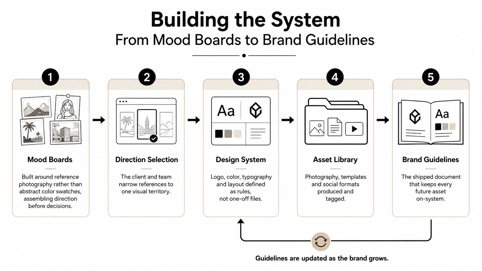
The strongest systems are built through production artifacts, not a single approval meeting. Each artifact answers a question that would otherwise create confusion later.
Start with reference photography
Begin the mood board with actual photographs, layouts, crops, materials, and lighting references. Abstract words such as “authentic,” “bold,” or “refined” can mean different things to different people. A board showing a shadow across textured stone, a close portrait with visible skin detail, and a wide interior frame gives the team a shared visual vocabulary.
Keep the references organised by function. Separate atmosphere, composition, people, environments, colour, and post-production. This makes it easier to identify which qualities are essential and which are merely attractive in a single example.
Narrow the direction
A mood board is not a final identity. The client and creative team need to select one visual territory and name its boundaries. For example, “editorial architectural documentation” might allow directional light, material detail, and human occupation, while excluding artificial poses, extreme wide-angle distortion, and aggressive clarity.
Write down the rejected directions too. That record prevents the team from reopening the same debate during the next campaign.
Turn taste into rules
The style sheet should show approved and unapproved applications. Define palette behaviour, type hierarchy, spacing, image ratios, crop logic, graphic elements, and accessibility considerations. Include named examples such as “full-bleed exterior,” “portrait with right-side copy space,” or “detail image for a square tile.”
The purpose isn't to remove judgement. It's to reserve judgement for meaningful creative choices instead of routine decisions.
Protect the shoot brief
A shoot brief should stand alone as a production document. It needs the location, intended audience, lens choices, talent direction, lighting approach, required orientations, shot list, usage needs, and priority images.
For architectural work, specify which views must preserve spatial relationships and which details need accurate material colour. For corporate content, explain whether people should appear observed, directed, formal, or in active collaboration. The brief protects creative range because the photographer can plan for variation without losing the central point of view.
Finish the handoff
Post-production standards should cover file naming, folder structure, retouching limits, colour-managed exports, metadata, and delivery formats. A brand guidelines PDF should survive handoff to internal teams, freelancers, printers, web developers, and partner agencies.
Treat the document as a maintained tool. When a new format exposes a weakness, update the rule rather than allowing the exception to become an unofficial standard.
When Clean Stops Working and Distinctive Takes Over
Minimalism is useful until it becomes indistinguishable. Many brands have adopted the same flat sans serif, evenly lit product image, pale background, restrained gradient, and carefully centred composition. The result can be tidy while giving the audience no reason to remember who made it.
Projection and trend coverage for 2026 points toward responsive, motion-aware identities, tactile materials, humanised visuals, and systems that can adapt across screens and contexts (2026 visual branding trend coverage). This is a projected direction, not a universal rule, but it reflects a practical problem: static polish no longer guarantees distinctiveness when every competitor can produce a similarly polished surface.
Hospitality brands may use film grain, warm interiors, and imperfect details to create a sense of lived experience. Boutique architecture practices may document a building through strong shadow, weathered material, and close observation instead of presenting every project as a bright, neutral catalogue image. Food brands may allow uneven arrangements, visible hands, and tactile still life rather than presenting every object with clinical precision.
A separate trend report found that searches for “luxury lifestyle” imagery rose 43% in a year, while an industry survey reported that 30% of marketers wanted more motion graphics, 30% wanted more authentic visuals resembling real workflows, and 29% wanted visuals to be more branded and systemised (2026 visual design trend reporting). These figures describe demand reported in that coverage, not a guarantee that textured imagery will outperform for every organisation.
The trade-off is production discipline. A distinctive system needs a firm baseline, because texture without rules looks accidental. Decide whether grain is consistent, whether shadows can become dramatic, how much imperfection is welcome, and which materials or human gestures belong to the visual world.
Distinctiveness isn't the opposite of consistency. It's consistency applied to more memorable choices.
A brand should choose character when sameness is the bigger risk. The commercial upside is qualitative at first: stronger recall, clearer positioning, and a visual presence that can support a more confident conversation about value and pricing. The system earns those benefits only when every contributor understands the boundaries.
Measuring the System and Choosing the Right Next Step
Return to one diagnostic question: is the visual brand recognisable without the logo?
You don't need a complex research programme to find useful evidence. Start with a small audience test. Show a selection of images, layouts, or cropped social assets with the logo removed and ask people what organisation they associate with them. Unaided recall is more revealing than asking whether the asset “looks on-brand,” because recognition is the job the system is meant to perform.
Then inspect the owned channels as a group rather than one at a time. Look at the website, social feed, proposals, presentations, print materials, and image library together. A qualitative consistency audit should record where colour, typography, cropping, lighting, image treatment, and logo use drift.
Use three signals:
- Unaided recall: Remove the logo and ask whether viewers can identify the brand or describe its visual character.
- Recognition consistency: Check whether the same colour behaviour, type hierarchy, and image treatment appear across every active touchpoint.
- Competitor confusion: Place representative assets beside a direct competitor's work and identify where the two visual languages overlap.
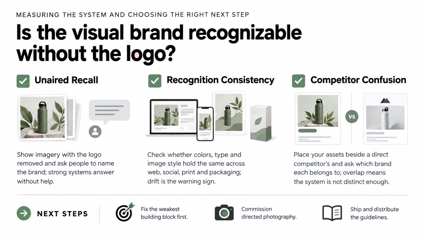
The next step depends on the weakest component. If the foundation is stable but the library lacks current, consistent images, commission a focused brand or architectural shoot. If the logo, palette, typography, and positioning disagree, work with a brand designer or agency before producing more photography. More assets won't repair an unclear system.
Use this decision checklist:
- Asset consistency: Can the team apply the system without repeatedly asking for permission?
- Photography coverage: Are there enough real images for web, social, proposals, editorial use, and campaigns?
- Conversion evidence: Do stronger visual assets support more useful enquiries, longer engagement, or clearer sales conversations?
- Portfolio assessment: Does a photographer show editorial range, lighting control, restrained retouching, and system thinking across multiple deliverables?
Jimmy Clemmons Photographer offers architectural imagery, commercial brand content, and professional portraits for teams that need consistent visuals of spaces, people, and products. If your identity is sound but your photography is fragmented, visit Jimmy Clemmons Photographer to discuss a directed shoot built around your visual system and upcoming content needs.