
You're in a meeting with a brand team, or staring at a homepage refresh, and the problem is obvious. The visuals look polished, but they don't feel like the company. That gap is where corporate branding examples become useful, especially when the strongest ones use photography, architecture, and spatial design to make a brand feel tangible before anyone reads a word.
The best corporate identity systems don't rely on logos alone. They use consistent visual presentation, because that kind of discipline can improve revenue performance and brand recall, and color can strengthen recognition sharply in the same benchmark set cited in branding research branding benchmark overview. For enterprise teams, that means photography isn't decoration. It's part of the operating system.
These examples are selected for a reason. They show how high-end architectural photography, commercial interiors, product documentation, and human-centered portraits can turn abstract positioning into something buyers, employees, and partners can feel. They also show the behind-the-scenes discipline that makes the visuals work, from style guides to lighting consistency to asset governance.
1. Apple Inc. Makes Minimalism Look Like Strategy
Apple's branding works because every image, material, and space feels edited with the same standard. That's the lesson for teams building a corporate identity system, consistency across touchpoints matters more than decorative variety. Branding research also notes that over 60% of Fortune 500 companies use combination logos and that Apple was valued at about $516 billion in a 2024 branding summary, which shows how far a disciplined identity can scale as an enterprise asset 2024 branding summary.
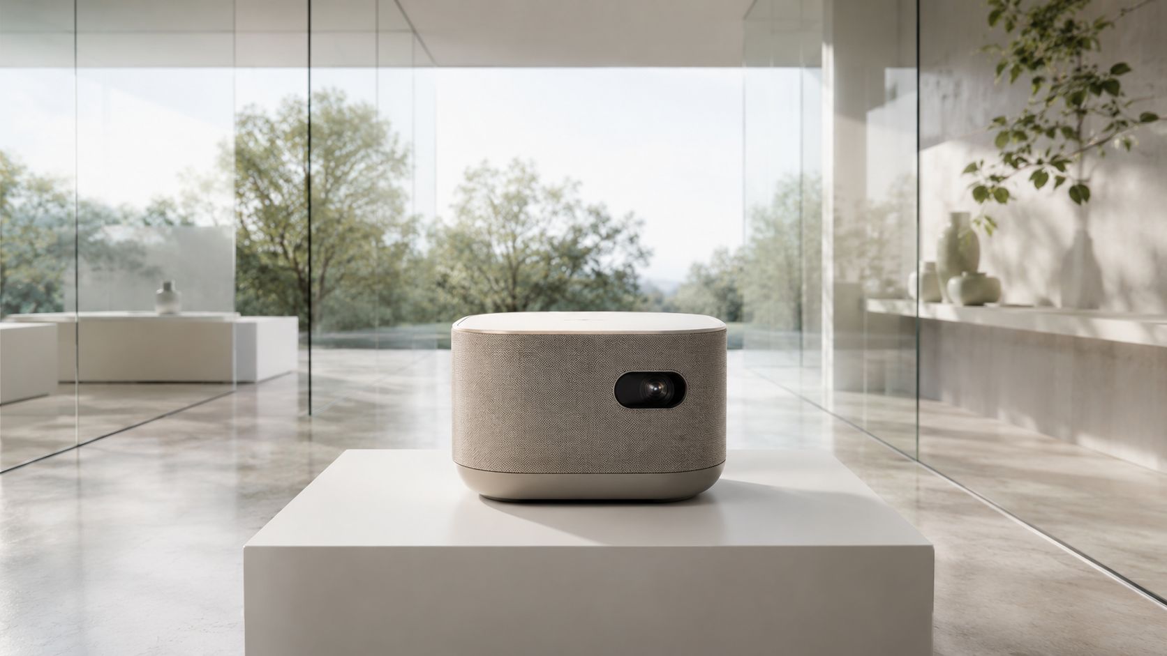
The visual language is easy to spot. Apple Park uses clean lines, glass, and open space to communicate precision. Product photography often relies on controlled lighting and restrained backgrounds, while retail interiors turn architecture into part of the brand story. The result is not just a design system, it's a repeatable image strategy.
Behind the scenes tactics that matter
Practical rule: build a photography guideline before you commission a single shoot. If your lighting, cropping, and background choices vary by department, the brand feels weaker instantly.
Use that approach everywhere. Executive teams should approve a shared visual standard for product shoots, building interiors, lifestyle imagery, and event coverage. In practice, that means specifying how much negative space is acceptable, what type of surfaces can appear in frame, and how people interact with objects in branded environments.
- Lock the environment down: Use neutral materials, controlled reflections, and clean lines so product and space don't compete.
- Standardize light behavior: Match contrast, shadow direction, and color temperature across campaigns and property documentation.
- Treat retail as architecture: Photograph stores the way you'd document a premium interior project, not like a simple point-of-sale location.
- Keep teams trained: In-house contributors need a visual reference library so they don't drift from brand standards.
Apple's playbook is simple to copy in principle and hard to execute in practice. If your company wants to look premium, the first step is not louder branding. It's tighter control.
2. Patagonia Uses Real-World Photography To Prove Its Values
Patagonia's strength is that its imagery feels lived in. The company doesn't sell a polished fantasy and stop there. It shows products in the environments where they matter, on trails, in weather, and among people who use them. That makes the brand's values easier to believe because the visuals don't feel staged for comfort.
For corporate teams, the lesson is direct. If your brand claims responsibility, craft, or purpose, your photography has to show evidence of that claim. Professional photography should still be sharp and well-composed, but it should also preserve texture, context, and friction. A spotless studio can make a sustainability brand look disconnected from reality.
What makes the imagery work
The strongest Patagonia-style visual systems use authentic settings, not generic office backdrops. Team portraits happen where work happens. Environmental documentation shows projects in progress, not only the final polished result. Product imagery fits the terrain, climate, or working conditions where the item is used.
Show the work, not just the promise.
That principle is useful for B2B companies too. Construction firms, energy companies, and professional services firms can all benefit from seeing their people in real settings, with real tools, doing real work. It builds credibility faster than a stock-heavy campaign ever will.
A disciplined behind-the-scenes process matters here. Hire photographers who can work fast without flattening the scene. Build shot lists around real operations. Avoid over-staging people into unnatural poses. And create a review process that prioritizes truth over tidiness.
If you need a brand to feel trusted, this is the model to follow. Don't polish away the proof.
3. Google Turns Campuses And Offices Into Brand Assets
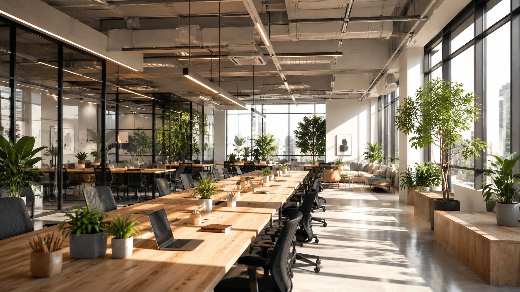
Google understands that a headquarters is more than real estate. It's a brand communication tool. The campus, office interiors, and collaborative spaces all signal how the company wants people to think about work, innovation, and access. That's why architectural photography matters so much in a corporate setting, it captures design intent in a way flat copy can't.
This approach is especially useful for employer branding and partner perception. When a company invests in open space, natural light, and usable public areas, the photos become evidence of operational culture. The brand isn't asking audiences to imagine the environment, it's documenting it.
Use the building as part of the message
For marketers and designers, the mistake is treating office photography like a one-time asset dump. Better teams document buildings during real use, with people moving through them, not empty and sterile. That adds scale, warmth, and credibility.
Photograph these elements with consistency:
- Exterior massing and circulation: Show how the campus sits in context, not just as a static facade.
- Interior daylight: Capture how natural light changes the feel of communal zones and work areas.
- Material details: Focus on finishes, joinery, and design choices that express quality.
- Active collaboration: Include people using the space so the architecture feels functional, not theatrical.
If you're managing a corporate campus, design studio, or mixed-use headquarters, create a photography calendar that captures different times of day and different modes of work. A workspace should look alive. If it doesn't, the brand feels frozen.
4. IBM Uses Consistency To Rebuild Credibility
IBM is a strong case because heritage brands can't afford visual confusion. When a company shifts from one market identity to another, the photo system has to support that shift across leadership portraiture, product imagery, office documentation, and client-facing materials. Otherwise, the market keeps reading the old story.
A brand system becomes operational. A professional services or technology firm doesn't just need attractive photos. It needs images that look like they belong to the same company across sales decks, recruitment pages, event signage, and executive communications. Consistency tells the audience the company knows who it is.
Build the system before you need it
The best IBM-style work uses restrained portraiture, serious environmental photography, and technical imagery that avoids gimmicks. That tone matters. If your organization sells expertise, the visuals should support authority without feeling cold.
A practical workflow looks like this:
- Set portrait standards: Define background, lens choice, framing, and retouching rules for leadership and team images.
- Document facilities regularly: Capture labs, offices, and service environments with the same visual discipline.
- Create reusable templates: Keep crops, aspect ratios, and file naming organized so assets can move across channels cleanly.
- Review all outputs together: Compare web, sales, and HR imagery side by side before final approval.
The point is to remove visual drift. When one department uses glossy stock and another uses documentary-style candids, the brand loses coherence. IBM's model shows that a mature corporate identity depends on the same look and feel showing up everywhere the company speaks.
5. Airbnb Blends Professional And User-Generated Visuals Without Losing Trust
Airbnb is useful because it doesn't depend on a single photographic style. It combines professional property imagery with user-generated content to create a visual system that feels broad, human, and flexible. That balance matters when a brand needs both authenticity and quality control.
For architecture and design teams, this is a strong model. Interior photography has to show layout, finishes, and atmosphere clearly, but it also has to leave room for the lived experience of the space. A property listing or brand campaign shouldn't feel like a magazine spread with no human presence. It should feel usable.
Keep the standards high and the content varied
The behind-the-scenes discipline is simple. Set photography rules for key angles, bathroom and kitchen coverage, natural-light timing, and room sequencing. Then allow enough freedom for hosts, guests, or contributors to provide context-rich visuals that don't feel overly manufactured.
Photography for social media matters here because the same image logic applies across listing pages, social feeds, and campaign materials. If the brand wants trust, the imagery has to be both aspirational and believable.
Practical rule: use professional images to establish the baseline, then let real-world content prove the experience.
That approach is especially effective for hospitality, travel, and property brands with diverse inventory. A one-size-fits-all photo strategy usually fails because different spaces need different storytelling priorities. Airbnb's model works because the system is structured, not random.
6. Hilton Shows How Hospitality Branding Depends On Visual Standards
Hilton's branding depends on consistency across many properties, and that consistency is visible first. Guests don't read a brand manual when they arrive, they see the lobby, the guest room, the lighting, and the amenity spaces. That means photography has to do two jobs at once, document standards and sell the experience.
This is a strong example for real estate and hospitality teams because it ties the physical environment directly to market perception. A hotel brand can't pretend every property is identical, but it can control how quality appears in images. That's where professional documentation becomes valuable.
Photograph the property like a system, not a single room
The smartest hotel photography plans cover multiple conditions. Daytime shots show clarity and function. Evening and blue-hour images add mood and sophistication. Public areas need enough context to show flow, while rooms need careful composition so scale and finish are obvious.
For brands managing regional properties, consistency is essential. Use the same framing logic for lobbies, corridors, guest rooms, and dining spaces. Keep file organization strict so updates can be deployed quickly across websites, booking platforms, and sales materials.
A practical note for teams that shoot properties regularly, the value of blue hour for luxury projects is not just aesthetic. It gives exterior architecture a controlled, premium feel that can enhance the entire presentation package.
The lesson is that hospitality branding lives or dies on what people see before booking. If the photos look fragmented, the brand feels fragmented. If the images feel orderly and intentional, the property feels more trustworthy.
7. McKinsey Uses Portraiture To Signal Authority
Professional services branding is often misunderstood. People assume it's mostly about thought leadership articles and a polished website. That's incomplete. The visual system, especially portraiture, tells prospects whether the firm looks credible, experienced, and cohesive.
McKinsey's style is a good benchmark because the images support the firm's positioning without shouting. Leadership portraits, team photography, and office documentation all work together to suggest rigor and seriousness. That's exactly what enterprise clients expect from a high-stakes advisory partner.
Make people look like specialists, not actors
Portraits should feel direct, composed, and efficient. Overly casual styling weakens the signal. Over-retouched faces weaken it too. The best professional services portraits show human presence without trying to create a lifestyle brand out of consultants.
If your firm needs this level of polish, corporate headshots in Atlanta are part of the broader branding system, not a side task. The same standard should apply to partners, associates, and conference imagery.
Use these rules internally:
- Keep lighting consistent: Different lighting setups across teams make the brand look disjointed.
- Control posture and framing: The subject should look confident, not stiff.
- Match office imagery to the portrait tone: Don't pair serious portraits with playful or casual workspace shots.
- Refresh regularly: Old headshots make the firm feel inactive.
The point isn't to make everyone look the same. It's to make the entire firm feel like it operates with shared standards. For B2B buyers, that matters.
8. WeWork Treats Interior Design As A Brand Experience
WeWork built much of its identity on the idea that workspace design could be aspirational. The company's visual branding leaned heavily on interiors, community areas, meeting rooms, kitchens, and social spaces. That made photography a core part of the sales process, because the images had to sell more than square footage.
This remains relevant for coworking brands, commercial landlords, and interior design firms. People buy the experience of space, not just the physical dimensions. If the images show a flat, empty shell, the brand loses energy before the tour ever happens.
Shoot the space while it's being used
The best interiors photography avoids dead rooms. Photograph shared spaces when people are moving through them. Capture casual collaboration, not posed networking theater. Show the small design details that make the environment feel intentional, because those details are what clients remember.
A strong visual program for workspace branding should include:
- Common areas in motion: Make circulation and community visible.
- Meeting rooms with context: Include setups that reflect how teams work.
- Amenity zones: Show kitchens, lounges, and support spaces with the same care as premium areas.
- Cultural moments: Document events and gatherings that reveal how the brand behaves.
WeWork's lesson is useful even if your company no longer operates in the same way. Interior branding can still drive demand when it feels aspirational and functional at the same time. The photography has to sell that balance.
9. Steelcase Makes Furniture Part Of A Bigger Workplace Story
Steelcase is effective because it doesn't photograph products in isolation. It places furniture inside designed environments and shows how people use those environments to work, meet, and collaborate. That makes the brand about workplace thinking, not just office objects.
This is a smart move for manufacturers, architects, and workplace consultants. Product shots tell one story. Environmental photography tells a stronger one because it links design decisions to business outcomes. The viewer sees how layout, material, and function work together.
Let the context do the selling
Furniture and workplace brands should resist the urge to isolate every object on a plain background. That can be useful for catalogs, but it won't build a strong brand narrative. The better approach is to show the product inside a thoughtful spatial system.
Document these scenarios:
- Workstations in use: Show how furniture supports actual tasks.
- Meeting rooms and collaborative areas: Make function visible through real activity.
- Before-and-after transformations: Demonstrate the value of a redesign or product package.
- Breakout spaces: Show how secondary areas influence culture and comfort.
Steelcase-style imagery works because it makes design feel practical. That matters to procurement teams and facilities leaders who need evidence, not hype. If the photo proves that the environment functions well, the brand becomes easier to trust.
10. Salesforce Turns Architecture Into Employer And Customer Messaging
Salesforce is a clear example of how headquarters architecture can become part of brand identity. The company's tower and office spaces don't just house the business, they communicate scale, confidence, and modernity. That's a valuable lesson for organizations investing in major physical environments.
The key is documentation. A strong building still needs strong photography to work as a brand asset. Exterior shots should emphasize the tower or campus in context. Interiors should show how people use the space. Community areas should reinforce the company's culture rather than just its size.
Use architecture to show values, not just height
Salesforce works visually when the photography connects design choices to the brand story. Sustainability features, open collaboration zones, and communal areas all matter. Without that framing, the building is just an impressive object. With it, the building becomes a message.
Corporate teams should build a regular update cycle for these images. Offices change, teams change, and the brand needs fresh assets that reflect current reality. A stale facilities library makes the company look inactive, even when the business is moving fast.
The strongest brands understand this simple truth. Architecture is not a backdrop. It's a communication channel.
Corporate Branding: 10 Visual Strategy Comparisons
| Brand / Approach | Implementation Complexity 🔄 | Resource Requirements ⚡ | Expected Outcomes ⭐📊 | Ideal Use Cases 💡 | Key Advantages ⭐ |
|---|---|---|---|---|---|
| Apple, Design-Forward Visual Identity | Very high 🔄, strict standards & centralized control | Very high ⚡, pro photography, design teams, retail buildouts | Premium positioning; strong global recognition ⭐📊 | Premium product launches; flagship retail & editorial campaigns 💡 | Consistent, highly polished visual system; cross-channel adaptability ⭐ |
| Patagonia, Authentic Environmental Storytelling | Medium–high 🔄, location logistics & storytelling focus | Medium ⚡, location crews, ongoing shoots, editorial talent | Deep emotional engagement; trust & longevity ⭐📊 | Brands prioritizing purpose, sustainability, authentic narratives 💡 | Authenticity and differentiation; reusable documentary assets ⭐ |
| Google, Architectural Simplicity, Digital-First | High 🔄, global facility coordination & standards | High ⚡, architectural shoots, production across campuses | Enhanced employer brand and culture perception ⭐📊 | Tech campuses, employer branding, campus PR photography 💡 | Spaces-as-assets approach; strong recruitment and media appeal ⭐ |
| IBM, Heritage Rebranding via Visual Consistency | High 🔄, multi-year global rollout and change management | High ⚡, executive portraiture, facility documentation | Successful market repositioning; unified brand narrative ⭐📊 | Legacy firms shifting to services or modern identity projects 💡 | Strategic repositioning power; leadership visibility and ROI ⭐ |
| Airbnb, Professional + User-Generated Hybrid | High 🔄, scaling pro pipeline while curating UGC | High ⚡, distributed shoots, UGC moderation systems | Increased trust and conversions; diverse global catalog ⭐📊 | Marketplaces, hospitality platforms, large-scale listings 💡 | Blend of scale and authenticity; measurable booking uplift ⭐ |
| Hilton, Hospitality Photography Standards | High 🔄, global consistency across many properties | High ⚡, recurring shoots, regional photographer networks | Consistent guest expectations; supports pricing & distribution ⭐📊 | Hotel chains, franchise portfolios, property marketing 💡 | Standardization that supports revenue strategy and brand trust ⭐ |
| McKinsey, Corporate Portraiture & Thought Leadership | Medium 🔄, scheduling execs and maintaining editorial style | Medium ⚡, top portrait photographers and stylists | Elevated credibility; supports recruitment and thought leadership ⭐📊 | Professional services, consulting, executive communications 💡 | High-quality portraiture builds trust and premium positioning ⭐ |
| WeWork, Interior & Workspace Experience Photography | Medium–high 🔄, documenting active spaces and events | Medium ⚡, interior shoots, lifestyle coverage | Aspirational brand perception; leasing interest (ops-dependent) ⭐📊 | Co-working, workspace leasing, design-led marketing 💡 | Lifestyle-driven imagery that drives demand and social reach ⭐ |
| Steelcase, Environmental & Product-in-Context Photography | Medium 🔄, client access & case-study coordination | Medium ⚡, product staging in real environments | Strong sales enablement; demonstrates product value in context ⭐📊 | Furniture makers, designers, B2B sales collateral 💡 | Shows functionality and ROI; supports case studies and sales ⭐ |
| Salesforce, Campus Architecture & Culture Photography | High 🔄, landmark documentation and ongoing updates | High ⚡, architectural shoots, culture documentation | Landmark recognition; strong employer branding and investor appeal ⭐📊 | Companies with iconic HQs, employer brand initiatives 💡 | Architecture as brand asset; recruits talent and signals scale ⭐ |
Putting These Strategies Into Practice
These corporate branding examples all point to the same conclusion. If you want people to trust the company faster, you need visuals that look deliberate, consistent, and specific to the spaces and people behind the brand. The best systems don't chase style for its own sake. They connect photography, architecture, and commercial presentation to a clear business position.
Use Apple when you need restraint and precision. Use Patagonia when authenticity has to carry the message. Use Google, Hilton, Salesforce, and Steelcase when built environments need to work as proof of culture and capability. Use IBM, McKinsey, and WeWork when people, process, and space have to look like one coherent system. And use Airbnb when your brand has to balance standards with real-world variation.
The tactical pattern is the same across all of them. Write a visual guideline before the next shoot. Decide what every location, portrait, and product image should communicate. Then enforce those rules across web, sales, HR, social, and property assets. If the images don't look like they belong to the same brand, fix the system, not just the campaign.
For teams that need this done professionally, Jimmy Clemmons Photographer is a relevant option for architectural imagery, commercial brand content, and professional portraits. The studio's work fits the exact kind of visual discipline these examples demand, especially when a company needs its buildings, interiors, and people to feel connected under one brand system.
If you need corporate branding photography that makes architecture, interiors, and executive teams look intentional, start with Jimmy Clemmons Photographer. The studio focuses on built environments, commercial brand content, and professional portraits that support a cohesive visual identity. Visit the site, review the portfolio, and see how disciplined photography can sharpen your brand presentation.