
The renovation crew has the chairs lined up, the screens are mounted, and someone from marketing wants “a few good shots” before the ribbon cutting. That's usually the moment the room stops being just a project closeout and starts becoming a public statement. A well-designed academic learning center has to work for students at 9 a.m., for staff at 2 p.m., and for a camera at the exact moment the institution needs to explain what all the money and coordination produced.
What an Academic Learning Center Actually Does
A finished learning center often looks calm in photographs, but the story is movement. Students drift in for tutoring, advisors meet one-on-one, peer leaders run small sessions, and a writing coach may be reviewing drafts in a quiet room two doors down. The facility becomes useful because it gathers services that used to live in scattered corners of campus and gives them one operational identity.
That distinction matters. A library offers study space and collections. A classroom delivers instruction on a schedule. A student union lounge gives people somewhere to sit. An academic learning center does something more specific, it organizes human support around academic performance, so the room itself becomes part of the service model rather than just the container for it.
A campus tool, not a leftover room
The institutional shift toward purpose-built centers is visible in the footprint and the traffic. A national survey of college learning centers found that more than two-thirds were founded since 1990, with an average center size of 3,972 square feet and a range from 20 to 40,000 square feet national survey of college learning centers. The same survey reported an average of 21,635 visits per year and a median of 10,000, which is enough to show these aren't fringe support rooms tucked into a basement corner. They're campus infrastructure.
Practical rule: if the center's work depends on staff-led conversations, it needs to be planned like a service hub, not decorated like a lounge.
That is why the term keeps showing up in enrollment, retention, and accreditation conversations. The center is where institutions can point to organized support, evidence of use, and a visible commitment to student success. In a good facility, the architecture doesn't just look polished. It helps people understand that support is central, scheduled, and expected.
Types of Centers and the Services They Bundle
A center's type should follow the service model, not the other way around. A tutoring-only space doesn't need the same circulation pattern as an advising hub, and a writing center should not be designed like a drop-in math lab. The wrong layout forces staff to work around the room instead of through it.
The common archetypes
A standalone tutoring center is usually the simplest model. It's built for drop-in help, scheduled appointments, or both, and the staff mix often leans heavily on peer tutors with a supervising coordinator. These centers work best when the architecture makes each conversation legible, accessible, and easy to find.
A writing center needs a different feel. The work is private, conversational, and often iterative, so quieter rooms and smaller consultation zones matter more than open capacity. If the design overemphasizes visibility, it can make students feel exposed when they're wrestling with a draft.
A math or STEM support center often needs a more public rhythm. Whiteboards, flexible tables, and visible tutoring stations help students understand where to go and how to join a session. These spaces usually look better in a photograph when the furniture can be rearranged without losing order.
An integrated student success hub bundles tutoring, advising, and sometimes accessibility support under one roof. That arrangement simplifies the student's path through campus, but it also creates operational overlap, so reception, wayfinding, and scheduling have to be sharper. If the desk can't direct traffic fast, the whole center feels confused even when the services are strong.
Matching service mix to room behavior
The quickest way to avoid a bad fit is to ask how students enter the service. Walk-in support needs obvious thresholds and clear sightlines. Appointment-based services need privacy and predictable room assignment. Hybrid centers need both, plus staff who can triage quickly without making students repeat their story three times.
A center that can't explain itself in one pass usually has a layout problem.
The visual cue matters here as much as the service cue. If the first thing a visitor sees is a line of anxious students with nowhere obvious to stand, the center feels improvised. If the first thing they see is a readable lobby, a few well-placed tables, and staff who can direct them, the room already communicates competence.
Design and Operational Considerations That Make or Break the Space
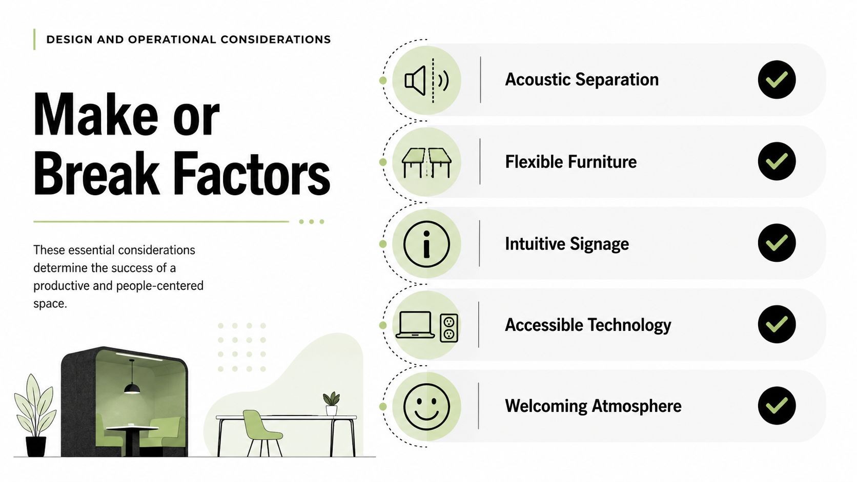
The room can look finished and still fail in use. Tutoring depends on speech intelligibility, so background noise, reverberation, and HVAC rumble aren't cosmetic issues. They're service issues, and students feel them immediately even if they can't name them.
The acoustic benchmarks are clear enough to work from. One higher-education facilities standard specifies STC 50 for perimeter walls, NRC 0.70–0.85 for ceilings, and maximum HVAC background noise of 40 dBA higher-education acoustic standard. It also prefers carpet tile for absorption. That's not overdesign, it's what makes tutoring rooms, advising rooms, and small-group sessions usable without vocal strain.
What to protect before value engineering starts
The failure mode is easy to recognize in photos and in person. A beautiful open ceiling can look impressive and sound terrible. A shallow partition can make the room feel modern and still leak every conversation. A late substitution that weakens acoustic separation will show up in complaints long before it shows up in the marketing gallery.
The same logic applies to network and AV planning. Learning spaces now behave like small technology hubs, not static study rooms. One university multimedia-classroom standard requires six Cat6 drops in a general-purpose learning space, plus 2.00-inch conduit from lectern to projector and an isolated 115V/20A circuit for lectern power university multimedia-classroom standard. Another learning-space guideline requires wireless coverage sized to the room's maximum occupancy and a dedicated high-density access point for rooms with more than 25 seats same standards package.
That means the most effective learning centers are designed around three linked conditions:
- Speech control, so students can hear one another without effort.
- Power and data density, so staff stations, displays, and device charging don't fight for the same resources.
- Layout discipline, so reception, tutoring, and study zones don't collide at peak hours.
Good test: if the room only works when every seat is full of cooperative users, the design is too fragile.
The visual trade-off is worth stating plainly. Architects often want openness, but photographers can see the operational cost of openness in every reflective surface, noise spill, and exposed cable run. The best centers usually combine a welcoming public edge with enclosed rooms where confidential work can happen. That balance is what makes the space believable to students and defensible to staff.
Why These Centers Matter for Student Outcomes
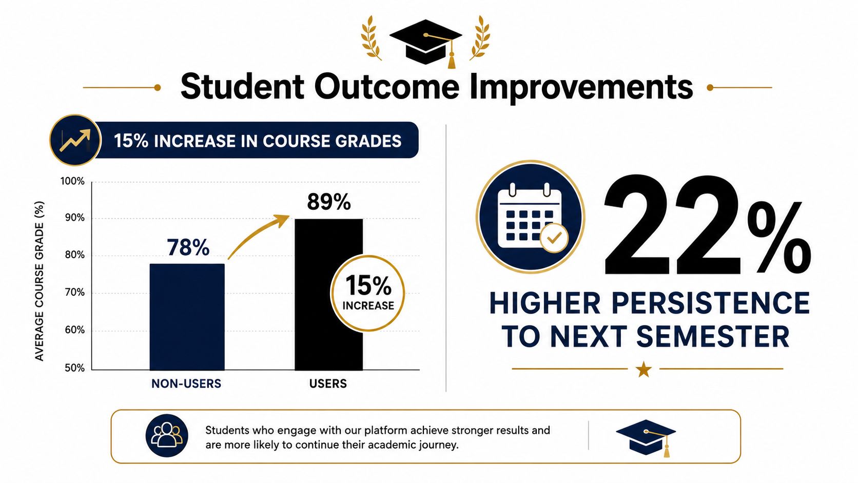
An effective learning center is not just a nice campus amenity. It is part of the institution's retention machinery, and the evidence base behind that claim is strong enough to justify real space and staffing decisions. One ERIC-indexed study reported that students who used a learning assistance center were three times as likely to be successful in their course and almost twice as likely to persist to the subsequent term ERIC study on learning assistance centers. That kind of effect size is why these facilities keep moving from student-services language into student-success strategy.
The scale of use reinforces the point. Penn State Learning reported that more than 14,000 students accessed its services and resources in 2023–24, with contacts exceeding 100,000, while its Guided Study Group program supported 12,717 students through 82,391 contacts Penn State Learning report. Those are not boutique numbers. They describe a service system with enough volume to affect progression, gateway-course performance, and the student experience at institutional scale.
Who still gets missed
The harder question is who the center doesn't reach. Older evidence on underprepared students shows that learning centers have long offered tutoring, workshops, and basic-skills labs, but more recent college-sector analysis found that 32% of surveyed institutions lacked resources specifically to help students balance work and study underprepared-student learning center analysis. That gap matters because the barrier for many students isn't content alone. It's time, transit, caregiving, and the friction of getting to campus when the building is open.
Accessibility changes the brief again. Online-learning guidance emphasizes universal design, captions, screen-reader compatibility, mobile-friendly access, and virtual office hours for students with disabilities, parents, working adults, and first-generation learners online learning guidance for underserved populations. It also notes that phones may be the only web access some students have, which makes mobile-optimized scheduling and communication a practical necessity rather than a feature request.
The center's reach is measured by who can use it on a bad day, not just by who likes it on a good one.
This related campus planning article is useful because it makes the same operational point from a different building type. If access depends on luck, parking, or a single time slot, the service model is incomplete.
Case Studies From Completed Campus Projects
Completed campus projects teach different lessons depending on what the building had to do. A private school renovation, a Catholic campus expansion, and a residence with a carefully sequenced interior all solve the same general problem, which is how to make a built environment legible to its audience without flattening its character. The camera catches those differences immediately.
Renovation, expansion, and interior rhythm
A private school renovation usually lives or dies on reuse. The hard part is making an older shell feel coherent after new finishes, new lighting, and new circulation patterns are layered in. For a learning center project, the useful photographs are not only the polished overview shots, but also the transitions, hall edges, arrival points, and places where old geometry meets new program.
A Catholic campus expansion adds a different challenge. When a new two-story academic building sits beside existing Gothic Revival architecture, the building has to read as related without pretending it is original. That is where photography matters most. Wide exterior frames show scale and adjacency, while tighter interior images can reveal how the new circulation, daylight, and finish palette support the institution's identity.
A residence that doubles as an interior study is more intimate. Here, sequencing matters more than broad context. The strongest images show how one room leads into the next, how furniture softens a corridor, and how the space feels when occupied rather than staged. For a learning center, that same idea applies to the gallery. A donor needs a sense of investment, but a prospective student also wants to see a place that feels usable and calm.
What the camera should prioritize
The photographer's job is to make operational logic visible. That means documenting:
- Scale, so viewers understand whether the space is compact or institutionally significant.
- Adjacency, so they can see how tutoring, advising, and study functions relate.
- Rhythm, so the sequence of rooms feels deliberate instead of accidental.
The best finished-project images do more than flatter the architecture. They explain it. A center that appears navigable, bright, and orderly in the final gallery is easier to market because the audience can infer how it will work on a busy weekday.
Documenting and Marketing the Finished Space
Photography should not wait until the punch list is done. If it does, the images often arrive in a rush, under bad light, with temporary clutter and no real plan for who the pictures are meant to persuade. That's a missed opportunity, because the same building has to speak differently to donors, trustees, prospective students, and accreditation teams.
The audience split is sharper than many organizations admit. Donors and trustees want finish quality, scale, and signs of institutional care. Prospective students want warmth, social proof, and visible activity. Accreditation reviewers want evidence that the space matches the service model and supports the work it claims to support. The same hallway can serve all three, but not with the same framing.
Shoot for sequence, not just inventory
Marketing asset planning marketing asset planning becomes part of the project, not just part of communications. The shot list should include hero exteriors, primary circulation, representative tutoring rooms, the quiet study zone, and the technology-enabled collaboration spaces, but the sequence matters more than the checklist. A gallery that opens with a cramped detail and ends with a wide room feels backwards, even if every image is technically strong.
Pre-occupancy and post-occupancy images each have a role. The first gives you architectural clarity, with controlled light and clean finishes. The second gives you lived-in credibility, with people using the center the way it was intended. Good institutions need both, because no single shoot can tell the full story.
Editorial rule: if the photos don't help someone understand how the center works, they're decoration, not documentation.
The camera also catches what marketing copy tends to skip. A room with thoughtful acoustics looks calmer. A reception desk with clear sightlines feels more welcoming. A well-planned collaboration zone reads as active rather than noisy. Those signals are why image planning belongs inside the design timeline, not after the opening ribbon is cut.
A Practical Photography Brief for Learning Centers
A useful photo brief starts before the photographer arrives. Facilities should confirm lighting schedules, HVAC timing, and any room resets that need to happen between shots. Marketing should clear temporary signage, remove visual clutter that doesn't belong in the final story, and decide where anonymous but realistic student activity will help the images feel credible.
The core shot list is straightforward, but it should be ordered with intent. Start with an exterior establishing frame, then move through arrival, circulation, tutoring, quiet study, and the technology-supported collaboration zones. That progression lets the viewer understand the building the same way a student would, from first approach to actual use.
A workable field checklist
- Prep the rooms thoughtfully: keep the space believable, not sterile, and avoid staging that hides how the center functions.
- Control the light: mixed-use academic interiors need consistency, so window glare, overhead color shifts, and monitor reflections have to be managed.
- Protect the sequence: shoot in an order that tells a story, not in the order the furniture happens to be easiest to photograph.
- Edit with restraint: keep the images honest, but don't flatten the design intent by overprocessing every surface.
A practical brief should also define what not to do. Don't let compressed schedules push the shoot into a room-by-room inventory with no narrative arc. Don't let occupancy concerns erase the human use that makes the center believable. The best results come when the photographer is brought in early enough to understand the operational story, not just the room count.
Photography process guidance for interiors and architecture is useful here because the same discipline applies across project types. The goal is always the same, to produce images that help the viewer understand scale, flow, and purpose without turning the space into a postcard.
Pulling the Threads Together
An academic learning center works best when three decisions are made early and held together through the project. First, the service model has to be set before the floor plan hardens. Second, acoustic and network budgets have to survive value engineering. Third, documentation has to be scheduled as a deliverable, not treated as a leftover task for opening week.
If those decisions are made late, the center still opens, but it opens with compromises the camera will expose immediately. If they're made early, the room can support tutoring, advising, and study without looking busy just to prove it is working.
Before breaking ground, a campus team should be able to answer a few plain questions. Who uses the center most often, and how do they arrive? Where does confidential conversation happen without acoustic bleed? What must be wired, powered, and labeled from day one? Who needs the finished images, and what story do those images need to tell?
The photographs taken on opening day will define the project for years, so they deserve the same planning as the partitions, the network drops, and the reception desk. If your institution is planning a learning center or refreshing one that never quite worked as intended, reach out to Jimmy Clemmons Photographer for architecture photography that shows how the space functions, not just how it looks.