
I still remember the first time a child in a library pointed at a dump truck spread and asked, “What does that one do?” The best construction picture books answer that question with more than labels, they use composition, rhythm, and visual sequencing to make building feel legible.
The market context helps explain why this subgenre keeps holding attention. A picture-book industry summary pegs the global picture book market at $9.2 billion in 2023 with a projection of $13.1 billion by 2028, and notes that the average U.S. picture book is 32 pages while the median picture book is only 500 words (WorldMetrics picture book industry statistics). That short format pushes illustrators to do the heavy lifting, which is exactly why construction books reward strong art direction, clear silhouettes, and disciplined pacing.
1. Goodnight, Goodnight, Construction Site
This is the title that many readers recognize first, and it earns that position through cinematic page design. The book treats five machines, crane, mixer, dump truck, dozer, and excavator, like a bedtime crew, and the spreads use strong color blocking and broad shapes to separate each vehicle cleanly from the background. That clarity matters for young readers, because the eye can land on one machine at a time without fighting clutter.
Why the illustrations work
The art behaves like a well-composed architectural interior shot. Lines lead across the spread, the machines are staged with enough breathing room, and the nighttime palette softens the scene without flattening the forms. The result is gentle, not static, and that balance is hard to pull off in a vehicle book.
The hardcover format also helps the images feel bigger than the page. Chronicle Books presents it as a sturdy storytime title, and that physical presence suits the book's bedtime rhythm and repeated read-aloud use (Chronicle Books). The trade-off is obvious, the wind-down arc reduces mid-book action, so readers who want constant motion may find it calmer than they expected.
Practical rule: If a spread can't be understood from the back of a group circle, the composition is too busy for preschool storytime.
For practitioners, the book also shows how a construction title can become a visual franchise. Its long shelf life makes sense in a category where durable picture books often win on rereadability, and the title's staying power pairs well with the broader market's long-tail economics, as seen in the overall picture-book data noted earlier. For a parent, teacher, or librarian, this is the safest first pick when the goal is emotional warmth rather than technical depth.
The internal critique is simple. It personifies machinery beautifully, but it simplifies what those machines do. If the child already loves excavators, this book satisfies. If the child wants process and mechanics, another title will go farther.
For readers who want a visual companion to building documentation, the way this book values framing and timing connects neatly with construction progress photos, because both disciplines depend on showing change clearly over time.
2. Mighty, Mighty Construction Site
The sequel shifts from bedtime calm to ensemble problem-solving, and that change affects the visual grammar immediately. The spreads feel busier, but in a controlled way, because the art has to track a larger team and a more complex build. Instead of one mood dominating the book, you get a sequence of coordinated actions, which gives the pages a stronger sense of momentum.
How the sequence reads on the page
This title works best when you read it as staging rather than spectacle. The machines are arranged to show cooperation, not just movement, so the eye follows the work from one role to the next. That is good visual storytelling because it gives young readers a repeatable model for teamwork, one that mirrors the logic of a construction site where each vehicle enters the frame with a clear purpose.
The rhyme-driven pacing supports that visual structure. It keeps the spreads from feeling overloaded and gives each machine a beat of attention before the next one takes over. Chronicle Books' product page positions it as part of the same construction-site family as the first book, and that continuity matters for buyers who want a coordinated set rather than a one-off title (Chronicle Books).
A notable trade-off is realism. The personified trucks are appealing, but they aren't ideal if your audience needs accurate machinery behavior or site terminology. The book also leans less on explanatory detail, so it's better for social-emotional learning than for a deep dive into equipment functions.
The strongest spreads don't just show activity, they show hierarchy, distance, and sequence.
That's why this sequel feels useful in classrooms. It gives educators a way to talk about planning, order, and collaboration without leaving the visual language of construction behind. It also fits neatly into libraries that need a companion title to the original without repeating the same emotional beat.
For buyers comparing options, the main question is whether they want a continuation of tone or a new type of information. If the answer is continuity, this sequel delivers. If the answer is specificity, keep moving.
3. Roadwork
Roadwork is the most process-driven title on the list, and the art reflects that from the first spread. The gouache illustrations are bold and graphic, which gives each phase of the road build a distinct visual identity. That matters because road construction is easy to misunderstand if the page is too soft or too decorative. Here, the book keeps the forms clear and the transitions readable.
A strong choice for visual sequencing
The book's greatest strength is that it shows a step-by-step workflow instead of treating the site as a single noisy event. The repeated sound words give children something to say aloud, while the pictures carry the informational load. Each spread advances the project, so the reader sees the relationship between site prep, machine action, and the finished road.
The design reads well across a room, which makes it especially useful for group read-alouds. That clarity is a direct advantage in classrooms and libraries, where the visual field has to survive distance, movement, and multiple small viewers. The format also comes in several editions, including board book, paperback, and e-book, which makes it easier to match age and setting (Candlewick).
The limitation is focus. This is a road-building book, not a general construction overview, so it gives depth in one lane rather than breadth across the entire jobsite. It also favors process over terminology, which is smart for early readers but less satisfying for kids who want the names of specific parts and machines.
The included image reinforces that strength. The cover composition uses strong diagonals and vehicle placement to guide the eye immediately to the action, which is exactly what a good architectural or construction photograph aims to do, establish order fast.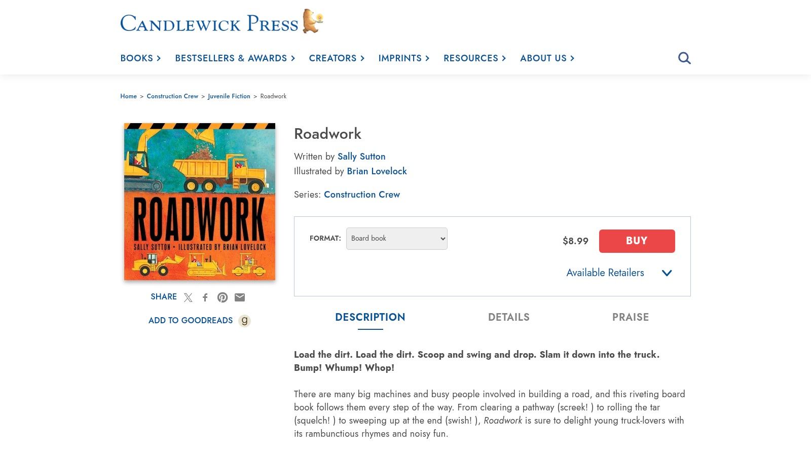
If you want a title that teaches sequence as much as vocabulary, this is one of the smartest picks. The book respects the reader's ability to follow cause and effect, and that makes the illustrations feel instructive instead of merely decorative.
4. Demolition
Demolition does something most construction picture books avoid, it starts with taking things apart. That shift changes the visual energy completely. Instead of a forward-moving build, the art has to capture impact, dust, pressure, and machinery force, and the spreads lean into that intensity without losing readability.
Visual energy without losing clarity
The book's best pages are the ones where action and structure collide. Cranes, breakers, and crushers create a layered composition that feels almost like a documentary frame, except translated for toddlers and early readers. The text uses high-energy verbs and sound effects to keep the pages moving, so the visuals never have to carry the whole load alone.
Candlewick offers the title in formats that include an audio read-along edition and board book options, which makes sense for such a kinetic subject (Candlewick). The board-book treatment also signals that the book is meant for short, intense attention spans rather than extended technical reading.
The trade-off is depth. Demolition is visually memorable, but it doesn't spend much time labeling equipment or explaining the sequence of events. That makes it stronger as an action book than as an educational reference. For truck-obsessed kids, that may be enough, especially when the goal is to show a phase of urban change that many build-focused books leave out.
The illustrated cover works because it commits to the force of the subject. It gives the viewer an immediate read on scale and motion, the same way a strong editorial image does when it documents an active site.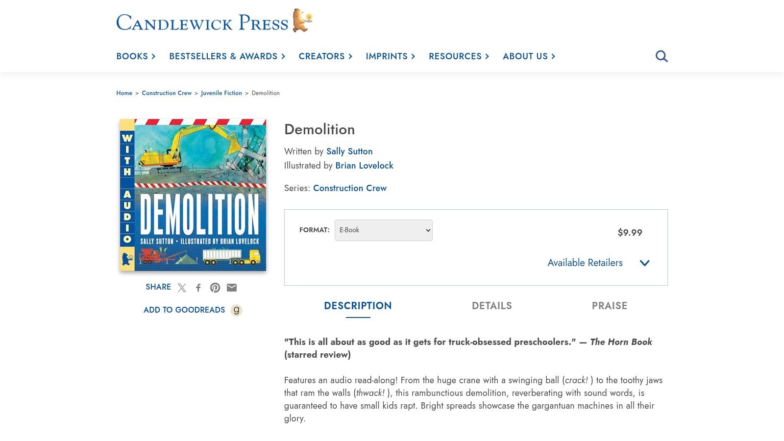
For adults choosing books, the key question is whether they need a build story or a site-cycle story. This one is the latter, and that distinction is useful because it gives children a fuller picture of what happens in the built environment.
5. Dig, Dump, Roll
This title uses a guess-and-reveal structure, which gives the illustrations a puzzle-like rhythm. Instead of presenting the school building all at once, the book lets the reader infer what each machine is doing before the reveal lands. That makes the pictures feel interactive, and interaction is a powerful tool when the audience is young enough to want immediate participation.
Composition as a clue system
The best thing about the art is that it treats each spread like a visual riddle. Machine placement, gesture, and partial information all do the work of the clue, so children have to read the page actively. That's a smart design move because it turns looking into a game without abandoning the construction theme.
The payoff is also clear. Since the machines are working toward a school, the final reveal gives the book a community purpose that extends beyond vehicles. Candlewick's product page positions it as a board book, which supports toddlers well, but it also means older readers may outgrow the trim size and the limited space for detail (Candlewick).
The trade-off is straightforward. The format is durable and engaging, but the compact scale leaves less room for technical explanation. That's fine if you want a shared reading experience with a clear endpoint. It's less ideal if you want to linger over equipment roles or site vocabulary.
The cover art helps the concept by keeping the scene broad and readable, with enough separation between objects for the eye to move quickly from clue to clue.
Practical rule: If a picture book invites a child to predict the next machine, the illustrator has already won half the engagement battle.
This is a strong pick for classrooms and community reading programs because the reveal creates conversation naturally. It doesn't just show construction, it gives the child a reason to guess, compare, and confirm.
6. Digger, Dozer, Dumper
This one is structurally different from the rest, and that difference is its main strength. Instead of a single continuous plot, it offers sixteen rhyming poems, each centered on a different work vehicle. That format gives the illustrations room to vary without losing cohesion, which is useful when you want breadth rather than one long narrative arc.
A gallery of machines, not a single story
The art style uses friendly caricature, but the machines still read clearly, and that clarity matters more than realism here. Each poem functions almost like a small portfolio print, a single subject framed cleanly so the viewer understands the vehicle's identity at a glance. That makes the book flexible for short readings, classroom transitions, or bedtime browsing.
Candlewick offers multiple formats, including e-book, which helps families and libraries choose the version that fits their use case (Candlewick). The Oppenheim Gold recognition also gives it extra shelf appeal, especially for buyers who want a title that already has a signal of quality.
The weakness is continuity. Poetry collections can feel episodic, and some readers want one project to follow from start to finish. If that's your audience, this book may feel more like a sampler than a story. It also doesn't stay in one lane of construction machinery, so the range is broader than the title might suggest.
The linked portfolio page is a useful reminder that clear, well-framed subject coverage matters in any visual field, whether you're shooting a machine or describing one on the page: construction company portfolio.
The advantage, though, is versatility. You can read a single poem or the whole collection, and the book still works. That makes it one of the more forgiving entries on the list for mixed-age groups or adults who don't know how long the attention span will last.
7. Machines at Work
Machines at Work is the most stripped-down visual statement in the lineup. The book depends on minimal text and bold shapes, so each spread lands fast and clean. From a photographic standpoint, that restraint matters because toddlers read pictures before they read words, and the layout gives the eye a direct route to the machine, the action, and the task.
Minimalism as a visual tool
This book handles composition like a tight architectural frame. If the subject carries the lesson, the surrounding space needs to stay quiet. The silhouettes remain crisp, the spreads stay uncluttered, and the page uses line and shape to guide attention without visual noise. That clarity is why it works so well in baby and preschool storytimes.
The format choices, including board-book and hardcover editions, support its durability-first purpose. Target presents it as an easy purchase choice, which suits a title made for repeated handling and very young readers (Target). The concise imperative text also supports vocabulary growth without demanding much from the listener. For families who already use construction progress photography documentation as a reference point, the book's direct, record-like approach will feel familiar, and it lines up with construction progress photography in the way both rely on clear subject definition and a controlled visual field.
The trade-off is obvious. The same simplicity that helps toddlers can leave older children wanting more site terminology, more sequencing, or a stronger narrative arc. It gives the cleanest possible entry point, but it does not reach far beyond that.
The cover image follows the same logic. Its compact composition reads almost instantly, which is exactly why this kind of book holds up in shared-reading settings.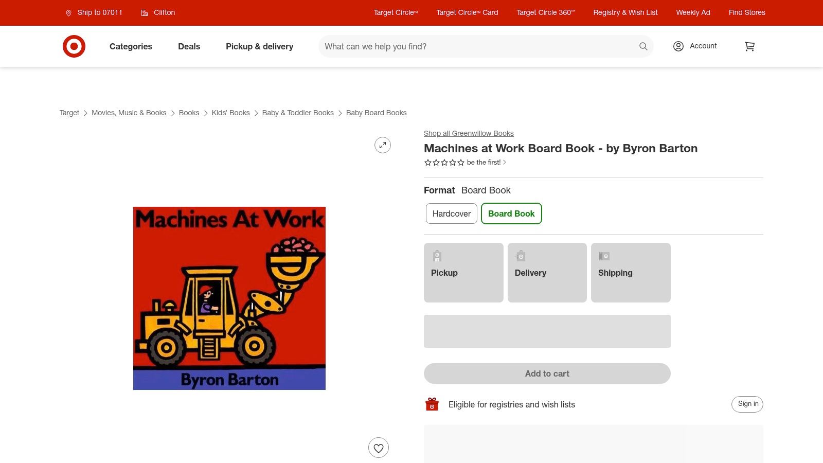
That makes it the strongest starter title here for readers who need visual certainty more than plot. If you want a book that behaves like a well-edited contact sheet, showing only the necessary frames, this is the one.
7-Book Comparison: Construction Picture Books
| Title | 🔄 Implementation Complexity | ⚡ Resource Requirements | ⭐ Expected Outcomes | 📊 Ideal Use Cases | 💡 Key Advantages |
|---|---|---|---|---|---|
| Goodnight, Goodnight, Construction Site | Low, simple rhyming bedtime arc | Moderate, hardcover, large trim for group viewing | ⭐⭐⭐⭐⭐, strong engagement & repeat read‑aloud value | 📊 Bedtime storytimes; series starter for young listeners | 💡 Calming cadence + big visuals maximize group impact |
| Mighty, Mighty Construction Site | Medium, more scenes and teamwork staging | Moderate, longer book, classroom use | ⭐⭐⭐⭐, promotes cooperation and sustained attention | 📊 Classroom lessons on teamwork; paired with first book | 💡 Useful for SEL (planning/cooperation) activities |
| Roadwork | Medium, sequential, process‑focused pacing | Low–Moderate, multiple editions (board/paper/ebook) | ⭐⭐⭐⭐, high participation and clear process learning | 📊 STEM/occupations units; group read‑alouds | 💡 Strong sequencing and onomatopoeia support participation |
| Demolition | Low–Medium, high‑energy, action‑driven text | Low, board‑book/audio options for young audiences | ⭐⭐⭐⭐, crowd‑pleaser for truck‑focused kids | 📊 Units on urban renewal or action‑focused storytimes | 💡 Fills niche on deconstruction; great for high‑energy sessions |
| Dig, Dump, Roll | Low, interactive guess‑and‑reveal structure | Low, compact board‑book durable for toddlers | ⭐⭐⭐⭐, clear payoff and sustained attention | 📊 K–2 classroom tie‑ins; community/build reveals | 💡 Engaging riddle format pairs literacy with curiosity |
| Digger, Dozer, Dumper | Low–Medium, anthology of short rhymes | Low–Moderate, multiple formats; award recognition | ⭐⭐⭐⭐, versatile for varied read‑aloud lengths | 📊 Short sessions or themed collections; vehicle units | 💡 Poetry format allows flexible use; broad machine coverage |
| Machines at Work | Very Low, minimalist text and clear visuals | Low, durable board/hardcover ideal for toddlers | ⭐⭐⭐⭐⭐, time‑tested for youngest audiences and libraries | 📊 Baby/toddler storytimes; preschool introductory units | 💡 High visual clarity and durability for repeated handling |
Framing the Future Beyond the Blueprint
The best construction picture books do more than entertain. They teach children how to read built space, how to notice sequence, and how to recognize that machinery, labor, and planning all leave visible marks on the world. That matters because the category sits inside a larger picture-book market that remains substantial and growing, and the format itself favors compact, image-led storytelling, just as the market data show with its short average page count and visual-first economics (WorldMetrics).
What stands out across the strongest titles is not just the trucks. It's the way illustrators use composition, line, scale, and light to make an abstract process feel concrete. A good spread shows where to look first, what changed second, and what the finished result means. That's the same discipline architectural photographers use when they document a completed building, because a carefully framed image has to communicate structure, atmosphere, and intent at once.
The category also has room to grow. Broader children's publishing data point to picture books as the dominant format inside the market, and the construction niche still leaves space for more stories about architecture, housing, interiors, teamwork, and the people who do the work. Many mainstream lists stay fixed on trucks and site vocabulary, but readers clearly respond to books that expand the frame.
For parents, teachers, librarians, and design-minded readers, that leaves a useful takeaway. Choose the title that matches the visual job you need done. Pick warmth, motion, process, or minimalism depending on the child and the setting. A good construction book, like a good site photo, tells you exactly where the structure is going and why it matters.
If you want visual content that treats built environments with the same care these books give to construction scenes, Jimmy Clemmons Photographer creates architectural photography, commercial imagery, and polished team portraits with a magazine editor's eye. Visit Jimmy Clemmons Photographer to see how purposeful composition and precise lighting can make your project or brand look as intentional as the spaces you build.